Artist Reference – Yury Toropstov

Yury Toropstov: Biography

  • Born in 1974 in a small village called Vladistov, U.S.S.R
  • Eastern Siberian origins.
  • Grew up in the Soviet Union until the collapse of communism in Russia in 1991.
  • Growing as an ethic minority in Communist Russia gave Toropstov a unique perspective of life.
  • Father died when he was  1 year old, and he was brought up by his mother.
  • Toropstov left Russia in 1998 to study at the New School for Social Research in New York to study project management
  • Toropstov travelled to America working as a translator.
  • 2004, Yuri becomes an assistant for a fashion photographer.
  • Since has been working as a documentary photographer based in Paris. He has completed various projects, made into slide-shows, films and books.
  • 2014 Yuri worked for 6 months in Jersey as the ‘Archisle International Photographer in Residence’. This 6 month project was finalised  with an exhibition entitled ‘Fairyland’.


Deleted Scene

  • Toropstov traces his origins, going back to the Russian village he grew up in
  • Respective style – Incorporation of family archive
  • Documents the isolated and remote region  of Eastern-Siberia.
  • Exploration of his father, who died when Toropstov was only one year old –“his untimely death turned him into an abstract character existing on the verge of oblivion”
  • There is no text to this narrative, and so it is up to the reader to make up their own interpretation of Toropstov’s father based on the images they are presented with

Evaluation of Photos in Deleted Scene

For my ‘Personal Study’, an important aspect to consider will be how I design the front cover of my photo-book . I think he front cover of ‘Deleted Scenes’ is very strong in providing a clear contextual introduction. Although only showing part of an image, it is clear  to deduce straight away that the photograph is an archival image, based on the sepia tone and worn-out post-card style of the border.

However, it is not the most interesting opening.  I find it to be quite plain and dull. From a objective viewpoint this makes  for an ineffective opening because it does not attract  or excite the viewer. Athough I do not particualry likke the opening I appreciate that Toropstov has attempted to grip the reader into exploring the narrative through the representation of a mysterious, ghost-like figure. I reckon that this could have been more interesting by perhaps showing slightly more of the image and in a photo editing software, cutting the image in half. Graphically this would work well and make for a more explosive, and vernacular styled opening.

The image in question is of Toropstov’s father. The back cover of the book shows the other section of the image. This is a metaphor for the narrative of the story, because the reader is given a brief indication that the story is perhaps about this half-revealed figure, and it is implied that over the process of the narrative they will be taken on a biographical journey of Toropstov’s origins with his father as the centre-piece, therefore being able to uncover ‘the whole picture’.  This narrative technique is known as foreshadowing, and establishes rising anticipation and suspense.


This image is a ‘still life’ shot of a child’s toy, perhaps a toy from Toropstov’s own child-hood. This photograph very much highlight Toropstov’s subjective approach because it draws his own personal input into the narrative. By reflecting on his past through an image of a lonesome toy, it is suggested that Toropstov has somewhat throughout his life felt, to a degree, lonely and lost in the absence of his father. Toropstov uses chiaroscuro lighting in order to reflect this dark, sombre mood. Chiaroscuro lighting is defined as “strong contrasts of light and dark”.

There is a somewhat reflective nature to this image. The horse facing outside of the window is in itself a metaphor for reflection. The old-fashioned appearance to the toy  symbolises this reflection to be retrospective. On a more subjective level, the toy horse looking out of a window may in fact represent for Toropstov’s lifelong quest to get to know his father. Personally I find this image to be very moving because it explores the tragedy and anguish of Toropstov’s situation in a symbolic way which is very poetic and subtle.

Toropstov effectively conveys his own emotional response through this image. The representation of the childhood toy in the window links the themes of reflection and childhood together, and therefore very much serves as a metaphor for the past. As this narrative is a look back into Toropstov’s past it is logical to assume that this image explores themes from Toropstov’s own childhood, with sadness, (implicity because of the fact the Yury grew up without a father), being explored  through the sombre mood created through Chiascuro lighting. This image is therefore is very honest and personal response.


Fairyland

  • Body of work that Toropstov made during his stay in Jersey as Archisle International Photographer in Residence (2013).
  • Explores Toropstov’s personal view of Jersey.
  • A visual narrative of his journey to fit into such a “discrete and mysterious place”.
  • Inspired by 1937 Film of Jersey Battle of Flowers – young girl named Joan Ivy Vibert on the float. Link to explore “history and reality of the island”.
  • Drawn into exploring mysticism within the island – viewed Jersey as idyllic and beautiful.
  • Intention to uncover mystery within the island, “notion of invisibility”.
  • Theme of work is very conceptual.

Evaluation of Images in Fairyland

This image shows a fraction of broken wallpaper. This is a classic detail-shot style – abstract in its close-up manner. On reflection the tear in the wallpaper resembles somewhat the shape of Jersey. Whether or not this is accidental, it is nevertheless apparent that Toropstov’s very specific style of observation comes through in this image, as he is picking out intricate details which act as symbolisations and metaphors – in this case either a direct reference to the shape of Jersey, or more poetically exploring Toropstov’s investigative nature. This is a reference to how he ‘peeling away’ at the surface of the island and uncovering its hidden secrets through the process of study and research.

The peeled away wallpaper is in itself a metaphor for imperfection. This links to the rugged and authentic feel that Toropstov attempts to convey in his work, a theme that vastly contrast with the more traditional style of Michelle Sank. It is quite  a unusual image to include in an exhibition as the context and relationship with the theme of ‘Fairyland’ is not clear. I would infer that the image has been included in the exhibition in order to break up the visual pattern of Toropstov’s style, which is very subtle.  On the other hand this is a very direct and abrupt abrupt image with a strong presence.

The formal aspects of this photograph make for a very visually strong image.

  • The shadows which emerge as a result of the peels in the wallpaper give a three-dimensional aspect to the photo, providing a sense of depth.
  • The white representing areas where the wallpaper is peeling off is position in the middle of frame. This means that the viewer is immediately drawn to this part of the  image as white is always the most natural shade to be drawn to.
  • The dark orange surrounding  numbs the intensity of the white glare and therefore balances the arrangement of the image.


In this image the subject is sitting in his longue, looking outwards at the view from his window.

Toropstov shoots from a suitable distance to the subject, making use of space to include a series of props such as the cluttered chair, painting and blurred out books. These props help add to the context of the image, and without them the photo would be visually, less exciting and engaging. The use of space, which I have focused on in my own study photographing my Grandma, is important when photographing subjects because it immediately draws a sense of vulnerability to them. This allows for certain characteristics to be conveyed in the image, giving a more open and personal exploration of the subject.

Although staged, Toropstov presents quite a natural and informal feel to the image by making the subject look into the distance, oppose to straight in the camera. This creates a more relaxed and natural atmosphere as the subject is not drawing as much direct attention to himself as he would have if he was acknowledging the camera. This calm atmosphere is important to create because a bold and energetic atmosphere would not suit the subtly Toropstov is trying to convey in his work.


Evaluation

On reviewing Toropstov’s work it is clear that he has a very conceptual style and approach to photography. Toropstov is a photographer who likes to create symbols and metaphors in order to build up different contexts and ideas. In addition, he has a very investigative approach when photographing and likes to research his themes thoroughly beforehand, often using archival sources to inform and add to the contextual basis of his work. This exploitative approach very much reflects Toropstov’s enthusiasm to engage and get involved deeply in his projects.  In my own project I want to execute a similar approach as it makes the overall work more personal,  of deeper context, and in my opinion, more enjoyable.

Toropstov’s project ‘Deleted Scene’ will be particularly useful to inform and inspire the basis of my own work because the topic of the story is about Toropstov wanting to learn more about his father. My own project is about wanting to learn more about my Granddad whom I also never got the chance to meet. Through studying this project I hope to gain a sense of the appropriate style and mood to evoke in such a personal topic. It is interesting that there is no text in deleted scene, and subsequently Toropstov makes use of photograph as the sole form of communication.

Toropstov has an incredibly sharp eye for detail. When photographing he will usually explore a variety of different shots, ranging from the the main establishing shots to very small detail shots, for example the close up of the cracked wallpaper in ‘Fairyland’. This varied and considered approach to what he photographs gives his body of work a great amount of depth for which a broader range of ideas can be conveyed in his work. It also is gives his photographs a sense of diversity and variation, important when piecing together a photo-book – a consideration I need to respond to myself in the making of my own photo-book as a final piece for my ‘Personal Study’.

Overall Toropstov is a very good story teller. The style he uses to create his work is something which I believe would be relevant and interesting to evoke within my own outcomes. His work is very personal to him, giving the narrative a sense of subjective purpose and meaning.



The Course So Far | Reflection

At the beginning of the A2 year we worked alongside photographer Tom Pope and adopted the idea of performance photography. I really engaged with this and found it so new and exciting, it was so different to anything that we had produced back in the AS course. I did research and one of the movements within performance photography was the idea of surrealism. This was something that I really gripped onto and loved producing this kind of dream-like and unreal work that I was able to produce. It was fun to create new world’s for my spectators to see and enjoy. I took inspirations from young photographers that I hadn’t heard of before including, Christopher McKenney and Brian Oldham. I do really like this style of work and think that I will be incorporating this into my own work again as it was so fun to create and come up with more unique ideas. I also love the genre of dystopian films and find it so interesting to see an imaginary world from the photographer or directors mind come to life. I will incorporate this through my own work too.

Christopher McKenney website: http://www.christophermckenney.com/

Brian Oldham website: http://brianoldham.format.com/home

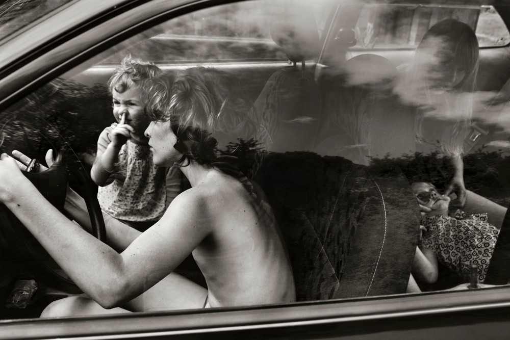
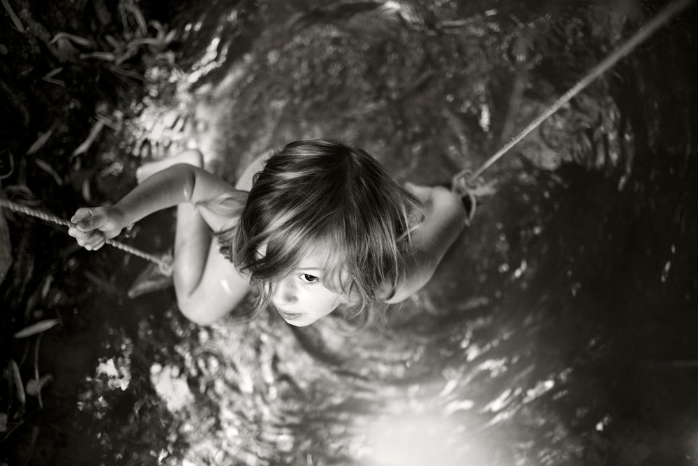
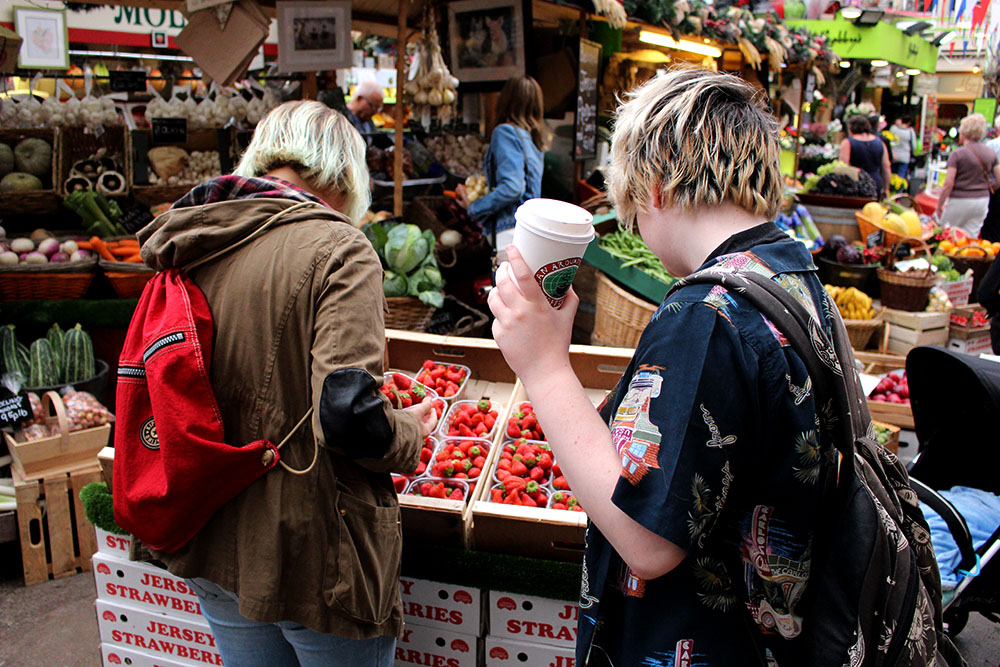
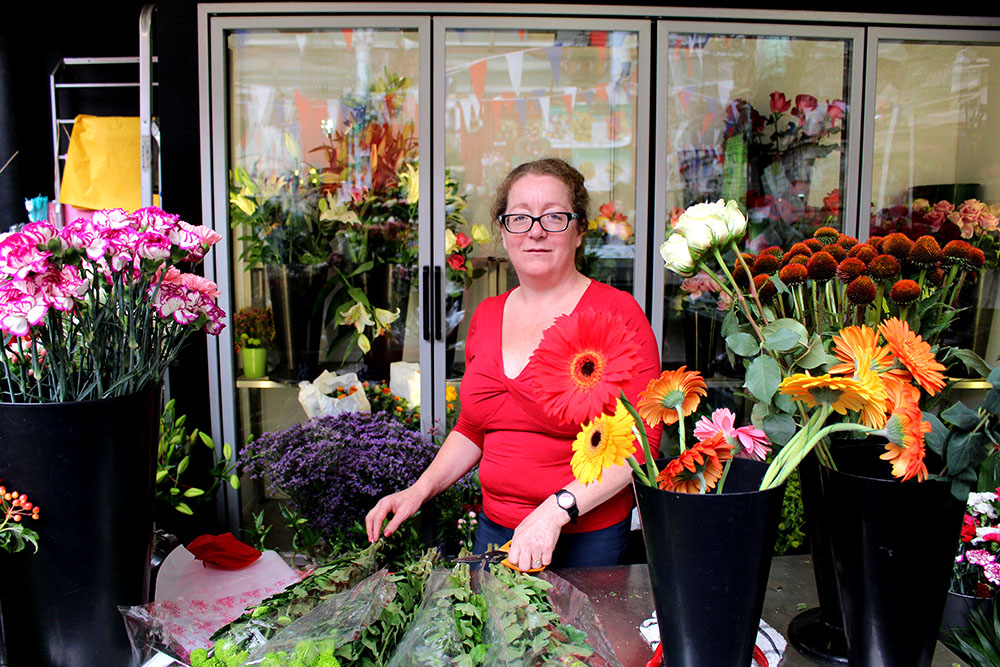
Further on in the course we started the study of documentary and narrative photography. Throughout the summer I made images of a day out with my friends and also did a shoot around the market community. These shoots were interesting to do and I like the images that I produced but do not want to develop those experiments any further. I learnt a lot with looking at the documentary work of other photographers and found this very interesting, especially the work of Alain Laboile. I do think that I will use the idea of documentary photography by making images of my own personal everyday life while also incorporating different methods of editing like in my own surrealism shoots to make for more interesting images as well as adopting John Baldessari’s method of making the subjects anonymous. I really want my spectator to focus on the general thing that the person/people are doing rather than who they are and their own personal background.

John Baldessari website: http://www.baldessari.org/

Alain Laboile website: http://www.laboile.com/

Reflection | Personal Study

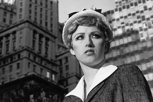
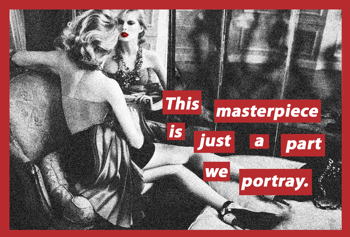
Looking back at the course so far I realised that I did enjoy a lot of it and want to focus in on the idea of surrealism and incorporate it along with tableaux work and how women are represented within our society. I want to further develop these ideas to create a picture story as I find it the most interesting and fun to do and it is also something that I feel strongly about and want to expand my knowledge and research further in that particular area. I think that this will be the most successful as I have previously done work and research on this subject. I feel that I still have a whole lot more to talk about and express through my work on feminism and the way that women are treated within our society. For this I am also going to further develop my research of Claude Cahun, Cindy Sherman and Barbara Kruger. I like their styles and ways of photographing as well as the meaning that their images hold behind them. I will be making different images and I want to adapt different styles of my visual literacy including taking inspiration from Film Noir and also different techniques from AS with triptych’s, panoramic and doing more studio work. I think that this will make for the best final outcomes and I have an idea of a photo book too or possibly a fashion style magazine that I will also produce.

Claude Cahun work: http://courses.washington.edu/femart/final_project/wordpress/claude-cahun/

Cindy Sherman website: http://www.cindysherman.com/

Barbara Kruger work: http://www.theartstory.org/artist-kruger-barbara.htm

‘Reaction’ Photographers, Concepts and Ideas:

In this post i’m going to research some ‘Reaction’ photographers and also some cool concepts linked this theme. I’ll then refer back to this and apply it to my own work:

‘REACTION’ PHOTOGRAPHERS

Patrick hall:

patrick_hall_taser_photoshoot_038patrick_hall_taser_photoshoot_054patrick_hall_taser_photoshoot_057patrick_hall_taser_photoshoot_021

Hall does the opposite of trying to make his subjects feel ‘comfortable’. Instead, in this piece of work he extracts reactions by using Stun Guns on people and called it ‘The Stun Gun Photoshoot’. Hall got the subjects friends to taser them personally, which created a wide range of emotions from both parties. For instance the friends tasering were probably excited whilst the subjects were afraid. In total he managed to photograph 100 people in one day. Everyone had to sit on a high-chair so that they would stay in place and not move too far away from the frame of the camera.

Hall created a video of his shoot which shows all the reactions taking place:

“What I found most interesting about the reactions people showed while getting tazed was you never knew how they would react.  Some people screamed while others were quiet.  A few people looked like they were experiencing pleasure while others had the most painful faces I’ve ever seen.  I saw jumpers and fallers.  People laughed and people cursed.  I even had about four guys and girls who did not react at all and seemed to be completely unphased by the 300,000 volts of electricity.” – Patrick Hall.

Hall wanted to get something ‘real’. He stated that normally when he had people get their picture taken they’d act different and pose. Therefore, I think that this ‘tasering’ concept caught them off-guard and captured their raw emotions and feelings, since it’s quite hard to hide them when being stung with that amount of volts.

Patrick Hall - Taser shoot
Patrick Hall – Taser shoot

Personally this photograph is quite interesting to me. The subject is wearing red sunglasses which add personality. He’s also got a surfer necklace which identifies his style. His facial expression is quite exuberant although he’s getting tasered. His lip lines and wrinkled skin are deepened due to hid bold reaction. Accordingly, his neck has tensed-up and his teeth are clenched. This may signify stress, anger, pain, etc.

Composition wise, Hall’s photograph includes a clean grey background which contrasts against the people’s bare skin. The back light shines on the people’s backs which gives a shine and as Hall says makes the subjects stand out from the background. Hall wanted the subjects to be bare on-top so that the the focus would’t deviate anywhere else.

More ‘Stun Gun Shoot’ photographs:

patrick_hall_taser_photoshoot_063                patrick_hall_taser_photoshoot_043_0                patrick_hall_taser_photoshoot_017

“You never knew how they would react,” said Hall. “Some people screamed while others were quiet. A few people looked like they were experiencing pleasure while others had the most painful faces I’ve ever seen. I saw jumpers and fallers. People laughed and people cursed. I even had about four guys and girls who did not react at all.”

Craig Silverman:

Silverman has cleverly shot some of people’s most frightening reactions. The photographs are taken at Niagra Fall’s scariest fear attraction called ‘Nightmares Fear Factory’.

Link to their webpage: http://www.nightmaresfearfactory.com

Examples include:

enhanced-24403-1444322009-1 enhanced-buzz-wide-2615-1444322007-8 enhanced-buzz-wide-24023-1444322212-27 nightmares-fear-factory-korku-fotograflari-14

http://www.buzzfeed.com/craigsilverman/amazing-photos-of-people-getting-scared-shitless#.xmp9lgpRA

The people’s reactions are so extreme and exaggerated with shows their true emotional feeling towards what they’ve seen.

Adrain Chesser:

His piece of work is called ‘I have something to tell you’. Here are some examples:

article-2558614-1B7914E100000578-312_634x785 article-2558614-1B7914E600000578-156_634x721 article-2558614-1B7914EB00000578-443_634x746 article-2558614-1B79150B00000578-680_634x764article-2558614-1B79152E00000578-680_634x760article-2558614-1B79154E00000578-173_634x767article-2558614-1B79152100000578-708_634x758article-2558614-1B79153200000578-117_634x726article-2558614-1B79154500000578-520_634x704article-2558614-1B79155700000578-918_634x747

Adrain Chesser succeeded in interestingly capturing some portraits of his family. These  vibrant portraits show the reactions that Chesser caught. Prior to have taken these shots, he told his family members a very shocking message. He revealed to them that he had ‘AIDS’.

“It occurred to me that if I ritualized the act of telling, that it might be possible to transform these childhood fears that were still effecting me as an adult.” – Adrain Chesser

The reactions vary extremely, some are seen frowning in disbelief whilst others are consistent in masking their emotions with a smiles.I think that the concept is great, and although he survived a modest way of causing an outburst of emotions.

Personal Website: http://www.adrainchesser.com/

Shea Glover:

Another cool manner of getting a reaction is through the medium of verbal utterances. For example the student photographer Shea Glover walked around her city telling people a positive phrase, which also doubled as a social experiment.

Basically she’d record random people whilst taking the shots as this shows the before, during and after process taking place. When the people asked her what she wanted to take pictures of, she replied with something along the lines of: “what I thought was beautiful”.

Her prime aim was to capture the way in which the people’s demeanor’s changed as she told them that phrase. In result, everyone either immersed into a little smile or a big one, but either way they had a positive response.

“I conducted an independent project, which evidently turned into a social experiment regarding beauty.” – Shea Glover

Examples of her work from a website: https://fstoppers.com/documentary/photographer-captures-peoples-reactions-when-told-they-are-beautiful-102444

told-you-beautiful-video-shea-glover-1 told-you-beautiful-video-shea-glover-2 told-you-beautiful-video-shea-glover-3 told-you-beautiful-video-shea-glover-4

Wan Chai:

Source: http://hongkong.coconuts.co/2015/04/16/look-me-wan-chai-reactions-your-face-photography

I really like Wan Chai’s work because he captures very real reactions. He practices street photography in this specific project called “Look at me!” and goes around the street catching people unexpectedly, which adds an essence of spontaneity.

Examples of his work:

look_at_me_7 look_at_me_8 look_at_me_11

look_at_me_14
“The Boss and His Buddies” – Wan Chai – Look at Me!

Similarly, Chai is also conducting a social experiment and using his camera to record it. Most of the reactions were defensive and the subjects tried to hide their faces or stared in a confrontational manner. Overall a certain friction and connection is created between the photographer and the subject.

My favorite photograph is the one of the citizens in the car which was called “The Boss and His Buddies”. It’s interesting to see their faces when being photographed. Since they are in the comfort of their own car and probably accustomed to looking out into the exciting city, I’m, sure they weren’t expecting to see a camera pointing at them.

He sums it up himself in this statement:

“It was a really fun experience. I didn’t say one word throughout the shoot, yet I was saying ‘look at me’ in my mind the whole time, hoping people would notice me so I could capture their reactions. “It was very interesting how different people reacted, and I could never predict the responses I got. It was also really exciting as some people exhibited really extreme reactions. I even got pushed and my camera almost broke at one point.” – Wan Chai


————————————————————————————-

CONCEPTS

‘If Only for a Second’ Campaign:

if-only-for-a-second-cancer-patients-vincent-dixon-3

I found a very interesting website which contained simple but extraordinary reactions of people, after seeing their carefree makeovers – http://www.mimi-foundation.org/en/. This project was created by a French Foundation called ‘Mimi Ullens’ that deals with Cancer patients. Exactly 20 patients were featured with their ‘outlandish makeovers’.

The foundation added that they got inspiration from a fellow patient that described her life before and after finding out that she had Cancer. She said: “You know what I miss the most? Being carefree.

They all showed a great variety of emotion:

article-2521235-19FF7E7300000578-992_634x423
“Being carefree: Hayat couldn’t stop laughing after seeing her Mimi Foundation makeover” – (website source)

This series is quite uplifting in my opinion; I say this because it has a very warm meaning behind it. The foundation aims to show patients that life is all about enjoyment and having fun.

Whilst getting their makeover the patients were placed in front of two-way mirror and told to keep their eyes shut, then when the makeover was over they’d be instructed to look. The Mimi Ullens photographer called Vincent Dixon, would be behind the glass and ready to snap the shot.

‘If Only for a Second’ or ‘Ne Serait-ce Qu’une Seconde’ – Vincent Dixon takes the shot precisely 1 second after the patients open their eyes. I believe that for that split-second the people feel something and completely forget their illness, so this project is very effective.

More examples:

if-only-for-a-second-cancer-patients-vincent-dixon-7 Patrick if-only-for-a-second-02

if-only-for-a-second-cancer-patients-vincent-dixon-1-600x285

“Within a second, smiling faces were seen all over the room. At that very moment, the cancer did not exist for the family members either.” – Mimi-Ullens Press Release.

‘The Make out Project’

Photographer Jedediah Johnson ‘made-out’ with people using bright lipstick and then recorded his results.

“The result is a portrait not only of the subject but of me and the moment as well” – he said.

—————————————————-


Christmas Plan

Shoot 1 – My first idea will take place next week when I’m in Birmingham with my family taking a set of images telling a story. These images will range from some Sally Mann style images with my cousins from images of my Nan and Poppa and hopefully some achieve images from their house.

Shoot 2 – I am going to carry on making images from my personal study from the picture story I created at Government House because I didn’t study this topic in much depth so want to pursue this idea to make it better. I am going to  try and get more involved with what the Governor does on a day to day basis and take images of him lounging around in the house and when at work in the office. I also need to focus on my dads part in the house and what his job entails. I want to try and involve every member of staff in this story so the audience can easily grasp an over view of what it is like inside Government House.

Untitled-2
Hierarchy

How has the experience of Archisle changed the way I think about my personal study?

Over the last term, I have managed to gain a wide variety of skills which contribute to archive research,  extraction, development and documentation. The creative pathways scheme has gained me vital competences in a creative  media, and has allowed me to feel confident in a workplace which is surrounded by these demands. Gareth Syvret and Karen Biddlecombe have helped me consistently to discover a new perception and insight into my personal study. Me and Karen extracted work from the archive which dated back to the post-war era, then with help from Gareth, we went through the images to see how it collaborated and linked with my project. This gave my project a new window into understanding the depth and relevance of me moving house.

_MG_4490
The first image we came across on the Archive’s computer system. When typing in the name of the house ‘Le Petit Fort’, we managed to come across this extraordinary image which was taken right in front of the house. This image made me think of how far this house has come since the war / post war era, and made me feel empathy towards the tragic and horrifying events which occurred around my house and within the proximity. Gareth and Karen have given me inspiration to explore this is greater depth, and can do this using montage, and merge in Photoshop, possibly to create this image of development and sentiment.

_MG_4491

As a final response, Gareth suggested that it was a good idea to place all the archival material we collected as a chronicle, for the viewer to understand the idea of a process, a space of time and a development, some of the key aspects I wished to consider in my project.

This is an example of how we pieced the final images together:

After this experience, I asked myself a few questions:

How has this experience changed my perception of the Archive? 

When entering this process, I knew little about what the Archive does, and how it works towards the achievements Gareth and Karen co-ordinate. I realised soon after that my own perception of the archive was far from correct.  There are various key aspects to the ‘Archive’ such as the archive itself, with images dating back over hundreds of decades. Sections of this can be used for the demands of Archeologists, Planning commissions, the Jersey Government, botanists, the environmental departments and many more to help with the development of their own investigations and relevance to history. The Library is also used thoroughly for archive extraction and exploration, with facilities like computers which link to the Archives database, which allows people to search using key words material they wish to extract. During my experience with the archive, I was lucky enough to discover some of these key aspects which are encapsulated within the Archive, I have learnt allot during this process.

What do you think when you hear the work ‘Archive’? 

When I hear the word ‘Archive’ I instantly hear the words

” records /  annuals / chronicles / registers /  accounts / papers / documents /  rolls / dossiers / files /  deeds /  ledgers /  history /  information / evidence /  documentation / paperwork / formal muniments.”

The oxford definition for ‘Archive’ is:

“a collection of historical documents or records providing information about a place, institution, or group of people”

The repetition of the word ‘history’ and ‘historic’ elaborates the vast relation to family, architecture and other aspects of society which has been developed over the many years of archival information which is stored at the Societe Jersiaise. Archive has been very relevant towards my project, my key theme ‘family’ has encouraged me to find features which relate to my life changing experience when moving house.

How will these skills be useful to you in a creative / non- creative workplace? 

I feel very much so that I have developed various skills in the creative workplace by the extraction, exploration and editorial processes of images and text presented by the Archive. Gareth and Karen have given me allot of support in the beginning weeks of this process, which then slowly got handed over to me. I was given tasks to do independently, allowing me to feel good about the outcomes I was achieving. Doing simple jobs like printing and filling also made me feel apart of their work force. Developing images in Photoshop, re-sizing and editing gained me skills with the editorial processes which are vital when depicting a certain hypothesis within an image.As well as developing creative skills, I feel I have developed major ‘soft skills’ in the workplace, which would be vital in any work-related area. I feel allot more confident with handling images and media, and genuinely confident to chat and talk to Gareth and Karen. I felt having a good relationship between the two of them incised me to communicate with them better. I felt the privileges of having a responsibility in the workplace made me feel motivated towards my goals of my project, and I became willing to succeed in Archival research and handling of materials. Punctually, turning up to a job encourages you to be more independent, and I felt as this process came along I gained more and more enthusiasm towards my want to succeed as a willing and passionate intern, as I saw the goals I wanted to achieve.

Would you recommend the Archisle contemporary photography programme to other people? Why? 

I would defiantly recommend this programme to anybody who is passionate about archival research and history. I feel it’s an amazing experience which I have gained so many important skills from. Gareth and Karen have been amazing role models in the work place, and they’ve inspired me to “make a mark” on history, encouraging me to think outside the box with my project relating my documentations to real life circumstances. I would of never felt confident working in a creative or non-creatove media without the help and commitment they have done for me, as their provision and time for my contribution has never been so beneficial. I am so grateful for the time and effort they have done for me, and they skills I have gained will help me incredibly in years to come when I pursue a career in any field of work.