Mini Essay

To what extent has Martin Parr incorporated the concept of ‘islandness’ in his work and in doing so how has he influenced the likes of those who nominated him.

‘Islandness’ is a shared sense that transcends the traditions of local island cultures. The concept is reinforced by being surrounded by bodies of water which illicit feelings of closeness to the natural environment. It is a metaphysical consciousness derived from experiences of isolation. ‘Islandness’ is a term which can be interpreted in a multiple of varied ways, for example, each photographer in this project has created their own perception of the idea. Ultimately, it links communities together forming a mini society and network.

This unique collection of artists have produced their individual portfolios of work which have explored the complexity and rarity of the term. I especially want to highlight the connections between certain photographers which have gained influence and passion from one another.

My own experiences of ‘islandness’ have been grounded in the morals and values of Jersey, Channel Islands.  The idea combines vulnerability and resilience. I think it is significant when considering the theme of Jersey and how you can represent the island and create art from it. Naturally, my research began into the Archisle where I could explore the talents of Martin Parr and the work he produced of the island. The Societe Jersiaise Photographic Archive introduced in 2011, The Jersey Contemporary Photography Programme. The main goal of the scheme was to promote contemporary photography through a continuation of exhibitions and education links. The island itself has attracted millions of tourists and fellow artists as it is known for its natural beauty. The island’s identity evokes a sense of pride and enthusiasm for the project.

‘Island arts engage with the land and the sea and the community. They address the large questions of existence, but they do it within a context of shore-bounded particularity.’- Peter Hay

Focusing more on my intention, Martin Parr was commissioned in 2013 by the Archisle to photograph Liberation Day in Jersey. It is significant that of such a high esteemed photographer, Parr decided to indeed take notice of our small island and beautifully captured the light and importance of the day. In my opinion, Parr’s distinct style represented the happiness and joy of the day. However, his work also included the more solace and memorial moments of the day’s proceedings. With the world constantly being flooded with media, Parr offers a sanctuary of his unique perception of the world. His work tends to be exaggerated, the colours tend to be garish and the angles are normally strange. However, amongst the humour, Parr produces entertaining and insightful images which translate to our way of life. We can almost recognise ourselves in his art work, especially with the theme of ‘islandness’. When looking at Parr’s work and considering my hypothesis I think Parr’s photographs capture this concept exceptionally well (even if this had not been initially intended). This ‘feeling’ has been photographed in the light of Liberation Day, it exemplifies this particular meaningful and important day carefully and accessibly. I think it represents the islanders resistance and perseverance even at the most difficult and tragic of times.

With regards to the links between the photographers in the project, Martin Parr is an influential and inspiring artist who’s work has been and is an in depth observation of our personal identities and values we hold in society. The work he produces is innovative, intriguing and contemporary, strongly reflecting the way we act and our inner natures.

In conclusion, ‘islandness’ is much more than a concept, it is a feeling, an emotion, a community. Therefore, it has the potential to be photographed and interpreted in many different ways. The term has layers, which each artist in the project has stripped away and identified their own version of what ‘islandness’ is. Quintessence is a benchmark of the five years of the Archisle Programme. It is a success of contemporary photography and shows the work of native islanders and welcomed visitors. The project enables inspired artists to shed light on the shifting society of today and produce art for public enjoyment.



Quintessence

Three questions that you want to find answers to on your visit: 

  • Q1. How did the term ‘islandness’ come about? Is it significant in today’s society? Does it isolate us as a community, or, reunite in as a family? 
  • Q2. How influential and successfull do you consider the archive to be? 
  • Q3. Do you think the JEP is a successful media for documentary photography? 

The first thoughts about the exhibition that enters your head when you walk in:

The images that I initially liked when looking at the exhibition:

Al Gore Was Here:Al nr 4_1000

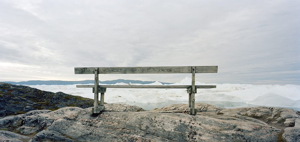
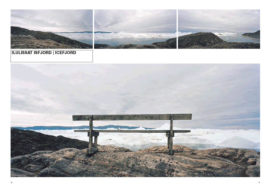
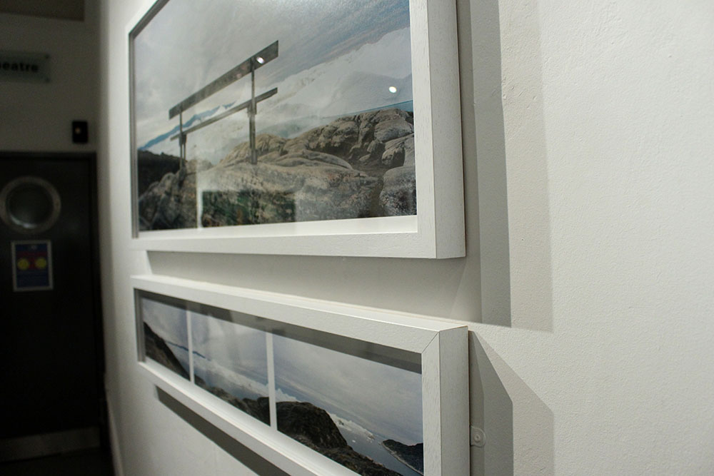
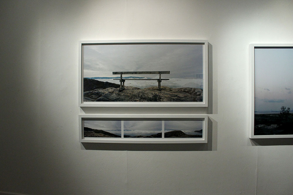
The first image that I thought was really interesting was produced by Finn Larsen. This particular photograph was taken in Greenland, Illulissat Icefjord. This image stood out as one of the most captivating photographs in the exhibition, I think it is very beautiful and is most definitely one of my favourites.  I really like the textures of the rock in the foreground it contrasts with the wooden bench creating a rustic look. I also really like the simplicity of the sky, it adds to the feel of the lonely and forgotten feel you get from the photograph. The composition of the photograph is perfect, having the bench in the middle of the image makes it the main focal point. This specific photographer has really captured what I would like to translate in my previous project and potentially my personal study. 

Beachy Head Boat Trip:1993-5016_57_1

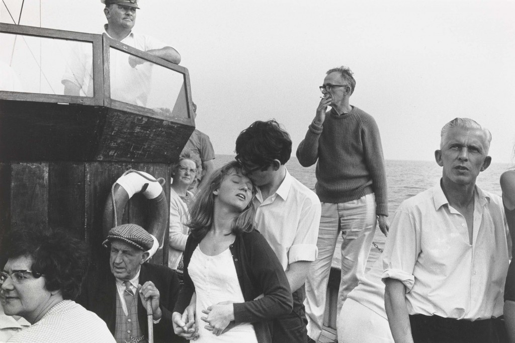
This is the second of my favourite images, I especially like the romance and personalities captured in this photograph. I think it is clever how the photographer has managed to capture most the faces in order to see all the different expressions and emotions of the people. I love how the image is in black and white I think it adds to the feel of the photograph. The composition in this photograph is also important and significant because of the focal point being in the centre of the image, with the surrounding subjects adding to the photograph further. Although, the couple are clearly a main focal point, I get drawn to the man standing at the back. I think he is really interesting in this photograph, possibly the way he is standing or his clothes and glasses but he makes the image have more depth. This image was taken by Tony Ray-Jones in 1967. 

Liberation Day Supper:

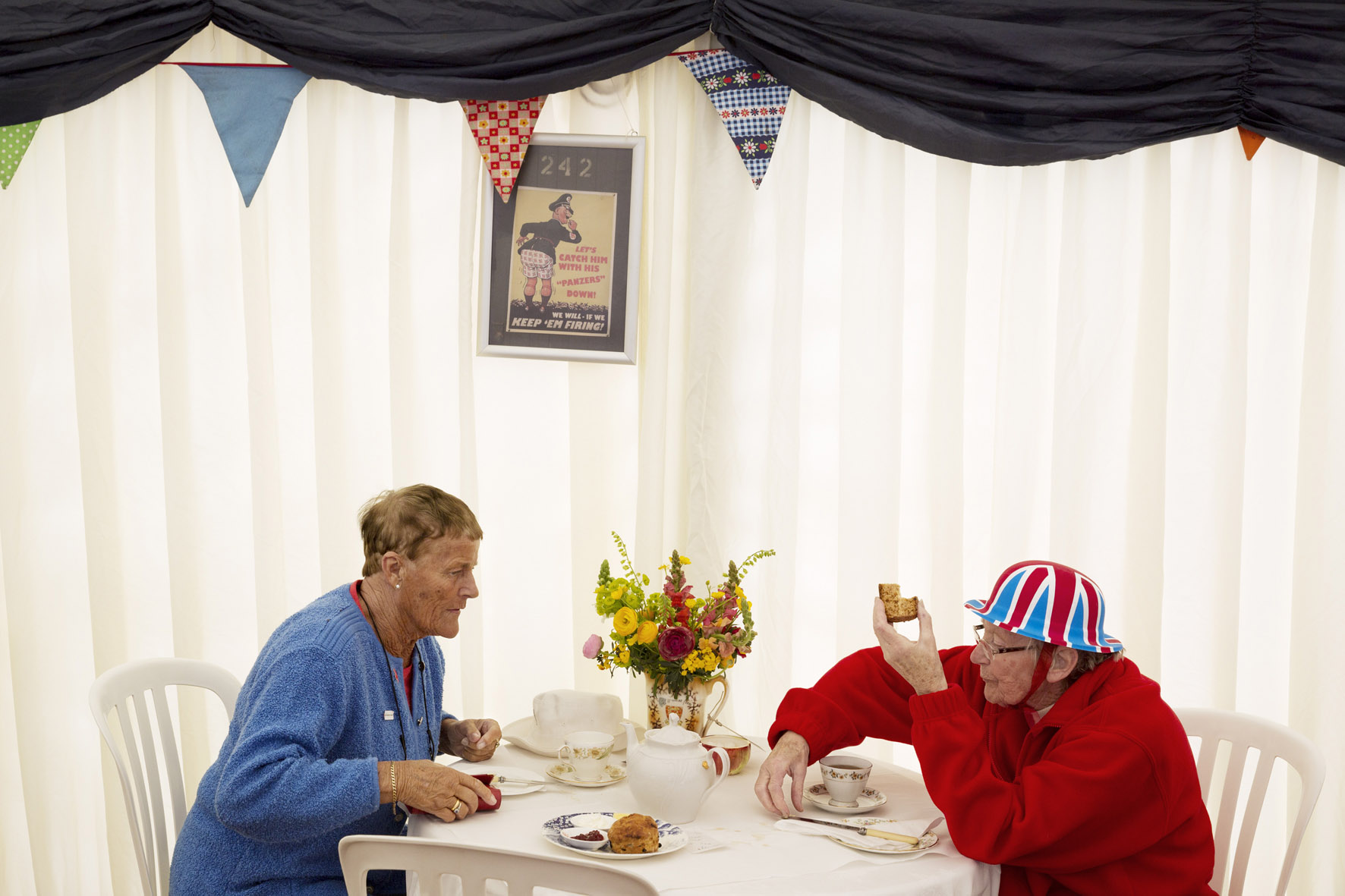
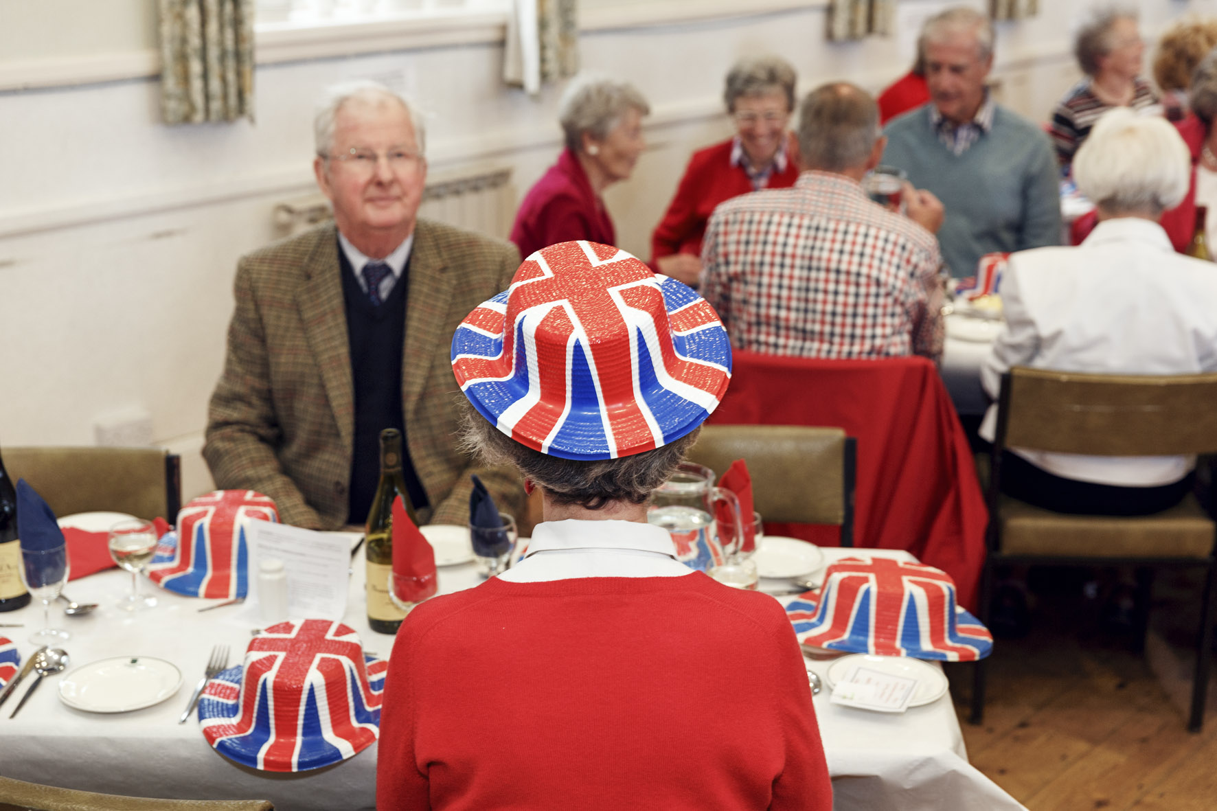
GB. Jersey. Liberation Day Supper at Trinity Parish Hall. 2013.

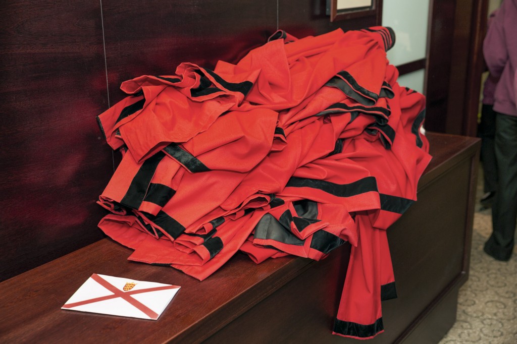
This third image is taken in Jersey of a Liberation Day Supper at Trinity Parish Hall in 2013. It was taken by Martin Parr which you can instantly tell due to the distinct style of his photography. I think this photograph is brilliant, it captures the main theme of the day without complicating it. This photograph is part of a collection of images Parr took of the celebrations, others include; Liberation Day, Robes of the Jurats of the Royal Court of Jersey and Liberation Day. 

printscreen

QUINTESSENCE

Two questions that i would like to find answers too when visiting the exhibition after reading the text are:

Q1: Why did you choose these photographers to be exhibited? 


Q2: Did all of the photographers which you choose explain why they choose the other photographer to be placed alongside their images?

015 1034674_orig Al nr 2_2000 Al nr 4_1000 and_the_earth_a_1-59464e7563bd17e84129851cf666bdabb7f619da

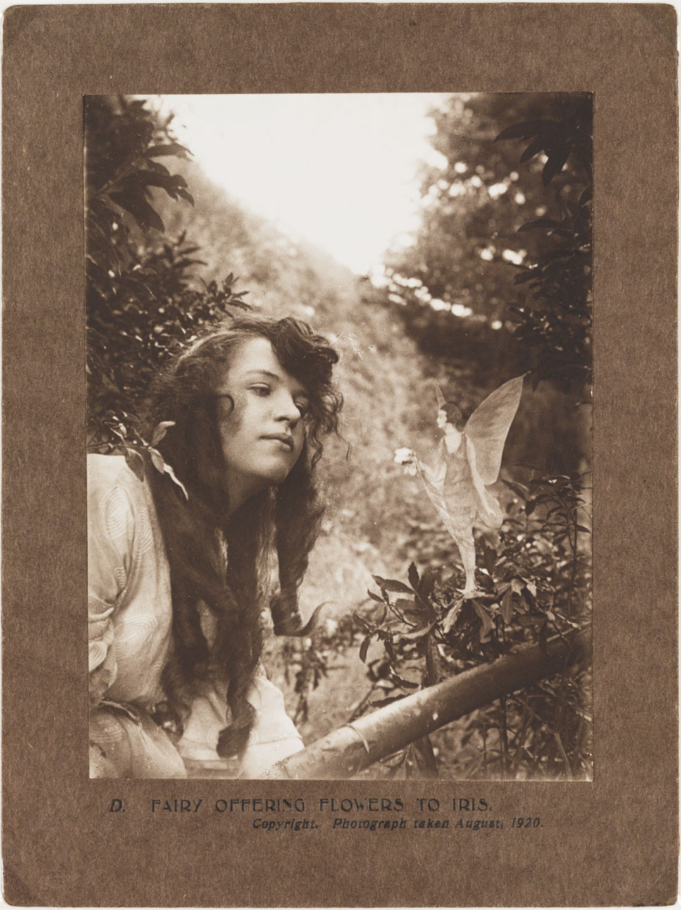
A photograph of Elsie Wright (1901-1988), taken by Frances Griffiths (1907-1986), in August 1920. A fairy stands on a tree branch offering Elsie a small bunch of flowers. After the first two fairy photographs had appeared, 'experts' demanded further proof. Edward Gardner - a leading Theosophist fascinated by fairies who had authenticated the earlier photographs - travelled to see the cousins. Gardner gave Elsie and Frances two new cameras, with secretly marked photographic plates to detect any tampering. He asked them to take more fairy photographs - of which this was one. This fairy's 1920s hairstyle attracted much comment at the time. Sceptics argued that the fairy kingdom was unlikely to be in step with the latest human fashions. The story of the Cottingley Fairies began as a practical joke in Cottingley, near Bradford, West Yorkshire in 1917. The photographs of the 'Beck Fairies', as the girls called them, went on to become one of the most famous examples of image manipulation in photography.
A photograph of Elsie Wright (1901-1988), taken by Frances Griffiths (1907-1986), in August 1920.

David-Goldblatt-FHCB_4-728x735 DSC_0245_Final

GB. Jersey. St Helier. Liberation Day. 2013.

Galinthia album nj12

GB. Jersey. Liberation Day Supper at Trinity Parish Hall. 2013.

These are some of the images that were displayed at the Quintessence, i choose these images as i think that these were the best images that were displayed at this viewing. I think that these images, whether they were taken in Jersey, Channel Islands or in other places around the world, are interesting to see the different cultural changes in different locations. I think that at this exhibition it was interesting to look at what artist a photographer choose to place their work next to, and what photographer they choose made me think why did they choose that photographer? and was their any specific reason, for instance, did they choose that photographer for their work to be placed by because they inspired their work that they have done as a photographer, or was it because they enjoyed their piece of work that they had done, this is what i thought when i was at the exhibition. As these are the images that i liked at the Quintessence their were also images that i did not like, this was because i thought some of the images were a bit explicit and should not of been displayed at this exhibition, however as these images were taken by Tom Pope i think that, by his nature he was just trying to change the perception of what people think is acceptable to be displayed at an event like this, and for that i think that the images he choose were good images to be placed into the Quintessence. 

Essay:


When thinking of an essay question, things that need to be included are what are the connections, influences and relationships between your chosen pairing of photographers? Common themes, subject matter, form, visual language, aesthetics, methodologies can be looked at to gain a further understanding as to why the photograph choose the other artist to sit by their work but also others that were displayed in the show. 


013 015 1034674_orig Doc1

These are the two images that Tom pope choose of his own images from when he was working with the Jersey Archisle, but also the two images of Peter Finnemore that he choose. 

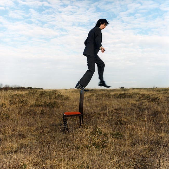
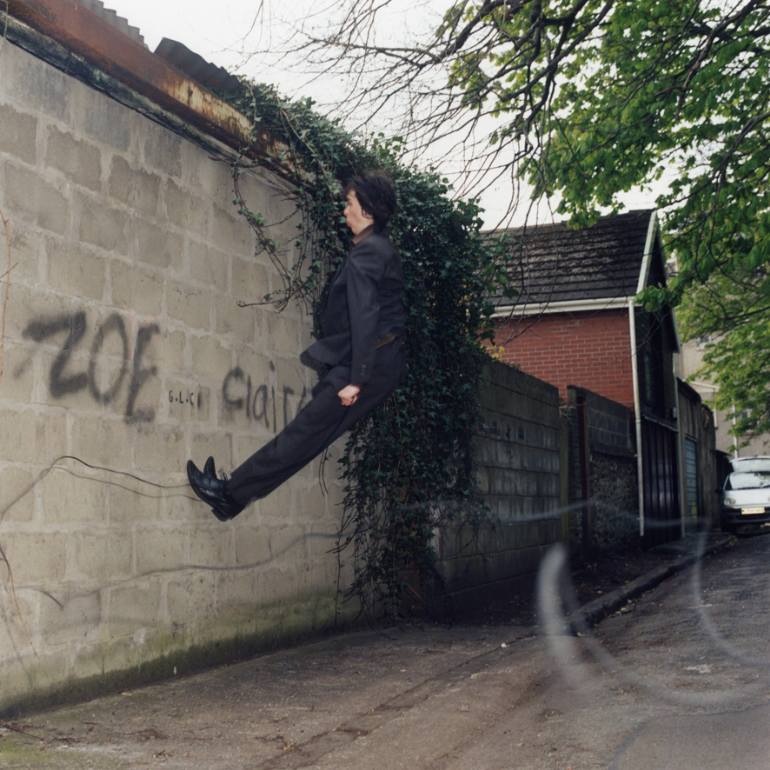
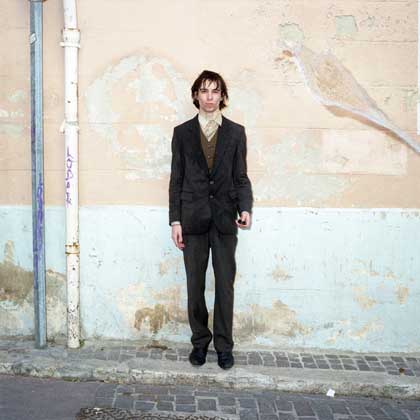
Q – How has Peter Finnemore influenced the style and genre of Tom Pope’s photography? 

Through researching Peter Finnemore and looking at his style of work, i think that their is a link with Tom Popes, as both work seems to display an idea of fun and play within their pieces of work. I think that both of the artists, Pope and Finnemore seem to have a wild imagination, where they add an aspect of what could be called ‘child’s play’ into their images. I think that through this you can directly see links between both artists which draw connections and show that Tom Pope has been inspired by Peter Finnemore. 

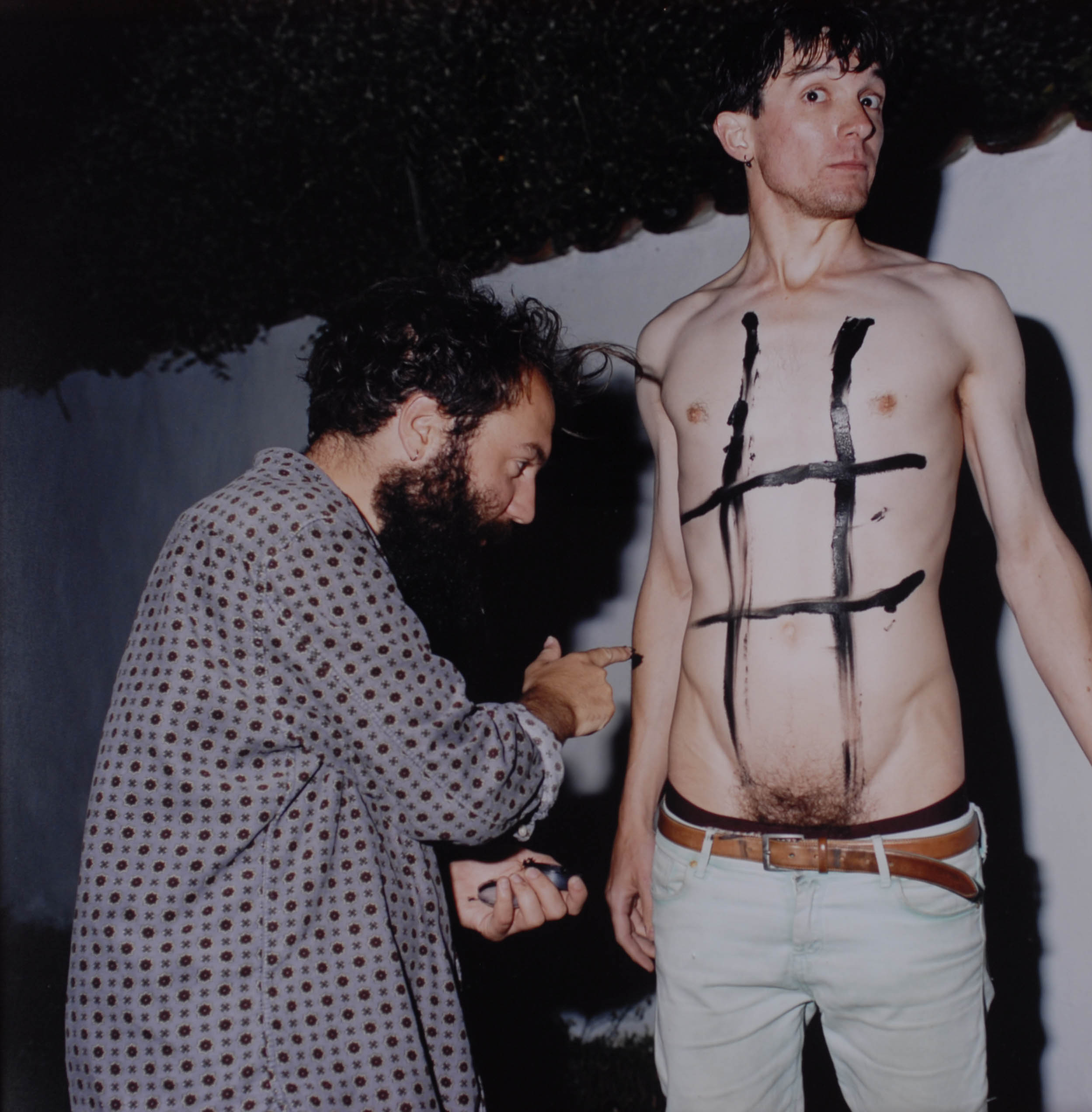
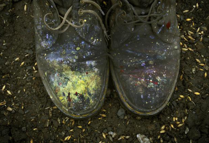
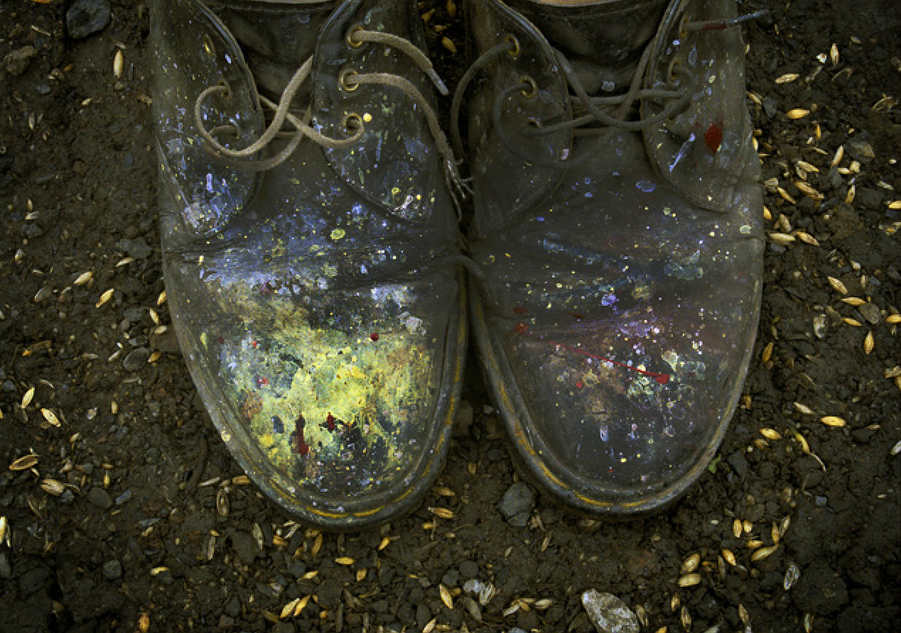
Peter Finnemore’s images seem to be colorful, as of the ones that Pope has chosen of his images to display, i think that Pope choose these two images because he himself found these images very imaginative and liked them himself, but also because i think that Peter Finnemore’s work is one of the artists that inspired Pope to start taking his images. Both of these artists seem to have a similar style, in a way that they bring their humor into the images that they take, whether this is to make their audience laugh, or just for their own amusement. I noticed something which i found quite interesting in both pieces of the artists work, i think that both of these artists seem to take their images in their everyday life, of these that they are doing at the time, not many of the images seem like that have been staged, however a few are staged so that both photographers get the right image that they want. The image called ‘garden shoes’ which Pope chose of Finnemore’s to be displayed is a simple image, this image silently has an idea of fun and playfulness behind the image, i think this because the shoes are colourful and have paint splattered on the images. Within Finnemore’s photographers i think as some of Popes images are, there seems to be an idea of chance within the images, as some of the images would not just occur, the photographer has to be ready, for at any time an interesting idea for a photographer could occur from a location, this is known as a theory called psycho-geography, this is where a location can give a photographer an idea of a photograph to take. 
It can be argued that Pope does not seem to be inspired by Finnemore because some of Finnemore’s images seem to be set up, whereas most of Pope’s images are because of being in the right place at the right time, for this reason i think that there are not direct links between the two artists. Also one of the images that Pope choose to display of Finnemore’s is called ‘Koan Exercises. 2004’ i think that this image shows how both of the artists work is not as similar as it is made out to be, this is because most of these images in this series do not include people, a few of the images in the series do, however i think that this shows how Finnemore prefers to not have people in his images, he likes for a location or a setting to describe what is happening in an image on its own. 

Overall i think that it is clear that there are some direct links between Finnemore and Popes work which shows that Pope has been influenced by Finnemore in that they have a similar genre and style of photographs that they both choose to take, however it is also shown that both of the artists to not share all the same connections, because i would say that their style differs in how they choose to take their images, to a certain extent Finnemore takes his images using the theory of psycho-geography, however i think that most of his images are staged in comparison to Pope’s photography which is all to do with the theory of change. Furthermore it is clear that both artists challenge the perceptions of what people think is ‘normal’ to photograph and they do this through their quirky images that they both take. 


Qunitessence

In what way has Martin Parr been influenced by Tony Ray-Jones photography with his work on celebratory events in Jersey in the late 1900’s.

This art exhibition is a representation from past to present. Presenting images both from our past in Jersey achieve at the Jersey Societe. This creation of photographs were produced in celebration of contemporary photography in Jersey and to mark a 5 year milestone for the Archisle. Immediately, I gathered a sense of patriotism as soon as I entered the exhibition as the first set of images I looked at were Martin Parr’s representation of Liberation day in 2013. The overall vibe of the exhibition felt very welcoming and as I could relate to some of the images, I found them very satisfying to look at in depth. Each photographer chose a photographer that inspired them to pursue their idea, and were presented next to their work in smaller print. This idea of recognition proved to make me, and others want to learn more about why and how these new images were created. It was amazing to hear where the inspiration came from as it got me thinking about linking the achieve with my final pieces but it makes the photograph worth more with regards to thought and power.
Tony Ray-Jones took these images from 1967 and in the photographs it is visible to see that they’re doing the same thing that happens each year, being together eating cake and drinking tea. In Martin Parr’s photographs, the type of people look different by the way they dress and they place they’re sitting, but really are ordinary working class people enjoying this day of celebration. His famous quotes was, “Photography can be a mirror and reflect life as it is, but I also think that perhaps it is possible to walk like Alice, through a looking-glass, observe the puzzles in one’s head and find another kind of world with the camera.” Tony Ray-Jones photography career spanned only one decade,  he defined a new way of looking at his own society — with irony, nostalgia, compassion and humor. His point of view exerted an enormous influence on the development of British documentary art photography from the 1970s through the present. I personally think this is how Martin Parr got his inspiration from Tony because his thoughts and visions were admirable.
Tony Ray-Jones

1993-5016_57_1

Martin Parr

timthumb

“Away from St Helier, you might not realise that May 9th is a special day in the Jersey calendar. Unlike Guernsey, where flags flutter from virtually every house, tree and telegraph pole across the island, Jersey seems to take a more low key approach. In some of the quieter and more remote settlements, aside from the occasional bed of strategically planted red and white geraniums, there is little to indicate the significance of the date.”

GB. Jersey. Liberation Day Supper at Trinity Parish Hall. 2013.

“After the meal, John thanks the cooks and leads a sing song, shouting out numbers from the parish song book. This is also a brisk, no nonsense affair, just one verse from each of the old favourites – Pack up your Troubles, Daisy Daisy, There’ll be Blue Birds.”

GB. Jersey. Liberation Day. 2013.
GB. Jersey. St Helier. Liberation Day. 2013.

Martin Parr focus’ on the true meaning of liberation day, his work is displayed in a story, whilst explaining his images show the true beauty of people who are involved in the event, together representing true patriotism. His work corresponds with Tony Ray-Jones as the simplicity of the photographs allow you to see the true events that occur on this special day. I like how Martin’s photographs are in colour as I think that the reds the blues and the whites really stand out and make the photograph look more eye catching and then you notice the true meaning behind the colours is in correspondence to the British flag. The innocence of the photographs really made me think about the events that occurred and therefore made me want to look into the achieve and find out more about the images. Martin’s captions to the photographs are really touching especially when he notices the pure enjoyment from ex-service men, “Soldiers like Eric were overwhelmed by the rapturous welcome they were given as they arrived in Jersey back in 1945. Although the number of people who experienced and can remember the Liberation is in inevitable decline, it has been marked every year since with dances, concerts, meals and parties across the island. Perhaps the most sombre event, fittingly held at the crematorium, is the memorial service commemorating the hundreds of forced workers brought into Jersey by the Germans to build fortifications. Tellingly, only one survives: Emile Boydens, a Belgian, who still lives on the island.” Background information make the photographs so much more meaningful and I think that Martin has perfected that art. The positive connection between the two artists is visible as you can see that Martin wanted to capture images of the current and ex service men and women and Tony Ray-Jones captures images of people returning home with the sense of relief from their loved ones being by their side. The emotions between the images from both photographers is really what I found special.

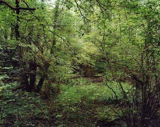
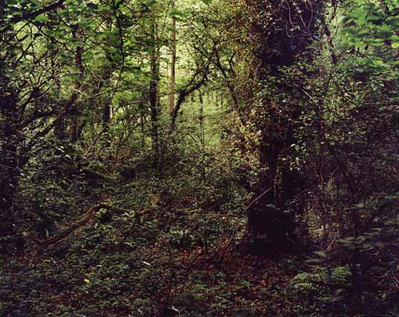
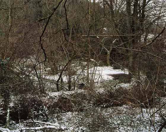
Case Study | Jem Southam

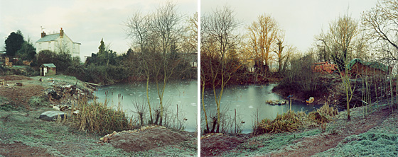
This photographer was chosen by the creator of the whole exhibition event Gareth Syvret. Jem Southam is a landscape photographer who makes rural landscape images used as a way to document man’s intervention in nature. Something that Southam does is photograph the same locations over months and years to show the difference that mankind has made in such a short period of time. Southam has photographed places across England. Southam was born in Bristol in 1950 and is one of the UK’s leading photographers.

Jem Southam on Artsy: https://www.artsy.net/artist/jem-southam

“I became heavily influenced by the Bechers, and pursued architectural landscape work.” – Jem Southam [interview with Seesaw Magazine]

Overview | What I think

After having a look at Jem Southam’s work I have actually been quite inspired by how beautiful his images look. I think that they are all effortlessly beautiful images and I also like the way that Southam makes images of the same locations over a period of months and years, this is really interesting and shows how we are constantly changing as a society and how much people can effect the way the natural world is and looks. I find it so interesting that Southam makes images from the same locations and tends to stick to around the same area when usually quite a lot of photographers will travel around to a load of different locations and places. I do think that Southam is working on a huge project to make images of the same places which will give the most effect in years to come when spectators will be able to see how much has changed and how much people have changed it.

****

26965-large

Q. How does the work of Jem Southam reflect the way we are as a society?

In this essay I will reflect on how much our society can be changed and re-moulded just by the environment we are living in and how much manmade objects change even the natural world.
Firstly, I really like the work of Jem Southam as it is really visually pleasing and interesting as the natural beauty of the images is really intriguing to look at. I can really relate to this work as growing up I always found the beauty in the natural environment around me like around an area where Liberty Warf and the office buildings are now. I had so many memories of playing and running around with my friends along there and memories with my family just from that patch of grass but now it seems that all those memories have been taken from me with the creation of offices and shops. I find that we live in a world that wants to become a lot more corporate and we tend to forget about the natural world and how beautiful it was before humans inhabited it. This is why I like to look at the work of Jem Southam so much as I feel that I can personally relate to it.
Another way that Southam’s work reflects our society is that his images are so simple yet is really interesting.
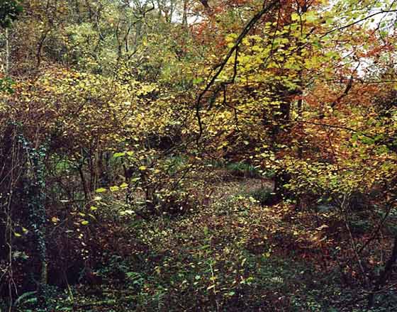
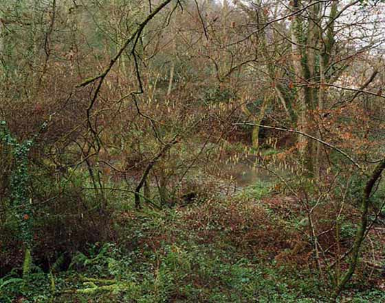
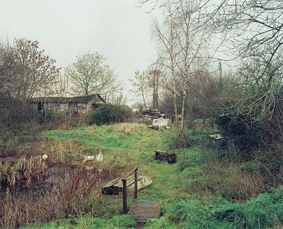
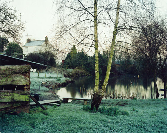
Secondly, I chose this mini set of images above as I found them really interesting. It looks so lovely and almost like a fairytale book, where you would expect a fiction character or someone to live. I like that there is one house in the far distance on the left hand side of the image as it shows how much the natural world rules over this part of the countryside but it also shows how our buildings and our society have moulded themselves and pushed into the natural world making more of a manmade one. This image interests me as I want to find out more and see what that particular location looks like in  a couple of years and to see whether or not the natural beauty is still there or if the corporate world has taken over. To me Southam’s work represents the greed of people and how much we seem to benefit from creating more and more corporate and unnatural environments just to make a bit of money. It really is fascinating to think about the lengths people will actually go to in order to make money, even destroy the natural habitat of so much wildlife, creates and just natural beauty and plants.
I really like the work of Southam as it is so interesting and he somehow makes his images look really beautiful even though the message is showing how much man has changed the way our world looks. Southam seems to make images more in the woodland areas or around the coastline to show how different these places may look after months and years. I think that Southam’s work reflects our society in somewhat of a beautiful and positive light with all of his images being visually pleasing and almost magical looking, however the meaning behind these images is a really strong one showing how much society has changed and how quickly we are expanding in the world and how much the populations are growing that we have to go into natures territory and claim it for our own. 


Case Study | Michelle Sank and David Goldblatt

Michelle Sank is the local photographer part of the Quintessence exhibition here in Jersey, as a visitor to the island previously she has a localized body of work. When asked who her influences were and her inspiration Sank said David Goldblatt. He is one of the most well-known photographers across the world.

Michelle Sank website: http://www.michellesank.com/
David Goldblatt website: http://www.davidgoldblatt.com/

About Michelle Sank

Michelle Sank was the photographer in residence at the Jersey Archisle back in 2013. Sank was born in Cape Town, South Africa but moved and has been living in England since 1987. Sank usually makes images of social documentary and tends to focus around issues of social and cultural diversity. While in Jersey Sank worked on social portrait images showing the difference in social classes and the way locals are compared to how they used to be in the Archisle images.

About David Goldblatt

David Goldblatt is a South African photographer and was born in 1930 in Randfontein, South Africa. Goldblatt has an interesting history as he was the son of Lithuanian-Jewish parents who fled from Europe in the 1890s [with their own parents] and Goldblatt lived in South Africa at a time of deep segregation between black and white people. He seemed to challenge this and made images of black people, showing that they aren’t so different. Goldblatt became a full-time photographer in 1962.

More info about Goldblatt: http://www.vam.ac.uk/content/articles/d/david-goldblatt-and-the-v-and-a/

Goldblatt in moMA: http://www.moma.org/interactives/exhibitions/1998/goldblatt/

Comparison | Michelle Sank and David Goldblatt

Q. Through the work of Michelle Sank and David Goldblatt how are we able to see the difference in society and the way our world has changed?

In this essay I will compare and contrast one of Michelle Sank’s chosen images compared to that of David Goldblatt and what social impact they have. I will be comparing the differences in world opinion from the time David Goldblatt made his images [1950s] and to present day when Sank made her images back in 2013.
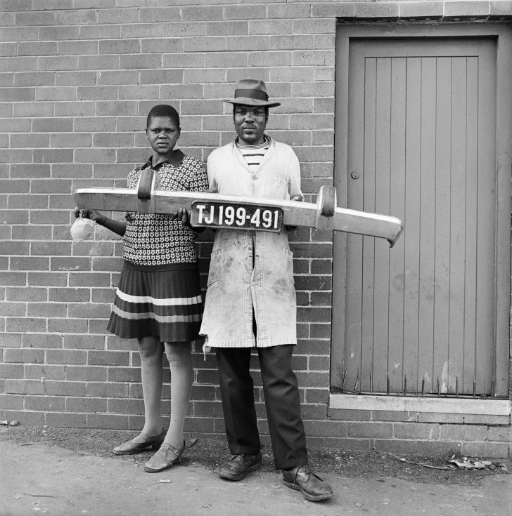
The above image made by David Goldblatt really interests me. I just like the  composition of this image with the two right in the center of the frame and are looking very seriously with a neutral expression into the camera, making the image a lot more personal and as if the pair are actually looking at the spectator. I find this image so intriguing as I wonder why they are holding a bumper to a car with a number plate, suggesting that the man is a mechanic as he is also wearing dirty looking overalls. They could also be stood outside their own house with the door off to the right side of the image. I really like that this image is in black and white, mainly because of the time it has been made, as it makes the image a lot more effective and allows the spectator to focus in on the subjects within the photograph rather than staring a the colour of the door or the colour of the lady’s dress.
Furthermore, I did some further research into the time period that this image was made, 1950s, and saw how South Africa was still a very racist place [it still isn’t completely desegregated today]. In South Africa they segregated everything, much like early 1900s America, there were separate toilets, cinemas, buses, schools etc. This, for me, is a very powerful image as David Goldblatt was a white photographer and it would have been seen as a radical notion to go out and photograph black people, it was seen as wrong to even talk to them at all. I really love the message behind this image showing that black and white people are no different, showing that we all have similar jobs and can work to the same standard there is no real difference between any of us. I think that this holds a strong social message showing how people can change, this photographer went out and made these images on his own free will.
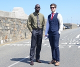
I chose to compare the images above as they both hold significance. The photograph made by Michelle Sank that I chose really went well together and almost complimented each other through their social attributes. The image made by Sank shows how far we as a community and society have re-moulded and adapted our closed minded way of thinking to becoming more accepting beings that realize that everyone is equal. Sank’s image would seem like a revelation if it was shown to those photographed in Goldblatt’s image. This image shows two men, one black and one white, stood next to one another as equals both wearing suits and ties. These men both represent workers and their attire represents this too showing how far we as a society have been able to change and develop our way of thinking. However, if I had no context or hadn’t been comparing Sank’s image to Goldblatt’s then I would not have thought anything of it at all and don’t find it to be a visually interesting image a part from the history and meaning behind the whole thing it isn’t really a strong image to me. I do find it similar in composition to the photograph of Goldblatt’s in both the subjects are slightly off center and to the side of the image but that is just how each of them made their photographs and I don’t think that there is any real relation there.
Likewise, I really do find Sank’s visually boring as there isn’t much going on in the background a part from an empty country road and it doesn’t really give any extra context to who these men are and where they possibly work. As an environmental portrait I don’t like it but what the men are both wearing suits shows what kind of people they are and suggests what they do as a job. I feel like the background is all too perfect with the blue sky and perfect light but with nothing in the background it just looks really quite dull to me. Comparing the two images I much prefer the work of Goldblatt visually and with everything that it represents too. I do like the work of Michelle Sank and like that she makes images showing the different communities and people within our society.
Overall, I feel that these two images alongside one another work really well and do show how society and world view has changed from the 1950s to present day. Through these images the spectator is able to see how far black and white people have come together in the creation of equality of life and jobs. I like these images and think they are strong together and reflect how much has changed in such a short period of history.

Case Study | Tom Pope and Peter Finnemore

I wanted to look more into these two as I have studied the work of Tom Pope and found it really interesting and unique. I find the chosen photographs of Peter Finnemore’s really interesting and engaging, they are strangely unique linking to the work of Pope. I find the two have very unique styles and the idea of performance really shows through their work. Finnemore was Pope’s teacher who he looked up to and was influenced by in photography.

Tom Pope’s website: http://www.tompope.co.uk/index.html
Peter Finnemore website: http://www.peterfinnemore.com/main.html

About Tom Pope

Tom Pope was the photographer in residence at the Jersey Archisle in 2015. He is a performance photographer and is currently living in London after graduating with a Ma in Photography from The Royal College of Art back in 2011.. Pope’s work is very unique and has strong political and social messages behind it. Much of Pope’s work is based around his project of Weak Anarchy and challenging the way we think as a society and what is right and wrong in the eyes of the community surrounding us.

Interview with Tom Pope: 

About Peter Finnemore

Peter Finnemore is a photographer born in Llanelli, Wales. He was one of the first students at the new Fine Art Photography Course, set up in 1984 by Thomas Joshua Cooper, at the Glasgow School of Art, Scotland. Finnemore gained an MFA in Photography at the University of Michigan, USA. Finnemore is a visiting professor in Photography at the University of Derby. He also lives and works in Llanelle, Wales. Finnemore’s work consists of many landscape images, environmental images that show the natural world.


Comparison | Tom Pope and Peter Finnemore

Q. How has Peter Finnemore influenced the style and genre of Tom Pope’s photography?

In this essay I am going to compare and contrast photographers Tom Pope and his chosen artist, from the Quintessence exhibition, Peter Finnemore. I really love the style of Finnemore and wanted to explore it further and find out more about the location of his work as well as how Pope relates to him and how their work differs.
I find that Pope and Finnemore have similar styles of photography. They tend to take the element of performance to the next step and really get into their role and what they want to do. One thing that they differ in is that Finnemore seems to prepare a lot of his work and knows what he wants to do and will usually make all of his images in his back garden whereas Pope tends to have a basic idea of what he wants to do and leaves it all up to chance in one image taken on a film camera and will perform in public and not stop if there are any passersby. Their work differs in the sense that Pope is very classic with the types of cameras that he decides to use and Finnemore is more modern using newer digital cameras as you are able to tell in the different ways that the images above look, with the way they capture the light and everything in the frame of the image.
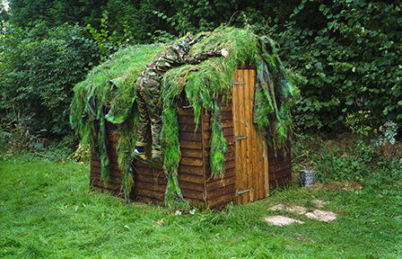
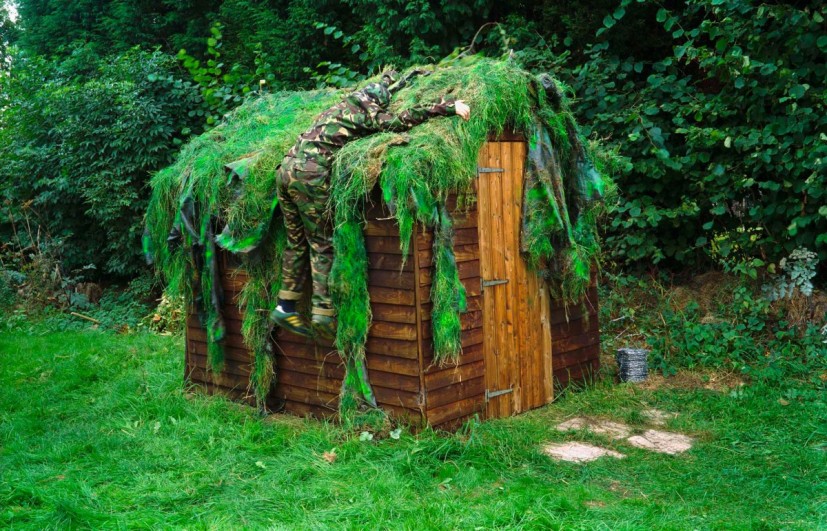
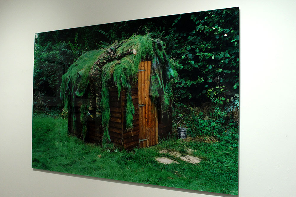
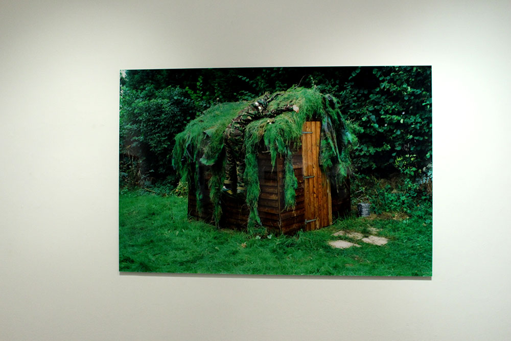
I chose the two images above as they interested me the most. I really love the photograph by Finnemore, there is just something about it that is really intriguing and makes me want to find out more about what is going on in this image and possibly a deeper meaning behind it. It reminds me of war and how during the war, in Jersey, they had to cover up an underground hospital with grass and dirt to make it just look like more land when the enemy flew over looking down and not actually being able to see that something is there. This image really interests me as the subject in the image, a man, blends in with his atmosphere and at first glance I didn’t even notice him at all. I really do find this image engaging as it is so odd and random yet it seems to remind me of war and how the world was at one stage in our recent history. To me it looks as though the subject just jumped at the shed and is clinging onto it to try and hold himself up. It’s also interesting to know that this was all taken in his back garden. Something that I really like about this image is that I am so interesting in it and really would like to find out more about it and if the meaning that I have generated from looking at it is actually the meaning and the message that Finnemore is trying to put across.
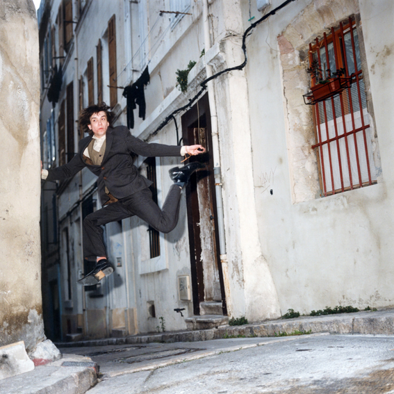
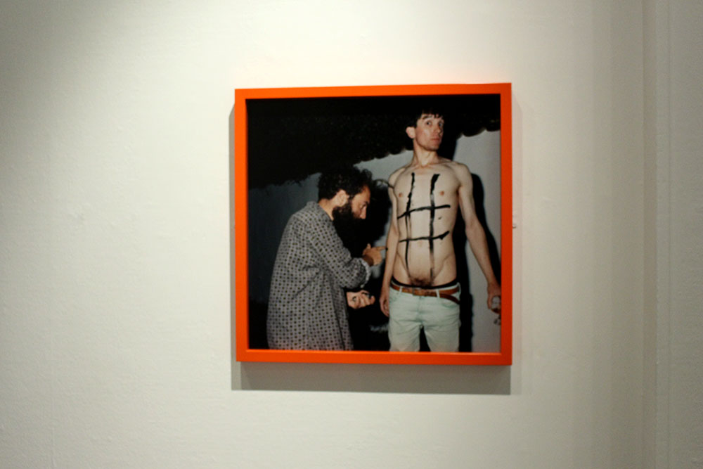
Contrary, I find Popes image very different. It doesn’t really make me think of anything political at all, I like the image but I am unsure as to what influence it has over me. I guess I could say that it makes me think we should all just be as carefree as Pope is and do things in public without worrying or being overly aware of the other people around, to be the real you. This image also reminds me of going on holiday as the lane and the brick flooring just reminds me of a place like Portugal or Spain or even the South of France. I do find this image interesting and almost amusing because of the way Pope is positioned in this image. I also like that he uses film cameras in his work to make everything authentic and when he does do his performances it is all down to chance that the camera will capture the moment that he wants it to really get.
The reason that I chose to compare these two images is because of the way both photographers approach photography as a performance and they do it for themselves and if someone happens to walk past then that performance has been seen by someone else but primarily they will just do it for themselves. I feel like Pope has been influenced by this through Finnemore’s work. Finnemore’s work is more of a poetic symbol in that it is about showing the world his home, his territory and his paradise. He wouldn’t want anyone else to steal his home or to invade his personal paradise. Contrasting to this I find that a lot of Pope’s work is very abstract and unusual but can also be poetic and symbolic of a deeper more political meaning.

Case Study | Martin Toft and Finn Larsen

For this case study I chose to look at Toft and Larsen first as when looking around all of the images these were the ones that really stood out most to me. I found Larsen’s images so visually pleasing and beautiful but I knew nothing about the images and what they represented and was shocked when I found out what they were really about. I love finding out new things in the photographic world and what underlining messages there are behind these types of images.
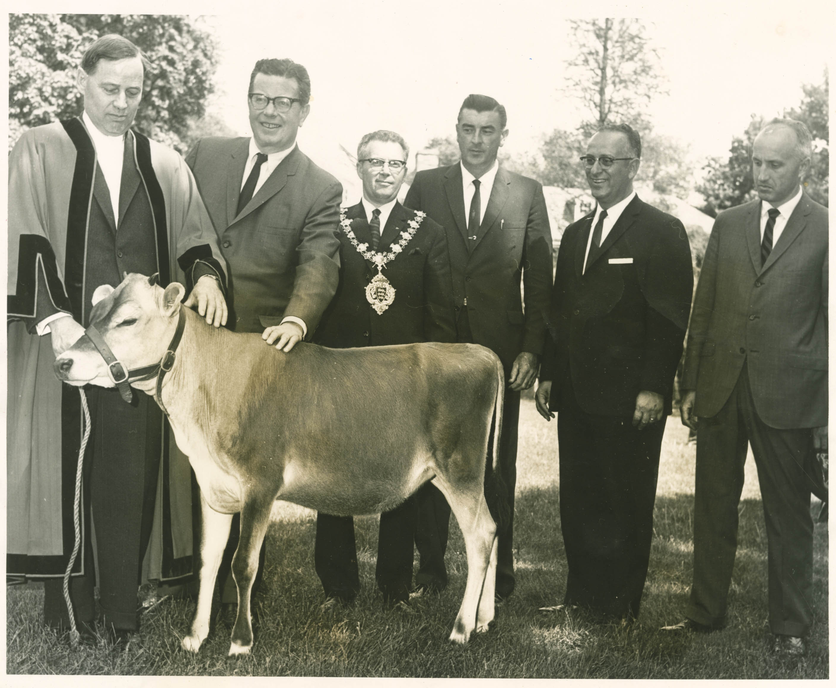
Martin Toft is the local photographer who nominated Finn Larsen. He is a Danish man and is currently living in Sweden. Toft was 25 years old when he figured out that he wanted to be a photographer and if he hadn’t met Larsen, Toft says that he wouldn’t be a photographer. He basically mentored him giving him a load of photographers photo books to read and study for one week, a box filled, the next week he would go back to see Larsen where they would discuss everything Toft had found out and learnt. They did this every week. This really helped Toft become a better photographer and so Larsen has become one of his biggest influences.

Martin Toft’s website: http://www.martintoft.com
Finn Larsen’s website:
 http://thephotographersprint.com/products-page/finn-larsen/

“The photographs and the art that interest me enter into a global and historical dialogue about how the world looks and how it can be understood. It is about seeing the world, society, the landscape as soberly as possible, without God, sentiments, nationalism, symbols and other abominations.” – Finn Larsen

About Martin Toft

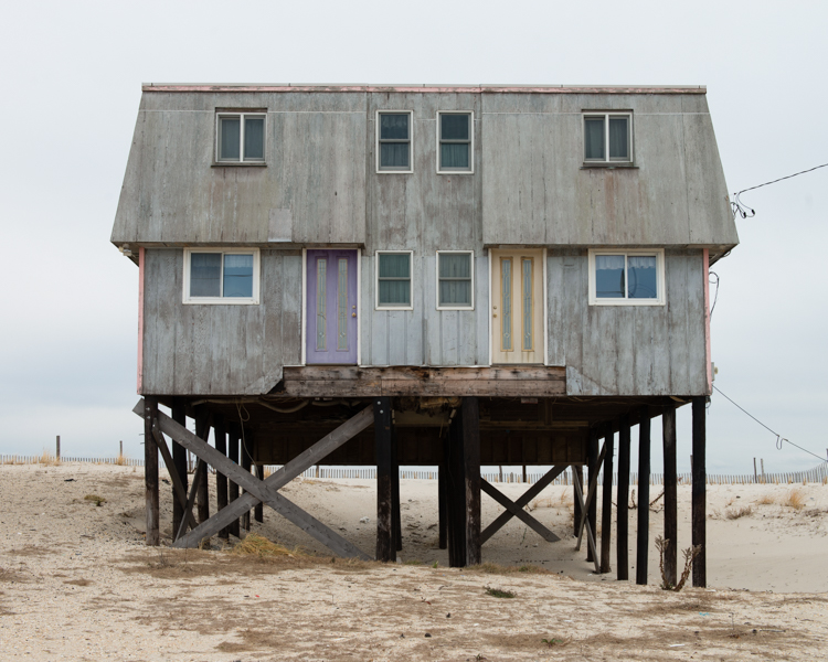
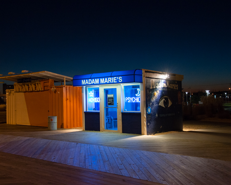
Martin Toft is a local photographer originally from Denmark. He is working as an A Level teacher here at Hautlieu school. Toft has worked on a huge project called Atlantus. This is a project showing the connections and contrasts between Jersey, Channel Islands and New Jersey. Through Toft’s work we are able to see how different and how similar the two are. It is strange that a lot of the world doesn’t even know that Jersey exists and this project in particular is interesting as it explores a place named after Jersey.

About Finn Larsen

Finn Larsen is an international photographer nominated by Martin Toft. He is a Danish photographer now living in Sweden. Larsen graduated as a photographer in 1980. He is a member of the Society of Artists and the Association of Visual Artists in Denmark. He is also a member of the National Organisation of Artists in Sweden. Larsen has published books over the years and has recently worked on a project titled ‘Mansland’ where he made images in Greenland of all of the waste and dump on the island.

Comparison | Toft and Larsen 

Q. What underlining social and cultural messages are held in the work of Martin Toft and Finn Larsen?

In this essay I will compare the similarities and differences between Martin Toft’s photographic work as part of the Quintessence exhibition and his chosen artist Finn Larsen.
Firstly, I find these two photographers different in their approach and their style. Toft’s project shows people and the environment surrounding those people and how different and similar Jersey and New Jersey are compared to one another. He also looks into the history of these two parts of the world and shows, through his images, how far each place has come and how different it is now compared to in the past, especially in New Jersey. Whereas Larsen’s images are pure landscapes giving little away but with a deep political and environmental meaning behind it. I like both photographers but for very different reasons. I find Toft’s work very interesting in the people he chooses to make his images and their facial expressions, the way they look and feel in front of the camera. Toft’s work shows how a place can be named after another place yet have nothing in common with the original place or it even shows different sides of the spectrum and how they take care of things differently. Contrary, Larsen’s work is more just landscape work with strong political meaning behind them. I find that his work is a lot more subtle in that you wouldn’t guess what is going on in just one image, you would need to see the entire project to understand what is going on. I find his work very interesting as he has some really beautiful images with a deeper meaning that you most likely wouldn’t get if you did not read more into it.
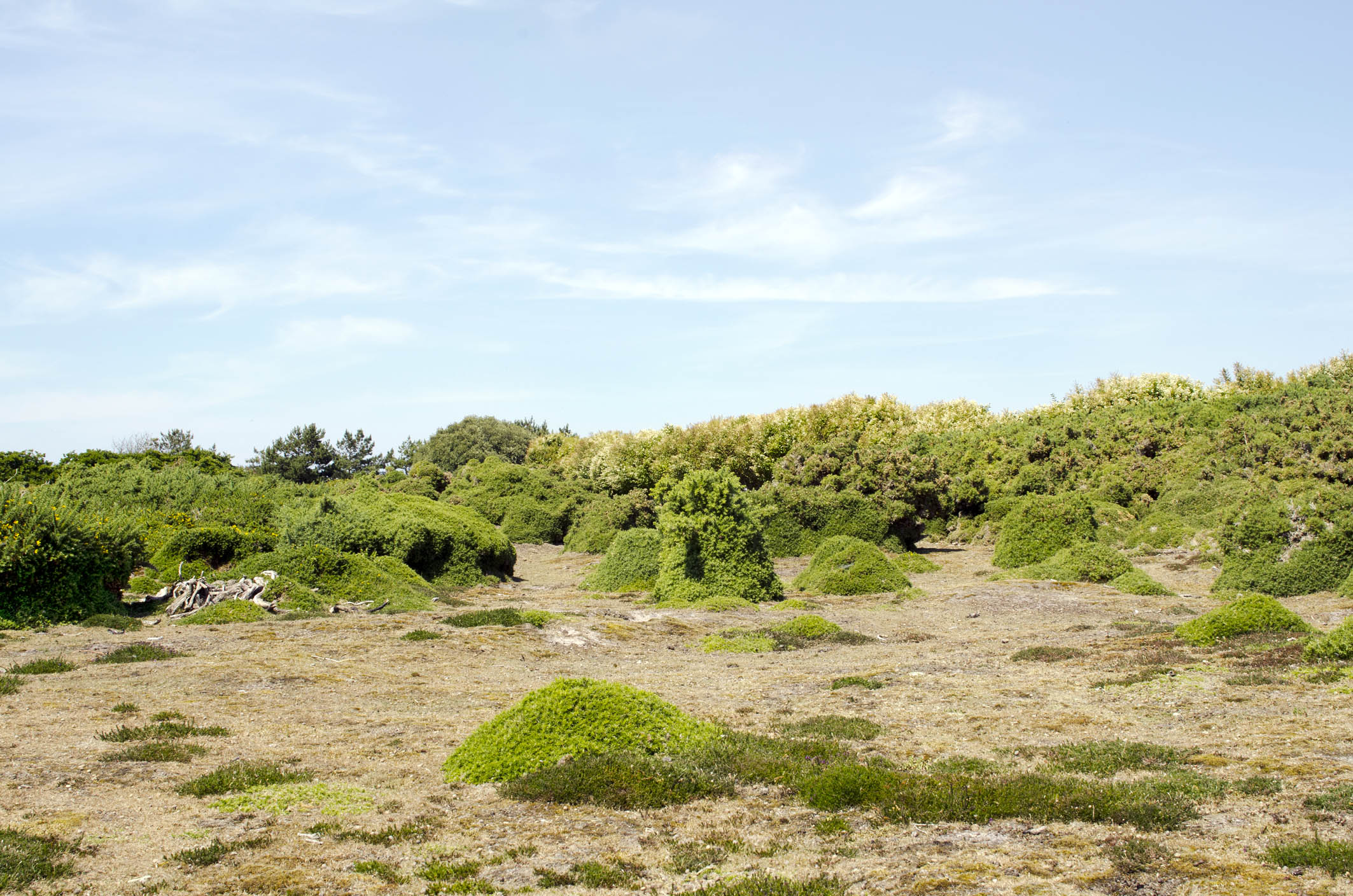
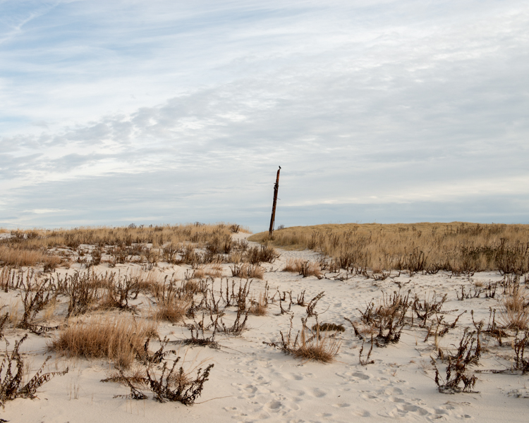
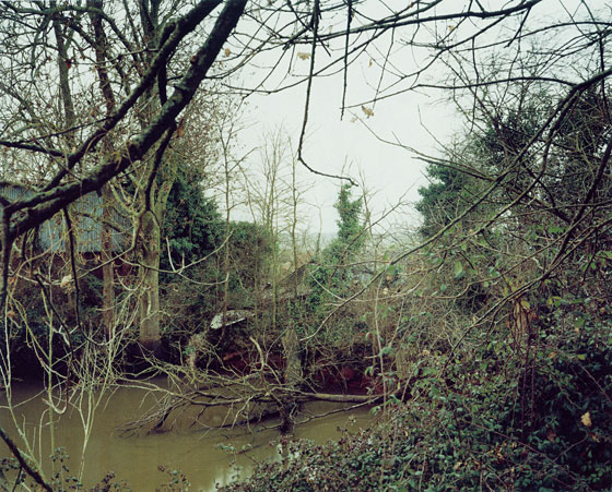
However, I chose to compare the images above as I saw similarities in them visually. In the center of both of these images is an object, Toft’s is a large stick or pole and Larsen’s is a wooden bench. I find that Toft’s image shows the natural beauty of the land, it is simple yet the cloudy skies and the landscape is captivating. On the other hand, Larsen’s image looks,at first glance, like another beautiful landscape image of glaciers in the water with the perfect view from the bench but reading more into this project I found out that just beyond those glaciers is a dump, filled with human waste. It is so sad, to me, to see both of these beautiful landscapes yet our own destructive human nature is slowly destroying that and taking over with these landscapes being ruined by our waste and dumping. I find Larsen’s image very powerful and almost sending out a political message to the rest of the world saying that this beauty is being destroyed and ruined by our wasteful nature.
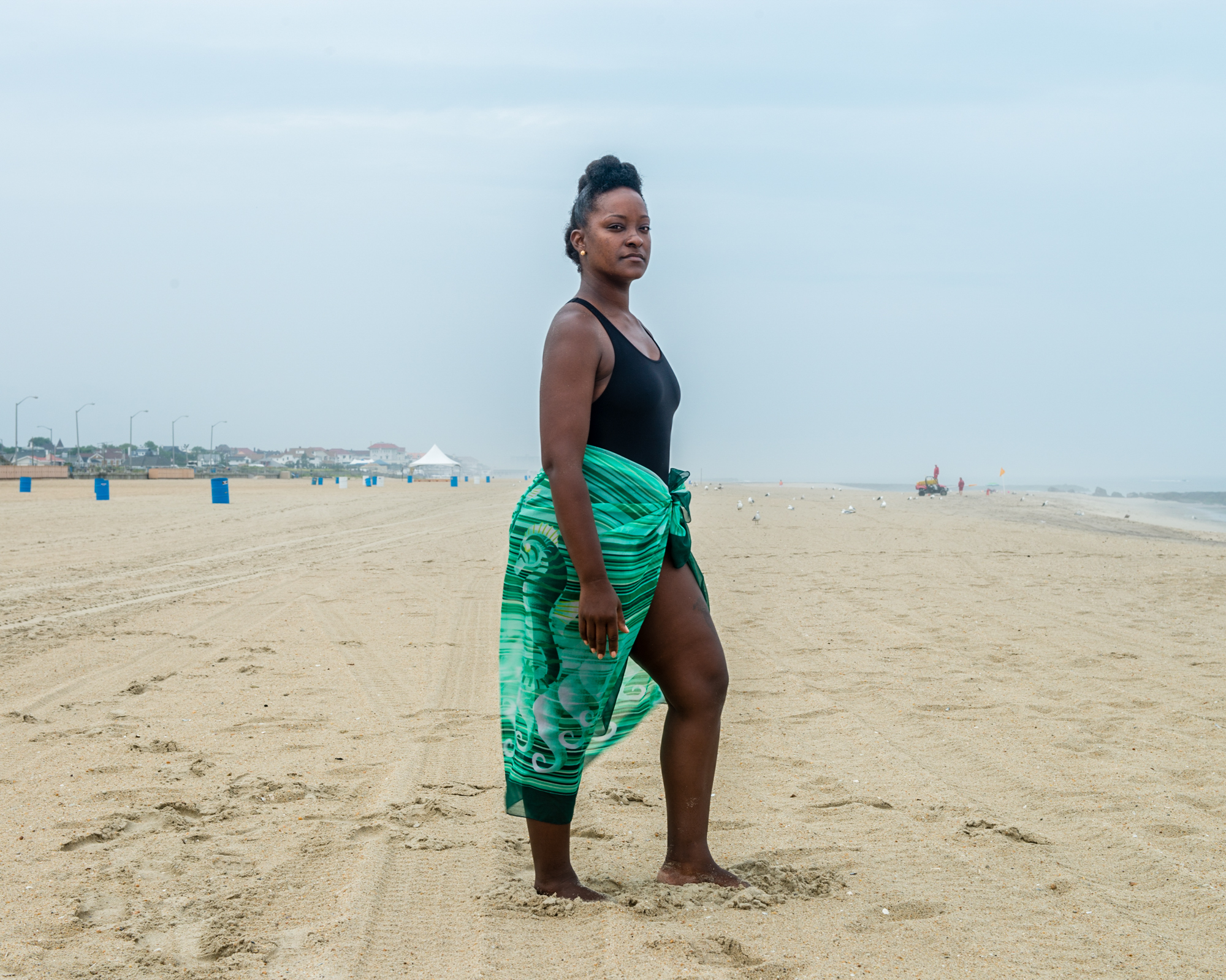
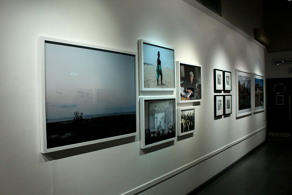
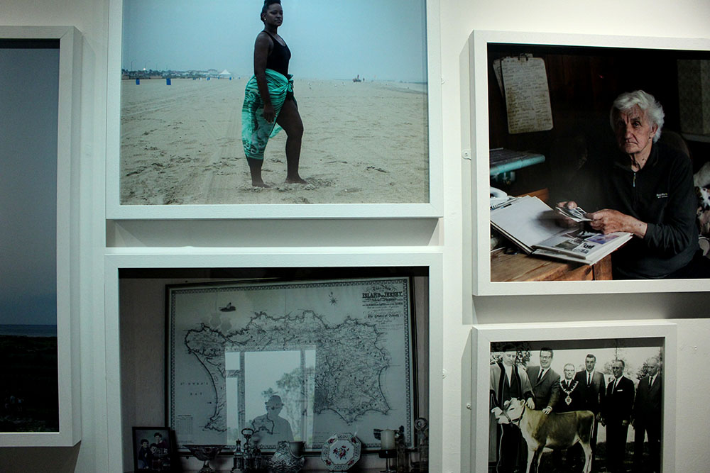
Contrary, better suited for the comparison would be the image Toft made of a black woman at a beach in New Jersey. This image represents a lot. It represents the struggle that black citizens of America went through. This image was made in a place in New Jersey called Asbury Park where black slaves used to stand and serve their white masters over 100 years ago. This is why this image represents a lot and is so significant in how far we have come as humans. In contrast, the image made by Larsen shows how really little we have come in society hiding our waste and dumping our unwanted rubbish behind a beautiful natural glacier. I really like these two images together as they both hold a lot more behind just that one image. It is captivating and interesting and the more you know about the subjects and the behind the scenes of what has gone on in the past or what is going on in the background makes the image even more powerful. I like these two photographers, Toft and Larsen, as their work holds meaning and doesn’t just tell us or show us in that single image, we aren’t given everything yet are left thinking about it and what it could represent. These images aren’t as simple as they look and have generated meaning behind them.
Likewise, a common theme that I am beginning to notice in both Toft’s and Larsen’s work is that it holds a deeper meaning. There is more to it than what you see as a spectator and their images hold so much significance and beauty. Both of their subject matters seem to reflect us as a society. The young black woman stood on the beach represents how far we have come as human beings and being able to bypass ridiculous laws and change the way we think to be broader minded and actually accept everyone as human beings. On the other hand, Larsen’s work represents society in a more negative light. This cant be seen in the beautiful image of his above as it shows the beauty of the glaciers and the sea and the cloudy skies but behind all that there is a disgusting dump filled with our own human waste and it shows how as a community and society we still don’t know how to control our own waste, how to not ruin the natural world that we have. It shows how we as a society are constantly taking over the natural world and making it a corporate one.

timthumb
Martin Tofts photography | Tamika Tolliver, Asbury Park

1000 Word Essay

To what extent is the work of Yury Toropstov and Michelle Sank similar?

On reviewing the ‘Quintessence’ Exhibition, it is clear that the work of International Photographer in Residence (IPIR)[1] of 2014 Yury Toropstov in ‘Fairyland’, conveys a certain degree of similarity to that by IPIR of 2013, Michelle Sank in ‘Insula’. Both artists, formal and methodical in their photographic style, take influence upon discoveries made from the Societe Jersiaise Photographic Archives, and subsequently their respective bodies of work made is achieved through a similar process. Nevertheless, there are clear distinctions in the work of the two artists. Firstly, the extent their respective personal influence is very different, thus shaping the direction of their work very differently. Secondly, they give varying representations of island life, with Toropstov photographing more subjectively than Sank. Although I can draw some similarities, I maintain that the obvious contrasts and differences in their work means that the extent of similarity between the artists is somewhat limited.

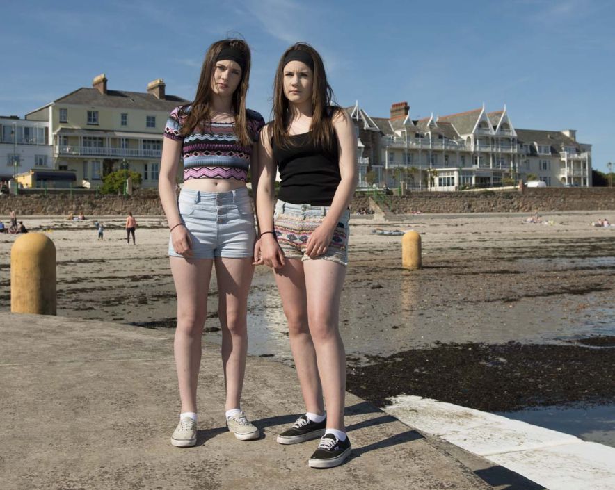
Both Sank and Toropstov’s photographic style is formal. Many similarities can be drawn from Toropstov’s image of “Vic Tanner Davy”[2] formally dressed in an office, holding a statue, with Sank’s image of two girls, “Chloe and Leah”[3]. They are both formal portraits, and it is apparent that both photographers have carefully considered how the image has been composed. Hands are used in both to symbolise the distance between the photographer and the subject. Sank keeps the hands of her subject down to convey a defensive pose, and Toropstov achieves this same effect by photographing the subject with his hands in his pockets, symbolic of a defensive nature. Both Sank and Toropstov were commissioned by Archisle “to live, work and teach for a term of six months”[4], and their outsider view of the island subsequently reflects this position. Their equally careful and methodical approach to dealing with their subjects explores how the work of both serves to express this outsider, and therefore limited perspective of island.

(Photographer: Yury Toropstov, Subject: Vic Tanner Davy, Jersey, 2014.)

(Photographer: Michelle Sank, Subject: Chloe and Leah, Jersey, 2013.)

Furthermore, similarities can be drawn from the considered approach to how Toropstov and Sank research their respective contexts and themes. In contrast to the work of Martin Parr, (also in the exhibition) both Sank and Toropstov convey a far more considered and formal approach to research, restricting the direction of their work to pre-determined themes, highlighted in Toropstov’s case by his image “Jess”[5] and the similarities this can draw with the archival image of Ivy Joan Vibert. Both artists use the Societe Jersiaise archive as the basis to inspire their work. Sank takes influence from social order of Henry Mullin’s mid-19th Century Portraits: “9,000 portraits of islanders placed and identified in grid configurations”[6], to explore class systems in the island, whereas Toropstov was inspired by footage of a young girl named Ivy Joan Vibert with her float ‘Fairyland’ at the 1937 Battle of Flowers, fuelling his exploration of the “discrete and mysterious”[7] nature of Jersey. The similar methods of research by both photographers to create their outcomes, draws clear similarities with both in terms of photographic approach, resulting in their work being of a similar pattern – very specific and concentrated themed images, of which this style of research based photography inevitably results in.

Although both similar in terms of research, the work of Sank and Toropstov are influenced in completely different artistic directions. All six Archisle artists nominated another artist whose work had influenced them, and this is a significant factor in differentiating Sank and Toropstov’s work. Sank chose David Goldbatt, who has four images in the exhibition, looking at the social barriers established by race in apartheid South Africa. One portrait is of a black couple holding up a registration plate, and they are shown to be poor and socially disadvantaged through the representation of their clothing and living conditions. Sank’s portrait of “Chloe and Leah”[8], draws striking similarities to the intentions of Golbatt, as the girl’s appearance of simplistic clothing and worn out shoes, implies too that they are working class. Sank therefore has very much been drawn down the artistic direction of exploring social status and order. Toropstov, on the other hand, was influenced by the concept of mystery and mysticism, an impression he established during his stay on the island,  citing the controversial ‘Cottingley Faries’[9] series by Elise Wright and Frances Griffiths as his influence. Sank’s influence is shown through her objective, documentary style, whereas Toropstov’s main influence inspires a degree of creativity, imagination and subjectivity.

(Photograher: David Goldblatt, “You’ll be the driver and i’ll be the Madam, Johanesburg – RSA, 1975.)

(Photographer: Michelle Sank, Subject: Chloe and Leah, Jersey, 2013.)

(Photographer:  Elise Wright and Frances Griffiths, “The Cottingley Faries”, Bradford – UK, 1917.)

Fundamentally, the main difference which highlights clear distinctions in Sank and Toropstov’s work is how they depict the theme of ‘islandness’[10]. Sank during her stay in Jersey became interested in the issue of class conflict on the island, as she describes, “I am interested in creating sociological landscapes”[11]. Her take on Jersey is that it is a place of extreme cultural diversity and social extremes; ranging from the the home of very rich to those in most abject poverty. The series is therefore an observational human study. In stark contrast to this objective viewpoint, Toropstov’s work reflects a more personal viewpoint of the island, and ‘Fairyland’ documents his own personal journey to “connect to island life”[12] and discover the hidden secrets of such a “mysterious and discrete place”[13]. Such a contrast largely impacts how the viewer interprets the images in the exhibition. Sank’s images invite the reader to reflect upon her work with a sense of observation and distance. On the other hand, the subjective nature of Toropstov’s work invites the viewer to interpret the images from a more abstract perspective, encouraging subjective experiences to determine judgement. This contrast is important as the mood established within the respective works is completely different.

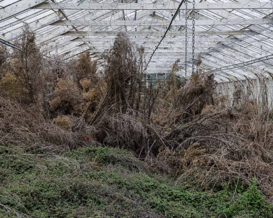
(Photographer: Michelle Sank, ‘Disused Glasshouse’, Jersey, 2013.)

It was interesting to reflect upon and compare the work of Sank and Toropstov. As respective IPIR, they were both completely new to the island and had the same time period and access to resources in which to make a photographic response. Although similar in terms style, it is undeniable that through their own personal influences, as well as opinions about island life that the context, intention and direction of their of their work is very different. Sank is far more direct in her photographic responses, whereas Toropstov response is more implied and metaphorical. For these reasons, I would argue that only to a very limited degree, is the work of Sank and Toropstov similar.


Bibliography

[1] Syvret. G, The Rescidency, Archilse Website, http://www.archisle.org.je/archisle-international-photographer-in-residence-programme-2015/ (2015)

[2] Syvret. G, Exhibition Text, ACCP (2015)

[3] Syvret. G, Michelle Sank – Insua, www.archisle.org.je/michelle-sank-insula (2013)

[4] Syvret. G, Exhibition Text, ACCP (2015)

[5] Toropstov. Y, Fairyland (Description), http://toroptsov.com/en/projects/fairyland.htm (2014)

[6] Syvret. G, Exhibition Text, ACCP (2015)

[7] Toropstov. Y, Fairyland (2014), https://vimeo.com/105940083 (2014)

[8] Sank. M, Portfolios – Insula, http://www.michellesank.com/insula (2013)

[9] Cooper. J, “Cottingley: At Last the Truth.” The Unexplained, No. 117, pp. 2338-40 (1982)

[10]Syvret. G, Archisle Celebrates Five Years with Quintessence, http://www.archisle.org.je/archisle-celebrates-five-years-with-quintessence-exhibition/ (2015)

[11] Sank. M, Artist Reference, http://www.michellesank.com/ (2013)

[12] Toropstov. Y, Fairyland (2014), https://vimeo.com/105940083 (2014)

[13] Toropstov. Y, Fairyland (2014), https://vimeo.com/105940083 (2014)


Quintessence essay

To what extent has David Goldblatt’s work influenced Michelle Sank’s work?

In this essay I am going to explore how Michelle Sank’s nominated artist David Goldblatt has influenced her work. I am going to do further research into both of the works displayed at the exhibition, to find further connections and relationships between them, beyond what is displayed on the surface.

David Goldblatt 

David Goldblatt is a South African photographer, he was born in South Africa after his Jewish parents fled Europe in the 1890’s . Since the late 1940’s he has photographed the social and physical landscape of South Africa. However, he is most well know for photographing people in South Africa during the period of apartheid, where black people were physically and socially segregated and treated differently  to white people through the use of separate facilities such as schools, accommodation and transportation. David Goldblatt has various publications and has won many awards. During this time period as a white person photographing black people was an unusual thing to be doing, because if you were caught Interacting with a black person you would be sentenced to prison.

http://www.moma.org/collection/artists/2214?=undefined&page=1

Michelle Sank 

Michelle Sank was born in Cape Town, South Africa. She has been living in England since 1987. Michelle photographs the human conditions exploring social and cultural diversity through documentary photography. Michelle has had many successful solo exhibitions and publications including books. She has also won many awards for example her most recent award was in 2013, Gold Award, San Francisco International Photographic Exhibition. She recently displayed her work both in Jersey and Guernsey.

http://www.michellesank.com

The photograph that I’m looking at by Michelle Sank that was published in the exhibition is actually from a larger collection of photographs under the title ‘Insula’ taken in April 2013. I read some more about the 6 months that Michelle Sank was in residency at the Archisle and found that she trying to photograph how being on the Island and within a ‘kept environment’ influenced peoples way of being. I then googled the definition of Insula, it showed that Insula means “a region of the brain deep in the cerebral cortex.” I then furher looked into the cerebral cortex and it is the part of the brain that is linked to your conscientious, self- awareness and perception. This is linked with the exhibitions idea of ‘islandness’ , being aware  socially and politically and also being aware and having other photographic connections outside of the island.  David Goldblatt also photographed peoples social and physical landscape and in this case for Michelle Sank it was Jersey.

One of the most damaging things that apartheid did to us, was that it denied us the experience of each other’s lives. – David Goldblatt

I then looked at David Goldblatt’s photograph which is of two black people holding a car bumper. I didn’t really understand what this represented or if it was a metaphor for something. However, when I looked at the tittle ‘ She told him: “You’ll be the driver and i’ll be the lady”, then they grabbed the car bumper and posed, Hillbrow, 1975’ I then connected with this photograph and found it quite touching. This photograph represented a dream that they couldn’t achieve due to the cultural segregation, which I think is wrong in everyway.  I think the fact that the bumper is straight, shows the divide between the people in the photograph who I think could have been servants and their ‘owner’ . The photograph is taken infront of a building which could be where they were living. The photograph was taken in Johannesburg which at the time was not a place were everyone was smoothly integrated, which renforces what David Goldblatt was photographing.  I think this photograph is very powerful and speaks for itself.

The first connection I saw between these photographs, although it was fairly obvious, was that they had both photographed a portrait of two people and included their surroundings, which allows us to get a better understanding. I then realised that David’s photograph at that time would have been of the working class, I then looked at Michelle photograph and by what they are wearing and their surrounding I think the girls are also from a middle/working class. I then questioned if there was any particular reason why she photographed twins, it could be that the people in David’s photograph are also related to each other although I don’t know this for sure. Other than the photograph itself I found connections between the photographers. The first one I found was that they were both born in South Africa and they are both white, this may be what inspired and influenced Michelle Sank and let her to choose David as her nominated artist. The second connection that I found although it was in different centuries they are both photographing cultural diversity and peoples physical and social landscape.

In conclusion, to answer my question I think that David Goldblatt is a huge influence for Michelle Sank  and there are many connections between not only their work but as people themselves. In this project Michelle Sanks work links closely to the work of David, as I have found above, however having looked at some of her other projects there aren’t as many connections although most of pictures are environmental portraits which show the differences between people as well as this I think the photographs portray personal identities. But these photos keep to the conjoint theme of photographing peoples physical and social landscape.

David-Goldblatt-FHCB_4-728x735
She said to him,’You be the driver and I’ll be the Madam’, then they picked up the fender and posed. Hillbrow. 1975
22
Chole and Leah.2013