
Quintessence is a group exhibition at the Arts center in town, celebrating the first five years of Archisle: The Jersey Contemporary Photography Programme. The Archisle Programme, hosted by the Société Jersiaise Photo Archive promotes contemporary photography through an ongoing programme of exhibitions, education and commissions. Archisle connects photographic archives, contemporary practice and experiences of island cultures and geographies through the development of a forum for creative discourse between Jersey and international artists. The exhibition features works by:
Martin Parr / Tony Ray-Jones / Jem Southam / Michelle Sank / David Goldblatt / Yury Toroptsov / Elsie Wright and Frances Griffiths / Tom Pope / Peter Finnemore / Mark le Ruez / John Gibbons / Martin Toft / Finn Larsen
We all have three parts to this tasks, Task one is a set of questions, Two is an essay and three is a photo shoot in response
- a) Write down the first thought about the exhibition that enters your head when you walk in?
When entering the exhibition I felt the room looked particularly empty but somehow cramped in some areas of the room. There were few images that really ‘stuck out’ for me, However there was one image that did stand out and was the first image I really noticed even though it was behind me as I entered the room. The photograph produced by ‘Peter Finnemore’ and the image was called ‘Koan Exercises’ from 2004. This image stood out for me due to the extreme saturation and size of the image.
- b) Look at all the images on the walls. Now find a set of images that you like/ don’t like and write short descriptions of them.
Throughout this exhibition I came to realise that there were a considerable amount of pictures I did not like and few that I did.
PHOTOGRAPHS I DID LIKE
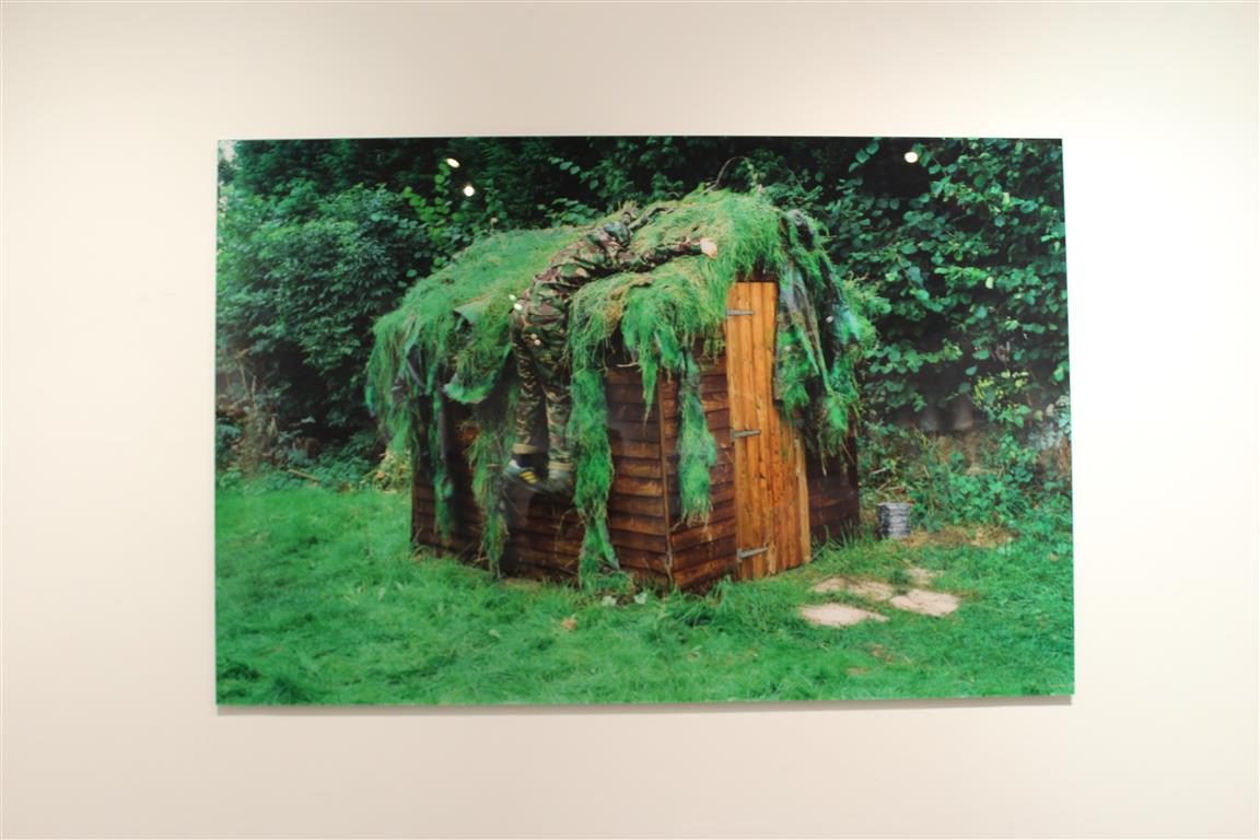 PETER FINNEMORE – KOAN EXERCISES
 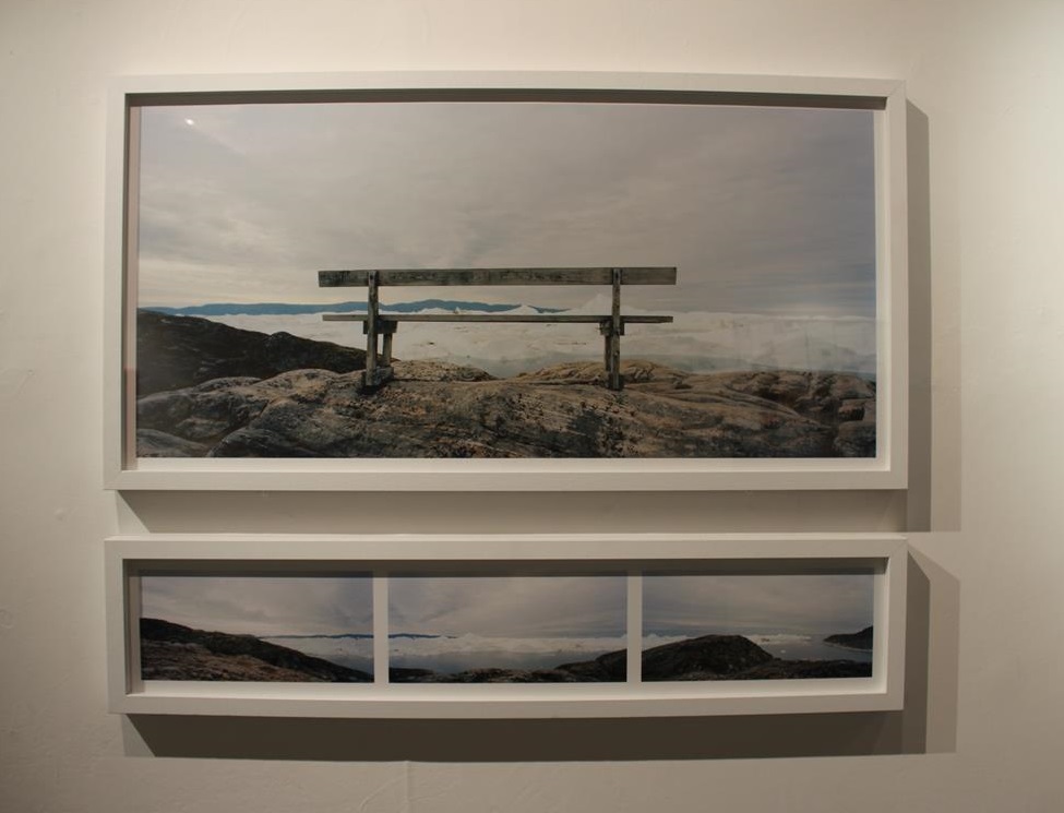 FINN LARSEN – AL GORE WAS HERE. LLLULISSAT ICEFJORD, GREENLAND
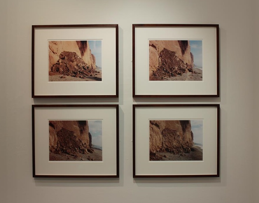 JEM SOUTHHAM – RED MUDSTONE, SIDMOUT
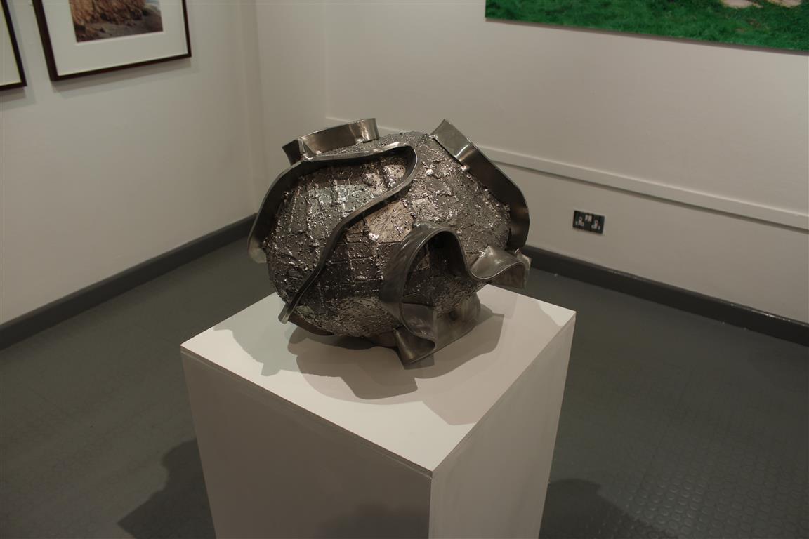
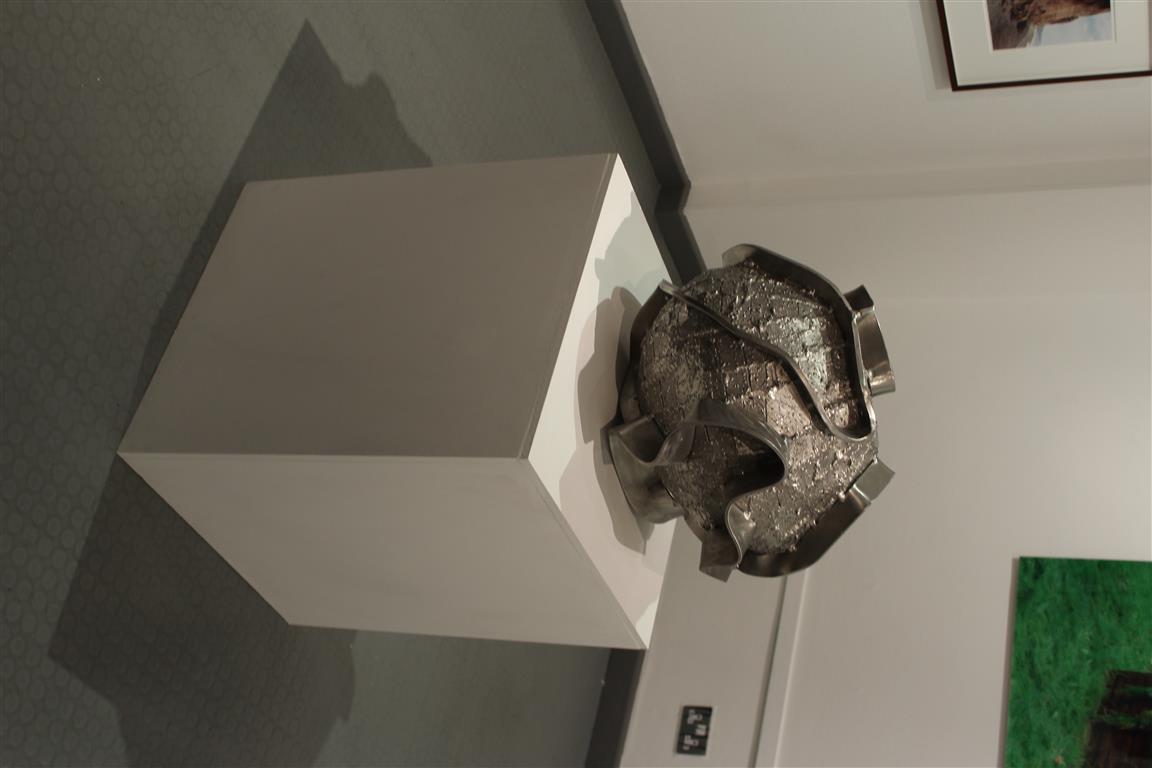 JOHN GIBBONS – AND THE EARTH CHANGES SHAPE
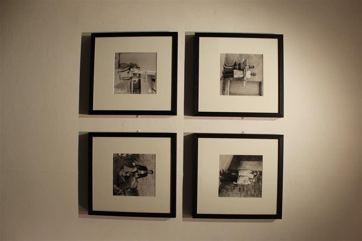 DAVID GOLDBLATT
I came to like the images above for many different reasons, some because on the contextual meanings and some purely because they were aesthetically enjoyable. Peter Finnemores Koan exercises is the first Iam to evaluate as it was the biggest and brightest in the exhibition, aswell as it being the first image to catch my eye. This is due to the bright and extremely saturating greens of the photograph. I found this image to be cleverly edited as the saturation and contrast increase make it the most ‘attractive image of the exhibition. I also find the image draws you in due to editing but the as you get closer to further examine it, you come to realize that there is a person in the image aswell. From afar the photograph just looks like a camouflaged shed, but a further examination reveals that there is infact a person hidden within the foliage. I find this type of image interesting as there are two stages to the perspective of the image. one from a far and one up close.
The two images by Finn Larsen were my favourite images from the exhibition. This is because I prefer ‘pretty’ photography rather than artsy and odd photography. These images I enjoy as they are both photographically correct Eg: well lined and edited. Rule of thirds is presented in the first image as there is an even and equal amount of space either side of the bench, aswell as the bench being horizontally straight.
The photograph has also been edited well as the colours of the image are seen as very clean cut and contrast well from the blues in the skies to the brown wood of the bench. I like how cold the image looks swell, how the focus of the image allows you to see the worn wood of the bench and the ice in the glaciers infant of the bench. However this project is infact about a landfill sight that is located behind the glaciers, Looking at the image on its own, one could not see that but researching the project it explains about the beauty in the nature of this image but you cannot see the ugliness of the landfill and garbage site beyond the ice.
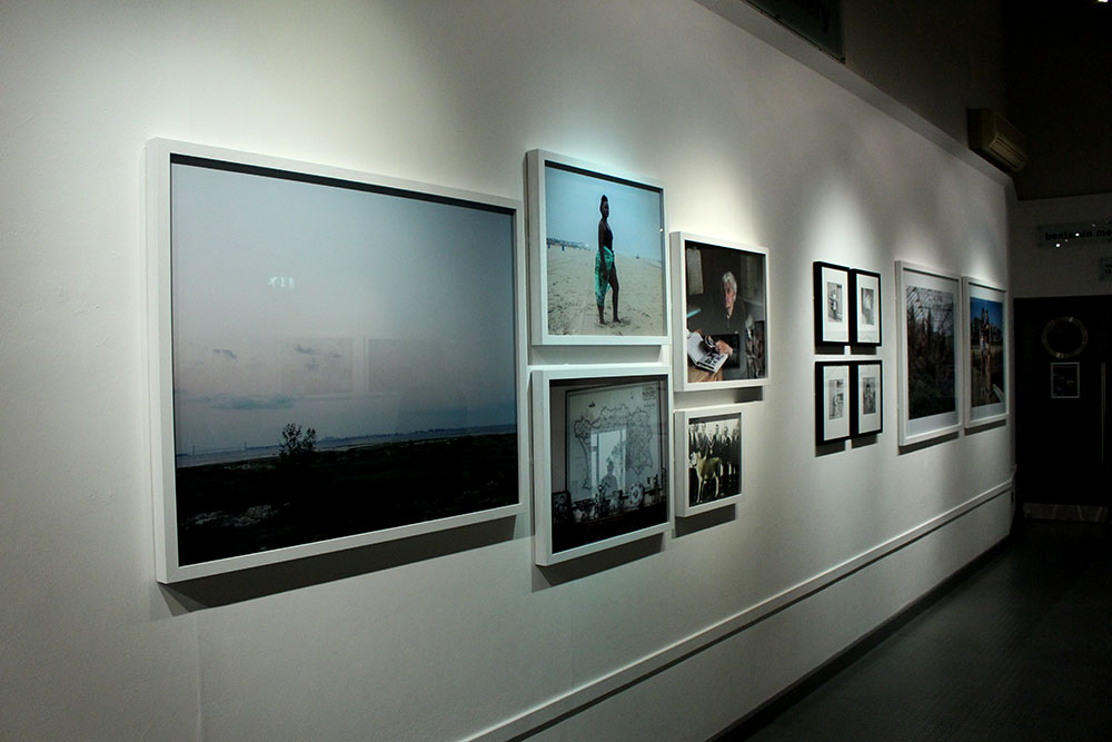
The following image is taken by Jem Southam, This image drew me in due to the ‘warmness’ of the image. The clean cut layout of the four photographs was also aesthetically pleasing. I was also draw in by this image as you believe it is a photo sequence or time lapse so you try to ‘spot the difference’, but you then discover that the four images were actually taken at different times. The vibrance of this image also attracted me as the saturated landfall contrasted well with the pale blue skies.
The next section of the exhibition was the only one of its kind in the room, a sculpture. This sculpture is by John Gibbons – And the Earth changes shape, I found this very intriguing as every other part of the exhibition was an image, in a frame, on the wall. This piece of work changed the feel of the exhibition as it was very different to the others. This piece of art I found interesting as the name obviously explains that the sculpture is of the earth due to the spherical shape, However there are rims that have been added on to the outside. This therefore interests the person viewing it and makes them wonder, why are there rims on the outside? why has the artist changed the sphere to have ridges on the outside?
The next images attracted me within the exhibition purely because of the layout and clean cut presentation of the work. The colours of the photographs contrasted well with each other and well with the frames they were in. The frames and images being the same size and presented in the way they were complimented each other well and therefore when viewing you could see the link between them all. 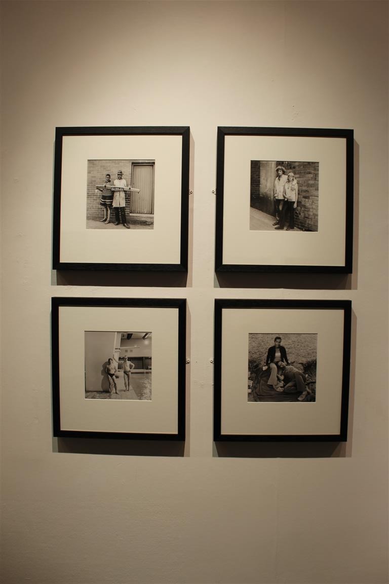 This artist was David Goldblatt nominated by Michelle sank a former ‘artist of residency’.
PHOTOGRAPHS I DID NOT LIKE:
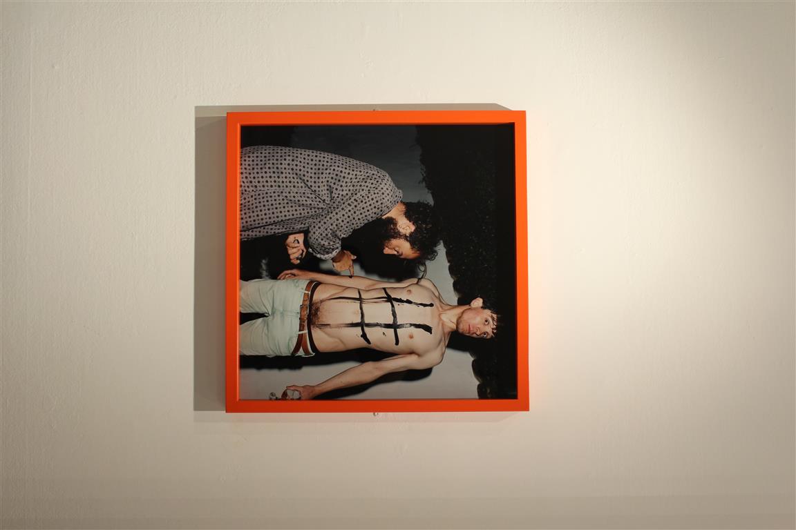
These three photographs I disliked due to their joint awkwardness. The photograph by Tom Pope I highly disliked due to the awkward and explicit nature, Im all for and explicit shoot and pushing the limits of ‘acceptable’ photography, but this image just made me feel very uncomfortable. 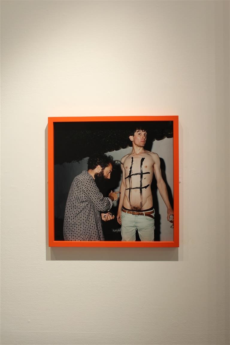 However, some of the good things about this image was the frame and interest of it. The frame was the only coloured one of the exhibition so clearly caught the eyes of many. Even though the photograph is extremely awkward and uncomfortable for me, it did interest many of the people that viewed the exhibition.
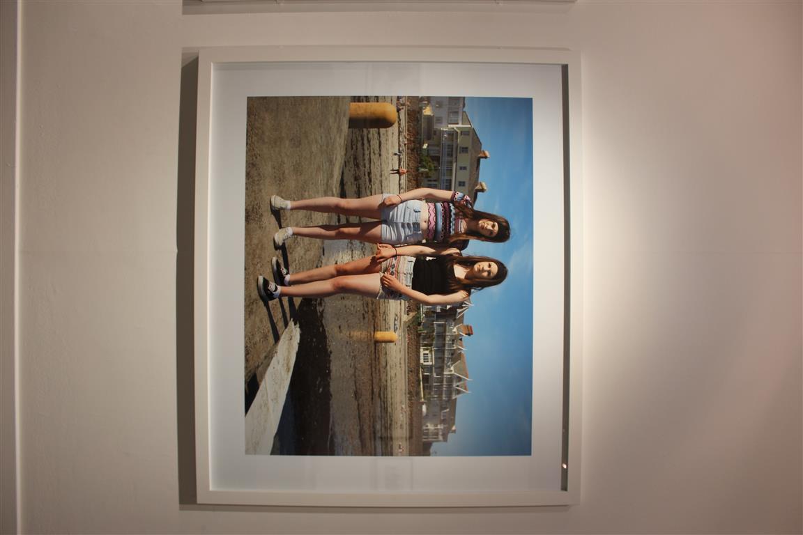
Although this image is well lined and edited, It also made me feel awkward and uncomfortable. This is because you can see the awkwardness that the two girls are feeling swell. Their body language and posture portrays discomfort and awkwardness.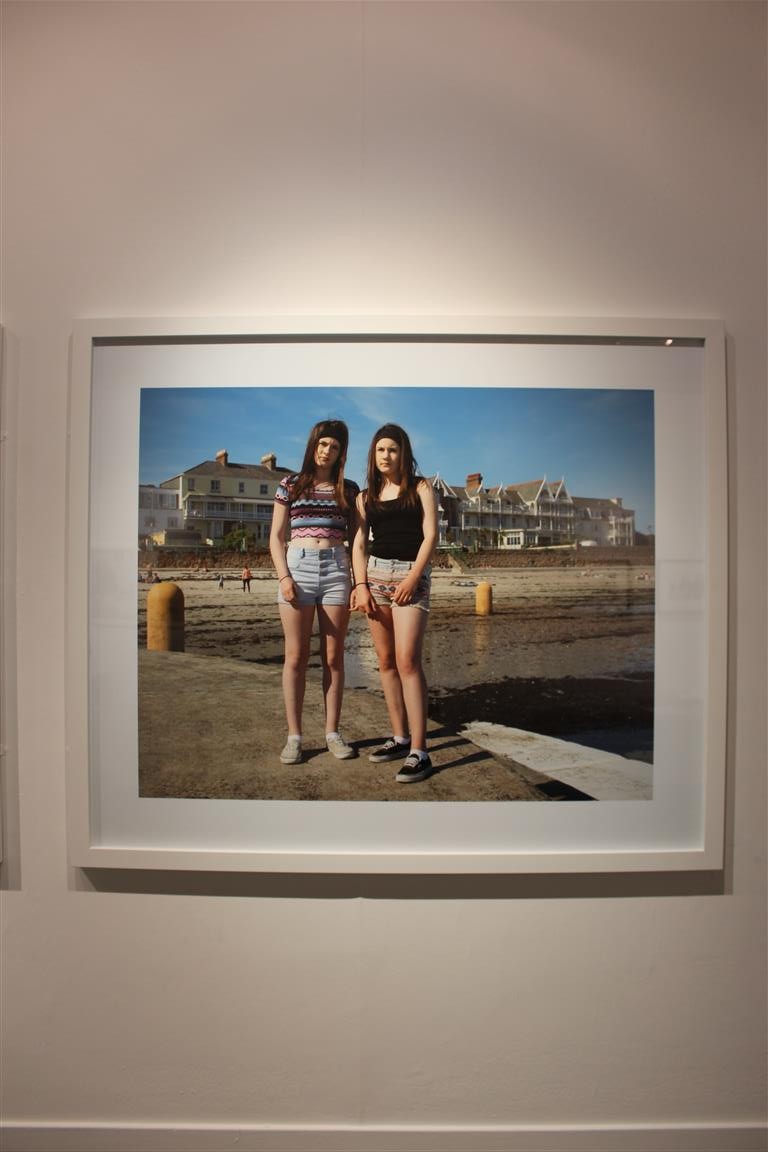
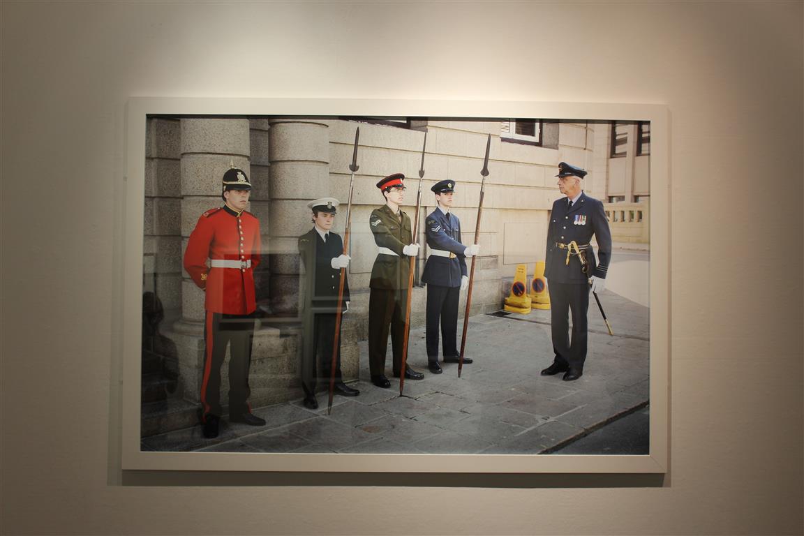
This photograph by Martin Parr, I felt was very linked to his style of work and similar to the style and themes that he portrays in his projects. This image is well lined and has little negative space so therefore is technologically correct.