Quintessence

How did Yury Toroptsov use the Jersey archive to help create his Fairyland exhibition? 

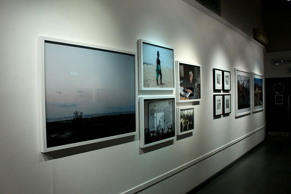
Recently I have been to visit the Quintessence photography exhibition at the Jersey art centre. This exhibition has been created in celebration of contemporary photography in Jersey and to mark a 5 year milestone for the Archisle. The work that was used in the exhibition was by artists who’s work was based on or inspired by our Island, Jersey. These artists were then asked to nominate a friend or a colleague to also participate in the Quintessence exhibition, these nominations were chosen in relation to their own work. The exhibition held a wide variety of photographs, which all held interesting context. All of the work was presented in clusters of each artists and were positioned next to their nominated colleague. I particularly took an interest in Yury Toroptsov, he presented some of his work from his FairyLand collection. As well as his own work he also included some of his research materials such as Jersey Archive photographs.

Yury’s ‘Fairy Land’ collection was created in 2014 when he came to stay on the island for 6 months. His first impression of Jersey was as well as it being a gorgeous Island, with lovely sunsets and beach’s he also came to the conclusion that “Jersey was a very mysterious and discrete place” (Toroptsov in FairyLand video 2014).

He wanted to get involved with the Island’s community and try and capture Jersey from his point of view. Yury’s first piece of inspiration was the traditional annual battle of flowers parade. He was digging in the archive and found a float from 1937. The float was called ‘FairyLand’.

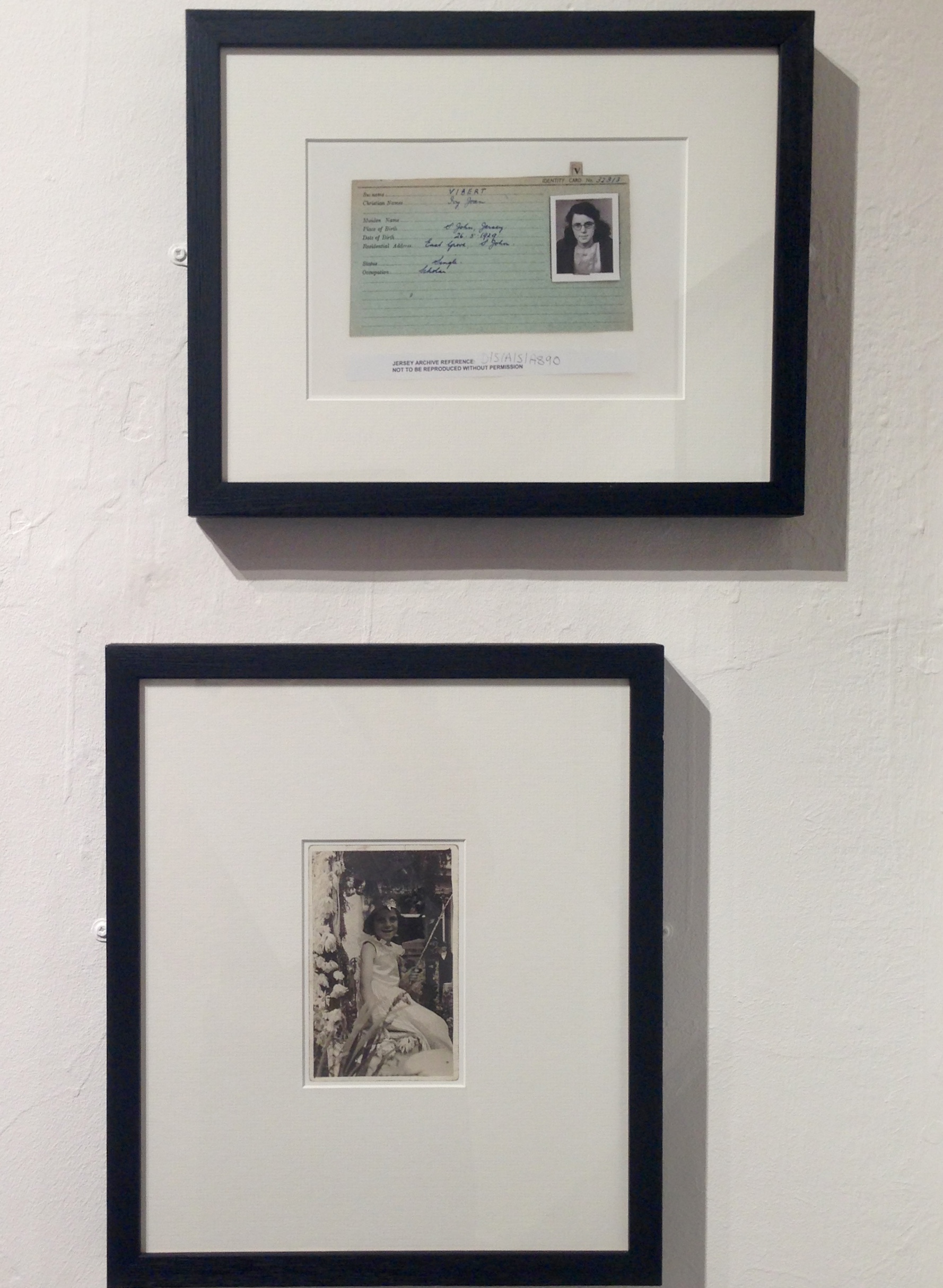
This float was created by Percy Vibert and his family, with his daughter Ivy Jean Vibert being the Fairy Queen of the Float. In Yuri’s collection of photographs that he chose to present at the Quintessence exhibition he included a portrait of the fairy queen. This portrait has Ivy Jean in the centre of the photo wearing a white dress with a flower crown. The photograph is in black and white, however it in rich in texture due to her being surrounded by flowers. I think this photo captures the innocence of Ivy Jean, and the innocence of the island. Another image that Yury presented in his collection is something that he found when looking up the Vibert family in the Jersey Archive. He found Ivy Jean Vibert’s juxtaposing portrait from when she was fourteen. This was her portrait from her German occupation registration card. Yury presented the two portraits together to tell the story of Ivy Jean growing up from a flower inspired queen to being a victim of the German occupation.

I really like that Yury has included archive photographs in his collection as I think it gives his work depth. It also gives the audience an understanding of were his idea’s have sprung from as well as making the collection have a wide variety of type of photographs to look at.
IMG_1013
Ivy Jean’s two different portraits

Another archive photograph that Yury Included in his work to help complete his collection is by Elsie Wright and Frances Griffiths called ‘Fairy offering Flowers to Iris’. Yury nominated Frances Griffiths as his chosen photographer, but he decided to include him work in within his cluster of photographs.

This photograph was taken by two children back in 1920, who were obsessing over fairies. They made a series of photograph’s featuring Elsie Write discovering fairies, which were edited on. I really like this photograph, firstly because of its age it has almost gone a sepia colour. Because of the absence of colour, it draws the viewers eye closer to the detail. For example the ringlets in Elsie’s hair, which have gone slightly frizzy, highlights the playful nature of the photograph. Secondly I like that it is surrounded by nature, which is similar to the portrait by Ivy Jean.
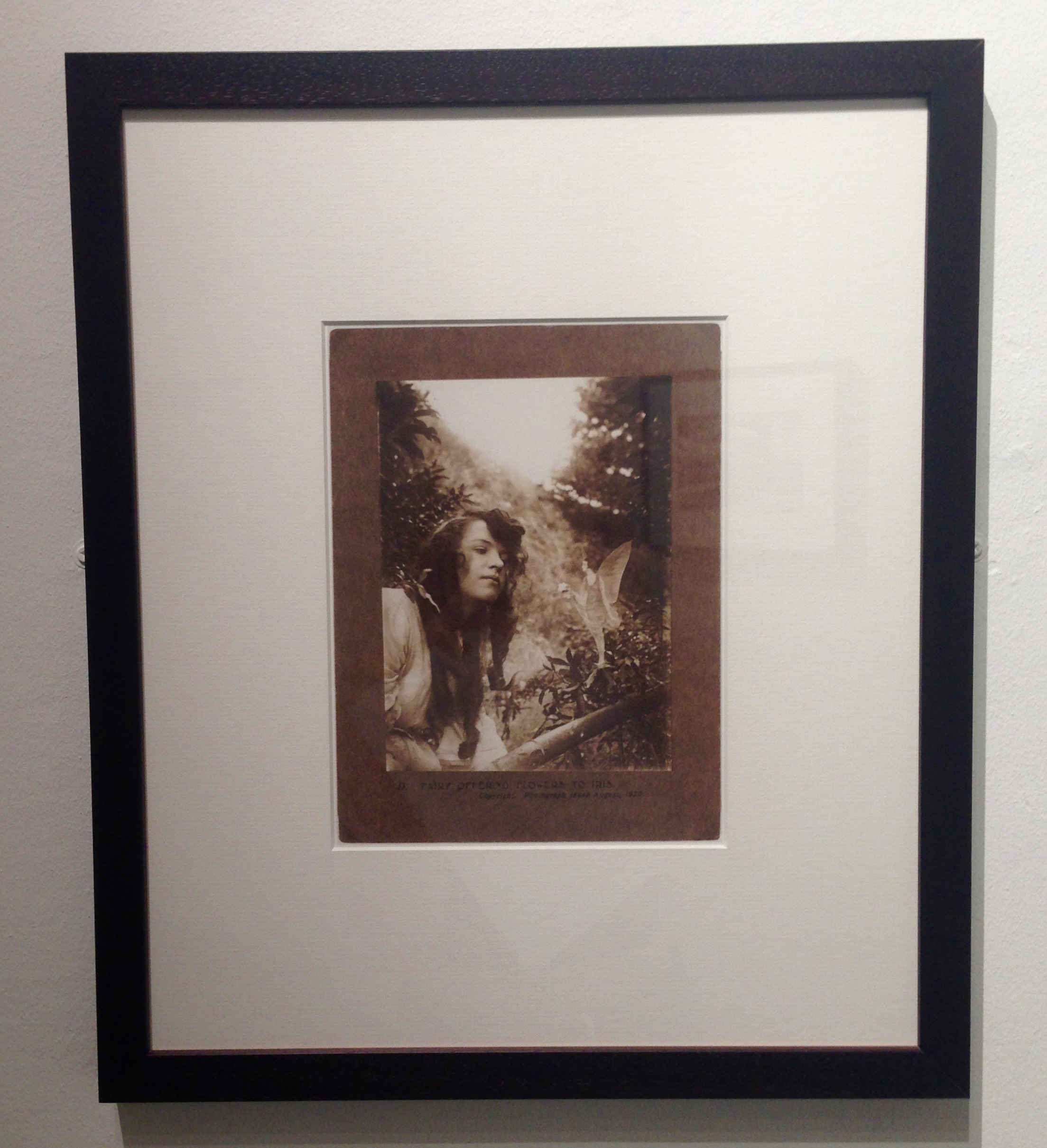
IMG_1011
Fairy offering Flowers to Iris

The final photo that I photograph that Yury presented is one of his own photographs called ‘Jess’. This photograph is in response to the theme of Fairy Land, with his modern interpretation. This photograph is perfectly composed and I believe it is a strong image.
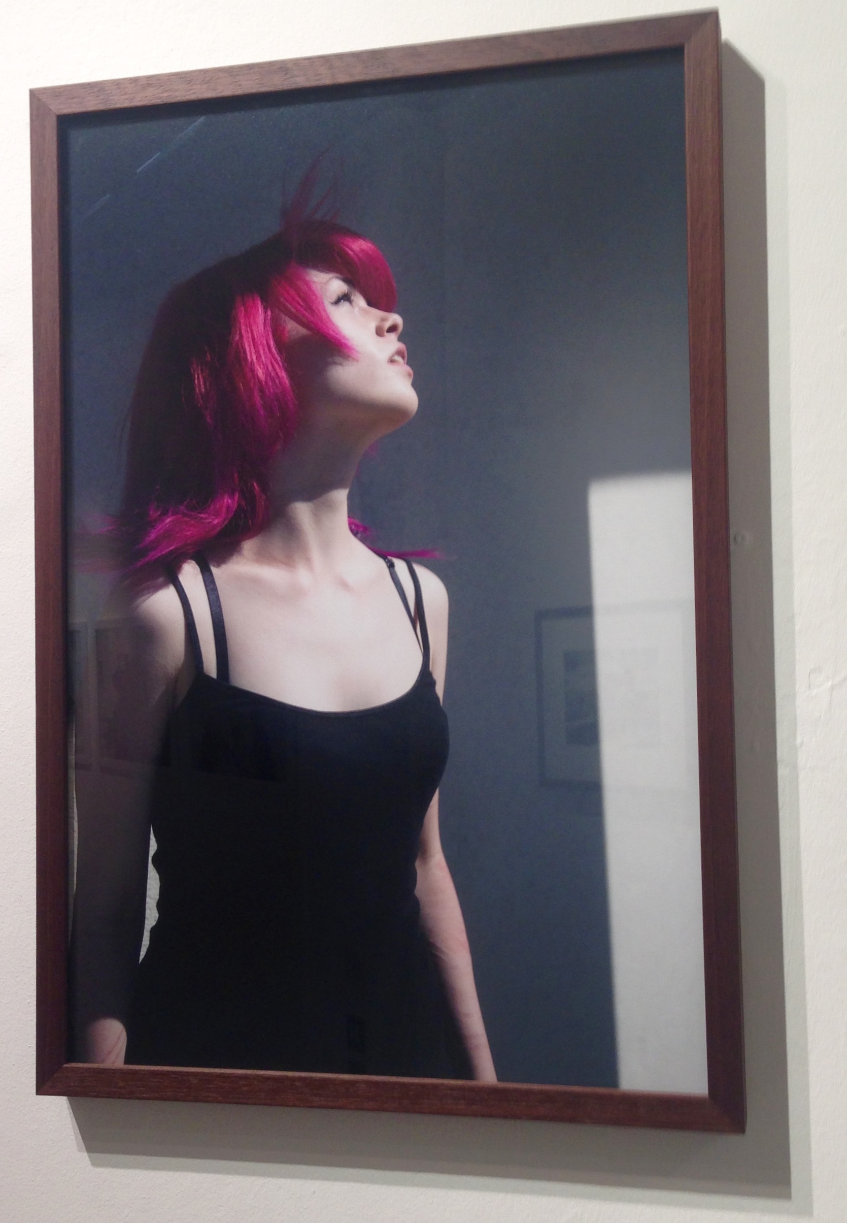
IMG_1012
Jess

I think that the colours used in this photograph are very important; the reoccurring black and the scars left of Jess’s arms are  foreshadowing the darker side of teen hood. However the obvious bright pink hair, which immediately catches the viewers eye foreshadows that last bit of playfulness left in teens. 

The photograph captures Jess looking up into the sky, which exposes the side profile. All of her facial features are well defined and create detail for the photograph. The hair is being blow backwards which adds another dynamic to the image and introduces a different texture to the eye. However I think this photograph would be more interesting if you could see more of Jess’s face. The expression on a persons face and the look in their eyes, can change a photograph and the story it tells.

In conclusion, I think that the Quintessence was a very good exhibition that provided amazing photographs that were “Socially and Politically Connected” (Gareth Syvret the 9th December  at the Jersey Art Centre) all of the work had interesting stories behind them.

QUINTESSENCE: Task 1 – Questions

Quintessence is a group exhibition at the Arts center in town, celebrating the first five years of Archisle: The Jersey Contemporary Photography Programme. The Archisle Programme, hosted by the Société Jersiaise Photo Archive promotes contemporary photography through an ongoing programme of exhibitions, education and commissions. Archisle connects photographic archives, contemporary practice and experiences of island cultures and geographies through the development of a forum for creative discourse between Jersey and international artists. The exhibition features works by:

Martin Parr / Tony Ray-Jones / Jem Southam / Michelle Sank / David Goldblatt / Yury Toroptsov / Elsie Wright and Frances Griffiths / Tom Pope / Peter Finnemore / Mark le Ruez / John Gibbons / Martin Toft / Finn Larsen

IMG_1699blog

We all have three parts to this tasks, Task one is a set of questions, Two is an essay and three is a photo shoot in response

  • a) Write down the first thought about the exhibition that enters your head when you walk in?

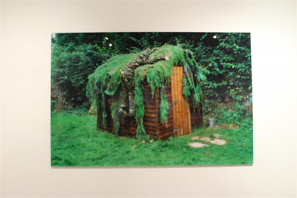
When entering the exhibition I felt the room looked particularly empty but somehow cramped in some areas of the room. There were few images that really ‘stuck out’ for me, However there was one image that did stand out and was the first image I really noticed even though it was behind me as I entered the room. The photograph produced by ‘Peter Finnemore’ and the image was called ‘Koan Exercises’ from 2004. This image stood out for me due to the extreme saturation and size of the image.

  • b) Look at all the images on the walls. Now find a set of images that you like/ don’t like and write short descriptions of them.

Throughout this exhibition I came to realise that there were a considerable amount of pictures I did not like and few that I did.

PHOTOGRAPHS I DID LIKE 

IMG_8121 (Medium)PETER FINNEMORE – KOAN EXERCISES IMG_8123 (Medium)FINN LARSEN – AL GORE WAS HERE. LLLULISSAT ICEFJORD, GREENLANDIMG_8122 (Medium) JEM SOUTHHAM – RED MUDSTONE, SIDMOUTIMG_8132 (Medium)IMG_8131 (Medium) JOHN GIBBONS – AND THE EARTH CHANGES SHAPEIMG_8126 (Medium)DAVID GOLDBLATT

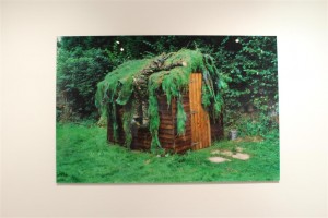
I came to like the images above for many different reasons, some because on the contextual meanings and some purely because they were aesthetically enjoyable. Peter Finnemores Koan exercises is the first Iam to evaluate as it was the biggest and brightest in the exhibition, aswell as it being the first image to catch my eye. IMG_8121 (Medium)This is due to the bright and extremely saturating greens of the photograph. I found this image to be cleverly edited as the saturation and contrast increase make it the most ‘attractive image of the exhibition. I also find the image draws you in due to editing but the as you get closer to further examine it, you come to realize that there is a person in the image aswell. From afar the photograph just looks like a camouflaged shed, but a further examination reveals that there is infact a person hidden within the foliage. I find this type of image interesting as there are two stages to the perspective of the image. one from a far and one up close.


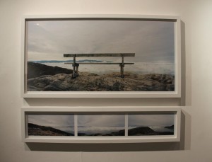
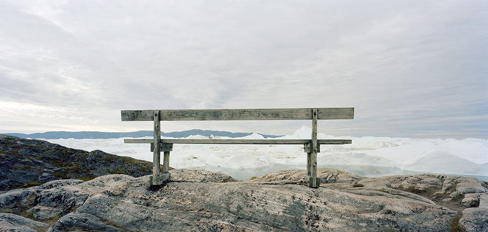
The two images by Finn Larsen were my favourite images from the exhibition. This is because I prefer ‘pretty’ photography rather than artsy and odd photography. These images I enjoy as they are both photographically correct Eg: well lined and edited. Rule of thirds is presented in the first image as there is an even and equal amount of space either side of the bench, aswell as the bench being horizontally straight.

IMG_8123 (Medium)The photograph has also been edited well as the colours of the image are seen as very clean cut and contrast well from the blues in the skies to the brown wood of the bench. I like how cold the image looks swell, how the focus of the image allows you to see the worn wood of the bench and the ice in the glaciers infant of the bench. However this project is infact about a landfill sight that is located behind the glaciers, Looking at the image on its own, one could not see that but researching the project it explains about the beauty in the nature of this image but you cannot see the ugliness of the landfill and garbage site beyond the ice.


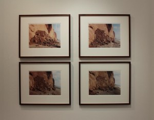
The following image is taken by Jem Southam, This image drew me in due to the ‘warmness’ of the image. The clean cut layout of the four photographs was also aesthetically pleasing.  I was also draw in by this image as you believe it is a photo sequence or time lapse so you try to ‘spot the difference’, but you then discover that the four images were actually taken at different times.  IMG_8122 (Medium)The vibrance of this image also attracted me as the saturated landfall contrasted well with the pale blue skies.


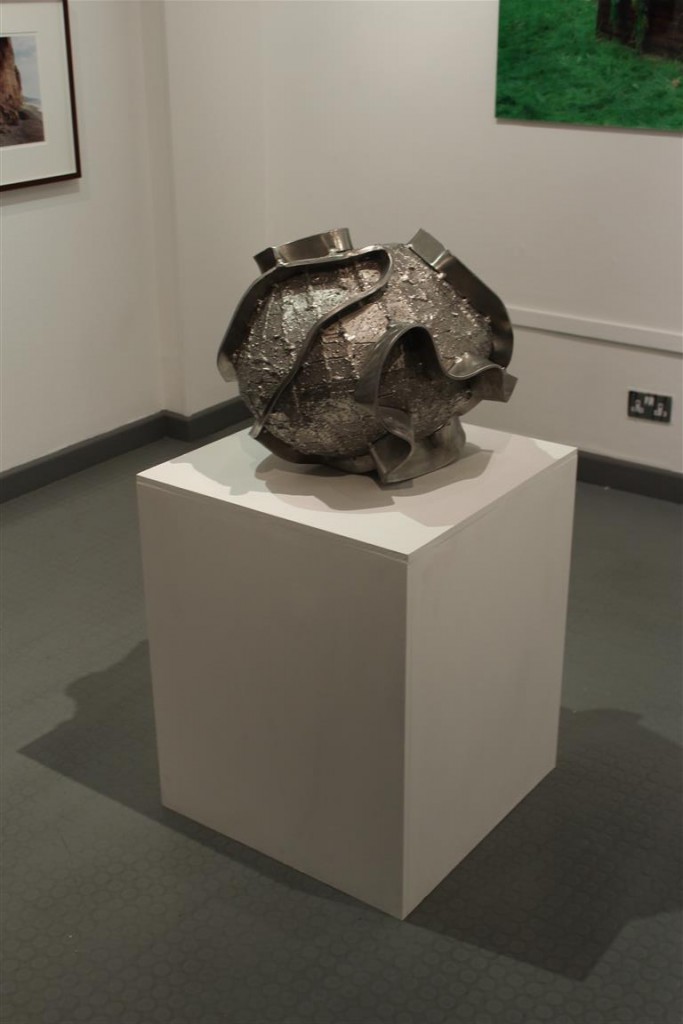
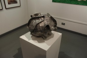
The next section of the exhibition was the only one of its kind in the room, a sculpture. This sculpture is by John Gibbons – And the Earth changes shape, I found this very intriguing as every other part of the exhibition was an image, in a frame, on the wall. This piece of work changed the feel of the exhibition as it was very different to the others. IMG_8132 (Medium)This piece of art I found interesting as the name obviously explains that the sculpture is of the earth due to the spherical shape, However there are rims that have been added on to the outside. This therefore interests the person viewing it and makes them wonder, why are there rims on the outside? why has the artist changed the sphere to have ridges on the outside?

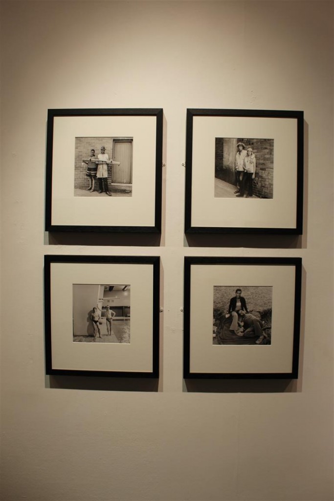
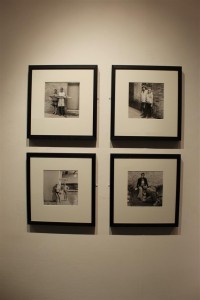
The next images attracted me within the exhibition purely because of the layout and clean cut presentation of the work. The colours of the photographs contrasted well with each other and well with the frames they were in. The frames and images being the same size and presented in the way they were complimented each other well and therefore when viewing you could see the link between them all. IMG_8126 (Medium)This artist was David Goldblatt nominated by Michelle sank a former ‘artist of residency’.


PHOTOGRAPHS I DID NOT LIKE:

IMG_8120 (Medium) IMG_8127 (Medium) IMG_8130 (Medium)

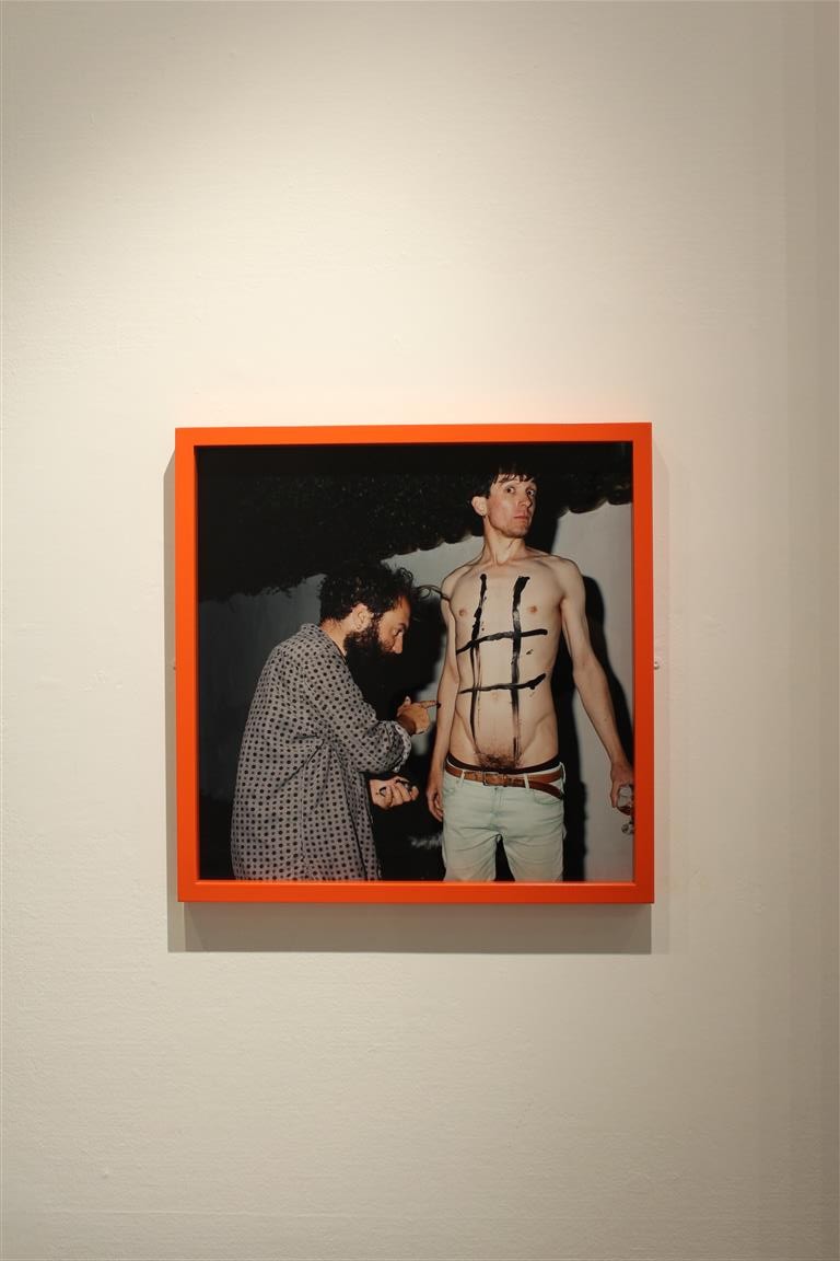
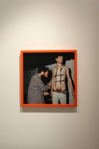
These three photographs I disliked due to their joint awkwardness. The photograph by Tom Pope I highly disliked due to the awkward and explicit nature, Im all for and explicit shoot and pushing the limits of ‘acceptable’ photography, but this image just made me feel very uncomfortable. IMG_8120 (Medium)However, some of the good things about this image was the frame and interest of it. The frame was the only coloured one of the exhibition so clearly caught the eyes of many. Even though the photograph is extremely awkward and uncomfortable for me, it did interest many of the people that viewed the exhibition.


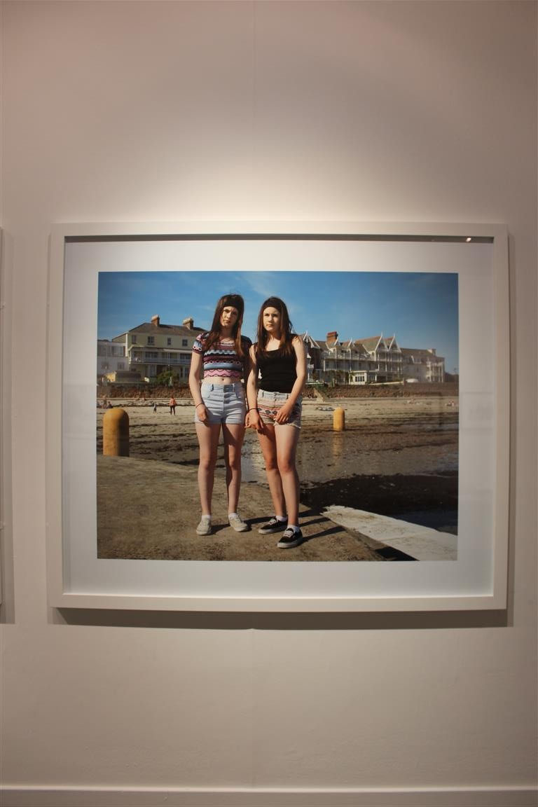
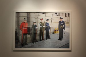
Although this image is well lined and edited, It also made me feel awkward and uncomfortable. This is because you can see the awkwardness that the two girls are feeling swell. Their body language and posture portrays discomfort and awkwardness.IMG_8127 (Medium)


This photograph by Martin Parr, I felt was very linked to his style of work and similar to the style and themes that he portrays in his projects. This image is well lined and has little negative space so therefore is technologically correct.
IMG_8130 (Medium)


Finished Print Products

I have designed two different Print products. One being a newspaper article and the other being a magazine layout.

The newspaper was the easiest of the two to design, as I am a to more familiar with the layout of a newspaper, as they all have very similar structures, whereas magazines have a much wider variety of layouts and design possibilities.

final newspaper double spread

I think the newspaper is very affective, and one of my classmates even asked if my images had been in the paper, because he saw a print out of it and thought it was a photocopy, or nice version of the newspaper print. I really like the simplicity of newspaper spreads and I feel that my newspaper spread has worked really well.

magazine spread final

The magazine was a bit harder, but instead of creating a design first, I started with the two colours red and black, creating the banner at the top and header, I then looked at the scope and how i could add it into my spread, and decided the best way to do this was putting a photo behind it. I then decided which images I wanted as background images, then made them slightly transparent. Trying to fit the text in proved much harder than it did with the newspaper spread, as magazines normally have much more creative ways of displaying text.

I do feel that both my products look very affective and somewhat professional and I am happy with how they have both turned out.

Tilt-Shift/ Miniature Photography

As I have been looking at large spaces and places where people will gather, I thought I should look at miniature photography, although I probably won’t use this technique within my own photos, I may be able to learn something that will improve the quality of my images and my project.

Tilt–shift photography is the use of camera movements on small- and medium-format cameras, and sometimes specifically refers to the use of tilt for selective focus, often for simulating a miniature scene.

citysrinkers_4 B Tal_2 ef bus

This kind of photography is quite intriguing, because there are some images where is difficult to tell if the image is of a real life scene or a model.

An artist named Serena Malyon took a very different approach to tilt-shift photography, taking paintings by Vincent Van Gogh and editing them through photoshop to create this tilt-shift affect. I think these images are a really good example of how this effect can really change an image and the way the viewer looks at them. This also forces the viewer to look at certain details more than others, and actually prevents other bits of the image to be seen clearly.
tilt-shift-van-gogh-starry-night-detail tilt-shift-van-gogh-red-chestnuts-in-the-public-park-at-arles-detail

tilt-shift-van-gogh-prisoners-exercising-detail tilt-shift-van-gogh-mountains-at-saint-remy-detail

tilt-shift-van-gogh-snow-covered-field-with-a-harrow-detail tilt-shift-van-gogh-the-harvest-detail

Some photographers go to great lengths to make effective tilt-shift images, for example, the art design group Skrekkogle made a giant 50 cents, with the scale 20:1, to make other objects look small. I quite like this idea, because rather than photographing whole models, or real life, they’ve decided to mix the two to make the images even more confusing for viewers.

50c_4-565x313

50c_9-565x385 50c_1-565x313

Olivio Barbieri mentioned that this kind of photography is good for showing off impressive structures, without all the business of crowds and it allows you to see the big picture without having to see the whole story.

 “I was a little bit tired of the idea of photography allowing you to see everything,” Barbieri says. “After 9/11 the world had become a little bit blurred because things that seemed impossible happened. My desire was to look at the city again.”

08la

Although I don’t think I will be using this style of photography within my project, I may try to experiment with it on a couple of images as I really like the effect, and it could add a different angle to my photo book.


Quintessence

Quintessence is a group exhibition which celebrates 5 years of the Archisle, which is a Jersey contemporary photography program made through the  Société Jersiaise Photo Archive.  The Archisle connects photographic archives to contemporary photography and experiences of Island life through the work of Jersey and international artists. Jersey is a small island but with internationalism, photographers are more socially and politically aware and have made many connections outside of the Island. To highlight the importance of connections and influences in this exhibition, Quintessence, the photographers have been asked to nominate someone who inspired their own work. “We do not travel alone; we take with us the histories, knowledge, influences and ideas of others; others we have met and other places we have known.”

We visited the exhibition on  Tuesday 8th of December, when I first walked into the room, the first thing I noticed was the way the photographs had been displayed. I think that the display looked professional and I like the way the photographs had been laid out because it flowed well visually . I noticed that there wasn’t any labels letting the viewers know who made the photograph, however there were booklets which included this information. I think that it would have been more user friendly to have the artist names with the photographs.I found myself constantly looking at the booklet and the photographs to try and find the artist which after a while became a hassle. I preferred this exhibition to the exhibition for 125 years of the JEP I think it was more visually attractive. In the JEP exhibition there was short paragraphs with each photograph explaining what was happening in the photo.  In this exhibition there was no explanation, when confronted with this question, Gareth the curator said that this was done deliberately so that the viewer would be intrigued by the context of the photo and do some further research into the meaning, rather than just looking at it once and never referring back to it.

My favorite photograph from the exhibition was the photograph by Finn Larson called ‘Al Gore Was Here’. I found this photograph visually attractive and I like the composition of the three smaller separate photographs had a line going through them which led my eyes from one photograph to another.  This photograph was simple but I think that’s what made it good. It was not until I further researched into this photograph that I understood the meaning behind it. Behind the photograph of what looked like a beautiful landscape, there was actually a rubbish dump hidden, which are at completely to different ends of the spectrum.  Often place are portrayed to be ‘ touristic-ally appealing’ but we rarely ever get to see the other side. I think in this photograph Finn Larson was trying to illustrate this divide, I think he achieved this in an intelligent way These photographs were the only ones displayed however he had a newspaper style booklet with photographs of the dump behind this landscape. After I found out the meaning behind the photographs I questioned why Finn had broken the small photographs that went together into three rather than using it as one, we then thought that he could be using the ‘breaks’ in the photograph as a metaphor for breaking the public’s perception of these ‘touristic-ally’ attractive places.
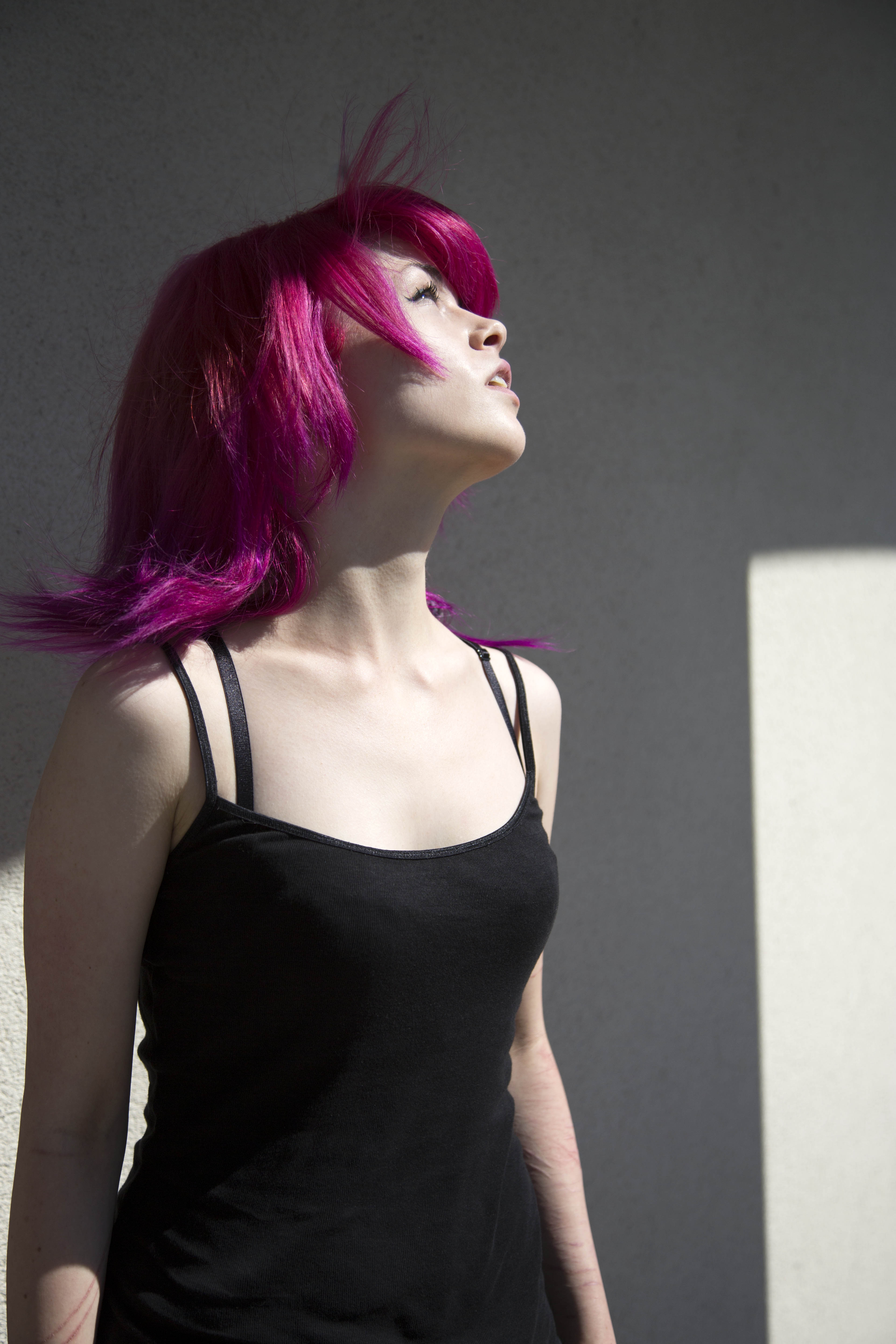
One of my least favorite photographs from the exhibition was the photographs by Iury Toropstov, called ‘fairyland’. I chose them as my least favorite because I didn’t really find any connection with the photographs and I didn’t think that they were very visually attractive. However I think that the portrait of the girl was quite powerful because it presented her as a beautiful mystical ‘creature’ which ties in with fairyland, however if you look closer she had bruises and cuts on her arm, showing that shes dealing with more deeper and serious issues that what she is presented to be. I also like the idea behind ‘fairyland’ and how it links in with Jersey’s history, however I don’t think the combination of photographs were strong or appealing enough.

Al nr 4_1000

Al nr 2_2000
Al Gore Was Here – Finn Larsen
haute vallee phone shot
Untitled from ‘Fairyland’. 2014 – Yury Toropstov
Yury Toroptsov
Jess St Helier, Jersey.2014 – Yury Toroptsov