Quintessence Archisle | Case Study

About personal study
The personal study needs to be finished by the end of the February half term and is a self directed study, you will make a hypothesis of what you want and are going to find out in this study. All of your work relating to this hypothesis must be enough to make up an entire book. You must find a subject and choose a story, finding a real issue and explore it. You’ll also be writing an essay about this of about 2,000-3,000 words.

Case study | Quintessence Archisle
This project brings together select Jersey photographers and international photographers in an exhibition set up by the Archisle. The Archisle was put together back in 2010 and has now been around for 5 years.
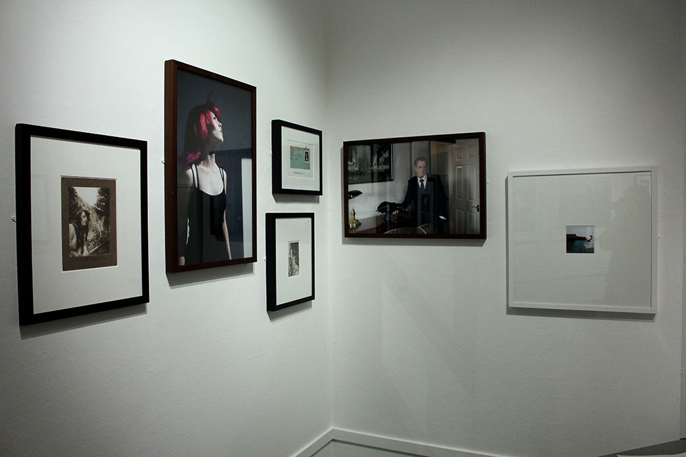
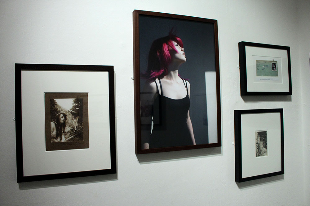
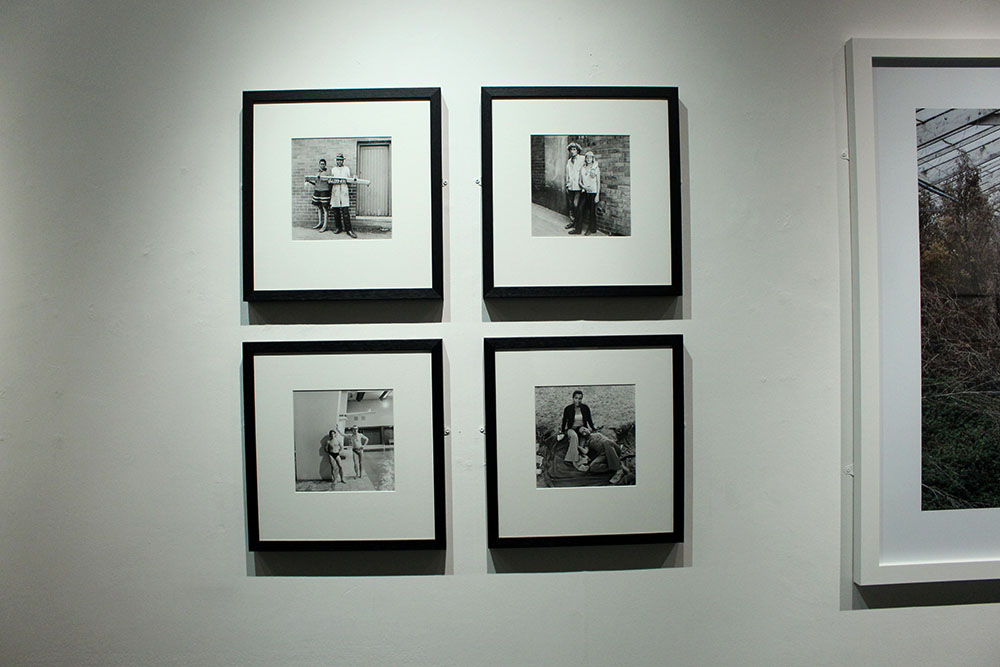
The Societe Jersiaise Photographic Archive in 2011 launched the Jersey Contemporary Photography Programme to promote contemporary photography in an ongoing programme of exhibitions as well as through eduction bringing Hautlieu into the mix. This brings in ideas to connect photographic archives, contemporary practise and experiences of island cultures. Jersey has become a big part in photographic history and has influenced many artists and new ideas. This exhibition celebrates the first five years of the Archisle. The exhibition contains work from 6 artists either from Jersey or whom have worked with the Archisle and they were each asked to come up with another artist who has inspired and influenced them. The artists are; Martin Toft – Finn Larsen, Tom Pope – Peter Finnemore, Michelle Sank – David Goldblatt, Yury Toroptsov – Elsie Wright and Frances Griffths, Martin Parr – Tony Ray-Jones, Mark Le Ruez – John Gibbons, Jem Southam.

Islandness | What I think
I really like the concept of islandness. To me it really makes sense as I do feel that as an island we are really bubbled from the rest of the world, unique. We tend to see the world differently to those living in the UK. For example, a mass murder in Jersey will hit headline news and be all everyone talks about for months and no one forgets but in America things like that seem to happen all the time and you lose count of how many killings there have actually been. This could be because of the fact that Jersey is so small and these things happen in America because it is so vast and huge but we do seem to reflect on the world in a different way. The idea of islandness is supposed to connect the thousands of islands across the world together. Our concept of identity is different to the rest of the worlds.
Our upbringing and culture moulds us and makes each of us unique. We can change with anything or anyone we meet or a place we go to and it can have good or bad results. Everything that you encounter changes you in one way or another, you can be somehow influenced by something in your life without even noticing it.

The Exhibition | My thoughts
answering questions

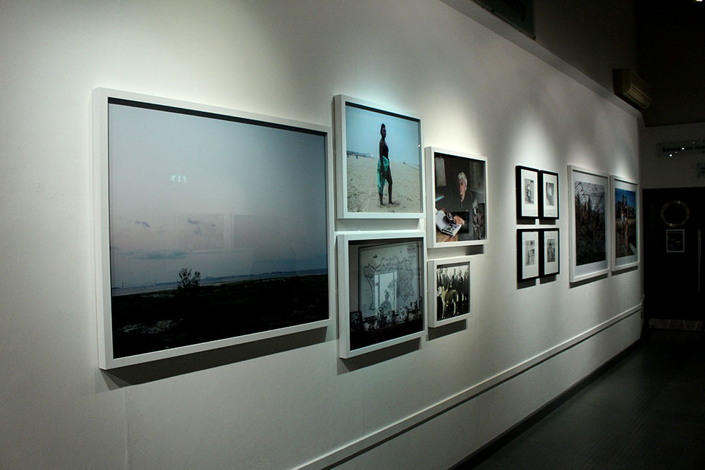
When entering the exhibition firstly I thought that it was in a much better location being in the Jersey Art Centre as it is quite a quirky place with the cafe beneath it and is in a more accessible part of town which a lot more teens and adults will likely know about. I also much prefer the layout of this exhibition compared to the Jersey Evening Post – Your Story, Our History: 125 Years Through a Jersey Evening Post Lens. This exhibition looks very professional and I prefer the white walls with the white frames on more of the images. I find the whole thing just looks a lot more professional and clear it is very well constructed and just altogether a better exhibition. I like that the Jersey photographers have their chosen artist/photographers work next to their own to show who they have been influenced and inspired by. I really like this idea of sharing and being influenced by other artists. I find it great that this exhibition is also able to sell the photographers work and showcase their talents to the community of local Jersey islanders. I have decided to do some further research on the work of Finn Larsen as I find his work captivating and after discussion at the exhibition I found that there is so much more to the beauty of the images that are shown in the exhibition itself which I am excited to explore further.

Task 3: Conduct further independent research and write a 1000 word essay

Try and think of an essay question (hypothesis) as a starting point for further investigation. 

Incorporate your answers to the questions above and any other notes from the exhibition text and gallery talk with Gareth Syvret (curator of the show). 

Include direct quotes from sources using Harvard System of Referencing. 

Illustrate your essay with images of artists work from the exhibition. Make sure you include name, title of work, year of production, dimensions, collections (if known). 

Link to shared folder from images included in the exhibition:

Task 2: Response to the Quitissence Exhibition

Upon visiting the exhibition, answer the following questions:

Look at all the images on the walls. Now find a set of images that you like / don’t like and write short descriptions. 

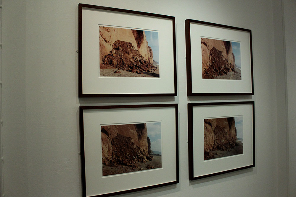
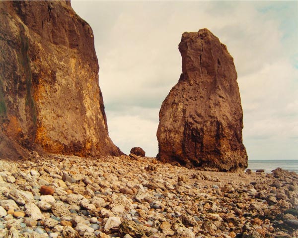
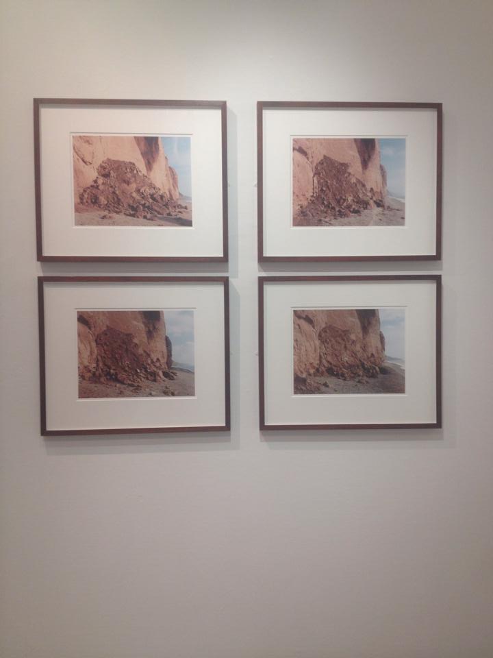
My first set of images which I favoured very highly where the works of Jem Southam’s “Red Mudstone, Sidmouth” (1995 – 1997) as I really enjoyed viewing the vibrant colours and diptych effect.

jem-s.
“Red Mudstone, Sidmouth” (1995 – 1997)

Ironically, I didn’t like Peter Finnemore’s interpretation of Southam’s images, as I felt they didn’t appeal to my style of photography. Finnemore’s works in the exhibition entitled ‘Koan Exercises, 2004’ Performance based photography is Finnemore’s speciality, and in my opinion , I don’t favour it to normal documentary-based photography as its too materialistic and stylised.

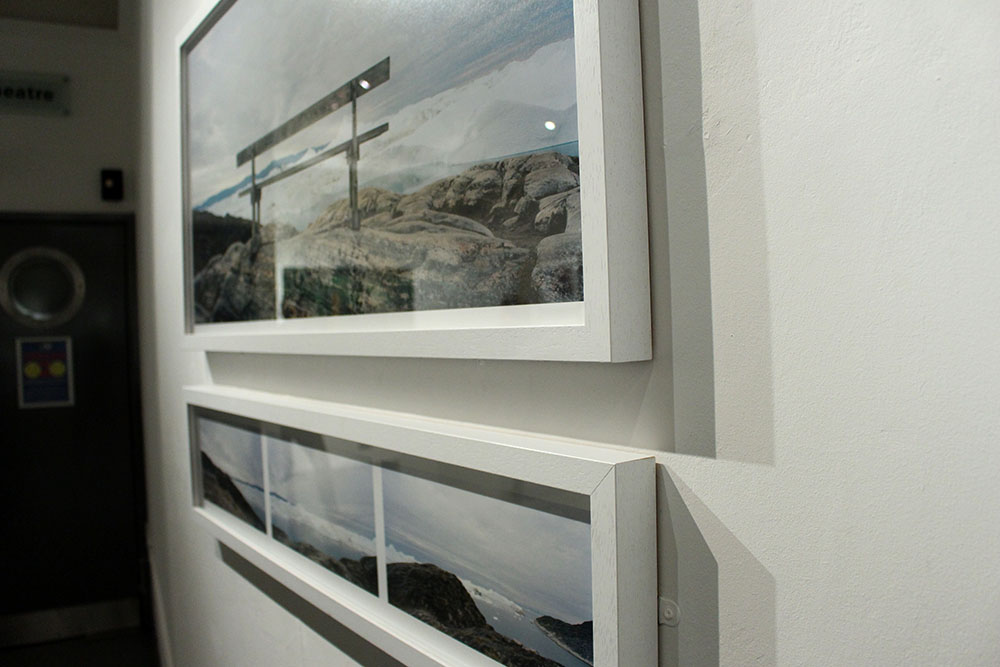
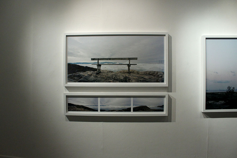
The second image  that I favour highly is Martin Toft’s   from the series ‘Atlantus’.

Using exhibition text, note down artist name, title of work(s),  his / her nominated colleague and consider the following:

Artist name:

Title of work (series): 

Nominated colleague: 

Title of work (series): 

What are the connections, influences, relationships between your chosen pairing of artists? Look also broader into the common themes, subject-matte, form, aesthetics, visual language, methodologies among your chosen artists and across others featured in the show. 

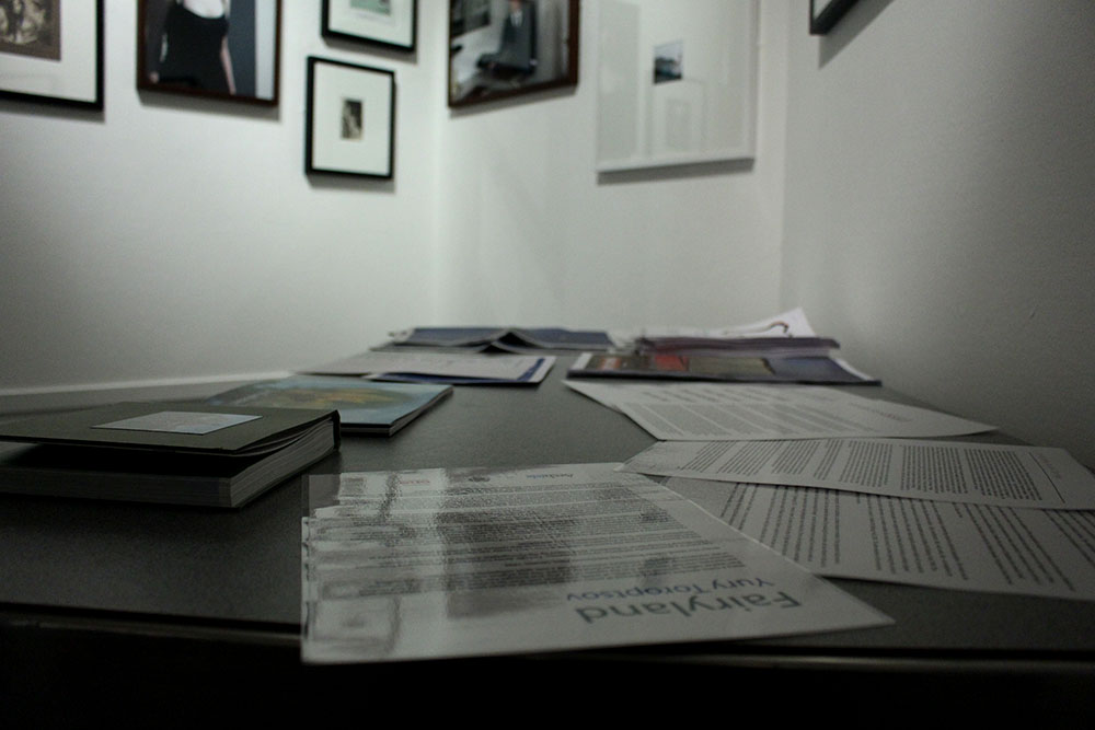
Have a closer look at the phonebooks and newspapers on show at the exhibition. This will provide a much deeper understanding of their work. 

Link to definition: 

exhibition response

In response to the quintessence exhibition we have to:

Task 1:  Read the case study and think of at least 3 questions to ask and find answers to when we go on the visit.

Task 2:  answer the following questions:

  1. Write down the first thought about the exhibition that enters your head when you walk in?
  2. Look at the set of images on the wall. Find a set of image that you do and don’t like and write a short description about them.
  3. Using the exhibition text, note down artist name, title of works and nominated artists and consider the connections, influences and relationships between them.

Task 3: Conduct further independent research and write a 1000 work essay.

Task 4:  plan a photo shoot and make a set of images that respond to your chosen artists paring in your essay.

Exhibition

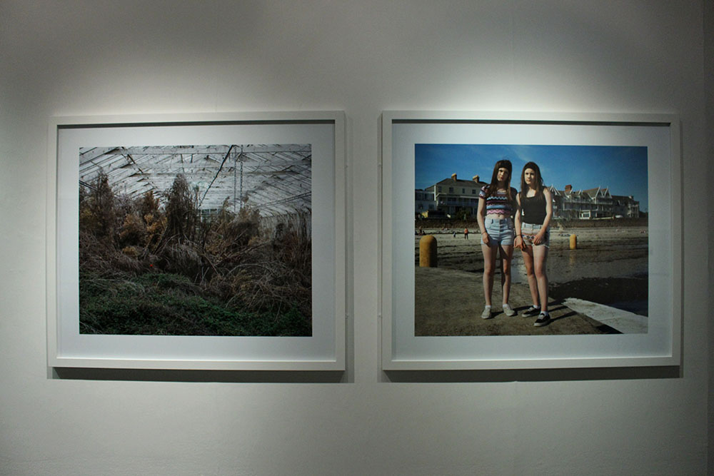
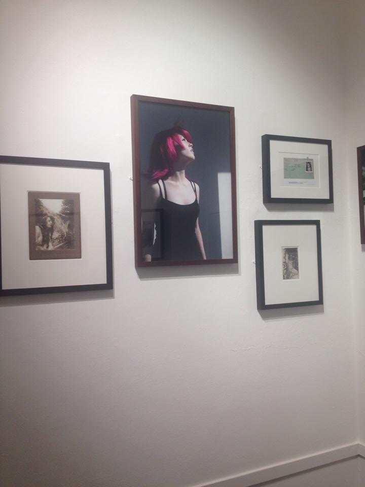
Yesterday, we went on a photography to the art centre to view the most recent exhibition that our teacher, Mr Toft is in. As soon as I walked in I was pleasantry surprised when  I saw how the photographs were displayed. I liked how they were mostly all uniform with white picture frames, and especially the size of the images as they were large which made it better to look at. My favourite photograph in the exhibition is one of the photographs that Mr Toft took, the one of the Tamika Tolliver in Ausbury Park, New Jersey. This portrait is really stunning in my opinion because I love the contrast between her skin colour and the bright green sarong that she is wearing. The two colours really compliment each other, her skin looks flawless and is a lovely tone. I like how the background is clear of people and the strip of sand goes on and on. Her pose is also very striking and I like how shes looking at the camera with little emotion, it makes the photograph more effective. The story behind the photograph is also interesting as the idea have come from an achieve photograph, as Ausbury park was place where rich people use to go and relax and is now for any member of the public.

timthumb

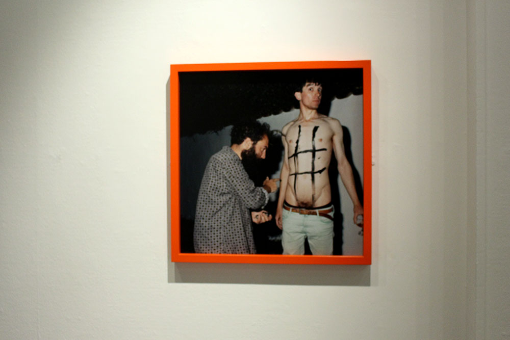
I liked how Tom Pope’s photograph was in a different colour frame, the orange was very striking as the photograph was by itself, it needed something like that to make it stand out. His image is very much performance photography is exciting to look at, however, isn’t the style of photography that I am leaning towards.

IMG_1767blog

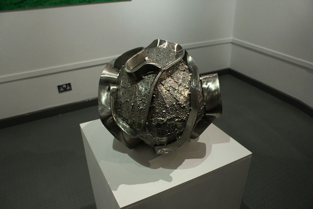
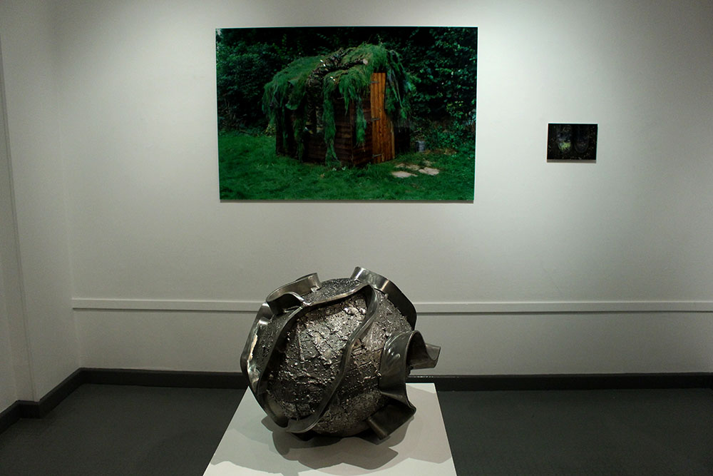
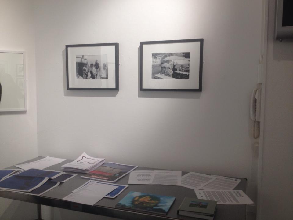
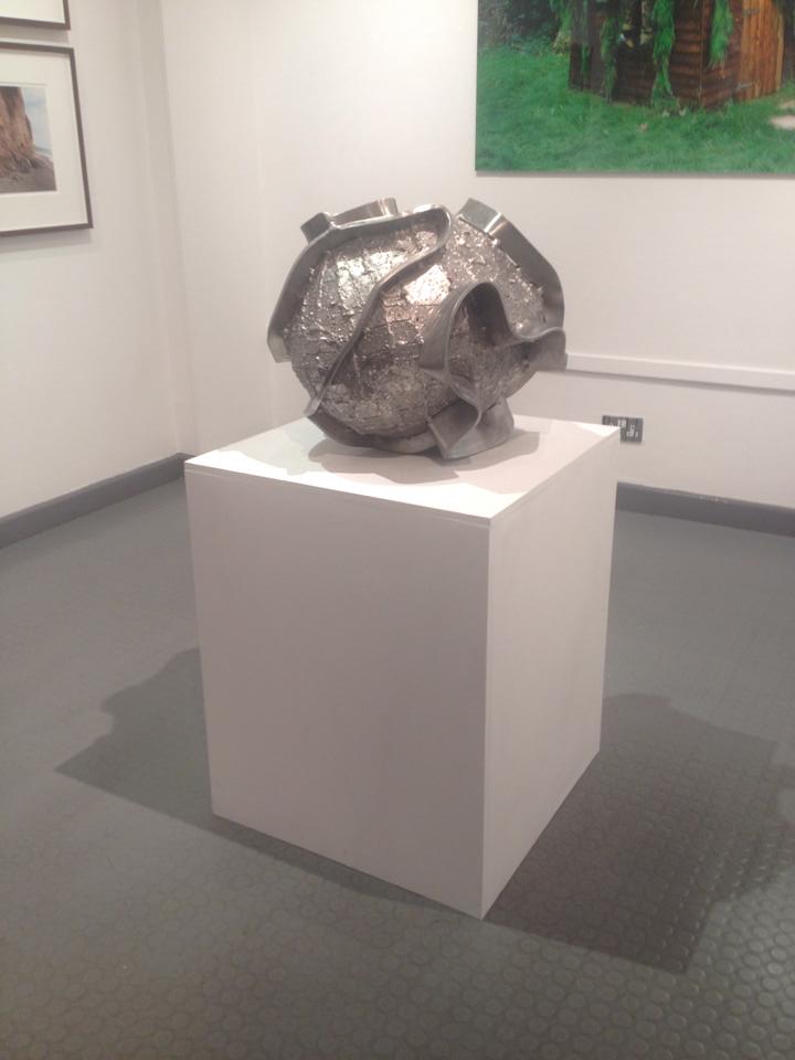
I liked how the exhibition had an extra something to it, as the photographs had to chose a photographer that inspired them to take images in Jersey. The photographs of their chosen photographer were placed next to their images which enabled me to view the connection between the old photographs with the new, using unique ideas.  These achieve pictures were much smaller which was important because the main images were the ones which were taken more recently. Overall, I liked the layout of the exhibition and the way the pictures were presented largely in a smaller space. The impressive sculpture made by John Gibbons really tied the space together, it was very artistic and well presented on the white stand.

Government House

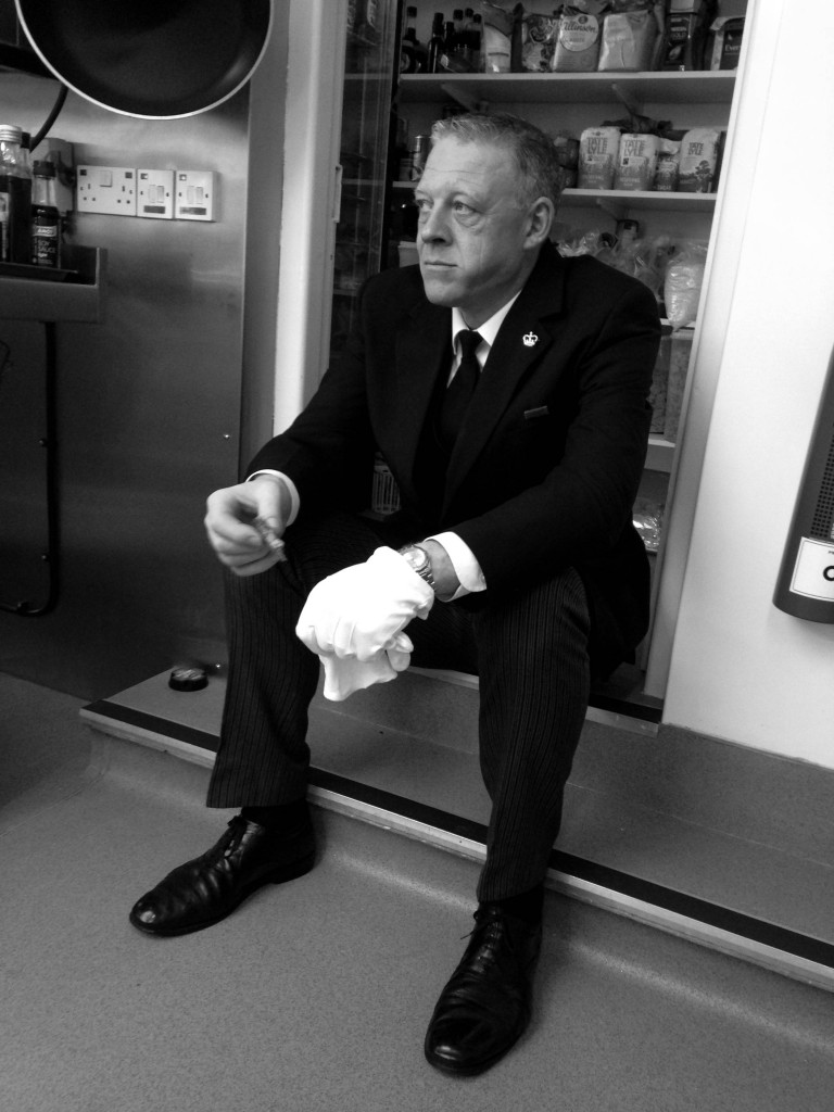
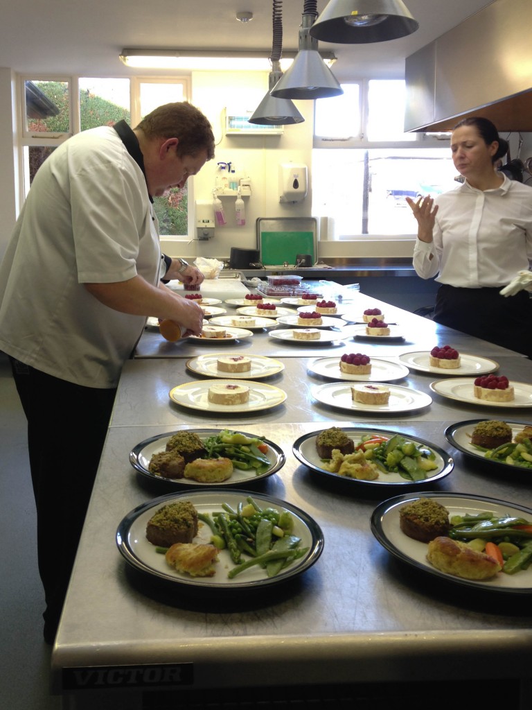
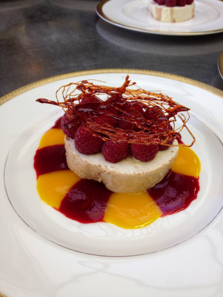
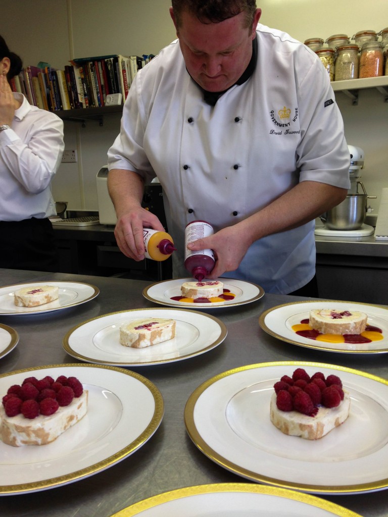
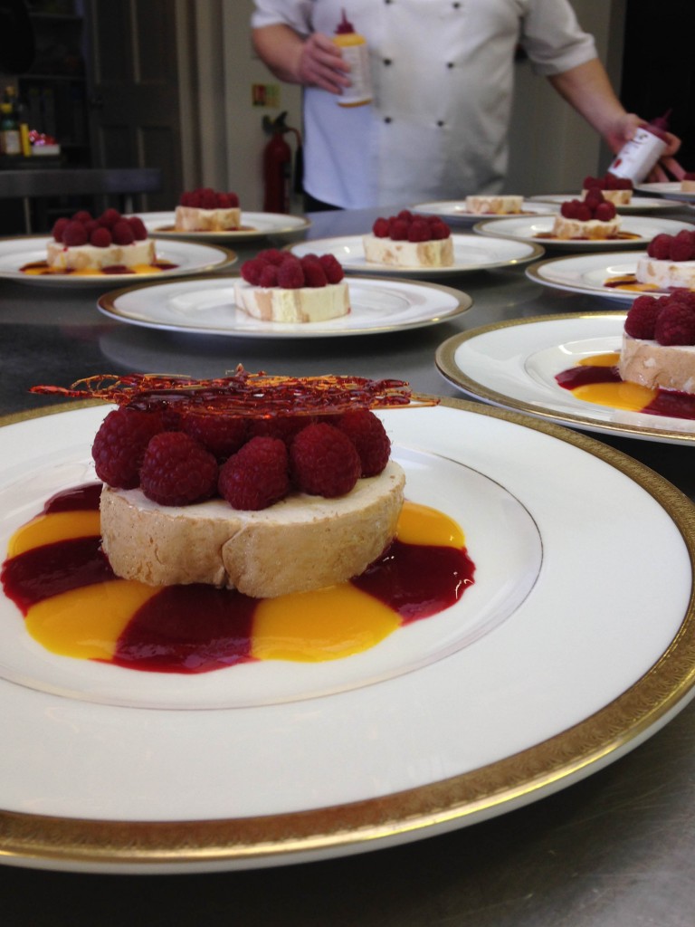
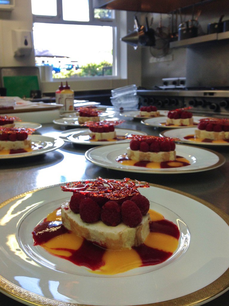
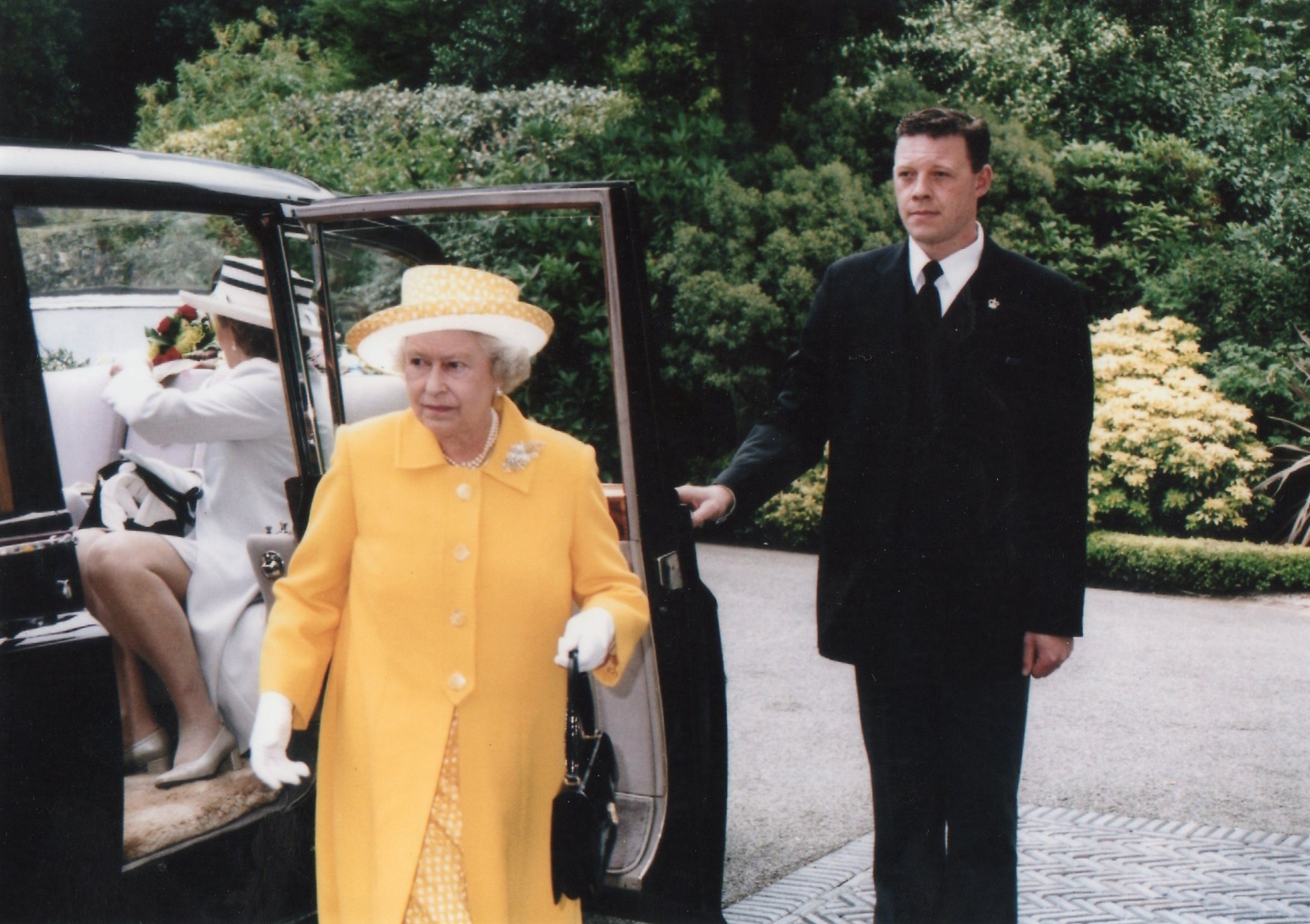
As I work at Government House I have the opportunity to take photographs of what I experience during my shifts. I worked at a lunch party yesterday and as we wait for the bell to ring to collect the plates the chefs prepare the next course, so I took a few images whilst waiting. I used my iPhone so the picture quality isn’t as good as my other photographs. It shows the life behind doors at government house which is an interesting topic.

IMG_5585

IMG_5589 IMG_5592

IMG_5587

IMG_5595

IMG_5597

img077

img078