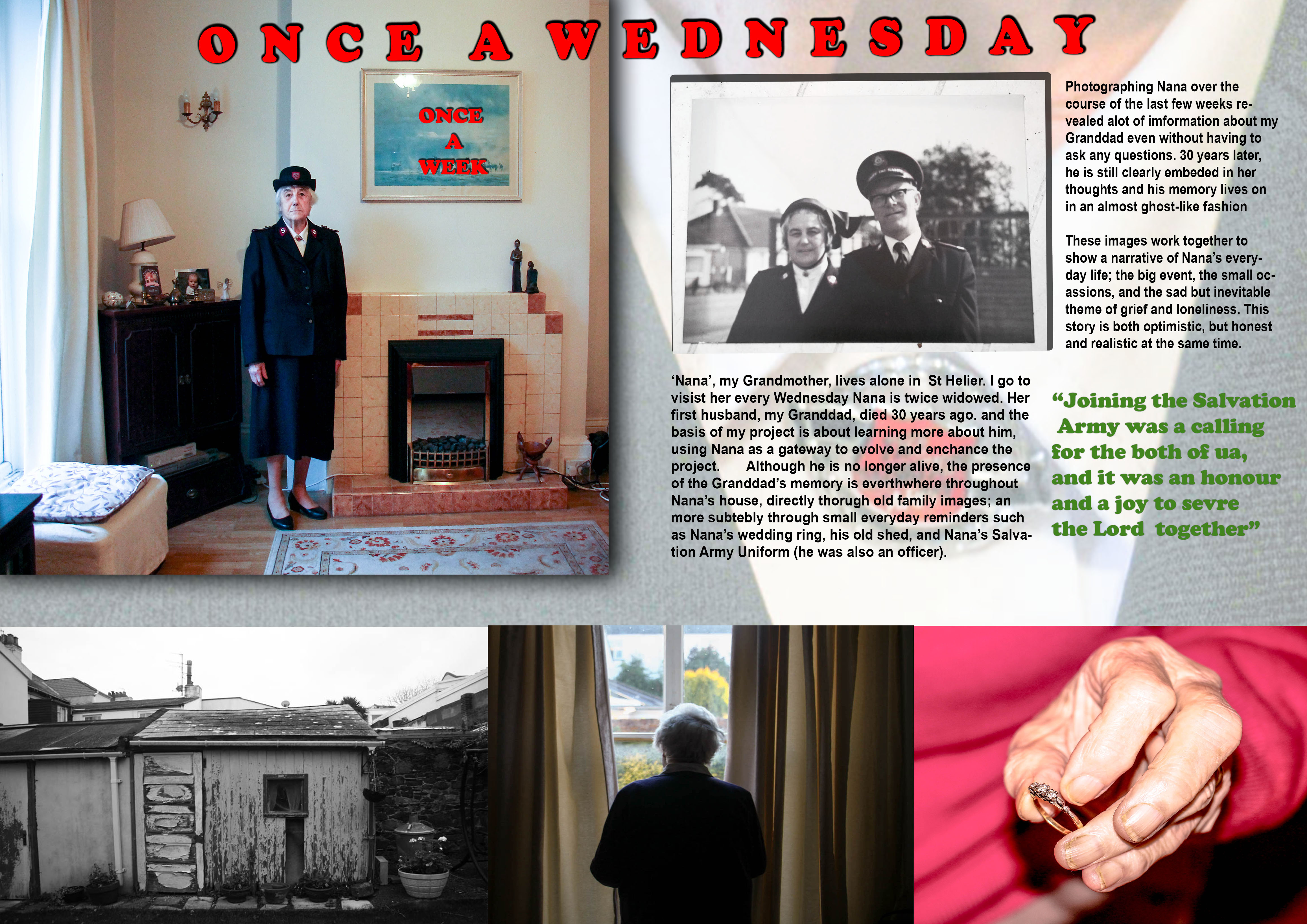
This is the revised edition of my first design. I wanted to make a much more traditional design template, one which is clearer and more suitable to the type of images I am currently making over the basis of this project. I included the same three images from the first story, however not as a triptych this time.
I felt a lot more confident making this design. I struggled making the the first design and was not happy with it. I learned a lot of skills however and used it as practise for this design
Layout
I changed the establishing shot which was originally Nana staring out of the window, to the portrait of her in her Salvation Army Uniform. I decided that this was a strong establishing shot because it directly introdues the theme of the Salvation Army, allowing the link with my Granddad to be easily conveyed as a result. Visually it is also a stronger image
This design, like the previous one, includes a triptych.
- The left-hand image is a picture of the shed in Nana’s Garden – used as the background picture in the previous design. I like this image, especially in black-and-white, because the run-down appearance of the shed in addition to the images high contrast made possible in black-and-white, means the image has a very strong texture, subsequently giving it a powerful and defining presence in the story.
- The middle image is the photo of Nana looking out of her window.
- The right-hand image is the one of Nana holding her ring
I decided for this design not to include any image captions or descriptions. This is because I wanted to create a story which was much more subtle, not giving as much away about the story. Also I felt that in my last design I included far to much writing, and this time around I wanted to simplify the layout.
The relationship shot for this picture is an old photograph of Nana and my Granddad. This links directly to the establishing shot of Nana, the through link of The Salvation Army, as Nana is wearing her Salvation Army Uniform in my portrait of her, and the archive image shows them both on duty, with their uniform on. The Army played an important part in my Granddad’s life and Nana’s also, and so I felt this was a good theme to establish for this story, as it establishes a link between them.
The background image is a close-up shot of Nana’s Uniform. This image confirms the theme of the Salvation Army as the main aspect of the story. Visually it is a good image to use as a background because it allows for text to be written over easily whilst remaining clear.
The use of drop shadow, which I have included for some of the images is effective because it helps to make the image visually stronger. I have done the same for the text in order to make it bold and easy to read, as I found on reflection that the text in the first design was visually quite weak. The red colour of the text further adds to the bold presence.
The quote is a reference to my Grandparents service in the Salvation Army. I chose this quote to make it relevant to the underlining theme of the Salvation Army, further adding context to the narrative.
Evaluation
Overall, this picture story is much more better than the first one. The images flow more on the page and the story and text fits much cleanly on the page. The inclusion of the drop shadow for the images and creates for a three-dimensional perspective, adding strength and depth to the presentation


Your understanding of design/layout is much better. Still thinks it needs a few weeks. Not sure about the either Font type and colour – its to garish. If you want a strong colour choose maybe pink/red in Nanna’s jumper. not sure about ‘Once a Wed’ inside frame on wall. Also extend margin around the entire page so that image float inside – experiment with drop shadows if appropriate