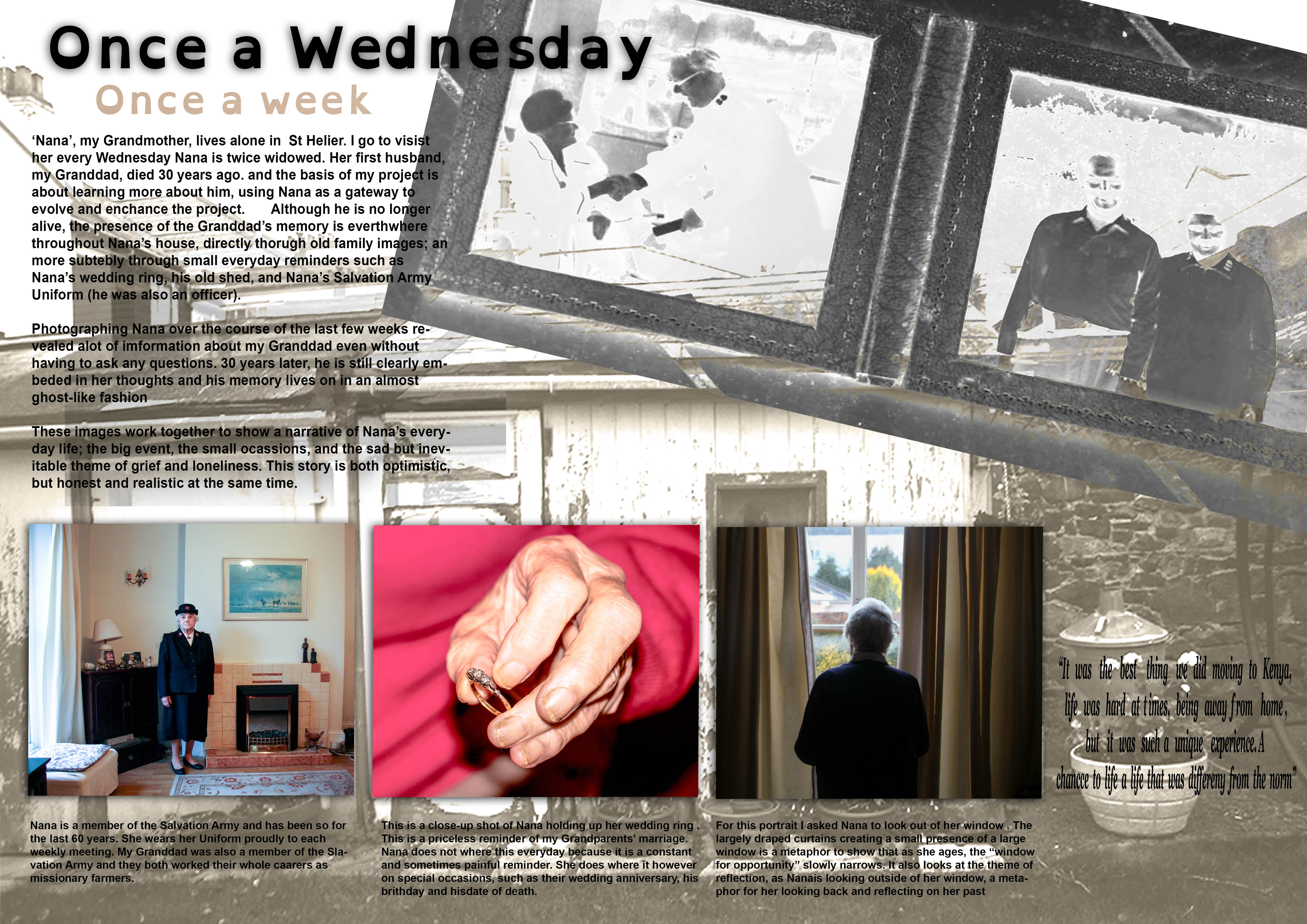
I struggled in the making of my first picture story design. I was just working out the different process and photo-shop skills needed to make a photo-story and so I found the process to be very challenging. I had no clear plan of how to go about making my first design and so tried to be as creative a possible in the designing process, changing my themes and ideas as I went along.
I started of by selecting my title. I decided on the title of ‘Once a Wednesday, Once a Week’ because it was the title I had previously used for by AS Exam Book I made and it works quite well.
Main Images
The three images in this story work as a triptych
Left-hand image: This portrait of Nana in her Salvation Army uniform is an ‘environmental ‘ shot. This is a good image to use as it is a strong and confident portrait that clearly establishes the theme of the Salvation Army. There is a sense of order to this image, it is calm and well considered, and therefore allows the viewer to reflect the theme in a focused way.
Middle Image: The image is a close-up shot of Nana holding her wedding ring which she wore when she was married to my Granddad. The close-up shot is very reflective of the style of Martin Parr (extremely close-up abstract style and with the use of flash), making for a strong, detailed image. Using a similar style to Parr was important in this instance in creating a raw and authentic image. For example, the rugged appearance of Nana’s hands which this style achieves highlights somewhat a biopic of her life, one which has been of hard-work and sacrifice to raise children whilst devoting herself to her work/religion at the same time. This makes the story more realistic.
Right Image: The last image of the series shows Nana staring out of a window in a reflective manner. This image is contains a lot of metaphors which I have explained in the image description. I find that this image works very well as an establishing shot because it is a strong image but at the same time is not too specific and keeps to the subtly of what I am trying to convey
Background Images
The way the background images have been arranged is quite unusual. The old photograph of Nana and my Granddad that I have included has been blended in the layer mode to present it in a silhouette style. This is a feature I have embedded into the story which explores my how Granddad and his memory almost a ghost-like apparition to Nana – still existent but an old and fading memory. The other image, a black and white image of a shed in Nana’s garden, again is presented in a very dream-like manner.
Text
The main body of text briefly explains my project learning more about my Granddad, and the work I have been doing with Nana in relation to this project.
The captions explain my image choices and provide context to the story in a narrative-like way.
I have included a quote which is a comment Nana made concerning the time they spent in Kenya. I included this quote because it explore how Nana often reflects into the past in a fond way.
Evaluation
I have worked hard in making my first design and it has been a good practise. The actual design however is very complicated and a bit confusing in terms of layout, especially the text. For my next design I think it will be a good idea to go for a slightly more traditional picture story, as the type of narrative I want to convey is more suited to this. I also need to reconsider my image selection to be able to give a more directed narrative.

