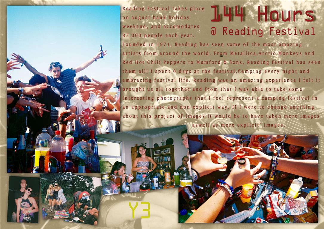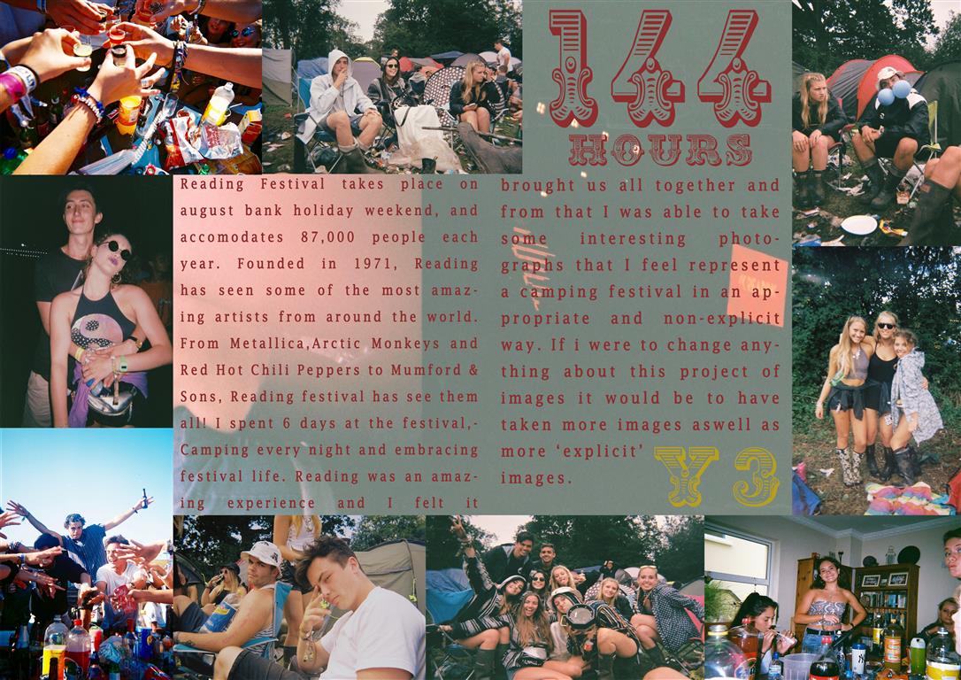
 The above picture story was the second I edited and when completed was my favorite also. This story is presented more as a double page spread, with no drop shadows or highly edited images. I increased the vibrancy in all of the images to bring out the colors. I felt this was a cleaner and less artsy layout due to the symmetry and images laid out all in line. My favorite part of this layout was the title text, as it was very bold and very different to usual titles I felt it fit well in this design. This design also had a background image, this image was a corrupted photograph from the broken camera and I felt it fit very well as a background as there is nothing important within the image apart from a few corrupted images and water marks.
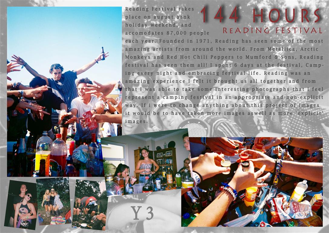
 This design was the third and least favorite design, The same layout as design 1 but with different color schemes and effects. The text should have been changed to another color as i feel it blends too comfortably with the background. I feel this story looks more of a poster than a picture story, The story is far from what i set out to design when i started but was an experiment and directed me towards editing my other stories more as i could then see what they were missing eg: drop shadows.