Creating Your Own Picture Story

How to: Design a picture story using PhotoShop – 

making a picture sotry

bella grace
editing progress [title + caption needed]
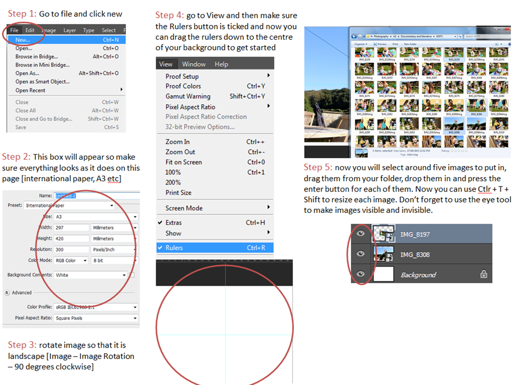
  • For these images make sure that your design is right to the edge and once you have finished you can then make a board round the outside. Your eyes are ALWAYS drawn to the right side of the image first as it is right there as soon as you open the page so here is usually where you will put your largest establishing shot image. You will also need to come up with a title and a small caption explaining what the story is about. Now experimenting with your images and how you want them to look will be a lot easier.
  • save experiments as JPEG’s and put them on the blog
  • remember to use the ruler tool to create an even amount of spacing between each of the images
  • Ctrl + H hides the ruler tool for when you want to have a look at your picture story as it would look when printed
  • Adding text – go to Windows then ‘Character’ to get the little editing box for your text. To get text all you do is click the T button down the left side of PhotoShop.

Experimentation with different designs

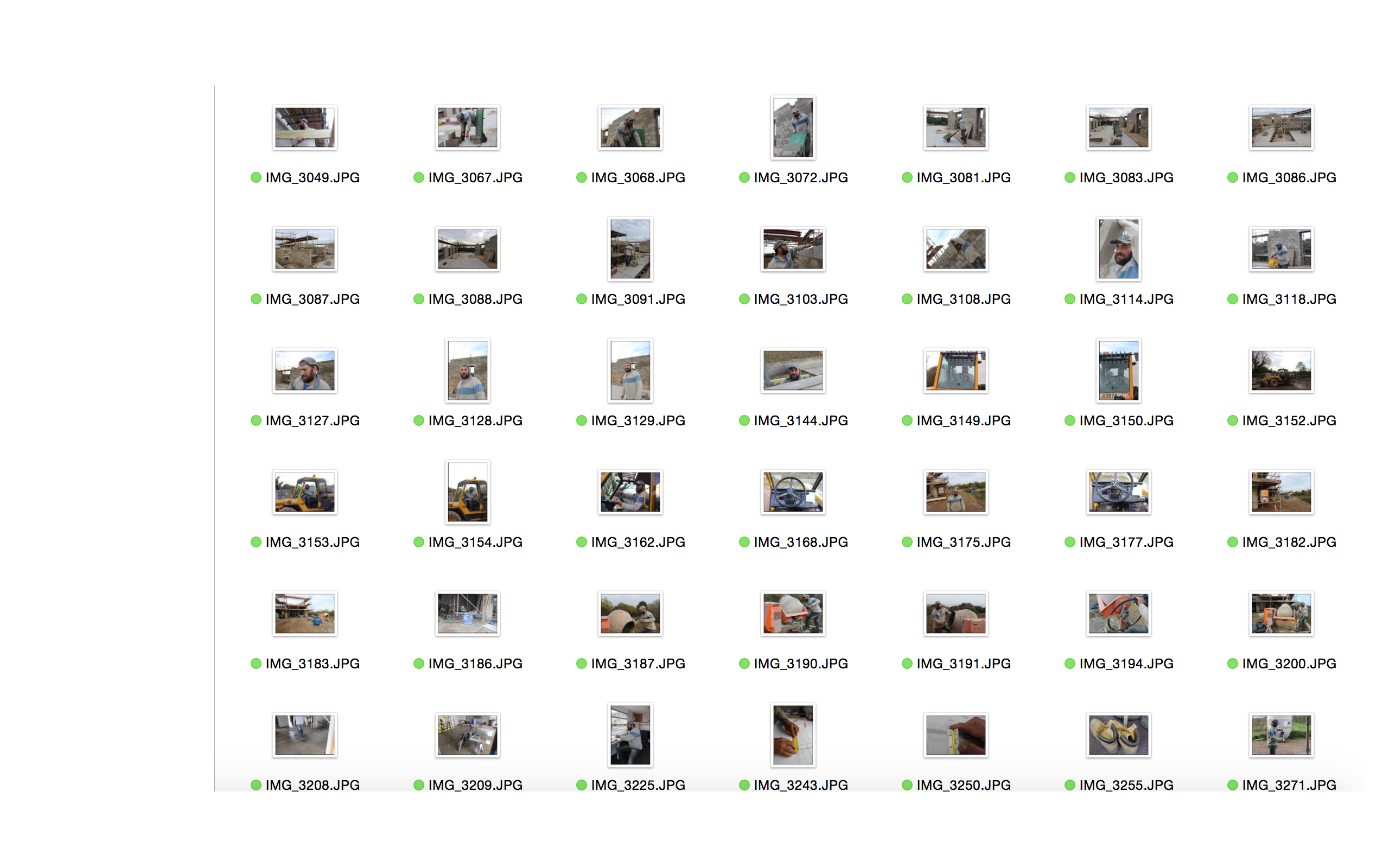
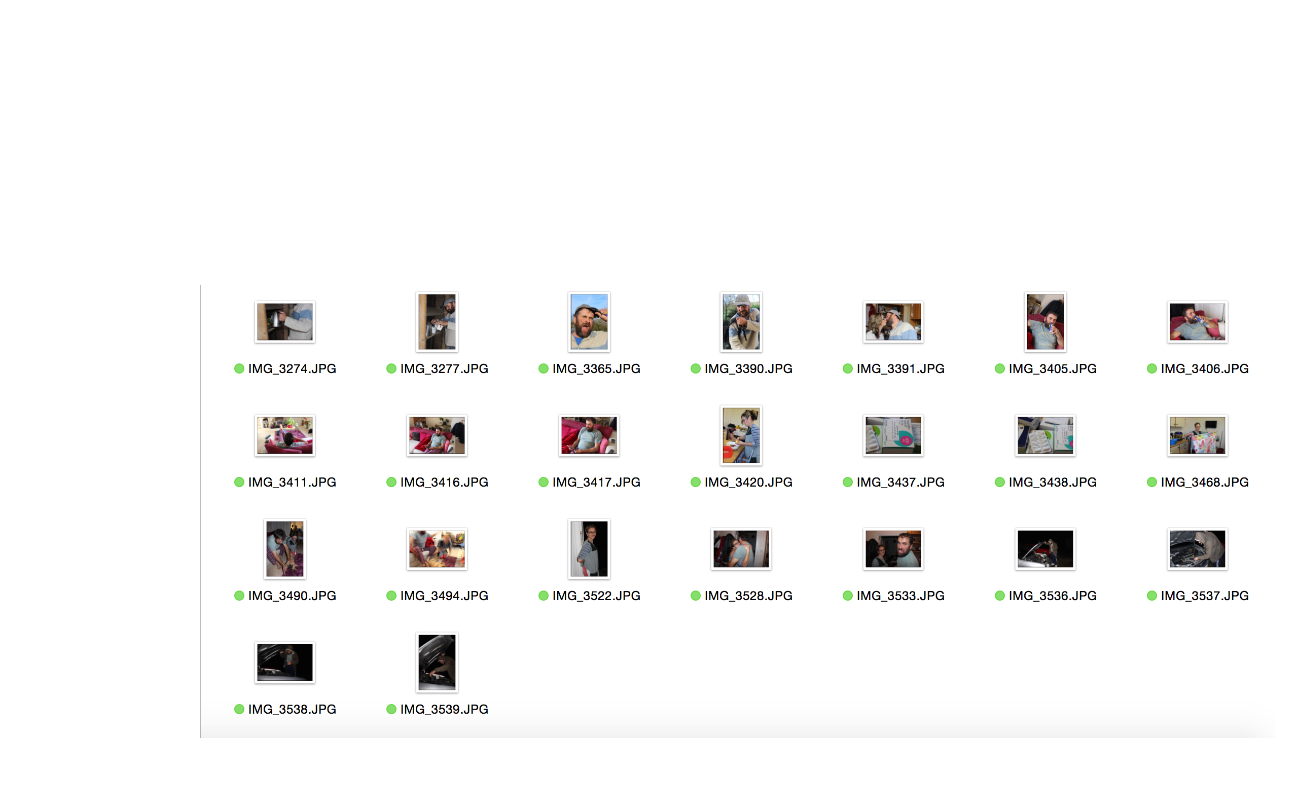
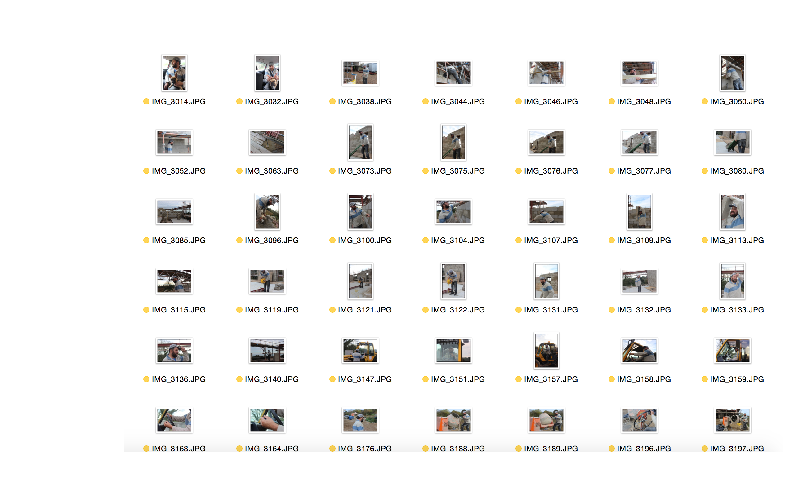
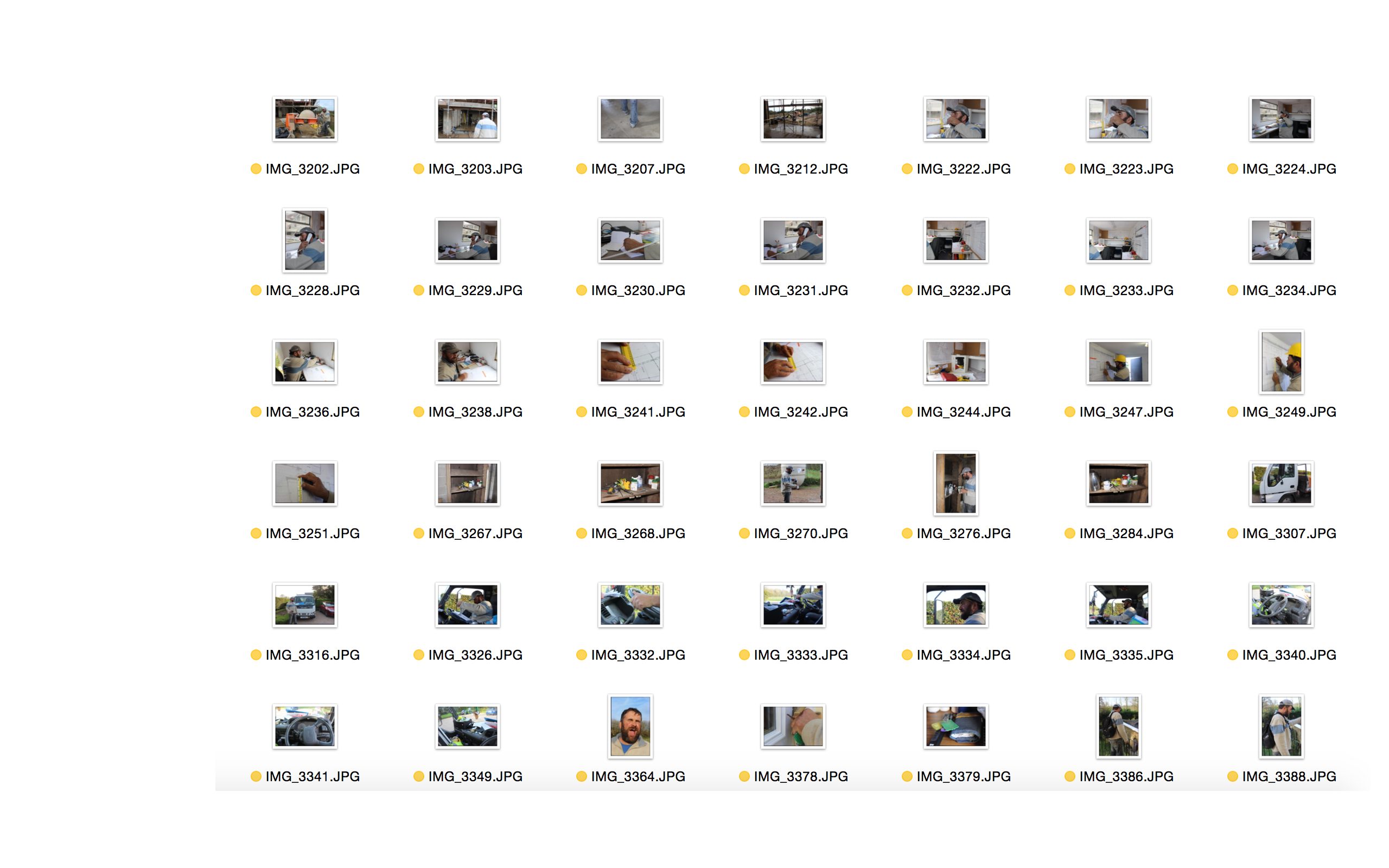
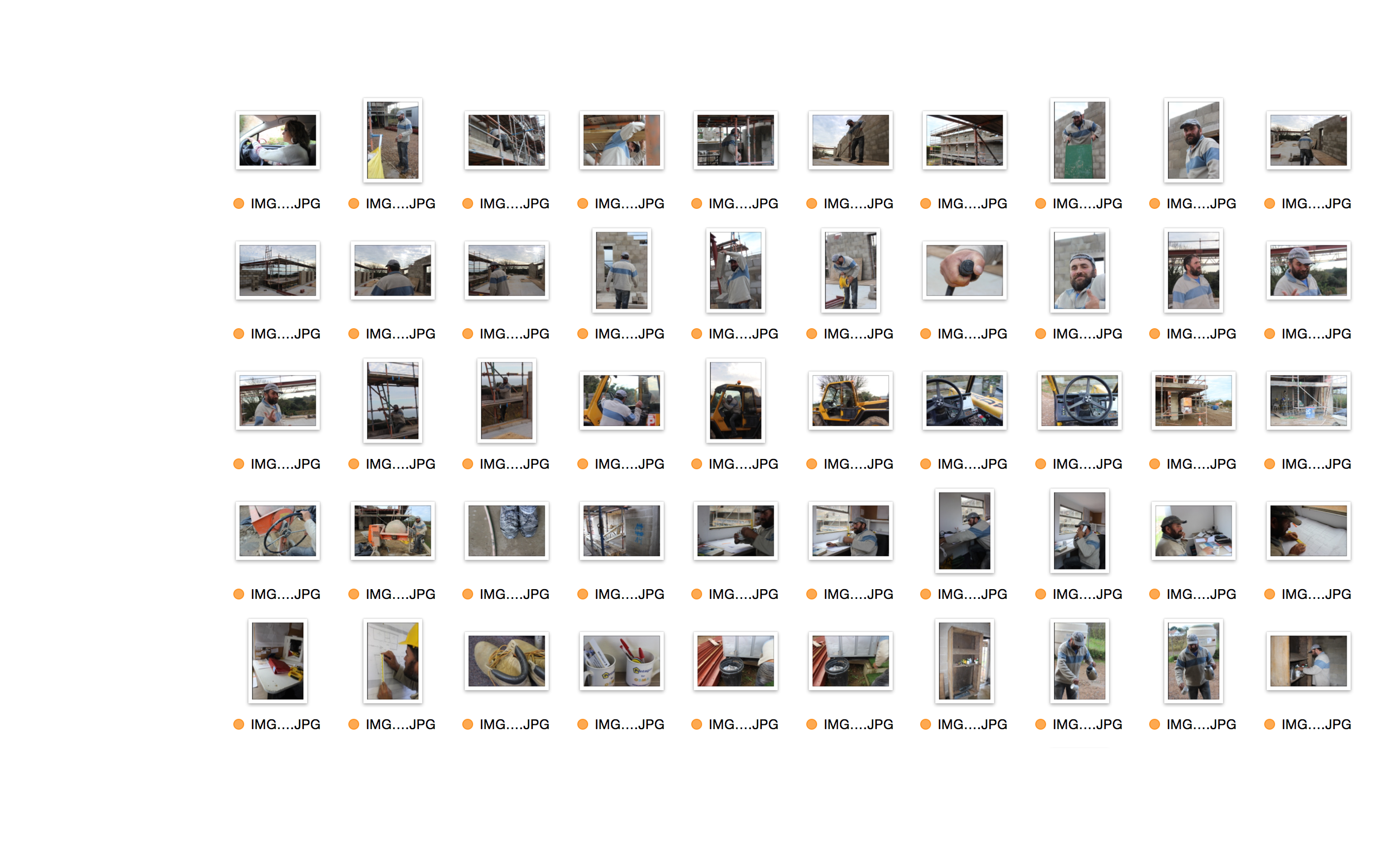
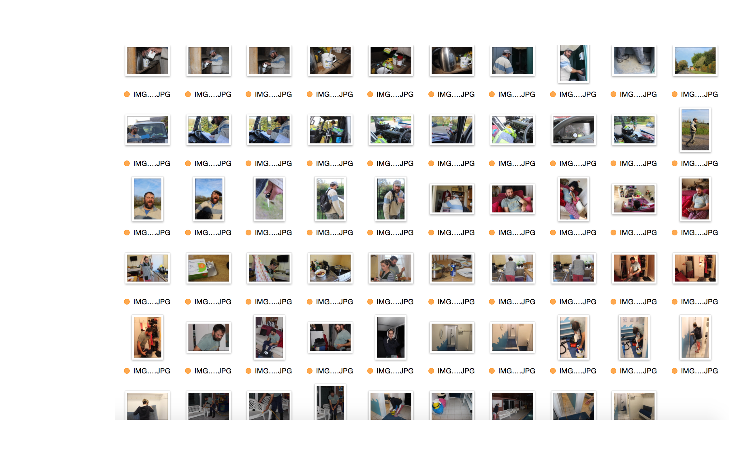
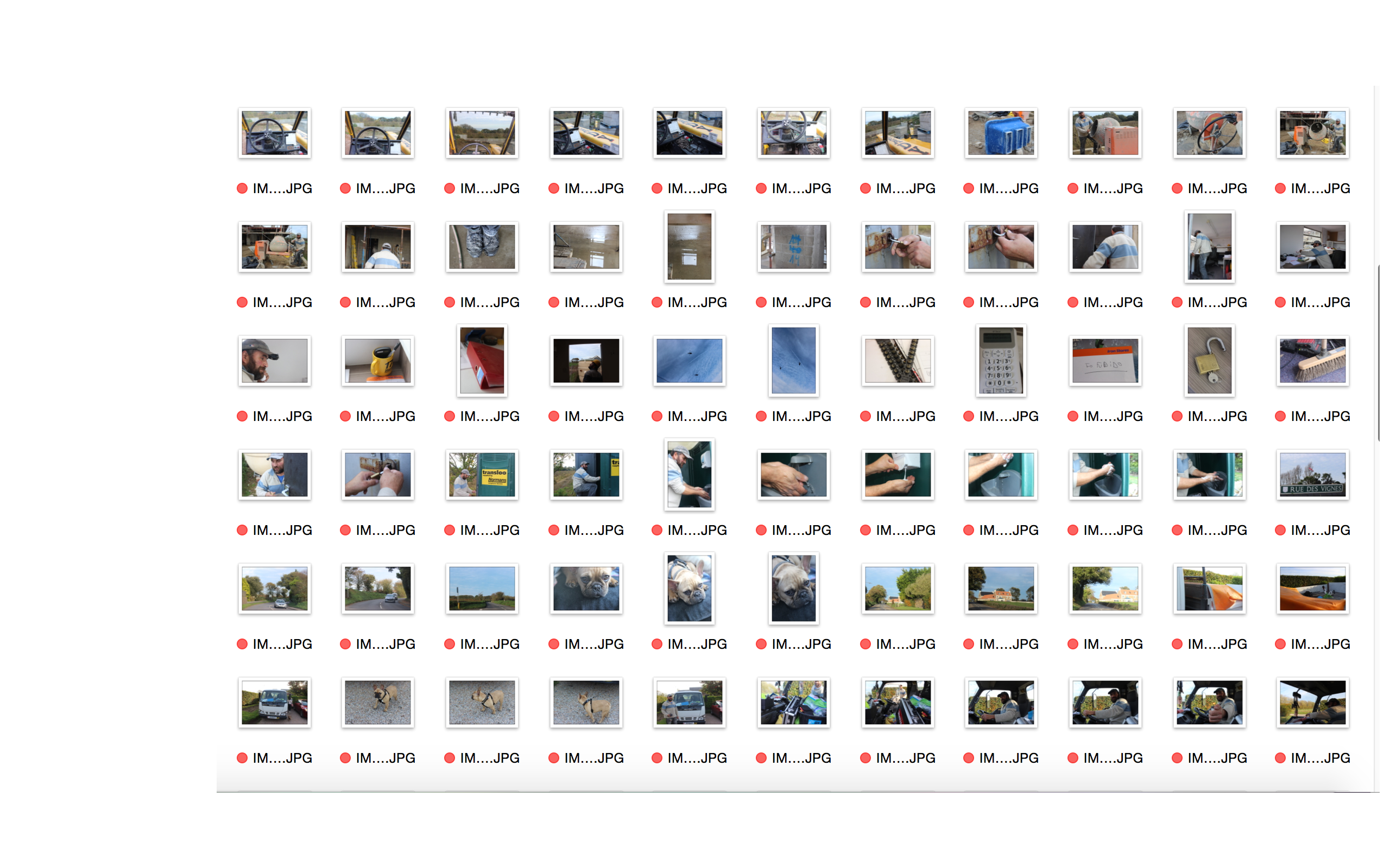
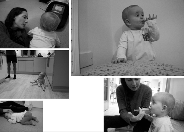
I have started to collect a few of my images together to create different picture stories, I haven’t found my favourite images yet that really work well and portray the story well but I am experimenting with the different shoots that I have done to make the best format and layout for my final chosen picture stories.

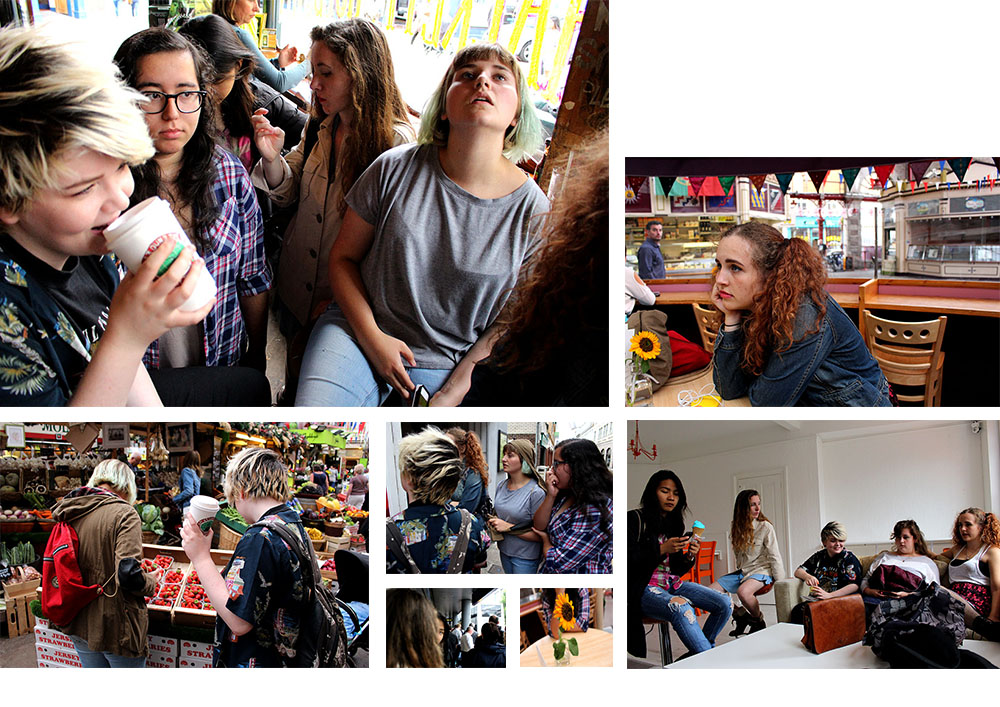
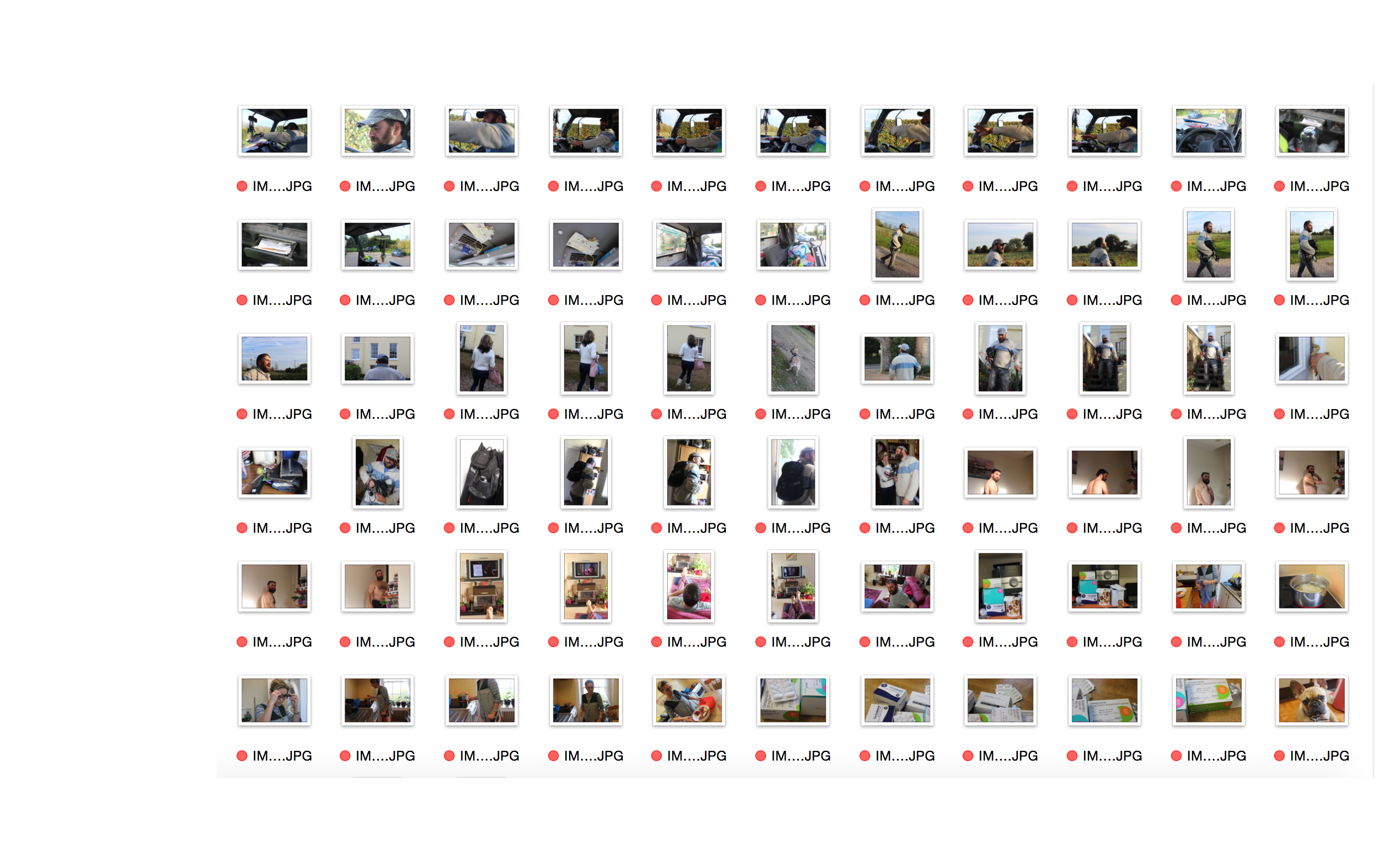
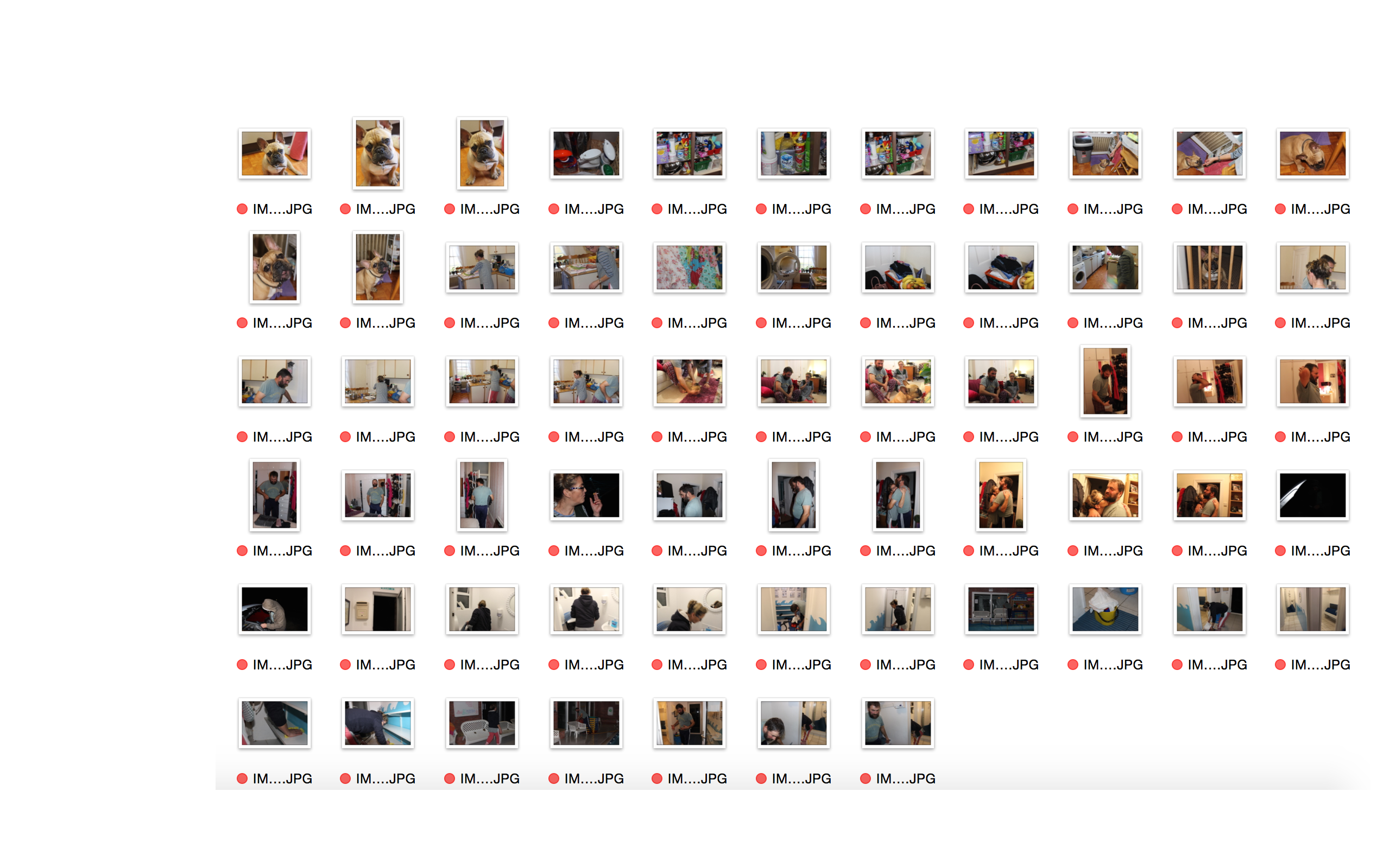
Here are just two different experiments with the some of the images that I have produced. I am still working around with the different images and positions of the images to find my favourite ones. So far I have only experimented with two shoots and I am unsure which images look best and if they actually stand out or whether or not they contrast each other too much and are overpowering one another. I think that I will have a look at all of my shoots again and try to make a design where I have a portrait, establishing and possibly a person at work shot just so it is more spread out and it isn’t just the same type of images being created each time.

markettttt
The Market People story experimentation
emma gym
experimentation with different shoots

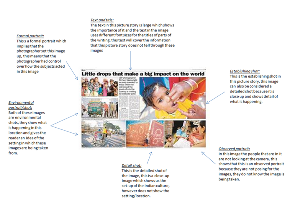
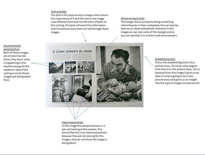
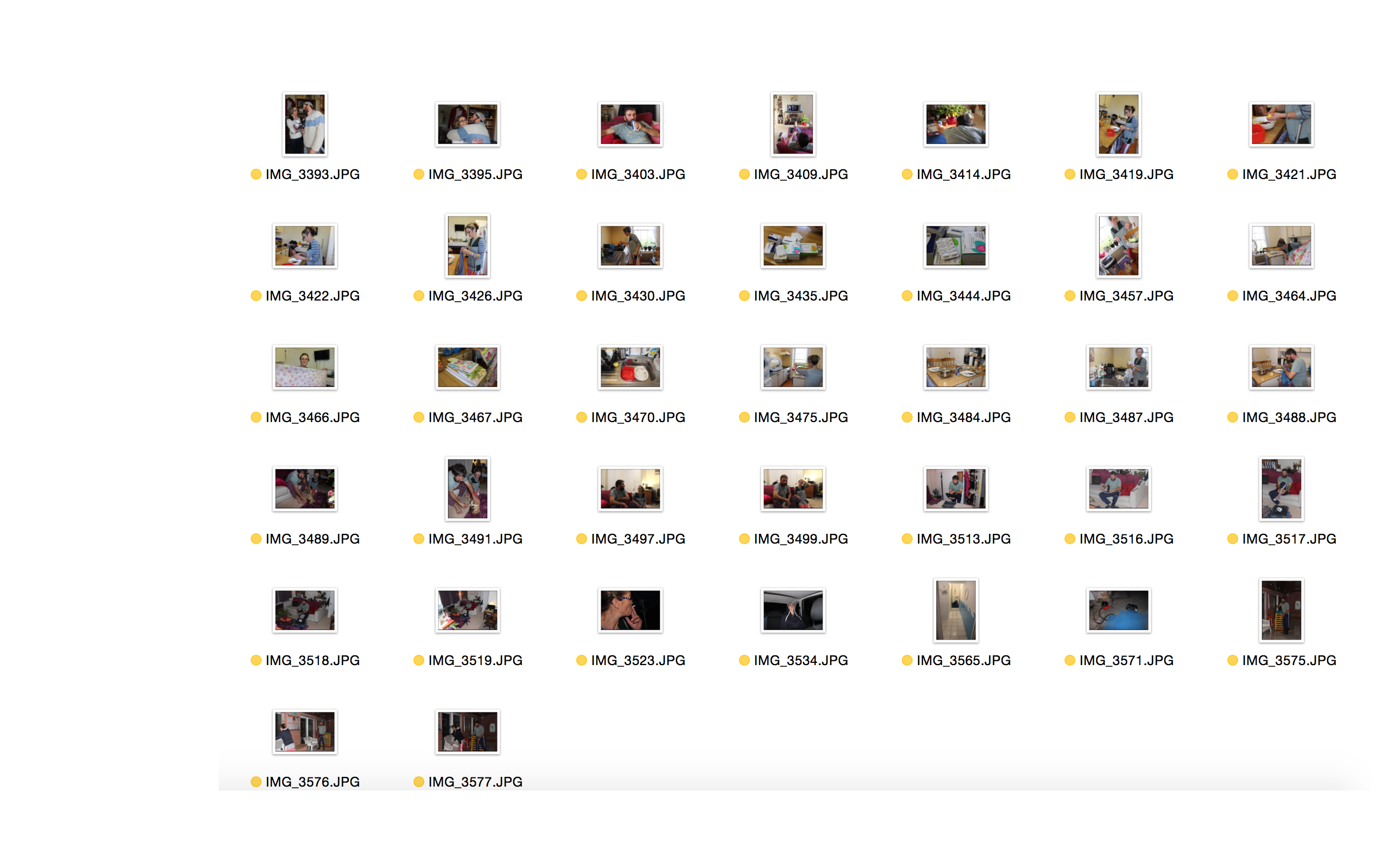
I don’t really like any of the experiments that I have produced as they aren’t complete and quite boring. I want to create a proper picture story that is interesting. I have gained inspiration from all of the newspaper articles that I’ve looked at and think that I want to create something similar to this as it is more interesting and I am able to get more images into the project rather than trying to squeeze in a load of images that don’t look right or are out of place.

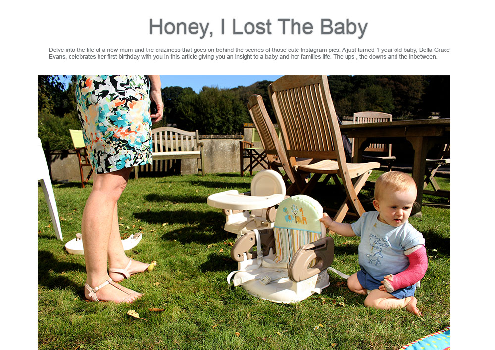
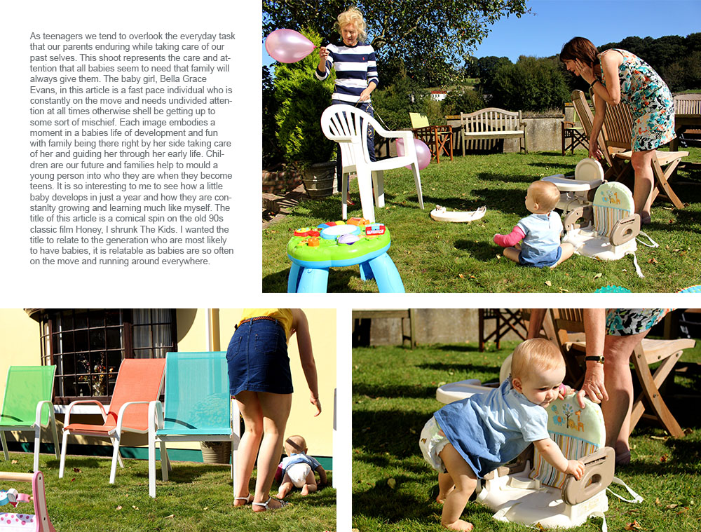
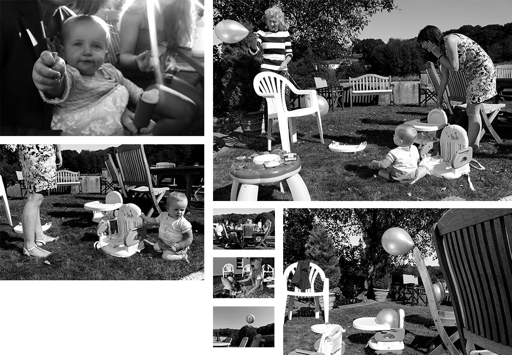
For this little article I took inspiration from newspaper articles as I find them a lot more visually pleasing and exciting compared to the picture stories that I have created above. I think that this is a lot more interesting as well as the information giving the reader/spectator more of an insight of what life is like being a new mother with an active baby. I do love these images and think they are interesting to look at with all of the bright colours surrounding the environment. I like the sharpness of these images as it makes them a whole lot more interesting to look at and will make the spectator want to read on as they will be drawn to the bright colours in the front cover image.

PICTURE STORY

When making a picture story the first thing to do is chooose 3-5 strong images that show the different types of traditional picture story images, such as the establishing shot along with a detailed shot and an enviornmental portrait for example. To make the picture story you need to open up photoshop and open up a white A3 document (New, international paper, A3) and then rotate the image so it is sideways (image, image rotation) and then place the images that you want onto the page. Once you have placed the images onto the page then you can choose how much spacing you would like between the images, and how to place them on the A3 spread. It is made into an A3 spread as this is how it would be presented in a newspaper. When placing these images the establishing shot should usually be the biggest image, and then the other images should be placed smaller around them, also leaving space for a title and text which we will need to leave to leave space for our text that explains about our picture story. When making the title you can use different fonts and layer styles to make the title stand out and make it original. For the picture story i will need to choose a title which explains my picture story. Using rulers when making a picture story will ensure that the spacing inbetween the images will be the same and this will make the picture story more neat. When placing the title it can also be placed over the image however you will need to ensure that if the image is a dark image then the title is lighter so then it stands out. In addition when making a picture story you need to think about how people view and read them, for example when reading in a magazine or in a newspaper people read from left to right, so by usually placing the establishing shot in the left top hand corner it makes it the main focal point of the page, even though it should be because esentially it will be the largest image on the page. 

Brainstorm on titles 

As my story will be on my mum my title needs to be something that explains our family life at home, or something to do with her anxiety. 

Living with anxiety 

Anxiety 


ANALYSING PICTURE STORIES

When analyzing picture stories you need to look at the different aspects that are in the images, for example if there is the setting in the image or whether the image is close-up or not. The different aspects that are in a picture build up a story-board and make it tell a story about something which has interest to someone reading it. The text that is in the picture story should explain what the images do not, if the images are ambiguous then the text will explain what the images do not, unless the photographer is leaving the images up to interpretation. 

Picture1

Picture2


DOCUMENTARY PHOTOGRAPHY – SELECTING PROCESS – YELLOW:

These are the selection of photographs that I think could be used and that I personally like, however feel like I may have better photographs that I feel could portray the story that I am trying to tell with my photographic essay. However I have made this selection as there may be some photographs or perspectives that I may want to include however didn’t make the cut for the photographs I am definitely wanting to use. 

Screen Shot 2015-11-23 at 10.18.58 Screen Shot 2015-11-23 at 10.19.09 Screen Shot 2015-11-23 at 10.19.15

DOCUMENTARY PHOTOGRAPHY – SELECTING PROCESS – RED:

These are the selection of photographs that I do not wish to use in any way for my project.  The reason as to why I did not want to  use them at all in my project was because they were either poorly composed, or were distracting from the main idea that I have for my picture story, therefore having a poor or no link to my idea, or simply because I took too many photographs and had many that were very similar in composition. Screen Shot 2015-11-20 at 13.23.26 Screen Shot 2015-11-20 at 13.23.39 Screen Shot 2015-11-20 at 13.23.48

My Documentary Spread – Magazine Layout:

The layout of the page is very important when presenting your photography. For our images we can apply them onto an A3 size of paper. Here’s a mood board of a few magazine spreads showcasing photography that i found:

1-Mosaic2mothers_day_photobook_7_webmagazine-layout-tiffany-ann7b-stylish-magazine-design

I have produced a two page spread that includes my favorite documentary outcomes. I’ve placed the pictures in a fairly varied layout. The photograph’s are all different sizes and dimensions. Accordingly, the angles at which I took them vary. I enlarged the image that I wanted as the main focus, because it intertwines the theme of ‘Family, Faith and Community’ in the best way.  All of the photographs are edited in some way or another. I included some very strong contrasts and vibrancy in them.

Here is my main picture:

DSC_0085 edit 2

This particular shot appears to be ‘layered photography’ due to the many subjects in one. In fact, no changes were made to the picture’s composition and nothing was moved.

Me and my family had just strolled to our car, that was parked in the church’s car park. As everyone was getting in the car, I took the opportunity to spontaneously take this.

I find it quite lucky that my friend was holding the booklet that we got given at our ‘Jersey Museum – 125 Hours’ visit:

fdgdh
“Your story, our history” booklet – Guidebook given to us at the Jersey Museum

I like how it shows the task booklet and gives a small detail about the photograph’s meaning. I believe that this manifests the theme of ‘community’, because it shows the assignment that our school was given to complete as a whole. Additionally the church in background adds depth whilst embodying the theme of ‘faith’. The girl in the picture is representative of the subject of ‘family’ in that I consider her to be my family.

I’ve tried out various designs in Photoshop as a form of ‘trial and error’ so that I could find the one design suited to illustrate my story.

Original layout:

Magazine spread - no text
Magazine spread – Original with no text

This was my initial magazine spread but i decided to alter it. I found that some of the images were out of context and didn’t relate to the overall subject.

Second layout:

magazine spread - 2nd try
Magazine spread – 2nd try with no text

For my second copy, I removed the picture on the bottom right-hand side as it was sort of an anomaly. I then moved some of the picture to create a balance. I aligned the photograph’s so that they would look more proportioned.

Third layout:

Magazine spread - 3rd copy
Magazine spread – 3rd copy

For my third alteration I expanded the titles so that they went across the top border of the A3 page. I wanted the writing to be spread out and aligned with the pictures.

Fourth layout:

sheet with photos 3rd try for the blog

This is my 4th try at the layout. I have added the text to go along with it and included some inspiring quotes associated with the subject I was doing. I also moved the two detail shots from the middle of the page to the top. This gives the layout more space for the writing and looks more balanced. Additionally, I altered the titles changing the color into purple. Purple is representative of imagination and individuality. ‘Impulsion Du Moment’ means ‘Spur-of-the-moment’ and this explains the whole spread, since I took the picture quite spontaneously as I wasn’t expecting to experience certain scenarios.

Own Archival Research: 1960s

These images which I came across from the previous owner of the house shows clearly the significant and original style of 1960s culture. These images show the counter development after the war, after its re-development in the late 60s and early 70s. As you can see, the development causes various similarities with that of its post-war development in the 1930s and 40s, prolonging its classic characteristics and structure. The images seem as if they’ve been documented using disposable camera’s, this is because, for example, in the image below the raw and vivid colouring is brought out from the decomposing of the walls, the grass, and the sky. This style is notorious, and easily recognisable, which connotes the time period as to when this was documenting, as this constantly relates back to the context and culture of the time this development took place. 2180110901_011_2001

2180110901_012_2001

2180110901_010_2001

2180110901_009