PHOTOSHOP: MAKING MY PICTURE STORY

When creating a picture story you need to choose a range of images and play around in Photoshop with where you want to place the images. First when starting you need to choose an establishing shot and this will be the biggest image, this is the one that should be in the left top hand corner as this is where a person would first look when they are reading a magazine or a newspaper. yhj

When making this picture story you need to use rulers to make sure that the spacing of the images is the same which makes it look neater and cleaner. By using rulers it can ensure that there is the same amount of spacing that is between the images. 

Untitled-1

This is my final picture story, i need to write some text in the spaces that i have left. For the writing i need to write in the third person. To expand on these picture stories i will make different lay outs for the images and place writing in different spaces. For some of the images i am going to place one of the images as the background and then place other images on top of that one. I will experiment with black and white and images left in colour. In this picture story the main image is the one that i have placed the largest and to the left so that it is the first thing that is seen that is on the page. 

Experiment 1: 

Mum

This is the picture story that i made of my mum. Around the images i wrote text that describes in general how anxiety makes people feel and how it makes people feel isolated sometimes. I also in the corner added a quote which my mum says a lot, i added this quote as she usually always feels very drained from feeling stressed which means that she is tired often. I made sure that the spacing was the same between all of the images and the text to make it look neat, i think that by having some of my images in black and white and the other in colour makes it more interesting as it makes the one in colour stand out.  

Experiment 2: 

image black and colour - mum

For this picture story which is the same as the last one, i changed the bottom image to colour so there was a range of black and white image and colour images, so that it was not just one image that stood out. 

Inspiration to my picture story design: National Geographic

03Oct-Orangutans-2-copy-2

mj_oman

ng-15

My most favoured article, where I got most of my inspiration from was: “Showing Haiti on Its Own Terms” –  Young photographers reveal pride and beauty in a land where struggle is the norm.

MM8286_140826_0510-1080-2
Six-year-old Tamara Pierre, in Ca Douche, wears choublak—hibiscus blossoms—in her hair. “I took this picture,” says Prophète, “because the hibiscus is one of my favorite flowers.” PHOTOGRAPH BY MYRMARA PROPHÈTE, 14


MM8286_140905_4533-2048
The bustling Iron Market in Port-au-Prince, destroyed by the 2010 earthquake, was restored to look as it did when built more than a century ago. Picture taken by ANGELAURE SAINT LOUIS, 17

“So many people work in the Iron Market. I was happy it was rebuilt after the earthquake.” – ANGELAURE SAINT LOUIS”

The Article follows up on Angelaure’s experience of the Earthquake and provides a brief biography to deep deep into the more personal side to the tragic event. I feel this aspect is a great way for the recipient to empathise with the picture stories, as well as being to relate well to it themselves.

MM8286_140829_6085-2048
In a street market in Cap-Haïtien Maryse (at right) and her friend Martine sell religious products used for Vodou rituals and ceremonies. PHOTOGRAPH BY PHILOMÈNE JOSEPH, 20

“I love my roots, and I take a lot of photos that represent what my roots are.” – PHILOMÉNE JOSEPH

FOTOKONBIT_smith027-1080
A regular at this pond in Camp Perrin, Johnny Pierre makes good use of available resources. “I’ve seen him catch fish for his family for months,” says Neuvieme, “and I wanted to capture this moment at dawn.” PHOTOGRAPH BY SMITH NEUVIEME, 32
FK-Darry-Endy-Dulcine_016-1080
A girl runs past the Maison Boucard, a historic home in this once wealthy city where fortunes were made in the coffee trade. PHOTOGRAPH BY DARRY ENDY DULCINÉ, 16

“Side by side we have shared a lot of beautiful moments through photography. We have had no regrets.”
DARRY ENDY DULCINÉ

I feel this way of documentation is a great way to tackle change. The loves of people weren’t beaten by the burdens of the natural disaster, but inspired to let people know through images how much of a change we can make for the future. The suggestion that the people of Haiti are stronger than the natural forces comes clear through the quotes from these young photographers, then again, allowing the receiver to empathise with the situations they’re going through. However, the non-cliché approach to committing with change is a nice break from seeing scared and terrorised people, all in all, making it an impacting picture story.

Here is a link to the full online article: http://ngm.nationalgeographic.com/2015/12/haiti-photos-by-haitians-text


Inspiration to my Picture story design: Atlantus

timthumb
‘Tamika Tolliver, Beach, Asbury Park, New Jersey, United States, 1 August 2014’ This is my most favoured portrait out of the whole project. I feel as a motor image, it speaks wonder to the reader of how this women is accociated with the main theme of the project: how are Jersey and New Jersey related? As a reader, I feel this image has given me a broad insight into the lives of this women living in New Jersey, her culture, and way of life. This image sparks subject of how there are similarities and differences, within landscapes and portraiture.
timthumb
Westside, Asbury Park, New Jersey, United States, 2 August 2014

atlantus

martin_tofte28093atlantus_covers

martin_tofte28093atlantus_1

Here is a link to Martin Toft’s Project ‘Atlantus’ http://www.archisle.org.je/atlantus/

Text in my picture story – Experimentation

The text written in my picture story will be written from a third person perspective. This will entitle me to  dictate the measure of change which has been taking place within my personal study: moving house. I want this text to be submerged around my pictures as I feel this will clearly clarify the subsidization of where my pictures fall regarding transitions of time. I almost want my text to be used as an under layer for the reader to establish my pictures more as a narrative than an article. With the supporting use of headings, titles and subtitles, I can support these notions throughout different areas I wish to discuss, ensuring the reader will understand clearly what I wish to establish.

I’ve decided to call this specific draft ‘Escape to the Shore’ as I feel it is a punchy way of incorporating my theme of moving by the sea. I had inspiration from the television program,  ‘Escape to the Country’, as in this sense, it means exactly the same.

Development of my first picture story (draft)

To create the document in Photoshop  – New document, selecting ‘International paper’,  size A3 and with RGB colour.

The first step is to place the images in Photoshop , putting them onto the page. Applying all of the images into a line and re-sizing them all to the same size for some of the image. Placing another image in the is larger which will be the establishing shot and tilt the image so that it is slanted. Then to place a shape into the picture story –  elliptical marquee tool will make circle shapes that you can place into the picture story, you can use the paint bucket to change the colours of the shape. Polygon lasso tool will give you a triangular shape and rectangular marquee tool with give a rectangle shape. Then, place another image into Photoshop that can be placed into the background of the image, using blending modes to blend the image into the background so that it sits behind all of the other images. Adding a layer mask allows you to choose either black and white: black foreground, white black ground, then you can erase back and keep the the parts of the real images that you want to keep. In addition, changing the opacity of some of the layers will make the images more clear that you want, once you have used the blending modes as some of the images may be covered.

PICTURE STORY 1
This is a print screen of my beginning layouts of my two images. I’ve used the top right image as the main major image of the house in the 1960s. Being on the ‘overleaf’ (right) page, it sets the reader up to defying what the article is about. The next stage would be to insert another minor image below the image top right, and a major on the left page. This specifically will be a portrait for the reader to establish the pivitol role in this project, which in effect is my parents. My overall goal is to incorporate the amount of change within my family project. Another thing to establish is a title. stringing together the narrative within the article.

Designing a Picture Story

Designing a picture story in Photoshop allows you to set images out in a way which narrates a story, to show a set of images with the accompany of text, however, broadcasting these images to provoke the reader away from the words written. Opening the window, and selecting a ‘web’ layout, you are faced with a portrait white background in which you can place your images on top of.

You then flip this image to landscape mode by selecting the ‘rotate tool’, you then are left with a landscaped, white background. This then leads you to select the rulers on the side of the tool bar, which enables you to set up the exact adjustments you wish to make on where you want to apply your images and text. This also allows you to do it accurately as the ‘rulers’ tool promises an accurate position of where the middle is both vertically and horizontally.

The next stage is the uploading of the images I’m going to use, and deciding how much ratio of text / to image there is going to be on my picture story.

Ive managed to select the following images for my picture story:

2180110901_012_2001
I chose this image of the house in the 1960s because I feel its a clear reflection of history, a classic photograph. I felt as a minor image, this could clearly make the reader clarify the changes its gone through, with the help with the development and plans made by my parents. I think accompanying this image with a portrait can make this statement clear, and make the narrative flow more.
OLYMPUS DIGITAL CAMERA
Taken on an OLYMPUS DIGITAL CAMERA, I like this image yet again as a minor image. I think it really sets up the reader into understanding the extent of change which has been happening in my new house. You also get a grasp from this the essence of culture, and how it differs from my archive images which I’ll also use in this picture story. I like the bright, unusual colours, this ensures a ere of ambiguity, and will hopefully, in effect, make the picture story more exciting and vibrant.


Archive Internship: How has this helped with my personal project?

Over the past half term, I have been working with the Societe Jersiaise Photographic Archive implementing key ideas to developing the Archive to my own personal project. These skills have made me develop various creative perspectives involving Archive extraction, research, experimentation and documentation. Exhibition and presentation design.

Some of the skills, which I have been contributing to my Archive experience, consist of:

  • Scanning & storing images
  • Image manipulation, resizing, creating composites
  • Producing teaching materials for Photo Archivist’s Workshop
  • Re-purposing images for Jersey Projection Gallery –(Ex.  Skip ton Arts)
  • Archive Searching database
  • Outputting digital prints, labeling and marking images from the
  • Understanding copyright policy
  • Retrieving original images from vintage collection in strong room
  • Working in secure areas, safe practice in the archive environment
  • Appropriate handling of original archive materials

My personal project has allowed me to evolve, as with help from Gareth Syvret, I’ve been able to manipulate photographs which relate to the history and period of my new house and how I can contrast the changes and traditions in everyday life today.

Danny Santos Research:

Danny Santos is a well know street photographer. He lives in Singapore where he captures daily shots of life.

Danny Santos - in the process of taking a strangers portrait
Danny Santos – in the process of taking a strangers portrait

Santos works in many mediums of photography such as studio portraiture and street portraiture. He grew fascinated by strangers as he wanted to capture their different characters and personalities through the lens.

I was especially captivated by a series of images he took in the rain and he entitled it “Bad Weather”.

“I used to always stay at home whenever the rain comes in the weekends. Eventually, I realized how the rain always brings refreshingly interesting scenes on how people react with it. I have written an article about my thoughts and experiences on shooting in the rain.” – Danny Santos

Here are some of his images that caught my eye:

danny-santos-03 bad-weather-22-1024x680 slide_291416_2326102_free untitled

As a response to his photograph’s, I’d like to create my own set. I think that the people’s responses and facial expressions are great. It’s a great variety from sad and angry to happy and cheerful.

Specification:

Who?

I want to photograph random strangers that are walking down the street.

When?

I shall be taking these photographs during the afternoon so the lighting will be quite dim and dark. Since the clock has gone back the daylight available is scarce. Therefore I may have to use flash in order to see the people.

Where?

I’d like to take these pictures in a city environment as the bright lights and detailed backgrounds will add to the image. It also gives it that urban feel.

What?

I want to aim to get a minimum of 50 photographs so that I have a wide variety of shots to pick from. I want to make sure that I capture people facing the camera and that there are minimal shots of people’s backs.

Family Photographer: Nick Waplington

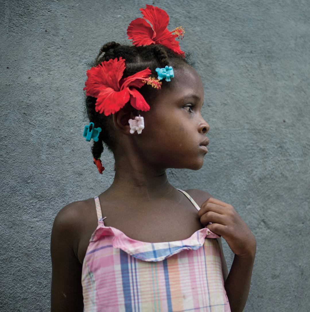
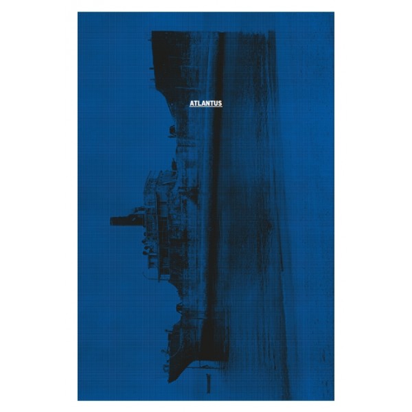
Nick Waplington is an artists and family photographer based in New York City and was born in 1965 in Sussex, United Kingdom. He went to study art at the West Sussex College of Art and Design in Worthing as well as studying at the Royal Acadamy of Art in London. His photographic work is usually amateur looking images of family, this interests me and I think that I can learn a lot from his work and the way that he photographs people.

About Waplington: http://www.claxtonprojects.com/books/nick-waplington/

Waplington’s website: http://nickwaplington.co.uk

Waplington’s Diary: http://nickwaplington.co.uk/diary

“I’ve never defined myself as a photographer. I make art” – Nick Waplington

“Photogragher Nick Waplington hit a creative high when he realised drugs were a waste of time” – Michael Fordham

Waplington mainly makes amateur style images to help portray his stories. His documentary style is almost like using a Polaroid camera or a disposable camera which is really interesting to me as they are quite artsy yet still seem to be of good quality. I like this style as it is different and stands out. Although I find his style interesting and unique for the images that I make I think that I want to keep to a higher quality style of images telling my story in a different way and relating more to Alain Laboile. I find that Waplington has a very unique and artsy style with weird unusual angles and amateur looking images. I find his work very interesting to look at as it is so different.

tumblr_mopnz8Kknz1sov71fo1_1280
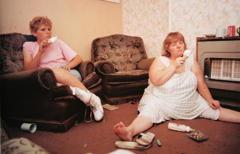
This is my favourite image of Waplinton’s as it is quite comical to look at. I find it really interesting to see the way the woman on the right side of the image is sat with her legs spread out as she slumps on the floor of the living room eating an ice cream with a blank facial expression on her face. I also like the way the woman on the left is sat as she looks very comfortable and they both look as though they are watching the television. This image doesn’t look staged at all to me and looks like a proper documentary image. I really like the entire composition of the image with the women not being totally in centre of the image and both being on either side of the image which allows the spectator to have a look at the whole of their surroundings. I like that this image is in colour as the spectator is able to see where the two women are and what kind of colours surround them. The colours are very yellow in this image which often connotes poverty or dirt as if they don’t have much money which is kind of evident with the entirety of the image showing how dirty the floor is and that one of the women is sat on the floor. Something that I really like about this image is the clothing that the women are wearing as it really interests me to see what fashion was like in the 80s and 90s. I like the colour of pink that the woman on the left is wearing as well as the, what looks like, undergarments or pyjamas that the woman on the right is wearing. I find that this image is very personal and was taken by Waplington as an insider to the family showing more of what an outsider photographer wouldn’t be able to do. This image really shows the behind the scenes of a working class family life and how they relax. I do however think that this family isn’t very clean and the house looks really dirty and as if they are less than working class and possibly living off of benefits or they are just jobless.

43bfb8edf94a2a3742ae910095c4e8b9
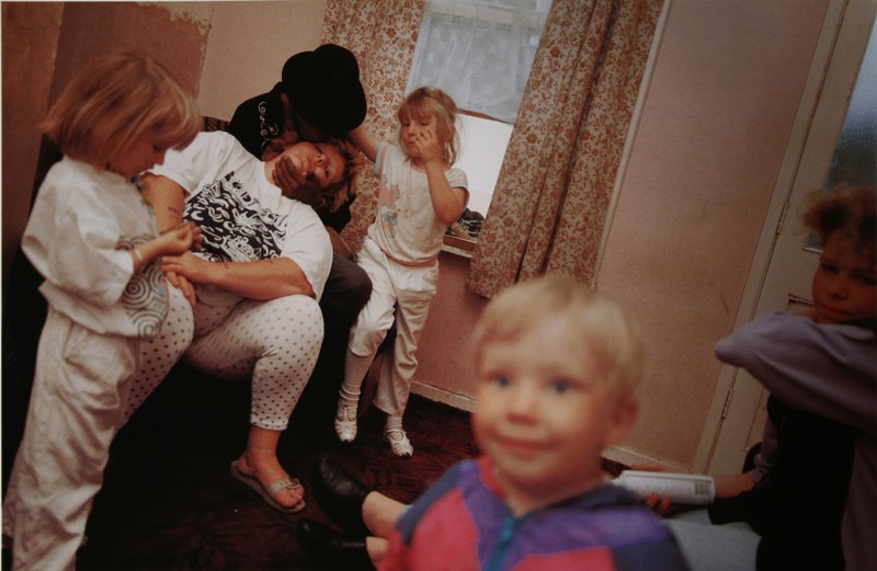
I find this image hilarious as the little boy reminds me of the images that I have made of my niece smiling into the camera and interacting with the person behind the camera. I like that the children are all just stood around waiting for their mum to wake up. I find it hilarious how the woman is sat asleep really showing the struggles of parenthood and constantly being on the move to keep up with the children. Something that took me a bit longer to notice was that what I thought was a male with a beard was actually a female being held up by a man wearing a black hat sat on the arm of the chair. I think that this is down to the exposure of this image which just adds to the amateur of the entire shoot. I do think that the composition of this image is interesting as Waplington was able to capture everyone at a really great angle, with one of the young girls looking at her hands very bored while the girl right in the background of this image looks as if she is trying to capture the attention of the person holding up the woman. I just love the cute little smile on the boys face as he looks happy and as if he is looking off the camera and at Waplington himself.

waplington-living-room-2-2
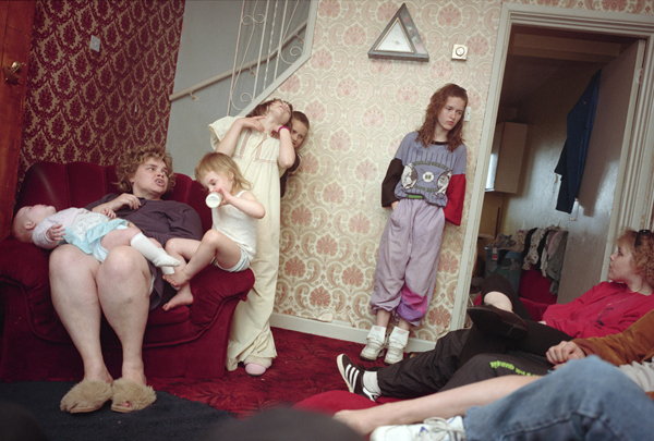
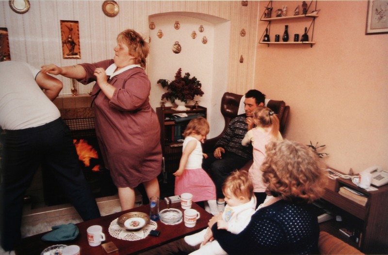
I find this image very interesting to look at. It just looks like a typical family photograph of a regular family dealing with everyday quarrels and laughs. I don’t actually like this image that much as it doesn’t really do much for me as everyone is kind of everywhere and the composition doesn’t particularly appeal to me, I don’t find it very visually pleasing. I do however like the left part of the image where the woman is mid punch/push to the man that is half out of the frame. I find this the most interesting part of the image as it has a story to it but the rest of it is just random to me. I think that this image is definitely capturing a more amateur style photograph as it does just look like an image that a family member made at random on their disposable camera. I do think that Waplington has much better work that this particular image. I think that this image would have looked a lot better in Waplinton was looking up at the family from a low angle as it would have made everyone look a lot bigger and made for a much more interesting photograph.