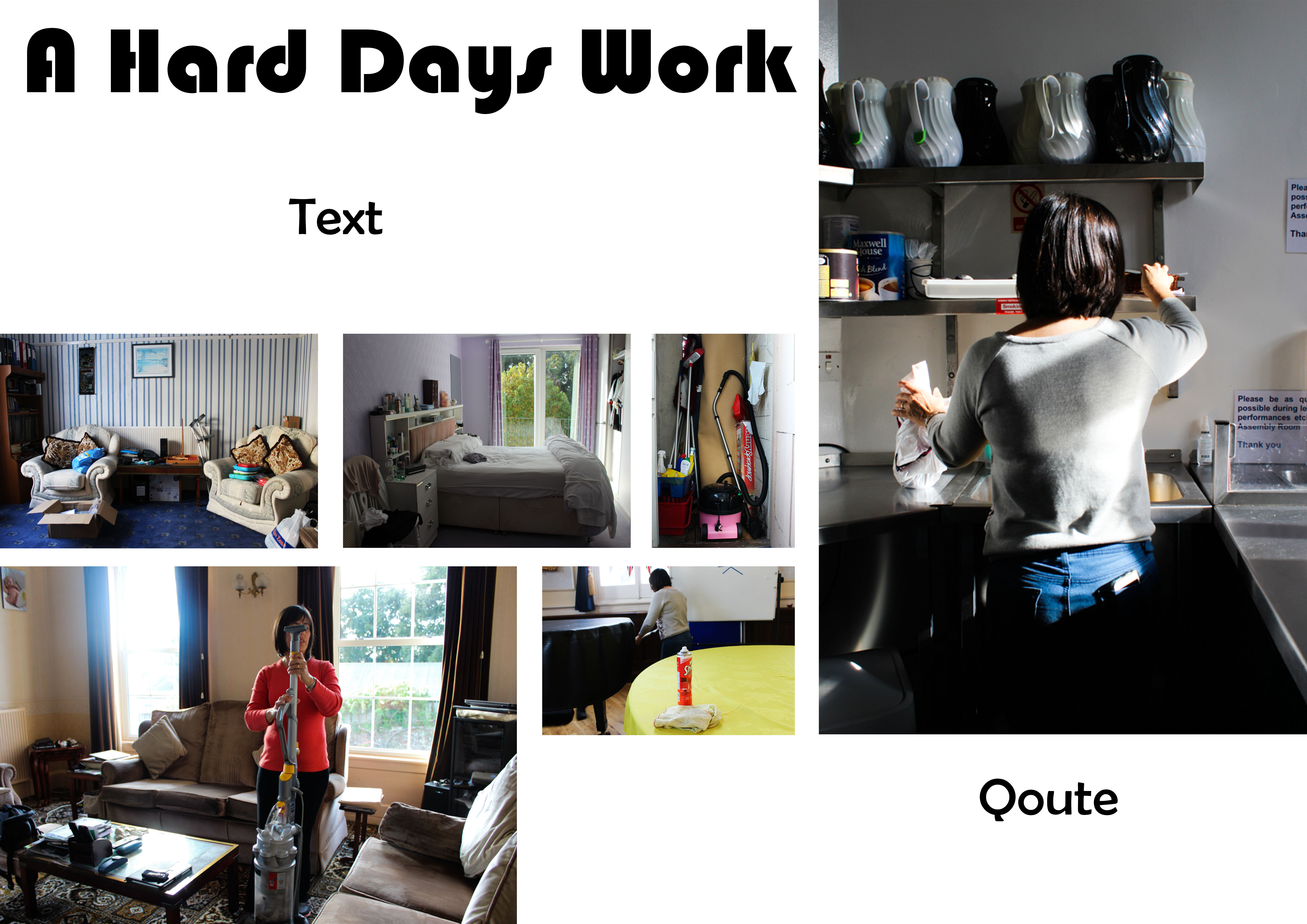
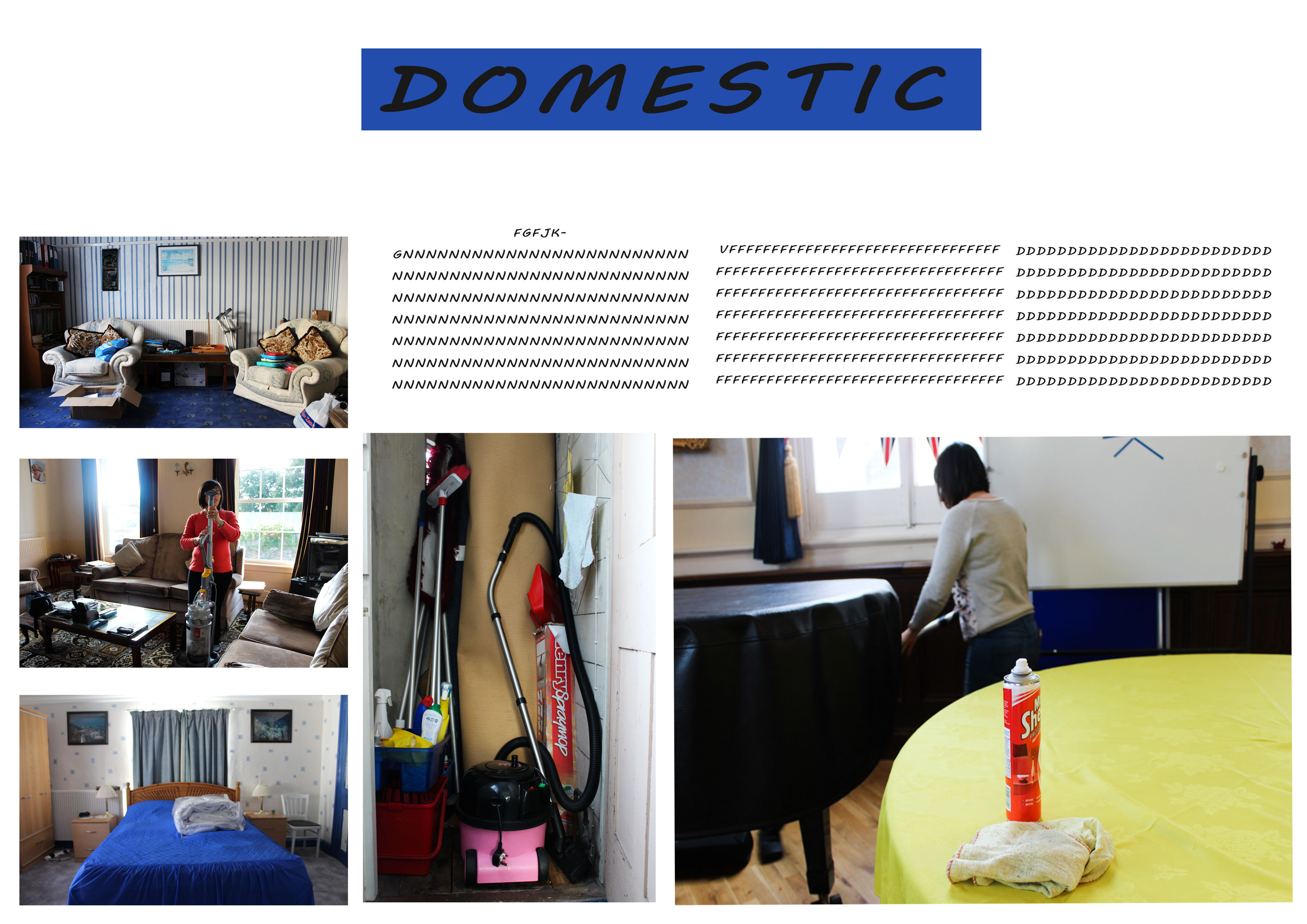
These are the first few designs that I have come up with for my picture story, in Photoshop I have focused on more ‘classical designs’ and have experimented with different layouts, designs and font types to find which design looks best . Through out the photo designs I have kept the symmetry and not experimented with rotation or backgrounds because I think adding these features will make it look more like a magazine spread. I like all three of these designs although they are not definite and I’m still working on improving the designs and coming up with new ones.


