To create the document in Photoshop – New document, International paper, A3, RGB colour.
First off place the images in Photoshop and place them onto the page. You should make all of the images into a line and re-size them all to the same size for some of the images. Place another image in the is larger which will be the establishing shot and tilt the image so that it is slanted. Then to place a shape into the picture story – elliptical marquee tool will make circle shapes that you can place into the picture story, you can use the paint bucket to change the colours of the shape. Polygon lasso tool will give you a triangular shape and rectangular marquee tool with give a rectangle shape. Place another image into Photoshop that can be placed into the background of the image, use blending modes to blend the image into the background so that it sits behind all of the other images. By adding a layer mask you can choose black and white, black foreground, white black ground, then you can erase back and keep the the parts of the real images that you want to keep. In addition by changing the opacity of some of the layers it will make the images more clear that you want, once you have used the blending modes as some of the images may be covered.
The writing
The writing has to be journalistic, you have to write about the story which you have explored. This will be written from a third person perspective. What i will look up is what is anxiety, and why do people struggle from anxiety. The text will be a deign feature, columns will make the text look more interesting on the picture story. You can look up different fonts by looking on Adobe and looking at all the the different fonts which you can download to add to the picture story.
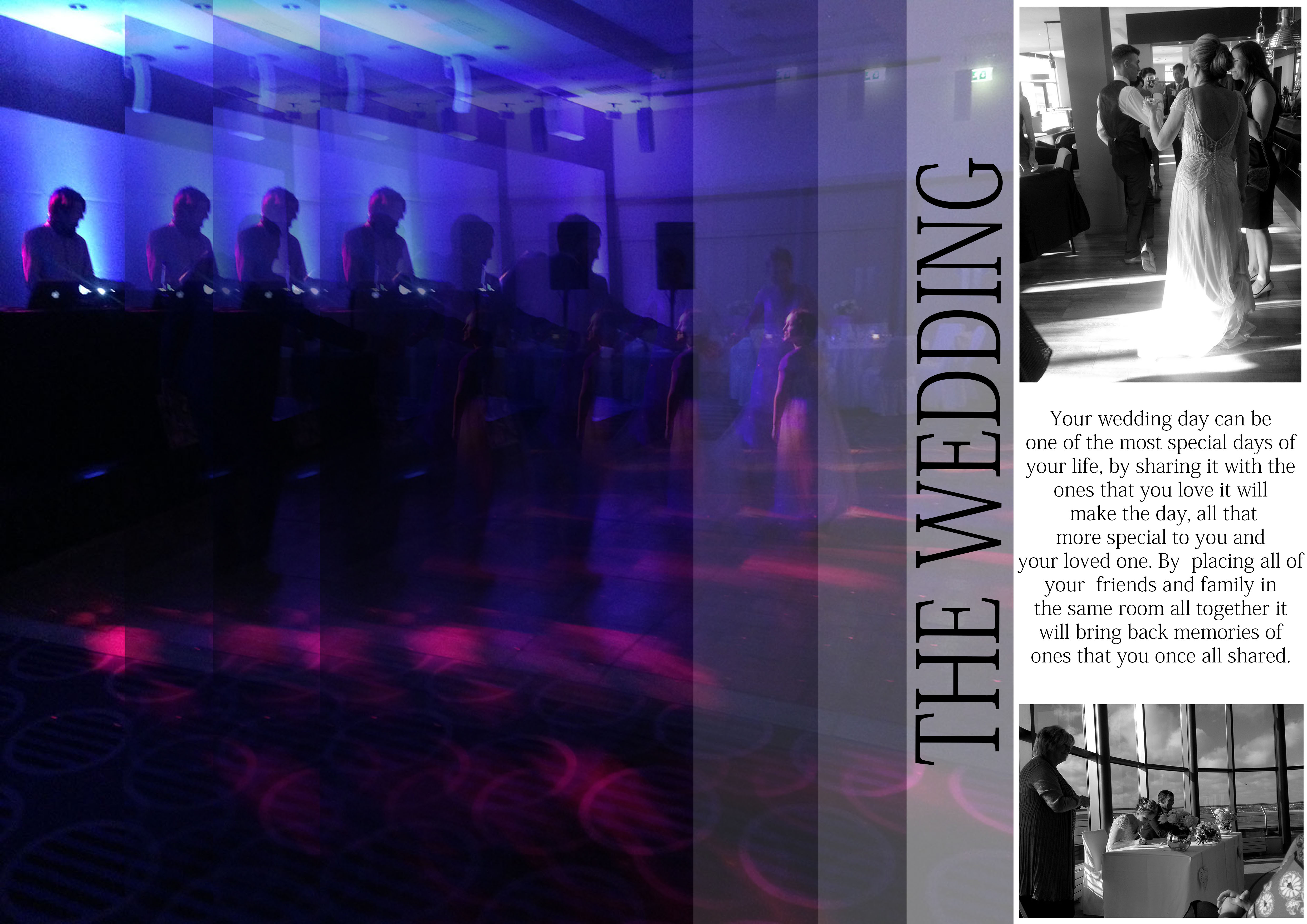
I made this picture story on what we learnt in class and by placing my image differently to create a unique looking picture story. I think that placing the right side of the picture story images into black and white it makes them stand out from the other image. On the images on the left i copied them using the duplicate tool to make this dragged out effect which i think looks really interesting because of the colours that are in this image. For this picture story i need to make a title.
I added a title to this picture story which i slanted on the side which i think fits in with these images that are in this story board.
Experiment 2:
This is my second edit from my wedding shoot that i took, i placed one of my images as the background and placed the image in black and white, i think that this image looks good because the images are in colour and the background is in black and white. In this text i wrote about how a wedding can be special to someone and how it is shared between two people.
Experiment 3:
For this experiment i selected over my image and (select, layer via copy) and changed the colour of the background, i did this by placing a colour overlay over my image, and then i changed the colour of it to purple to match the purple in one of my images. I used the blending modes to blend the colour overlay into the image and then changed the opacity to soften it. I also selected a strip down the right hand side to made it darker also, this makes some of the features in the image stand out as well and makes the image better.


