Nick Waplington is an artists and family photographer based in New York City and was born in 1965 in Sussex, United Kingdom. He went to study art at the West Sussex College of Art and Design in Worthing as well as studying at the Royal Acadamy of Art in London. His photographic work is usually amateur looking images of family, this interests me and I think that I can learn a lot from his work and the way that he photographs people.
About Waplington: http://www.claxtonprojects.com/books/nick-waplington/
Waplington’s website: http://nickwaplington.co.uk
Waplington’s Diary: http://nickwaplington.co.uk/diary
“I’ve never defined myself as a photographer. I make art” – Nick Waplington
“Photogragher Nick Waplington hit a creative high when he realised drugs were a waste of time” – Michael Fordham
Waplington mainly makes amateur style images to help portray his stories. His documentary style is almost like using a Polaroid camera or a disposable camera which is really interesting to me as they are quite artsy yet still seem to be of good quality. I like this style as it is different and stands out. Although I find his style interesting and unique for the images that I make I think that I want to keep to a higher quality style of images telling my story in a different way and relating more to Alain Laboile. I find that Waplington has a very unique and artsy style with weird unusual angles and amateur looking images. I find his work very interesting to look at as it is so different.
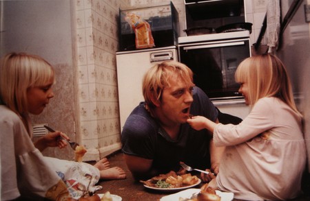
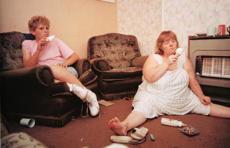 This is my favourite image of Waplinton’s as it is quite comical to look at. I find it really interesting to see the way the woman on the right side of the image is sat with her legs spread out as she slumps on the floor of the living room eating an ice cream with a blank facial expression on her face. I also like the way the woman on the left is sat as she looks very comfortable and they both look as though they are watching the television. This image doesn’t look staged at all to me and looks like a proper documentary image. I really like the entire composition of the image with the women not being totally in centre of the image and both being on either side of the image which allows the spectator to have a look at the whole of their surroundings. I like that this image is in colour as the spectator is able to see where the two women are and what kind of colours surround them. The colours are very yellow in this image which often connotes poverty or dirt as if they don’t have much money which is kind of evident with the entirety of the image showing how dirty the floor is and that one of the women is sat on the floor. Something that I really like about this image is the clothing that the women are wearing as it really interests me to see what fashion was like in the 80s and 90s. I like the colour of pink that the woman on the left is wearing as well as the, what looks like, undergarments or pyjamas that the woman on the right is wearing. I find that this image is very personal and was taken by Waplington as an insider to the family showing more of what an outsider photographer wouldn’t be able to do. This image really shows the behind the scenes of a working class family life and how they relax. I do however think that this family isn’t very clean and the house looks really dirty and as if they are less than working class and possibly living off of benefits or they are just jobless.
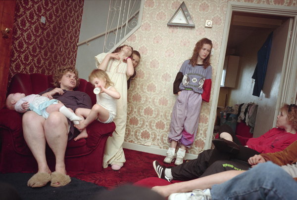
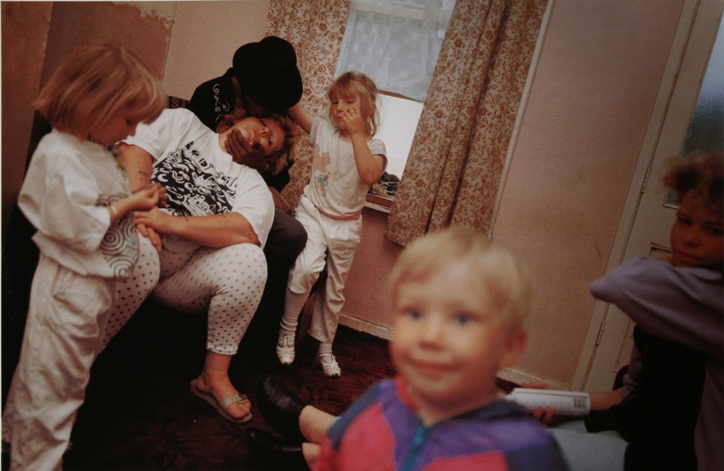 I find this image hilarious as the little boy reminds me of the images that I have made of my niece smiling into the camera and interacting with the person behind the camera. I like that the children are all just stood around waiting for their mum to wake up. I find it hilarious how the woman is sat asleep really showing the struggles of parenthood and constantly being on the move to keep up with the children. Something that took me a bit longer to notice was that what I thought was a male with a beard was actually a female being held up by a man wearing a black hat sat on the arm of the chair. I think that this is down to the exposure of this image which just adds to the amateur of the entire shoot. I do think that the composition of this image is interesting as Waplington was able to capture everyone at a really great angle, with one of the young girls looking at her hands very bored while the girl right in the background of this image looks as if she is trying to capture the attention of the person holding up the woman. I just love the cute little smile on the boys face as he looks happy and as if he is looking off the camera and at Waplington himself.
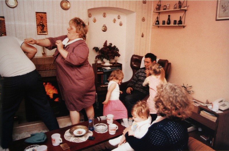 I find this image very interesting to look at. It just looks like a typical family photograph of a regular family dealing with everyday quarrels and laughs. I don’t actually like this image that much as it doesn’t really do much for me as everyone is kind of everywhere and the composition doesn’t particularly appeal to me, I don’t find it very visually pleasing. I do however like the left part of the image where the woman is mid punch/push to the man that is half out of the frame. I find this the most interesting part of the image as it has a story to it but the rest of it is just random to me. I think that this image is definitely capturing a more amateur style photograph as it does just look like an image that a family member made at random on their disposable camera. I do think that Waplington has much better work that this particular image. I think that this image would have looked a lot better in Waplinton was looking up at the family from a low angle as it would have made everyone look a lot bigger and made for a much more interesting photograph.


