Jersey Evening Post: Museum Takeover Day

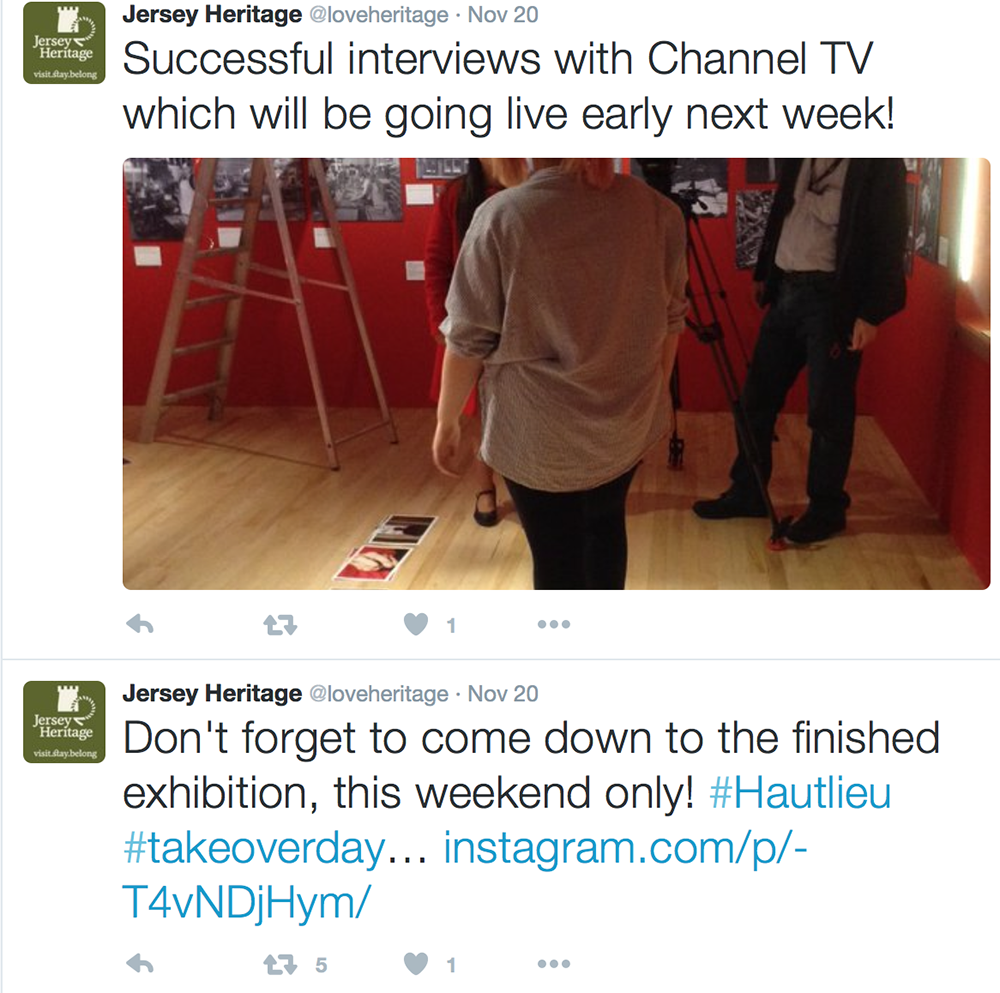
On Friday 20th November 2015 a small team of students went down to the Jersey Heritage Museum to get to work on creating a pop up exhibition entitled 125 Hours Through A Teenagers Lens. We all met at 9am and got into three teams, Creators; Kate, Max, Sophie and Layla, Designers; Heather, Ben, Katie and Georgia and the PR team being myself and Dylan. Each team got to work straight away on making decisions and coming up with plans. As part of the PR team we were took over Jersey Heritage Twitter and Instagram for the day and were given two of Heritage’s iPad’s to use throughout the day. Here we made loads of posts updating locals and followers on what was going on and how everything was going. This was a really fun process and we managed to make a load of great Instagram posts and Twitter updates. We were even retweeted by the founders of the whole museum takeover across the UK on Twitter. Originally Channel Television, the JEP and the local Channel 103 Radio Broadcast were supposed to head down for interviews and live interactions but only Channel TV made it and they interviewed Kate, Heather, Dylan and Lucy. This was really interesting to see the behind the scenes of a news report and to see how many takes they have to do to get it just right with the cameraman actually being more in charge that the women in front of the camera which I found interesting.

I was given a separate task by the head of the entire exhibition Lucy Layton from Jersey Heritage to create a short film from throughout the day as well as making different documentary images. I am currently editing all of this together and think that I managed to get a great deal of shots throughout the day that will really work with the film that I am going to produce. This was also fun to be able to watch the entire exhibition unfold step-by-step and to basically just photograph as pure bare witness like a photojournalist would. This film will be posted onto the Heritage Facebook page. I was really able to get creative and tell the behind the scenes story of what went on throughout creating this exhibition.

Images In The Exhibition:

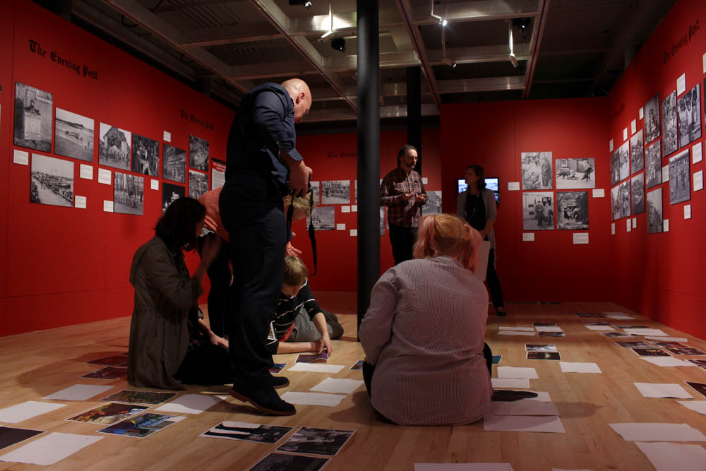
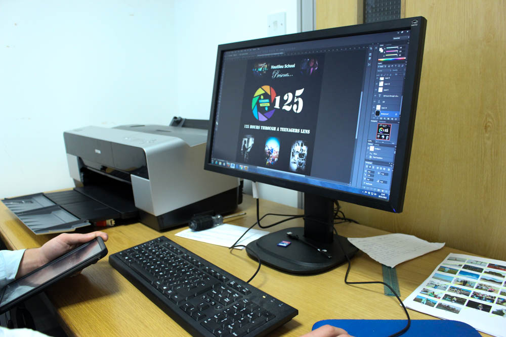
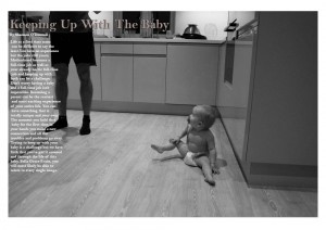
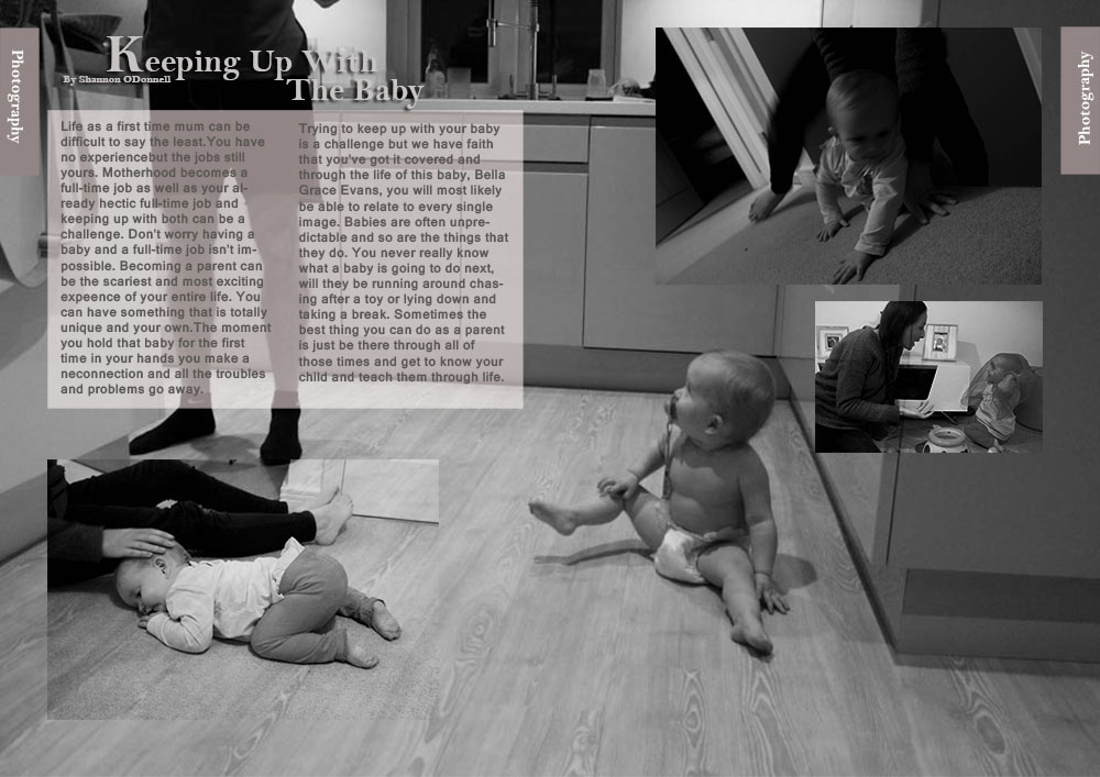
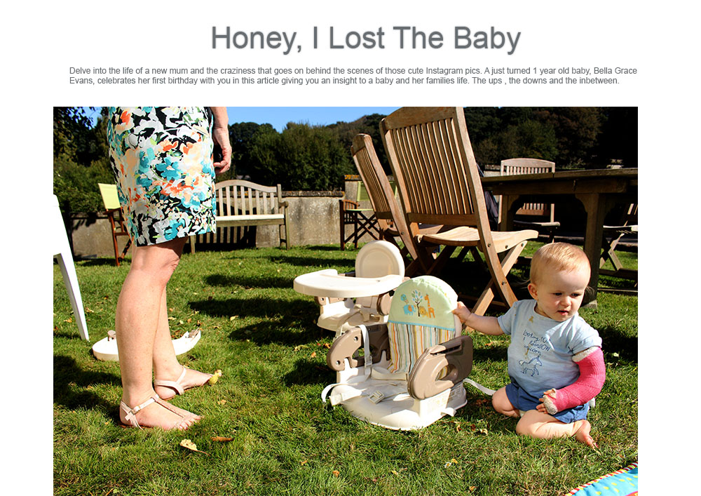
For the exhibition we were required to put in 3 to 5 images for the creation of 125 hours Through A Teenagers Lens. This was exciting to do as our work is going to be exhibited for locals across the island to see life through a young persons perspective. At first I was really unsure as to what images to post as I was thinking along the lines of only adding images of teenagers and their lives but then recently I have been focusing more on my sister and niece and how she is developing as a baby. I think that this is some of my best work and with the help of Toft I chose three images for the exhibition. I am happy with these images as I do think that they are some of my stronger images.

I like these images and think that they will work will with the strong colours to make the exhibition a bit more colourful as at the minute it is all black and white. However, I did make one black and white image which I think looks much better in black and white as in colour it just doesn’t look as good and doesn’t have the same effect. I think this images will work well and are interesting for the spectator to look at. I will make images at the exhibition when all of the images are exhibited. Through the selection process at the exhibition two of my images were chosen and those were the two that are in colour. Throughout the exhibition the design team came up with themes and mainly took one image from different individuals to create a new story. I think that this did work for most of it but found that the images themselves told mini stories yet they were taken out of context for this exhibition but it did work well and looked really great.

Toft and Mckinlay decided on the day that we are now going to create pop up exhibition at the end of every term wherever we can to create little exhibitions of all of year 12 and 13’s work that has been produced that term. I think this is a great idea and it will be fun to get the team back together to create more and this will give us a chance to get more creative and a wider understanding of what proper exhibitions are really like. We will be able to work on the presentation of all of our images as well as progressing each time to make the best possible exhibitions to represent the photographers themselves as well as Hautlieu.

Critique of the exhibition:

As PR and filmmaker on the day I was able to go around all parts of the team and be able to get a proper insight as to what everyone was doing and what went on. I found that everyone worked really well and there wasn’t one person not on task and working at their hardest. The only critique that I would give to the entire thing was that I thought that we should have had the photographers names and a little description under every set of images as that is what the JEP aspect of the exhibition lacked but we didn’t seem to make up for that. In the future I think we will add the photographers names but this time round we were just finding our feet and the creators were so busy with creating different parts of the exhibition coming up with an introduction as well as setting everything up. Also, I think that next time we should start preparing before hand just so it looks more professional and put together in terms of having photographers names etc. Overall, I am really proud of what we managed to achieve and even though the exhibition was quite small I think that it all went really well and everyone did a really great job.

With these images that I took throughout the day I wanted to create more documentary style behind the scenes images to make it interesting for the spectator to see. I really wanted to get a behind the scenes visual of the entire event and the day. This is shots that I made in between filming different behind the scenes shots. I found this a really fun shoot as for the entire day I was able to take the time to make images and to film. This made it so much easier without having anything else to worry about throughout the day.

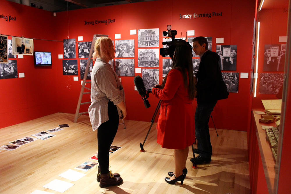
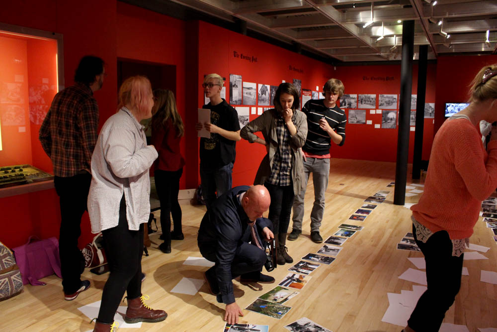
Above are some behind the scenes images of students getting interview by ITV, this will be broadcast either Monday 23d or Tuesday 24th. This was really interesting and funny to watch as they worked well under pressure and came out with some good answers which will be on the news. They asked to speak with a member of the curators team, design team and the PR team to get a rounded opinion from at least one person from each aspect of the project. When watching behind the scenes I noticed how the cameraman actually staged a fair bit of what he filmed with the design team having to mess up and put together the sign in a couple of takes for the cameraman to have extra footage for their news article.

museum takeover day-1516
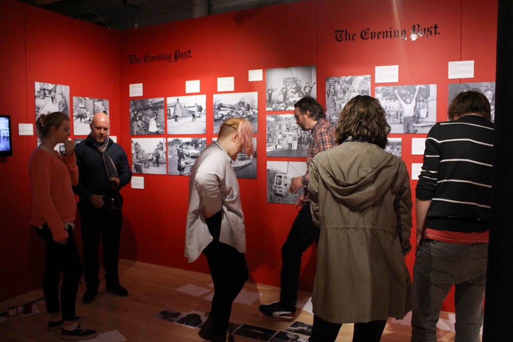
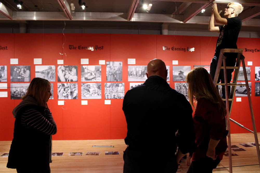
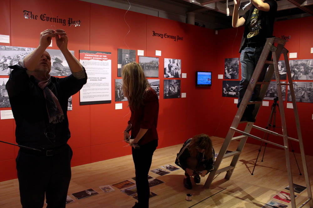
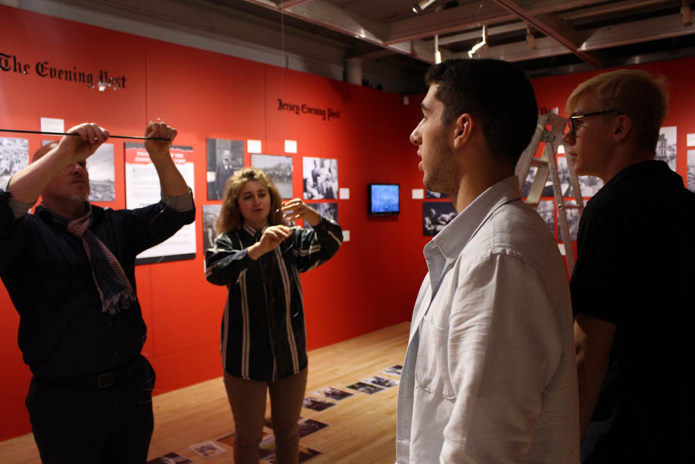
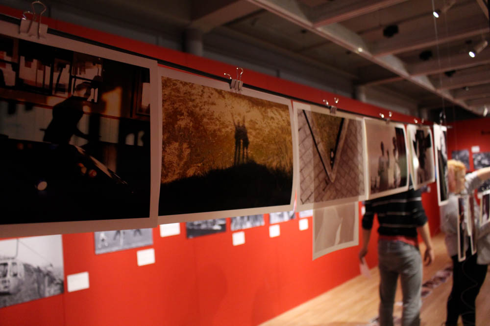
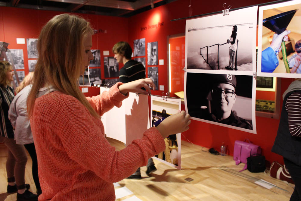
This is one of my favourite images from the exhibition as it is so interesting and was inspired by Claude Cahun. I just really like the expression on the subjects face and the way she is looking away from the camera as if she cannot stare the spectator in the eye. I love the dramatic makeup and think that the wig also works really well. A lot of the images were really great and it was interesting to see a lot of work that the year 12’s have managed to produce. The wire that is sort of in the way of that image is actually what we used to hang the poles up which the images are hanging on kind of like a washing line. Something that this also reminds me of is something you would expect to see in  a dark room when the images are  being hung out to dry. I really like this idea as it makes it easier for us as students to put all of the images up instead of having to mount everything on foam board and adding a load of extra little bits.

museum takeover day-1450
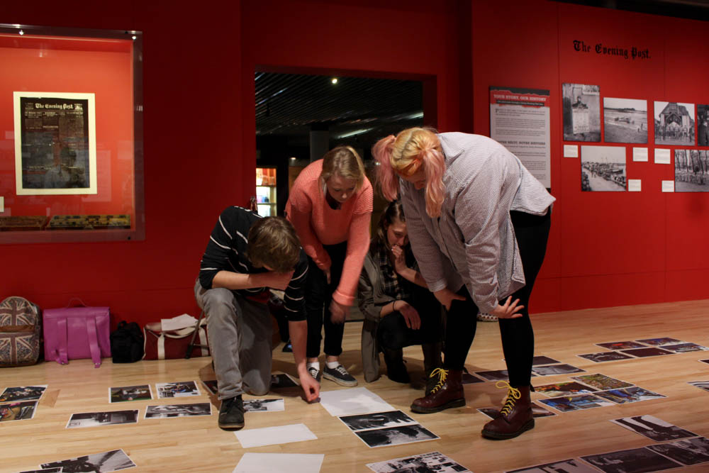
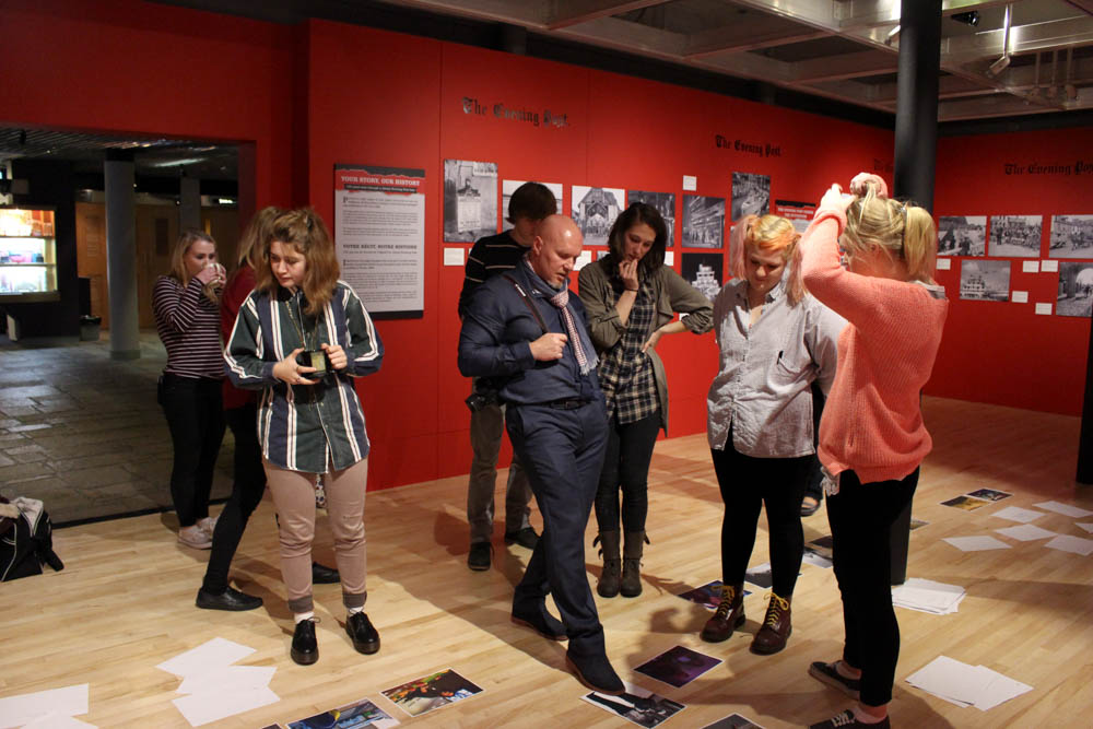
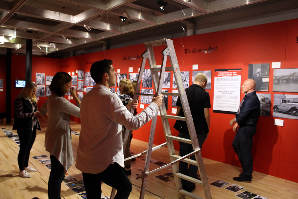
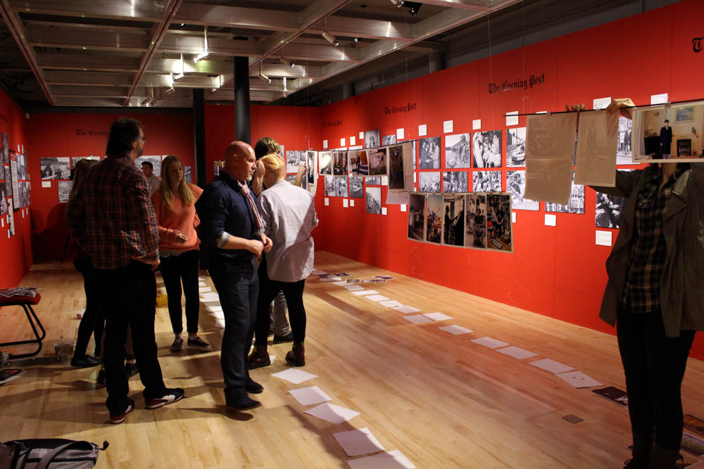
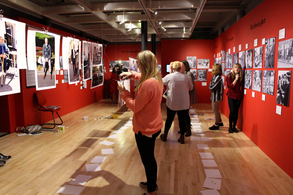
This is just an action shot of everyone busy at work. Layla and Sophie were busy writing down the names of all of the photographers that made it to the exhibition, Kate, Dylan and Max were putting the clips onto the images to put up onto the poles. In the background the ITV cameraman was getting some extra footage for the news coverage which will be shown this week. I really like this image as there is a lot going on and really shows what everyone was actually doing throughout the day. It was hard work getting everything ready and as well as filming and making images I did help to set things up as well as stick to Jersey Heritage Instagram and Twitter.

Jersey Heritage Instagram [JerseyHeritage]
Jersey Heritage Twitter [@LoveHeritage]

museum takeover day-1190
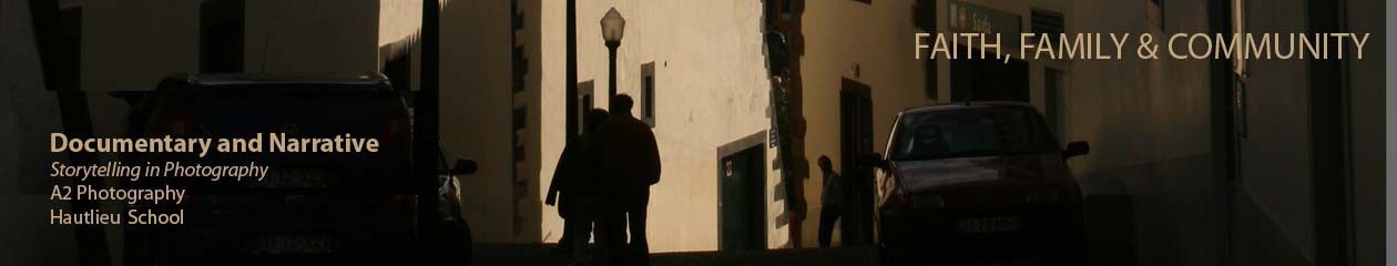
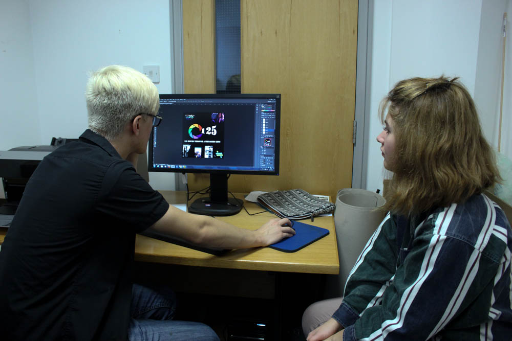
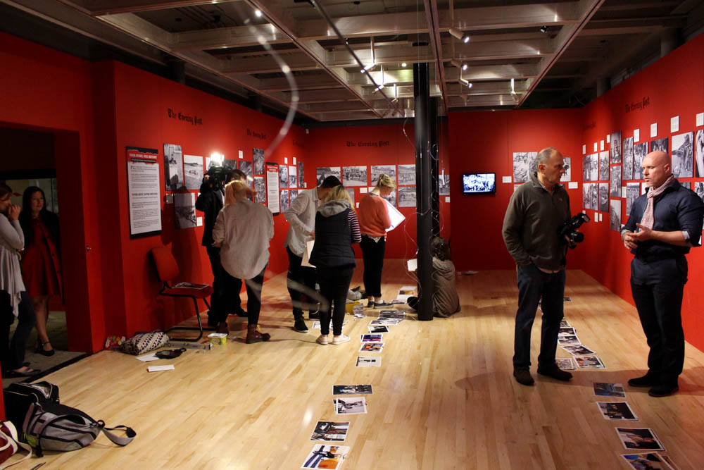
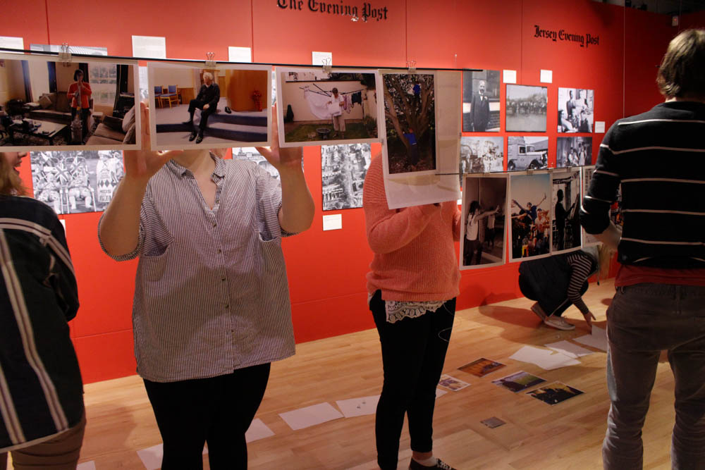
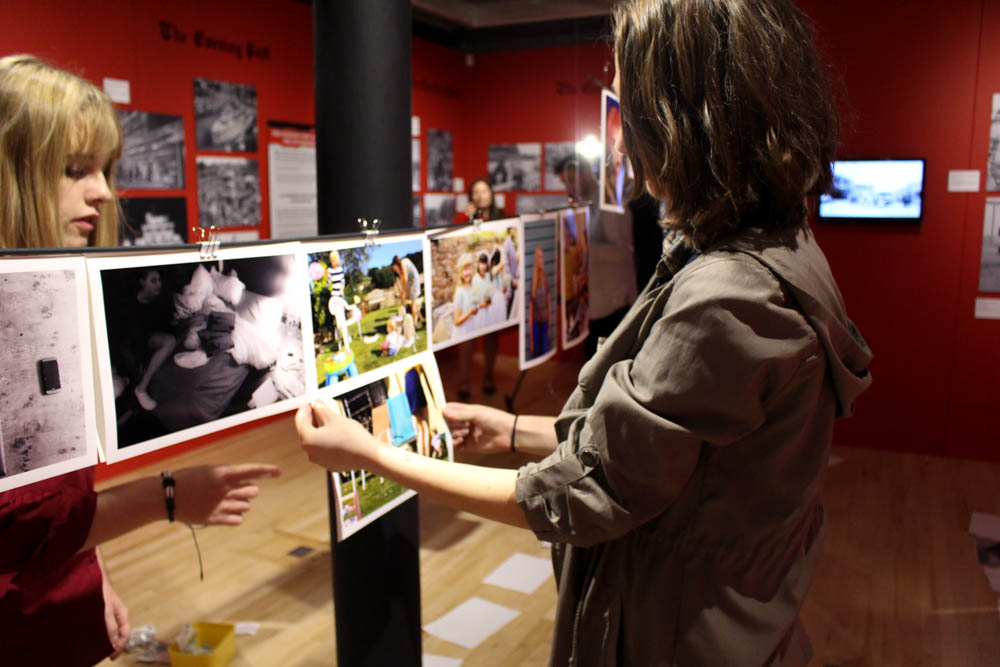
I like this image. This is one from the beginning of the day with the curator team making decisions about which images were going to be included in the exhibition. Here Kate, Layla, Sophie and Max are working together to come up with the best decision as to where the images would fit in and how they would look in this particular exhibition. This was interesting to watch and see how decisive everyone was when making decisions. The team needed to make quick decisions as there was limited time to go out to the printing place to get them done in time for half 4 when the exhibition would be open for a private viewing. I like this shot as I managed to get the team perfectly in the middle of the frame and they all seemed to be posing in a great way for the camera even though none of the images that I made of the day were staged at all. I like that everyone looks deep in thought showing that they really did try their best with making the correct decisions for what looked well and fit in with the themes that they came up with. None of the elimination process was personal as they even got rid of some of their own images as they didn’t fit in with what they were looking for on the day. All of the images that were chosen were great and I think that the main theme of the entire thing was to see the life of a teenager. I think that they interpreted the title in a different way to what I thought as they mainly wanted to focus on being a teenager and not really life through a teenagers lens. They did tend to focus on one aspect of teenage life with being young, having fun, drinking and smoking and skating etc. However, they did manage to add a few images from a different aspect of being a teenager through family.

PR work:

Throughout the day the PR team [myself and Dylan] were given iPad’s to make posts and updates across the Heritage social media. We managed to gain them around 15 followers on Instagram and a few extra followers on Twitter. We got retweeted twice on Twitter by the official museum takeover page from across the UK as well as some retweets and favourites from locals. This was an exciting process as we were able to experience what marketing would actually be like and how we can get the public excited about the entire exhibition. This will be good for in the future when we do more exhibitions. We used the hashtags: #takeoverday, #takeoverchallenge, #archisle, #hautlieu, #societejersiaise.

Instagram and Twitter Posts
Here are the posts that I made throughout the day on Twitter and Instagram. We worked together but made different posts of different parts of the day to make for some interesting content. I wanted to create a load of different Instagram posts which I did throughout and we tended to stay on the Instagram page more than the Twitter page as we wanted to make it as visual as possible since we were doing this as part of a photography project.


Heritage Instagram: https://www.instagram.com/jerseyheritage/
Heritage Twitter: https://twitter.com/loveheritage

Short Film:

Throughout the day I made a short film for the Jersey Heritage Facebook page. This was a fun task and I managed to get a lot of footage from the entire day. It was nice to actually be behind the scenes and to film different bits that the spectator wouldn’t be able to see. It gives them more of an insight as to what actually goes on in the making of the exhibition. I wanted to make this short film as visually interesting as possible so throughout the day I made a load of B roll for when it came to editing it all together. I had a tough job ahead when I imported the footage to find out that I had made 156 videos. I got straight to work on creating a really great short film for the Jersey Heritage Facebook page as well as for school to keep. I found that the entire experience and day down at the museum really fun and interesting making it fun to look back on while editing all of the clips together. I wanted to get an interview with the organiser of the entire event from Jersey Heritage, Lucy Layton, to play over different shots from throughout the day. I thought that this would be more of an interesting way to present the entire day while also explaining what was going on at the same time.I decided to create two short films, one is a lot shorter and more suitable for a school assembly while the other is a lot longer and gives more behind the scenes access to the museum takeover day.

Description of short edition: This is a short behind the scenes film that I creating during Hautlieu school’s one day takeover at the Jersey museum. Here we created a pop up exhibition showcasing fellow students and our own photography work entitled ‘125 hours Through The Lens of a Teenager’ fitting in with the already posted exhibition from the Jersey Evening Post’s 125th year anniversary. Watch out for the extended edition where you will be able to see more behind the scenes footage and get more of an insight of what actually goes on behind the scenes of a small museum exhibition.

[EXTENDED VERSION COMING SOON]

Description of film: For this project I was asked to come up with a short film to showcase the time, effort and talents of the creatives at Hautlieu school. Here 10 students, including myself, were invited down to the Jersey museum where we came together with the Jersey Evening Post, Jersey Heritage, Archisle Societe Jersiaise and took over the museum as part of a UK wide #takeoverchallenge. This is an extended version on the behind the scenes look of what went in to creating this pop up exhibition as well as the time and effort put in. Enjoy.

Jersey Evening Post article: http://jerseyeveningpost.com/jep-picture-galleries/2015/11/24/gallery-hautlieu-students-take-over-jersey-museum/12228205/

“when you take students out of a school context and into the real world, they are capable of doing amazing things.” – Martin Toft

Our pop up exhibition has been extended and will be open until Sunday 29th November 2015! This has been a really great opportunity for Hautlieu students which also resulted in a two page spread in the Jersey Evening Post as well as a featured article on their online site. 

Magazine Picture Story Layout

I wanted to create a more interest set of picture stories that go more into a modern style magazine article as I find this style is becoming more popular and magazines are getting more and more graphic and visual. I want to use geometric shapes to make my picture story more interesting too and to make the images look cooler. I think I like the look of my professional/classic photographic style and will adapt my picture story layout to look sleek and professional too. I think that I prefer the style and layout of a magazine article but then again I am unsure whether or not my specific images will look right with this style, either way I am going to experiment and see how it goes.

Editing inspiration:

Title and text:
For my picture story I have found that my favourite title is ‘Keeping Up With The Baby because it is so true that as a parent you would be constantly running around and having to watch over your baby because they can get up to something the second you look away. I also like this as I took inspiration from the reality show Keeping Up With The Kardashians which is a TV show that follows round a family through their everyday life and the use of the play on words that I did for mine basically shows how as a parent the only thing you’ll be able to keep up with is your child. For the text I have been changing it around each time and find the more times I change it the better it gets so for now I am still just experimenting with what I’m writing and keeping to the third person story/not making it sound like a blog post.

Experimentation 1

keeping up with the babay magazineblog so farI really do not like this layout as I find it just looks so cluttered and isn’t good enough. I am going to have to choose between colour and black and white because otherwise the images look too different to me and they kind of look like separate images and shoots rather than one big picture story. This is a lot more difficult than it looks as I just can’t seem to find a design that I actually like. I think the grey background also doesn’t look very good along with the grey triangles, it looks very basic and unprofessional. Through my next edit I will make it a lot better and work on which images I will be selecting to go into the magazine itself. I actually really dislike this layout and think that it looks majorly tacky and will have to have a rethink and make changes to make it a whole lot better.

More editing inspiration:

Experimentation 2

keeping up with the baby edit 1blog
First edit

This picture story was inspired by one of my inspiration images above titled Isolation’, I found that this one looked really great and wanted to give it a go myself. I do think that this is a strong image and works well with the text on the left hand side, however I do think that I need to use more images and possibly change the position of the text to make it look better and more like a traditional picture story rather than one that just has one image explaining the entire story. I do really like this image and think that it all works well but I am going to carry on experimenting with this one and possibly some new designs to make the best picture story that I can.

keeping up with the baby edit 1 blog 2
Edit progression

I decided to carry on experimenting with this layout as I do think that it is an interesting one visually and looks a lot better for a magazine layout than any other ones that I have done previously. I think that I just need to focus on what I think looks good and makes sense to me rather than trying to follow a traditional template of what a newspaper photography article would look like. I added three more images down the right side of the double page spread as I thought it added more depth to the shoot and really works well with the title of Keeping Up With The Baby’ as there are plenty of images of the baby running and moving about and playing constantly. I do really like this edit as I think it is the best one that I have done so far. It isn’t visible in this post but I actually made a white boarder around the whole double page spread as this is what I have seen in my magazine style models.

Experimentation 3

keeping yp with the baby edit 2blogI actually really like this edit as well. I think that I was trying to hard to make my picture story fit into the idea of making it like a newspaper which didn’t really work out well for me. I definitely prefer the layout of a magazine as it is a lot more visually interesting and is a lot nicer to look at. I took inspiration for this layout from another of my magazine layouts as I thought it was really interesting. I prefer these layouts and think that it looks good in black and white as it allows the reader/spectator to focus in on the images and the writing instead of being constantly sidetracked or distracted by the different pops of colour within each individual image. I also find these particular images look better in black and white as they were taken inside and the lighting isn’t really amazing and the colours around the house are very neutral.

Experimentation 4

keepinh up with the baby edit 3blogI do like this edit although it is similar to the one above. I decided to make my key image one of my niece with her mouth open looking as if she is shouting and so I decided to duplicate this to make it look like an echo of her shouting, it represents the noise she was most likely making when this image was created. The text is the same as above and basically talks about life as a parent and how hectic it is. The three other images I chose reflect the title of my picture story with the one of the far right being my niece quickly running down the stairs as my sister is trying to jump down before her so she can watch out for her and try to keep up with her. The middle image is one of my niece in her nappy looking up at her dad with a dummy in her mouth. I thought that this image worked well within the picture story as it is interesting to look at and with her leg slightly elevated it looks as though she is ready to crawl away. The far left image is one of my niece drinking from the little medicine tube that my sister uses to give her any medicine that she needs, in reality it’s just sugary liquid. I do like this picture story as it is interesting and would make the reader want to read more and look at the images.

Experimentation 4

keeping u with the babt magazine layout article ideablogI decided to create another layout design for a magazine article. This one I added the page sides that you would usually find in the different sections of a magazine. I think that the text works well in the two columns and looks a lot better than just down one line. I also like that it looks as though my niece is looking up at the text too. I really like this background image as it is interesting and I like the position that my niece is sitting in. I do think that I need to work a bit more on this design and add images around the blank areas to create more of a story for the spectator to be able to look at. I think that this layout looks the most like a magazine article and I like how it looks so far. I think that I will continue editing to try and make it better and more interesting to look at.

keeping u with the babt magazine layout article ideablog2I really do not like this second design. I think that it just looks like a bit of a mess. The original edit of this page looks a lot better as it is simple and looks a whole lot more professional than this page that I have added to. I don’t like the way the images look as they aren’t all an equal shape, usually that would look fine but I just think that in this page it doesn’t look good at all. I also do not really like the box around the text but it does help the text and makes it easier to read and stand out a bit more. I do like the image in the bottom left hand corner as it kind of blends in with the background image and looks as though it is part of the same photograph a part from having the boarders around the rest of the image. I think that it does work well with this page and looks good with it.

keeping u with the babt magazine layout article ideabloggggggThis is my favourite layout out of the three in this experiment as I do like the boarder behind the text. I find this a whole lot better as the text is easier to read and stands out a bit more and I like that the focus is on the one image of my niece looking up innocently at the text. I prefer this image in black and white as it stands out more as the colour version is really dull as there aren’t that many colours at all to make the image interesting. This one does look the most like a magazine layout and I do think that it looks professional but I don’t think that I will want to use it for a final as it isn’t really a picture story and doesn’t stand out enough for me personally.

Reflection

I don’t really like working with a picture story that I’m not 100% with in the beginning and if I don’t think that I can make it any better then I will completely start over and create a new one. I just find this method a lot easier and more effective. I want to create the best picture stories that I can without making them look tacky at all and I want them to stand out and look professional. I came up with the title/headline of Keeping Up With The Baby and took inspiration from the reality TV program Keeping Up With The Kardashians where a camera crew follow the lives of one family. I thought that this was a good play on words and works well as my niece is always so manic and crawls around everywhere until she goes to bed. I came up with the caption by just writing generically about what being a parent is like and basically relating to my target audience of parents and how they would be able to relate to the text as well as the images as every parent tends to go through very similar kinds of things. Here is my caption‘Life as a first time mum can be difficult to say the least.You have no experiencebut the jobs still yours. Motherhood becomes a full-time job as well as your already hectic full-time job and keeping up with both can be a challenge. Don’t worry having a baby and a full-time job isn’t impossible. Becoming a parent can be the scariest and most exciting expeence of your entire life. You can have something that is totally unique and your own.The moment you hold that baby for the first time in your hands you make a neconnection and all the troubles and problems go away. Trying to keep up with your baby is a challenge but we have faith that you’ve got it covered and through the life of this baby, Bella Grace Evans, you will most likely be able to relate to every single image. Babies are often unpredictable and so are the things that they do. You never really know what a baby is going to do next, will they be running around chasing after a toy or lying down and taking a break. Sometimes the best thing you can do as a parent is just be there through all of those times and get to know your child and teach them through life.’  I didn’t really add separate captions to each of my images in the edits above as I thought that it looked better without as a magazine layout but for my newspaper articles I did add some captions underneath all of the images as it did look a lot better.

Picture story designs 2

I have experimented with different picture story layouts  and designs, with the photographs I took of my dad. My main focus was trying to transmit the story through a few photographs.  I experimented with different photographs to find a combination which worked well together. I made more traditional photo stories by keeping the photographs straight and keeping the symmetry, similar to the ones by Eugene Smith. I tried to use a variety of different photographs such as detailed shots, portraits and environmental photographs to get a broader range. I also experimented with different backgrounds, I think the black background made the picture story look more professional however I think the white background works best. Although my first picture story is all in colour I chose to keep the photograph of my dad with his medication in black and white to emphasize that it’s the negative part of his life which is holding him back.

1 (Custom)

2 (Custom)

Untitled-1 (Custom) (Custom)

Picture story designs

These are the first few designs that I have come up with for my picture story, in Photoshop I have focused on more ‘classical designs’  and have experimented with different layouts, designs and font types to find which design looks best . Through out the photo designs I have kept the symmetry and not experimented with rotation or backgrounds because I think adding these features will make it look more like a magazine spread.  I like all three of these designs although they are not definite and I’m still working on improving the designs and coming up with new ones.


d4

d7

d8

PHOTOSHOP – PICTURE STORY

To create the document in Photoshop  – New document, International paper, A3, RGB colour. 

First off place the images in Photoshop and place them onto the page. You should make all of the images into a line and re-size them all to the same size for some of the images. Place another image in the is larger which will be the establishing shot and tilt the image so that it is slanted. Then to place a shape into the picture story –  elliptical marquee tool will make circle shapes that you can place into the picture story, you can use the paint bucket to change the colours of the shape. Polygon lasso tool will give you a triangular shape and rectangular marquee tool with give a rectangle shape. Place another image into Photoshop that can be placed into the background of the image, use blending modes to blend the image into the background so that it sits behind all of the other images. By adding a layer mask you can choose black and white, black foreground, white black ground, then you can erase back and keep the the parts of the real images that you want to keep. In addition by changing the opacity of some of the layers it will make the images more clear that you want, once you have used the blending modes as some of the images may be covered. 

The writing


The writing has to be journalistic, you have to write about the story which you have explored. This will be written from a third person perspective. What i will look up is what is anxiety, and why do people struggle from anxiety. The text will be a deign feature, columns will make the text look more interesting on the picture story. You can look up different fonts by looking on Adobe and looking at all the the different fonts which you can download to add to the picture story.

Wedding picture story2

I made this picture story on what we learnt in class and by placing my image differently to create a unique looking picture story. I think that placing the right side of the picture story images into black and white it makes them stand out from the other image. On the images on the left i copied them using the duplicate tool to make this dragged out effect which i think looks really interesting because of the colours that are in this image. For this picture story i need to make a title. 

Experiment 1:Wedding picture story2

I added a title to this picture story which i slanted on the side which i think fits in with these images that are in this story board. 

Experiment 2: 

The wedding2

This is my second edit from my wedding shoot that i took, i placed one of my images as the background and placed the image in black and white, i think that this image looks good because the images are in colour and the background is in black and white. In this text i wrote about how a wedding can be special to someone and how it is shared between two people. 

Experiment 3:

small image size

For this experiment i selected over my image and (select, layer via copy) and changed the colour of the background, i did this by placing a colour overlay over my image, and then i changed the colour of it to purple to match the purple in one of my images. I used the blending modes to blend the colour overlay into the image and then changed the opacity to soften it. I also selected a strip down the right hand side to made it darker also, this makes some of the features in the image stand out as well and makes the image better. 

Developing a Picture Story

For this task I decided to use images of my niece. I think that this is my most interesting story so far and think that the other stories that I have are’t as developed as the ones of my niece. I’ve been experimenting with different images and wanted to create the best possible picture story for my shoots. I took a lot of inspiration from the newspaper article on the ‘Nurse Midwife’ by W. Eugene Smith.

Tips:
– write the text in third person
– talk as though you are a journalist
– add different sized images
– make sure images tell your story
– don’t make text like a blog post
– fontspace.com for differnt font types

Experiment 1

bella article page 1 blog
page 1
bella article page 2 blog
page 2

I am not too keen on this layout as I don’t think it looks very good and doesn’t really seem like much of a newspaper article. I think that with my next experiment I will try a different layout and change it around to make it more visually appealing. I do like the colours in my images and think that they stand out and look good as part of a newspaper article. I also think that the text can be improved a lot more.

Experiment 2

bella picture story idea 2blog
page 1
bella picture story ideablog
page 2

I prefer this layout to the first experiment as it looks well put together [compared to the other one] and was more inspired by the work of W. Eugene Smith with his paper article of Nurse Midwife. I made these images black and white to fit in more with my inspiration newspaper and I do think that it looks good. Through my next experiment I think that I will leave the images in colour and start to create a  text in columns and more suited to the newspaper style.

Experiment 3

keeping up with the babyblogHere is an unfinished experiment that I have done. I plotted where I wanted the text to go and have filled it in but not with the actual text that I am going to be writing. I do think that this experiment is more newspaper like but I think the images that I chose are too much as it looks as though there is way too much going on and the spectators eyes wont be able to direct to one part of the image, I feel like it is bombarded with different colours and images where a lot seems to be going on. I need to focus more on finding images that create on larger story and that work well together and compliment one another rather than images that feel cluttered and not very good.

Photo-shop: creating a picture-story

The stages of creating my picture-story:

Firstly, I opened a new page of photo-shop, which needed to be size A3 and was international paper. Next, I selected the archival images I wanted to use and adjusted them so that I could see which designs looked best. I wanted to have a combination of black and white images as well as coloured images too. I decided my establishing shot to be the only photograph I have of my grandfather on his own because I found it fitting for it to be the main image which an audience looks at first. 

ttttt

wwww

After experimenting with the more traditional style of picture-story, I decided I wanted to take a more contemporary modern approach. I think the theme of my project being memories means the design needs to reflect it in order for it to work well. I took inspiration from one of the magazine spreads I found on the internet. I thought it was very imaginative and creative which is what I want my picture-story to portray. I overlayed the images of my grandfather because I have so many memories of him and he has lots of different aspects of him which I want to show in my study. This will be the establishing shot and the title will go in the top right corner so that they correspond. I think I want to experiment with having snap shots of family moments down the right side. But I will also produce a second versions of this picture-story however, instead I want to put more focus on the photographs I have taken now. I want the flower image to be the background which I will use the opacity tool to change the intensity. 

pic

picture story photo

Inspiration: These are some examples of picture-stories I found on the internet. They are magazine spreads and are very contemporary which is the style I want to experiment with. My favourite is the second one, I like the theme of it and the way it has been designed. It goes very well with the theme of memories and the past. Plus it has writing on the right and the photograph on the left of the page which is what I wanted. 

20000101_6619

magazine4