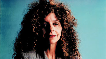
Barbara Kruger is an American conceptual artist born in 1945. Much of her work is done in black and white overlaid with declarative captions. These captions are written in white on red backgrounds with phrases in her works often including pronouns such as ‘you’, ‘your’, ‘I’, ‘we’ and ‘they’ really personalising her messages towards the spectators. Her messages address cultural constructions of power, identity and sexuality. I like the concept of Kruger’s work as she brings clear messages to the spectator and tells them what they should see in the image. Kruger is a conceptual and feminist artist.
Kruger’s website: http://www.barbarakruger.com/
Krugers MoMA portfolio: http://www.moma.org/collection/artists/3266
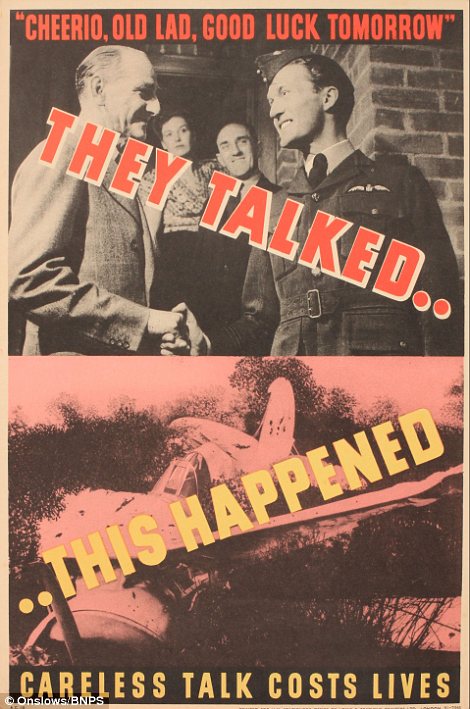
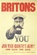
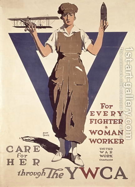
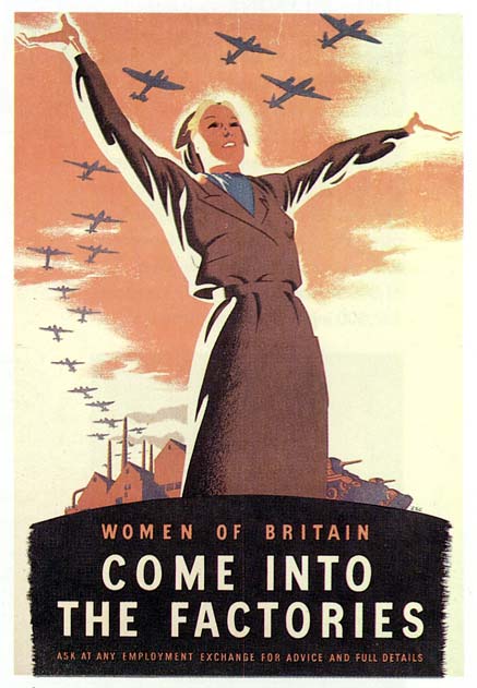
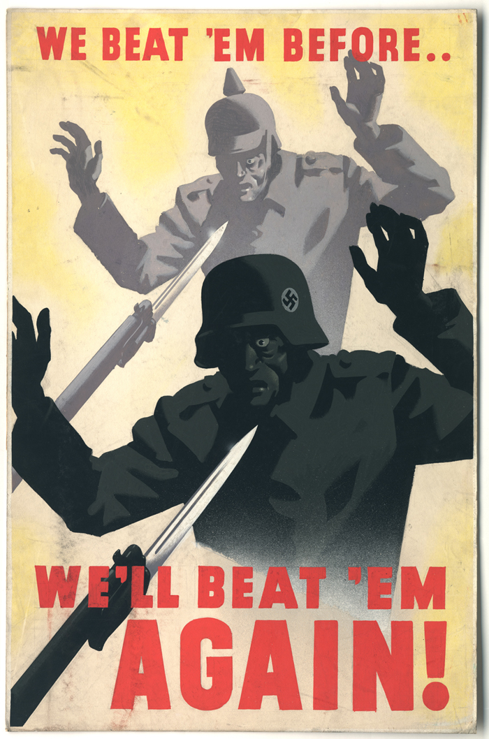
I think that I will take inspiration from Kruger in my own work and add this kind of Dada style written text and imagery in my own photographs. This style also reminds me of propaganda and really sends out clear messages. It mainly reminds me of the Second World War when they would try to get women into the factories to help in the war effort and how they would influence people to become soldiers. I find this a very interesting concept and can be highly influential and effective if it is actually done well.
The Guardian article on Kruger: http://www.theguardian.com/artanddesign/2014/jul/06/barbara-kruger-modern-art-oxford-review
“one of the best artists of the 1980’s without actually doing much that is new.” – Roberta Smith review
Conceptual art
Conceptual art is an influential movement that first emerged in the mid 1960s. It brought up ideas over the formal or visual components of traditional works of art. Conceptual artists will often challenge old concepts of things such as beauty, they question the conventional means by which the public consume art. Artists will often reject the conventional arts and use ranges of medias including maps, diagrams, texts and videos. Kruger is constantly making new images, she will find old archive images of something and stick a text in front of it with a clear meaning.
Feminist art
Feminist art emerged around the same time as conceptual art in the 1960s and 1970s. This came about so artists could explore questions of sex, power, the body and how gender categories seem to structure the way we see and understand the world. This art also frequently involves text and performance elements. Kruger will often use staged photographs as backgrounds for her text and manages to find great photographs to make her images stand out even more.
Whose Values? project by Kruger and 400 students:
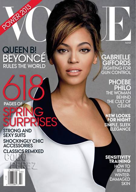
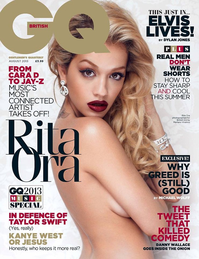
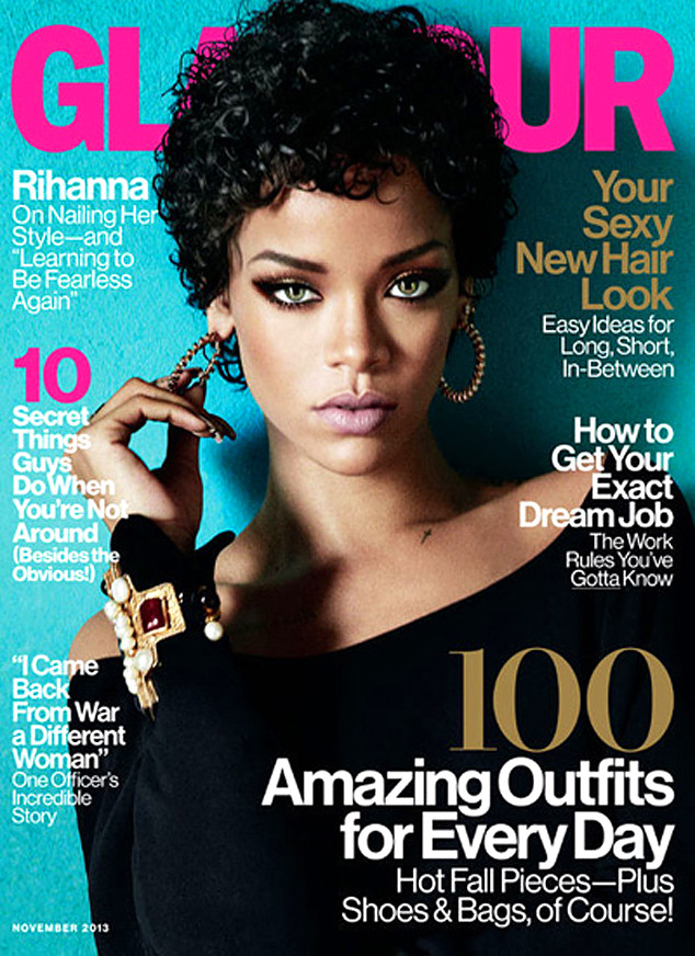
I do enjoy looking at Kruger’s work as a lot of it holds strong social messages. She tends to make her messages very clear and easy for anyone to understand as she has blatantly written them in found photographs. I think that I will use the idea of this within my work and incorporate it into my own work as well as experimenting with other works too. I want to be able to broaden my skills within photography and be able to make more artistic links within different forms of art and not just in the photographic sense. I think that I will be able to make quite a few different responses to Kruger’s work as I find this very interesting and unique in the photography world yet it seems so simple. Kruger took inspiration from magazines and made it her own, she believed that if they could do it and hold so much influence then she could do exactly the same thing. I am excited to respond to this body of work.
The Atlantic review of Kruger: http://www.theatlantic.com/entertainment/archive/2012/08/the-unsettling-text-driven-world-of-barbara-krugers-belief-doubt/261348/
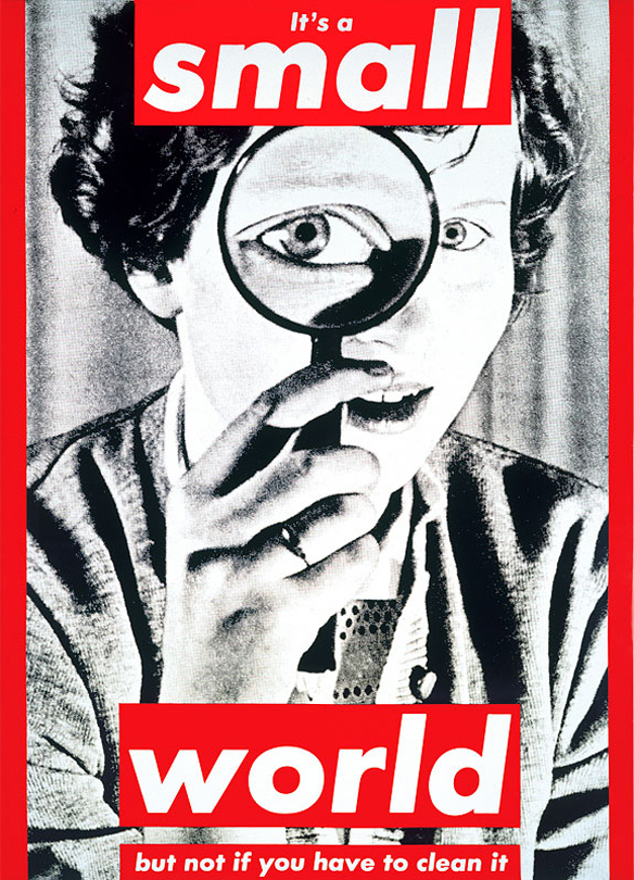
 This image particularly interests me as the background image is a woman looking through a magnifying glass. The text fits with the photograph as it states that the world isn’t small if ‘you have to clean it’. I think that this is really effective as the woman seems as if she is looking for dirt to clean and that she has to look closely to actually clean up and that there is so much to clean in this massive world. I like the bold font with ‘It’s a small world’ and the rest of the text much smaller ‘but not if you have to clean it’. For some reason this stands out to me and kind of seems like Kruger was saying ‘It’s a small world’ quite loudly and proudly while saying the part in the smaller text under her breath as if making a sly comment. I think that this is a strong image and shows how women are expected to do the cleaning and look after the house etc. There isn’t much to this image as the text is very plain and simple. It is obvious and to the point, it doesn’t just suggest things allowing the spectator to make their own perception it literally tells them exactly what she was thinking and what she wanted the spectator to get from the image. These images aren’t her own but she uses old images to make new ones with her own original text in front of them.
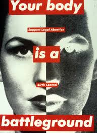
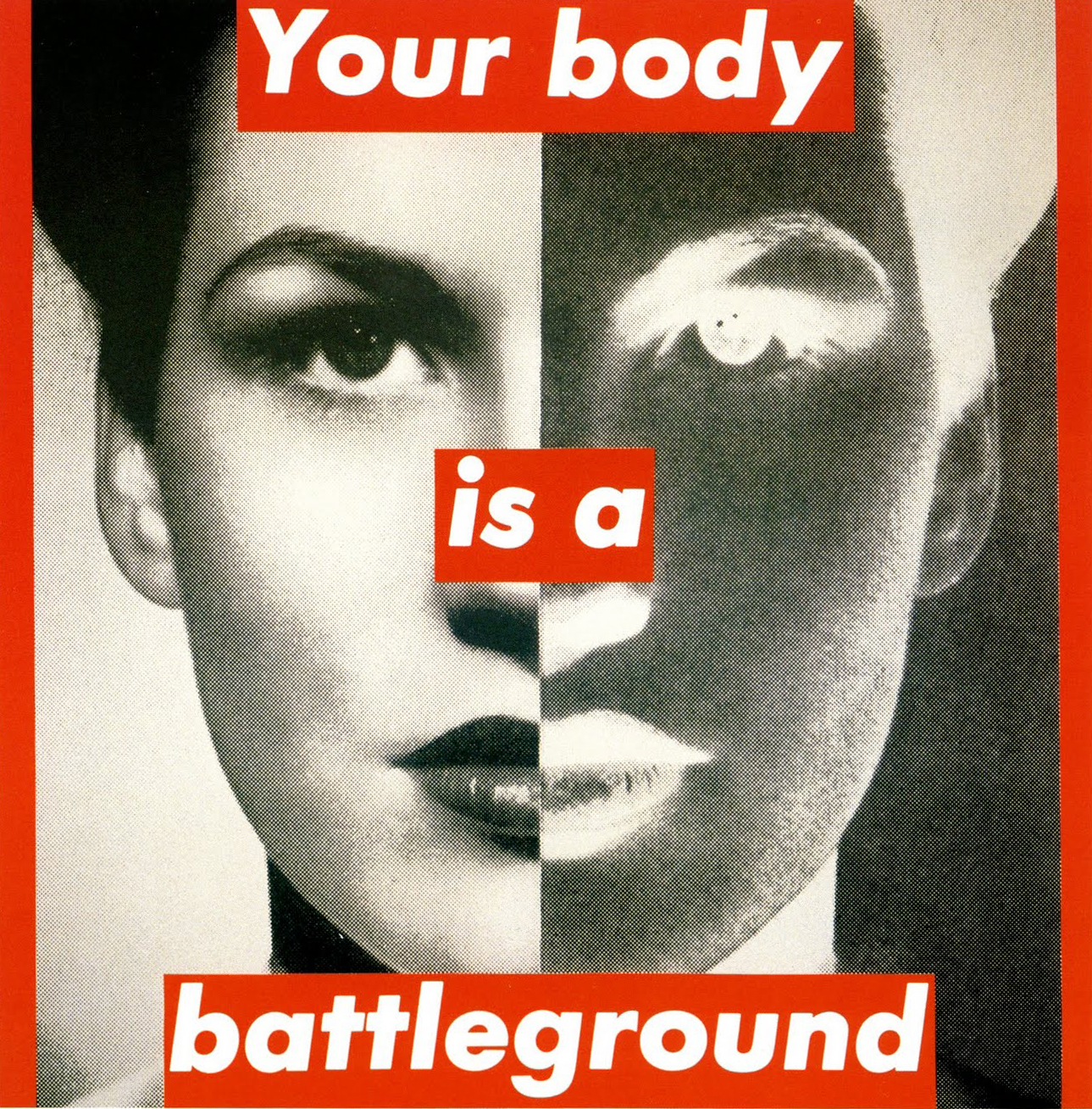 Another image that stood out for me was this one above. I think that this is the perfect image to go with Kruger’s text as it is very bold in itself and stands out to me. I like that one half of the image is in black and white with the other half in negative. This shows two sides to the subject, one pretty and good while the other looks more scary and a little bit sinister. The message that Kruger brought across was ‘Your body is a battleground’, this really interests me as it is in front of a woman’s face and how possibly the struggles that women face every month with having periods and going through cramps and constant bleeding. This could be what Kruger means by ‘battleground’. It could also be through pregnancy and how women often go through the struggle of being pregnant and then having children and being expected to carry on with everyday life almost straight away. I like this image as it is bold and is open for spectators interpretation.
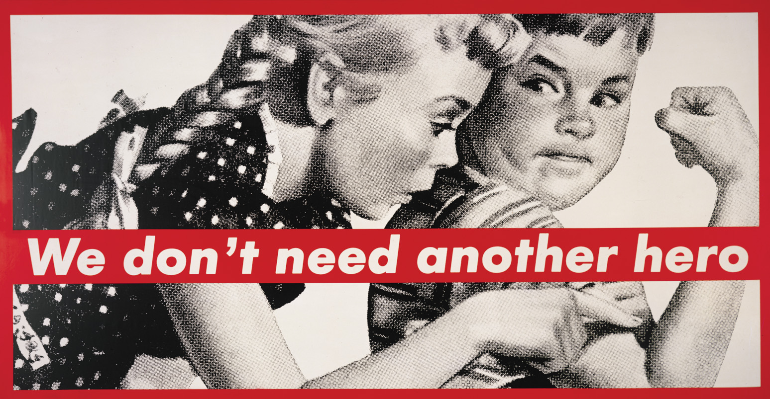
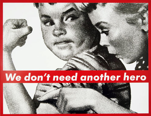 One other image that I like is this one above because it seems as if a little boy is being told that he doesn’t need to grow muscle as his mother pushes him down. The text really works with this image and is effective as it says ‘We don’t need another hero’. This could possibly be a message to young boys that they don’t need to feel that they have to fight in wars to be seen as masculine and they don’t need to conform to societies expectations of having big muscles and being strong and independent. It is almost as if his mother doesn’t want him to be another ‘hero’ because she loves him and doesn’t want to lose him like many other mother’s did during World War II. I think this is one of my favourite images as it is quite powerful and stands out to me. I think that the image and the text blend well together and almost look as though the image was made for the text and that is the way it was broadcast.



Excellent blog post which contextualise Kruger’s work within feminism and conceptualism. I’m eager to see how you plan to respond to this. Maybe try and elaborate on this. What type of words/text are you intending on incorporating? Maybe use language used in Social Media which are misogynist and sexist against women and then subvert it. Look up Yoko Ono and her early conceptual films challenging female sexuality.