Monthly Archives: September 2015
Filters
Family album
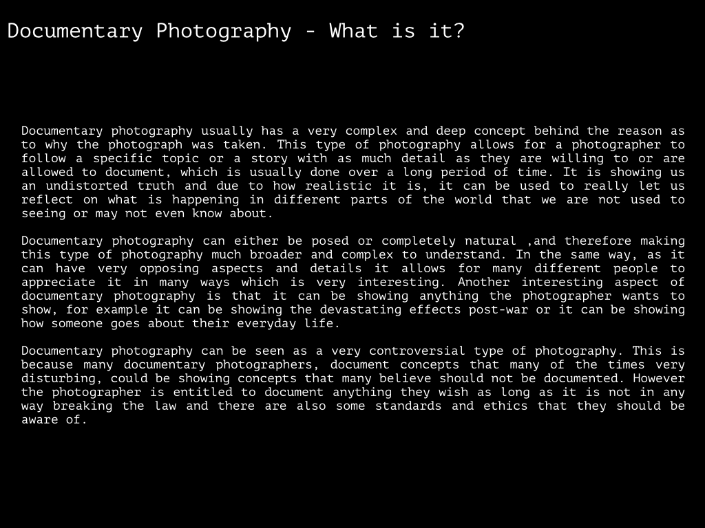
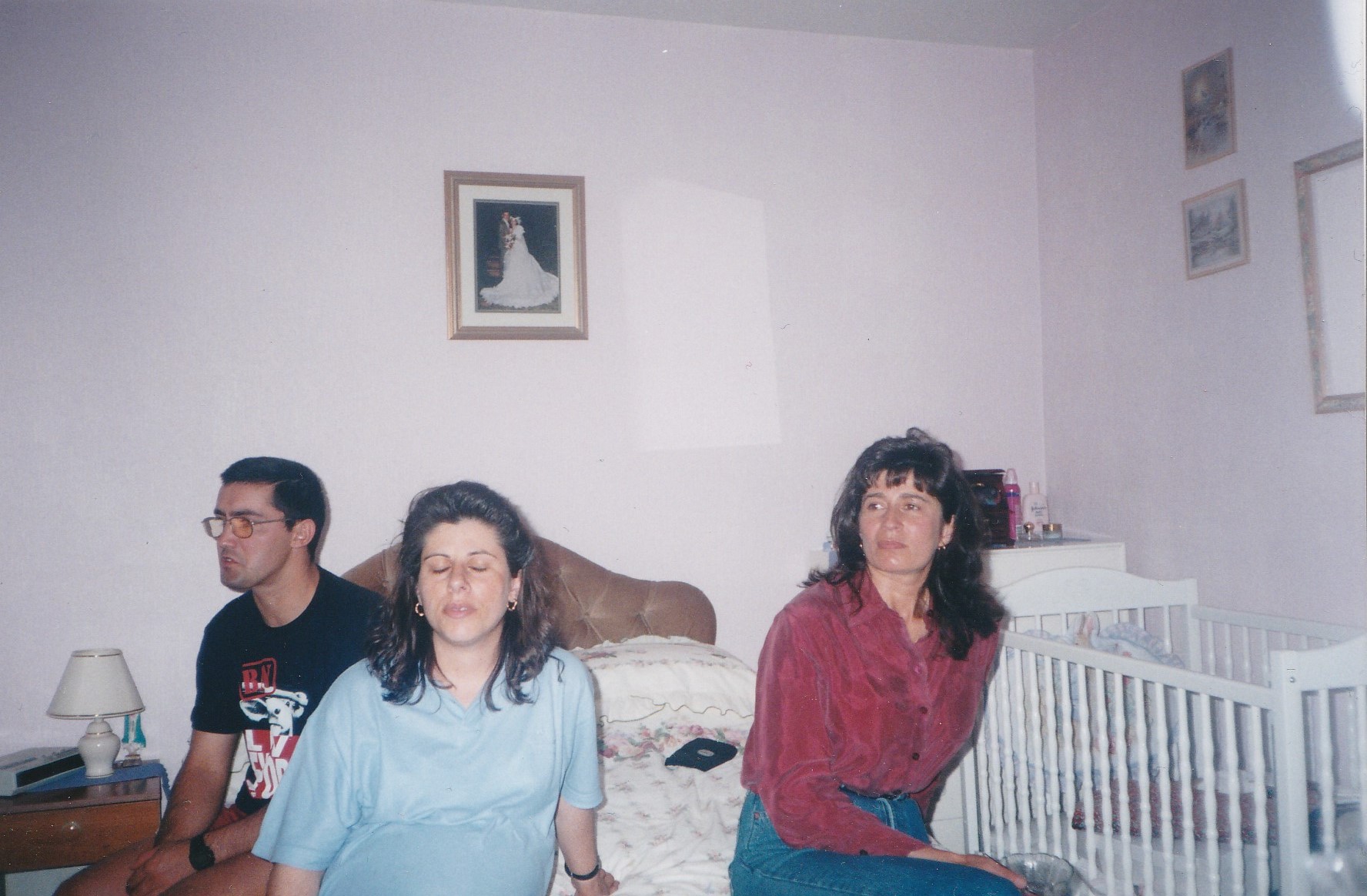
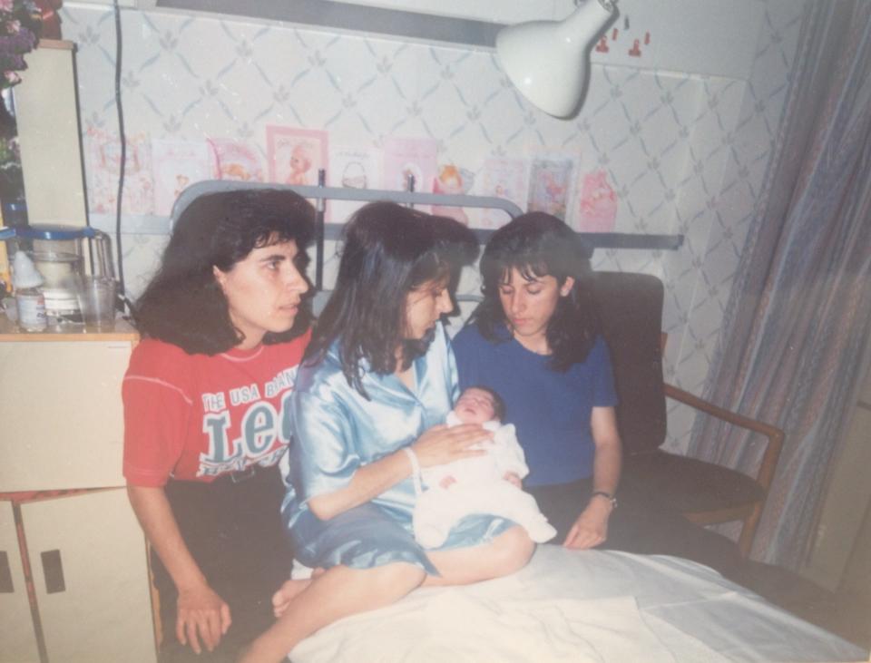
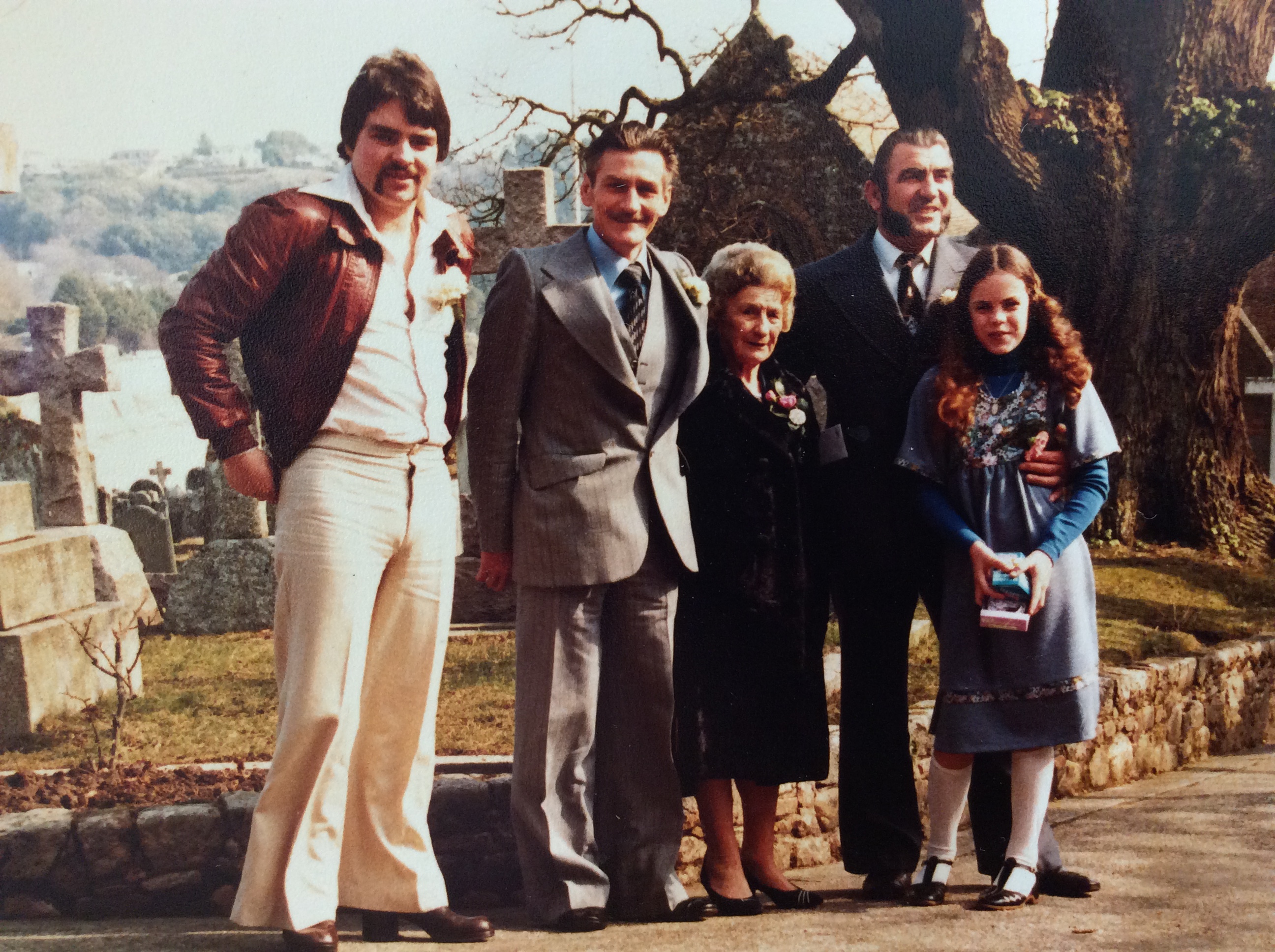
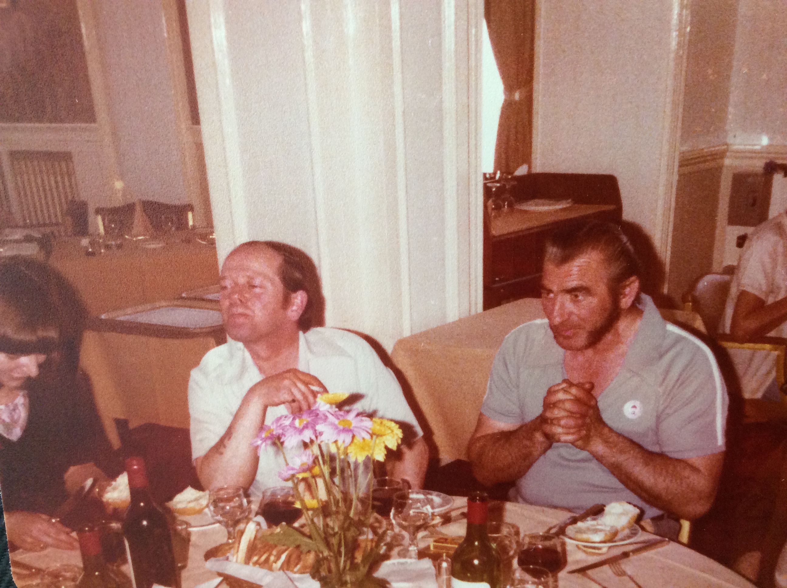
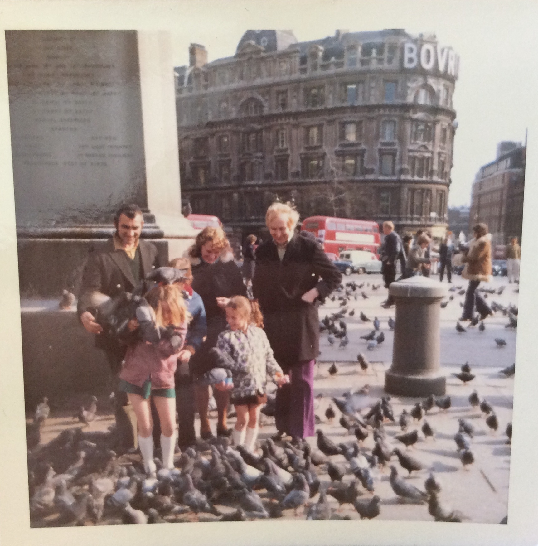
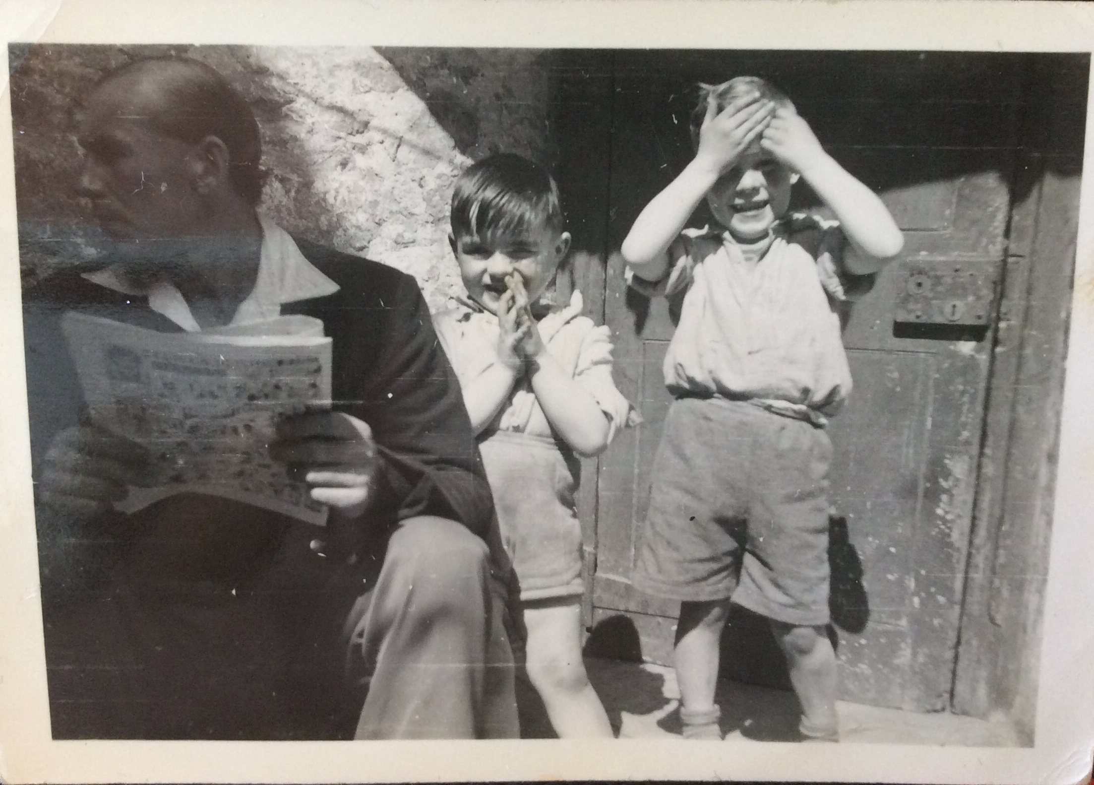
I started looking through my family albums and found some photographs of my mum’s side of the family before and right after I was born. However I don’t have access to photographs which were taken any earlier than in 1997 because they are with my Nan who lives in Madeira. My mum is part of a 6 sibling family I was able to find photographs of two of her siblings who were living in Jersey at the time. I also found a photograph of my auntie and two of my cousins in Madeira outside my Nan’s house.

Chris Hondros – Analysis of Work
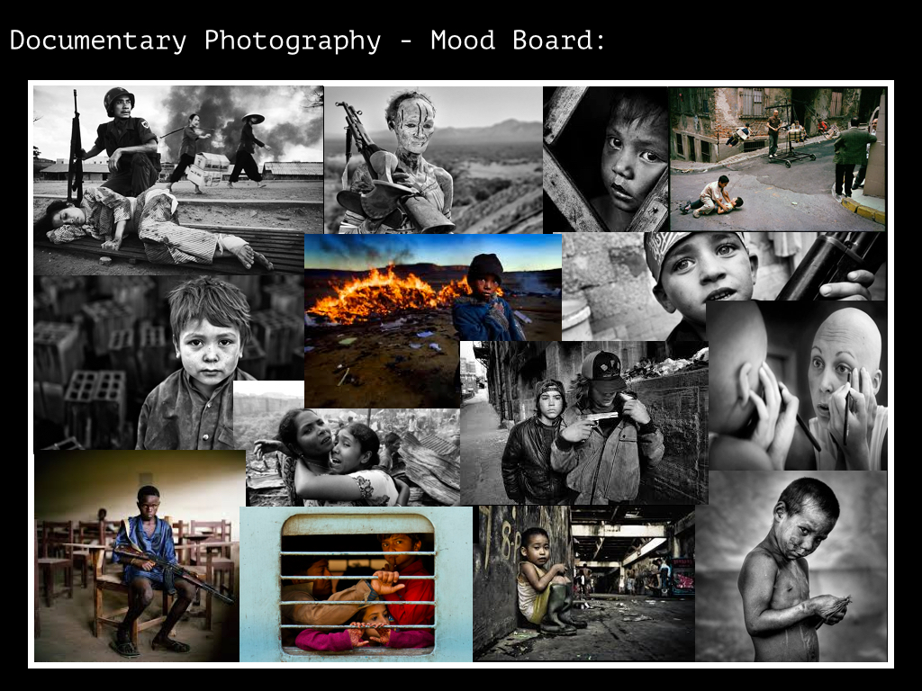
In 2004 Hondors completed an assignment exploring the Israeli-Palestinian Conflict. This conflict is an ongoing dispute between the State of Iserael and the State of Palestine over various territory disputes concerning the region of Palestine. The dispute is religiously motivated, as the region of Palestine is considered sacred the both Jewish and Muslim people. Iserael is run by Jewish Authorities, whereas Palestine is controlled by Muslim Authorities. The consequence has resulted in a in a series of small-scale guerilla warfare over the course of 20 years, still ongoing today.

This image by Hondros shows an eleven-year-old Palestinian boy called Abdallah looking through a hole from a window which was left by the Israeli sniper bullet that killed his mother. This image is a very harrowing and sensitive image which explores the devastating consequences that the conflict has had on the civilians involved. Abdallah’s mother was caught in the crossfire of a guerilla battle between Israeli and Palestini insurgents. This image is to an extent subjective because it highlights Hondros’ sympathetic viewpoint towards the Palestinian people. The image uses symbolism to portray an account of the helplessness experienced by the civilians caught in the dispute.
The broken glass that Abdallah is looking through symbolises how the Palestine region has been broken by the conflict. Abdallah, representative of the young generation of those in the region, is portrayed through the symbolisation of looking through the broken glass as vulnerable and fragile, faced with the prospect of a homeland which is dangerous, broken and tragic. The distorted viewpoint created through the glass symbolises the complexity of the conflict, juxtaposed with the sombre mood expressed by Aballah’s reflective stare, which clarifies the simpleness of the fact that tragedy still occurs, making the complexity of the tragedy inexcusable to cost innocent lives.
This is a very emotional and hard-hitting image. Hondros has captured a moment which distances its focus away from the war, forcing the viewer to consider from the heartbreaking perspective of a young boy loosing his mother as a direct consequence of violence. By viewing the war in the a manner which conveys a young boy’s personal tragedy, there is a suggestion that Hondros is criticising the Israeli and Palestinian’s government’s failure to peacefully settle the conflict, due to the devastating cost that such a conflict impacts on both sides.
Ethical Concerns:
I’m going to be analyzing a documentary picture with my own personal opinion. I’ll explain my own thoughts on the subject as well as commenting on the ethical concerns that apply the photograph. Ethics is defined as: moral principles that govern a person’s or group’s behavior. It’s about recording truth, in the realest way possible. However it’s also about who’s truth, what we believe in and what’s acceptable, which is where the ethics come in.
In class, we watched a YouTube clip that was dedicated to this incident. The film was entitled The Falling Man.
Here’s the link to it: https://youtu.be/m3gbxJ4xUDE
‘The falling man’, that was taken on September the 11th. Here’s the picture by the iconic photographer Richard Drew:

Richard Drew is the man behind this shocking picture. It was taken on September the 11th, when the World Trade Center was a target of the various life-threatening terrorist attacks. That day was full of chaos and with that came a lot of reporters, snapping away pictures of the scene. Surprisingly, Drew’s ‘falling man’ was the most memorable of the lot.

The man in the picture, was seen falling from the North tower. His body was in an upside-down position. There is a question that remains however. Is it that the man fell as a form of escape from the fire, or did he fall accidentally while looking for safety. That will probably remain a mystery. However, when the picture was released into the media, by the photojournalist Richard, it ignited masses of attention. When it was uploaded onto the internet, the companies were bashed with negatives comments saying it was ‘tasteless and voyeuristic’. Therefore, they removed all their online records of it, making it know as, by Drew, ‘the most famous picture that no one has seen’. The unidentified man appeared to be falling in an uncontrollable manner. The ferocious amounts of wind filled his white top with ripples.

For me, it was good that Drew released this picture to the press. Although a lot of controversial situations occurred, it became one of the most powerful photojournalism pictures of 9/11. I watched the film linked above, called ‘The falling man’. I will be writing a short paragraph of my thoughts on it:
Most picture that were taken that day showed the amazing and heroic scenes, in which people were being rescued. All of the attention was being placed on the soldiers, firefighters and people that helped with the event and aftermath. Even though that was truly amazing, no one wanted to show the victim’s struggle’s. Here are some of the generically typical photojournalism photographs of the heroism that day:


To summarize, the world preferred to remember the rescuers rather than the explicitly graphic scenes of the victims that suffered during the explosions of the terrorist attacks.
What I find so breathtakingly amazing about Drew’s ‘Falling man’ picture is that he simply shows a man falling to his death. It truly expressed the depressions he might have been in and highlighted the disasters of that day. The fact that another humans valuable life was lost. Drew captured the horrible torture of the people that fell or jumped had to endure. It depicted the harsh reality of what it might have been like for the victims. He took various pictures of many people in the air, here are some:

Most reporters that were on the scene that day didn’t film the people falling in mid-air. Instead, they were asking spectators and eye-witnesses what their thoughts on the scene were. Personally I believe that they shouldn’t have done so, as it doesn’t show the truth of what’s happening, it’s simply an opinion. For example, this picture, where they only interview onlookers:

It’s much more powerful in my opinion, to show the victims and then let the world evaluate the case in order to make positive changes.
It’s sad to think that their only hope may have been to suicide and end their life’s then and there. It was the only thing that they had control on. They could either choose to stay and burn in flames, or jump and end it quickly. Is it that they’d wait for themselves to die, or would they end it themselves. Many were forced to jump, or accidentally fell and had no choice. The desperation was incredibly high, showing the moments of fear and bravery. It’s like when everything around them was out of control, they could at least control one thing.
The only picture that left the most memorable response that day was Drew’s. Compared to other pictures of 9/11, his photojournalism picture emitted the biggest impact on a worldwide scale. This image of ‘The falling man’ received the deepest and most heartfelt responses that were combined with anger and frustration. The picture highlights the insane choices that the victims were urged to commit. It made spectators put themselves in the victims positions. They began to question what they’d do and their personal choices if they were in that situation. Drew’s image showed the negative side of the event and prompted people to want to change the world for the better.

Even though everyone was in denial that there were jumpers, Drew proved this. All of the broadcasts missed out the fact that people actually chose to leap, instead they said they were ‘forced out’. No one could seem to deal with the truth or confront it fully. Some spectators found that the specific way he died was not right. They felt uncomfortable seeing this. But as the man in the clip stated, the jumpers shouldn’t be excluded from the pictures, just because they died in a certain way. The falling man was symbol that demonstrated pure bravery on behalf of himself and the other jumpers. However, again he brought light to this subject and it was a real eye-opener.
Later they tried identifying the man, his white shirt resembled one of a waiter from the tower’s restaurant. They linked him to a man called Jonathon Briley. Briley’s family didn’t want to accept the fact that the falling man was him. They viewed the way he fell in a bad manner, they were quite negative about it. They stated it wasn’t the right way to die.

However, to this day ‘The Falling Man’ has never been properly identified. There is no proof that it was in fact Jonathon Briley. The ‘falling’ man will therefore always be a mystery, but it’s certainly a moment to remember.
Tom Pope Exhibition Visit:
On Friday the 25th of September, our photography class visited Tom Pope’s recent exhibition. It was called ‘I Am Not Tom Pope, You Are All Tom Pope’. In the building, he had a total of 21 works. Here’s a picture of Pope giving a speech on his outcomes:

Tom quoted in this exhibition letter: ‘My practice does not make artwork for a community, it creates a community through the act of making’. I think what he means is that he brings people by doing what he does. He is probably inciting that he isn’t the sole producer of the work, rather, community members have a big part to play. In that, everyone’s brought closer together under the name of visual arts. Here’s the letter:

He also displayed a rather long film, around 20 minutes or so. Pope and many other volunteers from all around Jersey, helped to push a small boat across the island. The film was entitled ‘The Last Portage’. Portage defined as: the practice of carrying a water craft or cargo over land, either around an obstacle in a river, or between two bodies of water. The boat was then placed on a slipway and pushed out to sea by Tom. The aim was for the boat to sail in the Atlantic ocean. Surprisingly, Pope then had to phone the coastguards to alert them that a ‘lost’ boat was at sea. The footage was displayed in a dark room, here’s a picture I took of the screening:

At the end of Tom’s presentation, I took some pictures. Here’s his collection from the first room:

This picture above, shows an upside down woman holding a reflected shoe on her heel. The background of the image is pitch black, so that the girls legs stand out. I think that this picture is quite bold. The subjects in this photograph are quite off balance. This is because there’s a massive void of empty space on the right hand side. For me, this creates interest and mysteriousness. Also the rule of thirds are rather strong. The legs intercept the two hot-spots and are aligned with one of the vertical lines.

This picture shows a portrait of a woman on the beach. She’s wearing a leopard skin bikini and has had a face altered on top of hers. The face is actually from the Jersey Archive and Pope’s cleverly placed it onto her body. I think that this hides her emotions and is a sort of disguise. Compositionally, it’s great. The woman is directly in the center of the frame and the sea behind her creates a vertical overlap with her. Also, her stance is strong and tall.

Tom Pope is actually featured in this one. This self-portrait shows Pope being painted by another man. His expression looks surprised and the painter looks focused. The way that Tom’s arm has been cut off on the right hand side, leads me to look at it. This image also has a pretty good amount of depth to it. The painter in the foreground creates shadows on Tom, which then creates shadows on the background wall.

Here, a man appears to be climbing on a statue. This was taken during the night, so it’s likely that a flash camera was utilized. In all, there is a lot going on in this picture. From the street signs on the side, to the cool statue and the man trying to stabilize himself. It looks like it was taken in an amateur man, because the elements aren’t that well aligned. Nevertheless, I believe that that makes it more intriguing.

Lastly, these two images were placed together. In the left one, a night scene has been captured, where someone seem to be holding a hockey stick. The man pictures was probably playing hockey whilst someone was snapping pictures. The image on the left is of a girl on a cylinder shaped structure. It looks as if she jumped on it and is now grabbing on. The way she’s holding on, somehow reminds me of a bear climbing a tree. The striped background works well, as it creates depth and leading lines.
If you notice, all of the pictures were framed with a bright orange frame. When asked why he did this, Tom said that he simply liked the color. He also said that it paint the pictures stand out and that he has presented his work like this in the past. For instance, when he photographed oranges, he’d normally frame in in that color. It could also relate to Baldessari’s work.

In this room, Pope had also displayed a blue podium. The color was bright blue and it stood out quite a lot. Pope stated that he chose this color to create a contrast against the white images on it. He said that it wouldn’t be as interesting to look at, if the podium was just plain white and i agree. The podium is cut at exactly one meter by one meter, making a perfect square. The way that he presented the images is also quite exquisite. Tom said that he would grab a picture and hold it up, at about one meter from the ground. He would then drop the image and simply leave it to land, whether it be upright or face down. Again this incorporates his love for performance photography. In this medium he performs something and records it, with the camera.
Here’s his collection from the second room:
Tom then gave us an insightful speech about his idea behind this part of the exhibition. There were various cutout faces placed on posts. The portraits were in black and white and so were the pieces placed on the tables. Pope said that the faces were actually from the archive. He added that this project was about distributing the archive out into jersey, which he did by photographing them. I think it’s great because he’s bringing the past and present together, to create new images.

Below are some close-ups of the masks. The eye’s have been cut out so that people can wear them:


On the tables, Pope displayed these pictures. He used a coin method to create these interesting holes. Basically there’s one picture on top of the other. Tom used a regular coin and placed it in a desired place. He then cut out the shape and left a gap for the photograph underneath to shine through. Again, a coherent theme of combining pictures is apparent here:


Family Album- Experimentation and record
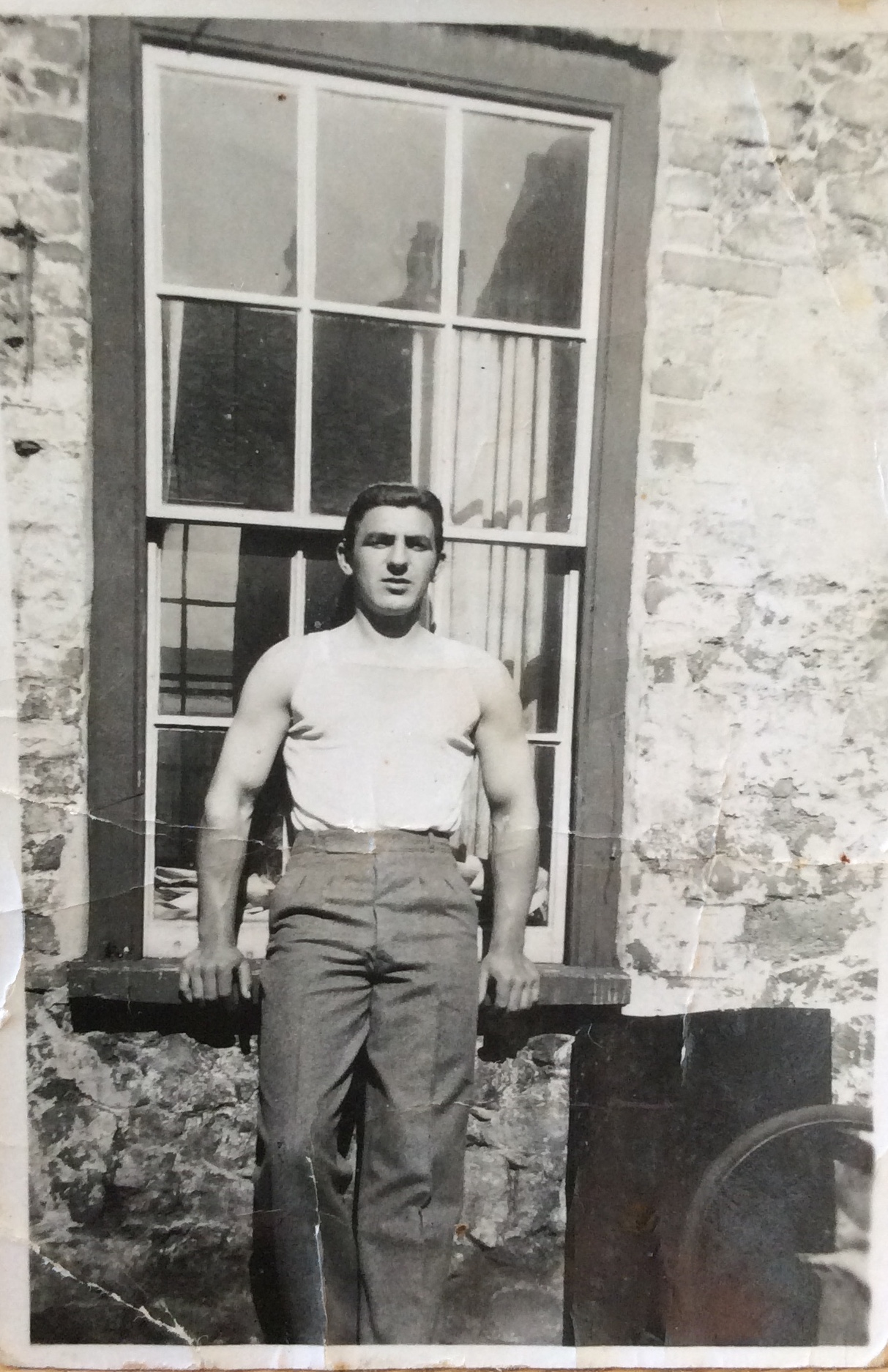
For my first idea I am focusing on my Grandfather’s life before he passed away. I want my project to focus on all the memories I have of my grandfather and the poignant moments of his life that represent who he was as a person. I began my research into his life by looking through an album of his life including all his family both immediate and extended.
Family Pictures I Took:
In order to explore the theme of family, I decided to take some pictures of my extended family. I went to my aunt and uncle’s house to do so. Since they were at home, I was able to capture more natural moments due to their familiarity and comfort in that environment. I took most of images in an amateur manner. It didn’t really matter whether the composition was perfect. I wanted to photograph with a casual approach, just like Richard Billingham did for instance. I made sure to experiment with different zoom lenses and angles. I also took staged and un-staged images, meaning my family didn’t have to pose.
I visited them on two different occasions. The first time I went, I mainly captured them outside, whilst we were having a BBQ. My parents were also there that day and the atmosphere was very different.
The second day, I shot them inside, in the lounge and dining room. They were doing ordinary things, for example my cousin was playing games and my aunty was doing house chores. I also caught some social interactions, like when my uncle played with my cousin.
Here are some examples from the first occasion:
Here are some pictures from the second occasion:


War Photography – Artist Reference – Chris Hondros
“I hope we continue to remember Chris by living our lives with the compassion and thoughtfulness that he expressed to so many of us during his brief time here on earth”
Inge Hondros, Chris’ Mother: tribute the her son after his untimely death

Chris Hondros was an American photojournalist and war photographer known for his frequent documentation of warfare in the middle-east. Hondros became highly credited as a photojournalist, becoming a twice Pultizer Prize finalist for ‘Breaking News Photography’. His career in photography lasted for 21 years, cut tragically short by his death in 2011 in the hand of pro-Government forces whilst covering the Libyan Civil War.
Early Career
Born in New York City in 1970 to Greek and German immigrant parents, the family moved to North Carolina where Hondros spent the majority of his childhood, graduating from Terry Sandford High School in 1988. A talented writer, Hondros studied English Literature at North Carolina State University,working for his campus newspaper. Hondros developed an interest for photography during this period and in 1991, he submitted a portfolio of his photography work, gaining a place at the Eddie Adams Workshop. Hondros then studied a Master’s degree at Ohio University School of Visual Communications, before working in New York for as a photojournalist for different Newspapers and Publications.
Break-through
When working as a photojournalist, Hondros developed an interest for War Photography. He started putting himself forward for war assignments in the late 90s, covering a range of European, North African and Middle-Eastern wars including Kosovo, Angola, Sierra Leone, Iraq, and Liberia. He became extremely well known for his work, appearing on the covers of magazines such as Newsweek and The Economist, and on the front pages of most major American newspapers, including The New York Times, the Washington Post, and the Los Angeles Times. Hondros was awarded the U.S. Agency for International development in 1999, and in 2001 was selected for the Johns Hopkins University Pew Fellowship for International Reporting.
A young Palestine boy looks through the hole left by the bullet that killed his mother.
Rise to prominence
Hondros’ big breakthroughs as a photograph came firstly through his series covering the aftermath of thhe 9/11 terrorist attacks. Hondros photographed the wreckage of ground zero, a theme he then returned to in 2010. His second breakthrough was his covering of the Iraq War 2005, in particular a picture series detailing the shooting of an Iraqi Family by U.S. troops, whom they mistook for suicide bombers, resulting in the death of both parents and paralysing one of the five children. This series won him numerous awards, including the Robert Capa Gold Medal, war photography’s highest honor, helping to make his name as one of the leading figures in the world of War Photograhy.
Death
Hondros was killed on April 20th 2011 in Misrata, Libya. He was covering the Libyan Civil War, along with fellow photojournalist Tim Hetherington. Both men were killed by Pro-Gadaffi Libyan Forces, by shrapnel from a mortar shell.
Legacy
Four years after his death, Hondros is considered to be one of the most successful and influential war photographers of the 21st Century. Hondros captivated the problems facing middle-eastern areas in the world, during a rapidly changing political, social and demographic time for Arab and Muslim populations. Hondros’ work showed a sympathetic viewpoint towards the innocent people caught up in the midst of suppressive regimes, civil war, and the rise of Islamic Extremism. Hondros was very much concerned with the devastating consequences these changes had on the people caught up in the cross-fire of war. Hondros strongly opposed the idea of war and attempted through his photography to document an honest representation of the devastations of war. He mad no attempt to glorify war, nor exaggerate it the other way to misrepresent it as demonic. Fundamentally he attempted to show those who viewed his images the truth. He was a true photojournalist, who showed the humanity caught in the cross-fire of war.
Artist references for family:
In this post I’ll be exploring at least two photographers, that explore the theme of family. I’ll also be analysing some of their best images and commenting on compositional elements, the aesthetical components and others.
The first artist that I’ll look at is Larry Clark and seconds Sally Mann. Both of these photographers were mentioned in my previous post ‘film notes on family’. They both have very different styles, which can be seen in their work.

Larry Clark has got a very specific style in which he photographs family. His photography is described as Confessional. Confessional work is very personal and shows honesty. It’s also referred to as a diary. Clarke’s an insider and not an outsider, which gives him a great opportunity. The audience truly gets a feel for what it’s like to be in his family.
Growing up in a very poor environment, his mannerisms and behaviour were affected by this. He was always surrounded by junkies, hustlers and alcohol users. He quoted: Once the needle goes in, it never comes out’. Clark displayed a risky and shocking exhibition called ‘Tulsa’, which is where I got these images from. Some may say that it’s an exploitation. Most of these pictures were black and white, so this gives it a different ambience.

I think that this picture above is very deep. I believe that there is a lot of meaning to it. Clark’s captures a very chaotic and busy family scene. The trio in the bathroom seem to have chill expressions, yet their body language says differently. Also, the small child leaning against the wall, seems very stressed. The way she’s crutching the doll or baby shows that she might be scared. There seems to be a very good contrast here. The bright white wall separates the outer shadows in this image. There is also a man smoking a cigarette. For me this picture communicates a very distraught and bad environment. It may be unstable to have a child there, and it appears that they are party-goers that like to have fun.

Moving on, I’ve selected this image from the ‘Tulsa’ series again. This is a particularly famous example of Larry’s many photographs. For me, this whole-body portrait has a certain vibe to it. When looking at this, people could stereotypically assume the following keywords: gang affiliation, danger, self-protection, etc. The black and white tones give this picture a very soft look. Also the face that the man is played perfectly in the middle of the frame is aesthetically good. The rule of thirds are quite well aligned. The mans pose doesn’t necessarily look natural. It’s possible that Clark assigned the man this certain position. Nevertheless, the expression on the males face looks sincere. I think that Larry was trying to show the type of lifestyle that he lives in. The fact that he has a gun says quite a lot, so it may show his struggles and what lead him to that point.

Sally Mann, photographs on a very different way. She photographed in a Collaborative manner. Her and her three children would help her to make these pictures so compositionally beautiful. The people which she collaborated with, had to hold a certain expression, they themselves, had to make the effort. Mann lived on a farm and spent her whole life there. She produced a great variation of family pictures whilst she was there. Sally quoted: “it’s always been my philosophy to try to make art out of the everyday and ordinary…it never occurred to me to leave home to make art.”

In this first image, I can begin to analyse some common features. Mann always seems to photograph in black and white. She includes many sharp and soft contrasts which may have been created with natural light, since they’re outside.
To me, her photographs look very natural, yet also well planned out. Her family portraits have a professional look to them. The expressions on the members faces are distinct and look honest. Sally said: “Every image is in some way a ‘portrait’, not in the way that it would reproduce the traits of a person, but in that it pulls and draws, in that it extracts something, an intimacy, a force.”
Aesthetically, and this applies to both images, I think that Mann captures the true essence of natural moments. She manages to catch beautiful snippets, which are taken just at the right time. Her family has quite symmetrical faces. This is seen as attractive, on an international level, therefore her images work well. Although these pictures have been taken outside, there seems to be a very soft bounce of highlights. All of these elements add up to create an aesthetically pleasing image. Mann stated: “ If I could be said to have any kind of aesthetic, it’s sort of a magpie aesthetic—I just go and pick up whatever is around. If you think about it, the children were there, so I took pictures of my children. It’s not that I’m interested in children that much or photographing them—it’s just that they were there…”.

In the second image, a small child is seen laying on a man. She seems to be fast asleep, and the fact that she’s asleep gives her relaxed appearance. The holding of the hands represents love. The angle this is taken from, is quite high up, and it cuts of at her waist. I think that the photographer was trying to show a common situation, which normally happens on summer days, maybe that the child has had so much fun and is now tired, for example. Sally Mann quoted: “Some of my pictures are poem-like in the sense that they are very condensed, haiku-lik. There are others that, if they were poetry, would be more like Ezra Pound. There is a lot of information in most of my pictures, but not the kind of information you see in documentary photography. There is emotional information in my photographs.”
Jeff Wall – Analysis of Work
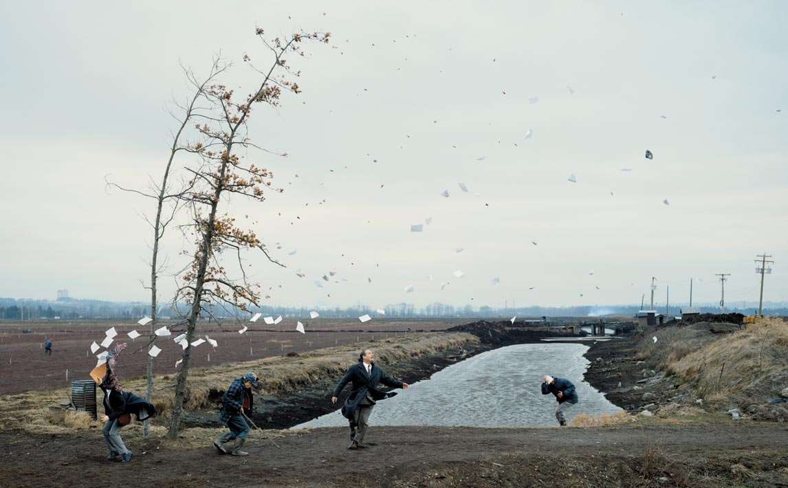
This photograph by Jeff Wall, shows four people battling against a ferocious gust of wind. Wall is attempting to highlight the power of nature, and represent humanity as helpless to its force. It is a very dramatic image with papers from one of the men’s briefcase flying everywhere, and and all other men attempting to shield themselves from the wind. This is a tableau photograph however there are clear elements of this image that were not staged and so affect the composition of the image to some degree. I find the composition to be very effective, and the photograph is very visually striking.
Natural Elements of the Image
Lighting
- The overcast day is out of the photographers control. It helps to make the image very dramatic because it establishes a dark and sinister mood, which is a cold, dramatic theme. The greyness from the sky gives an overall image which is low in saturation. This provides the image with a sense of subtlety as all aspects of the image blend in and compliment each other. Although Wall had no actual control over the weather in this image, I do believe however that Wall deliberately waited for such weather conditions as the achieve the effect it does
Wind
- The wind is an integral part of this image, again outside of the photographer’s control. Likewise to the overcast day, Wall has chosen to photograph at the moment when there is a gust of wind, an important selection because it completely defines the image, as the whole theme and composition is based on the effect the wind has.