media statement of intent

My intention for my 3 adverts are to use the following theorists,Propp’s character functions, and Peirce’s Sign Theory, or Semiotics. I want at least 2 of my adverts to have some mention of the game i created on the front cover, “oakvally”. I plan to incorporate them in a sponsor ad or a game bundle advert.

For my first advert I planning to create a game bundle advert for 3 different games. 

I plan to use out of the following 2 layouts as my display for this advert;

(competition layout of with a ^ formation of 3 games)

or

(page is split into 3 slashes showing action shots of the 3 games)

I think both of the layouts have their potential but the advert layout that’s divided into 3 might either be more eye catching to audiences or simply might fit correctly for an A4 and might work better as a landscape advert. But on the other hand the use of triangles to display the different games in the bundle could be another promising layout and will work with the A4 sizing. 

For my second advert I want to do a sponsored advert of a console sponsoring my game oakvally. Examples of possible companies I could use to cross platform are, PS4 or twitch. These two companies would have different effects in sharing the game across audiences. Using PS4 would give the intention for audiences to buy the game and can give a good wide reach across different audiences for users who have a PS4. this is still very useful but it wouldn’t engage the audience as much as being sponsored by twitch as it would reach a wider range of audiences who enjoy indie games and would be streaming the game playthrough through the platform which then is more free promotion and engages the audiences and can mean there more likely to buy the game since there favourite streamers have played it. The target audience would be the same age range of  young teens for oakvally and followers of PS4 or twitch.

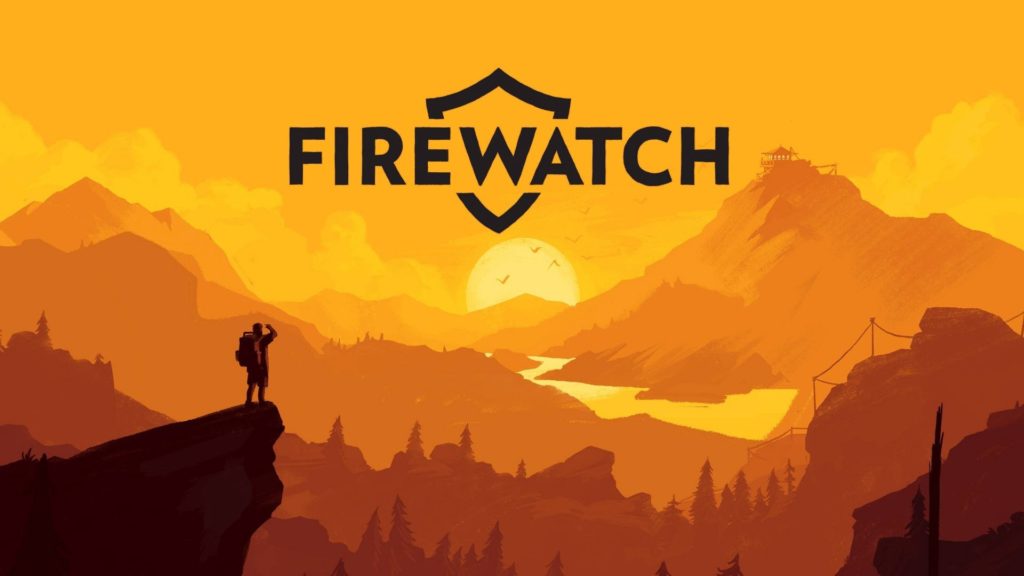
For my third advert I want to attempt to use silhouettes for a more simplistic but effective style for video game characters. This will be an advert for a separate game that would be coming out on PS4. I want to see how simplistic I can go with the advert but still have it look professional and realistic to what you would get in a video game magazine. I’ve seen this stype be used on PS4 covers and I think it displays a more subtle but effective show of strength and confidence of the character without having to physically show those emotions on their face. It’s a good way to make the audience, instead, focus on the body language of the character because, that is the only thing the designer has allowed them to see.

(the PS4 advert reference for advert 3)

Ps4 Pro Super Charge Your Gaming Experience Ad in Delhi Times on 29th Dec -  Advert Gallery
2nd advert layout idea

front cover layout references

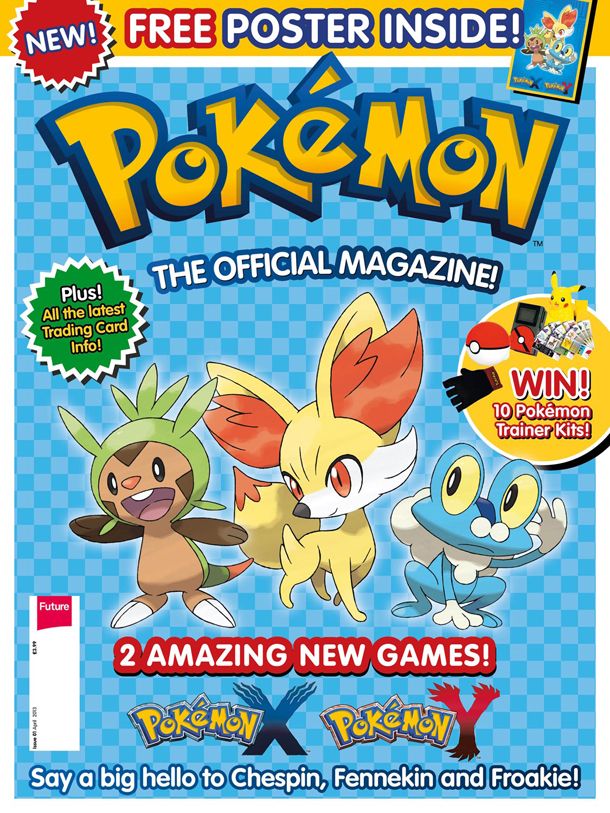
Subscribe To The New Pokemon Magazine! 3 Issues for 5 | GamesRadar+
Powerpuff Girls Magazine — Christine Moore

content page layout references

AusReprints - Garfield Cartoon Magazine (Egmont, 1994 series) November 1994

double page references

Pin on Magazines
Journey Article Magazine Spread by GirlNamedEd on DeviantArt
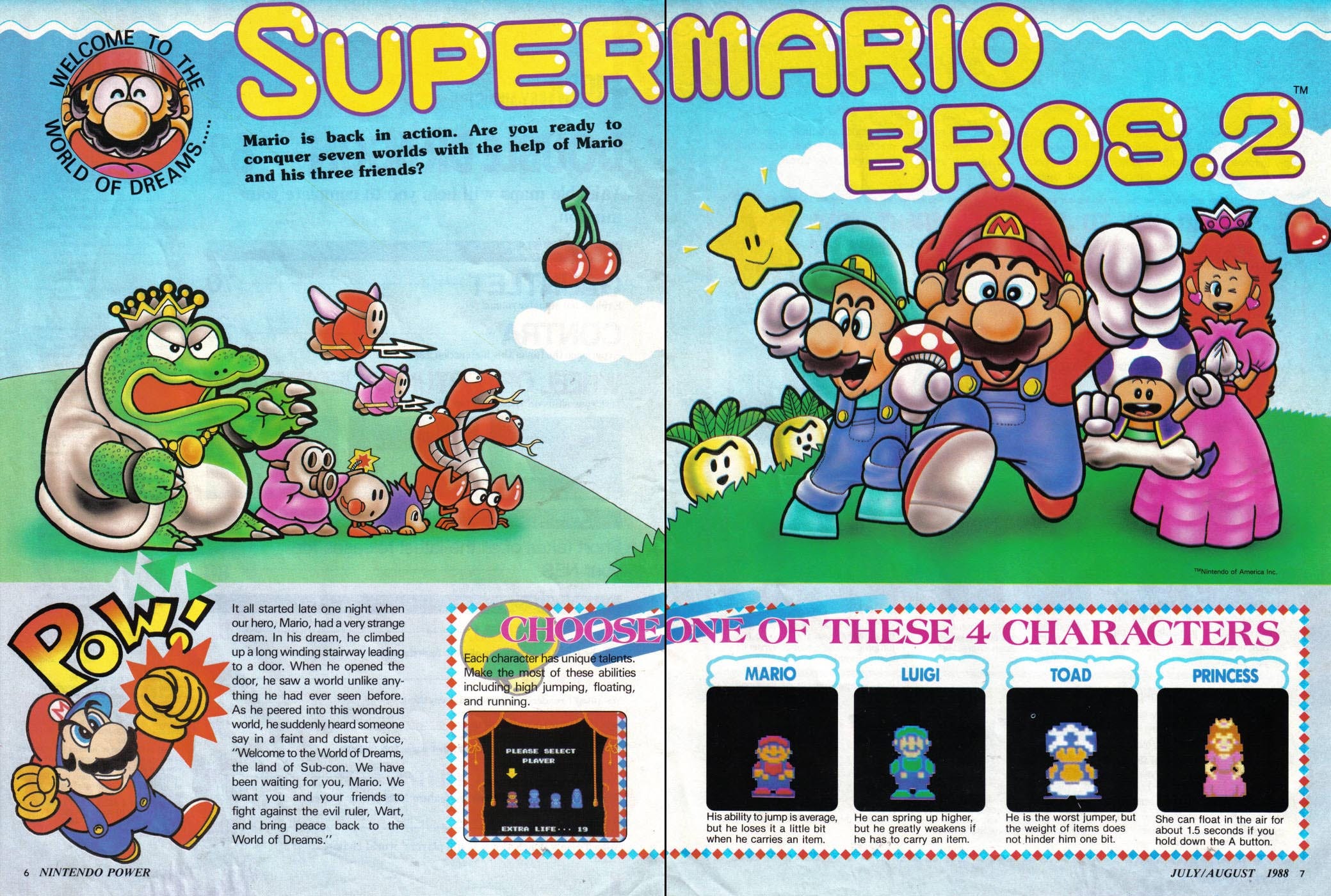
Video Game Magazines Revisited: Nintendo Power Issue 01 (July/August 1988)  | by Kyle Schruder | Medium
Pin on Magazine Design

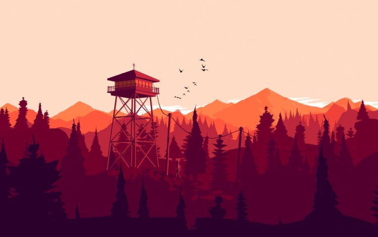
colour scheme references for part of 2d advert

3rd Advert References
NEA Statement of Intent

I am doing the NEA 2 which is the games magazines and adverts. I will do this by creating a radical product using a man as the dominant signifier in a war themed video game. This is radical as it is stereotypical having a man character being represented as the protagonist in an action genre game. I will use a Fuse man gamer on the front page as it conveys the message that it is for a specific target audience, the person will be wearing a headset and holding a controller with stereotypically big arms. My contents, I will then include pictures of animated characters to advertise a new game and screenshots from this game. For the double page spread I will use one image of a fuse character that will take up a lot of space on the left side, this corresponds with Judith Butler’s theory of gender as performative. As the game is a cross between skating and war which are both typically male dominated. The style model I have used for this is:

For the three advert prints I will be advertising an online football event. To communicate this I will use a background of a football stadium with bold writing to show the date and time of the event. This could appeal to a niche audience that enjoys football games as well as action. This is playing on the assumption of what men in this target audience would enjoy and what else would appeal to them. My next print will be an advert for a new games controller with voice recognition, the colours are blue and white which mocks the stereotypical colours associated with the male gender. This would appeal to a gaming audience as it is a new technology that is easier than using headphones with a microphone. My 3rd advert is for a new game called ‘Action Adam’ which is a game that features a typical action figurine-looking solider, who is based in a city doing different tasks. This game/advert would appeal to the audience as it fits within the action genre and in terms of representation, the target audience could identify as ‘Adam’ and give a sense of secured masculinity. The background will show a landscape of buildings to give an understanding of the setting within the game and have the avatar ‘Adam’ as the dominant signifier.

Statement Of intent

For my NEA I will be completing the second brief; aiming to produce a front cover, double page spread, contents page and three adverts for the gaming genre. My ideas will be influenced by a selection of already-produced gaming magazines that share similar codes and conventions to the ones I wish to use to attract a certain demographic. My magazine is predominantly aimed at a younger audience of 10-12 years. I aim to produce a product that is attractive and inclusive of all genders as this would likely increase circulation of my product as well as profit; many gaming-based products are targeted at a male audience. Ideas proposed by theorists such as David Gauntlet; his theory on gender fluidity suggests that whilst in the past the media tend to convey singular, straightforward messages about ideal types of male and female identities, the media today offers us a more diverse range of icons and characters from whom we may influenced by, meaning that gender identity is less constricted, this is what I aim to achieve.

I aim to target this specific demographic as they are highly impressionable, as they are seen as ‘mainstreamers’ they are also more likely to follow popular trends, especially in areas such as gaming which allow for a form of escapism. As the form of gaming is presented in a physical, literacy-based form this product will also act as a device to reinforce and enhance their use of lexis and vocabulary. The style of language and register that I will use is a mix of colloquial and slightly more formal as I want the magazine to be professional and factual in relation to its contents. However, it should also be appealing to my target audience through the informal language; they would use in everyday life so that they can relate to it, using the magazine as a form of escapism, interlinking with the uses and gratification theory.

My product is also going to be highly influenced by ideas surrounding postmodernism – the idea that reality is not reflective in human understanding, but rather constructed by individuals based on their own collection of fragmented thoughts. Therefore, my product will reflect these ideas as it aims to influence the audience to construct their own opinions based on individual interpretation, also linking in with Habermas’s theory on the ‘Public Sphere’ whereby individuals can share individual thoughts and feelings globally without intervention from higher institutions such as government.

I will also use the san-serif font – ‘Acumin Variable Concept’ – an informal font would be more eye-catching to a younger audience who may want to rebel against formal fonts that are dominant in more reactionary or ‘adult’ texts such as ‘The Daily Mail’. The font also act as anchorage for plugs as they will use similar styling. I also wanted to incorporate a retro theme to my magazine and used 8-bit characters and a tabloid size, similar to popular 80s magazines, with a width of – 27.94 CM and height of – 43.18 CM.

[Word Count = 500]

Statement of intent

For my music video I intend to follow the NEA brief set 4. My chosen artist is a DJ which will be featured throughout my music video. My target audience will be males and females ages 15/18 who have an interest in house music or drum and bass. The point of my music video is to promote my chosen artist and raise his profile. In the video I will include clips of the DJ playing his song, I would also like to film clips of lights flashing which will be featured throughout the music video, the flashing lights will create a party like atmosphere, The DJing will be the dominant signifier in the video. I will include the headphones the DJ uses in the video. I would also like to include cars to present wealth, girls and beaches which are all stereotypical ideologies featured in a DJing music video which will make my video very much reactionary. I looked at style models and I decided to choose Calvin Harris and Avicii to be good inspiration for my music video because they use more than one location in their video which I am intending to do as well. In terms of Blumler and Katz uses and gratification theory, I would like my music video to serve as a source of escapism as anyone will be able to watch it as it is free to stream and download. I will use Lasswells Theory of the Hypodermic model to ensure my music video is being understood by the receiver.  

For my magazine doubIe page spread will have the DJ standing in front of a nice car to present wealth. I want to include picture to make it look more interest and engage the reader.  The artist will also be dressed in expensive clothes such as stone island. My double page spread will be an interview about my chosen artist’s journey regarding their DJing career and how they have come to the place they are today. One of the questions I will ask will be what helped and influenced them. The research I have done for this is the general layout of how an interview and advert is laid out.  

The front cover which is promoting the artists tour will include the places that my chosen artist will be playing at. I will also include dates that the event is taking place. I would also like to include the DJ’s logo somewhere on the page to help promote his name. I want the name of the DJ announcing the tour in the centre at the top of the page to follow the conventional layout.   

Statement Of Intent

How will you use media language and media representations in order to create a product that meets the requirements of the brief, would appeal to the target audience and also reflect the appropriate media industry? (Maximum 400 words)  

Be specific about the ways in which you will use aspects of media language, media representations, target your audience and reflect the appropriate media industry for your chosen brief. 

I intend to create a music video which is a release to be used as a promotional scheme for an upcoming tour/gig for a band playing in the UK. The music video will also be used as a promotional scene for a headphone manufacturer. I intend to have an intended audience of people who enjoy the genre of metal music but also those who own motorbikes as the product I will be promoting are headphones for your motorbike helmet. This doesn’t limit the audience through age but through music taste and whether they ride motorbikes or not. I will be using mise-en-scene and props in order to create a better understanding of the setting and make the audience more interested in the music video and the song which is being played and the product which is being shown through the music video.

For my music video I will look at how other videos use props such as motorcycles in their videos, I will use a range of angles and camera techniques such as depth of field in order to create the best aesthetically pleasing view point for the audience.

For the magazine I will be promoting the band in their upcoming tour, in which the video will promote one of their tour locations. But will also show an interview with the band members. I will be using the genre of the music in links with the magazine and target the same audience. I will be basing my ideas of an already made and popular metal magazine

Statement of intent

For my NEA coursework I will be completing brief two, I will complete a front cover, a double page spread, contents page and 3 adverts about gaming, I will use style models to influence my designs and make sure my magazine products are lifelike.

The target audience for my magazine will be 13-15 years old’s who have a strong interest in gaming. They willalso be in education and will not work but the parents will be middle class. The point of my magazine is to provide escapism and enjoyment for its readers, the goal is for them to want read and learn more about here favorite games. My audience would interpret my magazine as dominant reading as there interested in gaming, other people may view it as oppositional or negotiated but the people how buy it will enjoy gaming so they will like it. 

My magazine will be reviewing the most popular gaming icons and rating them, this will be done by a made-up YouTube star. This will follow a dominate ideology (reactionary) because the reviewer of the games is a male which is common for gaming magazines. My front cover is also mainly about popular game characters which is again common game idea and often used, this makes it an iconic sign as it is so recognizable.

I will use many popular gaming icons which I will make on 8 bit art which captures an audience due to there popularity. I will use a black background to make the characters stand out against the dark background. I will use a plugs to show the context and to make it more appealing. 

My magazine will relate to one of Noam Chomsky’s 5 filters of manufacturing consent, the role of advertising will be seen in my magazine as I will create adverts to advertise certain products my audience in order to get them to feed into the consumer culture. 

Overall i think I will do a good job at creating a interesting magazine cover which attracts attention and serves the purpose of providing people with the choice to escape reality. 

statement of intent

Statement of Intent 

For my game magazine, I intend to make a football related theme that revolves around the 8-bit design mixed with modernised animation. Incorporating 8-bit within my magazine is a way to challenge the dominant ideology of typical games magazines which are promoted nowadays. The main purpose of my magazine is to target a younger male audience, the most suitable ages are around 4-12 years old. A key aim to attract my target audience is to add a lot of colour within my magazine, as It is football themed, I intend to have a football pitch as the background. The layout of my magazine will be structured in a rule of thirds layout. I intend to incorporate C S Pierce’s theory of semiotics and signs for my iconic sign I am planning to have two 8-bit football characters within the centre of the page to be the main centre of attraction. Bright colours such as blue and yellow and green will be used as a way of drawing the attention of my target audience. My indexical sign will be different coloured fonts within the strapline and the plugs. For my symbolic sign I will use distinct colours to symbolise an actual football kit. For example, I may use blue and white to symbolise Argentina.  

Within the contents page I will maintain the football theme and use 2 to 3 main images and a list of key pages which will direct people to particular pages within the magazine. 1 of the images will be used as a dominant signifier to really stand out. Size and scale will be used within the images as the dominant signifier will be larger in size compared to the two other images. I will use different sized text such as Drop Cap the more important pages that are within the list may be highlighted or in a bigger font compared to the other pages.  

Within my adverts football will still be the main centre of attention. However, I will use real life football images and animated images to promote the sport further.  within the adverts there will be a dominant signifier also it will include anchorage as the dominant signifier will be a sign that fixes meaning.  the meaning that will be fixed is the dominant signifier is a footballer the sign that fixes meaning is a football that will be included with the dominant signifier 

statement of intent

In my NEA set brief 4, I am aiming to use Lasswell’s theory of the hypodermic model to ensure that the intended message is directly received and accepted by the receiver. I am going to create a music video to promote an artist. I will also use the uses and gratifications theory which will help me to understand why and how people are actively seeking out specific media to satisfy others specific needs. This will be helpful because the theory outlines major areas to focus on when creating a product that you want to appeal to your target audience. My target audience for this set brief is younger men and women interested in hip-hop and pop music, as this type of music might only really appeal to a younger audience of men and women. The language style used in this set brief for the interview and the advert will be a mix of formal and informal which would appeal and be easy to read for all ages. I aim to represent a music video and magazine not only for a younger audience but, also for people of all ages who are interested in smooth hip-hop and pop music. I intend to get non-copyrighted rap music which I would get from either YouTube or SoundCloud.

For the music video, I will repeat ideologies seen in pop and hip-hop music which consist of going out, having fun with friends. I will start off my music video by showing the empty streets and a quiet town , with one person walking the streets by themselves giving the idea of being isolated. They would put some headphones on and then there will be flashbacks to when that person was having fun with friends and going out when the streets were more crowded. This would then represent the idea of isolation. I will change up the angles within the video making sure there are different camera shots. I will also include long and close shots of places and characters. I will look at how other music videos use props such as cars and buildings to see how I can involve them into my these of isolation. I will be sure to use camera techniques such as depth or field to ensure I create a pleasing video for my target audience.

For my magazine, I will aim for it to be a source of escapism for the reader so that they feel that they can have some time to themselves, reading about music they enjoy. My magazine will also be cheap so anyone of any social class can afford to read it. Before planning my front cover, I created multiple magazine covers of different styles, to see which style of magazine would be the most effective in persuading the target consumer to buy it. I aim for my magazine to be engaging and to be radical, in order to encourage anyone of any age, gender or ethnicity to enjoy the music being promoted. Within the magazine I will be promoting an artist in their upcoming tour. I will do this by creating an advert which will advertise the places where the artist will be playing. I will also be creating a double page spread where I will interview the artist about their upcoming tour.

I intend to create a 4 page music magazine of the artist where it will focus on how the artist rose to fame and their lifestyle. For my front cover magazine, I plan to imply a similar style to Billboard magazines. I will have one large image of the artist covering the whole page, with the title at the top and minimal writing around the photograph. I will be using the theory of preferred reading. I will make a media product where I put ideas in the texts which I will expect my audience to understand. This is called the theory of preferred reading, by Stuart Hall. This is what the producers of the text wanted them to understand. However, each audience is different, so they might understand the text differently to what was initially intended.

NEA Statement of Intent

For my NEA coursework I have chosen to focus on the Brief set 4. I will base my music video around a single artist and my genre of music is classical piano.

I will focus on one main character as the dominant signifier and will create contrasting scenes using lighting and effect. One scene will portray loneliness and boredom, whereas to contrast, the following scene will include headphones and make the character appear more fulfilled and joyful. These scenes will alternate at a fast pace to show the difference between emotions.

As research, I looked at music videos from well known artists, Billie Eilish and Harry Styles. Both of these artists use a music video style that is meaningful and they generally create radical pieces. They challenge the dominant ideology by creating videos that are unique and different. I aim to use these videos as inspiration and perhaps follow some of their styles to create a pastiche.

I am going to look at ideas surrounding the theory of post modernism in my music video. I will include the idea of fragmentary identities, and will present this through the contrasting scenes. When the character is without her headphones she is depressed and low, however, when she has the headphones on, she is a completely different person and is filled with joy. I think these contrasting scenes will represent this theory well as it is believed that people can have two identities both online and offline.

Looking at reflexivity, I will create a video that allows the viewer to think about themselves and the way that they live their life. The portrayal of two different identities will hopefully allow the audience to think about themselves and their true identity, both on and offline.