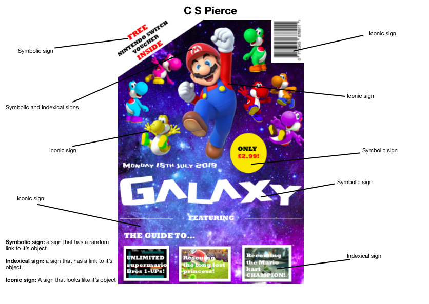
C S Pierce


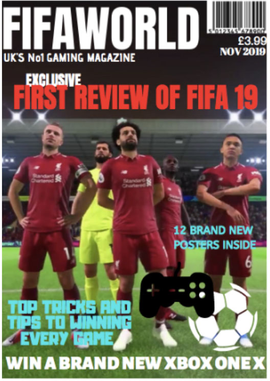
I based my gaming magazine around the digital football game called FIFA. One of my intentions for the magazine was to make sure it stands out on the shelf and that it was clearly about the game Fifa. The target audience is young men and boys who have an interest in football and the game FIFA. I named my magazine FIFAWORLD which clearly represents the idea and concept of the magazine. I made the masthead stand out by using a bold font called Anton and using the colour white on a dark background. The title is clearly in the top left corner covering most of the width of the page. The idea was to make sure that the title was easily recognizable and stand out on the page. I also wanted to make sure the date, barcode, and the price was clearly visible as well. I also placed my tagline “UK’s No1 gaming magazine” under the title. This is to show the gaming image of the magazine and will show the concept of the magazine. Using the terminally “No1” is effective as it connotes that the magazine is good and worth buying.
Another key intention of my magazine was to make it appeal to the target audience by using competition to win an Xbox. As the target market is gamers this will appeal to them. I placed this across the bottom of the cover in bold, white capitals to make it eyecatching and stand out. Another technique to make it stand out to the target market was my main cover line. “Exclusive first review of FIFA 19.” Again using bold font and the colour red. Using the word exclusive connotes that the article is only in this magazine and is, therefore a must-have. The background of the magazine is a picture of the game with some of the players from the game. There is also a football and a game controller just to create the imagery around the game. My colour scheme was white, red and blue which are quite bold and bright colours. The other overlines I used about the posters inside and the top tips on playing the game are again to make the magazine more appealing and give some information about what’s inside and what type of articles there are. I used a different font and a bright blue colour to make these cover lines stand out from the title and the background image.
Overall the main ideas and concepts of the magazine were to make sure that it was clearly representing the game Fifa and appealed to the right target market. I think using the colour scheme I used and the bring images made it look eye-catching and standout on the shelf. I think it also clearly represents the game as I have used an image from the game and added the image of the game controller. This also adds to the overall image of the magazine along with the fonts and the colors.
Iconic signs
Indexical signs
Symbolic signs

Gaming magazine design
Cinn Balcombe
Unfortunately, I lack the tools to create this magazine cover right now. However, I can still use the original plan and explain my process.
1 and 2:
Inserting a small area of text means that vital information about gaming news will be displayed as well as it being in a large enough, visible font as well as being short in length but just long enough to keep the attention of the reader, for example, it could say “nintendo announces new pokemon for sword and shield? More on Page 34”. This means that a small line is used to “hook” the reader into purchasing the magazine so that they can know more. This is used to display less popular games, with the most popular and anticipated game on the front.
3:
The title of the magazine must be bold, clear, and have a design that is unique and noticeable. The name of the magazine must be easily seen, so that frequent readers can spot the magazine easily, as well as those looking for a good gaming magazine within other different types of magazine. The title must also show the genre of “gaming magazine” clearly, for example, gaming weekly or something of the like. This easily shows to the reader what to expect.
4:
A video game title is generally used to interest those who are fond of the specific game shown, and it is usually followed by the game’s mascot on the front cover, or a popular character from the series. The logo should be large and easily seen from far away in order to catch the eyes of those passing by.
5:
A video game character is used in a similar purpose to the video game title but can also be used for those who do not know the series but recognise the character. This means that anyone who enjoys the idea of the series can know what the main article is about and can easily read more about their favourite characters. The idea of a character appeals more to children who do not know what the series is called but know the character, as the title always matches the character.
6:
A short sentence about the game is useful as it shows short and sweet information about the game. This hooks in the reader into reading, as they would like to know more about this. The hook is usually something major, which hooks them into reading it more.
7:
The background is usually game related, normally following a screenshot of the game on the title, displayed as a background. A background does not add much, but without it, the magazine is incomplete.
This magazine could be for anybody, but it is mostly aimed for teenagers and young adults.
Iconic:
Video game character, could be a console,
Indexical:
Logo, video game character,
Symbolic:
any text, letters, shapes (the squares of text on the front cover),

The title of the magazine is in a big, bold black font to capture attention and the eye of anyone looking as the white color stands out on the black background.. This could also represents the idea that characters or protagonists in games are brave and adventurous. This also compliments the other colors on the cover by bringing in a more basic element..
The centre of the cover is the video game character Sonic. Making him the main part of the cover creates a noticeable center/side piece which gamers may be familiar with, therefore making them eager to read about it. The vibrant appearance of the character results in contrasting colours which makes for a striking view.
The ‘NEW’ sticker gives an element of currentness which would make the reader want to see the newest events in gaming. Also the bold red colour is noticeable from afar and compliments the bold blue of the characters design.
The phrase ‘Run rings around your opponents’ is a catchy tagline which suggests an excellent game which has clearly had an impact. This would make the reader want to pick up the magazine as the exciting expression would intrigue them and make them wonder what’s so good about the game, therefore making them want to read about it.
The sub head ‘number one video game magazine’ shows that this magazine is top. They will instantly think that this is the best one to buy as many other players have already, hence why it’s number one.
The text ‘SONIC BOOM’ is striking with its colours and phrasing. The dramatic onomatopoeia acts as a loud catchphrase, evoking a reader to pick it up.
The visual impact of the sonic-style rings creates another visual factor which flatters the bigger image of the character. The golden shade of these rings gives another pop of colour which, again, creates a vivid cover.
The banner at the bottom includes a character with the line ‘Get to know all the characters.’ along with the sub title ‘Exclusive’. The color of this small character compliments the golden rings above as well as the word exclusive a it is in an electric blue colour like sonic sidepiece.
The small motto prompts the reader to open the magazine as they’d want to be informed about each protagonist.
Also there is the price and a bar code to show the affordability of the publication which could also urge the viewer to buy.
Edit:
Iconic signs = The Sonic character. The yellow character.

Indexical = "New" sticker implies modernness.

Symbolic = Colors of blue, red, green & yellow = confidence, adventure, goodness, happiness. Each color compliments the other.

Letters/words/the writing. The price.

The golden rings = money.

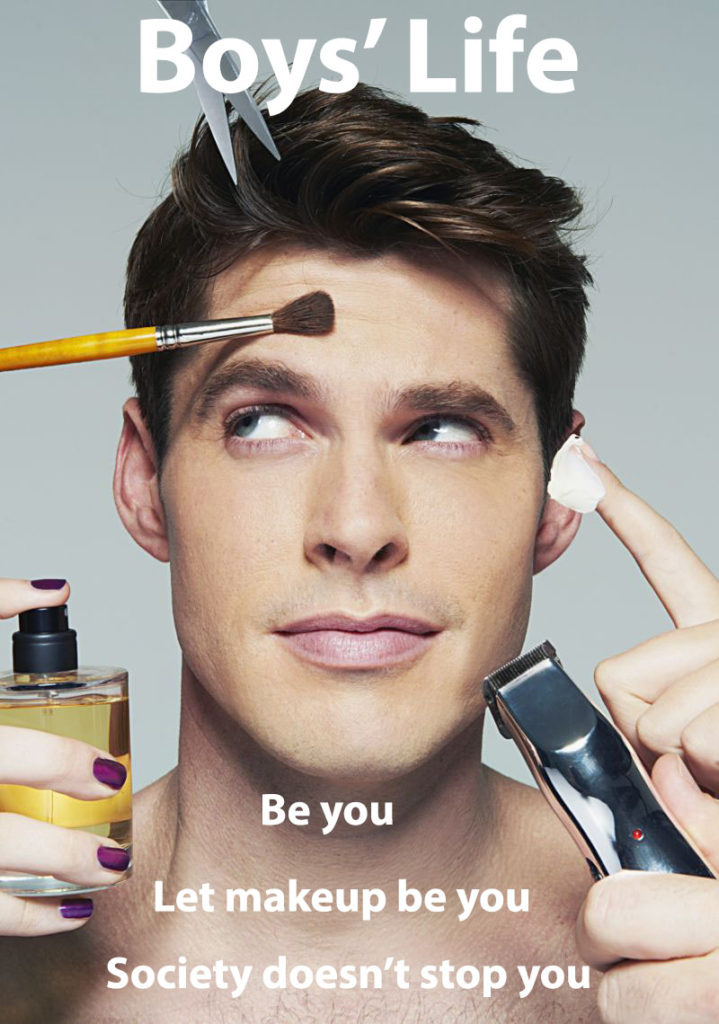
With my Boys’ Magazine, I wanted to send a message about makeup being for everyone and not being a stereotypical thing for women. By using a man on the front cover with makeup products and also some typical things such as scissors, it gives it some normality of men being able to wear makeup. I used 3 lines for my front cover to keep it short and easy and I ended with the word “you” every time to emphasise the readers that it is about them. It is a bold message for readers that you should think about your own appearance and especially for boys, it is okay to wear makeup and express your own style.
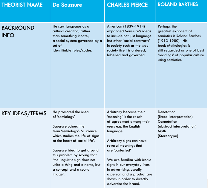
Usually in most media, cultural and communication courses there are three main theorists that are examined and applied:
And generally the following key language is part of this process:
To provide some context and overview I will provide a brief explanation for each one:
Pierce (1839 -1914) was also a Linguist. Also interested in Language. Also therefore appropriate to Semiotics, when you are looking to use some key language to deconstruct a cultural text. Again he was looking to develop an understanding of the way in which Language is a way of connecting meaning to different signs. Often he is used to identify different types of sign, which can be categorised into three distinct categories:
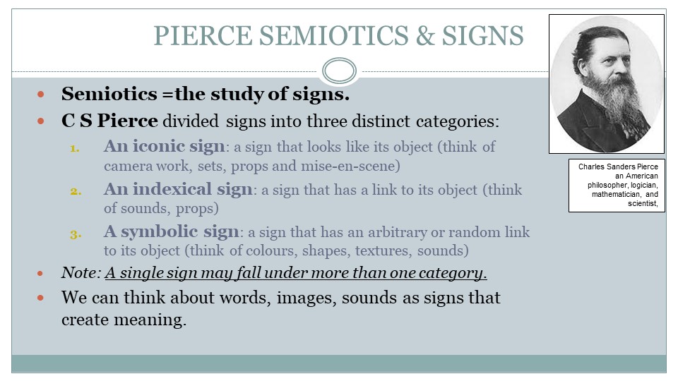
TASK 1: Go to your blog post that has your summer induction task and identify 6 x iconic signs, 6 x indexical signs & 6 x symbolic signs. Is it possible that a single sign may be in more than one category? In other words, is the colour red a symbolic and indexical sign?
Ferdinand Sausure (1857-1913) was interested in Linguistics, in other words, he was interested in Language – so you can see why we look at him in Media Studies. As a brief overview, he was interested in the connection between’ a thing’, ‘an object’, a something’ and the meaning that human beings then attach to ‘this thing’.
He wanted to explore this area, as it seemed to suggest that things don’t have an innate meaning, rather that meaning is given to things, often through some form of interaction – hence, the notion of symbolic interactionism.
Sausure then developed an approach to understanding the way in which meaning is created by detaching the signifier (the thing, the object) and the signified (the meaning). So it is important to try and use these two terms when referring to Sausure, when you are discussing key elements or signs in a text.
Roland Barthes (1915-1980) is often seen as a founding father of Media Studies, as many of his books look at the way in which media texts hold meaning. For example, Mythologies (1957) looks at wrestling, Roman films, soap powders and detergents, steak and chips, striptease, plastic . . .
Roland Barthes is often seen as a structuralist in other words, he was interested in tracing the relationship between significant societal structures, like the media and popular culture and identifying how they made an impact on society and individuals. In particular, he was interested in the ways in which dominant structures created dominant ideologies. To that end, he was keen to encourage a reading of cultural texts from an analysis of what they were (analysing the object), which operates at a denotative level (think for examples elements and signs that are in a newspaper, or radio programme, film, television, advert or web-page), to what they might mean, which is at a connotative level.
Beyond this Barthes felt that by understanding a range of meanings (connotations) from a range of similar texts (paradigms) it was possible to develop an understanding of an overarching dominant ideology or at a point that Barthes identifies as a myth. In other words, an argument is presented that suggests that the mass media contribute to a dominant ideology around gender, race, ethnicity, sexuality, religion, class and status, which are actually are myths. It could be then argued that these myths are actually in-line with the dominant ideology (attitudes, values and beliefs) of the dominant groups in society.
This aligns his views to a Marxist interpretation of society (one based on the ideas of Karl Marx), where the dominant ideology of society is actually the ideology of the dominant groups in society, which may not necessarily be in everybody’s interest or benefit.
The ideas of the ruling class are in every epoch the ruling ideas, i.e. the class which is the ruling material force of society, is at the same time its ruling intellectual force. The class which has the means of material production at its disposal, has control at the same time over the means of mental production, so that thereby, generally speaking, the ideas of those who lack the means of mental production are subject to it. The ruling ideas are nothing more than the ideal expression of the dominant material relationships, the dominant material relationships grasped as ideas.
Marx, German Ideology (1845)
Following this line of thought, cultural texts that appear to support the dominant ideology can the therefore referred to as ‘reactionary’ as opposed to texts which challenge the dominant ideology which can be referred to as ‘radical’. Although, what soon becomes apparent in any textual analysis is that most texts usually appear to have elements that are both radical and reactionary. As such, it may be necessary to think further about where meaning comes from, because if we think about it with reference to the theory of symbolic interactionism, then we need to consider the role of the audience in constructing meaning, as well as thinking about the role of the author of a text, or even the institution that made it. This idea can again be referenced to Barthes in his proposition of the ‘Death of the Author‘ and will be explored in another post. For now here is an excellent animated video that helps to explore some of the ideas that I have put forward.
TASK 2: Write up a blog post that provides a short definition and / or explanation for the following terms:
The reason I chose to do this specific magazine cover on the Simpsons game hit and run was because I used to play this as a child. This game was enjoyable and interactive and I thought that this would be a good game to promote to other children, even though it is an old game it was a hit in its time. It was an award winning game as I specified on my front cover.
Firstly I researched some magazine covers on the internet to see how they were structured and how they were formatted. I targeted PlayStation magazines as this was the main console for The Simpsons game to be played on. This is how I was able to get design ideas for my magazine cover. I went into Publisher as I thought this was the best place to create a front cover. I composed many drafts for the magazine cover. On my first draft I copied the front cover of the hit and run game with the PlayStation title and a blank background. I realized that this hadn’t the colour genre of the Simpsons, therefore I decided to do this completely different.
I moved onto my final draft which is the finished piece. This final piece is the best it can be in terms of colours and the boldness throughout. I immediately wrote PlayStation in big, bold letters to show the reader that it is best played on PlayStation, of course including the original PlayStation logo. As you can see above this, there are other names of consoles that it can be played on. I think this is a nice addition to it as I saw this on many other magazine covers. Moving onto the pink circle which is meant to be seen as a sticker, this shows the reader that this game has an award for being the “fave” game to play. This means that they are going to be persuaded into liking it more. To the far right of that, is the PlayStation controller shapes in bright yellow, this conveys to the reader that it is PlayStation based. Every magazine cover has gaming terminology to show what the game entails. Also it highlights the information on the inside for the reader to feel like they have to open it to find out more. I have executed both of these things, trying to give them hints to open the magazine. This in turn will lead them on (with the use of ellipses) as to what will be revealed inside.
Finally, for the main feature, I have shown a picture of the Simpsons and the title below it. This shows the reader a fraction of what the game entails. I chose the picture as I wanted the whole of the Simpsons family in it as they are the main characters in the game. I also dotted some of the other characters that appear in the game. These were shown as small features to draw the reader in. The title is in a bold colour to show the reader the name of the game. The Simpsons logo is in bright red with the name “Hit and Run” in a white box encompassing it. This gives the effect that it was stamped on. This will appeal to the reader when they first
come to look at the cover. I chose a blue background as this is in reference to the Simpsons sky when you’re introduced into the game.