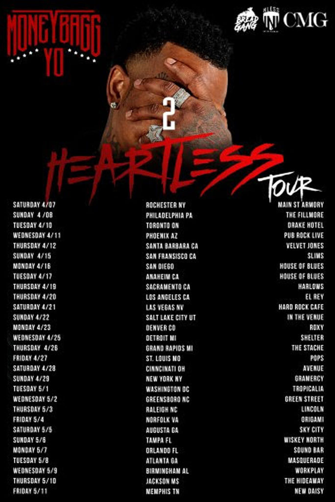
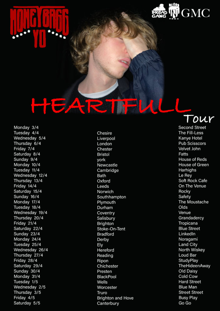


I will be focusing on my NEA 4 production. I will create a music video to promote an artist. I will be filming in at least 2 locations, with one character. My genre of music will be orchestral alternative Hiphop. I have collected my non copyright music from Youtube.
In preparation for my music video, I collected ideas by looking at music videos. the main music videos i have taken inspiration from Harry Styles, BTS, and Christina Perri.
My idea will portray scenes where the protagonist is looking sad and disconsolate. I will have scenes using natural lighting, studio lighting and under water sequences. Furthermore, i will introduce most of my scenes in slo-motion, as i fell it gives a more ambient and dramatic effect.
I will use Lasswells Theory of the Hypodermic model to ensure the music videos message is directly received and accepted the receiver. My audience would be more for young individuals who enjoy alternative hip hop music.
I intend to create a 4 page music magazine of the artist where it will focus on the secrets and struggles of being an artist. For my front cover magazine, I plan to portray style similar to Billboard magazines. I will have one large image covering the whole page, with the title centered at the top and minimal complimentary writing around the photograph. I will be using the theory of preferred reading. I will make a media product (magazine) where i put ideas in the texts which i will expect my audience to understand. Stuart Hall calls this a preferred reading, as this is what the producers of the text wanted them to understand. However, each audience is different, so they might understand the text completely different to what was intended.
I will be using the theory of uses and gratification, that was developed by Katz, Gurevitch and Haas (1973). The audience will watch this as escapism from the real world, and also a way of understanding the world in what we live in. As the artist portrays her feelings through the narrative theory, this allows the audience to understand the way artists really fell behind all the media. This also links with the cultivation theory, as the story behind the music video is all about how the media can change the way people feel, as being a well known artist can be overwhelming and difficult, making their identity fragmented.
Front Cover –
Contents Page –
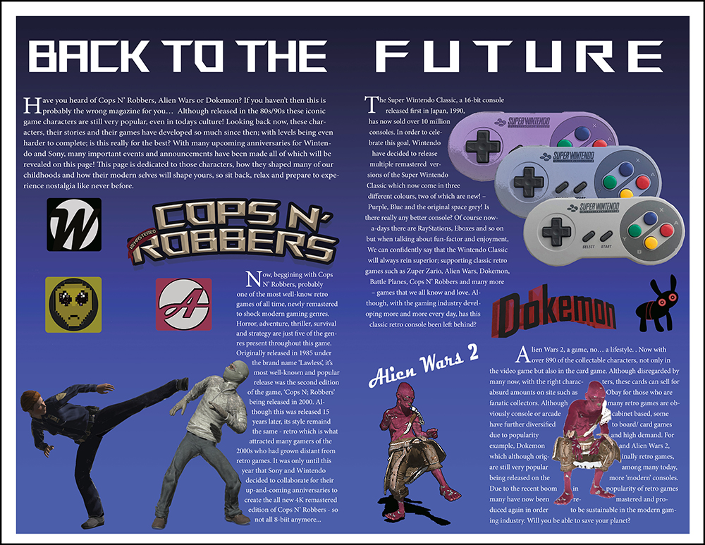
Double Page –
Ad 1 –
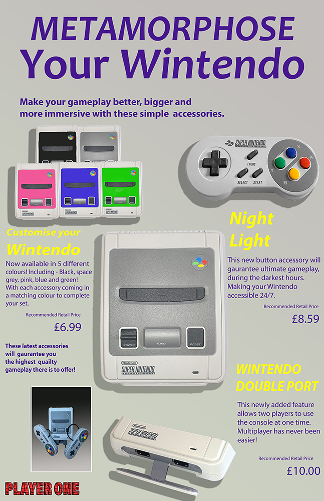
Ad 2 –
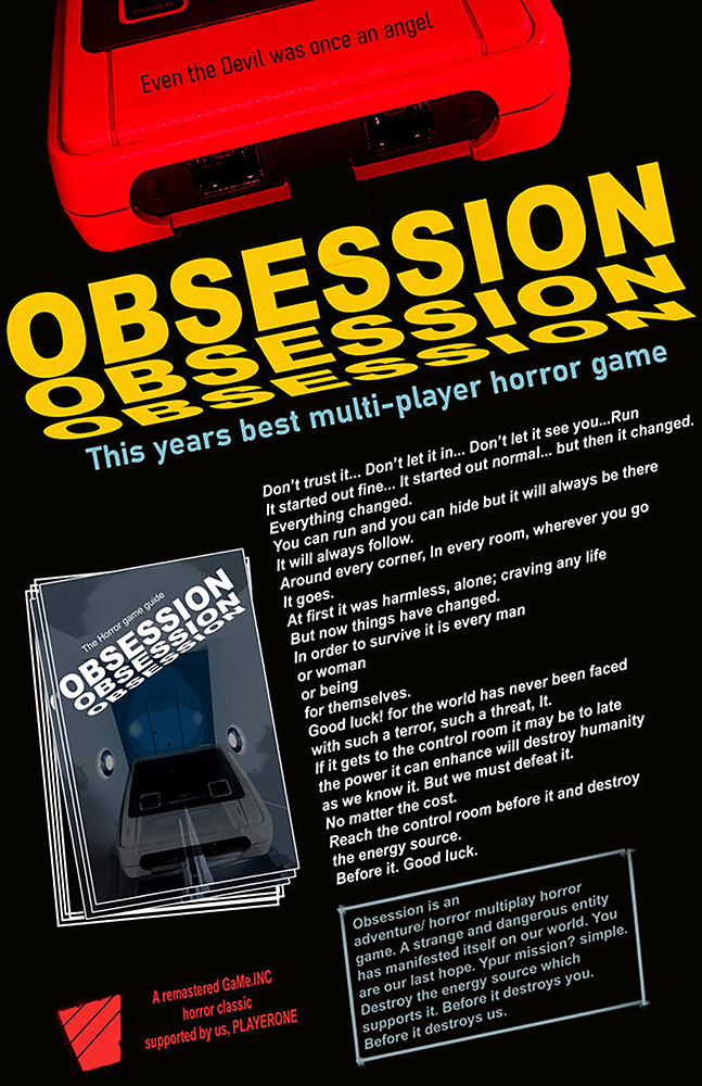
Ad 3 –

Statement of intent
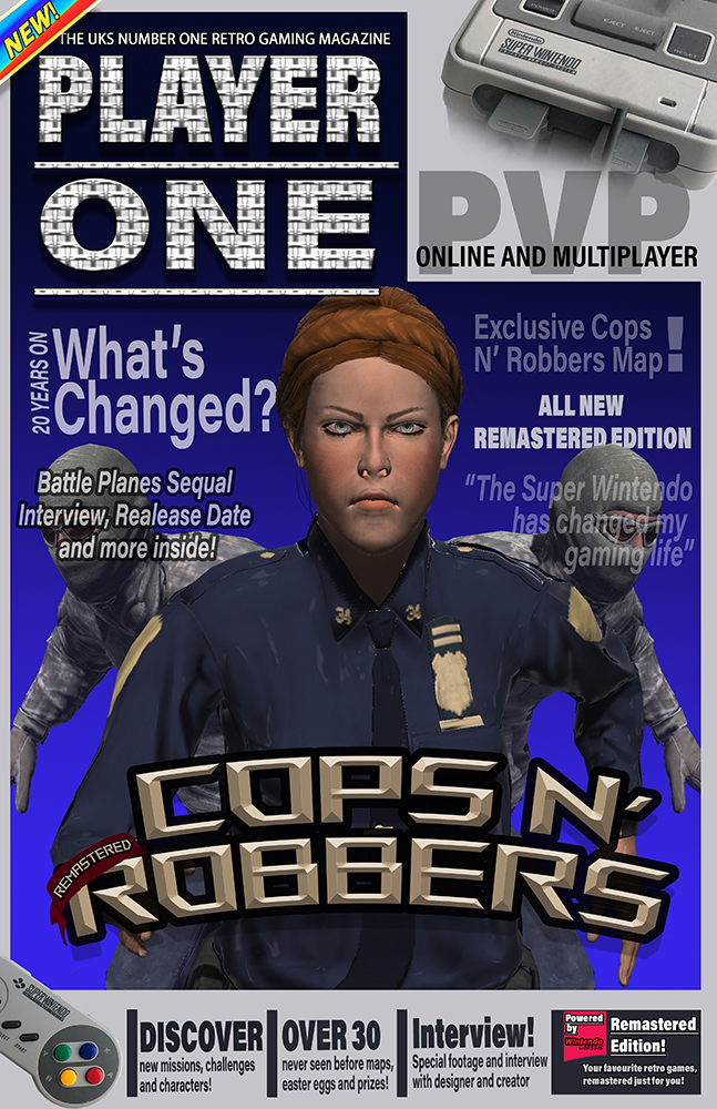
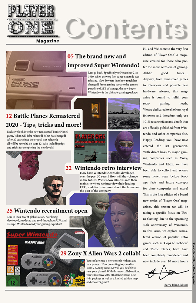
For my NEA I will be completing the second brief; aiming to produce a front cover, double page spread, contents page and three adverts for the gaming genre. My ideas will be influenced by a selection of already-produced gaming magazines that share similar codes and conventions to the ones I wish to use to attract a certain demographic. My magazine is predominantly aimed at a younger audience of 12-15 years. I aim to produce a product that is attractive and inclusive of all genders as this would likely increase circulation of my product as well as profit; many gaming-based products are targeted at a male audience. Ideas proposed by theorists such as David Gauntlett; his theory on gender fluidity suggests that whilst in the past the media tend to convey singular, straightforward messages about ideal types of male and female identities, the media today offers us a more diverse range of icons and characters from whom we may influenced by, meaning that gender identity is less constricted, this is what I aim to achieve.
I aim to target this specific demographic as they are highly impressionable, as they are seen as ‘mainstreamers’ they are also more likely to follow popular trends, especially in areas such as gaming which allow for a form of escapism. As the form of gaming is presented in a physical, literacy-based form this product will also act as a device to reinforce and enhance their use of lexis and vocabulary. The style of language and register that I will use is a mix of colloquial and slightly more formal as I want the magazine to be professional and factual in relation to its contents. However, it should also be appealing to my target audience through the informal language; they would use in everyday life so that they can relate to it, using the magazine as a form of escapism, interlinking with the uses and gratification theory.
My product is also going to be highly influenced by ideas surrounding postmodernism – the idea that reality is not reflective in human understanding, but rather constructed by individuals based on their own collection of fragmented thoughts. Therefore, my product will reflect these ideas as it aims to influence the audience to construct their own opinions based on individual interpretation, also linking in with Habermas’s theory on the ‘Public Sphere’ whereby individuals can share individual thoughts and feelings globally without intervention from higher institutions such as government.
I will also use the san-serif font – ‘Acumin Variable Concept’ – an informal font would be more eye-catching to a younger audience who may want to rebel against formal customs that are dominant in more reactionary or ‘adult’ texts such as ‘The Daily Mail’. The font also act as anchorage for plugs as they will use similar styling. I also wanted to incorporate a retro theme to my magazine and used 8-bit characters and a tabloid size, similar to popular 80s magazines, with a width of – 27.94 CM and height of – 43.18 CM.
[Word Count = 500]
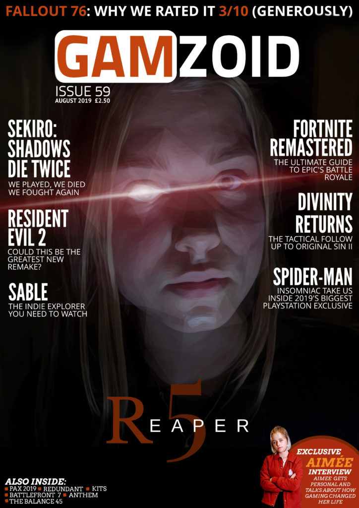
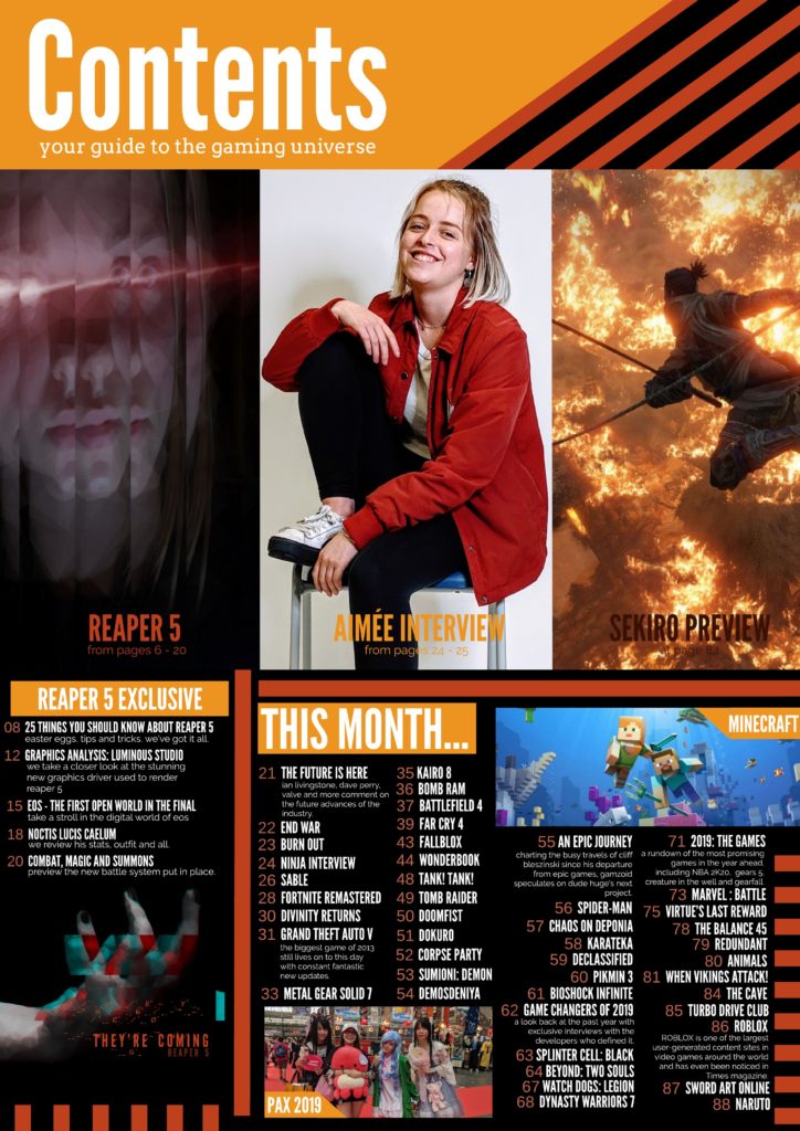
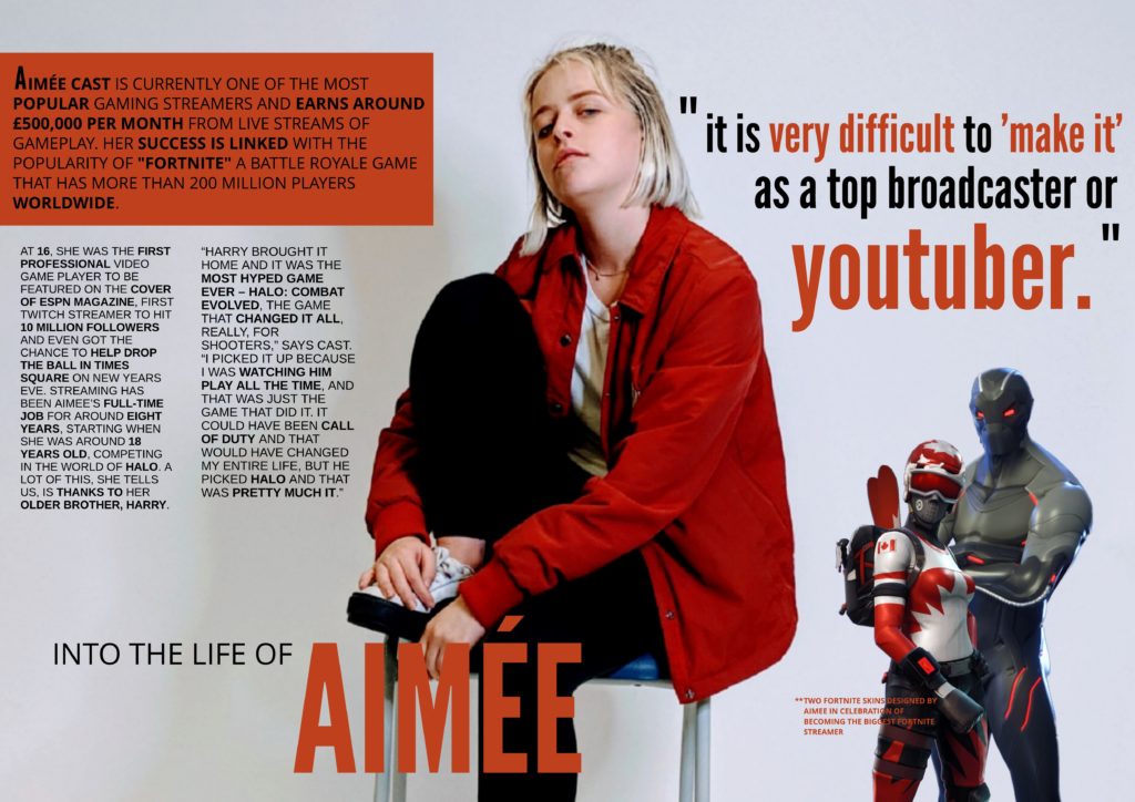

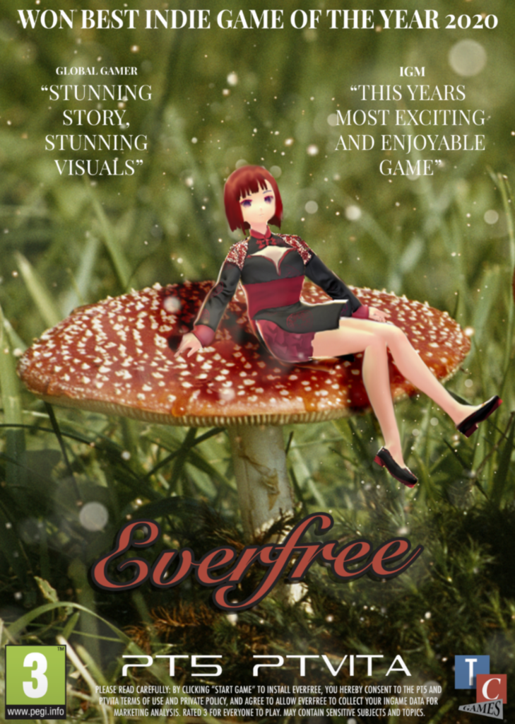
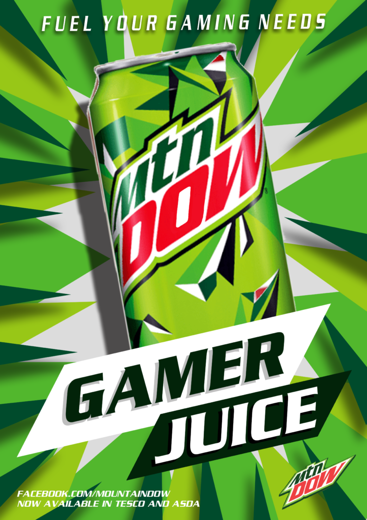
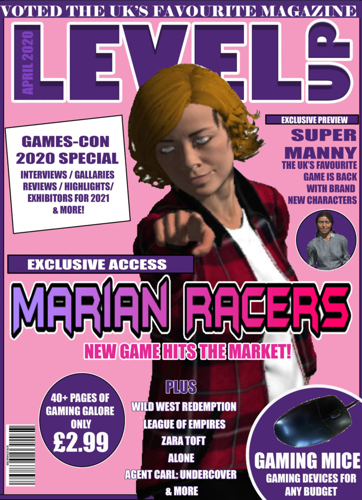
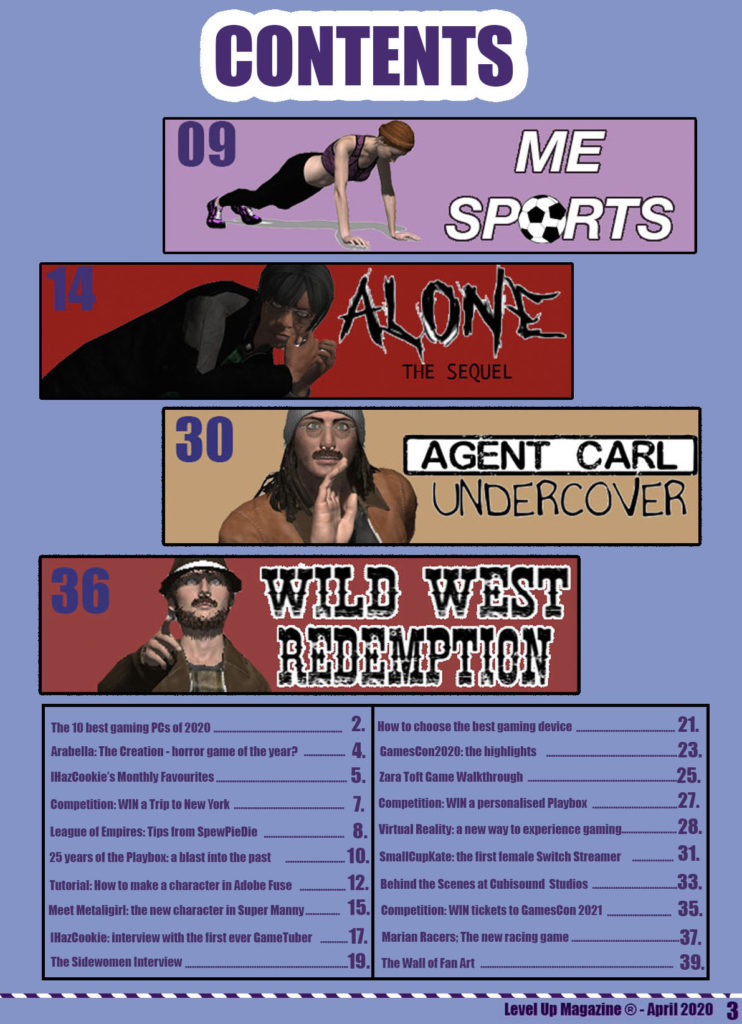
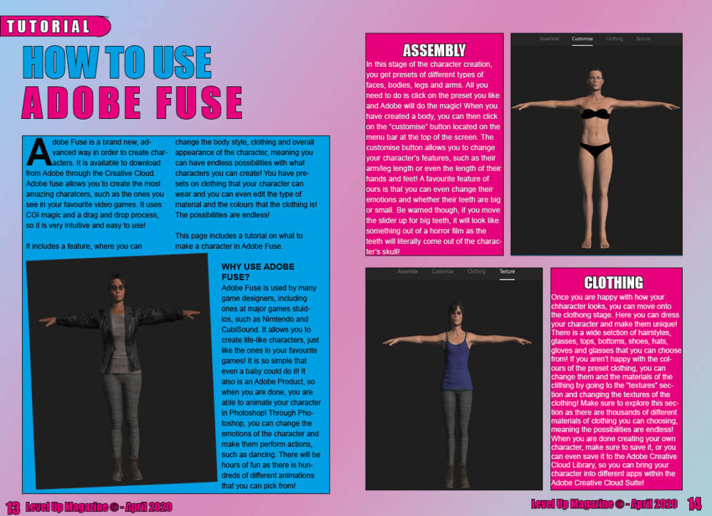

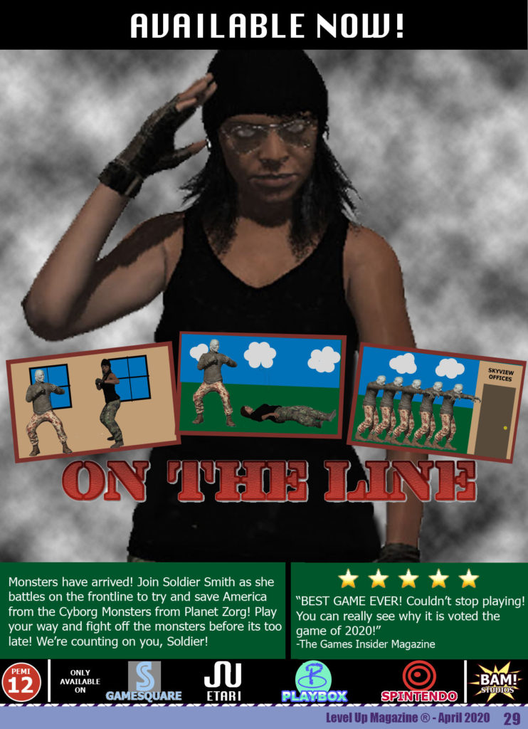

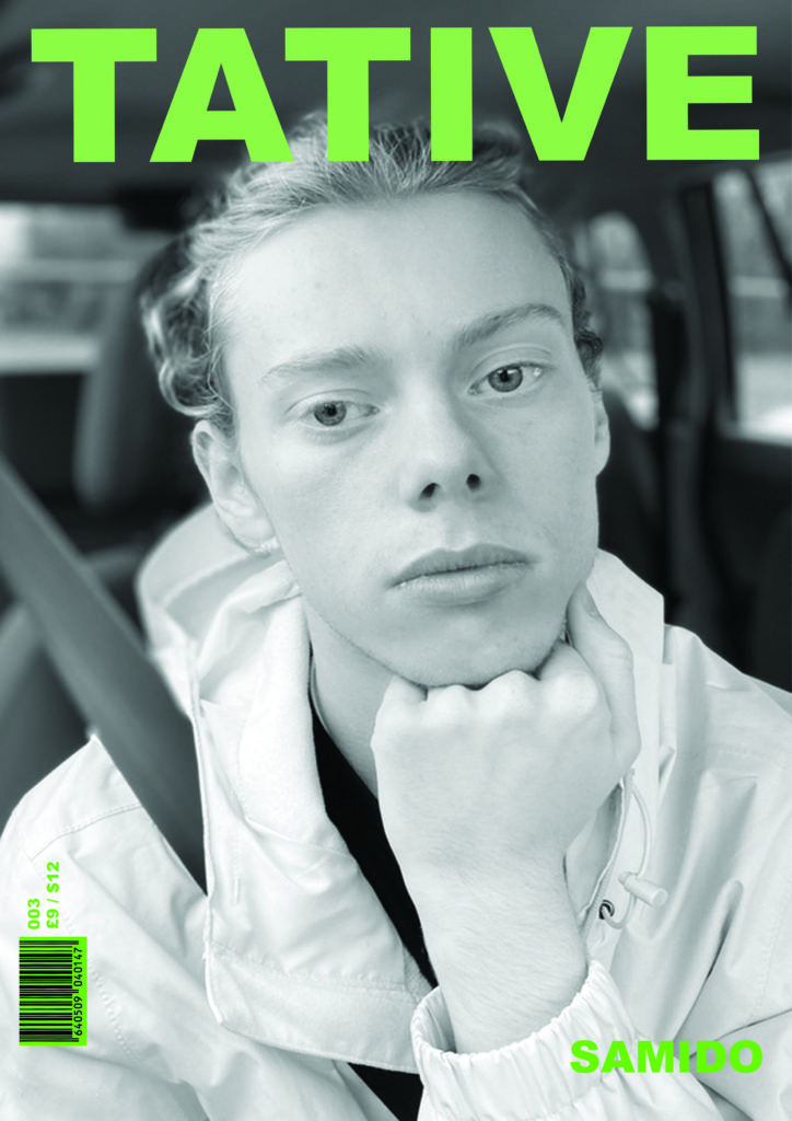
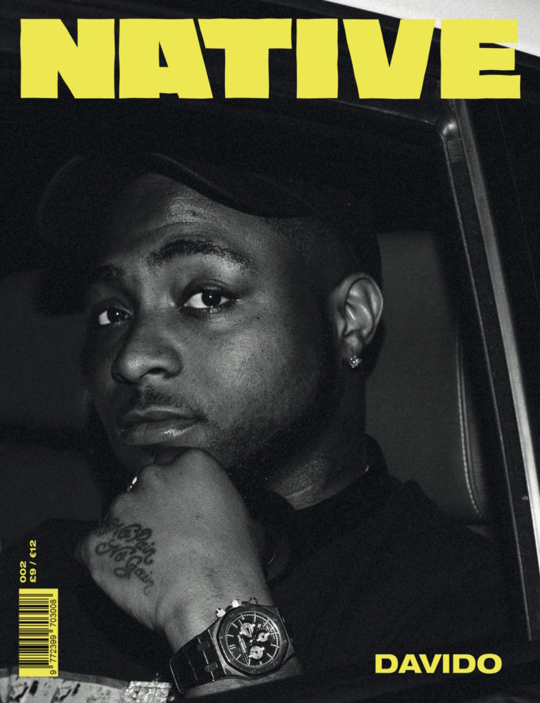
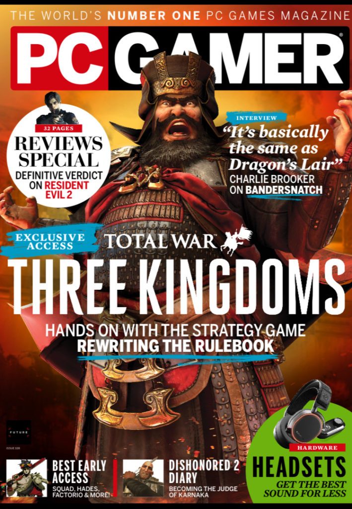
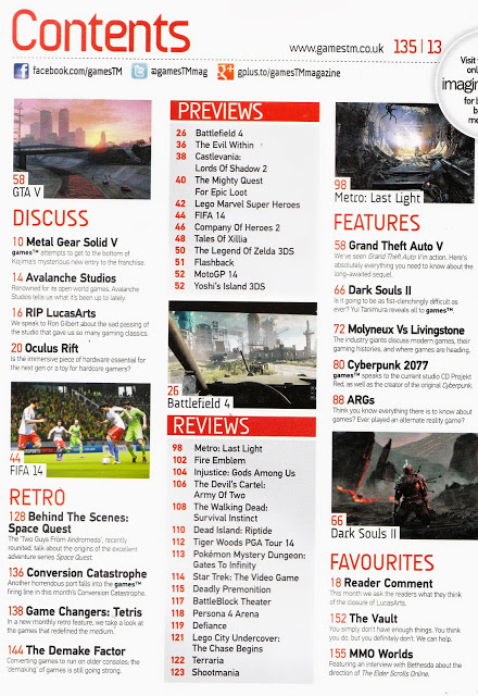
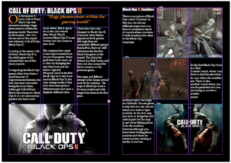

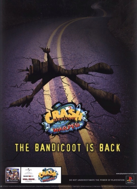
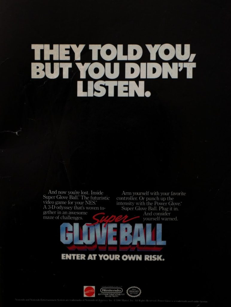
I am following brief two and creating a gaming magazine and three print adverts. My magazine will be named ‘GAMEIN’, this title is an attempt at a play on words as it is a gaming magazine which is about all the inside information and insights into the gaming industry, ‘GAMEIN’ also sounds similar to the word gaming. My intended target audience for this magazine is british male teenagers in the age range 13-17.
I have looked at style models from the magazines PC Gamer and Games™ and have taken inspiration from both of these magazines. I have also looked at adverts within these magazines and taken inspiration from them, my adverts will have simple designs that easily get the message of the advertisers across, I will advertise new games as well as a product that games can be played on. The games/products advertised will be targeted at the target audience.
The main font used for text throughout the magazine will be ‘Algerian’. My masthead will be in capital letters and in bold writing and a bold colour to ensure that it is eye-catching and stands out around other magazines.
I will include a clear house style to my magazine, all pages will be black with a red strapline across the top of each page. My masthead on the front cover will be in capital letters, bold and red.
I have used the colour black as the background / page colour for my magazine as black is associated with power, strength and rebellion, these connotations often relate to what my intended target audience is interested in and will make them more attracted to the magazine. I have also used the colour red as it is intense and it connotes symbols of blood, danger and war which is what is in a lot of games that teenage boys in the age range 13-17 are interested in so it draws them into the magazine and makes them interested.
All images, logos and copy is original, and I will create my magazine and print adverts on adobe photoshop. To create images for my magazine/print adverts I will use adobe fuse to create life-like cartoon characters to make them look as though they are actual characters from video games. I will also create 8-bit art to create vintage style games characters and icons.
I will use Blumler and Katz uses and gratifications theory and will create my magazine to be informative and educational about the gaming world. I also would like it to be entertaining. The main image is an iconic sign of a man in army style clothing. The code within the magazine will be through the use of colour. The codes will convey connotations of power, danger and violence. The magazine will be a reactionary text as it follows societies ideas of gaming and masculinity within it.
The song in my music video is by a local female artist, it is titled ‘Rehab’. My video will be about a teenage girl who is heartbroken about losing someone she loves, she goes into a downward spiral of depression and winds up being homeless. I will be showing the story from another person’s perspective, like someone else is watching the girl’s life. There will be a clear narrative structure in my production (equilibrium, disruption and new equilibrium). The opening scene of the video will be a wide shot of an empty park bench, then the girl comes into view looking upset and sits down on it carryinging all her belongings. This will set the scene, making it obvious that she is sad and also homeless. I will incorporate a circular narrative into the video, ending the video on the park bench where it started, this is to provide closure through a return of opening material rather than providing a clear conclusion, to show how she is still stuck in the same situation. My target audience is young adults, aged 18 – 25. I will target this audience by presenting the main character to be striving to escape stress which many young people can relate to. It will also show how easily someone’s life can take a turn and end up in a situation like hers, which is a growing concern in society today. I will use a range of camera angles and settings to show her journey more clearly, along with changing the pace in some scenes. Near the beginning and end I will keep the pace of the video rather slow to emphasise the equilibrium, however during the disruption when she is robbed of her belongings the pace will increase significantly.
For my advert I will be advertising an upcoming album for the artist whose song is incorporated into my music video. I have taken inspiration from one of our close study projects ‘Oh!’ while making this particular advert, keeping it very modern and minimalistic. I will include the artist’s name, the name of the album and some featured songs. Along with this I will state the platforms that the album will be able to be streamed from such as Spotify and Apple Music and the release date.
The front cover of my magazine will include a black and white image of the artist. The title will sit at the top of the page and read ‘Acoustic Weekly’ in black and red text. I will use a bold font and a sans serif text to make the title stand out. I have taken inspiration from old ‘NME’ magazines, particularly when it comes to the colour scheme. The target audience is indie/acoustic music listeners of all ages. I will use minimal language on the cover, only including concise cover lines and kickers to give a clear indication of what the articles inside entail.