Category Archives: Uncategorized

Filters

Author:
Category:

Statement of Intent: Summer Task

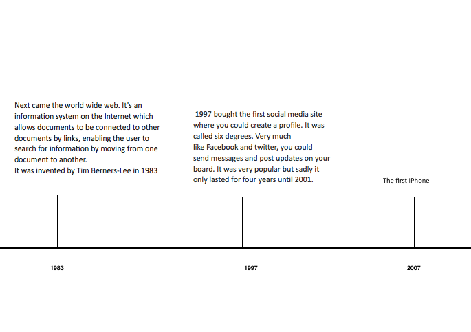
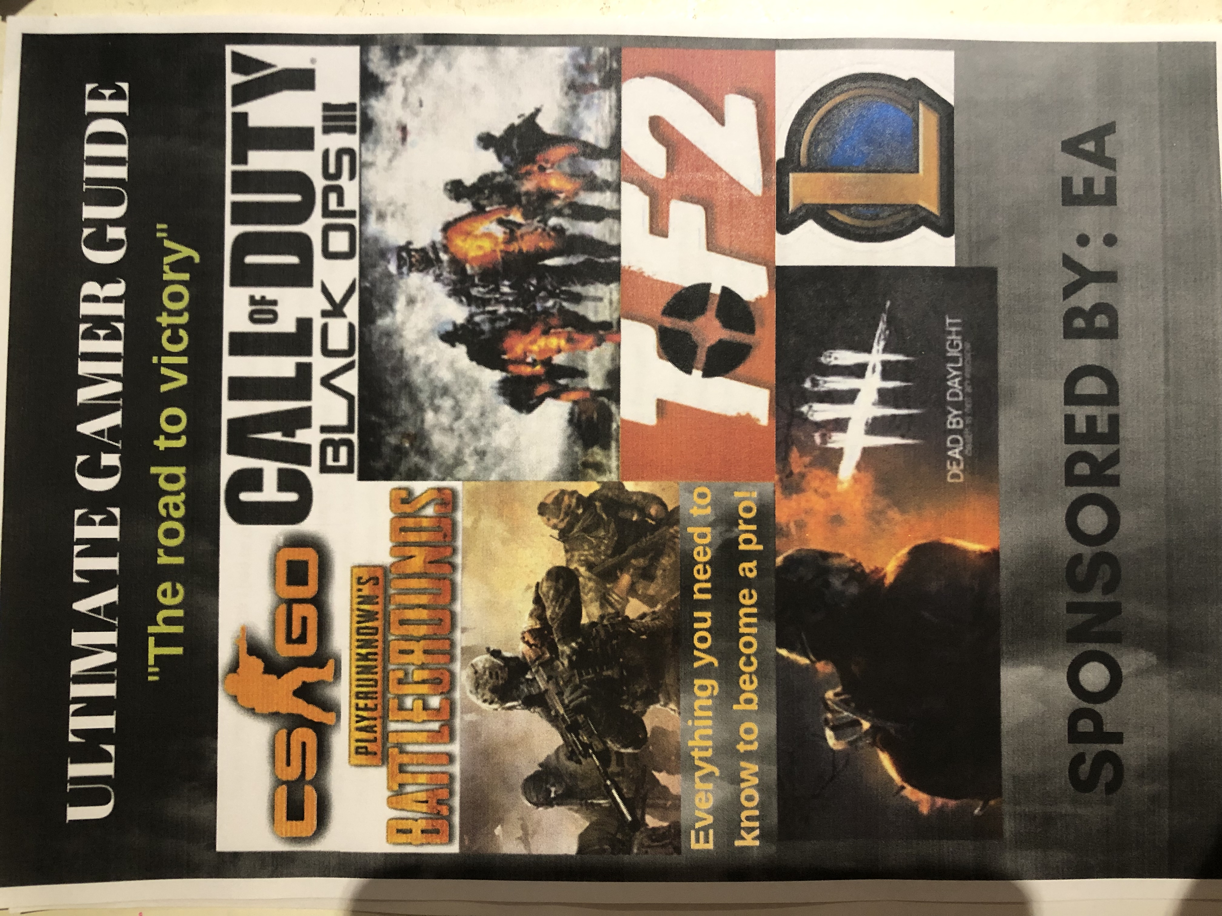
My thoughts and ideas behind my magazine front cover

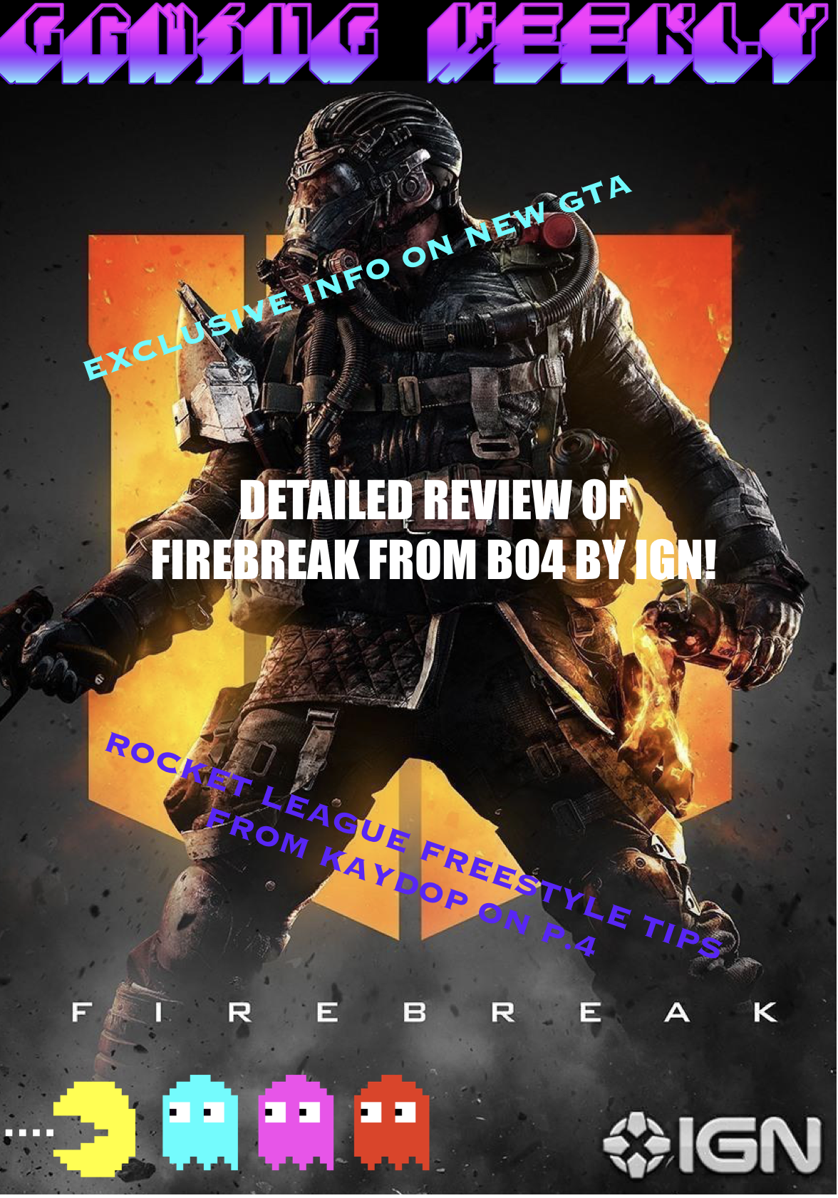
My ideology behind the design of the cover was to make it as educational and informative as possible. It is a subject I have very strong knowledge involving the topic. I also consider the game a hobby of mine as I pursue dreams of a possible esports appearance in coming years, considering I have the talent and ability meaning I am educated enough with all the changes and improvements to the game. There are still areas to improve on which I can talk about so I can make the review balanced and fair.  My brief reviews will accurate coming from a racer with experience. If i was to make a series on the topic in future there would be many topics to talk about meaning there would be no issues expanding. For example, changes to career mode with cutscenes and drama with the newly introduced Formula 2, as well as the development tree to upgrade your car and make it faster. In addition, you could talk about the game physics including the handling model, and the changes in downforce and grip from previous games. Furthermore, creating your own car setup to change the suspension, angle of attack for the wings, transmission, tyre pressure, brake bias and brake bias is another topic to talk about. Another copy of the magazine could be about what each option in the setup menu does and how to adapt to the car. The magazine could also turn into a tip guide to beginners on how to improve their actual ability.

If I was to improve on this task in the future, or change anything, my main priority would be making the presentation more flashy and eye catching with more designs and colour to attract the reader however designing is a weak point so I need to improve. I would also like to change the written layout, instead of it being in column so it is more interesting to the reader. The lack of colour is another problem I can fix. If I did the project on paper it may of been more intriguing to the reader as the finished product would be less bland and would have more design. I would also like to make the piece more authentic and realistic so I feel a greater sense of achievement and success which is at a high standard. A perk of making the piece on computer is that if you run out of space on the page you can go back and make changes so it fits like changing the font size.

From this conclusion, I have self evaluated the flaws in my work and how I can improve for future tasks by learning and developing skills. This self criticism has also worked as a brainstorming session to write future ideas on paper if I was to continue and make progress in my work.

Summer task

Mario is one of the most popular video games of all time. People play this game all around the world and on multiple platforms, whether it’s WII or Nintendo DS. Mario is designed for everyone, young and old and all age groups love it. Parents can pass their childhood Mario games onto their children for them to enjoy just as much as they did. This is why I decided to choose Mario as my magazine cover as it is so popular amongst many, including myself. 

Mario was released in 1983 and created by Shigeru Miyamoto. The character of Mario was first seen in the arcade game Donkey Kong and became an instant celebrity when more than 60,000 arcade machines were sold. Since 1983 various versions of Mario have been released such as the original Super Mario Bros in 1985 (which is the first Mario seen on the front cover of my magazine). New Super Mario Bros Wii released in 2009, Super Mario Bros Galaxy 2, released in 2010 and the most recent game of Mario legacy is Super Mario maker 2 in which you get to design your own levels for Mario to get through. This was released in 2019. This shows that even since 1983 Mario has been a major aspect of many childhoods and will hopefully still remain as big as it currently is, in the future. 

My main idea for the front cover of this magazine was so show visually how Mario has progressed over the 37 years of its existence and how it will continue to improve. This magazine which I have designed in particular is predominantly based for younger children due to the bright colours and eye-catching text. Some iconic features have been placed on the front of the magazine cover to give a full effect of the Mario experience, such as the mushrooms and the Mario background be the blue sky and green grass. The title of the magazine is in the Mario font which is used in all games. The caption “top 10 cheats for 2019” encourages gamers to read the magazine and discover what the cheats are. As it is cheats from 2019 this shows it’s new and current. The pictures of the different Marios on the front cover give a hint of what the magazine will consist of and gives the reader a taster of what they’ll be reading. The front cover also indicates what will be inside that issue and how they will be able to beat the level which they have been struggling with and get useful tips from expert gamers. The two red and white mushrooms are also a key feature of Mario and add to the texture of the front cover.  

This magazine in particular will enlighten the gamers and tell them more about what they are playing than they have ever known before. They will also find out the history of their favourite game and will show them what other Mario games Nintendo has to offer.  

In conclusion, inside this magazine will consist of Mario evolution, tips and tricks, and advice from pro gamers. Children will enjoy reading this magazine and will expand their gaming knowledge further than they could imagine.  

Summer Task

My Magazine  

For my magazine I have decided the main focus was going to be around a new character for a game, so I decided to have the back ground as the call off duty black Ops 4 Logo with a picture of Firebreak on the front. To go with this image I have attached a small amount of writing saying ‘Detailed review of firebreak from BO4 by IGN’ so the customer buying my magazine will know what is written inside the magazine as it was my main focus I have centred it in the middle of the page and I have made the font size bigger than the other ones I also made the font white as I thought it would stand out more. Most magazine have titles and logos so for my magazine I decided to make a Pac man logo on 8bitart and put it in the left bottom hand corner of the page. For my title I went with something very simple and to the point ‘gaming weekly’ this allows everyone looking at it to know it’s a gaming magazine that comes out once a week and gives you information on the previous week’s games. I wanted the title to be bright and colourful to catch people’s attention as well as the logo.  

Gaming Magazine Front Cover

For my gaming magazine front cover, I have chosen to do it with a black background with a yellow stripe and a white triangle with white yellow and black writing as the theme as it seems to really stick out. The reason I chose black to be the background for my gaming front cover is because when I was researching online the magazine cover with a dark background and big bold writing stuck out to me so I thought I would do my magazine with dark background as well so when I do the core colours like white and yellow they will really stick out and hopefully this will mean my magazine cover will stick out from others because if it was really my magazine will have to be noticeable as magazines are a competitive market so you want your magazine to stick out so people will want to buy and read it.

For my text, I overlapped on some of the images when I was researching I found out that the majority of the gaming magazine front covers would have some sentences overlapping the images like for example I mainly saw them overlapping the name of a newly released big game in bold. The text colour of yellow in particular works well as personally I get reminded of games in a way, for example, the classic gold coin from Mario and with the black background it really helps the yellow stand out especially with the white.

For my images, I got a png of the few video game characters that came to my head at the moment of creating my magazine front cover and would seem to suit and stand out from the dark background. I did the Minecraft steve the picture in the bottom right the largest image as he is an iconic character and also Minecraft, as a game seems, is on the rise again and many more people have started to play it again like popular YouTuber “pewdiepie”. The image of the Mario gold coin also fits well into the magazine as I called the magazine “gamer deluxe” when you think of deluxe you think of top-grade quality expensive things like gold also the gold coin from Mario is also such an iconic game item as well.

The name of my magazine isn’t the most creative of names but it creates the idea that the magazine is high end as I mentioned in the previous paragraph you think of quality items when you hear deluxe and as if it was a real gaming magazine front cover you want it to be attractive to customers and you want it to have a nice ring to it rather it be something that sound technological or simply simple like I have done so when potential customers read it I want them to think its good quality and want to read it. 

Iconic sign: wolfenstein, Doom slayer, Mario coin

Indexical sign: Minecraft title, box/ps4 symbol, doom slayers amour, wolfenstein military garb

Symbolic sign: bar code

Media Summer Task

Iconic signs: Logos, images, killer in Dead by Daylight
Indexical signs: Title, logos
Symbolic signs: Logo in TF2 is orange/red which could represent blood, logo in dead by daylight could represent claws or strikes, the orange also portrays anger, the background is black to represent fear or intensity, “The road to victory” is green which shows positivity and that it is possible to achieve, “ULTIMATE GAMER GUIDE” is in white and capitals as it needs to be bold and seen

Media Summer Task

To make the gamers magazine cover I used an app that allowed me to edit, add photos and text all within my phone. I began creating the cover by adding a background, I used the colour blue as it’s considered beneficial to the mind and body. It also slows human metabolism and produces a calming effect. Which I thought relates to gaming as for some people it’s their time to relax and enjoy the game. It’s also a colour that works for both genders. The blue background has some dark and light tones within it which then gives it some dimension and makes the cover more radical as it’s not plain nor basic.

  I’ve used a bold title to show the importance of gaming to gamers as it’s seen as their hobby and takes some skill in particular games. It’s game informer specifically because the magazine is all about the latest updates and newest events. Throughout the poster I’ve used black bold borders that contain small pieces of information about each individual game to make it more eye catching and stand out.

I’ve used specific games because they are popular amongst teenagers which therefore is more promising 

for them to purchase as they’d be interested. To add colour and specify what the magazine is about I’ve placed a few characters of each game, which gamers will familiarise and want to read about it and it’s also there to show those who don’t know anything about the game what it’s all about. They’re quite bold to keep the boldness persistent and ensure that the reader is interested.  I made sure I didn’t just specify in one game so therefore I chose three so that people could have a variety to see in just one magazine. 

I’ve also placed the new edition gun from fortnite to intrigue the readers and make them want to read about it therefore getting them to purchase the magazine.

I’ve used bold clip art boxes to make it exciting and eye standing so that the reader would be intrigued in what’s written inside, i’ve also used specific colours so that they link to the colours used in the characters, within the box it  introduces some key information about each game. I didn’t put much writing on the front cover as it would take the attention away from the pictures. 

I’ve also placed a ‘new’ tag as it then shows the reader that there will be new exciting event and updates to do with the games. The tag is also bright which therefore is noticeable. The new tag is directly above the price so that not only the reader sees how cheap the magazine is but also has a bargain as there are new updates. I’ve also placed an image of a controller to show that it’s mainly about gaming and in this case about ps4. 

I’ve used bright and bold colours to achieve a comic look towards it by using yellow, red and purple makes it very eyestanding and extremely bold it’s also constraint with the rest of the background. 

iconic signs: gun picture, game characters, control, games,

symbolic signs: comic diagram links to sound from games,

indexical sign: new tag, colours link to character outfits