Category Archives: Uncategorized

Filters

Author:
Category:

summer task lol

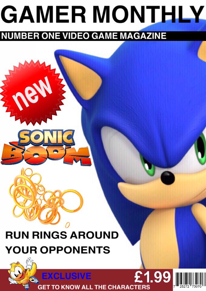
The title of the magazine is in a big, bold black font to capture attention and the eye of anyone looking as the white color stands out on the black background.. This could also represents the idea that characters or protagonists in games are brave and adventurous. This also compliments the other colors on the cover by bringing in a more basic element..

The centre of the cover is the video game character Sonic. Making him the main part of the cover creates a noticeable center/side piece which gamers may be familiar with, therefore making them eager to read about it. The vibrant appearance of the character results in contrasting colours which makes for a striking view.

The ‘NEW’ sticker gives an element of currentness which would make the reader want to see the newest events in gaming. Also the bold red colour is noticeable from afar and compliments the bold blue of the characters design. 

The phrase ‘Run rings around your opponents’ is a catchy tagline which suggests an excellent game which has clearly had an impact. This would make the reader want to pick up the magazine as the exciting expression would intrigue them and make them wonder what’s so good about the game, therefore making them want to read about it.

The sub head ‘number one video game magazine’ shows that this magazine is top. They will instantly think that this is the best one to buy as many other players have already, hence why it’s number one.

The text ‘SONIC BOOM’ is striking with its colours and phrasing. The dramatic onomatopoeia acts as a loud catchphrase, evoking a reader to pick it up.

The visual impact of the sonic-style rings creates another visual factor which flatters the bigger image of the character. The golden shade of these rings gives another pop of colour which, again, creates a vivid cover. 

The banner at the bottom includes a character with the line ‘Get to know all the characters.’ along with the sub title ‘Exclusive’. The color of this small character compliments the golden rings above as well as the word exclusive a it is in an electric blue colour like sonic sidepiece.

The small motto prompts the reader to open the magazine as they’d want to be informed about each protagonist.  

Also there is the price and a bar code to show the affordability of the publication which could also urge the viewer to buy. 

Edit: 
Iconic signs = The Sonic character. The yellow character.

Indexical = "New" sticker implies modernness.

Symbolic = Colors of blue, red, green & yellow = confidence, adventure, goodness, happiness. Each color compliments the other.

Letters/words/the writing. The price.

The golden rings = money.

Summer Task

The main aim of the magazine front cover was to draw in interest from video game fans which are likely to buy it. I did this by using a very recognisable video game character to catch people eyes, in this instance I used sonic and I made sure that he took up most the front cover to easily get people’s attention. The title covering the image stands out and is used to clearly state the main aspect of the magazine which allows people that are not familiar with certain characters or games to know what they’re buying. 
At the foot of the magazine I had a red box, red is known to catch people’s attention, so I used this to put what else was in the magazine. If the reader or customer didn’t like sonic then I used a variety of games to make a larger range of people want to buy the magazine. At the top of the magazine it has the title ‘PC GAMER’ this is used to clearly state that the magazine is about the computer/pc. 
The main colour theme for the magazine was dark, night like colours this was used to show the theme of the main game. However, I did most the writing in white to contrast the background and try to catch a consumer’s eye. I also used bold writing to show one of the games which would be included in the magazine ‘Mortal Kombat 11’. 
The bar code is an essential part of the magazine for selling copies. I put it in the corner to keep it out the way of the main or more important information. 

With my Boys’ Magazine, I wanted to send a message about makeup being for everyone and not being a stereotypical thing for women. By using a man on the front cover with makeup products and also some typical things such as scissors, it gives it some normality of men being able to wear makeup. I used 3 lines for my front cover to keep it short and easy and I ended with the word “you” every time to emphasise the readers that it is about them. It is a bold message for readers that you should think about your own appearance and especially for boys, it is okay to wear makeup and express your own style.

Magazine for gamers

The reason I chose to do this specific magazine cover on the Simpsons game hit and run was because I used to play this as a child. This game was enjoyable and interactive and I thought that this would be a good game to promote to other children, even though it is an old game it was a hit in its time. It was an award winning game as I specified on my front cover.

Firstly I researched some magazine covers on the internet to see how they were structured and how they were formatted. I targeted PlayStation magazines as this was the main console for The Simpsons game to be played on. This is how I was able to get design ideas for my magazine cover. I went into Publisher as I thought this was the best place to create a front cover. I composed many drafts for the magazine cover. On my first draft I copied the front cover of the hit and run game with the PlayStation title and a blank background. I realized that this hadn’t the colour genre of the Simpsons, therefore I decided to do this completely different.

I moved onto my final draft which is the finished piece. This final piece is the best it can be in terms of colours and the boldness throughout. I immediately wrote PlayStation in big, bold letters to show the reader that it is best played on PlayStation, of course including the original PlayStation logo. As you can see above this, there are other names of consoles that it can be played on. I think this is a nice addition to it as I saw this on many other magazine covers. Moving onto the pink circle which is meant to be seen as a sticker, this shows the reader that this game has an award for being the “fave” game to play. This means that they are going to be persuaded into liking it more. To the far right of that, is the PlayStation controller shapes in bright yellow, this conveys to the reader that it is PlayStation based. Every magazine cover has gaming terminology to show what the game entails. Also it highlights the information on the inside for the reader to feel like they have to open it to find out more. I have executed both of these things, trying to give them hints to open the magazine. This in turn will lead them on (with the use of ellipses) as to what will be revealed inside.

Finally, for the main feature, I have shown a picture of the Simpsons and the title below it. This shows the reader a fraction of what the game entails. I chose the picture as I wanted the whole of the Simpsons family in it as they are the main characters in the game. I also dotted some of the other characters that appear in the game. These were shown as small features to draw the reader in. The title is in a bold colour to show the reader the name of the game. The Simpsons logo is in bright red with the name “Hit and Run” in a white box encompassing it. This gives the effect that it was stamped on. This will appeal to the reader when they first

come to look at the cover. I chose a blue background as this is in reference to the Simpsons sky when you’re introduced into the game.

Alternative Cover Explanation

This magazine cover for “Boys life” defeats the idea of stereotypes for men. The cover challenges society in a way in which men are wearing makeup and wearing a product that is stereotypically designed for men. The magazine also challenges the role of masculinity in society and how people still believe “make-up is just for women” but shown clearly by Jeffree Star and Manny Mua, it isn’t. The question on the magazine “Can you be the next Covergirl?” is also going against society in the way in which men can also be the Covergirl and it is not only for women. The pink background and Jeffree’s pink hair also symbolises the feminity that is being portrayed by males. I chose Jeffree Star and Manny Mua because they are both males who are beauty influences. This is a lifestyle which usually women would take an interest in.  

Boys’ Life Choices

The version of the boys life magazine i made opposes masculine stereotype, this stereotype shows boys only enjoying action or dangerous situations. I choose a school boy as the main focus of my magazine to show that boys can also enjoy work and school. Showing boys how to enjoy and make the most of school, not only does this break the stereotype but it allows boys to have a successful future. I have also chosen a young impressionable boy to oppose the stereotype of men having to be strong and powerful.