

Gaming Magazine front cover
Style Model
Statement of Intent:
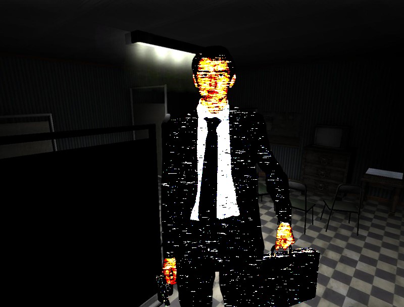
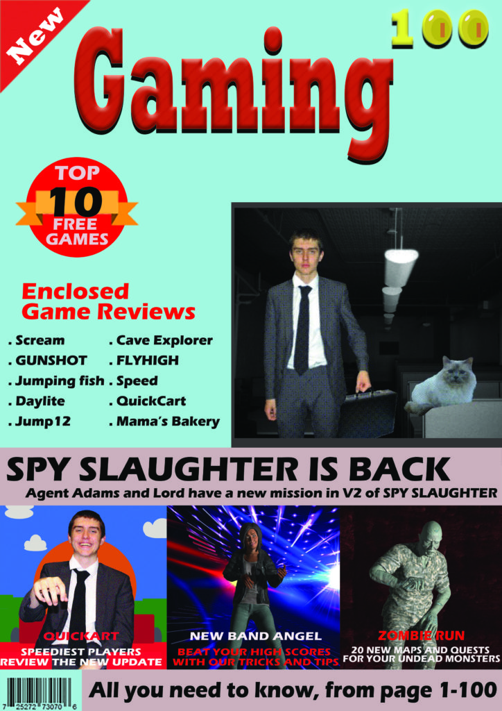
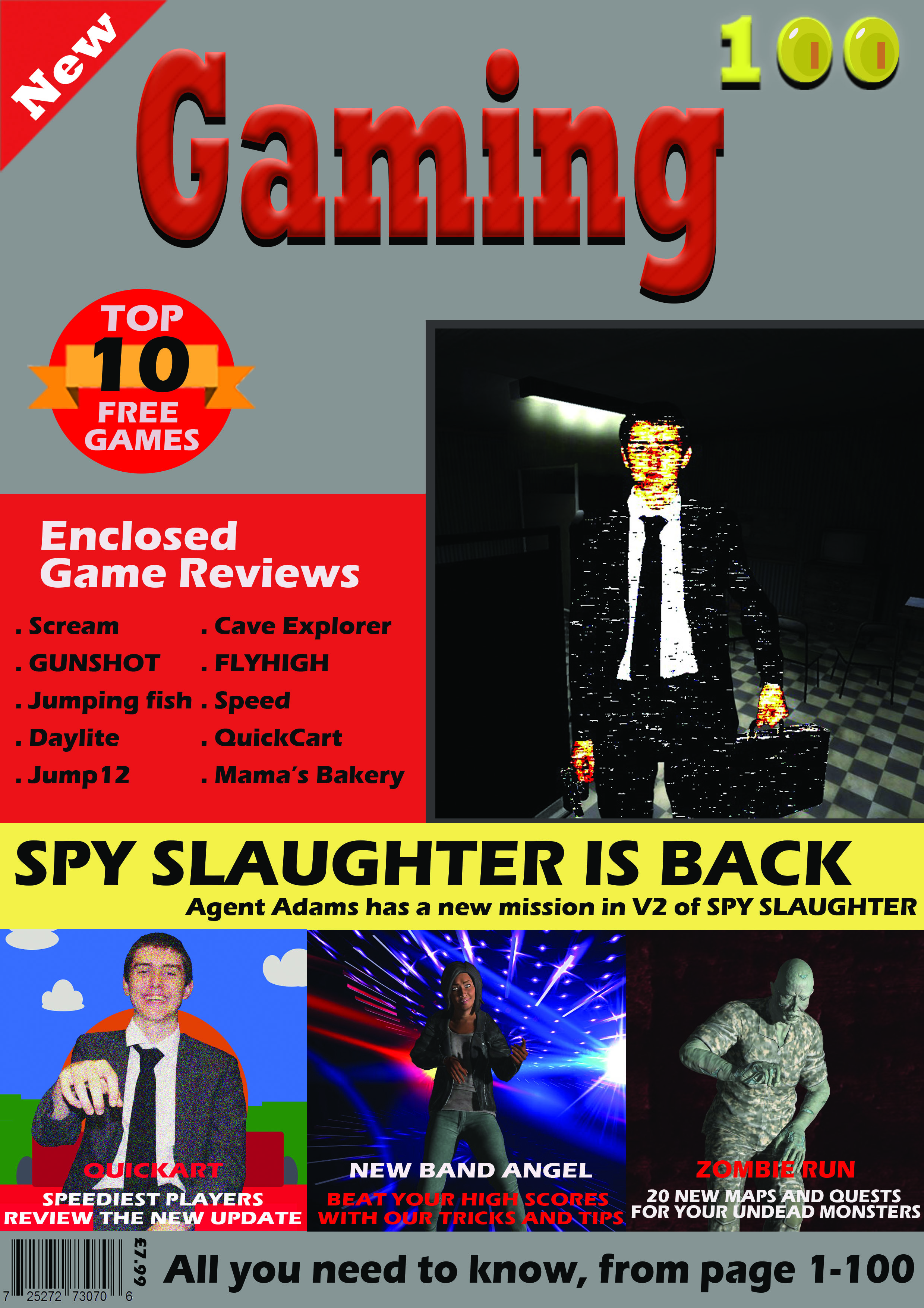
I planned to create a gaming magazine with a main image on the front cover from a game character. For this I used an image I took of my classmate and edited it using the motion blur, posterize, levels and multiply effects to make it look like a game character. Since this character represents a thriller/horror type game, I chose an image conveying mystery or despair with the character staring straight at the viewer. I also chose this because I wanted to use a screenshot like the style model to make the magazine look more impactful.
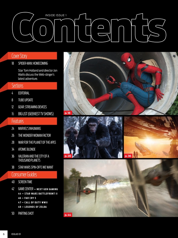
I added extra hooks on the sides and bottom of the magazine. The purpose of these is to entice the buyer and inform them quickly about what content is included in the magazine. I made put them in black boxes to make the text easy to read compared to if they were simply placed above the background image. I included to hook of reviews of the newest games from popular franchises to make the magazine appeal to a large audience, as both casual and hardcore gamers would know about popular franchises and should be interested about buying the magazine if reviews and articles about games in those franchises are featured. In addition, I included news from a gaming convention “E3”, A guide for the popular game Fortnite and links to two stories about gaming at the bottom of the magazine cover.
My magazine features the strapline/tagline “Reviews – Gameplay – News”. I chose this tagline as it is easy to remember so will stick in customers heads, and also it describes what is featured in every issue of New World Gaming.
For the title of my main game (the title anchored to the main image) I used emboss and satin effects to make it look like a title of a thriller/horror/mystery game. The satin affect adds a fracture-like feature in the text which I believe adds a horror element to the title and makes it look visually appealing to a potential customer.
My masthead features the title of the magazine “New World Gaming” which has connotations of exploration and discovery, and this links to what my magazine does, which is to explore all sorts of new games and tell the reader about them. The masthead has a branding of Embossed red text on a white background with a red border around it. This makes the masthead recognizable as it stands out among the rest of the magazine cover’s features. This also makes customers associate my magazine with these colours.
Notes:
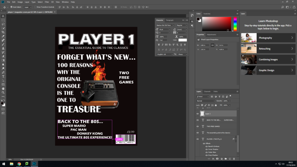
Add a block colour behind the game reviews to add another segment
Redo the main image, remove the cat and edit man differently
Change the cover line accordingly
Change the background colour to a darker colour, possibly light grey
Pixelate the bottom left character more
Add a price in top or bottom left corner
This was my cover for my first thought design, but then i decided to rearrange and add plugs on the top half to be closer to my style model
I wanted my front cover to be appealing to young adults and adults with children, and before I started working on it properly knew that I intended to make the cover look sleek and professional. I edited the image on the cover thoroughly so that it would almost have a gritty and intense effect on whoever were to look at it; and made sure that readers would be immediately drawn in. The theme of “a Magazine for Gamers” is ideal in the sense that gaming is entertaining and a hobby which means that potential readers will already have an avert interest in this topic. I chose the name “Gamestarz” to subtly promote the idea that withing the digital world, you can make something of yourself and be a “star”. This notion would be appealing to young adults and teenagers. Also, the bright contrast between the black and white , and blue and red looks right at home with “pop culture” and furthermore brings more attention to the magazine as a whole brand. After looking at genuine and authentic games magazines I chose a clean and simple layout that would still be effect. Also, I decided to use a controversial question because not only is it a realistic piece of journalism but because it is relevant to the media society today.
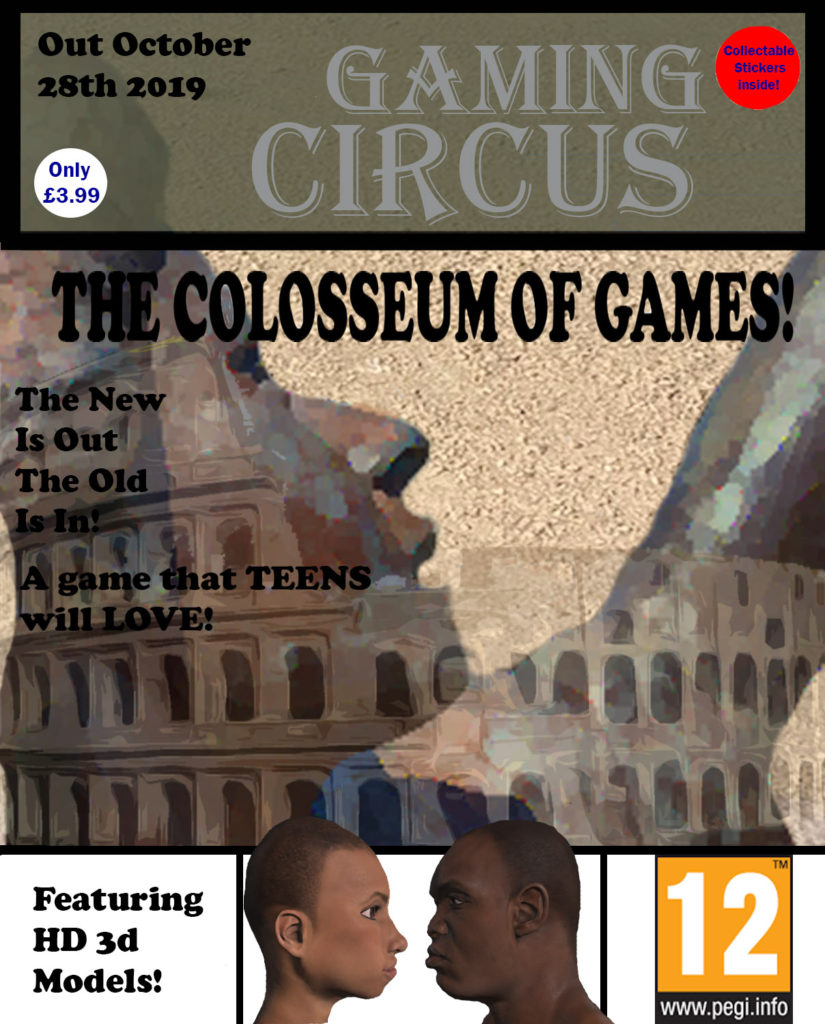
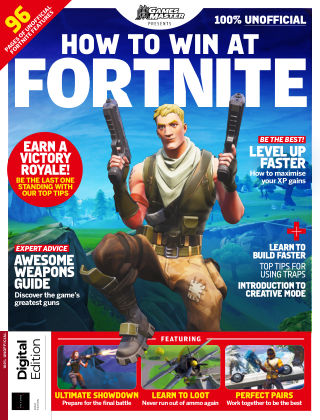
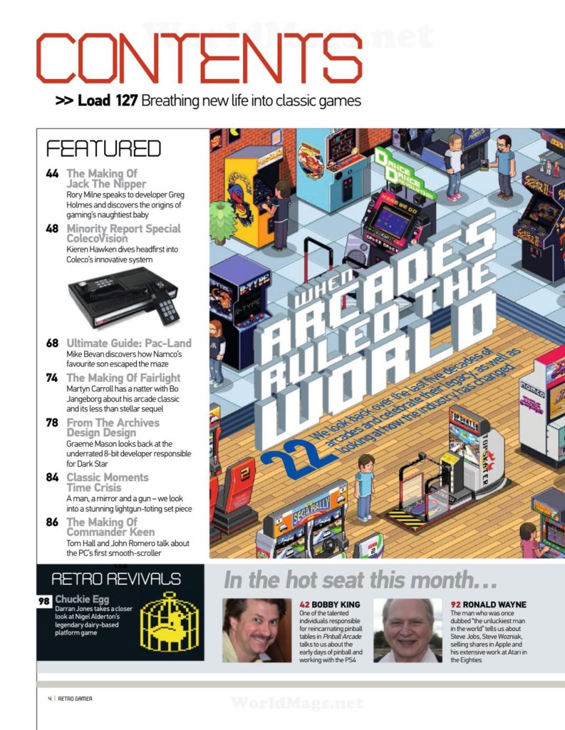
I have chosen to style my magazine cover similar to this Fortnite Magazine, as i liked the gallery display at the bottom of 3 different games, and will add this to my own design. I’m also going to include article plugs at the side with a red puff, as it it an effective way to reference multiple articles that will be in the magazine to interest the reader.
Not finished.
Media Studies NEA – gaming front cover
I intend to name the gaming magazine ‘’Azeroth Times’’ as I am trying to make the magazine based off the MMORPG game called ‘’World of Warcraft’’. For the masthead I intend to use a font commonly used within the game and I will include a shield similar to the one used within the ”World of Warcraft game front cover.This shield will be placed behind the ‘’Azeroth times’’ title to make the masthead more appealing and eye catching. In the gaming magazine front cover I plan to target the role playing games community as it is a broad audience which would perfectly suit a gaming magazine.To target the role playing games community, I have decided to create a character within the program ‘’Fuse’’ that will resemble an Orc from the game that I am basing my front cover on, and I will use the character as my main image in the front cover.The character will be positioned in a running pose in order to look more ferocious and grab the consumers attention.Behind the character I will add 3D effects which such as a drop shadow and a crack within the background in order to add more noise within the background of the gaming magazine cover as I believe it would be much more bland otherwise. To add onto the theme of World of Warcraft, I’m going to use a background which resembles an old piece of parchment as it will relate to the role playing games community more due to many of their games being based off fantasy worlds with swords,dragons and other mythical creatures.Along the sides of the main image I am going to add cover lines that will give insight info about what information the magazine includes. In order to appeal to my target audience more these cover lines will mention information that a role playing games community member would find interesting. For example I will mention in game competitions,guides and prizes to be won or redeemed within the game. I also plan to add a puff which will say ‘’chance to win a World of Warcraft token’’ as this will further interest my target audience and persuade them to purchase my product. The text within the puff will appeal to the target audience as it informs them that they can win 1 months worth of game subscription for the game ‘’World of Warcraft’’.
For my magazine I decided that i wanted to base it on the idea of encouraging more girls to get into gaming, this inspired me to think of the title ‘GAMER GIRL’, because it clearly conveys the message I intend to get across. I then thought of a catchy slogan for my magazine which is ‘Run head first into the gaming world’, which I put in a serif font with a flag effect to make it more appealing to look at. The dominant signifier of my magazine cover is a female games character, which focuses on my main intention for my magazine, this shows a strong independent woman who fights for what she believes in, this is the main message I want to get across with this magazine cover, and show girls who are around my age (mid – late teens) that it’s okay to do something your friends aren’t doing and it’s okay to try something new that’s stereotypically ‘for boys’ because girls are allowed to have fun too (this is also an iconic sign because it looks just like a female in action). I have used a san serif font (Franklin Gothic Medium and Heavy) to create a clear and crisp look to my magazine. I have used different symbolic signs (the colours red, black). Indexical signs include: buildings (symbolise a village where the main game is set). I also wanted my magazine to be interactive and appealing so I have used rhetorical questions such as ‘DO YOU WANT A NEW HOBBY’. I also had the intention of making my magazine look as realistic as possible, so I did some research into different magazines and got my inspiration from the ‘PC GAMER’ magazines. For my masthead I decided to make it bright and bold to catch my intended audience’s eye, to do this I chose the bold colour red to make it pop from the rest of the magazine cover. I also wanted to have a sense of depth to my magazine, this is shown with the mountains in the background with a village in front of them. I have also featured some things that are inside the magazine on the cover such as ‘the interview on page 3’. I have also stated the GAMING FOR U company that would sponsor the magazine.