Category Archives: Uncategorized

Filters

Author:
Category:

Front cover magazine/Statement of intent

Statement of Intent

My magazine cover was aimed at a target market ranging from the ages of 4-12 years of age, KICK-OFF is mostly aimed at boys however girls can also enjoy it too, it is a child friendly magazine which is reasonable, so that means it can appeal to all children it does not affect their economic state.

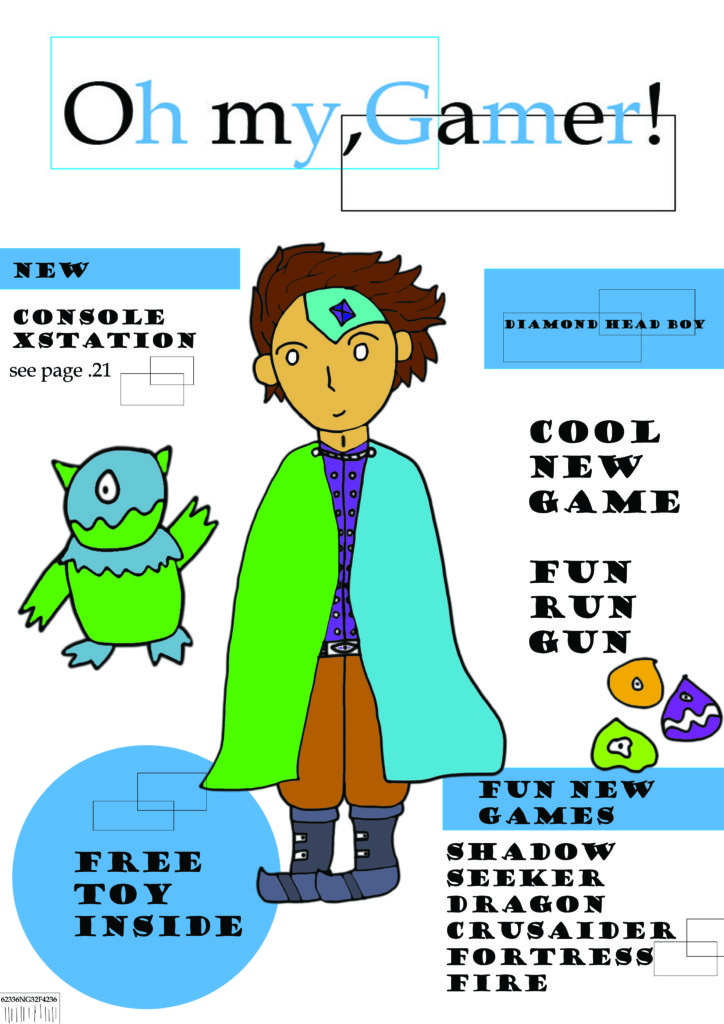
I decided to create a magazine that had a retro feel to it so I made the whole magazine 8-bit and based the magazine off football. To convey my retro style I used the rule of thirds to place my strap line, iconic sign and plugs. My iconic sign are to footballers reaching for a football to draw my target audience’s attention I used  bright colors such as blue yellow to really engage my audience and have them hooked right from the beginning just from the main image. I used an indexical sign on my different color fonts for example my strap line was yellow where as my plugs had a purple back round with purple writing the idea behind this was to grab my target audience’s attention with the variation of color. The iconic sign was then images of well-known professional footballers as 8-bit characters and the back round of the magazine being a football pitch. Even though a child aged 4-8 may not know these footballers they will be intrigued with the magazine due to the cartoon element of the magazine. I gathered inspiration of many magazines such as Match of the Day for the football element of the magazine and for the 8-bit element I used ideas from magazines such as Retro and Retro Gamer for my strap line and plugs I made a similar version/layout from the Match of The day article, this really allowed me to finalize my magazine as I was able to gather inspiration on what footballer to create to add to the plugs. I used a lexis of words such as Best and exclusive for these words I added extra effect on photo shop by putting both words on bold and using bevel to really make them stand out, I also added a hook to the magazine saying ‘Enter in a prize draw to win Ronaldo’s Football shirt’; this was added as a way of the target audience to really want to purchase the magazine as they all hope to win one of Ronaldo’s shirts.

Representation: I Believe my magazine front cover is radical, i believe my magazine challenges dominant ideology as i made it a retro 8-bit magazine. The reason why this challenges dominant ideology is because in this generation games are improving and the latest technology are allowing games and their quality to be similar to real life. The first reaction the audience may have from my magazine is believing it is a bit outdated because compared to modern day games which the public are used to; it stretches modern society beliefs on how games should be made nowadays. I wanted to challenge dominant ideology by allowing the public to remember where the roots of games came from to how they evolved now, this is why my target audience is from 4-10 year old’s. As they do not critic the outdated games they play them for fun due to the wacky kid friendly play styles and the variation in color.

Audience theory: Reception theory- This is where the media re enforces a message to the audience. some believe this theory only gives the media what they want to see, linking into my magazine by adding this into the audience this may change the opinion on how some people feel about my magazine due to the media re-enforcing a message for example portraying my magazine as one of the best gaming magazines this may influence the audiences ideas, attitudes and beliefs to the comparison of retro games and 21st century games and changing their belifs on what type of game they think they should be playing.

Cultivation theory- examines the long term effect of television and media this would effect my magazine as the audience would be so used to playing certain games seeing a magazine which challenges the games these members of the massed media play they may not be willing to openly try these new retro games and sway towards the ideas of their is no better game it does not mater if its 8-bit or 21st century graphics.

Front cover

Statement of intent

The title of my gaming magazine cover is Oh my, Gamer! the inspiration for my title was when I heard my colleagues struggling to come up with a title And I heard one of them exclaim “oh my God” so I thought I would set this as my title but with gaming relevance.

My audience is targeted for boys around the age of 4-6 as I put docile but bold format for my magazine as I made it so it would be understandable for the younger target audience as if the magazine had to complex writing the audience I was targeting wouldn’t want to ask their family but I did add the whole free toy for if the magazine were to be real the toy is the part of the magazine the kids want.

For my niche interest content, I made my game names related to genre’s like fantasy, battle, exploration these are types of games that will appeal to the younger generation as it has “cool” factor especially for names like for example Fortress Fire and the whole idea is the targeted audience even though young are able to comprehend that the game is attractive, “cool”.

My magazine is a viable magazine title because it is attractive and stands out and seems musical in a sense when you read it so it can get stuck in your head this is especially important since I have a young target audience so at their type of age they won’t remember a lot unless its key, rememberable information, for example, most young kid who asks to go to places like McDonald’s because they know that this means chips and chicken nuggets so if my title is rememberable enough the kids will want to buy the magazine when they spot it in a shop.

The proposed use of Language style for my audience is very simple and informal due to their age if they had to read very complex and formal writing my audience wouldn’t be able to understand and wouldn’t be attracted to the magazine and wouldn’t ask their parents to buy it.

My proposed use of representation form for the audience is a Pcgamer magazine but for a younger audience around the ages of 4-6 and I made a more docile version with white and blue with cartoonish character that I drew in photoshop but I kept some similarities with the original PCgamer like putting the main character in the middle of the magazine but there still the contrast to make it different as I mentioned before where I did white and blue when they normally do red and black.

Where I get my content from is just random ideas from my head but are influenced by thing like books and shows that I watch and since I had a cartoon rich childhood it affects how the characters look and are drawn as well I have played a good amount of videogames in my past which will also play a part on my content ideas.

statement of inten t

Working title: “Game Review” 

Target audience: 12-22-year-old boys with varying skill levels. This magazine can be used for beginners who are looking to fulfil their adrenaline a need of racing and they may look at the magazine for an opinion on the game’s quality and worth. In addition, existing simulator racers would use this to find any new tips and compare this to over games and magazines for their own opinion.  

Niche Interest context: My intent with this magazine front cover is to give comprehensive and balanced views to the gaming community about weather a certain game is entertaining, exciting, enjoyable and fun. I want to do this by showing positives and negatives within a game. In my magazine, my game will be called “M series”. “M series” is a racing game so I would review areas such as handling model, graphics and how the artificial intelligence performs against the player. By giving a fair and balanced review people can save their money if they aren’t intrigued or play, however on the other hand “Game review” can promote a game bringing in money and profit. 

Why is this a variable magazine title? The “Game Review” title gives me flexibility about what type of game used as it can be about any game in the world. It doesn’t just have to be about racing but, about modern first-person shooters of old retro games. 

Proposed use of language: The magazine will use informal language, modern slang and specific vocabulary linked to the game. This would be more interesting to the viewers because they would prefer to read something less informal especially from the age of 12-22.  

Proposed representation form for the audience: I intend to use different images in my contents page to include different races making the overall magazine feel more welcoming to other ethnicity’s and races other that stereotypical white gamers. 

Where will I get my content from: I will create my own opinion on a game created, so the overall view and opinion is my own that isn’t influenced by others so it is as raw and unbiased as possible 

Magazine nea front cover and statement of intent

My magazine is named ‘GAMEIN’ this is an attempt at a play on words as it is a gaming magazine which is about all the inside information and insights into the gaming industry, GAMEIN sounds similar to the word gaming. My intended target audience is male teenage gamers in the age range 13-17 who are based in the United Kingdom. 

My style model for this magazine is the already existing magazine ‘PC GAMER’ and you will be able to see the conventions of it throughout my magazine. The main font used for text throughout the magazine will be Arial. My masthead will be in capital letters and in bold writing and a bold colour to ensure that it is eye-catching and stands out around other magazines.

There is a clear house style to my magazine, all the pages will be black with the masthead on the front cover being a lilac colour, this colour will be carried through the magazine and used for the copy and headlines. The colours red and yellow will be used for plugs throughout the magazine. I have used the colour black as the background / page colour for my magazine as black is associated with power, strength and rebellion, these connotations often relate to my intended target audience and will make them more attracted to the magazine. I have also used the colour red as it is intense and it connotes symbols of blood, danger and war which is what a lot of teenage boys in the age range 13-17 are interested in so it draws them into the magazine and makes them interested.  

All images, logos and copy is original, and I will create my magazine on adobe Photoshop. To create images for my magazine I will use adobe fuse to create life like cartoon characters to make them look as though they are actual characters from video games. I will also create 8-bit art to create vintage style games characters and icons. 

I will used Blumler and Katz uses and gratifications theory and will create my magazine to be informative and educational about the gaming world I also would like it to be entertaining. The main image is an iconic sign of a man in army style clothing. The code within the magazine will be through the use of colour. The codes will convey connotations of power, danger and violence. The magazine will be a reactionary text as it follows societies ideas of gaming and masculinity within it.                                   

NEA

Statement of intent – title

I wanted my magazine cover to appeal to young adults, who don’t feel like they fit in. I used more darker and sleek imagery on the title to appeal to a more mature audience as well as a sleeker colour scheme (red). Furthermore, I have created some game titles which are used to as an anchor to the text. On the cover, I have used a large amounts of the colour red, which is a bold colour, allowing it to be easily seen and noticed. Furthermore, for my plugs, I have allowed the reader’s attention to be caught easily. A particularly good example of this is the middle plug, “fact or fake? Game myths debunked”. This causes the reader to be curious of the contents of the magazine. This means that one of the social needs, Knowledge about the World, is sated by buying this magazine.

As well as this, I have used a brightly-coloured plug, with a green glow surrounding it. This means that the plug is immediately noticeable. This could also encourage the reader to buy the magazine if they are struggling with the fictional game ‘Biolight’.

Another factor I used for the cover is an image of myself. This may fill the first personal need – as I myself am nonbinary and present uniquely to the norm. This can leave a sense of belonging to many others who feel unrepresented in media. Furthermore, I have used myself as a model for a fictional character. In this context, a non-conforming person to society such as myself being a character in a video game and presented for the front cover can fit the personal need of understanding the self to those who are marginalized and see themselves represented. This, as a result can cause them to be more willing to buy the magazine as the cover is radical in nature which can cause the correct title audience to purchase it as they feel represented. This is further presented on the rightmost plug at the bottom of the magazine, discussing representation is video games, enticing the reader further. Having a radical cover instead of a reactionary cover ensures that groups that may not usually purchase magazines due to lack of representation in media may feel more inclined to buy mine.

This radical idea can be taken through many ways by the audience – for example, if we use reception theory, the dominant response would be to accept this representation, that gaming is for everyone. This audience is likely going to be the ones seeking representation. the negotiated response is likely to be a mixed response about the representation, for example, an acception of the representation, but a dislike for video games. This could be people who fit into the age range of the magazine but do not fall into this marginalized group or gamer group. The oppositional response would be a complete dislike of this representation, which could be from anyone, but is most likely to come from an older generation with more traditional beliefs. Furthermore, those who were raised under traditional beliefs may take a dislike towards the magazine.