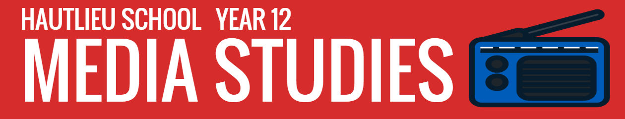
Lighting: The lighting emits through the Tomb Raider logo in the background and creates lines that create leading lines for our eyes to follow back to Lara Croft.
Props: There are two Desert Eagle pistols that Croft is wielding. This can symbolise that she is holding smaller and worse quality guns in comparison to men in game covers who hold bigger and more powerful guns creating gender stereotypes in the sense that woman can hold guns but only small ones.
Costume: Lara Croft wears very little clothes such as tank tops and short shorts so her body and figure is shown. This is used so the male audience is drawn in so more copies are sold.
Colour: She is wearing very bland and beige to match her environment of the outdoors.
Facial expression: Lara croft is looking confident and in incontrol to show dominance and authority to contradict the male stereotype.
Body Language: Croft is posed in a manner that she shows off her figure to draw the male audience to play the game.
GAME COVER SEMIOTICS: TOMB RAIDER (CINEMATOGRAPHY)
Camera angle: In the image the camera angle is a body shot from a lower height showing signs of a worms eye view to show off Crofts physical features in a sexual manner to attract the male audience from a slightly lower angle looking up.
Shot Type: Medium long shot to show Crofts full body and figure.
GAME COVER SEMIOTICS: TOMB RAIDER (TYPOLOGY)
Font: The font starts small and increases for the key words of “Tomb Raider” with a bold font to increase its presence.
Colour: The background is black with bright lights shining through the logo which is dispersed out to the side of the image. The clothing is bland boring colours to contract with the background
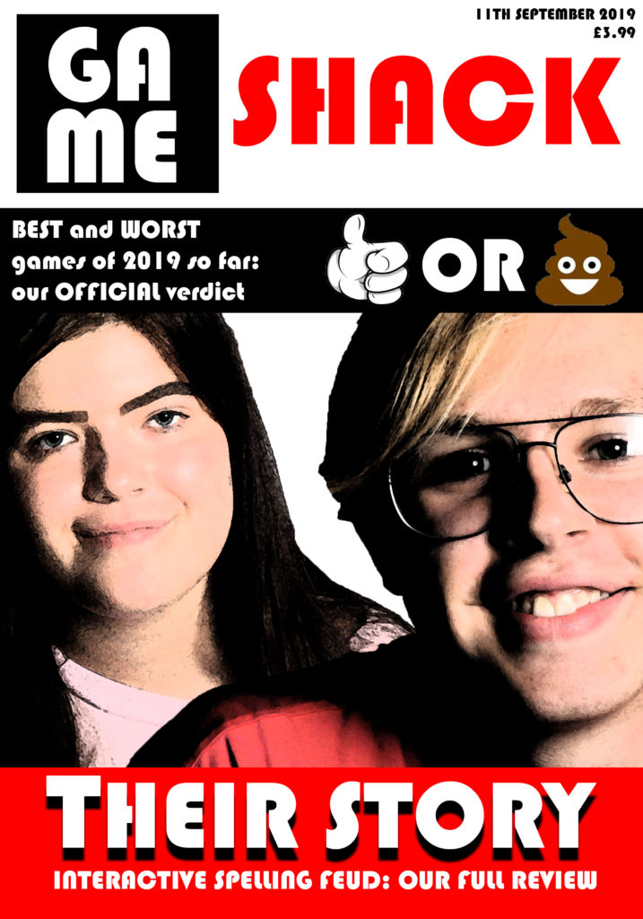
my working title for this gaming magazine is ‘Gameshack’ – this title implies that the reader is part of a tight community of gamers and that they are in the ‘shack’ – they are in the know, where gaming is concerned. As my target audience are 16-24-year-old men, this sense of being ‘in the know’ is helpful, as this demographic tend to follow trends both in gaming and in wider society. This demographic is addressed by the use of relatively simple language on the magazine cover, giving way to more technical jargon on the inside (traditional gaming magazines tend to use this strategy of simple outside/complex inside) and ensuring the magazine’s broad appeal. my magazine will include an article about the game mentioned in the cover strapline – Interactive Spelling Feud – and it will interact with the magazine’s readership through ‘best and worst games of Summer 2019’-type discussion in the magazine, designed to spark debate. my magazine’s main image is a depiction of the two main characters in Interactive Spelling Feud, demonstrating the centrality of that game to this issue of the magazine, and the magazine uses white text on bright red on the magazine’s headline in order to draw the attention of the reader to the magazine’s coverage of Interactive Spelling Feud. I used the font ‘Bauhaus 93’ in order to create a futuristic and electronic style on the magazine’s cover. This magazine, despite its relatively mainstream characteristics, remains viable due to the fact that the gaming magazine market is still a growing market with much space for high-quality new additions. It also uses the standard conventions of a date and a price.
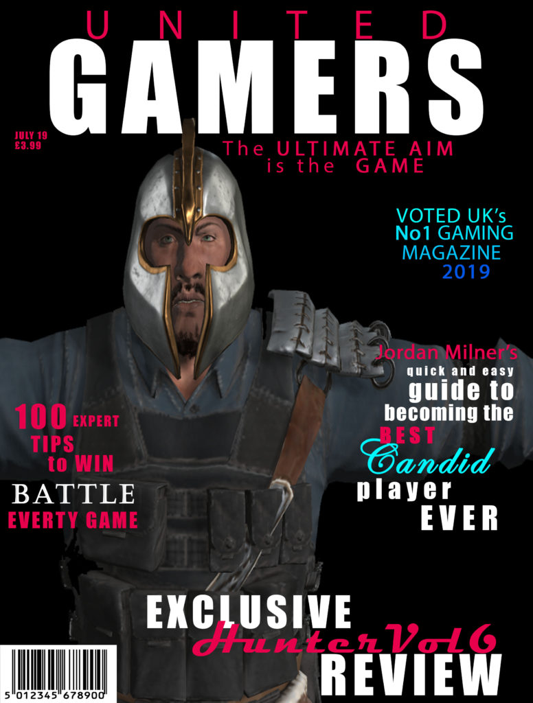
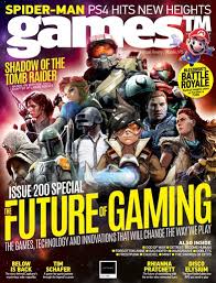
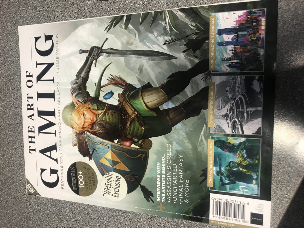
The main intention of my magazine was the create a gaming magazine that was inclusive to both males and females. To do this I did some research on some existing magazine covers including PC GAMER and GAMES TM. I found the majority of the covers were using dark colours and featured characters. Using this research, I decided to layout my magazine with 4 plugs and the main image of a character from a game. I also made the background black as it connotes death and mystery which link to the theme of my magazine.
My gaming magazine is called ‘UNITED GAMERS’. The target audience for my magazine is teenagers (12-19 years old) who are male and female, who have an interest in gaming. I named my magazine ‘UNITED GAMERS’ as the word united immediately connotes that everyone is joined by a common interest and the word gamers indicates that the magazine’s topic is gaming. I used the fonts Impact and Mydrid Pro which are bold fonts that are eye-catching for the target audience. The colours I used for my cover are black, red/pink, blues and white. I used black and white as they are both shades and are not linked to a specific gender. I then used the blues and red/pink as these denote male and female which again portrays that the magazine has content for both girls and boys. Also, the colour red links to danger which relates to the plugs which are about battle and war games.
The main image is a cartoon man from one of the games mentioned in the plugs, this will be instantly recognizable for the target market that plays the game and knows the character. My cover has 4 plugs which are all in the same 3 fonts to make it cohesive. I n the plugs I used words like “exclusive”, to make them stand out and appeal to the target audience by implying that this magazine is the only place to get the information. I also have a barcode, date and price as these are part of the codes and conventions.
Representation;
The dominant ideology of my magazine cover is about war and battle games. I used a male character from one of the games who follows the stereotype of a male, which features large muscles and angry expression. This image represents the ideal male this makes my magazine a reactionary text. As my target audience is teenage males, they will be able to engage with the cover as they might idolize the character. Also, the name of my magazine is ‘UNITED GAMERS’ which is an iconic sign and provides anchorage for the target audience.
Audience theory;
The encoded message of my magazine is war and battle games.
appeals to my target audience because emphasizes there interests.
Asking the question if my games cover is radical, or reactionary. Does my cover goes with the dominant ideology of video game covers, or if does go against them?
I would personally say my cover is radical. my reasoning behind my opinion is;
Firstly the layout, in usually gaming magazines would place their main character as their dominant signifier, on the front cover with no other side characters. (Unless they were important to the story AKA sidekick, or were other protagonists form other video games the magazine is covering). In my cover I have 8 characters in view, so who’s to say who the main character is? There is no big dominant signifier besides the positioning of one blue characters being at the front of the v formation.
references for layout and design for the front magazines
formation ideas charactersstyle ideas of charactersvideo games outfit ideas
back story for video game
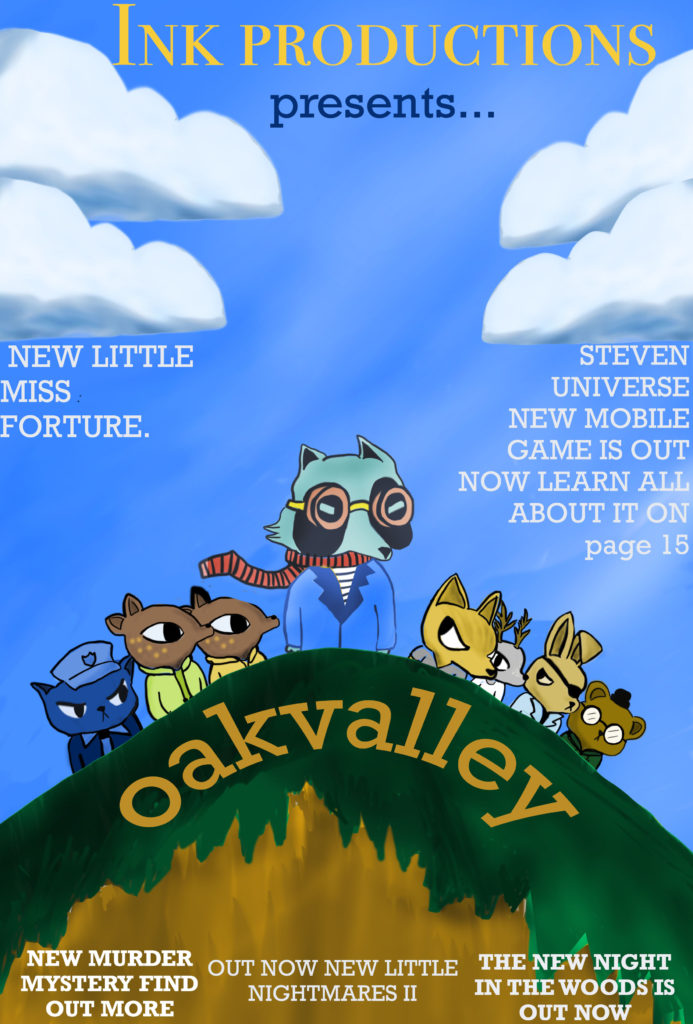
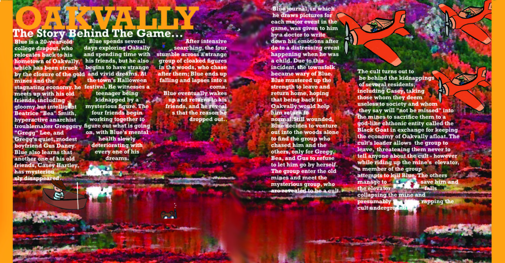
I changed my rough idea for my front cover to this new updated gaming cover about a game I created called “Oakvalley”. It’s a story driven, adventure mystery game. The lead character is College dropout blue who returns home to the crumbling former gold mining town of Oakvally seeking to resume his aimless former life and reconnect with the friends he left behind. But things aren’t the same. Home seems different now and his friends have grown and changed. Leaves are falling and the wind is growing colder. Strange things are happening as the light fades. And a town secret is about to be revealed.
layout
Describing what I have done for my layout is; firstly I created a dominant signifer of the title of the game and the master head at the top of the cover. I chose the layout of the subheadings and text to fit around the main image so it wouldn’t take away the focus of the main character. When consumers looked at my magazine I tried to put into consideration was how the front cover should feel to the consumer. My plan was to make it intrigue the viewer by give a sense of dramatic mystery.
Relating to “Applying Theory Of Audience”, my magazine would relate to the Struggler’s who have the need to escape from reality, which can be achieved in story arch video games. Since storyline video games help relate to gamers, and give a sense of joy playing.
I planned to layout my characters for “Oakvalley” in a “V” formation since I wanted to make the main character stand out the most, to show the importance of the character. I plan for the size of the magazine to be A4 since I don’t want to stretch my characters too much or have too much free space on the front cover. The advantages of keeping it A4 are; it is a suitable size to carry around, either by hand or in bags. Also if I planned to make the magazine anything bigger than A4, for example A3, it would be significantly heaver which is something I don’t want because I want my magazine to be a light weight and appealing magazine.
Brief About Magazine
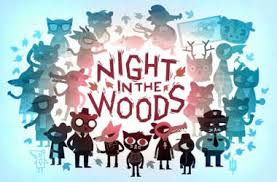
this magazine is going to be themed around mystery/adventure video games with hand drawn cartoons done by me
Next Step Forward
I am going to next upload my sketch to photoshop and use it as a background layer to draw on top. I will try to make a lot of different layers for the characters so I’m able to change scales of clothing or accessories
APPLYING THEORY: AUDIENCE
Looking at Maslows hierarchy of needs, my cover and game relates most to the loving belongs, and self-actualization levels in Maslow’s triangle. I think this because, when it comes to storyline games people can build real connections with the characters. So the way the characters are designed and written can give a sense of belonging or love. From the audience having a specific character that they can relate to and adore will help build up a loyalty of the audience. A story game could relate to the self-actualisation level since a certain games plot, could relate to someones home life on a basic or on a deeper level. It’s the same when an audience can relate to a certain character. It can make them feel more invested in the game, since it can help them feel less alone because the character might imitate the audiences feelings or emotions. So this all leads to a person having a subconscious connection to the game and make it more appealing.
double page spread
For my double page I want to theme it around the murder mystery games with using inspiration from video games like; bendy and the ink machine, little Misfortune, Fran bow, sally face. by inspiration I mean there art styles/ settings that I can use as backgrounds. I plan to use “Adobe photoshop” to create the double page spread of a landscape sensory that I have edited to give it a more cartoony style. I added my characters on top of the background so the page would have a better connection with the game instead of just being a landscape background. I drew plane with little “blue” characters in them to link to the main character and then scattered other side characters around the environment but placing them in place they would still be spotted and noticed. as a finishing touch on the double page I added orange boarders that were 1 cm each since I felt the page felt like it wasn’t fit for the frame but by adding the visual blocks the page looks a lot more together and fixed. If I was to improve my double page I would have chosen a different topic to talk about on the page, plus more subheadings about different topics in the game instead of just the backstory of the game. since I feel the long paragraphs make the page look less interesting to read and pay attention. unlike if it had shorter snap paragraphs about different sections of the game to keep the audiences attention.
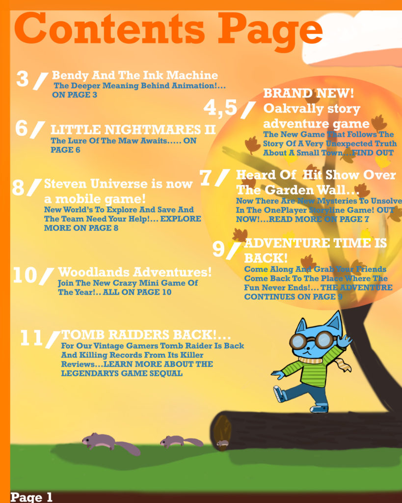
Contents Page
For my contents page I plan to use one of my references video game pages, for the layout designs. I personally liked the contents page that had the icons of the certain games linking to the page I thought it was a good technique to interest audiences more into buying the magazine as they can see small preview of what the magazine in-tales. I’m going to be using Photoshop to draw all the contents page images, possibly creating the icons to link with the reference content pages. background ideas for the page and I might use “Adobe indesign” for their text breaks and formal styles for their bios. I want the magazine to have the running theme of what age it’s directed to(audience theory). I want the pages text to be more round/soft but bold as well, giving a comic book vibe fitting with the gaming magazine.
I ended up creating my own little scene for the page linking to my video game “OakVally” from the from cover. I placed a character on the page in the same art style as the from cover so it was a noticeable linkage. as well by giving the character pilot goggles and a scarf like the main character has on the front cover. I referenced my colour palette to my double page by using much warmer colours like oranges, yellows and reds.
For my Magazine from cover, I am going to use a picture (of my own) of a female statue and adjust it to make it look cartoon like as if it is from Ancient Rome as it’s where the game is based, this means that it is an indexical sign because there is a link to Rome but not a direct or obvious representation. It will be the main focus/focal point of the magazine as it will be the main statue of the arena in the game. This is also why I have decided to include an emerging background of the Rome Colosseum. This can be considered an iconic sign because it directly links to Rome and this why the game title is “THE COLOSSEUM OF GAMES!”.
The game title links to the magazine’s name as it is called “GAMING CIRCUS”, meaning that circus which is a form of entertainment would be held in giant stadiums like the Colosseum. I included a Moto being “The New Is Out And The Old Is In” it means that “classic games” and games based in “the past” have become more popular with teens within the recent years, hence why I wrote “A Game TEENS will LOVE”. I will write “TEENS” and “LOVE” in capitals to draw attention to the target audience which is teenagers and that they should really enjoy the project. This is why I included a ‘Pan European Game Information’ (PEGI) rating of 12 so that the customers and the receivers of the text will know that the game has slight violence and that it isn’t realistic and why it’s suitable for teenagers. On the bottom of the Magazine there is writing that says “Featuring HD 3d Models” letting the buyers of the magazine know that the game will have 3d models of a high quality which has become really popular in the gaming industry. To the right of the writing, in a separate section, there will be 3d models which will be the main character(s) in the game. I also included a price of the magazine as a white circular sticker with writing in the middle as it helps someones attention be directed to it. I also included a sticker that indicates that there will be collectible stickers throughout the magazine which customers of real magazines sometimes par-take in for fun, this can encourage people to buy that magazine again in the future so the company will make money, become popular and be well remembered .
I want the games main character to be chosen by the player which is why there is one male and one female character. This goes against the dominant ideology of women having power which will help to attract female gamer’s and get as many players as possible in general. This shows that the game will be a radical text because it goes against what society view a woman as which would be damsel in distress and on standby however, in the game the female protagonist will be a ravenous, blood thirsty warrior who enjoys fighting. The game will also be able to be seen as a reactionary text because the male protagonist will also be a ravenous, blood thirsty warrior which in the gaming industry is a very popular character trope. An example of this would be Kratos from “The God of War” games. Both characters will not be over sexualised but will have big muscles which is expected from warriors
The Typeface of the informative pieces of writing and game title is copper black, which is serif as it has decoration, which is mostly in black writing as it’s easy to read for most customers. This doesn’t include the Price tag or the Sticker information, they are blue writing with a standard sans-serif font which means without decoration. This is because they aren’t as important and don’t need as much attention as the other parts of writing, it’s also why they are smaller. The writing that stands out the most is the title of the gaming magazine “GAMING CIRCUS”. It is a serif typeface as it has decoration which draws attention to it and the text receiver should remember it easily. It’s also grey writing which contrasts with the background which is a dark green with an opacity of 80.
I included borders on the front cover to separate certain aspects from each other, a border to separate the header from the body and a body to separate the footer which is separated into three sections which all have a purpose. This also helps to keep it neat and look professional.
The colour scheme of the magazine is very brown and gold with other little colours that stand out. This is to give it an old roman like vibe. The background of the magazine is gravel which adds to the roman like aesthetic of gravel walkways and paths.
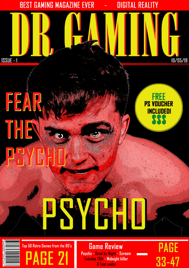
Statement of Intent The choice of red as one of my main colours on the front cover was intended as a symbolic sign to represent danger and emphasise the sense of horror in the game ‘Psycho’. I also chose to make my main character (front cover image) red to increase a sense of fear in the reader. The yellow text contrasts against the red of the character and background so stands out. The red and yellow colour scheme is not associated with a single gender therefore making my magazine unisex. My target audience, therefore, is anyone aged between 15 and 25who would be interested in horror and dark games. This game would not be suitable for younger children. I used the Dollar signs as an indexical sign to signify money which would be appealing to this audience as they are young and probably don’t have as much money to spend on smaller / luxury items such as vouchers compared to older individuals. The word ‘FREE’ is in the same colour as the dollar signs to make it stand out and having ‘FREE’ and ‘$$$’ close together makes the reader subconsciously think about free money. I would maintain an iconic style with all of my front covers and make it aesthetically pleasing over multiple issues so that it becomes a magazine that readers would want to collect which would appeal to the audience, as gamers often enjoy collecting random gaming related items. This is because gaming has become a lifestyle for many as well as a hobby and I would want my magazine to be a part of that lifestyle.My title ‘DR GAMING’ has a catchy style to it and the DR also stands for Digital Reality which is a memorable tag to accompany the title of the magazine. I used a mixture of gaming related terminology and code to appeal to my audience. The effect of a large title that stands out in the top third of the magazine cover is to attract readers as this is all they would see if the magazine was in a rack at a shop. The main image appears behind some text and in front of the title to give it a 3D effect and stand out to the reader.