GAME COVER SEMIOTIC ANALYSIS


Lara croft can be seen in a reactionary manner due to the fact that physically she is seen as feminine due to her outer features. Yet, she can also be seen physically as a masculine character because of her weaponry and muscles and also the context of the game. Also, her persisting independence, strength and intelligence make her a good role model for young girls, as these are traditionally male qualities.
On one hand, Lara Croft can be seen in a reactionary manner due to the fact she is heavily sexualised. This is supported by her positioning on the cover and her physique. On the other hand, she can be viewed radically as she is standing boldly and carries weapons that a male would typically hold. Although she has enhanced breasts and a small waist, she also has strong arms, emphasizing her masculinity. Therefore, she challenges both reactionary and radical responses as arguably she can be placed as both masculine and feminine.

My target demographic is 15 year old boys as emergent service workers as they are socially and culturally active so understanding the re-emergence of retro and 8-bit games and having middle economic capital being able to afford the £6.99 price tag. They also fit into the photographic audiences the Explorer as they are seeking out the up and coming niche retro movement. Studies prove if a magazine has a free item people are more likely to buy it, using this i also highlighted key word, keeping the same color scheme as the title to contrast the blue, (Free collectible, New, 10 piece) to further entice purchase. I chose a light orange as it is opposite the blue background on the color wheel meaning it will stand prominently on the page. The main color of the magazine is a deep blue which connotes to a moody serious style matching the dominant ideology of 15 year olds moving to adult hood. This is created through the editing of the background image using the ripple effect and blur tool to merge all of the range of blues in the image. I made a 8-bit warlock to be my dominant signifier of the magazine ,as it is an iconic sign, and created a paradigm of 8-bit by using the style to create the main text pieces. My main character also gives anchorage to the paradigm of Destiny 2 linking to the other 8-bit destiny character and the background image. My piece is a reactionary text as it fits into classic magazine style with inspiration from PC Gamer and Tabletop Gamer, both aimed at mid to late teens. Also mimicking the placement of bar code and price vertically next to it to remove any interference of the signification of the other signs on the cover.
The clear representation of an action game through iconic signs of guns in the hands of both figures but continue their meaning through their nature as indexical signs and feeding ideas to the younger gamers without their knowledge of it. Furthermore the brown and green color scheme of there clothing connotes to the camouflage worn by army soldiers starts to create a paradigm of action and violence which targets younger game with easily understandable and simplistic signs of the dominant ideology. The more advanced editing of the piece by the dominate ideology is that the character has all sexual areas covered to reduce links to homosexuality which is being deterred by the upper class, straight, white, christian. male who create the dominant ideology of western culture. It evens go so far to add a long cloak around the hips to stop any angle of viewing from front and back.
Audience Theory
George Gerbners Cultivation theory
George Gerbners theory says that over time the mass media can reinforce the ideas already had by individuals and this is shown through my cover as the re ignition of retro games causing people who have liked them previously to be cultivated into liking them again positioning the genre back into popularity.
Stuart Halls Reception Theory
Stuart Hall believed that the audience were both the producers and the consumers of mass media and that in textual analysis there is a place for negotiation and opposition by the audience. This is a post gramscian view as it opposes the idea of maintained control in a hegemonic society.
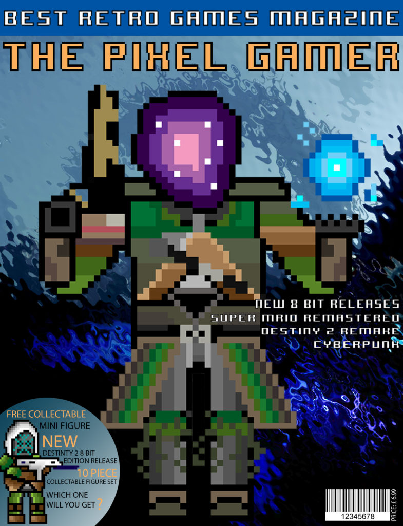
My magazine is based of reactionary ideas but is produced in a reactionary form to conform to traditional media to get the radical ideas into the main stream whilst making it accepted by rules set by the mass media.Through out my piece I use a paradigm of 8-bit characters and fonts to keep to the retro house style of the magazine. Specifically the dominant signifier of the Warlock on the main cover. I use clear iconic signs especially in my contents page to display popular 8-bit games (Mario and Donkey Kong) whilst keeping the influence of Destiny 2 with captures I have collected through the game. My demographic is late male teens because they are emergent service workers that are socially and culturally active and recognize the re-emergence of the retro gaming industry. Through selective representation I was able to target stereotypical “gamers”. Furthermore the predominant use of imagery is to reduce the reading weight to entertain the smaller attention span of the younger generation and create counter types to access a wider audience and sway people to the dominant reading of my magazine. I used two color schemes the cover using blue and orange the blue gradient background contrasts well with the dominant signifier and the light orange is the opposite color to the background it is on creating contrasting colors making it stand out on the page. Secondly the red and black scheme is typical of retro games and is connotated with formal informative magazines. For my double page spread I used images i captured through Destiny 2 and edited them to fit the style of the magazine and continue the myth of dark being evil. As I made all of the 8-bit images I was able to edit them to fit any game style i needed, the “Christmas Mario” to recreate a cliche idea of Mario and make a constructed reality for my magazine. The larger page size was inspired by more visual gaming magazines that promote and display the art side of gaming as the larger size offers more space for the images which allowed me to take a more artistic approach to my magazine and interest more than just gamers. A smaller aspect is the “Free collectable figure” which statistically is meant to improve sales as people are more likely to buy if they receive an additional item with there purchase.
| CODE | DENOTATION | CONNOTATION |
| Mise-en-scene (lighting, props, costume, colour, facial expression, body language) | The costume is short and shows a lot of her skin. She has a classic ‘looking over the shoulder’ pose to show off her body. | This creates appeal to an audience of menThis adds to the appeal |
| Cinematography (camera angle, shot type, etc.) | They used a medium shot on the front cover showing most of her body. | Further increasing the appeal to the target auidence. |
| Typography (font, colour, etc.) | There is a golden colour scheme In the title and background. | The use of this colour highlights her body and links to the positive connotations of gold |
| LEVEL OF SIGNIFICATION | DENOTATION | CONNOTATION |
| ICONIC – Laura Croft | Holds guns and looks fierce | Stereotypically male attitude |
| INDEXICAL – The guns | She is holding 2 firearms | Connotes war. The guns make her appear powerful and strong. |
| SYMBOLIC – Gold/Light | Highlights Laura’s body and draws attention to certain areas | The light connotes good against evil which supports Laura’s character. The gold also connotes wealth |