

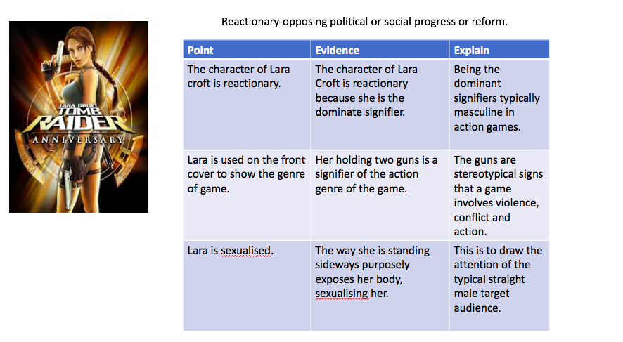
| POINT | EVIDENCE | CONCLUSION |
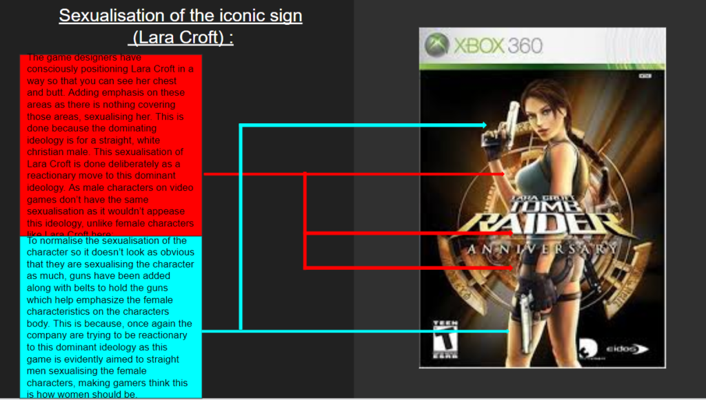
| Challenges dominant ideology and common beliefs. | Shows a women holding a gun “Says something about the how we see women in pop culture and society. “ “Strength and intelligence knows how to use more weapons then most military personnel” | – We believe she challenges dominant ideology as she is challenging stereotypical men who a more dominant than women – she’s strength and power thought the photo and her body language the colour yellow is associated with energy, this represents the women’s power COUNTER ARGUMENT However we believe it could be reactionary as the creator Toby Gard intended in making the games protagonist a female this is a meaning of something as on the article it states the plan as to make her similar to Indiana jones however due to law suits they had to change their plans and that how Lara Croft was made. The way she’s positioned on the front cover, showing her behind and enhanced graphic features. Female characters are portrayed in this way to draw in straight Christian male audience. |
| Gamers were used to seeing women play the role a victim, seductress, or evil villains. | Males playing female protagonist were mostly unheard of Women were often portrayed as the weaker and inferior, however here, she is portrayed as the saviour and hero | Shows it challenges the dominant ideology, because she is presented heroically |
Statement of intent
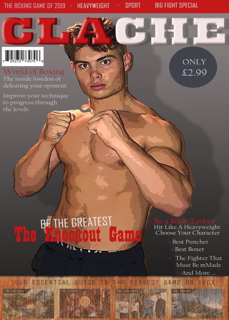
Clache
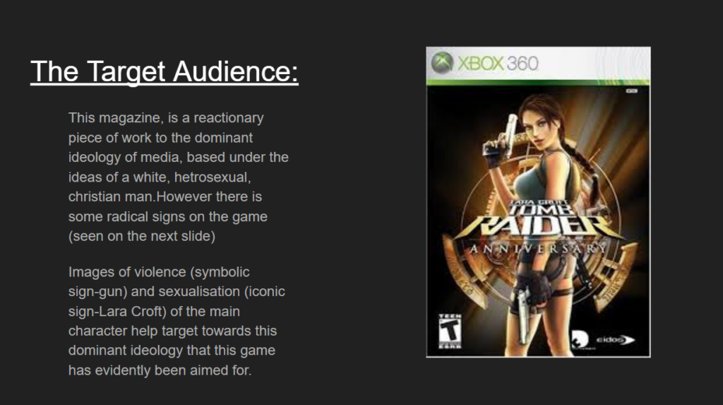
The typical audience would be young males aged between 19 and 25. Young professional workers employed by corporate organisations, have an expendable income. Generally, youthful and active members of society have high sociable interaction. During breaks or lunch they are likely to read the physical copy of the magazine and conform to the new affluent workers.
The front cover draws the specific reader into finding out more through the use of the index sign (body image) represented on the front. The title is in a bold dynamic colour, which will attract this demographic. The red colour signifies energy proving the point of the magazine as energy is needed in boxing. The body image stance portrays dominance which will attract this age group. This is because in their spare time they will go to the gym and wind down/relax by gaming.
As there are relatively few gaming magazines for boxing, I chose this style of gaming and added the title clache as a play on words with clash. Clache will appeal to this audience as the word clache evokes violence and males tend to like violence in games. This is symbiotic of the aspiring group, aiming for body perfection believing that image is important to them.
I use the word “knockout” which symbolises a knockout punch in boxing, major references to boxing terminology are annotated. Words like “heavyweight, low blow”, appeal to the reader as transference from the boxing game to the boxing ring can be deduced from the use of these words. Mainly informal wording was used so that their interest would not be lost.
I aim to represent boxing to the young professional classes rather than the stereotypical working class ideology. This magazine is aimed at white collar workers. There is a definite trend for white collar boxing, whereby the proceeds are given to charity
I am able to photograph a member of my family who typifies the image we are trying to create and his experience in the gym. This proves him to be the perfect candidate for this project. I have a console myself and understand how gaming works. By using the images and the words this can create aspirations joining the game and gym fraternity.
| CHALLENGES | REINFORCES |
| Guns Strong Independent Presented as stereo typically masculine | lack of clothes Hair Body Language Makeup Appearance |
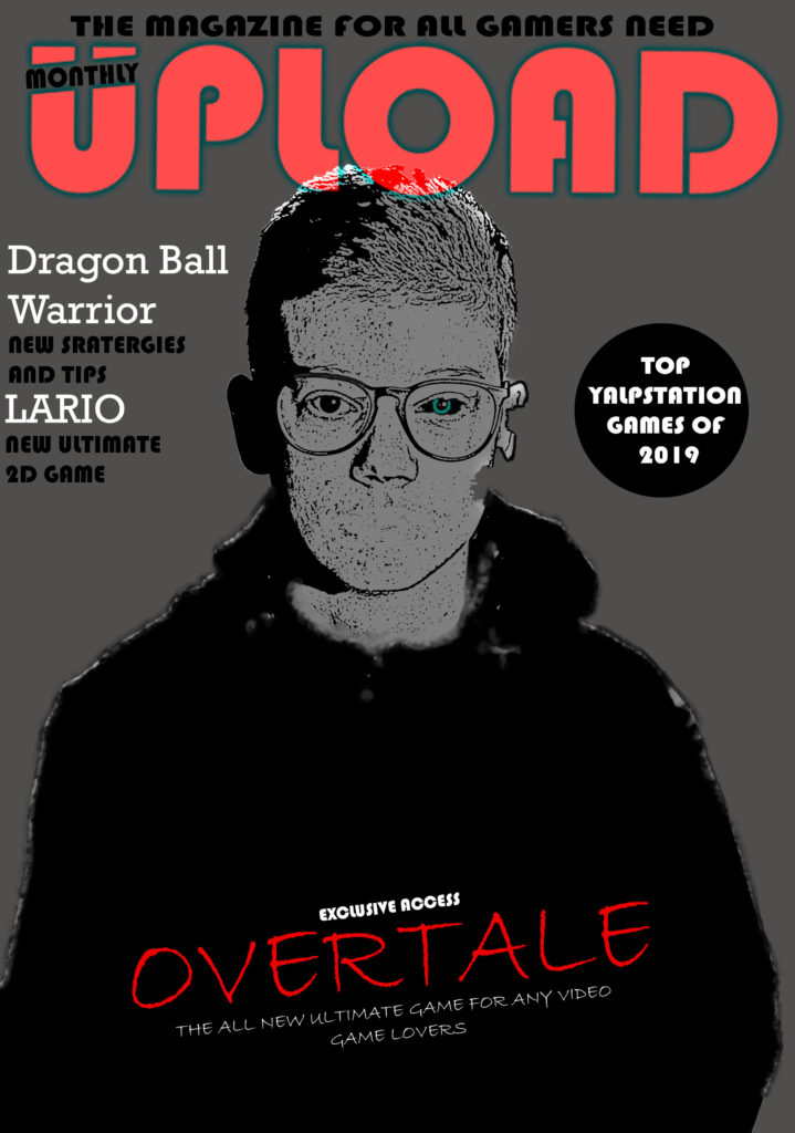

My games magazine is called ‘Ultimate Gaming’ the style of my magazine is influenced by an existing magazine called ‘PC GAMER’. I chose to do mine similar to the layout of PC GAMER because of the simple yet eye catching layout. My intended target audience for my magazine would be British male teenagers aged 13-15. My magazine will be relatively cheap, so that people of any social class will be able to afford it so that people will be more inclined to purchase it if its cheap. The main aim of my magazine will be to be informative and educational yet fun and still appeal to my target audience.
I will use the colours that are stereo-typically associated with males to promote gaming. I chose to do my background in black because black is associated with power and strength. I chose to do my title in red because it is the most important aspect of the magazine and I wanted it to really stand out. For the font of the title I decided to chose a serif font to make the words stand out more, the main font of my title is in bold to make it stand out and catch the audiences attention.
There will be a clear design to my magazine as all the pages will be black to make the overall look of the magazine flow. I will also be keeping the red and yellow colours for plugs throughout my magazine. I chose to do 3 small and simple plugs in my magazine because I felt that it would best suit my target audience as teenagers ages 13-15 wouldn’t want to read much but rather the front be bright and eye catching with big writing.
Before I did my magazine I looked at other magazines for inspiration and noticed that most of them had males on the cover so I decided to stick to this idea as that is what is suitable fort my target audience. The main picture on my magazine is of a strong built man I designed this character on adobe fuse. I chose to do his body type like this because it would appeal to the audience and also associates with a range of game types such as battle games, which I have advertised on the front cover. I also created an 8-bit art character on the lower part of my magazine as I wanted to present a range of game types, not just battle games. My main character on the front cover is reactionary which supports dominant ideology as he supports a typical male gaming character. This is because of his large built body type and his big muscly arms.
