nea content page

According to the Internet, children are 27% of the entire population and fall in the DE Social group. My magazine will serve as a source of escapism and will be cheap, so anyone of any social class can afford it. Before planning my front cover, I created multiple magazine covers of different styles, to see which one was the most effective at persuading the consumers to buy it and was suitable for my target audience. I concluded that having 3 little plugs with photos summarizing pages in my magazine was most effective and suitable for my target audience.
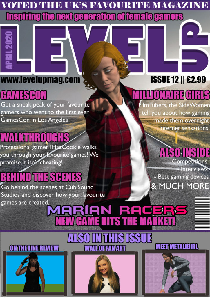
Before planning my magazine cover, I looked at covers of famous gaming magazines and noticed that game characters are predominantly male. The main aim of my magazine is to promote more females into the gaming industry. Elements of my magazine will help to promote female gamers, such as interviews with female gamers.
I have also included plugs, such as an interview with professional gamers as gaming is very popular with teenagers, so I feel the interview will be relevant to my target audience. The photo of Marian will be an iconic sign and the “Marian Racers” logo will be an iconic sign, so that the consumer automatically knows that a main article within my magazine is the launch of “Marian Racers”. Finally, I have thought very carefully about the sizing of my magazine, and I have decided on an A4 size of magazine because it will be able to fit into the consumer’s bag.
I have created Marian to appear radical to create the interpretation that women can be like men, in the fact that they can take on the adventure and action as well. I’ve also designed Marian to have masculine features to remove her sexuality and make her like male characters, as usually female game characters have large breasts, and their body is in an hourglass shape. This is also shown by the posing of Marian, usually females are posing sideways, so that their feminine features are defined, however, I have put Marian in a masculine pose, to challenge the dominant ideology and emphasise how women should be equal to men. Marian is also wearing clothes strategically covering her bottom, challenging the dominant ideology of females and the representation of women on games covers. I’ve also included no makeup on Marian to challenge the dominant ideology and emphasise how women and men should be represented truthfully, as not all females are the same as what is represented by the dominant ideology.
The cultivation theory says that by creating more media challenging the dominant ideology, you will be able to change people’s theories. On my magazine cover, I am cultivating the idea of equality for both males and females. This is shown by the common occurrence of females doing more male orientated activities, such as Marian (a female) is a female rally car driver, challenging the dominant ideology that only men can participate in car racing.
My gaming magazine will have a main character as the main image and the center piece of the magazine. The colour scheme for the character and background will be more of a dull colour scheme with colours being black and white but the writing being bright colours that attract peoples attention, I will use bright colours on a dark background due to exaggerated look of the character but also the impact the bright colour will draw the attention of people.
My main character for the front cover of the magazine will be a guy looking slightly away from the camera with a chiaroscuro look to make the main character and frame look more threatening to the audience.
I got this inspiration from the following magazine
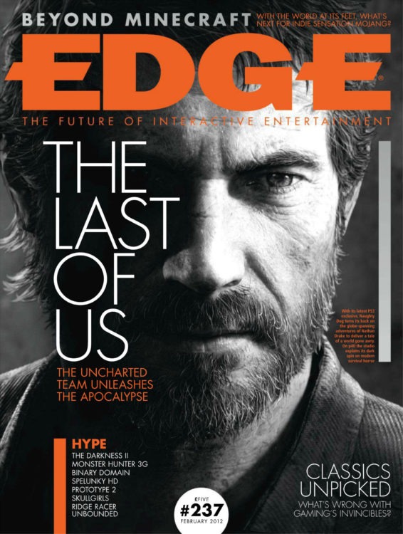
I really like the look of the black and white character and image as it has that ‘edgy’ and threatening and sinister look which is really effective to create an atmosphere.
I am going to use a real person instead of using fuse because I would be able to get the lighting for the chiaroscuro look a lot easier as I would have to physically do it myself, I can also get my model to have specific facial expressions which I would use to create a specific feeling within the audience.
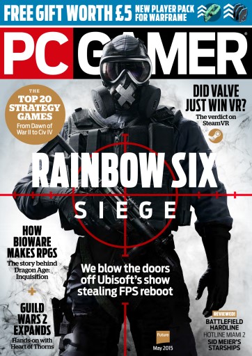
This is the other front cover of a gaming magazine that I am taking inspiration from, which has a similar look and design of which I was thinking of doing but also the other style model I’ve been looking at. With the main image being a character which is the only picture in frame which you are instantly drawn to, with it being in black and white, but having main and bold colours such as blue and red which really stand out. This front cover uses multiple layers on the cover, with the character covering the title of the magazine and the red target and the name of the game partially covering the games character.
My target audience are going to be young males between 18-24 who are interested and enjoy playing open world and violent games, the reason I have chosen this age group is the magazine will be promoting a game which promotes violence and there is a minimum age where you can play such violent games. But the actual audience would be anyone who picks up this magazine, which could be nay age, gender or race.
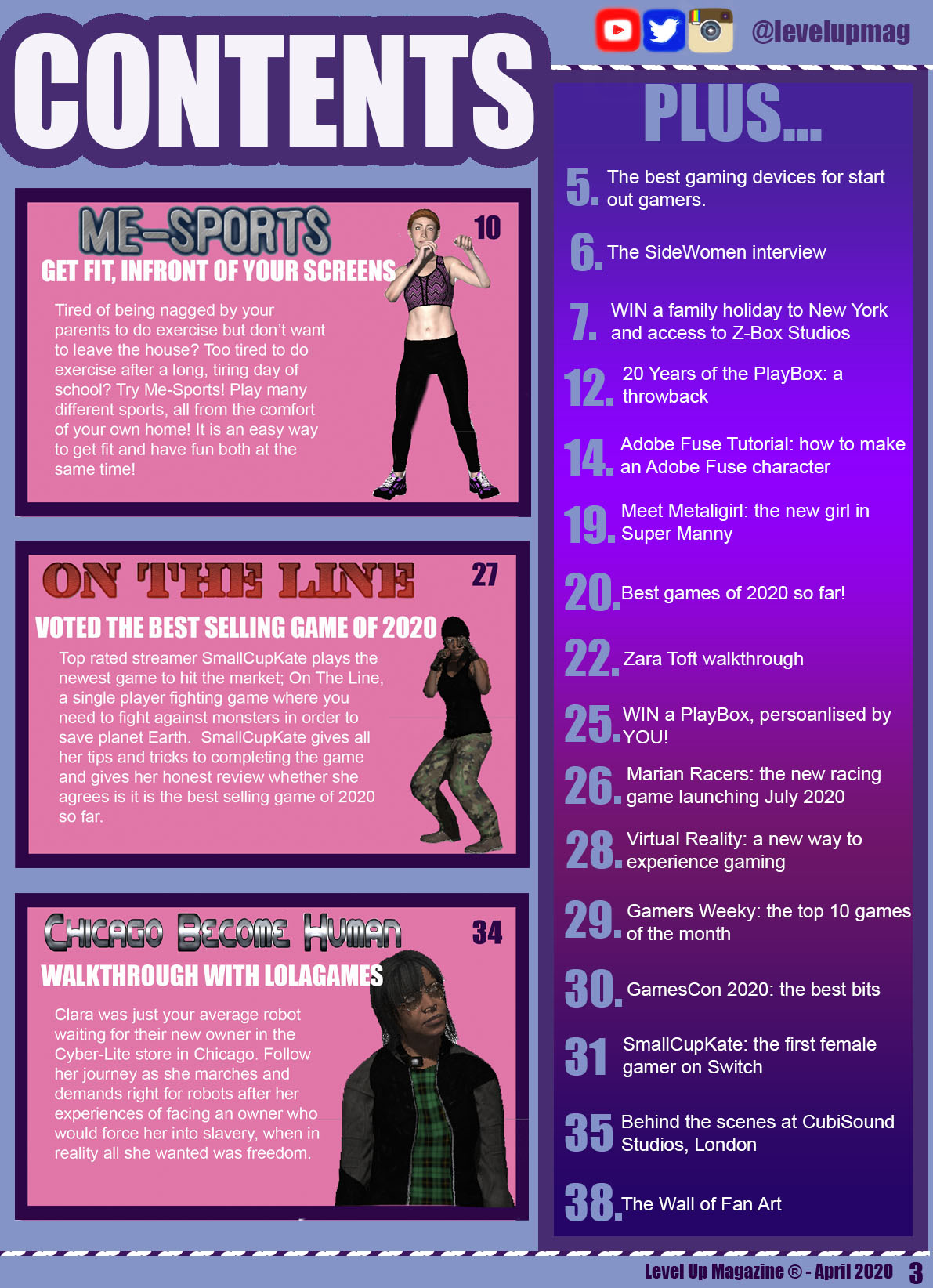
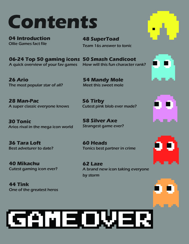
I have decided to follow a purple colour scheme as I feel this colour is a stereotypical female colour, thus emphasizing who my target audience is. The colour purple is also a symbol for power, which creates a radical message from my magazine as my aim is to get more females into gaming, an industry predominantly occupied by males. The colour purple is also radical as I am trying to deliver a message that within the gaming industry, both genders are equal. Throughout my magazine, I have followed a suitable style model by using the same fonts that have appeared on my front cover, so that is appears consistent and professional-looking. In the top right-hand corner of my Contents Page, I have included social media links to the magazine’s social media pages, as a majority of my target audience will have social media accounts because it was reported that 9 out of 110 teenagers have a social media account.
My featured articles are in a large pink box because it sticks with the stereotypical female colours and I want it to stand out, so I feel the bright pink background will attract my target audience’s attention. On the right-hand side of my Contents Page, I have a box that has a majority of all the other articles appearing in my magazine issue. I haven’t included all of them as it might stultify my target audience, so instead I have decided to include the articles that might appeal to my teenager target audience, such as competitions, interviews and tutorials. For my featured articles, I have included many game characters of a different ethnicity to include that minority, presenting my magazine as radical because not a lot of game characters are of a different ethnicity. I also have the featured games characters designed to appear quite masculine and in masculine poses to appear radical and reinforce the idea that both males and females are equal.
The fonts I have used are the same as the fonts that have appeared on the front cover and double page spread, as I want to keep my style models consistent and clear. I do not want to bombard my target audience with loads of text as I am aiming my magazine as teenage girls, therefore a lot of text will make them lose interest, therefore I have kept to the minimal text possible, but ensured that I have still covered the minimal requirements that have been set.


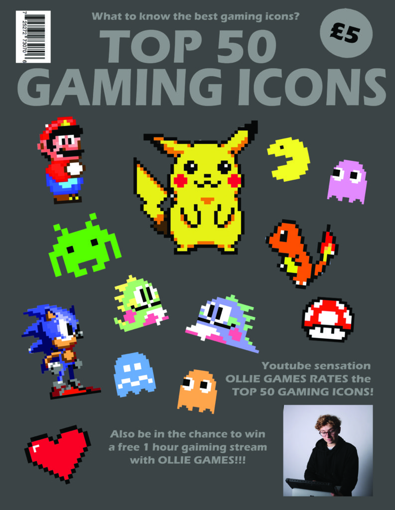
My gaming magazine is going to try and target a larger audience by featuring different styled games which will attract more people. My front cover contains a a multi-style layout so that I can show my audience the style of magazine that it is through the front cover
WHAT’S IN THIS ISSUE?
04 WHY 80S GAMING RULED
08 FORTNITE CHALLENGE
16 LEVEL UP
20 MARIO GUIDE: TACTICS
24 THE MAKING OF MARIO
28 THE MAKING OF SONIC
32 ULTIMATE GUIDE: MARIO VS DONKEY KONG
36 TOP 25 NINTENDO GAMES
40 TOP 25 PLAYSTATION GAMES
I have now decided rather than doing an interview with a professional games designer, I will instead do a how to tutorial with Adobe Fuse.
I liked the layout of this DPS as it is clear and I also liked the tilted title and images in a bordered box as I feel it it will appeal to my young teenage target audience. I will use the same house style (fonts and colouring) than I have used in my contents page and front colour.
Once I began designing my contents page, I realised it doesn’t follow the codes and conventions of a magazine cover. Therefore, I have looked at more exemplar contents pages and have decided to redesign my contents page and follow this style model as I liked the layout and the use of space.
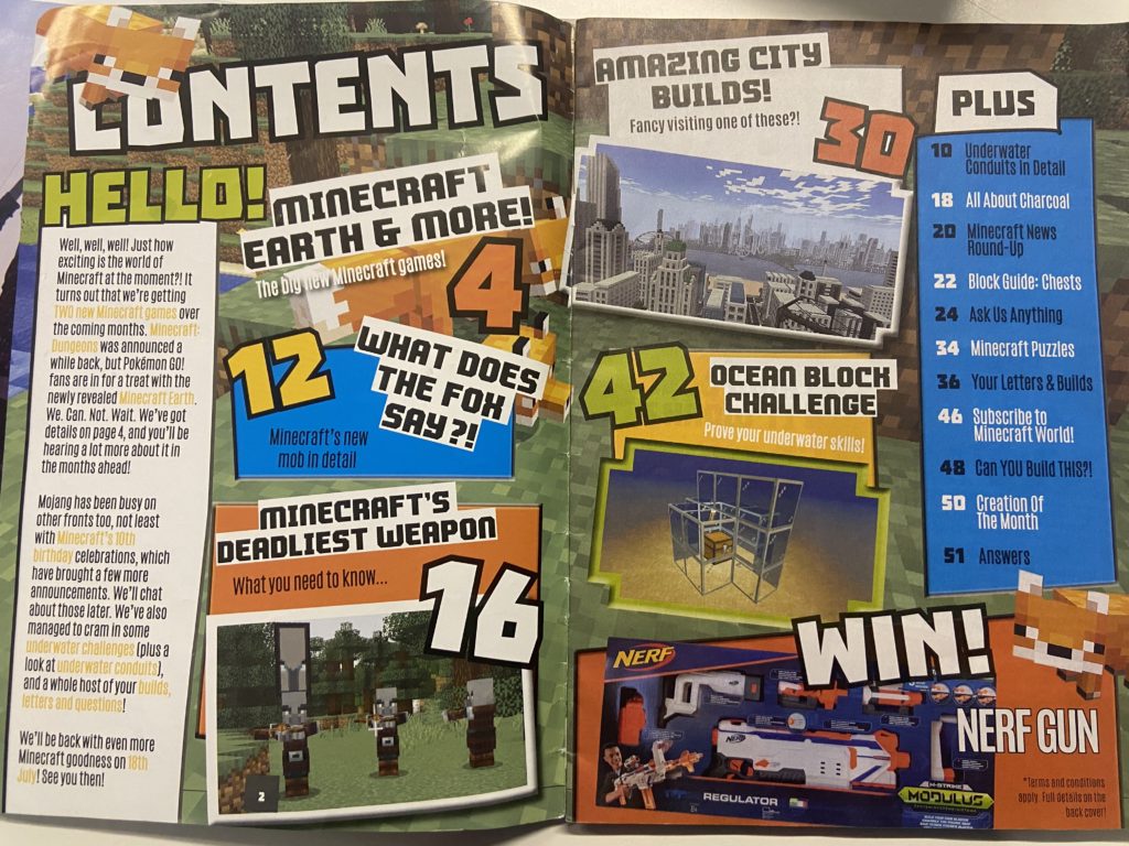
Even though it’s double page, I am going to remove the welcome message. Instead I am going to have boxes with previews into games featured in my magazine and I am going to have a “plus box” with extra articles.
I have decided to redesign my magazine contents page as I feel this layout will appeal to my target audience rather than my original style model, which didn’t suit my teen target audience