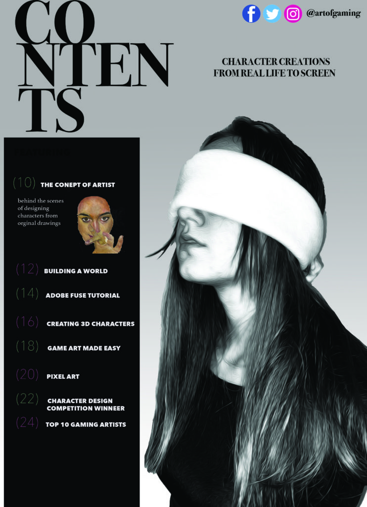
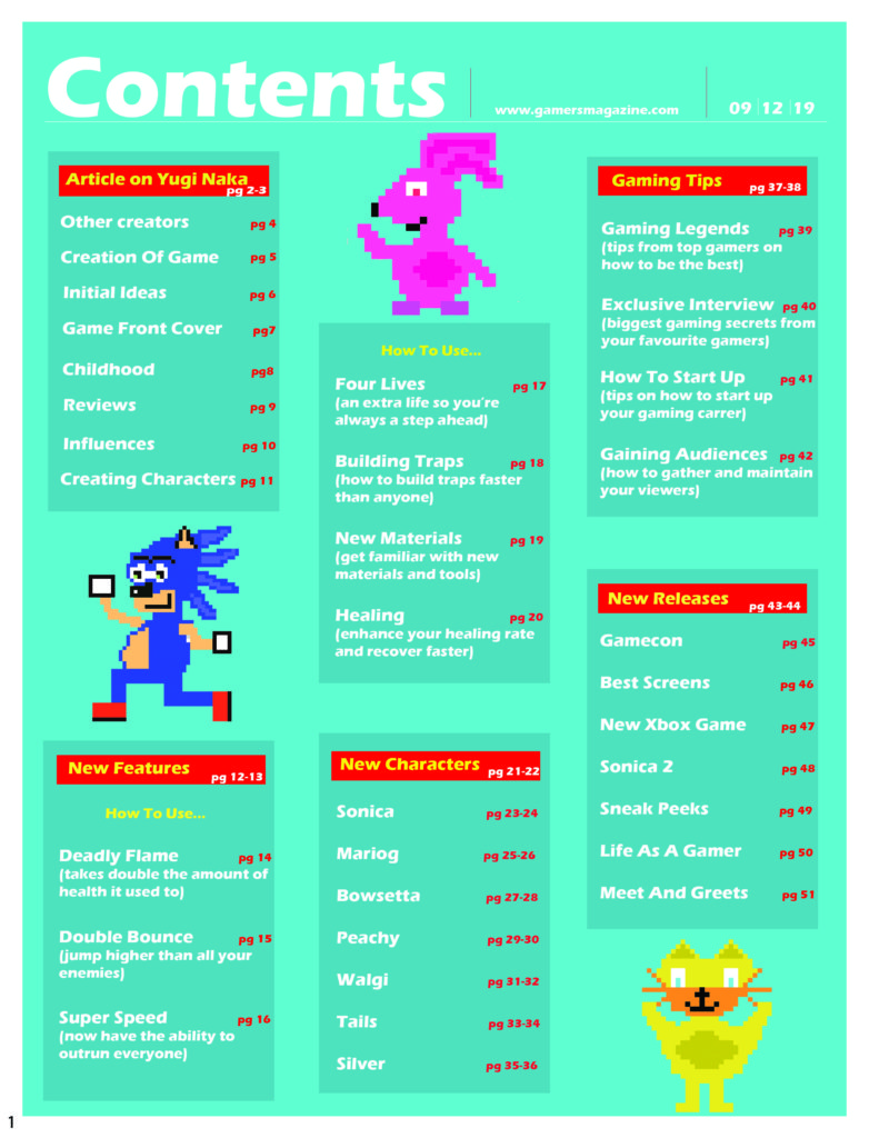
Contents Statement of Intent:
For my contents page, I have chosen to use black and white as I feel it makes the page look simple yet effective. I have chosen this photo of the girl with the blindfold as it represents the secret behind the art of gaming, as gamers don’t see how gaming characters are made. For the title of the content, I have taken inspiration from a magazine while I was researching magazine layouts and house designs. I have used this effective title as it gives interest to the page, as it isn’t just set out in a straight line. I have designed a box to display page numbers and titles. I have used the colors pink and green to give the page some color.
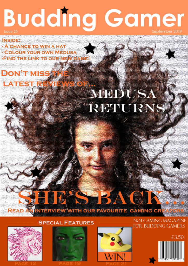
Front cover statement of intent
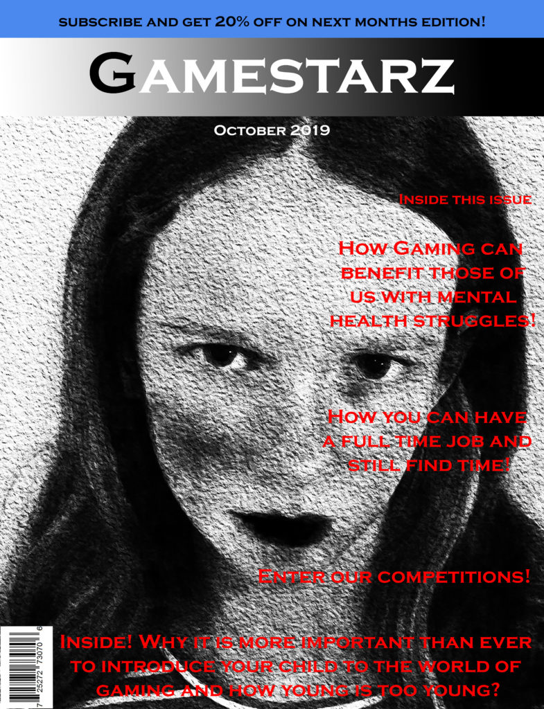
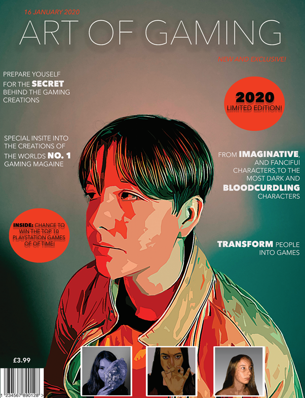
I have redesigned my front cover to look more colorful and appealing. Furthermore, I created it to satisfy the personal needs of my target market; teenagers with an interest in art, by showing drawings in the plugs, and words such as ‘creations’, ‘imaginative’ and ‘transform’. My target is for my audience to satisfy their needs and escape into their enjoyment of art. The main colors I used to create this front cover was orange, green, white and black. Linking to C.S Pierce, who looked into semiotics, which is the study of signs, I have used a symbolic sign by using a vibrant orange to give the magazine a more gaming style, as a feel that bright luminous colors are used in games. Also, I have used an lexical sign within one of my plugs, which is a mask, held by a girl. This mask links to disguise, which can link to gaming characters such as Assassin’s Creed. So audiences who like Assassin Creed will be intrigued to buy this magazine. I have used different fonts to give bolder, sharper texts and light, clean texts. I have made some words within the texts a larger size, and bolder to make the words stand out. The words I have chosen to stand out are key words that represent the magazine as a whole; ‘imaginative’, ‘transform’, ‘secret’. For the main picture in the center, I used color red and blue color sheets to create this orange light effect. I like this as it gives the magazine more of a gaming effect as it looks more creative and robotic.
Statement of Intent
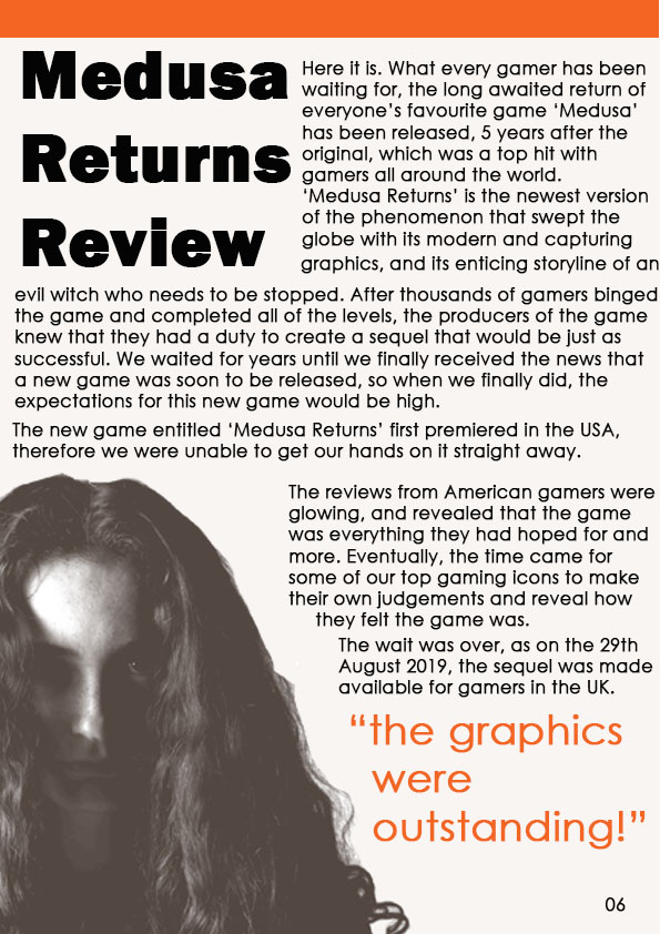
I decided to make my magazine within the retro gaming genre. I decided to make my colour theme red and blue as they’re complementary colours and the contrast makes my magazine stand out. This links to semiotics theory because the indexical colour red indicates danger which makes the game seem dangerous and exciting.
I will create this type of magazine for my target audience because the dominant ideology indicates that they’re more likely to like adventure games as that’s what most children their age like to play. Since 8-10 year old’s are in their key social and emotional developmental stages of growing up they’re more prone to follow trends as they want to fit in and build friendships.
I’ll make my title bold and use a block-like font which is easy to read because I want my magazine to be understandable without the trouble of reading fancy fonts; however I’ll add texture to my title so that it draws some attention. I’ll a short title ‘ how to game’ because I want the magazine title to be straight to the point as my consumers are young and they won’t want to read loads of words. The style of language I will use is informal, colloquial language because it’s more appealing to my target audience as that’s how they speak in their everyday life. Since they’re able to relate to the magazine it will bring them joy and they can use it as a form of escapism.
I ‘ll make the majority of my images cartoon-like and friendly looking because of cultivation theory. Since these are the types of games and characters that are popular they’re constantly seen on screens , this makes the audience begin to like and agree with the dominant ideology (which states that cartoon games and characters are good) because if they’re constantly being shown these games and told they’re good they’ll start to believe it therefore my magazine fits within a popular gaming genre.
For my contents page and double page spread I’ll make columns of three to separate and make the structure of my pages appear more organised. I’ll use boarders, titles, gutters, numbers, dates and images with text wrapped around them. I’ll placed the most interesting and important information on the top left corner of my page as it’s been proven that, that is where we first look on a page. I’ll add images on my page too because younger children are more interested in pictures as opposed to text therefore I have added images to maintain my target audiences attention.
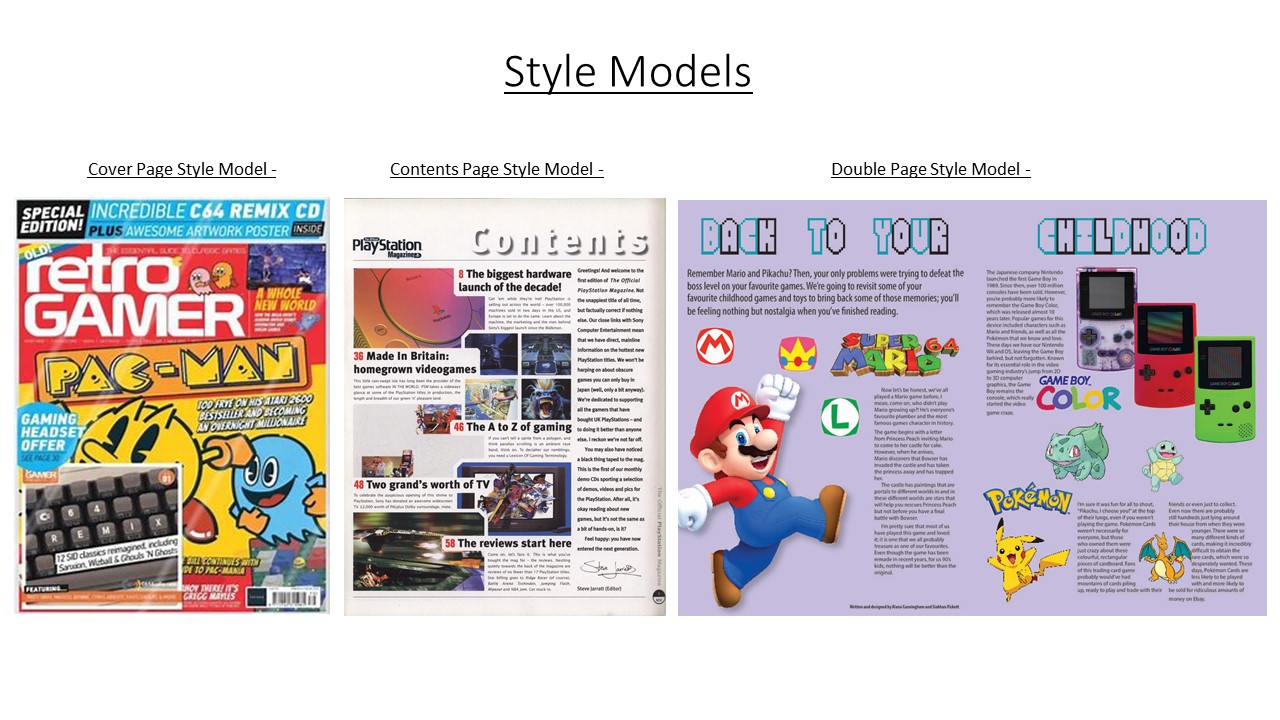
Style Models
My Produced Work


Before I began creating my coursework, I closely studied gaming magazines that are currently on the market and noticed that games characters are predominately male and there are not many gaming magazines aimed at females. Therefore, I have decided to create a front page, contents page and double-page spread aimed at getting teenage girls (11-18 years) into gaming, an industry that is currently more male dominated.
The language I have used is predominately colloquial because of my target audience’s age and understanding of more formal language that adults may use. I have also used colloquial language in order to attract my target audience as my magazine will serve as a source of escapism from school and life. This is also reflected in the cheap price of my magazine, which will allow my target audience to buy my magazine with their weekly pocket money. I have thought carefully about the sizing of my magazine and decided a size that is smaller then A4 is most suitable for my target audience as it will easily fit into their school bag.
I have followed a very simplistic style model for my magazine and its contents and followed a colour scheme of stereotypical female colours (pinks and purples) as these colours are the reactionary colours that occur on girls magazines aimed at older children/teens. However, the contents of my magazine will appear radical, such as the cover image of my magazine and images included in my magazine going against the dominant ideology of females having an hourglass shaped body and define feminine features. I have purposely created the women in my magazine to appear radical in order to create a message that women and men are equal, which is shown by me purposely not including makeup on any of the females within my magazine. The no make-up wearing females produce a truthful message and will bring more confidence to women, who may wear make-up in order to hide themselves, whereas my magazine is showing that the beauty is who you are, not what you look like. I have also included drop caps, columns and page numbers for every page within my magazine, as I am following the style model of a professional gaming magazine already out there on the market and I want my magazine to appear similar quality to those that are already sold in supermarkets and bookshops.
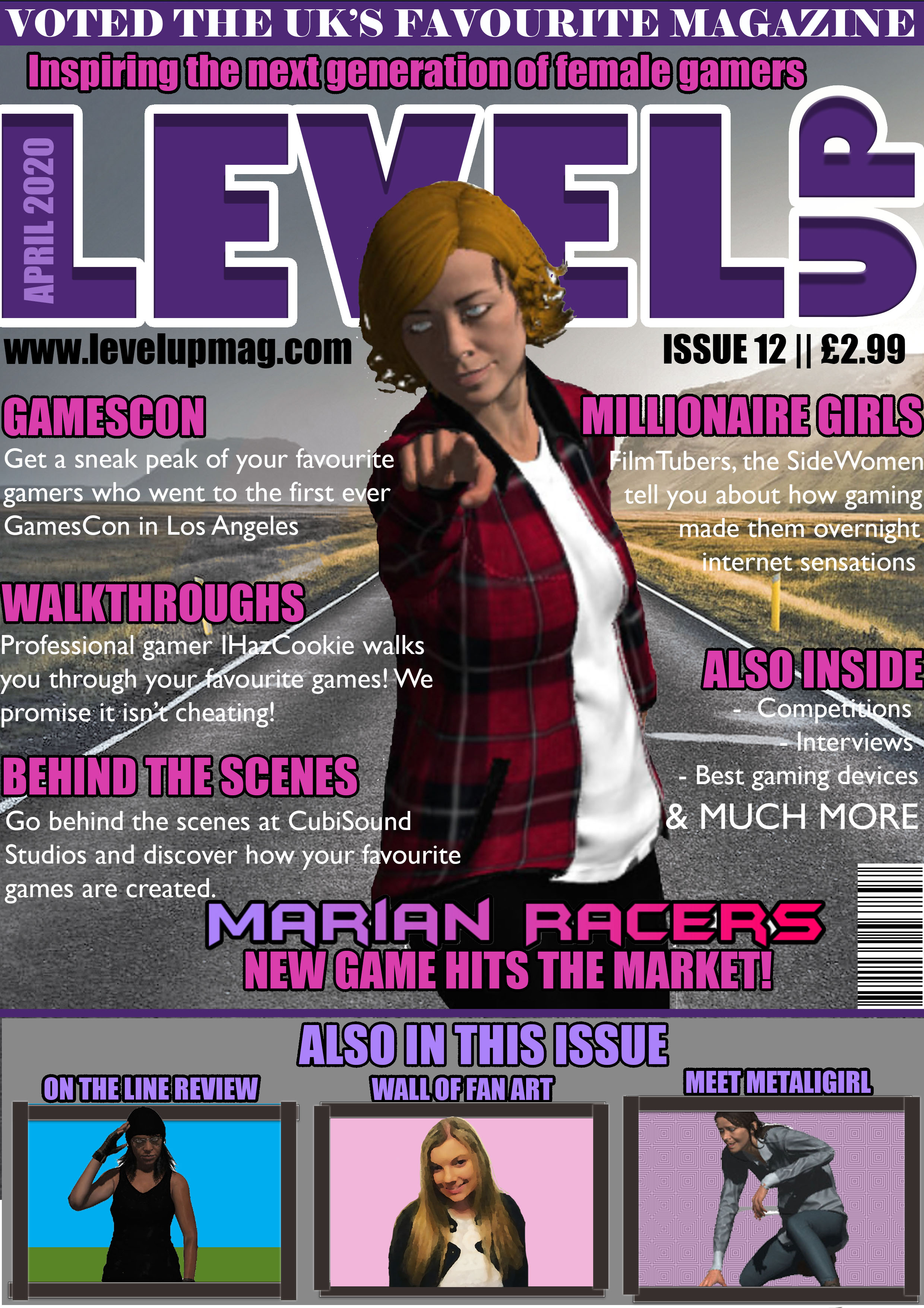
The cultivation theory says that by creating more media challenging the dominant ideology, you will be able to change people’s theories. Within my magazine cover, double-page spread and contents page, I am cultivating the idea of equality for both males and females which is shown by the common occurrence of females doing more male orientated activities, such as Marian (a female) on my front cover being a rally driver and the woman appearing on both my contents page and front cover is an Army Veteran. I am also cultivating the idea of equality towards males and females by strategically making the female games characters included within my magazine wear clothes which are strategically covering their bottom, as a majority of the famous games covers out on the market that involves a women character has them wearing clothing which is ‘revealing’ in order to emphasise their feminine features.
I have also included the magazine’s social media usernames, as around 94% of teenagers have social media and 71% of that percentage used more than one social media site. While designing my magazine, I have thought carefully and from my own experiences as a teenager, I have included things that would appeal to my target audience, such as interviews with professional streamers, as it has been reported that 75% of children aged 6-17 had said they would like to become a “YouTuber” or Games Streamer. I have also included pages that are based around games of every genre, in order to widen my audience and attract more consumers to buy the magazine due to its coverage of games of their preferred genre.

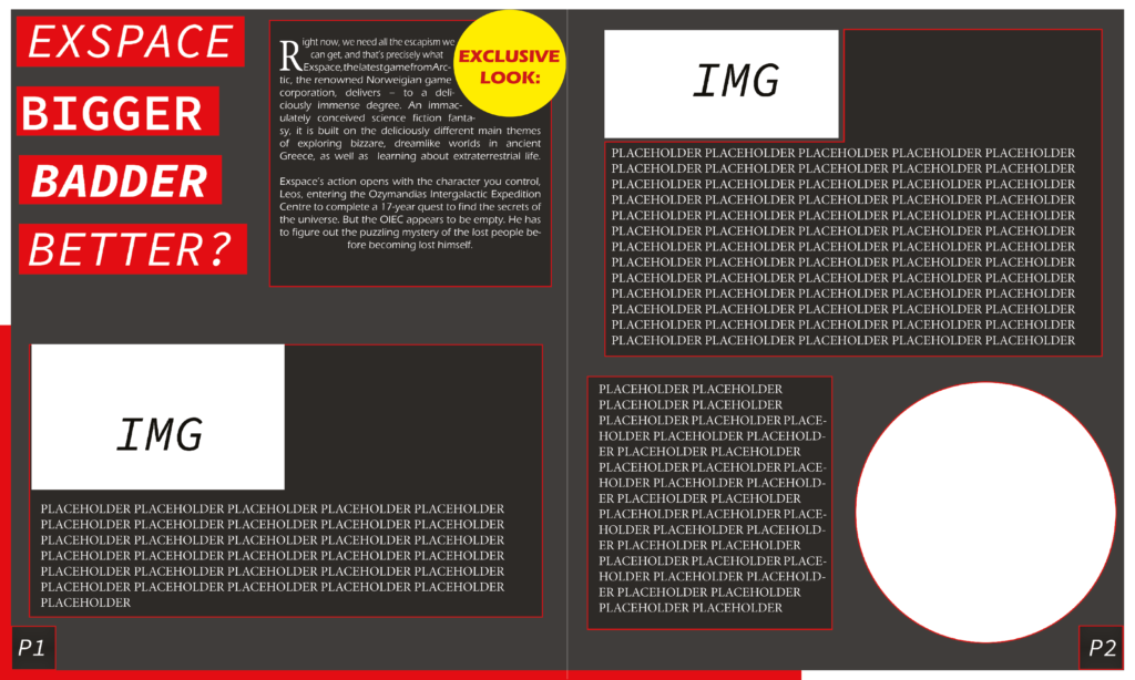
I have designed my double page spread to be a tutorial on how to use Adobe Fuse because I feel the more creative side will interest my target audience. I also chose a tutorial because I want to differentiate from other magazines and challenge the dominant conventions of a standard gaming magazine. I also feel a more creative element will attract my target audience as teenagers are usually interested in the craftier side of things where they can escape from the daily grind rather than being bombarded with information that could make them lose interest due to the stress of exams and school. I have ensured to follow the style model I have used on both my contents page and front page in order to create consistency and deliver a clear layout which will engage my target audience.
I have split my opening paragraph into two columns, in order to create a clear and professional layout, as well as follow the codes and conventions of a double page spread, in order to make mine appear a similar quality to the ones produced by professionals. I have also included a drop cap and page numbers, as they are following the standard style model of a standard double page spread that you would see in a professional magazine out there on the market. I have also used a white background because I wanted my double page spread to be gentle on the eyes, especially as I already have lots of colours on both the pages.
I have used very simplistic language, mainly because my target audience are young teenage girls, as I feel a majority of my target audience won’t know advanced language that adults use. I have also laid it out and colour coded the different sections with the steps and the image in alternate colours to the next step and image in order to make it clear to my target audience. Finally, I have used multiple images as it will appeal to my target audience, especially because from personal experiences, I know at the age of my target audience, they would pick up a magazine and buy it because of all the pictures and the lack of words, as loads of words would bore them and counteract my aim, which is to satisfy their needs of escapism from school and serve as a source of entertainment.
(My Double Page file is too big for the blog so I will email it)
Statement Of Intent –
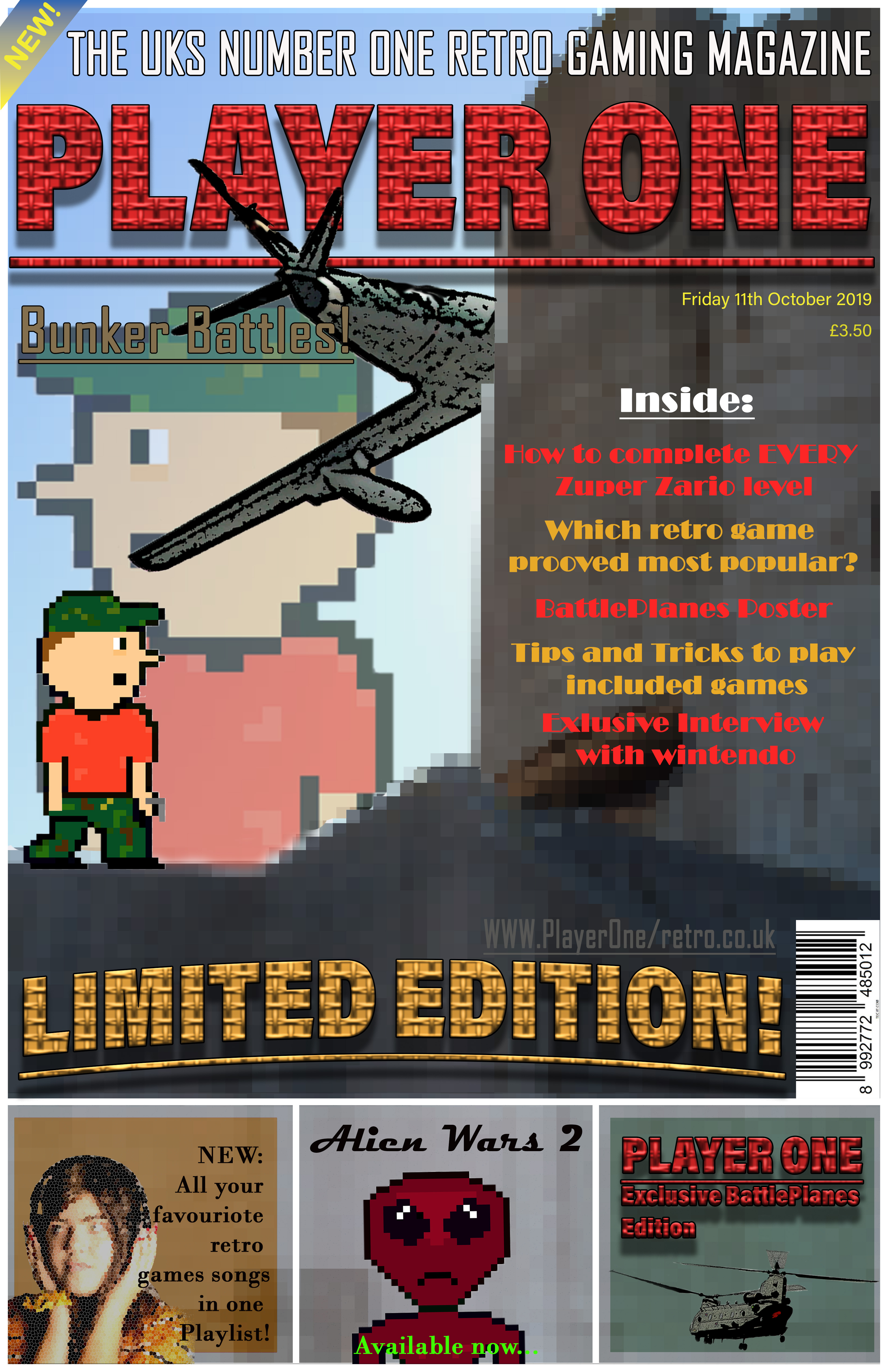
For my gaming magazine I am going to prioritize the genre of retro gaming; supporting consoles such as Commodore 64, Nintendo 64 and NES. My magazine is predominantly aimed at a younger male audience around the age of 12 as the dominant ideology suggests they are more likely to be interested in violent games, they are also mainstreamers, this is because due to their age – they’re more likely to follow the ‘trend’ and what they think is ‘cool’.
The style of language that I will use is a mix of informal and colloquial because I want the magazine to be professional and factual in relation to its contents. it should be appealing to my target audience through the informal language; they would use in everyday life so that they can relate to it, using the magazine as a form of escapism, interlinking with the uses and gratification theory.
In addition, I will also use the san-serif font – ‘Acumin Variable Concept’ –I will also use a sans-serif font for the selling line to follow the house style. By using an informal font, the product is more eye-catching to a younger male audience who may want to rebel against more classical, formal fonts. The text can also act as anchorage for plugs.
When creating the actual of the magazine cover, I am going to use the tabloid size, similar to popular 80s magazines. With a width of – 27.94 CM and a height of – 43.18 CM. I will use this size as the majority of gaming magazines released in the 80’s would have been a similar size – just below A4. Therefore, the dimensions of the double-page spread will be double – a width of 55.88 CM and a height of 86.36CM.
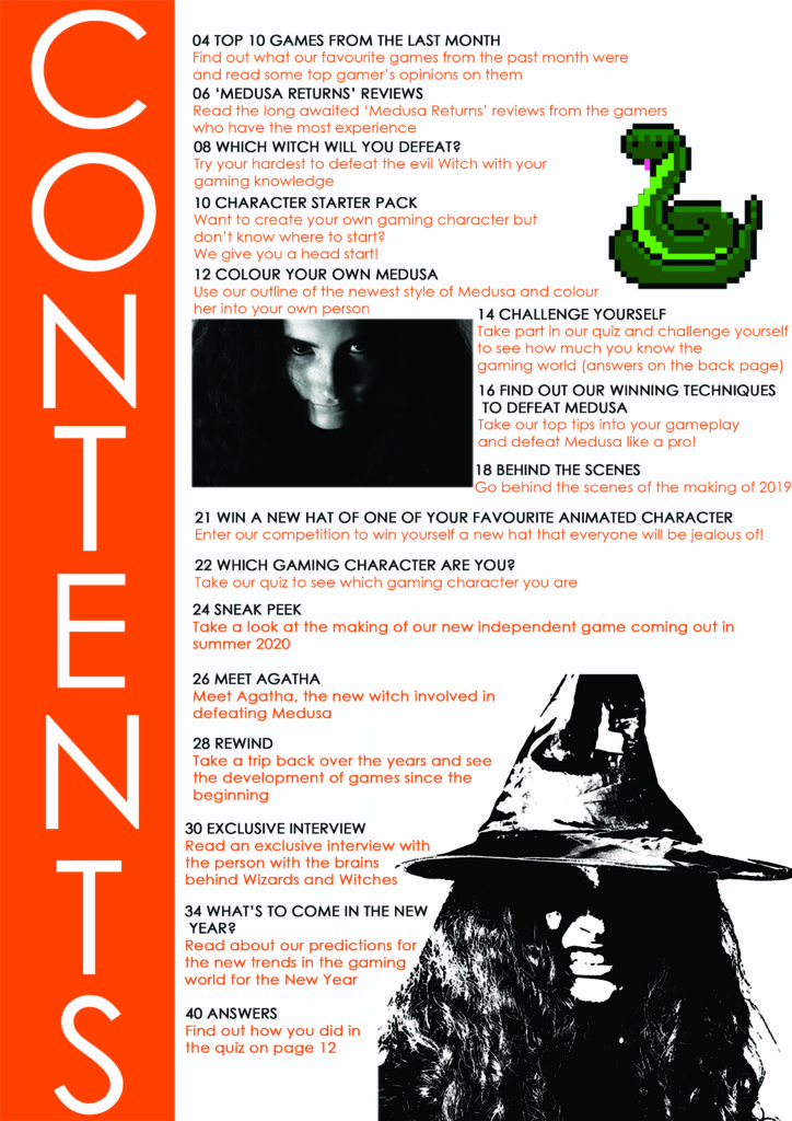
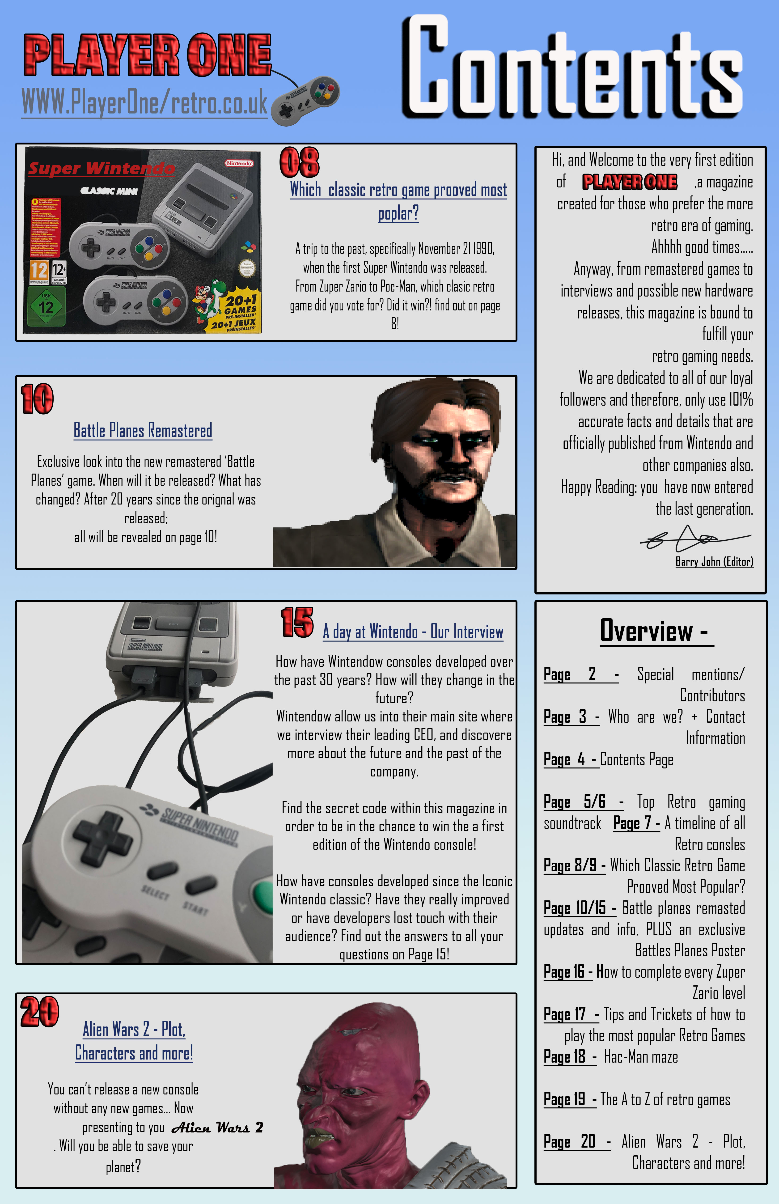
Contents – influenced by parts of my style-model by displaying key parts of the magazine, reference to the title and a description of what the magazine is about. However, I will change a few things to compliment my individual style. For example, I used columns and boxes in order to make it more organised and a section on the pages and what they contain. The magazine will also follow common codes and conventions by using similar fonts and the same background, so the magazine can flow. For the double page spread, I also used a boarder, similar to the previous pages, and a gutter so when the magazine is folded, there would be nothing going across the centre which could distort the image.
I didn’t stick with the style model I showed in my statement of intent and I didn’t do what I said I was going to do in my statement of intent.
I changed the style back to one of my original ideas which was to create my own character using Fuse. Here is my outcome.
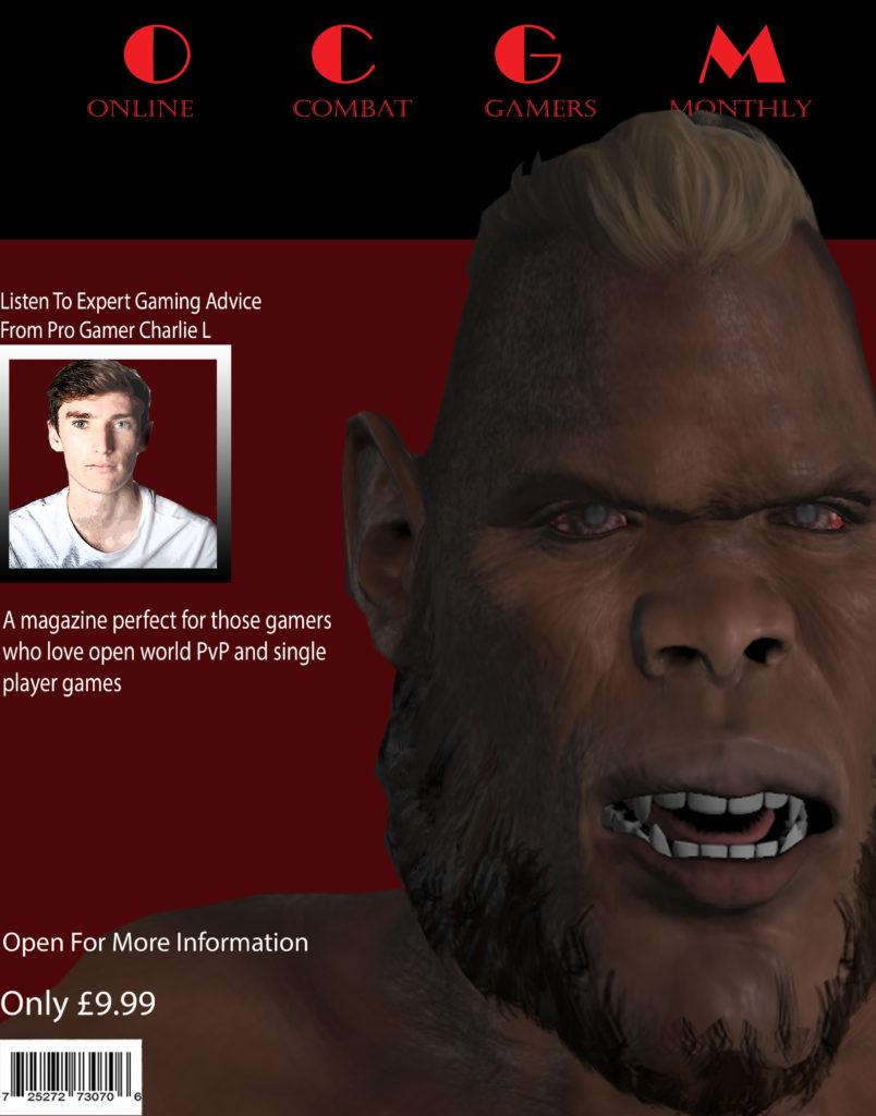
I really like how this turned out with the main image really drawing your attention and the color scheme really creates a feeling within the audience and sets a spooky and fear chilling feeling. When you look at the image and the color scheme you really get that feeling as to that this game is a PvP and/or violent game, which is what I was aiming to create.

Statement of intent
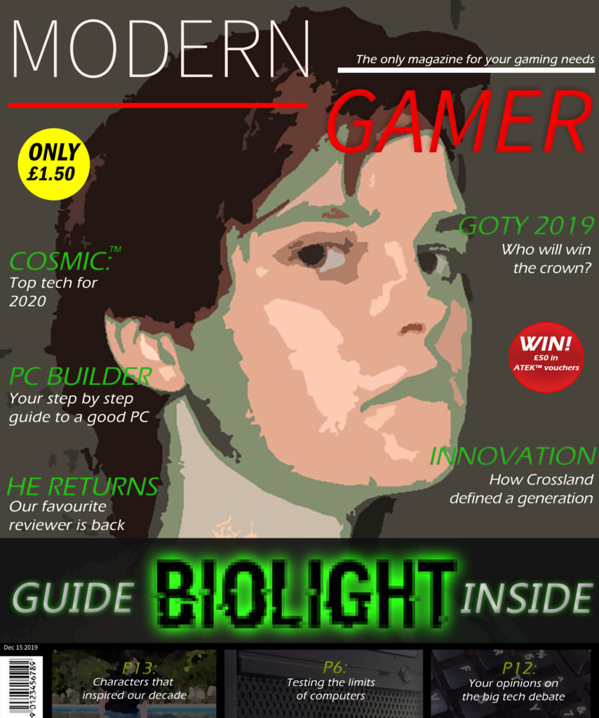
I’ve made a front cover, a contents page as well as a double page spread using PC Gamer as inspiration. I similarly wanted my magazine to appeal to young adult gamers. I used darker and sleek imagery on the magazine to appeal to a more mature audience as well as a sleeker house style (red, black, grey white). This colour scheme is also an indicator to the reader that this is in fact a gaming magazine – using black, white, and a bright colour of choice. I chose red accents as the colour this also draws in the eyes and is bold and noticeable. I clearly listed the price on the cover, allowing it to be easily read with black font against a yellow plug. I have allowed the reader’s attention to be caught easily. an example of this is the large stylized game title – BIOLIGHT. The bright green contrasts the black, making it stand out. Furthermore, this advertises a guide for the game, meaning that the magazine capitalizes from the flaws of gamers. This allows more copies to be sold as the reader wants to find out how to improve their skills. This means that one of the social needs, Knowledge about the World, is sated by buying this magazine. I used original images, and edited them to look like game screenshots
Another factor I used for the cover is an image of myself, used to represent the protagonist of the fictional game ‘Biolight’. This may fill the first personal need – as I myself am nonbinary and present uniquely to the norm. This can leave a sense of belonging to many others who feel unrepresented in media. Furthermore, this uses outrage marketing, a marketing tactic used to advertise a minority or behaviour in media, in order to cause outrage on social media. This allows the information or product advertised to spread through word to mouth. In this case, The position of a minority being displayed on the front cover on full view displays this.
This radical idea can be taken through many ways by the audience – using reception theory, the dominant response could be to accept this representation. This audience is likely going to be the ones seeking representation. the negotiated response is mixed. The oppositional response would be a complete dislike of this representation, which could be from anyone, but is most likely to come from those with traditional beliefs.