


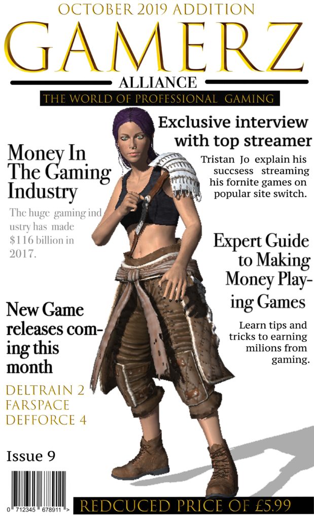

For my magazine I decided to title it “Gamerz Alliance’ as I wanted it to be catchy. I thought this would appeal to my target audience of males between 28-30 and new affluent workers, who have a keen intrest in gaming and the world of professional gaming industrys. I used a games charater I designed in fuse as the dominate signifier to represent the theme of my games magazine. I chose to size my magazine at a width 11cm and a height of 17cm, I decided this as it would fit well into someones bag and would be a big enought size to read comfortably. I chose the gold font as it stands out and aims to my target audience of more sophisticated professional gamers, aswell as giving the magazine a sleek professional look and I chose to put it all into captial letter to draw attention to it. When coming up with the design and target market I research popular gaming magazines on market and was inspired by the use of Signifiers in the magazines to make it clear waht its about and whated to do this with having bold headlines.
I wanted to make the font really bold to stand out to attract my target customers and give some instate on whats inside the magazine. I chose to have my headlines all around the character in order to keep the magazine simple but also effective with the character adding colour into magazine and being the dominate signifier. As i am aiming my magazine as more of a professional magazine to experienced games i decided to price it at £5.99 after reasearching what some of the more professional gamers magazines are priced at i decided to go with a average price. I also promoted it as a reduced price inorder to attract more customers. I also used plugs with my headings and decided to use topic headlines that would attract my target audience of more porfessional gamers and therefore spoke about the business side of media.
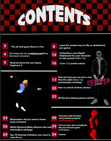
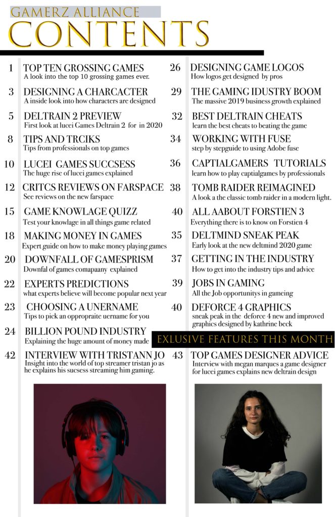
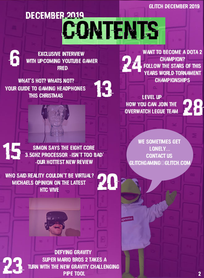
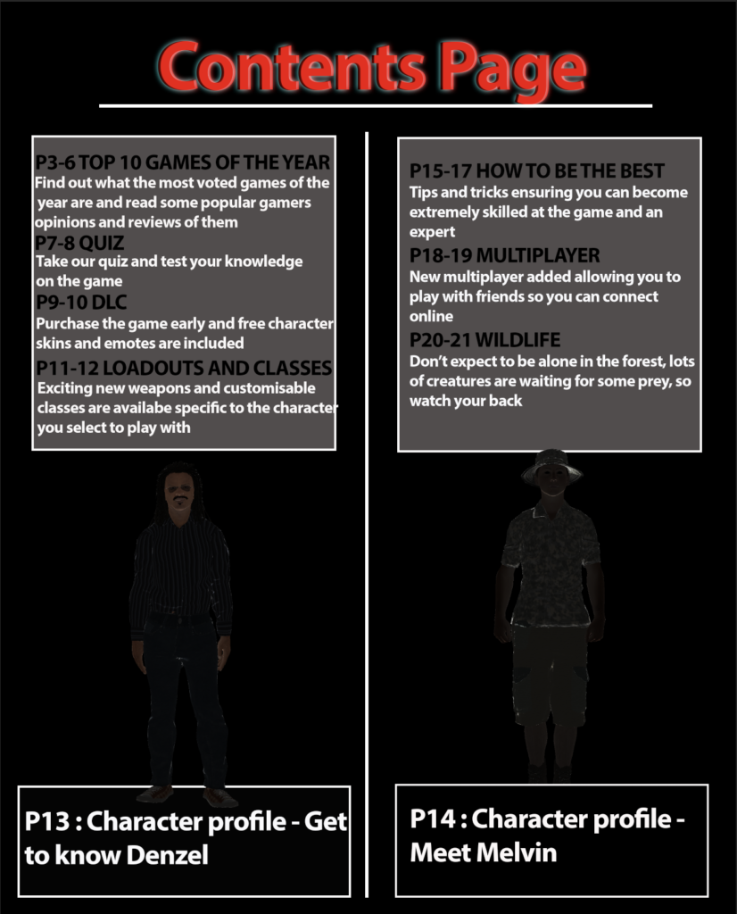
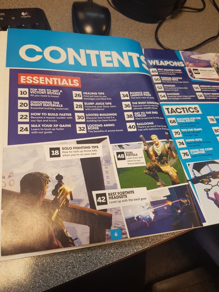
For my contents page I wanted to stick with the sleek model look I used on the front cover and used Greatest gaming Icons as a style model on how to lay it out but changed the colour scheme indoor to achieve a more modern mature sleek look. i wanted to include clear made feature of the month and used image to make the feature be prominent. the use of lines was to keep it organised and clear as to what is inside the magazine.
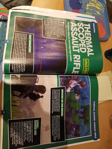
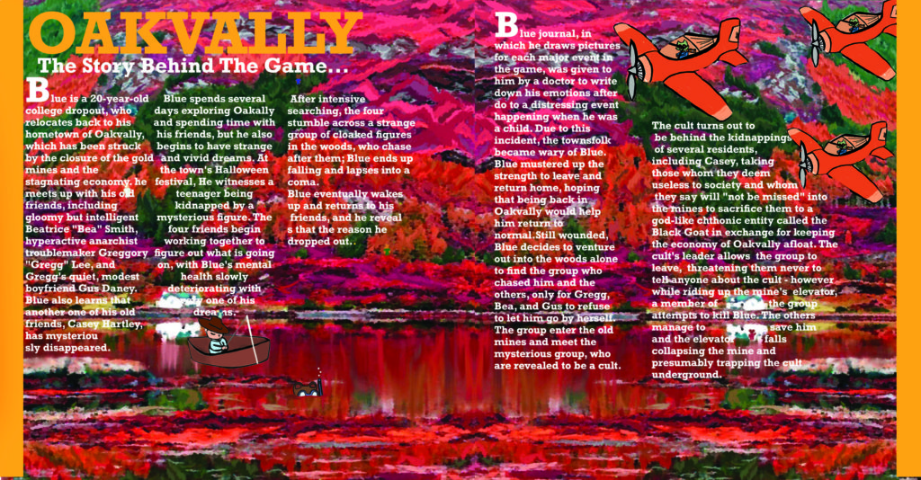
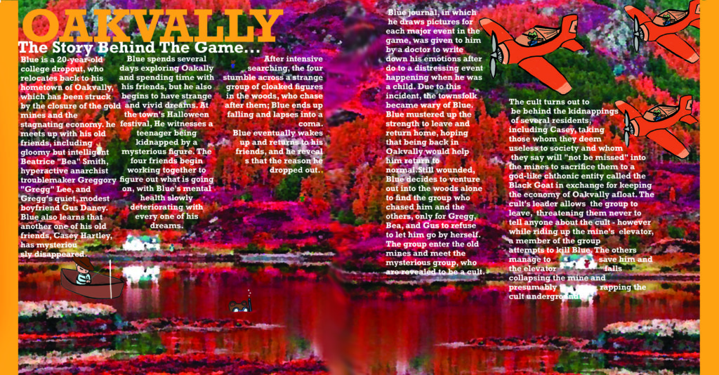
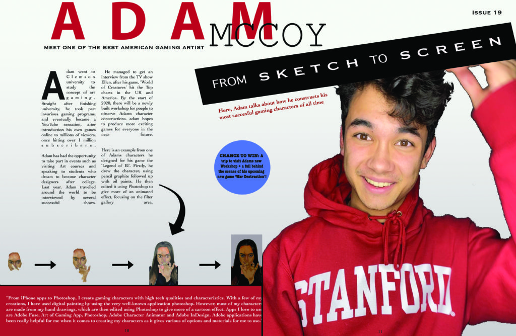
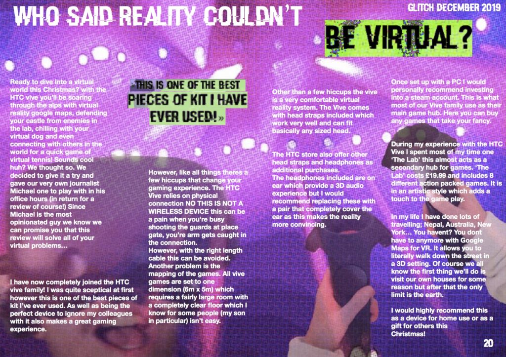
For my double page spread I wanted to again keep it sleek and modern as to fit to my theme and appeal to my target audience of 28-30 year old more sophisticated gamers. I decided to uses image using red a blue lighting indoor to both and colour and repressed interviewees brand. I decided to use column text keeping it uniform and neat in order to again appeal to my audience.

Double Page Spread Statement of Intent:
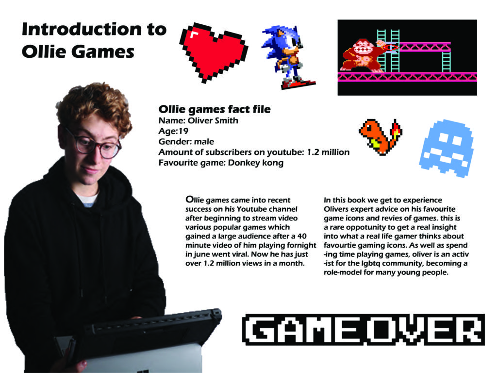
For my DPS I decided to talk about a gaming artist. I went for a color theme of red, as the model is wearing a red jumper. These pages are designed to be informative and easy to read as my target audience is young teenagers. I have made some writing bold to make it stand out, for example, the ‘sketch to screen’ font is very large and bold, as I wanted my audience to know what the page is all about.
Statement of intent:
I intend to create a magazine cover, contents page and double page spread all focussing on the world of gaming. My target audience are all people with a keen interest in gaming around the working class demographic. This audience will not be required to have a high level of english to decode this magazine however this magazine will be primarily aimed at gamers over the age of 14 as some of the featured articles may not interest a young gamer. From research I have concluded that the age group with the largest amount of video game enthusiasts and spenders is 18-24 with 16% of the worlds gamers. This group will be my primary audience.
Since my audience are in the working class demographic they would not stereotypically look at buying an expensive magazine. The pricing of the magazine is targeted to be in the range of £2-£3. To create my magazine to be tailored to a specific audience I found out that gaming psychographics conclude that women make up 48% of the gaming population however only 5.5% of these are willing to spend money on gaming (games, equipment, books, magazines…) as oppose to 17.5% of men. So, when creating a gaming magazine it is kept in mind that the largest consumers of the product statistically should be men.
On the cover of my magazine I will use direct address to tell the audience they need a certain type of equipment or advice and plant the idea in their heads that they must read the articles inside. This directly relating to a theory by Albert Bandura ‘effects debate’ (the idea that the media can implant ideas in the mind of the audience directly). Many would argue that this refers mostly to media influencing actions and planting ideologies in society however I feel it can be used as a selling technique through persuading the audience they need something. (self actualisation- Maslow’s hierarchy of needs)
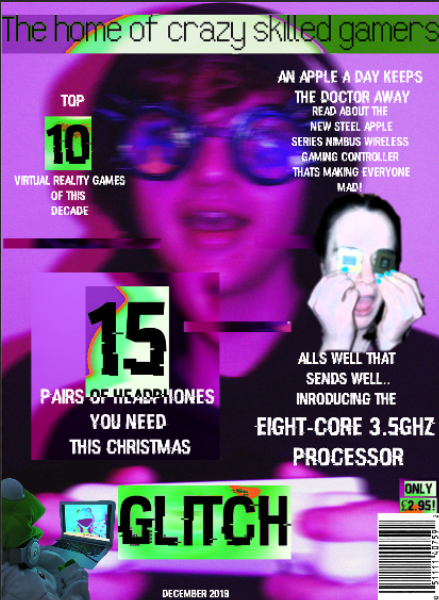
The USP of my magazine will be its graphology. The magazine will be called ‘Glitch’ which is the basis for all design elements. The images will be edited in a computed glitch style with a constant broken purple computer screen style throughout. Another theme within my magazine will be the theme of madness and disorganisation. I feel this will attract an audience from a far as its combination of purple and green is not common and will play on a humans natural curiosity.
Statement of Intent
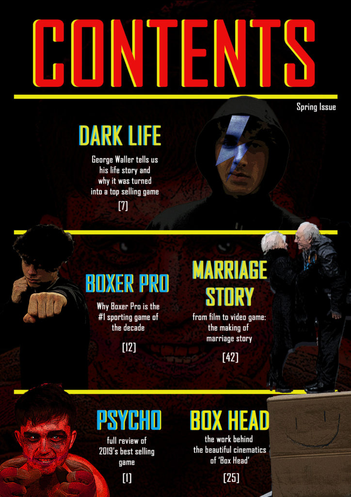
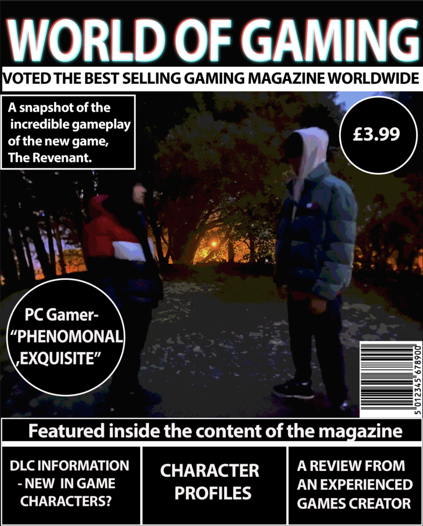
My magazine is labeled by the title of ‘World of Gaming’, this is mainly targeted towards males between the ages of 15-19. It is targeting mainly males because the specific types of genre that are featured within the magazine are more appealing towards males. However, females may enjoy these genres so could be intrigued into reading this. I wanted to create a gaming magazine that is gives useful insight on the game and to lure the audience into feeling like they’re in the game giving them an idea of what it’s like. This allows the reader to become involved within the game. Between the genres in the game, hybridisation is involved as it’s a combination of more than one genre. The genres that consist in my game ‘The Revenant’ are horror, action and adventure. All these different elements are different aspects of the game. Common ideology when the genre of horror is featured is associated with a dark and gloomy setting adding to the effects, hence why my game is set in an unattractive forest. I’ve used darker colours to emphasise the fact it’s a horror game as a connotation to the forest. Predominantly I wanted to use darker colours as well as red:red is a very deep colour that refers to blood or the devil which is perfect in this aspect to use consistently throughout my magazine.
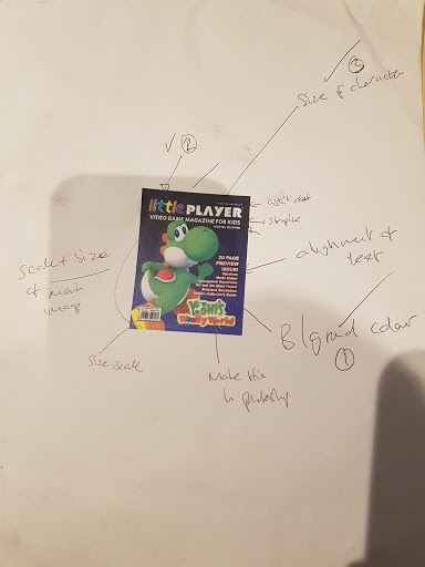
I redesigned my old gaming magazine to improve it so it was more appealing to my target demographic which are young kids ages around 3-6 and used Little player as my style model. Firstly I redesigned my Masthead to replicate my style model by making it is multicoloured and basic white with Broadway Font, I did it this way so it is more appealing to my target demographic which are kids so by me putting bold font and various colours will catch their eye. For my main image, I enlarged the image that I had created in Photoshop to scale it to be more similar to the model, to make it stand out more, and in order to do this, I had to remove the unnecessary Pieces to create negative space which was then filled when the image was made larger, I also had done this to the barcode which I made in Photoshop which I scaled to be similar to how the model is in the left third of the page. I then added a strapline saying the same thing as my model “video game magazine for kids” which was placed behind the main image just like the model so it makes the main image stand out even more as it needs to be the main attraction when you look at it to bring in potential consumers. The alignment of text was also replicated to be on the right third of the page and I used BrodWay Font with bright colours to make it stand out like how it does on the style model but yet doesn’t distract the consumer from the main image. For my Background colour, I used the gradient tool of blue and green which are the main colour themes that I used and gives the dominant signifier of “boys” as my magazine is mainly targeted and explores more “boyish” games.

For my contents page I
For my double page spread