Category Archives: Uncategorized

Filters

Author:
Category:

NEA Coursework

Front Cover
Contents page
Double page Spread
Front Cover Model
Contents Page Model
Double-page Spread Model

Statement of Intent

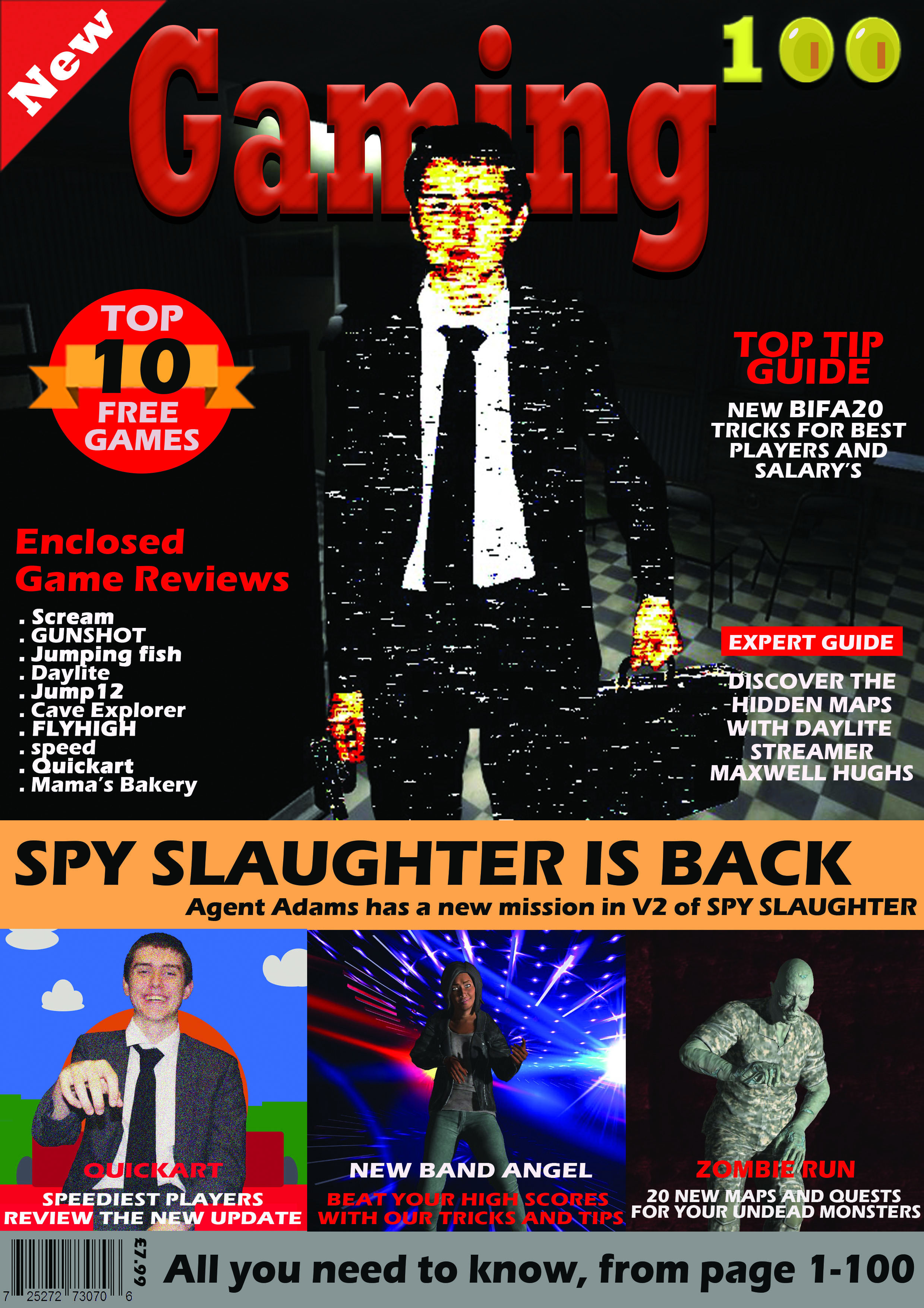
The target audience for my gaming magazines is aimed at teenagers, predominantly between age 12 and 16, interested in a range of different games. I chose the title ‘Gaming 100’ representing the 100 pages of my magazine, which allows this magazine to be inclusive to both boys and girls, with any genre of gaming interest.

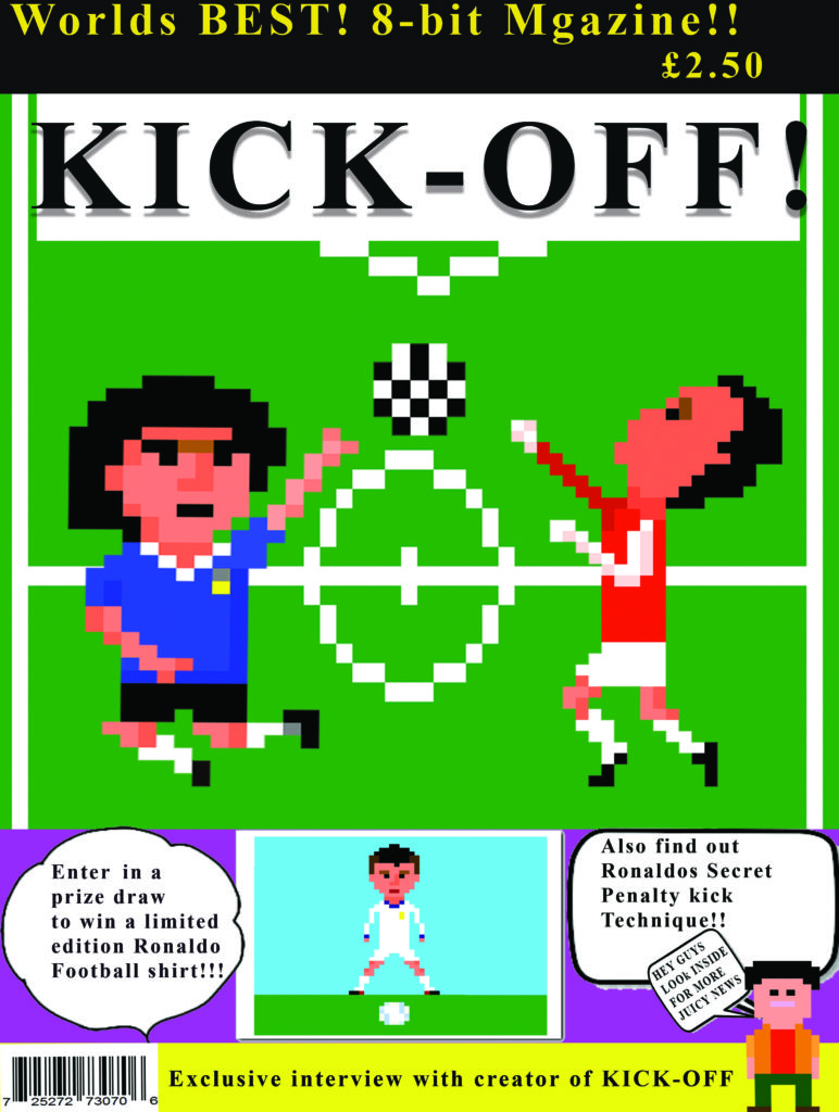
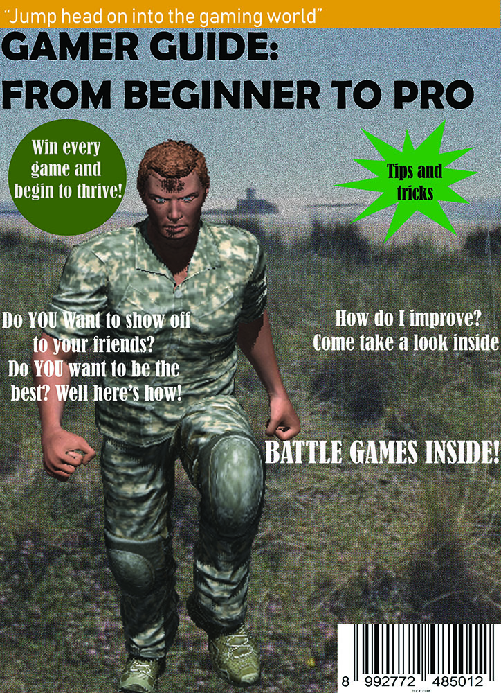
My aim was to have a magazine that has something for all teenage gamer’s, and with that I chose an overall basic colour theme with black, white and red, but also included a musty yellow to add a brighter colour. I designed the ‘100’ of my masthead to have the two zeros as coins, similar to ones collected in various video games, to keep the design closely and clearly linked to gaming, and therefore recognizable to the reader. A sans-serif font was used to create an informal and relaxed look, suitable for a teen based magazine. I based the layout on a fortnite magazine cover I had in class, using the rule of thirds to help guide the reader around the cover, with a main image on the whole top half, but with the masthead slightly covered by the dominant signifier. Then on the bottom third, a gallery of 3 more images and captions to display some of the articles inside. I used extra puffs and plugs on the sides to include as much information about the pages found inside, to interest as many possible consumers.

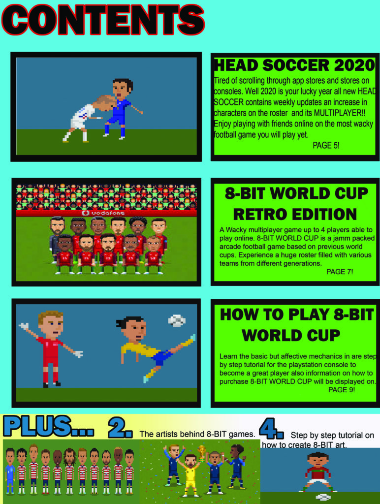
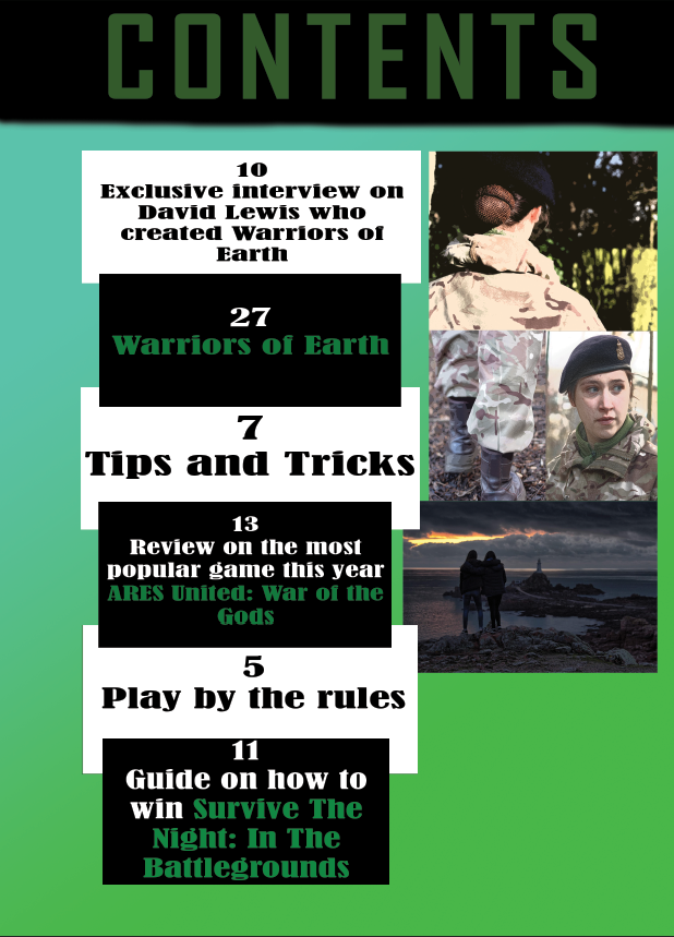
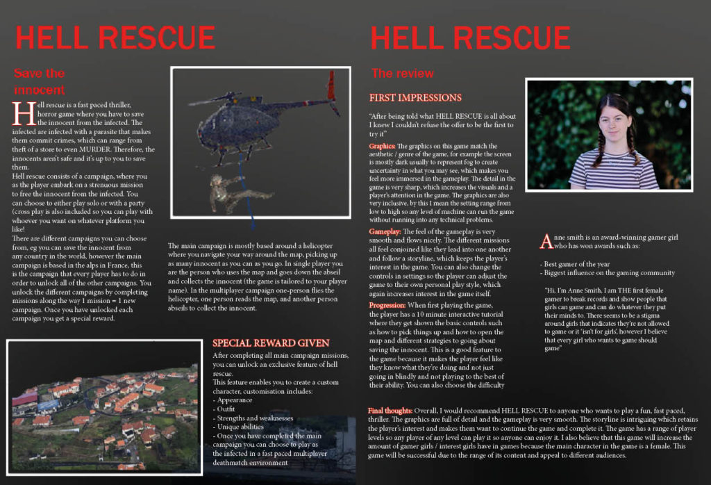
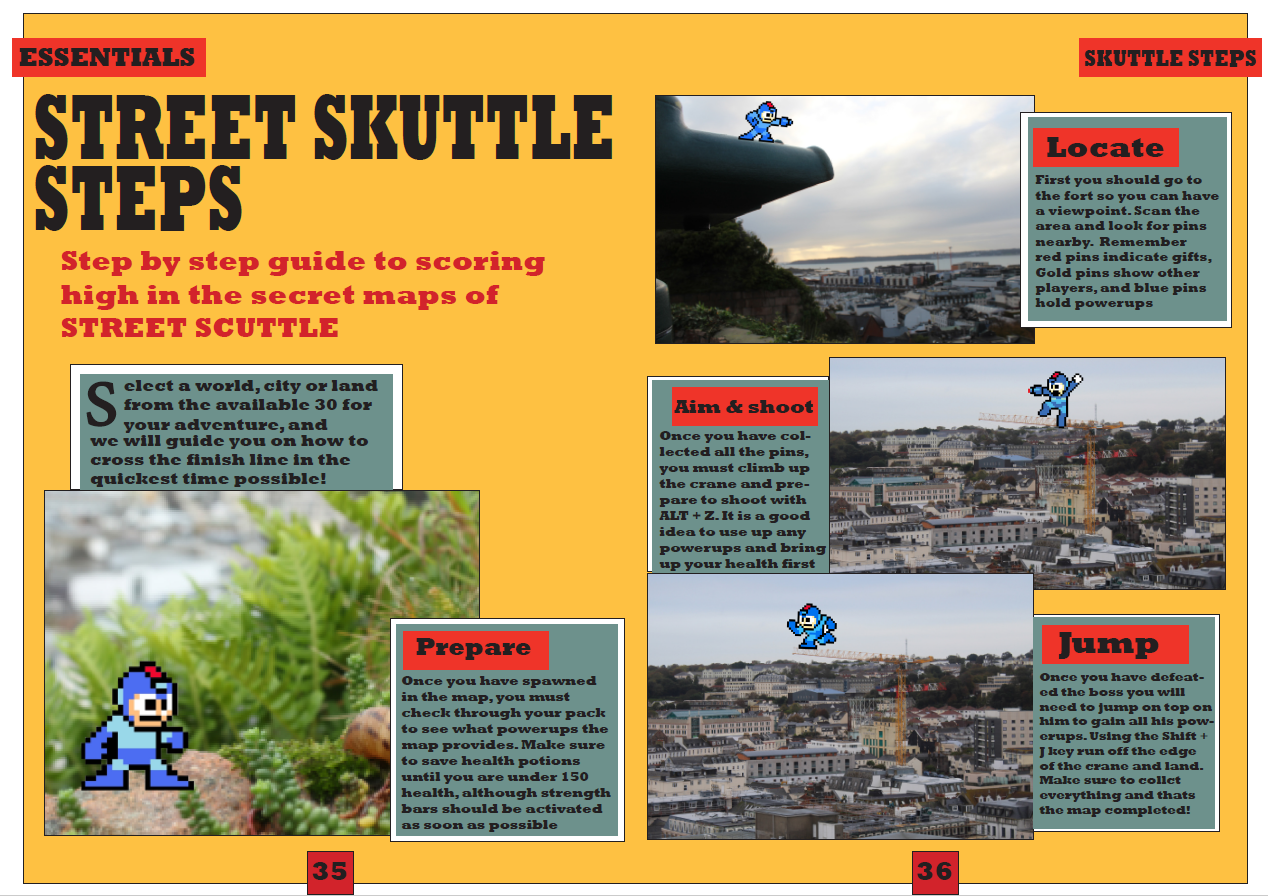
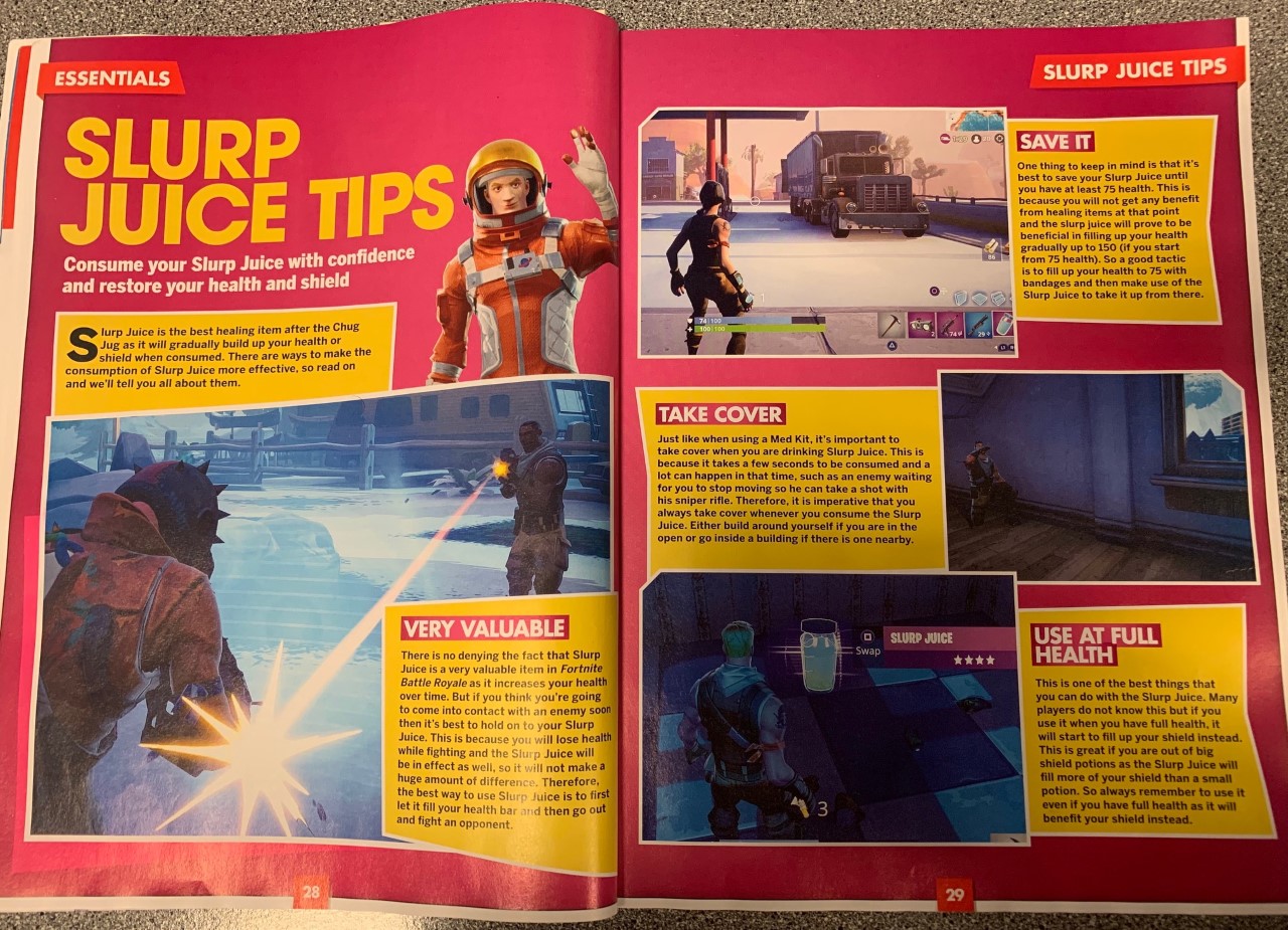
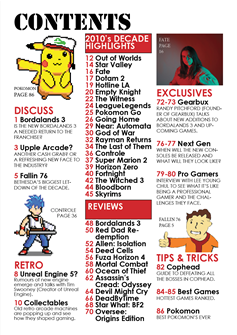
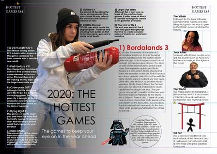
With the contents page and double page spread I referred closely to my style models, and kept the colour theme running through, with a bold and basic font often found in gaming magazines. I included lots of original imagery and created a game for a step by step guide which was found in many pages of my style model.

I gave the magazine a reasonable price for a 100 page magazine, to be affordable and accessible to the younger teenage audience, who would mostly be middle class student, possibly with only a small pocket money allowance.

NEA Coursework

STYLE MODELS

STATEMENT OF INTENT

My working title is Macro Gamer to emphasis the scale and variety of content in my magazine. My target audience is both men and women however primarily women, aged between 16 to 25. This is because my magazine is filled with strong women as the main protagonists and antagonists. Being more mature, my colour pallet is mainly black, white and red. This is more of a horror gaming magazine as there are dark images which is more R rated then generic magazines however does apply a more child-like nature with the 8 bit art. The audience conforms to the emergent service workers due to being very young but high levels of cultural capital. Also, my target audience are part of the Explorers in Rubicam’s 4 C’s due to many games being covered in my magazine being a challenge or adventurous. My magazine will cover reviews, exclusive interviews and a couple new emerging games and my cover is easy for people who are not fully cultured in the game industry due to using more informal language but also rewarding for those who are. I believe my magazine challenges the dominant ideology as it has strong female characters that aren’t over sexualised, such as my dominant signifier on my front cover and double page.

teenvogue

Teen Vogue is a former US print magazine and current online publication launched in 2003 as a sister publication to Vogue, targeted at teenage girls. Like Vogue, it included stories about fashion and celebrities. The magazine had also expanded its focus from fashion and beauty to include politics and current affairs.

Condé Montrose Nast, a New York City-born publisher, launched his magazine empire in 1909 with the purchase of Vogue, which was first created in 1892 as a New York weekly journal of society and fashion news. At first, Nast published the magazine under Vogue Company and did not incorporate Condé Nast until 1923.

een Vogue was established in 2003 as a spinoff of Vogue and led by former Vogue beauty director Amy Astley under the guidance of Anna Wintour with Gina Sanders as founding publisher.  The magazine is published in a smaller 6¾”x9″ format to afford it more visibility on shelves and some flexibility getting into a digest size slot at checkout stands. Teen Vogue‘s original price was $1.50 (USD)–“about as much as a Chap Stick” media critic David Carr noted–and about half the price of contemporaneous magazines aimed at a similar demographic, like Seventeen and YM. At launch, founding editor-in-chief Astley said that topically, Teen Vogue would focus on doing “what we do well, which is fashion, beauty and style.”Teen Vogue was the first teen-focused addition to the Condé Nast portfolio, previously focused on adult audiences. The publication began with four test issues, then published six issues in 2003 and ten in 2004.

content

fashion

sexuality

politics

teenvogues worth

Halsey was meant to make albums, and it shows

From start to finish, from lyrics to production, Halsey’s third album “Manic” tells a complex story.

BY AAMINA KHAN

https://www.teenvogue.com/story/halsey-new-album-manic-a-track-by-track-review

Halsey’s New Album “Manic”: A Track-by-Track Review

Halsey

Statement of intent

The target audience for my magazine is targeted at 13-15 years old’s who have a strong interest in gaming. They would also be in education and wouldn’t work but the parents would be middle class. The point of my magazine is to provide escapism and enjoyment for its readers, the goal is for them to want read and learn more about here favorite games.

I researched into what gaming covers look like, what games are enjoyed and the most popular types. I used a gaming cover to base my cover from by being inspired by there layout and how they had presented it to give it an overall fun look.

I decided to do my magazine on reviewing the most popular gaming icons and rating them, this would be done by a made up YouTube star. This would be a reactionary sign due to it being very common for male video gamers to bring out magazines. I used many popular gaming icons which I made on 8 bit art which captures an. audience due to there popularity. I used a black background to make the characters stand out against the dark background. I used a plugs to show the context and to make it more appealing.

Overall i think i did a good job at creating a interesting magazine cover which attracts attention and serves the purpose of providing people with the choice to escape reality.

Representation My magazine cover follows dominate ideology (reactionary) because the reviewer of the games is a male which is common for gaming magazines. My front cover is also mainly about popular game characters which is again common game idea and often used, this makes it an iconic sign as it is so recognizable.

Audience theory My audience would interpret my magazine as dominant reading as there interested in gaming, other people may view it as oppositional or negotiated but the people how buy it will enjoy gaming so they will like it.

Nea statement of intent

From this brief, I have decided that I will make a magazine aimed at 8-10 year olds. From my research I have found that there are not many gaming magazines for young people in this age range, as most gaming magazines seem to be aimed at older people like teenagers and young adults, therefore I think it would be interesting to make a magazine for younger gamers.

Lots of gaming magazines like ‘PC Gamer’ and ‘tabletop gaming’ focus lots of their imagery on violence and battle, whereas I have decided to go against the normal ideology of gaming magazines, and focus on characters and their appearance, rather than their actions instead, because of the young target audience. Normally the dominant signifier of a gaming magazine is an image of some sort of monster or character holding some sort of weapon or making an intimidating facial expression. On my cover I am going to make the dominant signifier a character but will not include any forms of violence. In the contents page I will use similar images of the character on the front cover and relate to them as the dominant signifier. I have been inspired by the contents page of Gamer TM, as I like the way that it has been laid out and looks professional and smart. I still want to make sure I keep to my age range, so will add things like stars and colours to keep to that target audience.

For the double page spread, I have decided to focus on a review of the game features on the front cover. Gaming magazines often include articles like this, no matter what the target audience, to give readers an insight into some of the new games on the market. I will include larger pieces of text (quotes from the article) around the page, as I have seen that this is commonly used in the media. The theme of the colour orange will run throughout the whole magazine as this is bright and youthful colour. 

NEA Coursework

Front cover (I don’t have my updated copy at home):

This image has an empty alt attribute; its file name is Front-cover-for-magazine-1.jpg

Contents page:

Double page spread:

Statement of intent:

I want to create a magazine which will reflect how people can improve in games they want to improve in and will be appealing to the reader/consumer, and I intend to make a gamer guide for beginners as people today are often in need of guides however they often cease to exist. I would like to include relevant information to my initial ideas and needs to be up to date, informative and somewhat interesting as this product does need to appeal to the target audience. I intend to make it readily available to a variety of people and include a wide variety of games. My target audience (ideal consumer) will be for teenagers aged 15+ (both genders) as this is generally the age where most people get into gaming and want to improve.

My dominant signifier in my front cover is being represented as being ‘big’ and muscular which implies masculinity and represents how we portray men in the present day. We expect them to be muscular and strong and fight to get what we want or think we deserve as that’s what we’ve always known; it’s what we accept in society nowadays because it’s not something that has been introduced but has just been with us in the community for decades. This could be considered dominant ideology.

My contents page will resemble how this guide is supposed to be fun and have educational factors within it. The iconic images represent exactly what will be in the magazine and it gives the receiver an insight on what this magazine will actually contain. Although my contents page is simple it will show consistency throughout as everything will be in a more or less similar format as I don’t want to take away the physical content inside this magazine. The colour theme of the magazine is kept throughout the contents page as I don’t want to override the importance of the front cover and I don’t want to take away from the dominant signifier.

My double page spread will consist of one main image of a game and then have a guide on how to be good at this game and win it the majority of the time, with detailed descriptions of how to approach these tips. It will have some useful tips in order to facilitate the purpose of my magazine. It will be simple as I don’t want to take away from the purpose of this section.

Coursework

Statement of intent

My main intention for my magazine was to show that females can be just as good at games as males can, I wanted to do this by making women the main feature of my magazine whilst keeping the main elements of games which make them fun eg adventure and combat. I intended to do this by supporting the launch of the new game HELL RESCUE. To find inspiration for my magazine I looked at PC GAMER magazines, through doing this research I noticed that there aren’t many gamer girl magazines out there and the gaming community is predominantly male. Therefore, I intended to make a magazine focused on girls to show that girls can game too aimed at girls aged 13-18, this led me to think of the title GAMER GIRL. My dominant signifier in the front cover is a female character, which challenges dominant ideologies due to the strong, independent impression given off. I wanted to make the magazine interactive, so I used different fonts (Franklin Gothic medium and heavy, serif and sanserif). I wanted the magazine to catch my audience’s eye so I wanted to make the dominant signifier pop by creating a sense of depth of field between the character and the mountains in the background by using a shadow. I wanted to make it appealing by using a catchy slogan ‘RUN HEAD FIRST INTO THE GAMING WORLD’, where i wanted to add a colour block, shadow and wave effect to stylise it. I wanted to use the rule of thirds(title, main components, other information). Another way I did this was by using a range of colours / images whilst keeping the magazine uniform throughout to present a clean finish. In my contents page I wanted to clearly show what was in my magazine, I then looked for a template to follow and saw that most game magazine contents pages were in boxes like mine is, I also used images to show a visual representation of what’s in it. For my double page spread I wanted to create a professional looking spread, so again I used a template. I included images to aid in the description of the new game HELL RESCUE, for a more aesthetic appeal to my intended audience (13-18-year-old girls). I have used a range of symbolic signs (colours red, black, white and grey). Inexical signs (buildings symbolising a village where the main campaign is set.