All posts by Wiktoria S

Filters

Author:
Category:

Statement of Intent AND MAGAZINE COVER

For my magazine cover I have decided to create a magazine aimed at young teenage boys preferably aged 11-13. My ideal consumer is that age, it’s a male who can speak English, is in a wealthy family and gets enough pocket money every week to have enough left to buy my magazine each week, he’s very interested in gaming and would like to get better, he has no siblings therefore has a lot of time to himself and can dedicate it to gaming and learning and gaining new gaming skills.

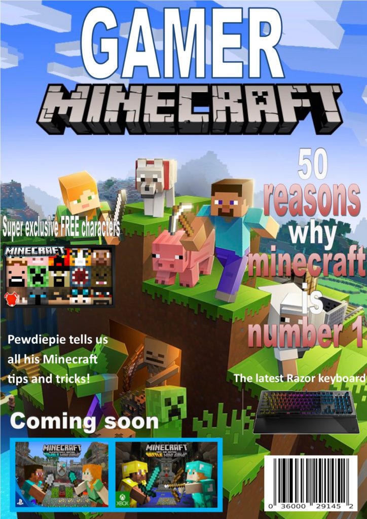
I decided to make the main colour theme of my magazine to be red and blue as they’re complementary colours and therefore the contrast makes my magazine stand out and catches the eye of the consumer. Blue is also the most popular favourite colour amongst young boys so I thought this would make them like the magazine even more.

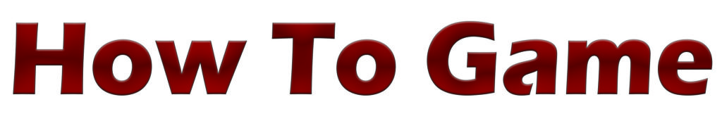
I made my title bold and big and used a block-like font which was quite simple and easy to read because I wanted my magazine to be clear and easy to understand without the trouble of reading fancy fonts; however I did add texture to my title so that it did draw some attention. I used the basic words ‘ how to game’ because i wanted the magazine title to be straight to the point so that my young audience knows exactly whats within the magazine and doesn’t get bored by too many words on the front page.

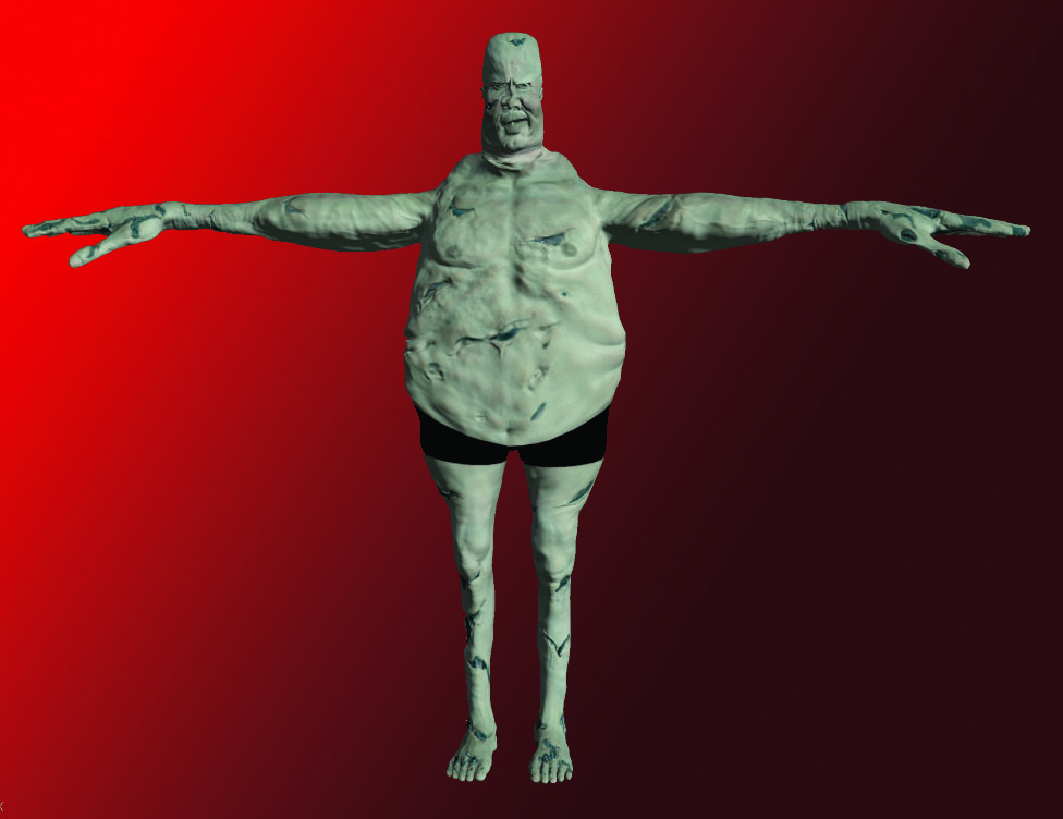
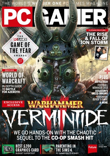
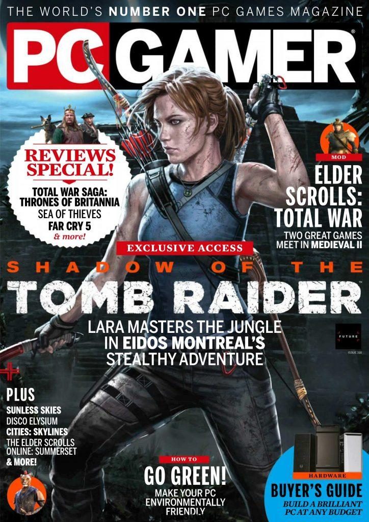
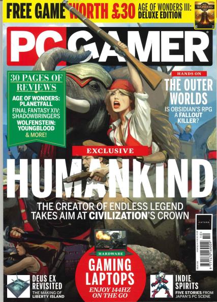
I have made one big main image in the middle and I tried to make a child friendly character with yet again the popular blue colour so that the young boys would be interested in playing the game. The blue contrasts the red and makes the character stand out and I’ve left white spaces around it because I don’t want my magazine to be too crowded and I’ve got my layout inspiration from a PC gamer magazine.

Around the sides I have added stickers and interesting facts and information about the magazine. My magazine has hard lines around the boarder and I have overlapped my headings on them because I wanted to bring them forward so that my reader instantly spots them and their importance is emphasised. I have used descriptive words such as ‘deadly, exclusive, free and new’ so that the reader is more prone to buy my magazine because they feel as if they’re gaining rare and exciting things from reading my magazine. Also the word ‘new’ would make parents more likely to buy the magazine for their sons since they’ll feel like they’re getting their moneys worth. Lastly. I used pronouns so that my reader feels as if my magazine is directed towards them and so that they feel like they’re part of something and included when reading this magazine.

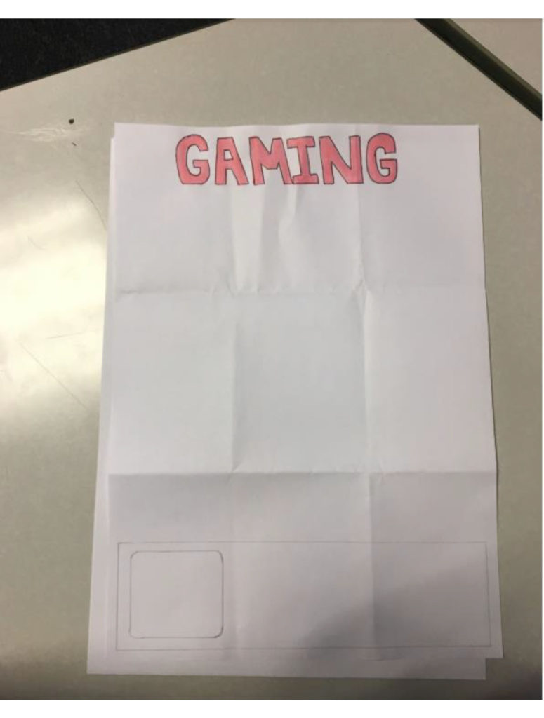
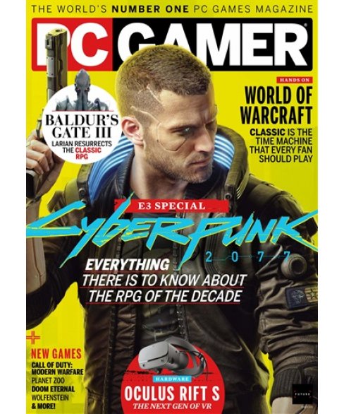
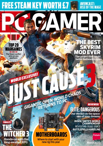
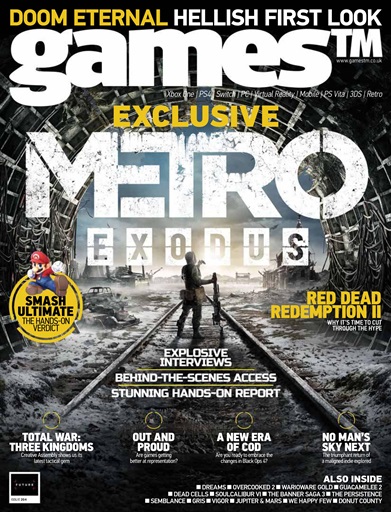
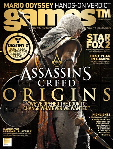
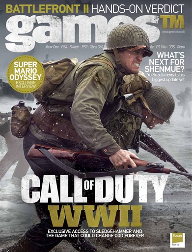
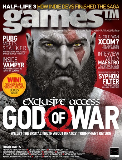
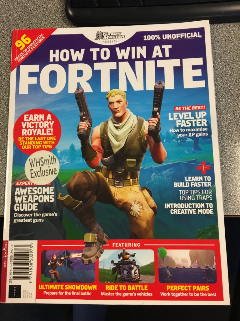
My inspiration magazines

Representation- My character follows dominant ideology and is reactionary because my main character is a male who is stereo typically the brave hero who saves the day.

Audience theory

Dominant- these are the people who agree with what my magazine is saying and they believe that gaming is fun. This would probably be younger males who enjoy gaming.

Op-positional- These are the people who completely disagree with my magazine and they think gaming sucks for example this could be adults or elderly people.

Negotiating- these are the people who are in the middle, they don’t think gaming is amazing but they also don’t hate it. This could be younger girls or boys who haven’t gamed before, these people are the people I’m trying to appeal to because they’re the ones who you want to persuade onto your side.

Magazine cover start

For my magazine I would like a big picture in the middle as the main focus, I’d also like one big main title at the top of the page. I want new upcoming games along the bottom with a bar code and along the side I want gaming news and smaller subheadings with pictures to intrigue the reader.

  • Ideal consumer
  • Male
  • Age 14/15
  • Is able to speak English
  • Interested in popular games
  • Has enough pocket money to buy a magazine
  • Games a lot and wants to get better
  • Stays up late gaming/ lots of gaming experience
  • Has wealthy parents
  • No siblings

Print Language

  • Image
  • Photograph
  • Caption
  • Illustration
  • Logo
  • Crop
  • Depth of field
  • Perspective
  • Shutter speed
  • Colour
  • Contrast
  • Texture
  • Setting
  • NVC
  • Text
  • Font type
  • Font size
  • Serif/ sans serif- with/ without
  • Colour
  • Italic/bold
  • Underline
  • Title banner
  • Heading
  • Subheading
  • Leading line
  • Tag-line
  • By line
  • Structuring/ sequencing
  • Institutional information
  • Adverts
  • Layout
  • Rule of 1/ 3rds
  • Blank/white space
  • Size
  • Position
  • Orphans
  • Widows
  • Gutters/borders
  • Juxtaposition
  • Hard lines
  • Graphic feature
  • Watermark
  • Drop cap
  • Columns
  • Paragraphs
  • Plugs/ ears
  • Page numbers
  • Date issue no.
  • Colour blocks
  • Gradient

Definitions

  1. Barthes-  he was a French literary theorist, philosopher, critic, and semiotician and he studied signs.
  2. Pierce- he created the idea of signs being iconic, indexical and symbolic. He was an American philosopher, mathematician, and scientist. 
  3. Saussure-  he was a Swiss linguist and semiotician. He theorized in language and the connections between their meanings associated with the language.
  4. Semiotics- the study of signs and symbols and their use or interpretation.
  5. Sign- an object, gesture or action that is used to convey information or an instruction.
  6. Signifier- a sign’s physical form (such as a sound, printed word, or image) as distinct from its meaning.
  7. Signified-  the meaning expressed by a sign.
  8. Icon- a person or thing regarded as a representative symbol
  9. Index- a sign or measure of something
  10. Symbol- a sign that represents or is associated with something
  11. Code- a system of words or figures or symbols that is used to represent something
  12. Dominant Signifier-  dominant meaning of a sign. 
  13. Anchorage- some signs hold down and fix meaning.
  14. Ideology- set of ideas or beliefs that people have regarding different. kinds of technologies. 
  15. Paradigm- a typical example of something.
  16. Syntagm- when a sign appears in a sequence, that creates a different meaning.
  17. Signifcation- making meaning.
  18. Denotation- the object.
  19. Connotation- an idea or feeling or meaning of the object.
  20. Myth- a story that has been made up that isn’t 100% true. 
  21. A radical text- a text that challenges a dominant ideology .
  22. A reactionary text. – a text that supports dominant ideology.

Summer task

For my gaming magazine I have decided to use a currently popular game for the main image because it is relevant and will interest lots if people since a lot of people are currently playing that game therefore they will be interested to find out what the magazine is about and they will be more likely to buy it. 

I then decided to make a really big and bold colorful title to catch the attention of the gamers, the big bright title will catch their eye and if the title is interesting then the buyers are more likely to notice this specific magazine and that makes them more prone to reading the title and becoming more interested in actually purchasing the magazine. I also decided to use complementary colours because that makes the writing and the writing stand out even more.

I also decided to use words like ‘you’ and ‘we’ to make the reader feel like this specific magazine was directed towards them and make them feel included in what this magazine is talking about and like they belong which I believe will make them want to buy the magazine more.

I then added a few different smaller images of different games around to add more of a variety because the reader may not be specifically interested in the main game I have put on the front; however they may be interested in one of the other games and this broadens the variety of readers and creates a bigger possibility of a reader finding something they are interested in and in general increases potential number of magazines sold.

I also made sure that the secondary pictures were in different sizes as I have made the currently more relevant games larger and the less relevant games smaller. I decided to do this because the larger the image the higher the potential of someone noticing it and if the game is more popular then theres a higher chance of the reader being interested. 

I have also put words like ‘free’ and ‘super exclusive’ because these words catch the readers eye and help sell the product because it makes them believe that they are gaining something more from buying this magazine and everyone loves free gifts and this may make their parents more likely to buy it because they’re getting a lot from this magazine. Also the word ‘exclusive’ makes them feel special and like they’re being let in on a very important and unknown new piece of information. 

I have added a few smaller subtitles with a few intriguing headings so that once the reader does hopefully pick up the magazine they have other things that they can look at and hopefully become interested in enough to actually buy the magazine. Also these subheadings give sneak peeks of whats in the magazine so they can determine wether they want to buy it.

I also put some advertisement on the magazine because if they buy the magazine and they see this they will know what to expect in future magazines and make them want to buy more and get excited for new things coming out. 

  • Iconic signs– looks like its object (e.g : camera work, sets and props)
  • sonic is the actual character
  • the yellow character
  • Indexical– a sign that links to its object (e.g : sounds, props)
  • ‘Boom’ is onomatopoeia and sounds like explosion
  • ‘new’ sticker
  • Symbolic– a sign that has a random link to its object (e.g : numbers, letters and colors)
  • the writing
  • the letters
  • the colors
  • the ‘£’
  • green eyes show he’s a good person
  • gold ring shapes= money