
Comparative Venn Diagram




Statement of intent
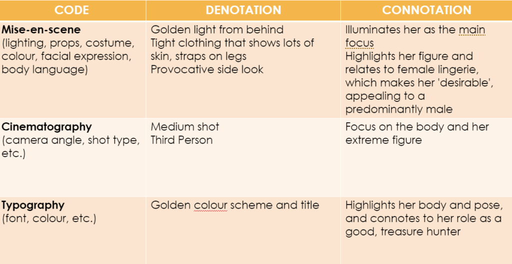
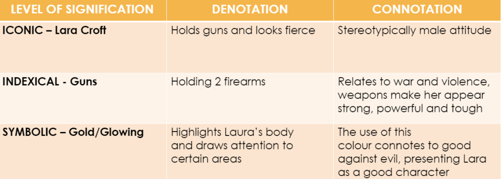
The target audience for my gaming magazines is aimed at teenagers, predominantly between age 13 and 16, interested in a range of different games. I chose the title ‘Gaming 100’ representing the 100 pages of my magazine, which allows this magazine to be inclusive to both boys and girls, with any genre of gaming interest.
My aim was to have a magazine that has something for all teenage gamer’s, and with that I chose an overall basic colour theme with black, white and red, but also included a soft yellow to add a brighter colour. I designed the ‘100’ of my masthead to have the two zeros as coins, similar to ones collected in various video games, to keep the design closely and clearly linked to gaming, and therefore recognisable to the reader. A sans-serif font was used to create an informal and relaxed look, suitable for a teen based magazine. I based the layout on a fortnite magazine cover I had found online, using the rule of thirds to help guide the reader around the cover, with a main image on the whole top half, but with the masthead slightly covered by the dominant signifier. However, the cover line is the most eye-catching as the bold black contrasts to the yellow background, whereas the masthead, supported by only half being clearly shown, fits into the background. Then on the bottom third, a gallery of 3 more images and captions to display some of the articles inside. I used extra puffs and plugs on the sides to include as much information about the pages found inside, to entice as many possible consumers.
I gave the magazine a reasonable price for a 100 page magazine, to be affordable and accessible to the younger teenage audience, who would mostly be middle class student, possibly with only a small pocket money allowance.



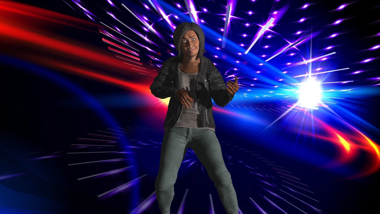


Notes:
Add a block colour behind the game reviews to add another segment
Redo the main image, remove the cat and edit man differently
Change the cover line accordingly
Change the background colour to a darker colour, possibly light grey
Pixelate the bottom left character more
Add a price in top or bottom left corner

This was my cover for my first thought design, but then i decided to rearrange and add plugs on the top half to be closer to my style model
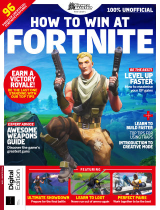
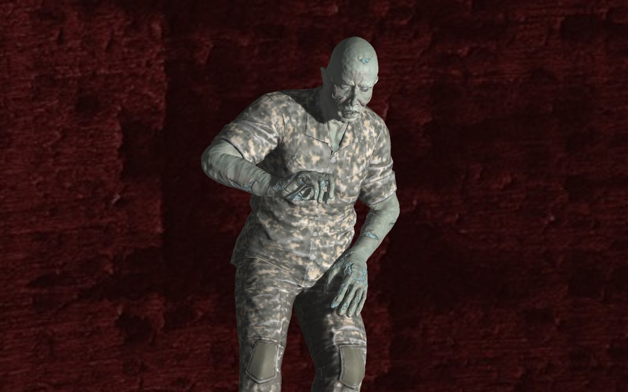
I have chosen to style my magazine cover similar to this Fortnite Magazine, as i liked the gallery display at the bottom of 3 different games, and will add this to my own design. I’m also going to include article plugs at the side with a red puff, as it it an effective way to reference multiple articles that will be in the magazine to interest the reader.



As a student she is currently a C1 , lower middle class as she is still learning and working towards her profession, but once she has graduated, she will become an Upper middle class, A grade citizen as a lawyer is a prestigious, high paying profession.
As a successful lawyer she would become an established middle class member, as she will be creating a good amount of money for her self and has a high grade of education.
She is a main streamer in terms of the 4 Cs, but depending on how her law degree results, she could become a succeeder, with good moral value
Age range – Demographic
Gender – Demographic
Social Class – Demographic
Race/Religion – Demographic
Lifestyles and aspiration – Psycho graphic
Tastes and interests – Psycho graphic