All posts by Orna O

Filters

Author:
Category:

Genders representation and the impacts on its consumers

In my essay, I am going to be talking about the stereotyping of genders and the negative mindsets it encourages. I am using two different forms of media to explain and expose the subliminal similarities these sources show. The sources I’m exposing today are the popular magazine “Men’s Health”, and the video game cover of “Tomb Raider. The topics I will be discussing “Men’s Health” are first specifically chosen dominant signifier and its fabricated dominant ideology, associated with male stereotypes. Also, I will be talking about the planned bold subtext and chosen primal colours, that are meant to attract certain audiences throughout men’s health magazine. I will then be interpreting and explaining why it can give off a negative mindset for its audience. Then I will be explaining how not just the title page is covered in subliminal messages that complies with Maslow’s audience theory. After that I will lead onto tomb raiders and the links with Men’s Health and Gauntlett’s audience theory, additionally I will mention about the protagonist on the front cover of Tomb Raider, and how it enforce opinions of objectifying women. After going over that, will finish with my conclusion of how the gender shown in media impacts its audience either in a positive matter or negative matter.

Beginning with the magazine known as “Men’s Health” and its meticulously, chosen layout of its front cover, the audience is first drawn to the dominant signifier of the male figure, on the centre of the page. The most noticeable feature in this image is his positioning and lighting effects on his muscles. The company has specifically directed his stance and the lighting to accentuate his biceps. The company’s reason for doing this would be to comply with the stereotypical male and the theme of the magazine. Subliminally stating in the image that a man is strong, cool, determined are all symbolic signs to add to the theme of the magazine to attract male audiences. This can impact audiences, psychologically, because it can set too high of a standard of living, and identity, which isn’t realistic for males to live up to. This dominant ideology of the stereotyped male is toxic and can damage the mental health of men excessively. By subliminally telling their male consumers, who may not have the appearance or presence of “coolness” that this image has, being anything different is supposedly bad, or won’t be liked by society. The company’s choice of representation and subliminal messages it can give off can refer to cultivation theory by George Gerbner based around his research on TV viewing. Explaining that with time and exposure to a certain opinion, can change the consumer’s thoughts unknowingly to fit the companies once radical ideas, into reactionary dominant ideology.

 Moving onto his chosen clothing of neutral colours of grey and black, further complies with the stereotype, held up to men. It’s considered normal for men to wear dark and bland colours since it helps make them look “cool”. Referring to colour psychology, colours influence perceptions that aren’t obvious, to display emotions, making things more favourable, more exciting, and are symbolic signs that can tell an audience who the magazine is for without saying it. For example, the colour pink in a magazine can mean its more of a girl magazine since it’s a stereotype that women are linked and love the colour pink. Focusing on the certain type of t-shirt he is wearing is important to notice he has short sleeves, tight around the tops of the arms but looser around the chest, and he has a v-neck to show more of his muscles off, without being too revealing. For male models, it’s quite radical to ever see a man in a crop top, or in sexualized positions used in women’s modelling because its classified as radical. I think instead someone should challenge the dominant ideology of the stereotypical men and women, so they aren’t so different and toxic. Why can’t women and men stereotypes, be more realistic, encouraging, and accepting? Giving off good motivation and messages when generations are influenced by them, instead of giving them something impossible to live up to. 

Looking back now at the text around the dominant signifier of the front page it’s noticeable to see many bold, blue coloured, subheadings, framing around the centre of the magazine. There are over 10 plugs used to attract certain audiences, uses of colour psychology and uses an example of a counter type and a universal sign, by using the colour blue saying its known that all boys like the colour blue, and are linked with the colour blue. This paradigm can all fall under the category of codes for the media, but on a more specific note, I want to focus on the plug that is called “SHORTCUTS TO T-SHIRT ARMS”.Furthermore, this phrase complies with the gender narrative and negotiated identity theory created by Swann of how the once agreed upon identity of let’s say a man’s arms being strong, is then set in stone to be a standard by all and therefore becomes the dominant ideology. With this phrase, I read further about the page it’s linked too and it talks about the exercises for his “blockbuster arms” with weight training. It then goes onto talk about how to “Fire Up Your Engines” by sprinting, but I’d like to point out the key language the writer used when writing of counter typing of having certain titles and subheadings in blue or having the background colour of a paragraph blue. Subliminally telling readers that this page is for boys. The use of targeted language, specifically pointing out to the reader about growth hormones and testosterone increase. Instead of mentioning other hormones like endorphins or dopamine which is less directed to male readers, they used the word testosterone and growth hormones because it makes the information more direct and desired to read since its set that men need a lot of it to be considered a real man. Secondly, the connotations and Anchorage on this page are the lighting bolt above the paragraph to signify energy, and energy with humans can be associated with exercise so that’s why it’s used. The use of Anchorage would be the bullet points used to make the information easier to read and to keep the interest of the reader. 

Elaboration the middle page I really only want to focus on the bottom left image with its speech bubble. The image is of the front cover protagonist named Diesel and the speech bubble says, “Diesel slant is one to aspire”. I want to go further into this phrase, since it’s a great example of subtle and subliminal control of consumers ideology. Why is something so pointless as a way of standing need to mean anything?, Why does the media chose to make a certain way of standing, something we need to worry about in our day to day lives. This just adds to the list of things we are expected to be and do and the theory explained by Gauntlett of constructed identity to convey specific ideas and values related to culture and identity in society.

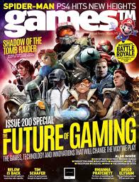
Talking more about Gauntlett Audiences theory, Gauntlett’s theory can relate to the video game Tomb Raider, new and old version. On the front cover of the newer Tomb Raider, the shape of the main character Lara croft complies with the theory of constructed identity and reality. You can see this because developers created Lara Croft in a specific way for her to be more desired. Which also links to the stereotype built for women and how women should be thin which links with the identity part of Gauntlett’s theory. By her having an unrealistic but desirable shape their game is therefore more desired by the public. Since first, the hourglass shape is sexualized for women and have been known to be more wanted by the male audience from generations and generations idea of the ideal woman. To the female audience the image of Lara croft can give an impression of how they should look, and that’s again theory of constructed identity. Furthermore the different audiences that are showed this game can be put into categories, just like in Stuart Hall’s Audience Theory of preferred reading. Were you can have an audience love the character design for its sexual nature for instance the majority of male audiences. Then the negotiated audience, who are indecisive about the character design, possibly contemplating if they agree with the characters subliminal message or not, this could be some women or girl gamers who fall into the trap of constructed reality. Finally the oppositional audience, these types of gamers would reject the character design completely, for its message and the constructed reality it implies.

With this in mind, another noticeable thing about Lara Croft’s character is how her pose, and clothing are clear examples of objectifying women. Starting with her pose, Lara Croft is facing left with her face turned to face the front of the cover, this is done because then her butt is in frame plus her hourglass shape can be more noticeably recognised. Why is this allowed and normalized in society? Allowing covers to pose women specifically, just for the benefit of attracting audience by appealing to sexual aesthetic. Tomb raider is one of the first games with a female protagonist which I can see as a positive action done by the developers, but the way they have displayed her character is engunuin since on the one hand, it’s promoting female protagonist, but then on the other hand the cover has subliminal messages behind the character to make her more desired by sexualizing her.

In conclusion I think that media platforms such as Tomb Raider and Men’s Health use what I would consider, quite harsh and terrible ways to control their audiences, by impacting and controlling consumers confidence desires, and anxieties. I think that this contributes to bad mental health being formed, just so media platforms can sell their products.

the language of moving images

Technical CodeDenotation (ie what is it – simply describe what you see / hear)Connotation (ie what does it signify what’s the meaning behind it)
Settinga New York hotel room, 2 friends enter then open a suit case whole set changes and is ” bossed up” (glittered up and new sound affects/music is added)as the bland room changes into a brand new room it shows the world transforms when the product is applied
ClothingNeutral coloured clothing to start of with then after being bossed up clothes change to golden black and sparkle.this shows again the transformation the product creates
NVCThe gestures and body language are done through out the video to show how amazing everything is body language first displayed is exaggerated to show emotions of happiness and excitement then after they are bossed up they use stances that are considered powerful, strong and cool. To show the audience that it wasn’t just a physical change it was a mental change in confidence.
Dialogueusing unnatural conversations promoting the product then using slang for the slogan and for the advert.convo used for promoting the product and using slang for the slogan then used for the advert suits easier for audiences to remember them.
Sound Effectsound affects of subtle music beat under the characters voice, leading up to when they get bossed up the music increases and lots of sparkling and shinning sounds are used the sound affects used are subtle music beat under the characters voice so the music is in the whole video and doesnt come in randomly in the video and as they get bossed up the music increases into a climax and lots of sparkling and shinning sounds used to emphasise the products desire by the viewer, explaining how the product is life changing.
Musicdrum beat with dubstep leading the transformation of being “bossed up”simple beat to get stuck in audiences heads so the advert becomes more rememberable because its easier to remember tunes over dialoge
Camera shot sizeslow-motion skills are used plus different camera cuts for different angles and frames of time in seconds this is done to make the product look more interesting and to show how life change the product is
Camera movementslow horizontal smooth moving camera around the room plus the rise and fall after the suitcase is opened
this is done to make the product look more interesting and to show how life change the product is like its entering a new world when using the product
Editingcamera cuts are used quite a bit to jump from frames showing the product isn’t just bossing up the actors but bossing up the world(set)this again shows us about the transformation the product supposedly creates

definitions II

Positive and negative stereotypes- A stereotype is a mistaken idea or belief many people have about a thing or group that is based upon how they look on the outside, which may be untrue or only partly true. Stereotyping people is a type of prejudice because what is on the outside is a small part of who a person is.

• Counter-types-The definition of a counter type is a positive stereotype and emphasizes the positive features about a person. An example of a counter type is that all religious people are kind.

• Misrepresentation-Something that misrepresents an idea, situation, or opinion, or the fact of a subject or person.

Selective representation-Selective representation is when media sources specifically present a certain type of person, place, or object to influence and proclaim there opinions.

• Dominant ideology-Dominant ideology is reactionary text meaning its classifies certain things as “normal”, and is what the majority of people in the world agree on as normal.

• Constructed reality-When a media source creates there on ideal reality which isn’t the same as our own that the audience can crave.

• Hegemony-media hegemony means the dominance of certain aspects of life and thought by the penetration of a dominant culture and its values into social life.

• Audience positioning-Audience positioning concerns the relationship between the text and the responses an audience may have to that text. The producers encode the texts with signs and messages and the audience decode these messages.

Fluidity of identity-Explains that identity isn’t fixed but dynamic and can change at any time.


• Constructed identity
-Is the dominant ideology and concept of how people should act.


Negotiated identity-Refers to an individual’s multifaceted identities of cultural, ethnic, religious, social class, gender, sexual orientation, professional, family/relational role


Collective identity– the identity of a group

STATEMENT OF INTENT

This image has an empty alt attribute; its file name is blue-1-693x1024.jpg

Representation

Asking the question if my games cover is radical, or reactionary. Does my cover goes with the dominant ideology of video game covers, or if does go against them?

I would personally say my cover is radical. my reasoning behind my opinion is;

Firstly the layout, in usually gaming magazines would place their main character as their dominant signifier, on the front cover with no other side characters. (Unless they were important to the story AKA sidekick, or were other protagonists form other video games the magazine is covering). In my cover I have 8 characters in view, so who’s to say who the main character is? There is no big dominant signifier besides the positioning of one blue characters being at the front of the v formation.

references for layout and design for the front magazines

formation ideas characters
style ideas of characters
video games outfit ideas

back story for video game

I changed my rough idea for my front cover to this new updated gaming cover about a game I created called “Oakvalley”. It’s a story driven, adventure mystery game. The lead character is College dropout blue who returns home to the crumbling former gold mining town of Oakvally seeking to resume his aimless former life and reconnect with the friends he left behind. But things aren’t the same. Home seems different now and his friends have grown and changed. Leaves are falling and the wind is growing colder. Strange things are happening as the light fades. And a town secret is about to be revealed.

layout

Describing what I have done for my layout is; firstly I created a dominant signifer of the title of the game and the master head at the top of the cover. I chose the layout of the subheadings and text to fit around the main image so it wouldn’t take away the focus of the main character. When consumers looked at my magazine I tried to put into consideration was how the front cover should feel to the consumer. My plan was to make it intrigue the viewer by give a sense of dramatic mystery.

Relating to “Applying Theory Of Audience”, my magazine would relate to the Struggler’s who have the need to escape from reality, which can be achieved in story arch video games. Since storyline video games help relate to gamers, and give a sense of joy playing.

I planned to layout my characters for “Oakvalley” in a “V” formation since I wanted to make the main character stand out the most, to show the importance of the character. I plan for the size of the magazine to be A4 since I don’t want to stretch my characters too much or have too much free space on the front cover. The advantages of keeping it A4 are; it is a suitable size to carry around, either by hand or in bags. Also if I planned to make the magazine anything bigger than A4, for example A3, it would be significantly heaver which is something I don’t want because I want my magazine to be a light weight and appealing magazine.

Brief About Magazine

this magazine is going to be themed around mystery/adventure video games with hand drawn cartoons done by me

Next Step Forward

I am going to next upload my sketch to photoshop and use it as a background layer to draw on top. I will try to make a lot of different layers for the characters so I’m able to change scales of clothing or accessories

APPLYING THEORY: AUDIENCE

Looking at Maslows hierarchy of needs, my cover and game relates most to the loving belongs, and self-actualization levels in Maslow’s triangle. I think this because, when it comes to storyline games people can build real connections with the characters. So the way the characters are designed and written can give a sense of belonging or love. From the audience having a specific character that they can relate to and adore will help build up a loyalty of the audience. A story game could relate to the self-actualisation level since a certain games plot, could relate to someones home life on a basic or on a deeper level. It’s the same when an audience can relate to a certain character. It can make them feel more invested in the game, since it can help them feel less alone because the character might imitate the audiences feelings or emotions. So this all leads to a person having a subconscious connection to the game and make it more appealing.

double page spread

This image has an empty alt attribute; its file name is Untitled-1-5-1024x534.jpg

For my double page I want to theme it around the murder mystery games with using inspiration from video games like; bendy and the ink machine, little Misfortune, Fran bow, sally face. by inspiration I mean there art styles/ settings that I can use as backgrounds. I plan to use “Adobe photoshop” to create the double page spread of a landscape sensory that I have edited to give it a more cartoony style. I added my characters on top of the background so the page would have a better connection with the game instead of just being a landscape background. I drew plane with little “blue” characters in them to link to the main character and then scattered other side characters around the environment but placing them in place they would still be spotted and noticed. as a finishing touch on the double page I added orange boarders that were 1 cm each since I felt the page felt like it wasn’t fit for the frame but by adding the visual blocks the page looks a lot more together and fixed. If I was to improve my double page I would have chosen a different topic to talk about on the page, plus more subheadings about different topics in the game instead of just the backstory of the game. since I feel the long paragraphs make the page look less interesting to read and pay attention. unlike if it had shorter snap paragraphs about different sections of the game to keep the audiences attention.

Contents Page

This image has an empty alt attribute; its file name is sdfghj-1-819x1024.jpg

For my contents page I plan to use one of my references video game pages, for the layout designs. I personally liked the contents page that had the icons of the certain games linking to the page I thought it was a good technique to interest audiences more into buying the magazine as they can see small preview of what the magazine in-tales. I’m going to be using Photoshop to draw all the contents page images, possibly creating the icons to link with the reference content pages. background ideas for the page and I might use “Adobe indesign” for their text breaks and formal styles for their bios. I want the magazine to have the running theme of what age it’s directed to(audience theory). I want the pages text to be more round/soft but bold as well, giving a comic book vibe fitting with the gaming magazine.

I ended up creating my own little scene for the page linking to my video game “OakVally” from the from cover. I placed a character on the page in the same art style as the from cover so it was a noticeable linkage. as well by giving the character pilot goggles and a scarf like the main character has on the front cover. I referenced my colour palette to my double page by using much warmer colours like oranges, yellows and reds.

This image has an empty alt attribute; its file name is blue-1-693x1024.jpg