VENN DIAGRAM

| POINT | EVIDENCE | CONCLUSION |
| Challenges dominant ideology and common beliefs. | Shows a women holding a gun “Says something about the how we see women in pop culture and society. “ “Strength and intelligence knows how to use more weapons then most military personnel” | – We believe she challenges dominant ideology as she is challenging stereotypical men who a more dominant than women – she’s strength and power thought the photo and her body language the colour yellow is associated with energy, this represents the women’s power COUNTER ARGUMENT However we believe it could be reactionary as the creator Toby Gard intended in making the games protagonist a female this is a meaning of something as on the article it states the plan as to make her similar to Indiana jones however due to law suits they had to change their plans and that how Lara Croft was made. The way she’s positioned on the front cover, showing her behind and enhanced graphic features. Female characters are portrayed in this way to draw in straight Christian male audience. |
| Gamers were used to seeing women play the role a victim, seductress, or evil villains. | Males playing female protagonist were mostly unheard of Women were often portrayed as the weaker and inferior, however here, she is portrayed as the saviour and hero | Shows it challenges the dominant ideology, because she is presented heroically |
Media Statement of Intent
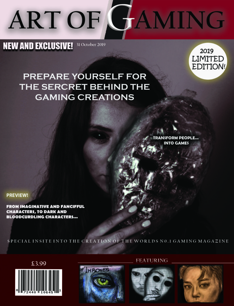
To start creating my media front cover, I researched some magazine where I could get inspiration from and get an idea for my own front cover. I managed to gather a couple magazine front covers, and I choose one to use as an interpretation, which is this one shown here.
I have called it art of gaming as my magazine front cover is about the creation of gaming, which shows behind the scenes of how to create gaming characters. It is based around the theme horror, so, I would say my audience is mainly for people who like horror and scary gaming magazines.
Firstly, I gathered some of my drawings I used from my previous magazine cover, so I could add them into this current one. I made sure I had at least four images for my front cover.
To start with, I opened up Photoshop and started creating my title and masthead. I used the colours red and black as I feel that these colour create a dark, cold and eerie atmosphere, as the colour black is associated with power, fear and mystery. It can also be associated with authority, I have chosen this colour as I feel that my magazine front cover could have authority over other magazine covers that are seen as competitors. As the colour red is associated with fire, blood and strength, I feel that it’s a good colour theme to use for this specific gaming magazine cover, as it is based around the theme horror.
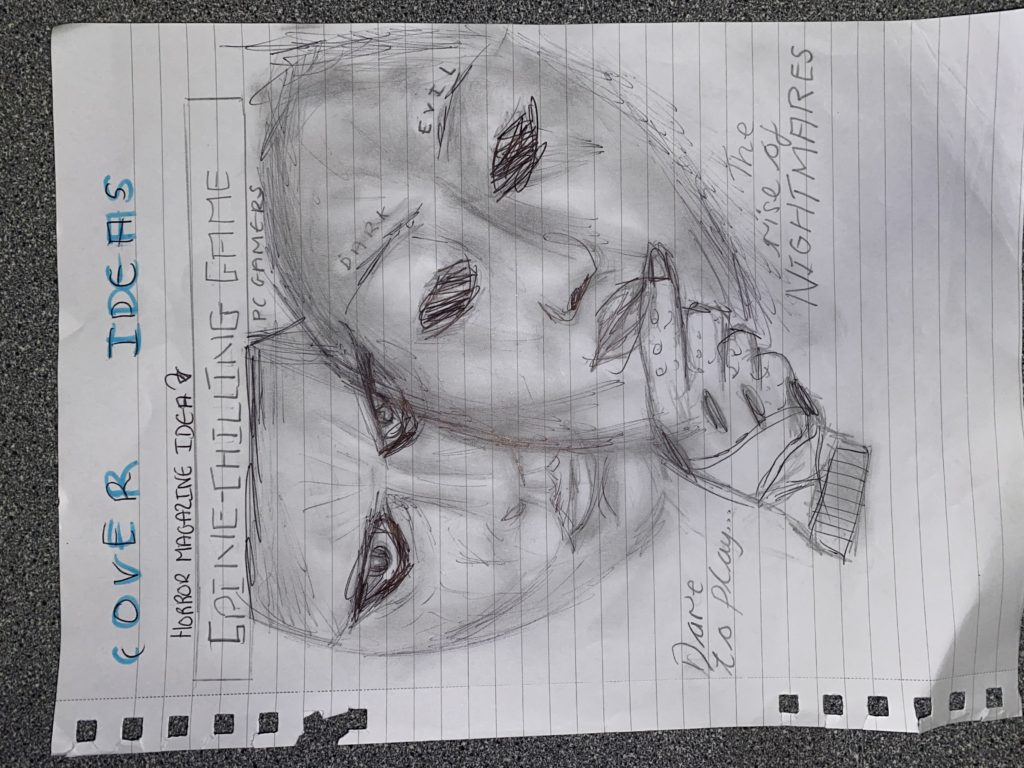
Next, I added my background photo, which is the girl holding the mask. I have chosen to do this as I feel like it brings attention to my cover, is it looks quite sinister and spooky.to make it more sinister looking, I photoshoped the face, by simply adding contour to darken areas of the face. I also photoshopped the eyes black, as it thought it finished the look. From my research, I saw I magazine cover which really intrigued me, so it inspired me to add a mask in with the photoshoot. (I made this mask using cling film and cello tape.( This item made my front cover stand out more as it looks creepy and gives more of sinister atmosphere.
At the bottom of my front cover, I added in plugs, to show what was inside the magazine. I set out three images, which I have hand drawn myself. I decided to hand draw these, as I feel it gives my creation and imagination to the whole aspect of the front cover. Furthermore, as my magazine is about the art of gaming, I feel like drawing my images was a good idea. I have drawn two menacing pictures, which will be showing how to create scaring characters from drawings, and the other image of a person, which will be showing how to create gaming characters from drawing people. Before putting these photos on to my magazine, I edited them in Photoshop to make them more eye catching and outstanding. For example, for the middle image in the plug section, I added more tints of black, and contoured around the drawing similar to how I edited my main image.
I have added some text, for example, “new and exclusive”. I have added this to intrigue customers into buying my magazine as it is one of my selling lines. Another selling line I have added is “limited edition”. This is a good idea to put into my cover as it shows that it’s a special magazine.
The reason I have chosen the price to be £3.99, is because that is the average selling price of a magazine. Also, I didn’t want it to be too expensive as I didn’t want people not to afford it. Furthermore, my audience isn’t specifically for young children, due to the sinister and menacing games theme, so there’s I didn’t want to lower the price, as my target audience is for older people who like horror, and they are more likely to afford it then a child.
REPRESENTATION: I would say that my front cover is radical and reactionary. Firstly, i think its radical as i believe that it is a unique gaming magazine, as it doesn’t advertise actual games, it focuses on the art of games, and how they are made. So, people are intrigues by the concept of not actually being games, but the actual art and creativity within it. On the other hand i think its reactionary because it supports the dominant ideology of the theme horror, due to the creepy features I have involved, such as the mask. In my opinion, I think that girls are always seen as the dominant figure in horror movies, however, in horror games, i feel that males are the dominant figures. So when people realize its a horror gamers front cover magazine, it turns from reactionary to radical.
AUDIENCE THEORY: George Gerbner theory of cultivation says that “Cultivation theory suggests that repeated exposure to television over time can subtly ‘cultivates’ viewers’ perceptions of reality.” In my magazine cover, i feel that my message to society/customers/people is that games have a very creative world of art, and that it need to be appreciated more.
following the concept of art of gaming, I believe that my intended message, which is that people need to perceive and value gaming more as art and creativity, not just playing a game for entertaining, i feel that my dominant audience would be mainly people who has an interest in art and people who have a very creative personality.

M

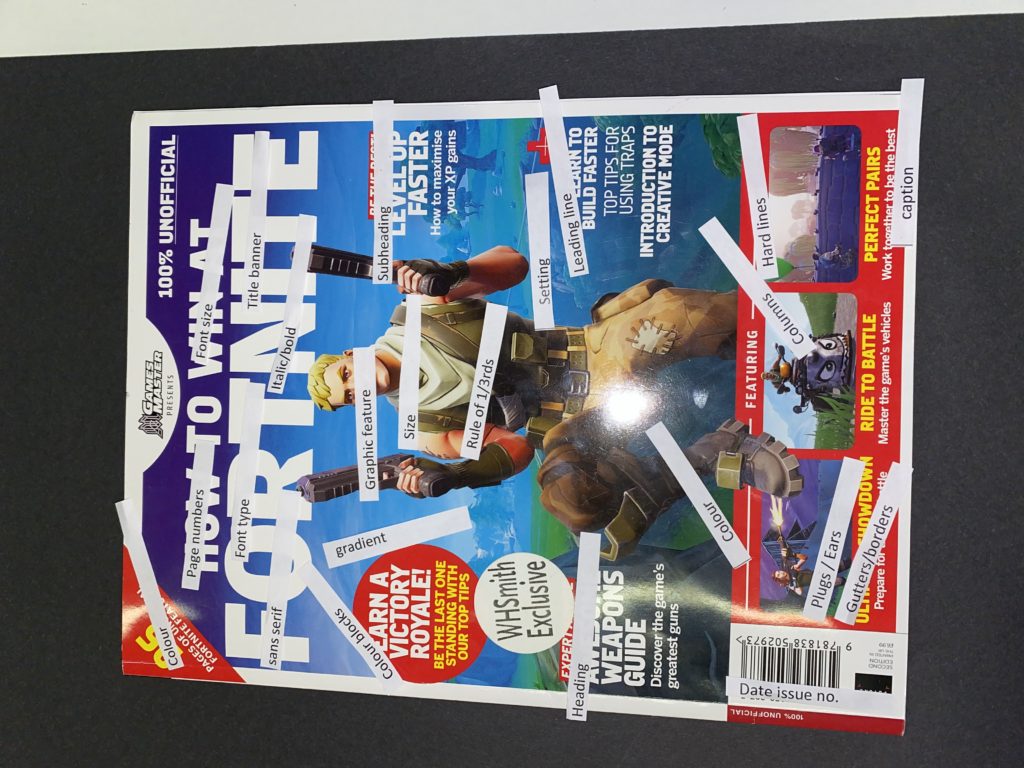
I have started my front cover by planning how Id create the cover. I created this all from hand drawing. Through my creative skills, I wanted to use them to design a colorful and eye-catching piece of work. I decided to draw Game of Thrones, as it would interest the older generation, as it is a very popular tv series at the moment. I would say it relates to gaming due to the title “Game of Thrones”. Furthermore, they have made Game of Thrones XBOX games for people to play. I think this was I good idea to put on my poster, as this PlayStation game is quite thrilling and exciting for many people. Also, having the dark colors can give a sense of evilness and spookiness, which can intrigue people who have an interest in eerie games. However, with having the dull colors from the drawing of the night king, it could possibly give an idea that the game is quite boring, yet it depends on how people view things.
I have also decided to draw the PlayStation game Avatar. In my opinion, this was a good idea as the characters have unique colors and features, therefore having the characters displayed on the front cover of a gaming magazine can be really outstanding and attractive. With the bold, bright colors of the blue and purple, it gives off a tranquil atmosphere.
I think the contrast of the grey, dark colors and the bright blue colors make the magazine front cover more interesting to look at, as the front cover page isn’t just full of bright colors, there is various colors of bright and dark.
I would say the Game of Thornes game is aimed towards adults, due to the graphics of the game and the fighting involved. However, on the other hand, for the Avatar game, I would say that it is more aimed towards the younger generation, as it is more fanciful and pg.
In my opinion, I think that the strongest areas of my magazine front cover is the Avatar drawing. I feel that it stands out the most, with its bright mix of blue and purple colors. Due to the characters in the Avatar game looking unique and bizarre (aliens) I would think that this would fascinate people and intrigue them into purchasing the magazine, as they may want to know more about it.
I have chosen to write words that best describe the games, e.g. for the Game of Thornes game, I have written ‘rivalry’ ‘powerful’ ‘medieval’ etc. This advertises the game being deadly and violent. On the other hand, for the game Avatar, I have written a description besides the picture, and I have enhanced the main words, such as ‘hero’ ‘epic’ and ‘beyond imagination’. This gives the reader an idea about what the game is, and how it is a very imaginative game full of fantasies.