- About a family going on holiday but they lose their son.
- It is an example of cooperation between the BBC, STARZ (USA) and the Belgian government’s Tax Shelter scheme.
- It is the BBC’s response to the success of ITV’s ‘Broadchurch’.
- It written by brothers Harry and Jack Williams.
- The first episode aired on October 28, 2014.
- The last episode was aired November 30, 2016.
- There are two series.
- There are 16 episodes.
All posts by Millie F
Filters
theories (narrative)
| Theorist | What does it mean (in your own words) | How does it apply to the advert (in your own words) |
| Equilibrium | Every story has an exposition, conflict and resolution or beginning, middle and end. | They begin with plain clothes, the bell boy brings in the product and they are transformed. |
| Binary Opposition | A pair of related concepts that are complete opposites like good and bad. | Male and female, straight and gay, white and black, New York and somewhere less glamorous |
| Character Types | Stock characters that audiences recognize from other narratives like the hero, the villain, a princess, the father etc. | The mascara is the hero as it transformed , the villain is other makeup brands, the two influencers are the princes as they got saved. |
language of moving image
| Technical Code | Denotation (ie what is it – simply describe what you see / hear) | Connotation (ie what does it signify) |
| Setting | New York hotel room | Metropolitan, busy, wealthy |
| Clothing | Begins in casual, plain clothes, turns into gold | This mascara will make you rich and wealthy |
| NVC | Wink at the camera, bell boy has a smug expression & shrugs | Like they know something, as if he knew what was going to happen |
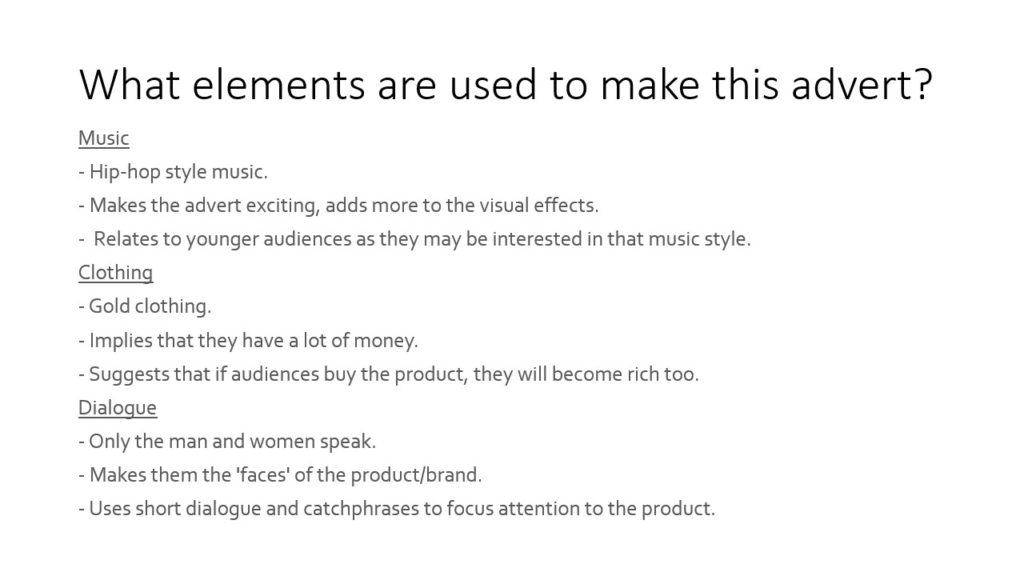
| Dialogue | “Bossed up.” | ‘Bosses’ are considered powerful and in charge |
| Sound Effect | Twinkle noise | Magic, transformation |
| Music | Hip-hop style, upbeat | Relates to younger audiences, captures attention |
| Camera shot size | Wide shots | Promotes product |
| Camera movement | Zooms in and out | Creates a focus on the product |
| Editing | Transition from plain to gold |
csp 3 – maybelline advert analysis

essay – compare gender in men’s health & tomb raider
- Plan:
- Introduction
- p 1 = men’s health analysis – flour, colours
- p 2 = tomb raider analysis – pointy nose, nails
- p 3 = comparison, differences = gender, Lara is real similarities = both have a person as the main focus
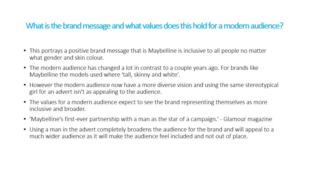
The Men’s Health magazine cover and the Tomb Raider game cover both represent gender in a different way. I believe both are mainly radical texts but with a hint of reactionary to help sell the product. Exploring this idea will broaden how the media uses audience theory to almost brainwash the public by either confirming or disagreeing with their opinion. In addition, I’ll be referring to an article which analyses Lara Croft and her evolution to cement my argument.
This cover of ‘Men’s Health’ represents how the male gender can alter their bodies to look more desirable, like Vin Diesel who is the focus point of the cover. He also appears in the contents page, which could show the reader that he has the perfect male form. The contents page features varying signs which are connotations of this being a radical text, the clearest being the words “Flour Power” placed in the right column. It plays on the phrase ‘flower power’ which is ironic due to flowers usually being associated with women and softer objects. Irony is also present as Vin Diesel, again the most prominent aspect, is presented to be the opposite of soft, emphasised by his visible muscles and stern face. Additionally, this could be a pun of the idea of carbohydrates being a healthy source of gaining muscle, once more relating to the celebrity occupying each page. Secondly, the choice of colours can be considered radical as it is quite plain with small accents of pink, yellow and blue. These lighter shades are generally connected with innocence and not a manly nature, therefore challenging the dominant ideology of male colours being dark blue, balck etc. In relation, going back the front cover, a lot of blue is presented which could suggest that this text is reactionary. Blue is typically masculine, often symbolising abstract ideas like trust, confidence and intelligence. It is as if the editors are trying to persuade the reader that if they buy the magazine or follow the advice given inside, they will become more trustworthy, confident and wise. This could be translated to cultivation theory as if someone already believed that all men should look like the male celebrities on the cover of magazines, their opinion will be reenforced as over time more magazines will be published with similar looking people on them.
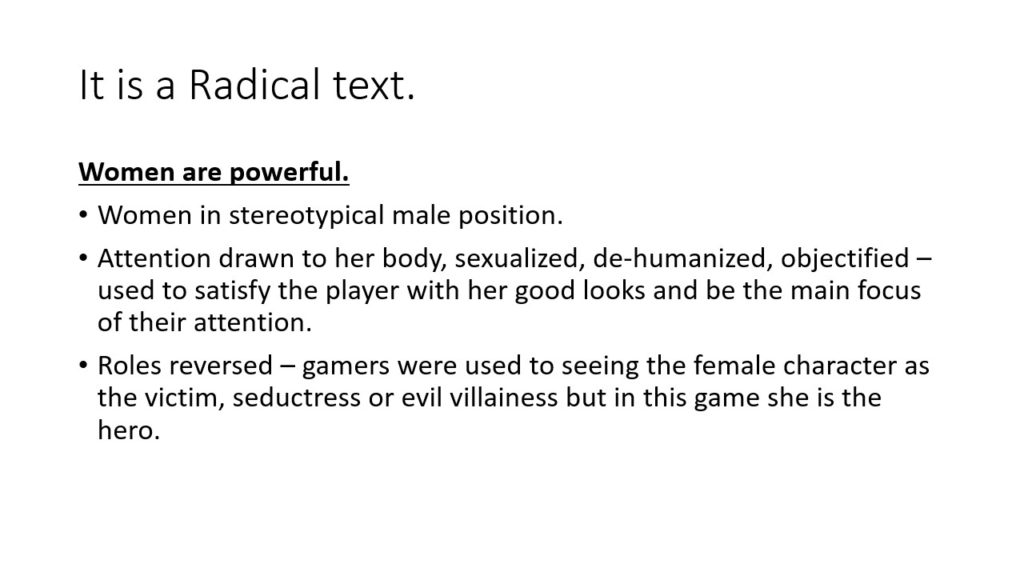
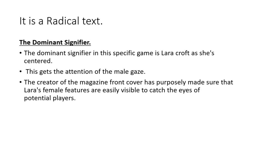
The Tomb Raider cover can be considered a radical text as the dominant signifier of Lara Croft is the focus of the cover, more specifically, her body is. This is clearly radical due to her unrealistic shape and the fact that her female features are easily visible, catching the attention the the male gaze which sexualises and dehumanises her. Also, Lara is in a stereotypical male position, playing the hero instead of a victim, emphasised by her gun which has connotations of death. Women are not usually perceived to be dangerous, but more delicate, providing more evidence that this is radical. A more subtle way that the creators represented this would be through her pointed nose and sharp nails. The essence of emphasised femininity is apparent, resulting in connotations of this character being piercing and fierce. On the other hand, this could be reactionary as with the rise of the internet, the idea of females bodies being shown is less taboo than before. The Lara Croft article paints a mostly positive view of the character, evidently in the quote “empowering a generation of women”. However, it also states that her creator “avoided hypersexualized… character traits” with the goal to “keep her realistic” which serves a sense of irony. The realism aspect is instantly lost when the audience even glances at the cover. Her abnormally large female features anchor the idea of all women looking, or wanting to look like her which is a myth. This relates to reception theory as the intended message of Lara Croft’s figure being realistic can be opposed, agreed with or negotiated.
The similarities of both texts would be that both the magazine and game cover have a person as the centre. This possibly lures people to buy as they are both visually appealing and not drastically different from another magazine or game box. Simultaneously, it allows familiariality and is regonconisability to regular readers.
The difference of both texts lie in the gender choice. It makes sense that a man is on the front cover of a ‘Men’s Health’ magazine and a women, although horribly altered, is the focal point to a franchise which is based around her. However, the most interesting fact about the choice of CSP’s is that Lara is a video game character – she’s not real. This appeals to the male fantasy as it creates an image of a woman that does not reflect real life whereas Vin Diesel, although he may not be the typical form for all men, does not construct a false ideology.
To conclude, I believe ‘Men’s Health’ magazine and the ‘Tomb Raider’ game box are radical texts although they both have small elements of reactionary. The idea of gender can be a somewhat abstract concept which these publishers seem to not take into account. Instead they presents males and females in which can be considered unrealistic.
definitions – identity
- Positive and negative stereotypes – Good or bad overgeneralization of a person or thing.
- Counter-types – Something that opposes or contrasts with something else.
- Misrepresentation – An incorrect, false or misleading representation of one’s character or an object possibly with an intent to deceive.
- Selective representation – Choosing to show only some parts of a bigger image or issue.
- Dominant ideology – A bigger idea, reason or image that everyone accepts.
- Constructed reality – The idea that the way we present ourselves is shaped by our reactions to experiences and occurrences / A world made by media.
- Hegemony – Dominance or authority over someone or something.
- Audience positioning – Putting the audience in a place that prevents them from expressing their own opinion.
David Gauntlett:
• Fluidity of identity – The flexibility of the gender spectrum.
• Constructed identity – How we learn about our own identity through interactions with others.
• Collective identity – A person’s sense of belonging to a group.
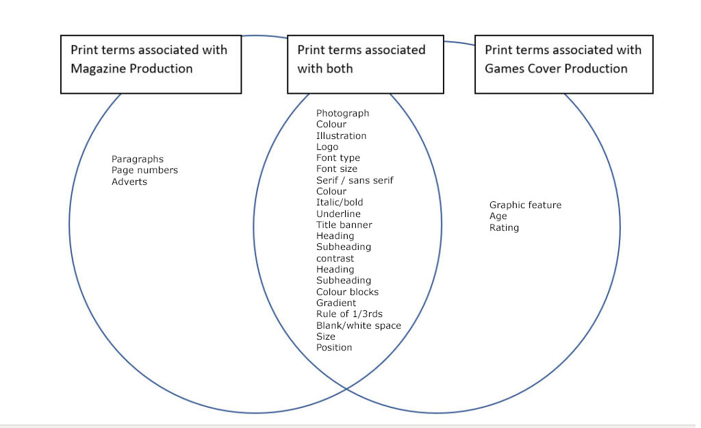
venn diagram 4 print lang
csp 1 – tomb raider cover analysis

character LMAOOOOOOOO
nea initial idea for some reason lol

For my cover, I want a title presented in an stylish way, a game character or person to be the central focus with writing along the side and the bottom. Also include a barcode and the price at the bottom. Maybe a triangle at the top left corner telling the reader how new the magazine is.
My ideal audience would be a young adult male in his twenties. He would speak English and be wealthy due to his parents. This means that he has access to the latest new consoles and games. Also it would mean he is quite posh, classy and plays games in an elaborate way. Because of this, he would be interested in gaming books and upper-class, expensive magazines.