All posts by Megan B

Filters

Author:
Category:

Statement of intent + magazine

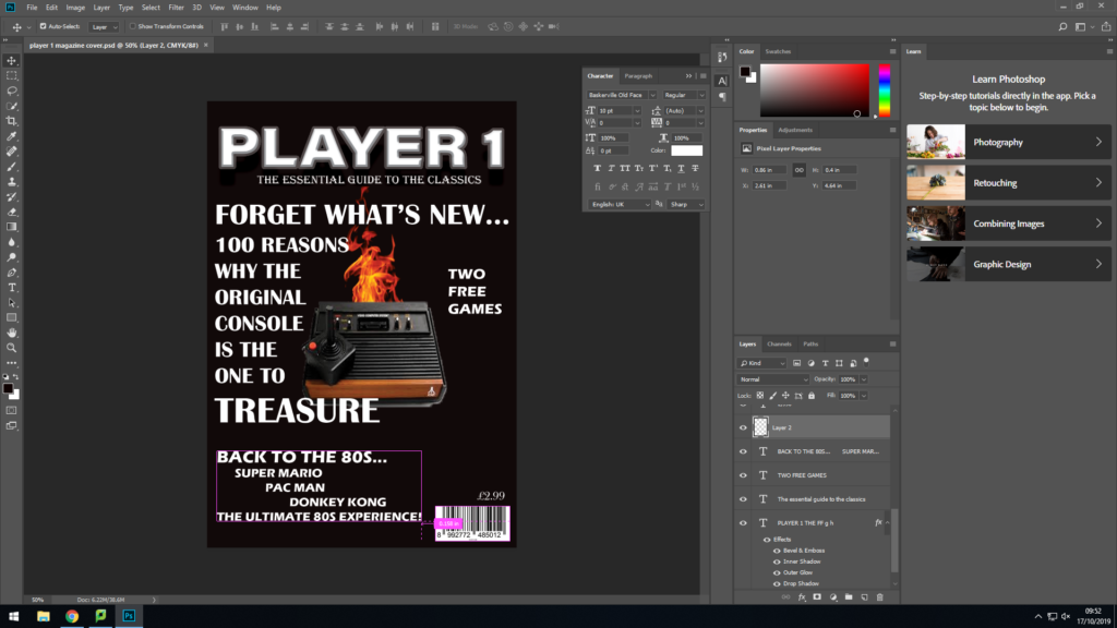
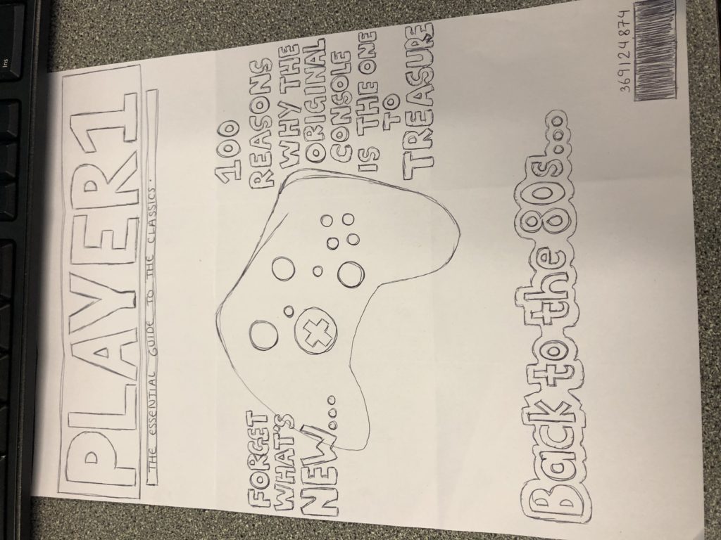
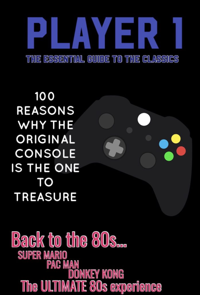
I have chosen to call my gaming magazine ‘Player 1’. I got the inspiration from the magazine ‘Retro Gamer,’ and chose to follow a similar layout. I have designed my masthead in a bold font and included a shadow on the text to emphasize its importance on the cover. The byline reads ‘THE ULTIMATE GUIDE TO THE CLASSICS.’ Again, I got the idea for this byline from the magazine “Retro Gamer” which reads something similar.

The dominant signifier on my cover is the main image, which is an original game console. This connotes the idea that my magazine cover (and inside pages) have a theme of nostalgia. I also added fire to the background of the main image sparking out of the console, to draw the readership’s attention to the main image and to signify its importance.

The text around the dominant signifier reads “100 REASONS WHY THE ORIGINAL CONSOLE IS THE ONE TO TREASURE.” This again adds to the nostalgic sense. Focusing on the target audience, I have made it clear that the cover is aimed at those who experienced 80s gaming as my text reads “Back to the 80s.” This signifies that predominant readership will be adults in their 30s/40s.

I have incorporated a puff into my cover, in order to persuade my target audience to obtain an interest on what features there are inside.

As a whole, I chose not to bombard my magazine cover with too many codes and conventions in order to gain my receivers full attention. As the predominant target audience are adults, I decided not to fill the cover with bright images and symbols. Therefore, I focused on more copy and one principal image (along with the fire background) that links to the whole retro concept of the magazine.

Compare the representation of gender in both men’s health and tomb raider


In this essay I am going to compare and discuss the representations of gender in both Men’s Health and Tomb Raider and how the purposes behind them are strikingly different. 

Firstly, on the cover of Tomb Raider, Lara Croft is the dominant signifier. She appears multiple times on the cover to show that she is the convention with the most importance. Her clothing, physique and positioning all add to the reason why she holds a lot of attention. She has been designed wearing petite shorts, a chest almost double the size of her waist and placed on the cover looking over her shoulder – a pose sometimes associated with being provocative. She is also standing unnaturally so that both her chest and bottom are visible for the targeted viewers. This introduces the first theme of Lara’s character being heavily sexualised. Leading on from this, the target audience surrounding Tomb Raider is predominantly (and stereo-typically) male, adding to the reasons why she has been designed to appear this sexually. This is due to the fact that male stereotypes would be just as interested in her body as they would the magazine/game. In contrast to the character’s sexualisation, Lara Croft has been designed with some features to represent a sense of masculinity. Firstly her clothing is green and brown, stereo-typically not very feminine colours. She is also positioned holding a gun, connoting a sense of power and strength and linking with the idea of masculinity, as it is more common to see males carrying weapons such as guns than it is females. The colours in the background are another masculine feature, the black and red connote danger which Lara is brave enough to face due to her power implied. This also contrasts the fact that most of the time it is men that participate on a dangerous quest to save a girl but this time the girl is the one on the quest. 

Both the overly sexualised and masculine ideas suggest that the cover can be viewed in a reactionary and radical manner. Tomb Raider can be seen as a reactionary text as Lara has been presented significantly sexually to satisfy the male target audience. Nevertheless, the cover can also be understood from a radical perspective as she is presented as a strong, powerful fighter due to her weaponry, which opposes stereotypical ideology.

On the other hand, gender is represented in a strikingly opposite way in Men’s Health. Vin Diesel is the dominant signifier, centre of the page and grabs the most attention. Vin Diesel’s body has been edited to portray the idea that he has more physical strength. A good example of this is shown through his heavily muscular arms. This differentiates from the idea that Lara had to be designed holding weaponry to even connote the idea of strength. Vin Diesel’s physicality needed only to be presented for that objective to be thought of, as evidently he holds different guns to Lara (and not the weapons.) This leads on to the target audience. For the cover of Men’s Health, Vin Diesel has not been created in a sexual manner. Again, the cover has been designed for male receivers, although this time it is for men to perceive in an aspirational sight instead of a sexual one. I don’t view Men’s Health in both reactionary and radical texts like I did Tomb Raider. This time round, I only invision it reactionary as the conventions included connote the idea that men hold all strength, which is still a heavy attitude supported by society today. As Tomb Raider has overly sexualised women for men and Men’s Health has not done the same, this relates to the point that males still maintain more control and dominance than females.

To conclude, I think the whole concept of Lara Croft’s gender representation on the cover of Tomb Raider is overshadowed by negative connotations. Although she included some positive aspects regarding her strength and masculinity, it was suppressed by her being excessively sexualised for the satisfaction of men. Whereas the gender representation portrayed on Men’s Health beams with positive connotations due to it being a man encouraging other males. Both these outcomes connect with how the two genders still remain today. 


Lara croft – radical and reactionary

On one hand, Lara Croft can be seen in a reactionary manner due to the fact she is heavily sexualised. This is supported by her positioning on the cover and her physique. On the other hand, she can be viewed radically as she is standing boldly and carries weapons that a male would typically hold. Although she has enhanced breasts and a small waist, she also has strong arms, emphasizing her masculinity. Therefore, she challenges both reactionary and radical responses as arguably she can be placed as both masculine and feminine.

Induction task sketch

Magazine title/masthead; PLAYER1
For my magazine sketch, I have started drawing out my summer task cover however I have added more text on the front. I am also going to try and include another image so there is more to focus on.
Ideal consumer; mostly males – as the magazine includes features that refer to the 80s, the audience would be targeted at males that experienced 80s video games. As these consumers are older, their income may be higher than a child’s/teenager’s therefore advertising higher priced products in the magazine can be included.

Definitions

Barthes – A French leading theorist of semiotics.

C S Pierce – An American philosopher, scientist and mathematician sometimes known as the “father of pragmatism.”

Ferdinand De Saussure – A Swiss linguist and semiotician.

Semiotics – The study of signs and symbols and their use/interpretations.

Sign – An object, quality or event regarded as an indication of what is happening or what is going to happen.

Signified – The meaning/idea expressed by a sign.

Icon – A person/thing regarded as a representative symbol.

Index – A sign/measure of something.

Symbol – A mark/character used as a conventional representation of an object, function or process used o represent something such as an organisation.

Code – A system of words/letters/figures/ symbols used to represent others, especially for the purpose of secrecy. A phrase or concept used to represent others in an indirect way.

Dominant Signifier – main accepted meaning of a sign.

Anchorage – When a piece of media uses another piece of media to reduce the amount of connotations in the first piece.

Ideology – An ideology is a set of beliefs and values that a person or other entity has.

Paradigm – An example or pattern of something; a pattern or model.

Syntagm – When a sign appears in a sequence that creates a different meaning.

Signification – A representation or conveying of a message.

Denotation – The literal meaning of words in contrast to what the word suggests.

Connotation – an idea or feeling that is abstract to the meaning of intentions.

Myth – A false belief or idea.