
| Theorist | What does it mean? | How does it apply to the advert? |
| Equilibrium (Todorov) | Everything is equal. Todorovs theory suggests a beggining middle and end (Equilibrium, Problem, Solution) | The norm is represented as dull Golden suitcase with mascara is introduced The product is used and now the norm is golden |
| Binary Opposition (Levi-Straus) | Each media form such as a book contain opposing main characters – Villain and Hero. These binary opposites help to thicken the plot as well as introduce contrast or curiosity | The difference between the ‘models’ before using the mascara and after using the mascara. At first they were dull and then after using it they suddenly became a lot more glamourous. |
| Character Types (Propp) | Every narrative contains 8 ‘stock’ character types. Such as a villain who at some point will fight the ‘hero’ | The bell boy/ person working at the hotel would be considered the dispatcher as he distrupts the equalibirum to something that was already ‘everything’. To begin this character is pretty dull and has no dialogue using NVC in order to show his feelings. |
All posts by Leanne S
Filters
CSP3 Table

CSP3

Essay – the representation of gender
In both ‘The Men’s Health’ and ‘Tomb Raider’, representation of the male and female genders are both emphasized; although different techniques have been used in order to translate a representation which would attract that medias specific target audience’s dominant ideology. In order to appeal to their target audience, the producers of Tomb Raider use a negative stereotype of women; implying that things such as their breast defines them and is their most important feature. Whereas in ‘The Men’s Health’ magazine, there is a positive stereotype of men that has been used in order to convey the idea that the main subject is strong and independent, this can be seen through the subjects pose and how it’s sexualisation is very minor, making sure that things such as his behind isn’t at all visible unlike Lara Crofts.
When comparing the front covers of both magazines, The Men’s Health magazine represents the main subject – Vin Diesel as a positive stereotype as they haven’t objectified or sexualised his body. For example, when imagining a men’s health magazine, the dominant ideology would suggest that the main subject wouldn’t be fully clothed, exposing a lot of muscle in order to signify his health or how this magazine has ‘changed’ him and could benefit the audience; promoting them to look like Vin Diesel or some other muscular celebrity creating a constructed reality. However, the main subject of this magazine doesn’t show off a lot of muscle, only his arms whereas other Men’s Health related magazines such as ‘Muscle and Fitness’ repeatedly leave the subjects topless in order to focus directly on appearance and less on health. Therefore, I would consider this magazine as radical as it focuses more on the actual health of men and how to become healthy – “Demolish junk food cravings” – rather than just their appearance. This reflects Harold Lasswell’s ‘Hypodermic Needle’ theory whereby an intended message is directly received and wholly accepted by the reader. In this instance, the phrases surrounding Vin Diesel such as – ‘Shortcut to T-shirt arms’ is taken in by the audience, causing them to buy the magazine with the idea that by buying this magazine they will be advised on how to improve their health as well as their appearance.
On the other hand, The Tomb Raider game cover represents the female gender through a negative stereotype; yet for its time, would still be portrayed as a reactionary text. Lara Croft, the main subject, is over sexualised, symbolising the female gender as objects, emphasising only her breasts and behind. This idea is further reinforced by the positioning of the games title which is strategically placed above her behind but below her breasts; covering one of the only sections of her body which may not be sexualised. As this game was released in 1996, I would say that the sexualisation or objectification of women would have been more common than today, where women have more of a say in how they themselves want to be presented individually. Both the front cover of The Men’s Health magazine and Tomb Raider would be used in order to appeal to a similar demographic – men. Even though the Tomb Raider cover supposedly goes against the dominant ideology by using a female as a main character suggesting that this game maybe targeted at women, this idea is soon neglected when Lara Croft becomes more of an object through over sexualisation’s.
The back cover of the game magazine, Tomb Raider, uses a serif type font which could be viewed as more of a female related font due to the elegancy of it. On the other hand, the pages inside the Men’s Health magazine use more of a sans-serif type of font as it is ‘blockier’ and therefore may be considered more manly through stereotyping. As well as this, due to the genre of the media types, the Men’s Health magazine may have used this font style as it is more factual and serious; advising people of how to improve their health or lifestyle. Whereas Tomb Raider is a game and is therefore more of a form of escapism allowing the serif type font to reinforce this. Although here, I believe that due to the previous over-sexualisation of Lara Croft, the serif font has been used in order to back up the female presence as most action games are predominantly male based; this game was also meant to be dominated by a male character – ‘Gard had initially designed the original Lara as a male character instead because he had imagined “a guy in some tombs”.’
To conclude, I believe that the representation of gender in both magazines are both prevalent however, for contrasting reasons. The men’s Health magazine is very positive, non-objectifying and non-sexualising allowing the target audience to focus on the main point of the magazine rather than an unrealistic example. The magazine achieves this using positive stereotypes which promote the dominant ideology – this magazine can provide insight of how to be come healthier. On the other hand, the Tomb Raider game uses negative stereotypes in order to represent the female gender, highlighting such things by giving the main character unrealistic body proportions – enlarging her breasts. Therefore when comparing the two, the target audience of the Men’s Health magazine don’t necessarily have an unrealistic example to follow yet females who may see or buy the Tomb Raider game does as it is the dominant ideology.
Key words
• Positive + negative stereotypes – A subjectively favourable belief held about a social group. Negative stereotypes are traits and characteristics, negatively attributed to a social group and to its individual members.
• Counter-types – a positive stereotype and emphasizes the positive features about a person. An example of a countertype is that all religious people are kind.
• Misrepresentation – The action or offence of giving a false or misleading account on the nature of something
• Selective representation – The choices media producers make about how to represent particular events, social groups and ideas. Audience positioning.
• Dominant ideology – Dominant ideologies are ideologies or beliefs that we live by in our day-to-day lives and often do not question – they have become ‘natural, common sense’ things to do. This effectively dissuades people from rebelling against these beliefs (Radical), and keeps society ‘stable’.
• Constructed reality – The theory of social constructionism asserts that all meaning is socially created. Constructed reality might feel natural, but is not and does not accurately represent society.
• Hegemony – leadership or dominance of one group over another.
• Audience positioning – refers to the techniques used by the creator of a text to try to get the audience to understand the ideology of the text.
• Fluidity of identity – The idea that identity isn’t stuck and is/ can be fluid
• Constructed identity – our identity is made and shaped by us, those who surrounds us and any other influences
• Negotiated identity – People come to an agreement about ‘who is who’ in a relationship regarding their identities
• Collective identity – An individuals sense of beloning in a group
Venn Diagram

Key Terms

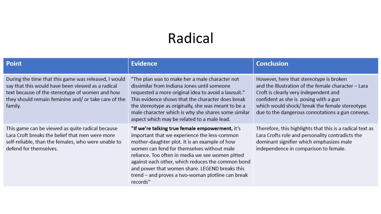
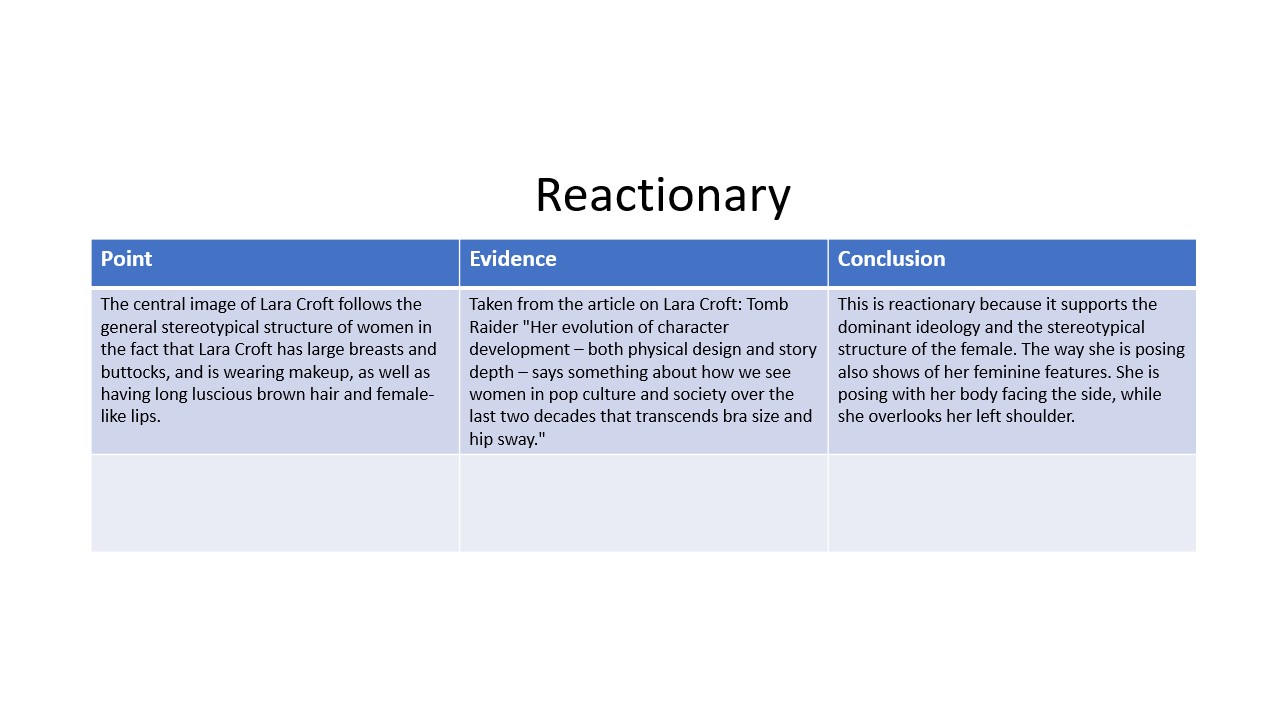
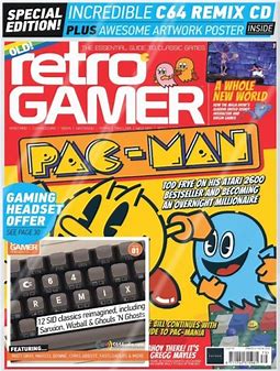
Tomb Raider – Reactionary or Radical?

NEA Gaming Magazine Coursework
Statement of Intent –
For my gaming magazine I am going to prioritize the genre of retro gaming; supporting consoles such as Commodore 64, Nintendo 64 and NES (Nintendo Entertainment System). My magazine is predominantly aimed at a younger male audience around the age of 11 as the dominant ideology suggests they are more likely to be interested in war/ Sci-fi related games, they are also mainstreamers, this is because due to their age – they’re more likely to follow the ‘trend’ and what they think is ‘cool’.
The genre of my magazine is retro, and this will be represented as the magazine will include promotions of 8-bit characters acting as an indexical sign for the genre, interactive quizzes related to retro games characters/ retro games and a plug referring supporting a playlist containing tunes/ songs from popular retro games.
The style of language that I will use is a mix of informal and formal because I want the magazine to seem professional and be factual in relation to its contents but I also want it to appeal to my target audience by using more colloquial language they would use in an everyday life so that they can relate to it and use the magazine as a form of escapism, interlinking with the uses and gratification theory.
In addition, I will also use the san-serif font – ‘Acumin Variable Concept’ – for my masthead as it is fairly blocky therefore portraying quite a retro effect. As well as this, I will also use a sans-serif font for the selling line as it emphasises its importance. This font style isn’t formal, therefore more eye-catching to a younger male audience.
When creating the actual foundations of the magazine cover, I am going to use the tabloid size which Photoshop generated. With a width of – 27.94 CM and a height of – 43.18 CM. I will use this size as the majority of gaming magazines released in the 80’s would have been a similar size – just below A4.
As well as this, I am also going to layout my plugs/ advertisements along the bottom of the page in order to make the overall magazine structured by using lines and columns to separate each one, similar to the style model I have chosen which adds depth to the magazine due to the depth of field caused by the lines and boxes between the plugs and the actual front cover. In order to increase the authenticity of the magazine, there will be a ‘New!’ sign in the top left to act as a signifier to show the intended viewer that this is the latest realised version of the magazine. In addition, the use of text throughout the plugs also acts as anchorage; supporting other similar games/ magazines.
Representation –
In some respects, my magazine cover can be veiwed as a radical text as modern games which are ‘popular’ today don’t tend to be retro or 8-bit style. The dominant signifier of the magazine – the 8-bit soldier character can be seen in camo trousers, holding a gun. Therefore, this magazine cover could also be portrayed as a reactionary text as the main genre – action/ thriller follows the dominant ideology of having a male lead who is carrying some sort of defence (the gun) not commonly associated with women.
As well as this, a dull/ dark colour scheme has been followed which therefore aims the magazine to a male audience due to the stereotype of males not commonly opting for bright or neon colours due to it’s link with femininity.
In addition, aother reason which supports this text being reactionary would be how covered or plain the main character is due to his gender. Whereas if the main character was female, the dominant ideology would be to have her clothes be slightly more revealing and her body to be slightly more emphasised in order to sexualise/ objectify her to appeal to the standard male audience.
Audience Theories –
Reception Theory – Stuart Hall – Suggests that media texts are encoded and decoded; the producer encodes messangs and/ or values into their media which is then decoded by the audience or viewer/s.
Cultivasion Theory – George Gerbner – This theory suggests that over time, exposure to media can cultivate/ change a veiwers attitude or opinion towards different subjects. Frequent television viewers are more likely to be ‘exposed’ to their perceptions of reality being changed (for better or worse) / become reflective of the most common messaged which are advertised.
Theory Of Preferred Reading – when the audience rejects the preferred reading, and creates their own meaning for the text – An oppositional View. Negotiated Reading – This is when a member of the audience partly agrees with part of the product.
Style Models –
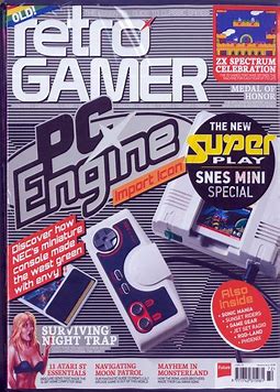
My Magazine Cover –

New/ 2nd Title
