| Technical Code | Denotation (ie what is it – simply describe what you see / hear) | Connotation (ie what does it signify) |
| Setting | New york, hotel room | glamour, high fashion, fame, travel |
| Clothing | plain white clothes then transitions to golden suits | represents how the boss life changes your life to more sophisticated. |
| NVC | confident body language | confidence, strong, fashionable |
| Dialogue | Excited expressions and catchy lines eg, “bossed up” | relates to the boss lifestyle |
| Sound Effect | Magic glittery sound | could signify a magic wand of changing your life after using the product. |
| Music | Upbeat trap | Modern, young and popular |
| Camera shot size | application of the mascara | shows the product being used perfectly |
| Camera movement | Slow motion and zooming in on the product | Draws the attention of the viewer by extending time. |
| Editing | The transition between normal life and boss life |
All posts by Lucie H
Filters
Essay
The cover of Tomb raider and Mens health have many similarities and differences, especially when it comes to the representation of gender. Tomb raider has a dominant signifier that is a woman and Mens Health being a man. But is this reactionary or radical for these covers? And does it support or go against the dominant ideology of how these genders are presented.
The way Mens Health is presented is radical as it is what you would expect to be on the cover of a Mens Health magazine. This begins with the dominant signifier being a healthy, fit looking male which is what you would expect to be on the front cover of a Mens Health magazine. Another way in which Mens Health is radical is the colour blue being a main theme. Many of the drop caps, paragraphs and headings are different shades of blue. This is radical for a mens magazine as it is the stereotypical colour that society associates with men.
Tomb raider is both reactionary and radical. The way Lara Croft is presented on the front cover is reactionary as you normally wouldn’t expect a female to be on the cover of a game that has a majority of male consumers. However, the dramatic scenes Lara Croft is shown in on the back cover would be radical for the genre of a typical action game. This could be the images of her fighting a dinosaur or the image of her using a rope to run across a wall which is what you would expect to see in an action game.
The way the man looks on the front cover sends a message to the consumers about gender. This message is that in order to be a healthier man you must have bigger muscles and a generally fitter appearance. When I’m reality the dominant signifiers arms have probably been photoshopped to appear bigger so it gives the consumer a false hope of thinking they would be able to look like that after buying and reading the magazine. There is a Lexical field of words that have connotations to wanting to be or look like the man on the front, such as: “blast, muscle, arms stronger, body fat, double your metabolism”. These words are used to associate to the health theme of the magazine.
Both Mens Health and Tomb raider contribute to the negative stereotypes of gender. For Mens Health this is shown by them promoting the idea of having an ideal body type, to look bigger and stronger and that if you do so you will be a better man. In Tomb raider this is shown by Lara Crofts over sexualised body to please typical straight men who will play the game. This is a negative stereotype of woman bile cause it suggests that woman are objectified and should look a certain way that is unrealistic.
Gender in tomb raider is reactionary as you wouldn’t expect a female to be the protagonist in an action genre. However this attracts the typical male audience as they are interested in females plus the action game.
The dominant signifier of Lara croft and her gender is sexualised. This is mostly shown in the way she is standing on the front cover where she is positioned sideways to expose all of her body that the ideal consumer would be attracted to. The fact that these parts of her body are emphasised sexualises her. I’m terms of gender the way Lara Croft is sexualised in this way supports the dominant ideology of women in video games that is wearing unnecessarily revealing clothes that again expose her body to the audience. This is the complete opposite to men in video games who always have a covered body for example gun belts and capes the cover their behind. There are myths over why this may be such as only boys play video games so if you’re going to show a woman you should make her unrealistically physical attractive so she is more appealing to the boys.
definitions
- Positive and negative stereotypes – traits and characteristics that relate to a typical type of person that are generally either negative or positive.
- Counter-types – This is a representation that is the opposite of a stereotypical associations of groups, people or places.
- Misrepresentation – giving a false or misleading account of the nature of something
- Selective representation – the ways in which the media portrays particular groups, communities or topics from a particular ideological perspective.
- Dominant ideology – the term dominant ideology denotes the attitudes, beliefs, values, and morals shared by the majority of the people in society.
- Constructed reality – the argument that society is created by humans and human interaction, which they call habitualization.
- Hegemony – leadership or dominance, especially by one social group over others.
- Audience positioning – the techniques used by the creator of a text to try to get the audience to understand the ideology of the text
- Fluidity of identity – an identity that is constantly changing or is constantly evolving
- Constructed identity – where an identity has been structured by interactions with family or friends, organisations, institutions, media and other connections we make in our everyday life.
- Negotiated identity – where people reach agreements on “who is who” in their relationships.
- Collective identity – is the shared sense of belonging to a group.
Venn diagram
Print terms associated with magazine production
- Adverts
- Watermark
- Drop cap
- Columns
- Plugs / Ears
- Page numbers
- Date issue no.
print terms associated with both
- Font type
- Font size
- Serif or sans serif
- Colour
- Italic and bold
- Underlining
- Title banner
- Heading
- Subheadings
- Leading line
- Tag-line
- Colour blocks
- Paragraphs
- Crop
print terms associated with games cover production
- Illustration
- Logo
- Depth of field
- Perspective
- Shutter speed
- contrast
- Texture
- Setting
- gradient
Coursework – gaming cover

Statement of Intent
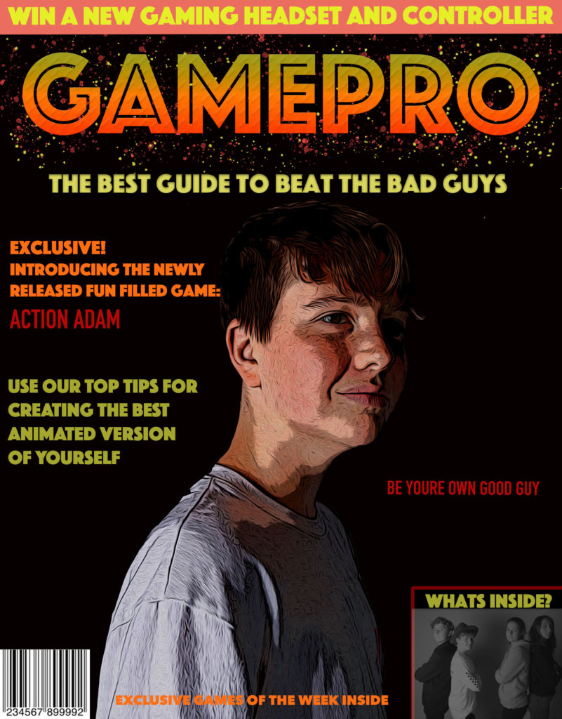
I wanted to create a gamers magazine cover with a theme of adventure games and cartoon imagery. Therefore my ideal consumer would be 12 or 13 years old. They would wear brightly coloured trainers and a t-shirt with comic or gaming characters printed onto it. They have glasses that are square shaped with blue frames. So this person would have a stereotypically geeky look/style. The main idea of my cover is promoting a new game called ‘Action Adam’ where you can create your own animated action character like ‘Adam’, who is pictured in the middle.
For the layout of my cover, I have used the rule of 3rds. The top section of my cover is the heading, the middle is the main picture which is also going to be the dominant signifier and the bottom right is a text box that shows what’s inside the magazine. The image inside the text box is four gaming teenagers which relates to the audience the magazine is aimed for. The font and size of my heading has bright colours with an orange and red gradient. Underneath the heading there is a tag line saying “the best guide to beat the bad guys” this suggests a theme of ‘good and bad guys’ in gaming. I also used the word ‘exclusive’ in a slightly bigger font to make it stand out and draw your eyes to that part of the text.
To create my dominant signifier I have used photoshop to manipulate a picture of a teenage boy into a cartoon looking form. This allows my ideal consumer to be able to relate to what they are buying. The image will be highly saturated to bring out the colours which contrasts the black background. The fact that he is looking into the distance creates an effect of empowerment in gaming and that he is strong and serious. This would hopefully be relatable to teenagers who are interested in gaming as it represents them and they would want to become like that boy on the cover.
My dominant signifier is reactionary as it is what you would expect a magazine cover of that genre of game to look like. I would say the genre is an adventure game. The way the character is looking into the distance shows he is focused and motivated to go on an adventure. However, you could argue that the dominant signifier is radical as you wouldn’t expect a younger boy to be a hero of an adventure game. It would usually be an older strong male like Indiana Jones for example. But the fact that my dominant signifier is younger makes him more relatable to the ideal consumer of a young boy.

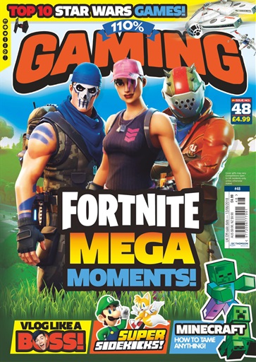
This is the magazine that I based my own cover off of. I mostly took inspiration from the yellow and red colours of the text and how they went together with each other, I wanted to use that in my own cover. I also liked the idea of the gaming characters being in the centre of the cover with the text surrounding them. I also took the idea of including a picture that shows ‘what’s inside’ as it advertises the rest of the magazine to the viewers.
Overall I wanted to create a smart, bold and colourful cover using a theme of good and bad characters in gaming.
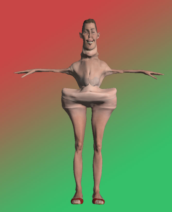
Adobe Fuse – mouldymort

Statement of intent plan
- 400 words
- use print language
- use semiotics language
- Key image, text and layout language
- talk about rule of 3rds
- target consumer
Gaming Header

Magazine cover plan
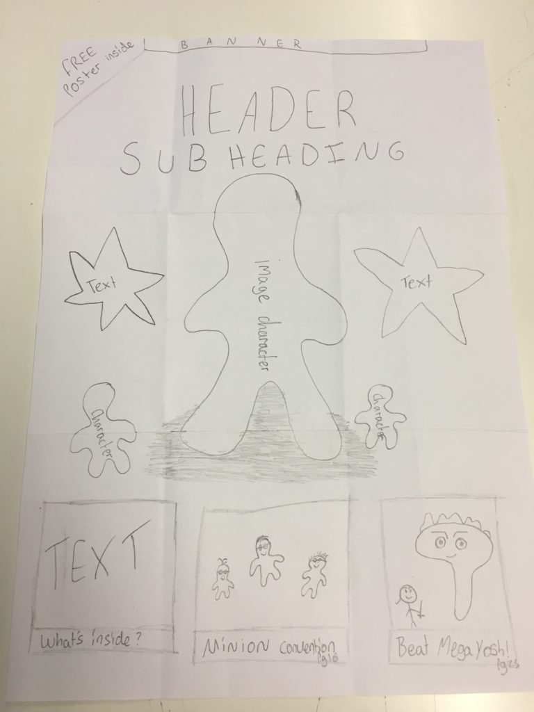
For my magazine cover I want it to be aimed at an audience of age 9-13. This means my cover will include cartoon style characters which I will make using Photoshop or taking a picture of an action figure and editing it. If the magazine is for kids then I will use big fonts and many colours to make it appealing to their eyes and make then want to pick it up. At the bottom of the cover there will be three text boxes. One explaining what’s inside, one a preview of what’s inside and one being a picture of a ‘minion convention’.

Ideal consumer
My ideal consumer would be a 9 nearly 10 year old boy. They are fairly small with short blonde hair and they wear brightly coloured trainers and a t shirt with comic characters printed onto it. They have pale skin and glasses that are square shaped with blue frames.
