
| Theorist | What does it mean (in your own words) | How does it apply to the advert (in your own words) | |
| Equilibrium | The power is in a state of equilibrium (power). As the plot develops the balance can change giving someone or something more power | The power shifts after they apply the make up | |
| Binary Opposition | media that contains opposing main characters | Both main characters are opposite genders | |
| Character Types | The theory that there are certain specific characters in every media form / text | ||
We could be the victims and the Lobby boy could be the dispatcher and the company / two main characters could be the heroes but it is all subjective
Both Tomb Raider and Men’s Health Magazine use over sexualised examples of people to present their products and target specific audiences. The dominant signifiers in theses texts are misrepresented because they imply that the way they appear is what everyone should expect in real life. These signifiers can be interpreted as counter types, negative and positive stereotypes for many different reasons.
To begin with, I believe that Men’s Health Magazine front cover has a fully negative representation of men and does not create a safe, nor realistic symbol for men to copy and aspire to look like. With phrases such as ‘Lose 8KG fast’ , ‘Blast Body Fat’ and ‘New year muscle’ Men’s Health have created a paradigm all emphasising the idea that men should lose weight and gain muscle to look ‘perfect’ and supporting the dominant ideologies of the male appearance. The use of Vin Diesel as the dominant signifier increases the chances of men striving to reach these body goals as he is well known, rich and famous, creating more and more goals that are unhealthy to strive towards.
In comparison to Men’s Health, certain features of Laura Croft on the front cover of the 1996 game were stereotypically male such as her independence, strength and gun. These features impower Croft and turn her into a counter type for how women were presented in the late 90’s. However, more similarly to Men’s Health, Laura Croft is very sexualised and stereotypical of female video game characters. During this time period almost all female video game characters wore little clothing, whereas male video game characters wore amour often covering their bodies had to toe. Laura Croft definitely fit the trend for this time and this was a very negative representation of women. This means Laura Croft both challenges and supports the dominant ideologies of gender and her character both positively and negatively represents women in these times. Therefore, Laura Croft is reactionary and radical.
Another difference between the two texts would be that Laura Croft is a made up character whereas Vin Diesel is a real person. This shows that the connotations of Croft in relation to female appearance is more unrealistic and therefore more harmful. Both representations of their respective gender are bad for society and make men and women feel insufficient. However, Vin Diesel’s appearance is realistically achievable with a lot of work but Croft’s could be considered fully unrealistic as she isn’t real her self so no matter how much work any woman puts in they will never achieve the goal they want to achieve and therefore always feel inadequate. So, Laura croft being a character potentially makes her a more negative example of dominant ideologies surrounding gender.
On the other hand, a similarity between the two texts would be with Croft and ‘The Marathon Man’. These dominant signifiers both act as counter types to their respective genders. The ‘Marathon Man’ challenges the ideology that men should strive to stay and act young by using a 69 year old man as the subject. Howells also does not necessarily have large muscles or appear to have a six pack so he also impacts the dominant ideologies of male appearance. Laura Croft’s male stereotypical attributes (talked about before) are juxtaposed with her overly sexualised appearance, causing the effect off her being a countertype to be emphasised which overall has a positive effect on the viewer.
Rule of thirds is used in the cover of the Laura Croft game to position her and the text so that the over sexualised parts of her are still fully visible. This is simply a design technique used to emphasise the negative parts of her character in relation to the representation of women. Also, the colour choice of gold behind Croft connotes money and wealth which add to the list of goals people shouldn’t be prioritising and especially expecting to be the ‘norm’. Whereas, Men’s Health uses different techniques such as plugs and adverts to emphasise the dominant ideology surrounding men’s fitness and body appearance. However, it also uses colour expect it is to represent gender stereotypes as the main colour schemes of all three pages is blue.
In conclusion, both of these texts have negative and positive aspects with relation to gender. Laura Croft is a powerful and independent woman, but she is very over sexualised and unrealistic. Men’s Health over sexualise Vin Diesel and encourage weight loss, however they do encourage fitness among older people and present a positive body image. Overall I believe these aspects all cancel each other out making Laura Croft and Men’s Health both reactionary and radical texts with their representations of gender.
•

| CHALLENGES | REINFORCES |
| Guns Strong Independent Presented as stereo typically masculine | lack of clothes Hair Body Language Makeup Appearance |
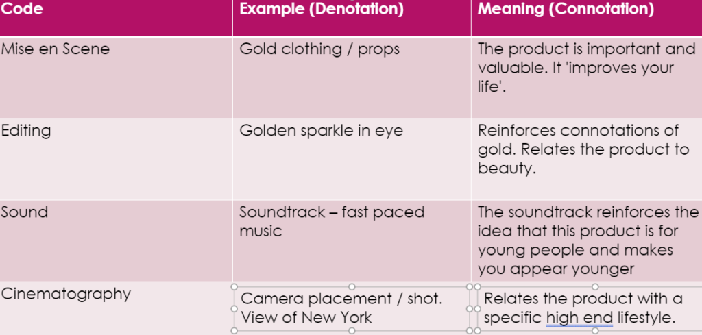
| CODE | DENOTATION | CONNOTATION |
| Mise-en-scene (lighting, props, costume, colour, facial expression, body language) | The costume is short and shows a lot of her skin. She has a classic ‘looking over the shoulder’ pose to show off her body. | This creates appeal to an audience of menThis adds to the appeal |
| Cinematography (camera angle, shot type, etc.) | They used a medium shot on the front cover showing most of her body. | Further increasing the appeal to the target auidence. |
| Typography (font, colour, etc.) | There is a golden colour scheme In the title and background. | The use of this colour highlights her body and links to the positive connotations of gold |
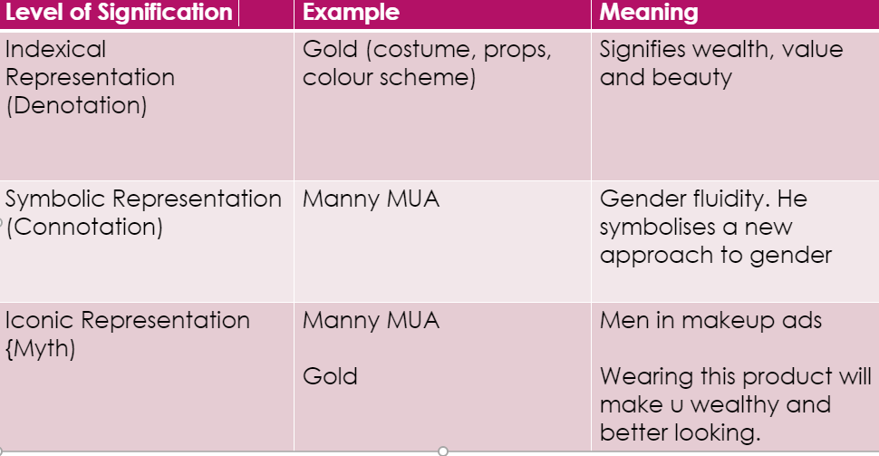
| LEVEL OF SIGNIFICATION | DENOTATION | CONNOTATION |
| ICONIC – Laura Croft | Holds guns and looks fierce | Stereotypically male attitude |
| INDEXICAL – The guns | She is holding 2 firearms | Connotes war. The guns make her appear powerful and strong. |
| SYMBOLIC – Gold/Light | Highlights Laura’s body and draws attention to certain areas | The light connotes good against evil which supports Laura’s character. The gold also connotes wealth |
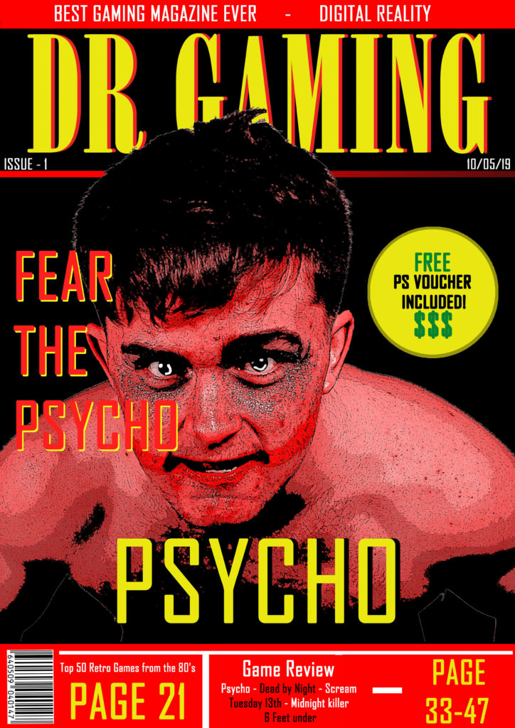
Statement of Intent
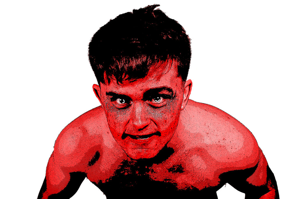
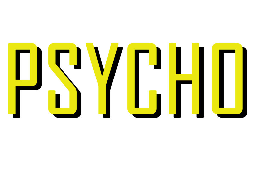
The choice of red as one of my main colours on the front cover was intended as a symbolic sign to represent danger and emphasise the sense of horror in the game ‘Psycho’. I also chose to make my main character (front cover image) red to increase a sense of fear in the reader. The yellow text contrasts against the red of the character and background so stands out. The red and yellow colour scheme is not associated with a single gender therefore making my magazine unisex. My target audience, therefore, is anyone aged between 15 and 25who would be interested in horror and dark games. This game would not be suitable for younger children. I used the Dollar signs as an indexical sign to signify money which would be appealing to this audience as they are young and probably don’t have as much money to spend on smaller / luxury items such as vouchers compared to older individuals. The word ‘FREE’ is in the same colour as the dollar signs to make it stand out and having ‘FREE’ and ‘$$$’ close together makes the reader subconsciously think about free money. I would maintain an iconic style with all of my front covers and make it aesthetically pleasing over multiple issues so that it becomes a magazine that readers would want to collect which would appeal to the audience, as gamers often enjoy collecting random gaming related items. This is because gaming has become a lifestyle for many as well as a hobby and I would want my magazine to be a part of that lifestyle.My title ‘DR GAMING’ has a catchy style to it and the DR also stands for Digital Reality which is a memorable tag to accompany the title of the magazine. I used a mixture of gaming related terminology and code to appeal to my audience. The effect of a large title that stands out in the top third of the magazine cover is to attract readers as this is all they would see if the magazine was in a rack at a shop. The main image appears behind some text and in front of the title to give it a 3D effect and stand out to the reader.