CHARACTER
Signs
Iconic Signs
Indexical Signs
Symbolic signs
Summer Tasks – Communication of Ideas and Intentions
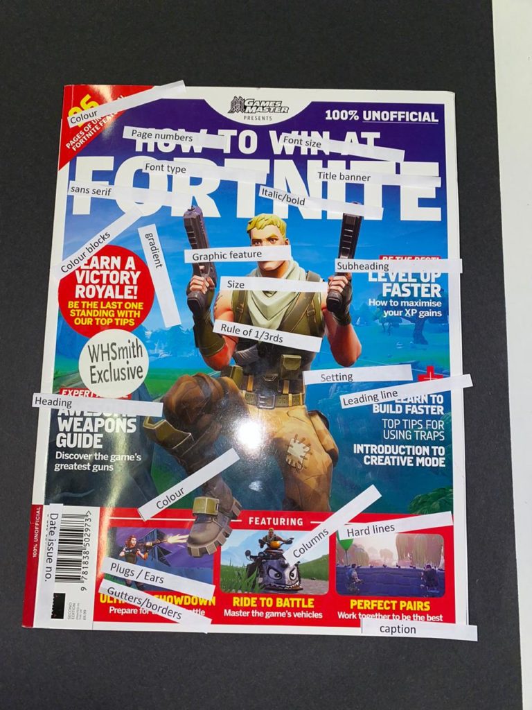
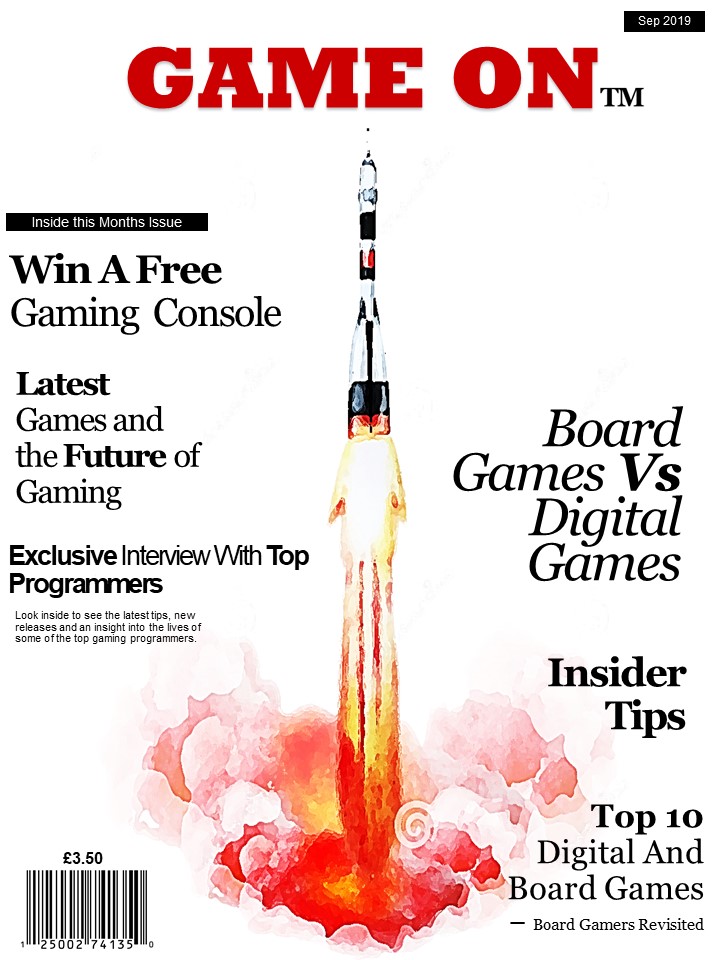
The title of my new magazine for gamers is ‘Game On’. I have named it this because it has alternative interpretations, for example the Gamer colloquium for the game has started as well as the continuation and future of gaming. I have made the title much larger and in a different font to the rest of the text with the intention of it standing out from a distance to try and capture attentions. It is bold and the colour red as red is a colour associated with fire, energy, danger, hate, strength/power, as well as passion/desire, and love, typical themes associated with modern digital gaming. It is located in the centre and the top of the cover with little other text around it so that it draw more attention to the title itself.
I have included a price of £3.50 and date on the cover as this magazine is intended to be monthly and issued on the 1st week of each month.
I have included many subheadings of article and information contained within that particular issue on the front cover. The items inside this issue are varied including a mixture of board gaming articles and digital gaming articles with constant comparisons of the benefits between the two. It includes tips and advice that might appeal to serious or armature gamers. Interviews with programmers which gamers or those with an interest in that particular field or career may find appealing. Competitions to actively involve buyers of this magazine, and luxury prizes to encourage more people to purchase the magazine. I have included this particular selection of articles on the front cover with the aims of appealing to a varied audience and trying to broaden the market of this magazine to encourage different interests and buyers of the magazine.
For all text, excluding the title, on the front cover, I have used the same font and colour. However, have varied the size and positioning of the text and put certain words in bold with the aims of drawing focus to the key words and inciting intrigue however, there is no particular order on structure to the size of text, only the explicit aims to make it varied and entertaining, such as gaming itself. I have used all black text on the cover to stand out from the background and title, it is a universal colour that is not heavily associated with either board or digital games as this magazine addition is equally focuses on both.
The background colour of the front cover is plain white, white is often associated with things that are brand new, (digital games,) however, can also be associated with tradition, (traditional games/board games). As it is plain it can represent the start of a game e.g. an empty board or new level etc.
The background image is a simple design of a rocket taking off an object off which could be associated with the start of a game or an object within a game. It is a simple, plain image so that its contents and headings are more focused on as that is the main function of the magazine.
What is Media?
Media is methods of communicating and advertising though the use of different mediums such as; magazine, Tv, radio ect.
What is Media Studies?
Media Studies is the study of the history, use and effect of various, different medias.
What is the point of Media Studies?
The point of Media Studies is to educate and inform people about the different aspects of media and their use.
Studying Media:
I think studying media will help me gain a deeper insight into the different types media and their uses.
I think studying media will allow me to be able to use various types of media.