How does it apply to the advert (in your own words)
Equilibrium
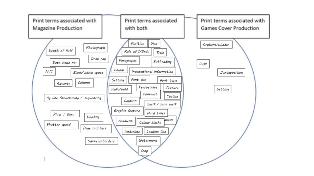
Story Structure – All stories follow a certain structure Beginning Middle — disruption End – resolution
Manny meeting Shayla in hotel room Makeup box arrives – putting makeup on ‘Bossed up’ – wearing makeup
Binary Opposition
A pair of related items with opposite meanings
Working in as hotel – Staying in a hotel Wearing makeup – no makeup plain colours – gold
Character Types
Stock characters Hero and Villain How many stories are there – only one, all follow the same structure. In ‘Bossed Up’ advert the character types are the Bell Boy = victim. MannyMUA and Shayla are the heroes. Makeup is also the hero and the natural/no makeup is the vilian
Compare the representation of gender in both Men’s Health and Tomb raider
In this essay I am going to discuss both the portrayal of the male gender as seen in ‘Men’s Health Magazine’ and the portrayal of the female gender as shown in the video game cover ‘Tomb Raider’. I will discuss the representation of both and how it is conveyed as well as whether the texts are radical or reactionary.
The portrayal of the female gender as seen in the ‘Tomb Raider’ game cover is sexualised and objectified. The use of the character Lara Croft as the dominate signifier draws peoples attention towards her and her appearance rather than the game itself, detaching the protagonist from the context of the game and instead objectifying her and focusing on aestheticism of the character. This is seen through the strategic positioning of the character in the center of the cover, this is attained through the rule of thirds which draws direct attention to the character and the contortion of her body to emphasis certain features such as her breasts and de-emphasie certain features such as her waist. This is further seen by the title being placed across her middle and by the use of serif text forces the subconscious eye to draw attention to these features. Hence making her characterisation purely sexual. The representation of Lara Croft is representation the stereotypes and ideologies of the female gender. At the time this game was released it the portrayal of Lara Croft was radical due to the fact that prior to this time all protagonists in action games had been male and females were only portrayed as villainesses, victims or seductresses, the fact that this game created a ‘Female Indiana Jones character’ was initially to ‘avoid a law suite’ however, lead to the development and varied representation of female protagonists in future games. However, to today’s audience might view this cover as reactionary as the objectification of female is typical on most game covers. Also by creating a female character who has ‘typical’ masculine, action game qualities such as, the iconic signs of ‘the gun, muscles, backpack’ suggests that a female protagonist has to adopt certain stereotypical masculine qualities to be applicable/ associated with action games and to be supported by the dominate ideology of hero-sexual, Christian, Caucasian males.
Similarly, the portrayal of the male gender can be seen from the use of ‘Vin Diesel’, a stereotypical masculine male as the dominate signifier. The focuses on the dominate signifier is again emphasised by the positioning in the center of the cover, attained through the use of the rule of thirds. The representation of the male gender here is muscular and physical fit. This is shown through the position of the dominate signifier and how he is contorted to emphasises muscle and minims body weight such as ‘his arm slightly outstretched and shiny’. This magazine also uses a juxtaposition of colour and lighting to represent males, by using ‘a mixture of black and white colours’ which has the indexical connotation of good and bad, positive and negative. Light colours and shine have been added to define the muscles and muscular form and used black/shaded the un-muscle defined areas showing that the stereotype of strong muscles bound masculinity is ‘a good/positive’ thing and should be seen and supported whereas, less muscular areas are hidden and shaded supposedly ‘negative and non-masculine.’ Through the presentation of the male gender shown on the cover of this magazine we can see that this magazine adopts a reactionary, stereotypical approach towards the presentation of males as it demonstrate and complies with, the typical conventions of male stereotype. The audience would see it as the idealised version of a male and perhaps the unrealistic body aims and representation of masculinity as supported by the dominate ideology.
In conclusion of both covers represent genders in a reactionary way, compiling to negative stereotypes and unrealistic expectations by objectifying their dominate signifiers and manipulating the audience into believe these dominate ideals.
Positive and negative stereotypes = A positive stereotype is a favorable belief or trait held about a social group or individual. A negative stereotype isnegative traits and characteristics that are associated with a social group or individual.
Counter-types = A counter-type is a positive stereotype.
Misrepresentation = when somethings represented wrongly.
Selective representation = Is representing something in a particular way including certain elements.
Dominant ideology = the main/dominate system of ideas and ideals.
Constructed reality = a reality that is created
Hegemony = Dominance or leadership by one social group over another.
Audience positioning = the way in which the audience is positioned to understand the text and its meanings.
Fluidity of identity = shows the ability to and changeability of identity
Constructed identity = The creation and development of an identity.
Negotiated identity = an identity that is discussed and agreed upon.
Collective identity = individuals who share a sense of being in a group due to similar characteristics and identities
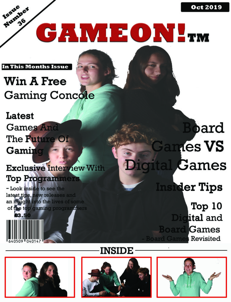
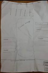
To create my magazine cover, I first carried out research into different magazine covers to gain inspiration for my brief. From my research I discovered this example of a magazine front cover and subsequently decided to base my front cover of this style model.
Using the rule of thirds I constructed this rough plan for my cover. I have replicated the general structure of the style model and incorporated it alongside my own ideas to create my front cover. I developed many of my original ideas after constructing this plan, including the inclusion of plugs at the base, a sticker on the top left corner, this has increased the strength of the piece in looking like a professional magazine cover.
My intentions of the magazine are to create
a wide target audience, this magazine is not bound to a particular gender or
age group and instead it is aimed at anyone with an interest in gaming or the
world of gaming. I have included a particular selection of articles on the
front cover with the aims of appealing to a varied audience and trying to
broaden the market of this magazine to encourage different interests and buyers
of the magazine. These ideas are reflected through the use of the headings
on the front cover. The inclusion of varied headings such as; a mixture of
board gaming articles and digital gaming articles, tips and advice that might
appeal to serious or armature gamers. Interviews with programmers which gamers
or those with an interest in that particular field or career may find
appealing. Competitions to actively involve buyers of this magazine, and luxury
prizes to encourage more people to purchase the magazine.
The title of
my new magazine for gamers is ‘Game On’. I have named it this because it has
alternative interpretations; the Gamer colloquium for ‘the game has started’ as
well as the continuation and future of gaming. It is the colour red because of it is semantically symbolic and associated
with fire, energy, danger/hate, as well as passion/love, typical themes
associated with gaming.
The
background colour is white, often associated with new things, (digital
games) or with tradition (board games). As the background is plain it can represent
the start of a game, an empty board or new level.
For all text,
excluding the title, I have used the same font and colour. However, I have varied
the size, positioning of the text and put certain words in bold, (aiming to
draw the focus to the key words) and done so in no particular order or
structure, only with the explicit aims to make it varied and entertaining, such
as gaming itself. I have used all black text to stand out from the white
background, this has the connotation between good and bad, which is heavily
associated with either board or digital games (as this magazine addition is
equally focuses on both.)