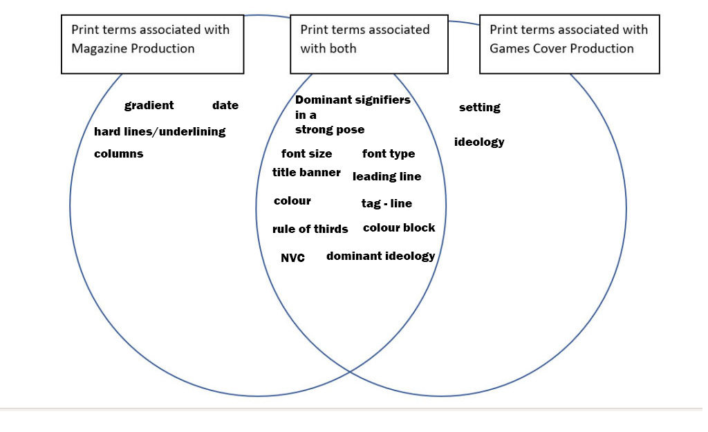
Venn diagram of magazines and games covers
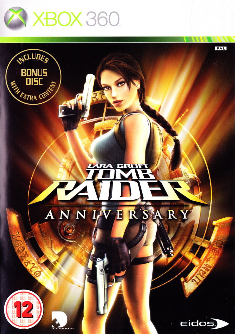
Tomb Raider – Lara Croft
Representation
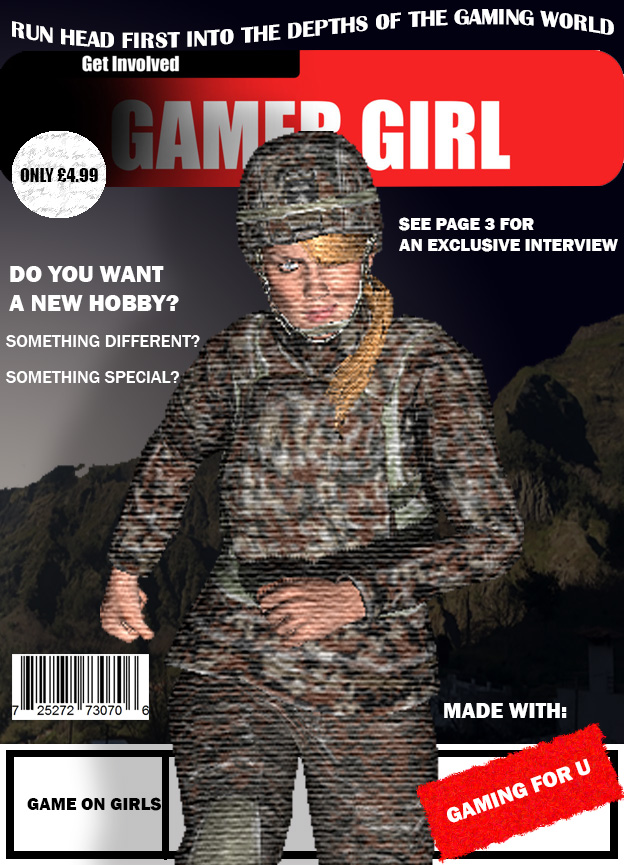
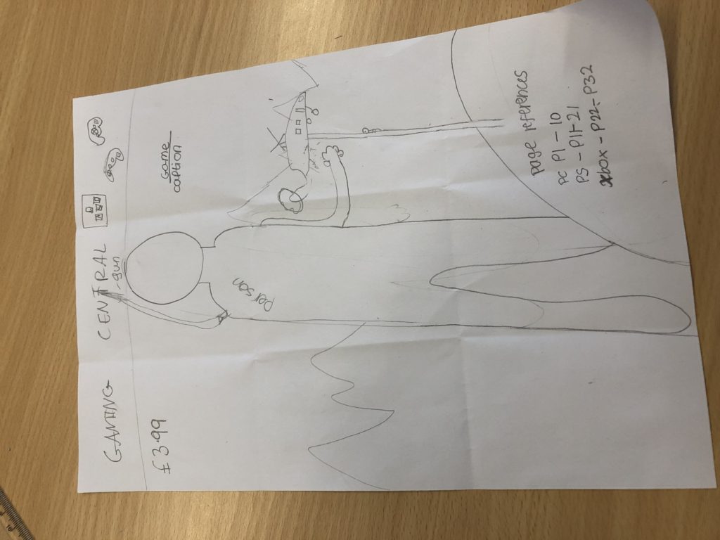
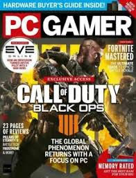
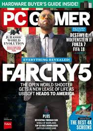
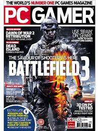
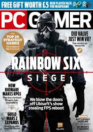
For my magazine I decided that i wanted to base it on the idea of encouraging more girls to get into gaming, this inspired me to think of the title ‘GAMER GIRL’, because it clearly conveys the message I intend to get across. I then thought of a catchy slogan for my magazine which is ‘Run head first into the gaming world’, which I put in a serif font with a flag effect to make it more appealing to look at. The dominant signifier of my magazine cover is a female games character, which focuses on my main intention for my magazine, this shows a strong independent woman who fights for what she believes in, this is the main message I want to get across with this magazine cover, and show girls who are around my age (mid – late teens) that it’s okay to do something your friends aren’t doing and it’s okay to try something new that’s stereotypically ‘for boys’ because girls are allowed to have fun too (this is also an iconic sign because it looks just like a female in action). I have used a san serif font (Franklin Gothic Medium and Heavy) to create a clear and crisp look to my magazine. I have used different symbolic signs (the colours red, black). Indexical signs include: buildings (symbolise a village where the main game is set). I also wanted my magazine to be interactive and appealing so I have used rhetorical questions such as ‘DO YOU WANT A NEW HOBBY’. I also had the intention of making my magazine look as realistic as possible, so I did some research into different magazines and got my inspiration from the ‘PC GAMER’ magazines. For my masthead I decided to make it bright and bold to catch my intended audience’s eye, to do this I chose the bold colour red to make it pop from the rest of the magazine cover. I also wanted to have a sense of depth to my magazine, this is shown with the mountains in the background with a village in front of them. I have also featured some things that are inside the magazine on the cover such as ‘the interview on page 3’. I have also stated the GAMING FOR U company that would sponsor the magazine.