


Overview of my magazine
For my magazine i’m going to use 8bitart to make the gaming characters at the top of the page. I’m then going to have three plugs at the bottom of the page to make the magazine more informative of the information inside it. My magazine will also have a character in the middle of the page to do this I will take a picture of someone dressed up and then I will edit it in Photoshop so it looks more gamer like. At the bottom of the magazine I will have a logo which I will create on 8bitart as well. I’d like it to be bright friendly colors with lots of children appropriate games.
Who my magazine is aimed at?
My magazine is aimed at younger children around the age of 10 to 13. As they are young they won’t have jobs so the price for the magazine will be around £2.50 as this is a reasonable amount of money for them to use their pocket money. It will be for both boys and girls. The games they will be interests in will be Mario and Sonic and more games like that. Their will be give away in my magazine as my audience won’t be able to just go buy themselves a new computer device. The consumers for my magazine will still be in education.

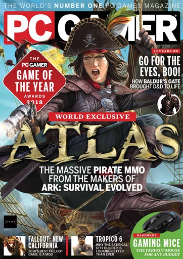


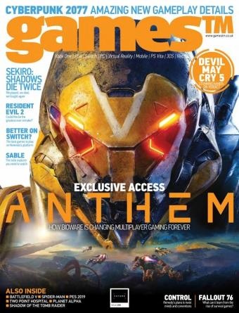
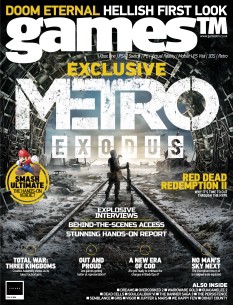
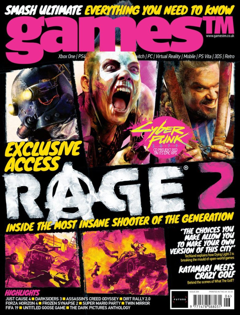


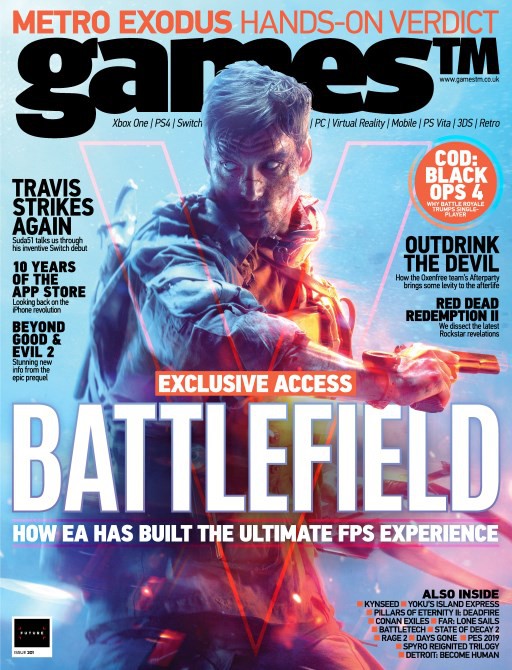
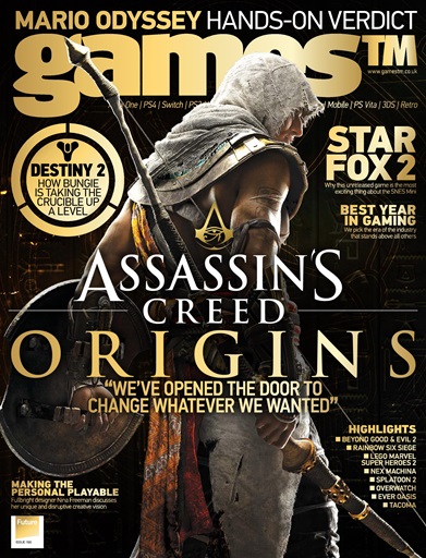

Barthes- a french philosopher who developed the ideas of semiotics.
Pierce- an american philosopher who studied the idea of different ways of communication and the idea that things could be split into three sections, iconic, symbolic or indexical.
Saussure- was a Swiss linguist and semiotician. He theorised in language and the connections between their meanings associated with the language. He developed the ideas of signified and
Semiotics- the study of signs and symbols and how to interpret them.
Sign- an object or gesture that shows an intention or idea.
Signifier- a signs physical form for example sound. (Saussure)
Signified- the meaning of a something expressed by a sign. (Saussure)
An Iconic Sign- a representative symbol of an object or person for example a picture of the queen.
An Indexical sign- An indirect communication for example colour
A Symbolic Sign- letters
Code- a communication of rules or orders.
Dominant Signifier- main sign for example the JEP’s dominant sign is the tile JEP.
Anchorage- the fixing of meaning towards the sign
Ideology- a set of ideas or beliefs
Paradigm- a collection of signs
Syntagm- a sequence of signs that work together. Number of signs need each other for it to be right or make sense.
Signifcation- the representation or conveying of meaning.
Denotation- the object
Connotation- the meaning of the word
Myth- a belief that lots of people believe in however it isn’t true.
Radical text- challenges a dominant ideology.
A Reactionary Text- supports dominant ideology.
Dominant Ideology- dominant attitudes ideas and beliefs.
3 Different types of signs
Symbolic- has a random link to its object e.g. color, shapes, textures.
Indexical- a sign that has a link to its object e.g. sounds, props.
Iconic- a sign that looks like an object e.g. sets, camera work.
Signs on my Pre As poster.
Symbolic- the letters and text in my poster are symbolic as they can be interpreted any way you like.
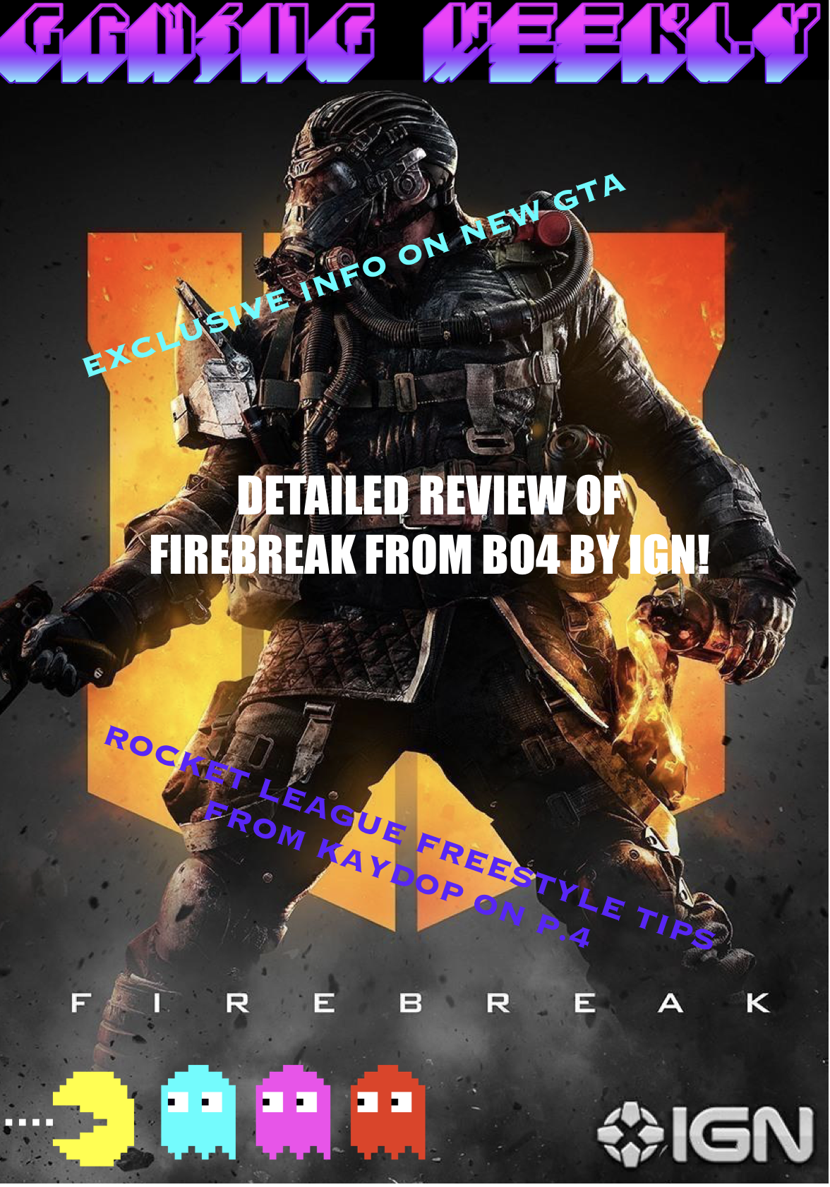
Indexical- the colour of the fonts, for example blue makes me thinks of calm and red makes me think of anger. The picture of pac man could be indexical to childhood and youth as well as old fashion.
Iconic- pac man, and the picture of the character firebreak


My Magazine
For my magazine I have decided the main focus was going to be around a new character for a game, so I decided to have the back ground as the call off duty black Ops 4 Logo with a picture of Firebreak on the front. To go with this image I have attached a small amount of writing saying ‘Detailed review of firebreak from BO4 by IGN’ so the customer buying my magazine will know what is written inside the magazine as it was my main focus I have centred it in the middle of the page and I have made the font size bigger than the other ones I also made the font white as I thought it would stand out more. Most magazine have titles and logos so for my magazine I decided to make a Pac man logo on 8bitart and put it in the left bottom hand corner of the page. For my title I went with something very simple and to the point ‘gaming weekly’ this allows everyone looking at it to know it’s a gaming magazine that comes out once a week and gives you information on the previous week’s games. I wanted the title to be bright and colourful to catch people’s attention as well as the logo.

