Write up a 750 word formal essay (ie beginning, main body and conclusion) that compares the representation of gender in both Mens Health and Tomb raider
In this essay I am going to argue that there are both radical and reactionary representations in Tomb Raider and Men’s Health. To do this I am going to analyse the front cover and contents page of Men’s Health and the front cover of the Tomb Raider game. I am going to apply Gauntlett’s concepts of representation and reception theory to these products.
Gender representation is the presentation of gender roles in the media, which can be displayed in many different ways. Usually gender representation in media follows common stereotypes (the common representation of specific groups in media). The most common type of stereotype that is represented in media, especially traditional and older media is the “cool” man, which will be discussed during the analysis of Men’s Health. This gender representation will be compared to Tomb Raider’s Lara Croft and compared to the dominant ideology of gender.
Men’s Health displays both radical and reactionary views about masculinity. For example, the cover of Men’s Health contains strong, bold fonts which reinforces that all men are strong and powerful. Furthermore, the cover of Men’s Health also contains a semantic field of violence, strength and power: “demolish”, “blast”, “slay”. This is reactionary, as it reinforces the dominant ideology of the “cool” man – that men are strong, cool and brave. This is emphasised by the image of Vin Diesel on the front cover, who appears to be muscular with a tough and serious expression. This presents a dominant idea of masculinity, which one could argue is a toxic representation of masculinity – as it creates unrealistic body standards for men. In this photo, Vin Diesel has been photoshopped to appear more muscular than he actually is. This creates the impression that the impossible is achievable, creating a sense of false hope for men trying to become something that isn’t real. Furthermore, this creates a ‘standard’ for how men are supposed to look, creating a negative impact on the body images of men and their desire to ‘fit in’ – linking in to identity. This image of the “cool” and “muscular” man is, however, juxtaposed by the plug “detox for foodies” at the top of the magazine. This reflects on Gauntlett’s concept of gender fluidity – the fact that gender isn’t fixed, and can be changed. This is shown by the trait of specifically enjoying and critiquing food – a particularly feminine trait, being shown on the front cover of a men’s magazine. This also shows that the magazine is radical. Looking at the contents page, the influence of masculinity within the textual features is still strong – but less so. There is no semantic field of power or violence, and the gender role of “powerful man” is reduced to seemingly almost a façade. The contents page contains the strong text and blue colour – signifying masculinity, but including other features such as pink backgrounds for icons and softer fonts. This breaks the dominant ideology – in which men have to be unfalteringly masculine all the time.
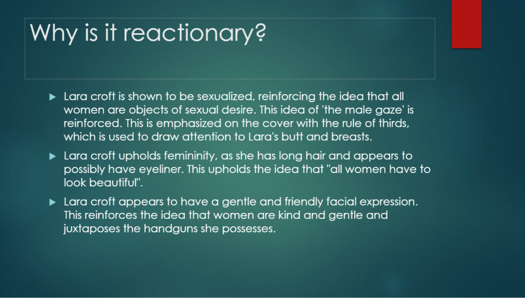
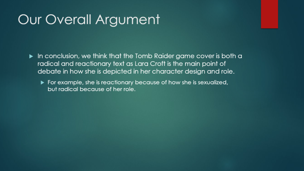
This is similar to the front cover of Tomb Raider, as Lara Croft is both radical and reactionary, similar to how Men’s Health is presented. Firstly, the dominant signifier of the game, Lara Croft, is presented with highly feminine-conforming features: a flawless face, long hair, makeup as well as sexualised clothing. This is reactionary as it holds to the dominant ideology that all women are beautiful and desirable. Furthermore, Lara Croft’s clothing designs present her as very sexual, as her clothes leave a lot of skin exposed as well as the rule of thirds being used to emphasise her butt and breasts. This connects to the idea of the ‘male gaze’ – that straight cis white men control the media, which as a result shows us their visions of how they view different groups. In this case, Lara is sexualised to appeal to male gamers. This is also reactionary for how society views women. Lara Croft’s character is also, however, also radical. Lara Croft was created in order to have a strong female leading character, which was rare at the time. Furthermore, her story made her independent as she did not need a man in order to be strong. This, amongst women in society, is reactionary. But, for the dominant ideology, it is radical. Furthermore, Lara Croft is in the position of a man, doing things that would have been deemed ‘too daring’ for a woman to do in the game, such as ‘fighting fearsome creatures’ as denoted on the back and scaling walls. In conclusion, Tomb raider and men’s health both vary – Tomb raider is mostly radical, but is also slightly reactionary while Men’s Health is mostly reactionary, but is also radical in some parts.
These two texts both represent reactionary beliefs and radical beliefs. Tomb raider shows a woman in a man’s position wielding a gun and doing amazing feats, while appearing sexualised, and Men’s Health shows strong motifs of masculinity – strong text and a semantic field of power, while presenting that men can have more feminine traits such as being passionate about food. These ideas are presented to the audience in different ways, and the entire audience is not going to immediately accept this. If we use reception theory, it shows that there will be a divide in the audience. The intended representation of these texts will not enforce or change the entire audience’s beliefs. For example, the message that “men have to be strong” in Men’s Health will be received by the audience and there will be a divide based on opinion, such as: the dominant response – the intended response, which will enforce the audience’s opinion that “men have to be strong”. Then, there’s the negotiated response, where the audience may partially agree and disagree with “men have to be strong”. Finally, there’s the oppositional response, which would be a complete disagreement with the message. This, in turn has an effect on the dominant ideology of gender in society. This could have a negative effect, such as stereotyping. This could make outside parties assume that, for example, all women are flawless like Lara Croft, which can have a negative impact on women, as they are pressured to look flawless. Or, it could have a positive impact. For example, for Men’s Health, men could be less ashamed to talk about their interests or hobbies if the dominant ideology of “men have to uphold masculine interests” is challenged. This, therefore can end up enforcing more healthy beliefs with gender.

