All posts by Ewan N

Filters

Author:
Category:

Definitions

Positive and negative stereotypes: Positive– A good evaluation of a specific group that is in someways better than another group, it can be seen as a praise or a compliment. Negative-A bad generalization on a person because they are part of a specific group. Can be seen as an insult.


Counter-types– Goes against the stereotype of a group that they are part of.


Misrepresentation– Wrongly interpenetrating/ understanding something.


Selective representation– When something is more represented than another, usually biased.


Dominant ideology– What is normal in the eyes of people and Social Media.


Constructed reality– The way we shape ourselves because of other people and their standards.


Hegemony– The main influencer of an ideology so it becomes the dominant ideology and other people agree because the creator of it is seen as a leader.


Audience positioning– A way the creator of the text uses techniques to get the audience to understand the ideology of that text.

Media COURSEWORK statement of intent Draft

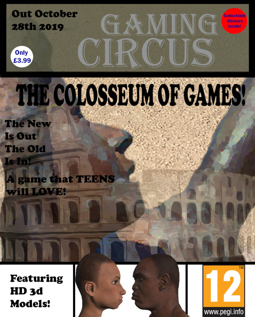
For my Magazine from cover, I am going to use a picture (of my own) of a female statue and adjust it to make it look cartoon like as if it is from Ancient Rome as it’s where the game is based, this means that it is an indexical sign because there is a link to Rome but not a direct or obvious representation. It will be the main focus/focal point of the magazine as it will be the main statue of the arena in the game. This is also why I have decided to include an emerging background of the Rome Colosseum. This can be considered an iconic sign because it directly links to Rome and this why the game title is “THE COLOSSEUM OF GAMES!”.

The game title links to the magazine’s name as it is called “GAMING CIRCUS”, meaning that circus which is a form of entertainment would be held in giant stadiums like the Colosseum. I included a Moto being “The New Is Out And The Old Is In” it means that “classic games” and games based in “the past” have become more popular with teens within the recent years, hence why I wrote “A Game TEENS will LOVE”. I will write “TEENS” and “LOVE” in capitals to draw attention to the target audience which is teenagers and that they should really enjoy the project. This is why I included a ‘Pan European Game Information’ (PEGI) rating of 12 so that the customers and the receivers of the text will know that the game has slight violence and that it isn’t realistic and why it’s suitable for teenagers. On the bottom of the Magazine there is writing that says “Featuring HD 3d Models” letting the buyers of the magazine know that the game will have 3d models of a high quality which has become really popular in the gaming industry. To the right of the writing, in a separate section, there will be 3d models which will be the main character(s) in the game. I also included a price of the magazine as a white circular sticker with writing in the middle as it helps someones attention be directed to it. I also included a sticker that indicates that there will be collectible stickers throughout the magazine which customers of real magazines sometimes par-take in for fun, this can encourage people to buy that magazine again in the future so the company will make money, become popular and be well remembered .

I want the games main character to be chosen by the player which is why there is one male and one female character. This goes against the dominant ideology of women having power which will help to attract female gamer’s and get as many players as possible in general. This shows that the game will be a radical text because it goes against what society view a woman as which would be damsel in distress and on standby however, in the game the female protagonist will be a ravenous, blood thirsty warrior who enjoys fighting. The game will also be able to be seen as a reactionary text because the male protagonist will also be a ravenous, blood thirsty warrior which in the gaming industry is a very popular character trope. An example of this would be Kratos from “The God of War” games. Both characters will not be over sexualised but will have big muscles which is expected from warriors

The Typeface of the informative pieces of writing and game title is copper black, which is serif as it has decoration, which is mostly in black writing as it’s easy to read for most customers. This doesn’t include the Price tag or the Sticker information, they are blue writing with a standard sans-serif font which means without decoration. This is because they aren’t as important and don’t need as much attention as the other parts of writing, it’s also why they are smaller. The writing that stands out the most is the title of the gaming magazine “GAMING CIRCUS”. It is a serif typeface as it has decoration which draws attention to it and the text receiver should remember it easily. It’s also grey writing which contrasts with the background which is a dark green with an opacity of 80.

I included borders on the front cover to separate certain aspects from each other, a border to separate the header from the body and a body to separate the footer which is separated into three sections which all have a purpose. This also helps to keep it neat and look professional.

The colour scheme of the magazine is very brown and gold with other little colours that stand out. This is to give it an old roman like vibe. The background of the magazine is gravel which adds to the roman like aesthetic of gravel walkways and paths.

Definitions

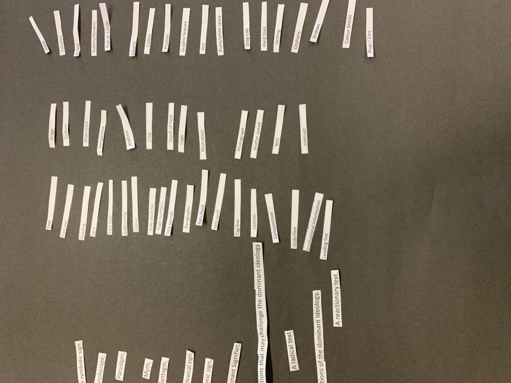
  1. Barthes: Ronald Barthes was a French literary theorist, Philosopher, Critic and a Semiotician. He studied many different fields.
  2. Pierce: Charles Sanders Pierce was an American philosopher, logician, mathematician and a scientist. He was known as the ‘father of pragmatism’. He studied as a chemist and worked as a scientist for 30 years.
  3. Saussure: Ferdinand de Saussure was a Swiss linguist and semiotician and his ideas put down the building blocks for development in linguistics and semiology in the 20th century. He is considered one of the founders of 20-century linguistics as well as a major founder of semiotics and semiology.
  4. Semiotics: The study of signs and symbols, as well as their use of interpretation.
  5. Sign: A sign can be a signal or action that is used to convey information or an action.
  6. Signifier: A signifier is a signs physical state, such as a sound or a printed image, different from its meaning.
  7. Signified: The meaning or idea shown by a sign.
  8. Iconic sign: A direct representative symbol of an object.
  9. Indexical sign: It’s a sign that strongly links to an object.
  10. Symbol: Something thing that represents something else.
  11. code: A system of words, letters or symbols to be represented as others.
  12. Dominant Signifier: The most important sign.
  13. Anchorage: A sign that fixes the meaning.
  14. Ideaology: Set of ideas and beliefs.
  15. Paradigm: A group of things.
  16. Syntagm: A series of connected signs that have a meaning together.
  17. Signifcation: Process of making meaning.
  18. Denotation: Barthes: The meaning.
  19. Connotation: An idea or feeling a word invokes.
  20. Myth: Ideas made from connotations that create a dominant ideology.
  21. A radical text: Challenges the dominant ideology.
  22. A reactionary text: For the dominant ideology.

Media Summer Task

Media Summer Task

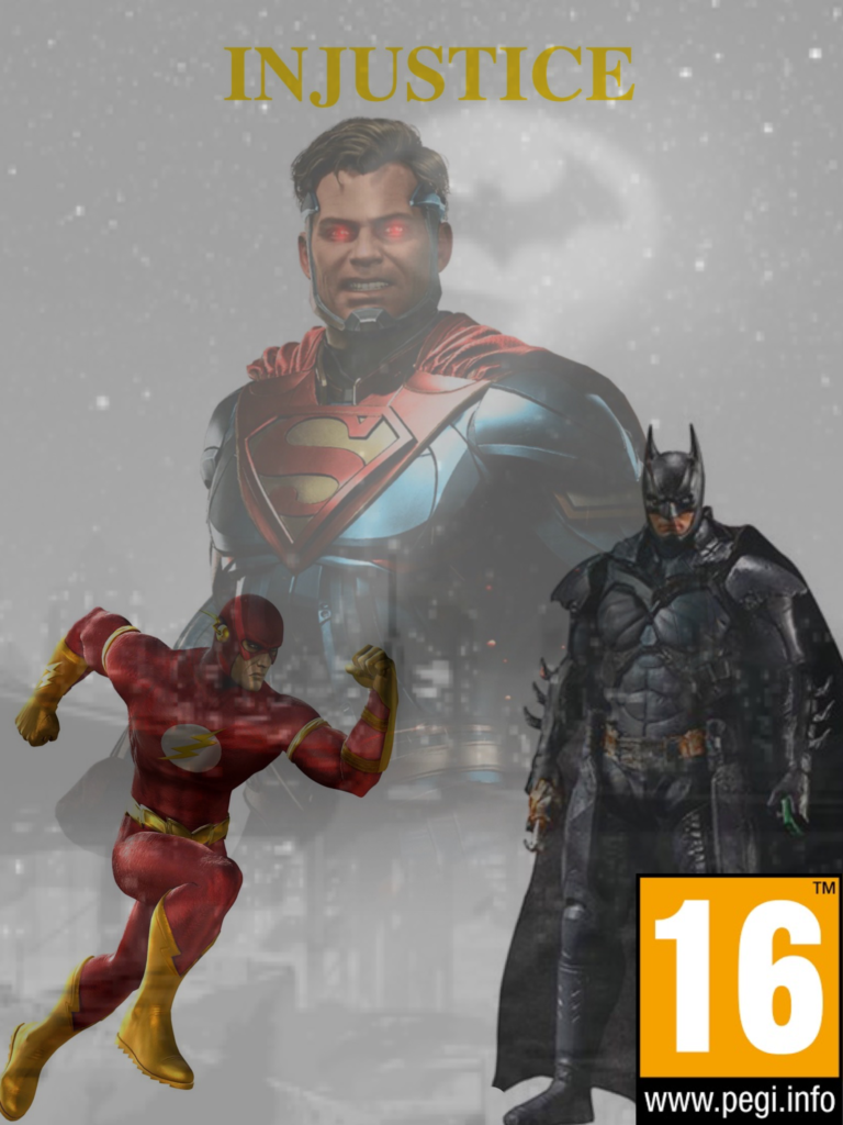
For my magazine cover I first off had to choose a game, I had decided on the Injustice universe games. The first game’s title is “Injustice: God’s among us” and the sequels title is “Injustice 2”. Both games go off of the storyline of the Superhero ‘Superman’ becoming evil and being the main antagonist in the first game as well as the second game.

 Because of this I decided to put him in the center of my magazine cover with red glowing eyes, ready to shoot heat vision. To get the image I went onto Google images and picked an image that I thought would capture his evil essence. However, because I did this with all my images I don’t know if they have any copyright claims that any owners could potentially use against me and therefore sue me.

Because there is an antagonist on the cover there must also be the protagonist, in this case it is Batman. Batman also feels as if he is partly to blame for why Superman has become evil. Because of this I wanted to get an image of Batman not looking happy or sad, however I did get an image of him looking very determined and serious. I decided to put Batman’s layer over Superman’s layer because it generally went well with the aesthetic and overall looks better if it were the other way around. Batman is wearing his second game costume as it represents he is a new man from who he was before.

The last and final superhero character that is on the front cover is ‘The Flash’. I chose ‘The Flash’ because in the first game he is an Antagonist somewhat against his will. Yet, in the second game he has been given a redemption and is on his way to becoming a Superhero once again. I decided to choose a picture of him of him running for two main reasons:

  1. Reason number one is because it’s simply his ‘superpower’ and it makes sense of him to be using his abilities like Superman and Batman with his utility belt.
  2. Reason number two is because it can be representative of him on his ‘run to redemption’ and once again becoming one of the good guys.

For the background I decided to pick an image of ‘Gotham city’ with the Bat torch being shone into the sky. I chose this because it shows the Batman is being in need of service to help save the day. It also shows that Batman is needing to protect his home city where he grew up and protect the ones he loves.

I chose to include a Pan European Game Information (PEGI) rating of 16. PEGI is to help European consumers make decisions when buying items like video games. This rating specifically is to alert the audience that there may be some strong violence and is an action game. This means that young children are recommended not to play it. It also means that if you are under the age of 16 you won’t be able to buy the game in stores.   

Iconic signs:

  • PEGI 16 Logo. This links to who should be playing the game.
  • Batman Logo (in the Background). This links to heroism.
  • Flash Logo (on the Flash suit). The symbol looks like lightning.
  • Superman Logo (On the superman logo). This links to heroism.

Indexical signs:

  • Batman holding his grappling hook. This links to violence.
  • Superman and his eye lasers. This links to violence.
  • PEGI 16 Logo. This shows that it’s specific to a certain target audience due to the violence and sensitive issues in the game.

Symbolic signs: