All posts by Emily B
Filters


2nd Attempt of a Media Banner
Media Definitions
- Barthes = he created the 5 narrative codes and is known as the “Father of Media Studies”
- Pierce = he was the discoverer of Semiotics and established that signs can be split into 3 categories: Iconic, Indexual and Symbolic.
- Saussure = he was a was a Swiss linguist and semiotician (person who studies semiotics)
- Semiotics = This is the scientific study of sign and symbols
- Sign =A mark, sign or word that indicates, signifies, or is understood as representing an idea, object, or relationship. For example, a love heart could be a sign of being in love.
- Signifier = This is the thing, item, or code that we ‘read’ on a source of media, this can include images, drawings, text, image captions.
- Signified = This is the idea or meaning being expressed by a signifier. For example, with the Mario photo as the cover image on my magazine, it is signified the edition is all about Mario.
- Icon = This is an image defined by the way in which it is used; any image deemed “icon” is understood as a medium for an outlying entity. For example, gaming consoles are icons of gaming magazines.
- Index = It is also called the ‘efficiency indicator’. Index describes the degree to which a target audience matches to the entire population of an analysed platform.
- Symbol = This is a mark,a meaning or a word.
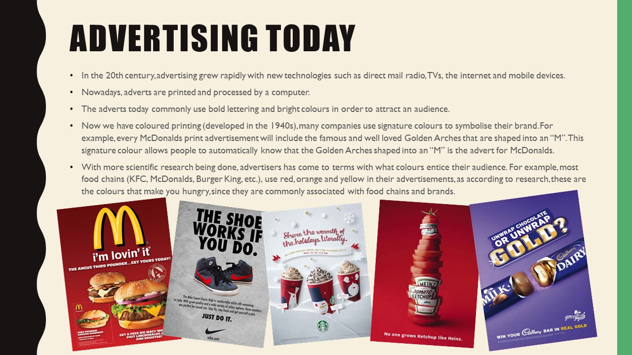
- Code = These are loads of signs that create a meaning of something. Media codes include the use of camera, acting, setting, mise en scene, editing, lighting, sound, special effects, typography, colour, visual composition, text and graphics to develop a TV advert.
- Dominant Signifier = The most important thing we see on a piece of media. It also provides anchorage (signs with a fixed meaning)
- Anchorage = Anchorage is when a piece of media uses another piece of media to lower the amount off connotations in the first piece of media, therefore allowing the audience to interpret it much more easily. For instance, in a newspaper, pictures are accompanied by a caption that allows us to understand what the picture is showing us
- Ideology = A view shared shared by a wide group of people
- Paradigm = a group of signs
- Syntagm = These are signs but if one sign is removed, nothing will make sense. Thus, for example, the letters in a word have syntagmatic relationship with one another, as do the words in a sentence or the objects in a picture.
- Signifcation =this is what we think something is
- Denotation = this is usually the first level of analysis: what the person can visually see on a source of media (ie magazines and TV adverts)
- Connotation = Connotation is when you expand on your denotation and is a second level of analysis because you identify what the denotation represents.
- Myth = these are false beliefs and stories which aren’t proved true by science. In media terms, Barthes discovered things in the news (ie articles) that aren’t true but people choose to believe is true is also a myth. In today’s terms, this can be known as “fake news”.
- A radical text = A text that challenges myths and the dominant ideology
- A reactionary text = this supports the dominant ideology
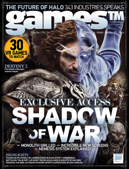
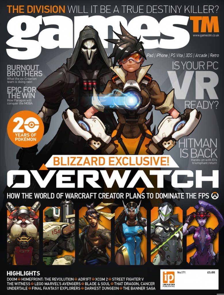
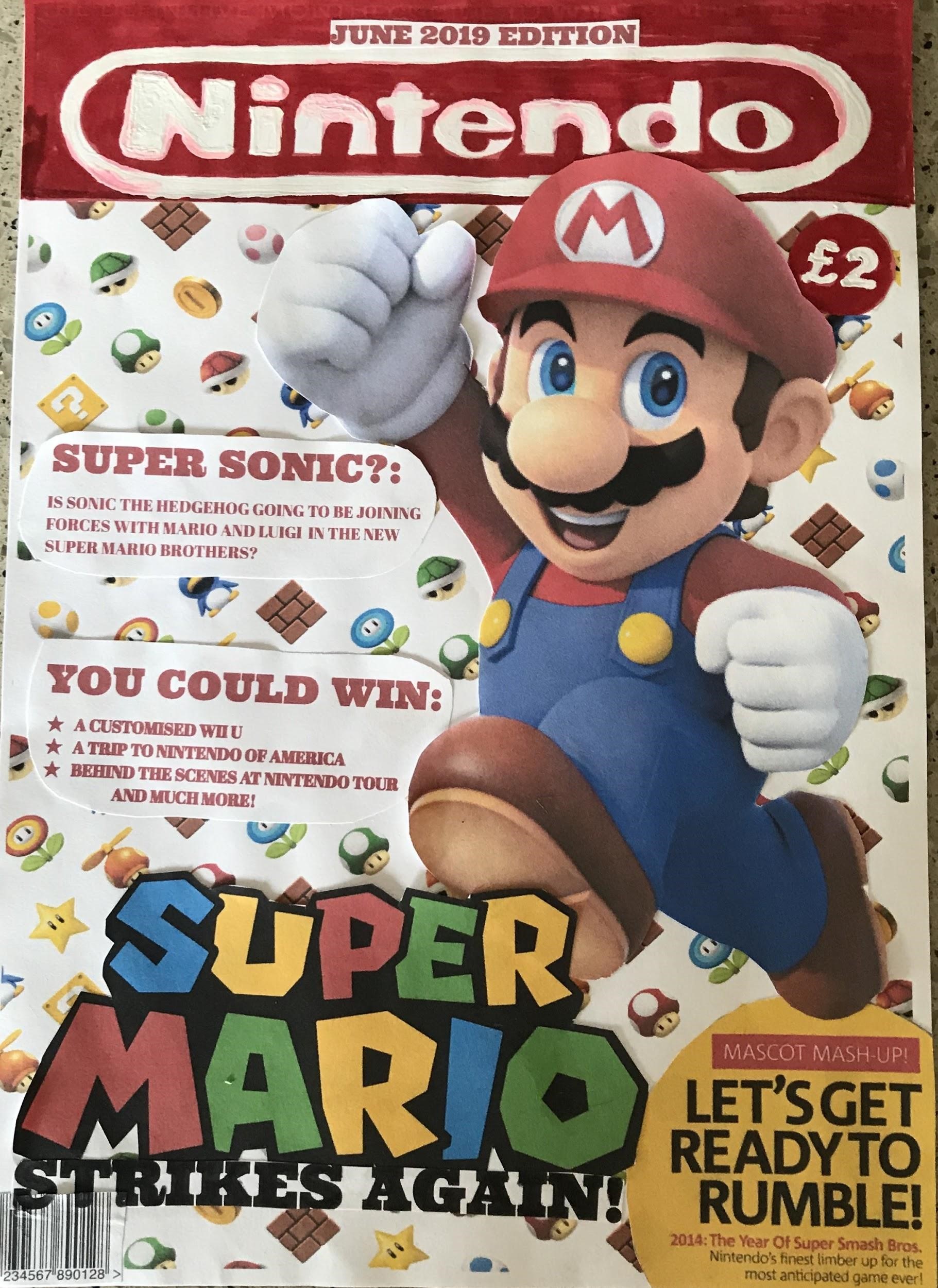
Different Signs on My Nintendo Magazine
Iconic Signs:
- Nintendo Logo
- Red font (Nintendo branding)
- Super Mario logo
- Barcode = shows it is a magazine
- Mario image = looks exactly like Mario
- Mario power-ups in the background relate to the Super Mario games.
Indexical Signs:
- Super Mario
- Red font colouring
- Mario coins in the background
- Mario power-ups in the background
- Super Mario colours (rainbow used in the Super Mario logo)
- The font used for the font saying “Super Mario Strikes Again” is similar to the famous Super Mario Logo used in all the games within the Super Mario franchise.
- Price on my magazine cover
- Mario jumping = associated with the game as Mario jumps to collect the coins
- Pop up for Super Smash Brothers in the bottom right hand corner as Mario is a playable character in the Super Smash Brothers Game.
Symbolic Signs:
- Pop up for Super Smash Brothers in the bottom right hand corner as Mario is a playable character in the Super Smash Brothers Game.
- Super Mario colours
- Red font colouring
- Mario coins in the background
- Mario power-ups in the background
- White background (colour of Mario’s gloves)
- The font used for the “June 2019 Edition”
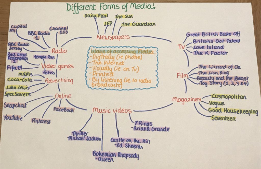
Different Forms of Media: Flowchart
My Second Attempt of a Gaming Magazine Cover
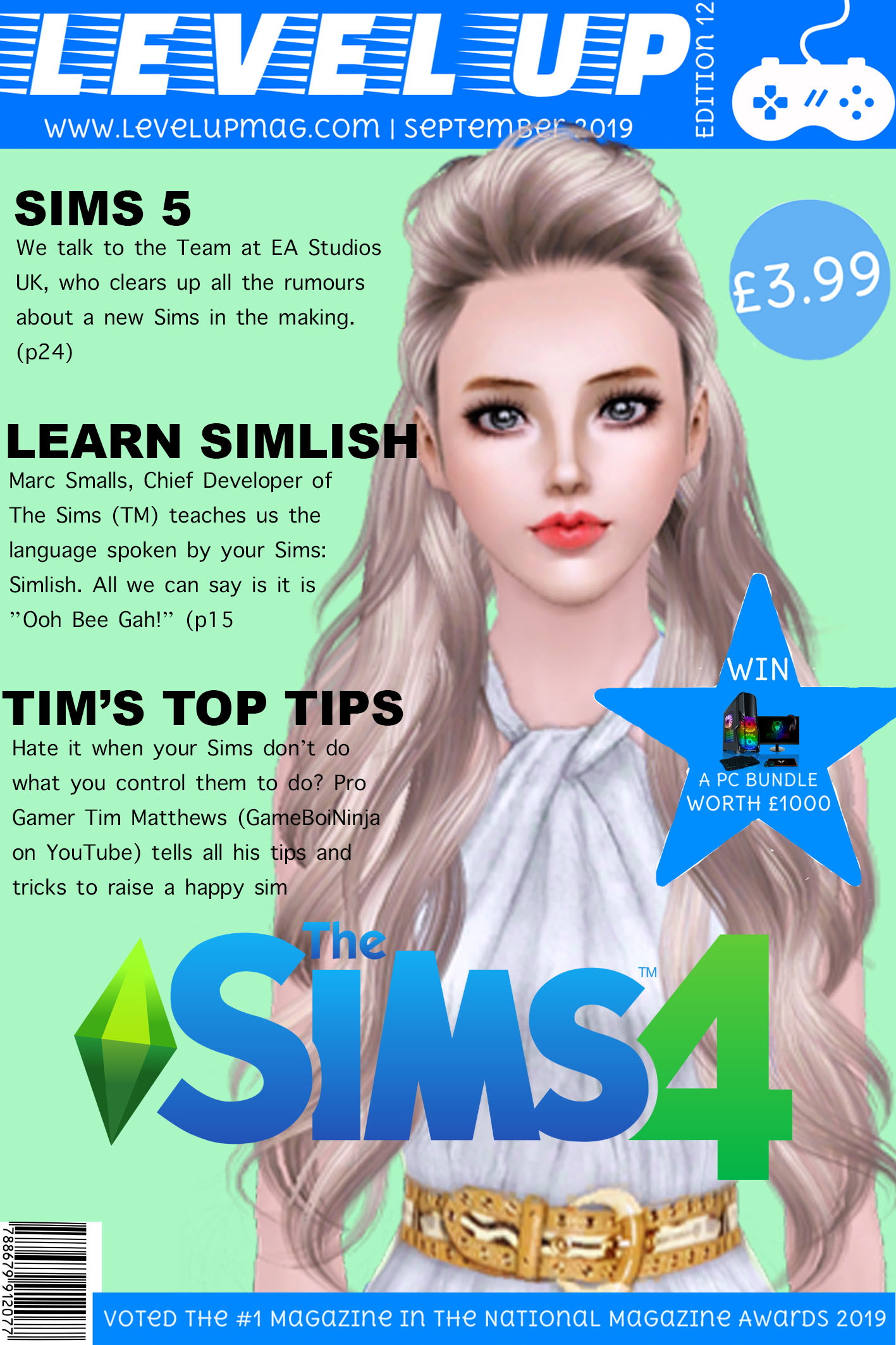
Sims Magazine Cover
This is my second attempt at creating a magazine cover for a gaming magazine. Before I started, I had a look at what I included in my previous magazine cover attempt and identified what I was missing and how I can improve. This magazine cover is based around “The Sims”. I have chosen to base mine on “The Sims” because it is one of the most popular games and it is also very famous, meaning people with instantly recognise the logo, hence why I have added it onto my magazine. I created my magazine cover in Photoshop and cut out bits of other magazines to use in my magazine. My magazine is based for Older Children and Teenagers (10-18years).
At the top is my Masthead, I have used the colours of the Sims branding (Blue and Green) as these colours look quite nice together and the bright blue stands out against my pale green background. On my masthead, I have also included the edition number and the date so people know when my magazine issue hits the shelves. I have also included the price, at (£3.99), which I think is quite reasonable as it entices children to buy it with what could be their own pocket money. I have decided to include a close up of a Sim as my main image, so from a distance people automatically realise this edition is based on “The Sims”. The Sim used as the central image is looking directly at the consumer as if they are trying to communicate with the customer. I feel the direct address makes the consumer feel included and more likely to buy the magazine as its as if they and the Sim are establishing a relationship.
I have chosen my cover articles carefully. I have chosen “Learn Simlish” (the language the Sims speak) as a bit of humour and to entice the reader to read on as I included a phrase of “Simlish” so they would want to find out the meaning. I also used alliteration with “Tim’s Top Tips” because at the age bracket my magazine is aimed at, kids want to succeed at a game, so I feel this article is suitable to out on my magazine cover. Lastly, I think the article about the Sims 5 is appropriate for the cover as it is an exclusive article. I also feel by mentioning the possibility of a new game, consumers are enticed to buy my magazine and to discover whether it is true or not. The “Sims 5” is a selling line of my magazine because if a new game is talked about, people are bound to buy the magazine to learn more about it. I have kept my cover lines quite vague to entice readers to buy the magazine and read on. Finally, I have a huge star shape with the word “Win”. I have made this quite large because I feel that promoting competitions with a prize worth loads of money will also entice consumers to buy the magazine.
Media Banner
My Summer Task
My Chosen Magazine Cover
Prior to designing this magazine cover, I looked at the covers of many Gaming magazines. After many attempts of creating magazine covers, this one I decided was my favourite. I decided to design the magazine cover for the Nintendo Magazine. This cover is aimed at Older Children and Teenager (between the ages of 10-24). I have designed the logo free-handed, with all other features of this magazine being printed off. I have gone with a red and white theme as they are the main colours of the Nintendo branding. Red and white also I find looks quite appealing together because the red is quite dark, and the white colouring used for the title makes it stand out from a distance. I have included a date line, which is written in red to fit in with the colour scheme of the magazine and I have also included it on top of the masthead because I feel with its placement there, people will take notice of it.
The masthead is the name of the magazine. I have used it against a predominantly white background so that it stands out. The masthead also matches the colours on the main image. I have used red and white for the masthead as they are quite bright colours and will stand out from a distance, thus attracting the consumer’s attention. The Masthead is the Nintendo logo to inform the consumer that the magazine is associated with the Nintendo branding and franchise. It also is large to stand out and used on every magazine issue so the consumers instantly know this is the Nintendo magazine. I have used Mario as the central image on my magazine because Mario is the most famous Nintendo Character and I find his red overalls make him stand out over my predominantly white Mario themed background. I also used symbols associated with Mario (ie coins and the power-up items) as my background behind the large image of Mario, so the consumer instantly knows that this magazine edition is all about the Super Mario franchise.
As my magazine is based on the Super Mario Bros Franchise, I have used the Super Mario logo as my central image’s caption. This is so that everyone knows the magazine is all about Super Mario Brothers. I have even included a yellow bubble with an article that will appear in the magazine. I have chosen yellow because it stands out as it is bright, it also quite closely opposite to red on the colour wheel and yellow is a colour used within the Super Mario Franchise (Wario’s hat and shirt). I also included the caption “Mascot Madness” as I find it is quite catchy and the alliteration helps people to remember it, thus allowing them to keep my magazine cover in their minds, making them more likely to buy it and future issues.
Finally, I have included headings of articles. I have written them in red to fit in with the Super Mario colours. I played with words and came up with the heading “Super Sonic” by combining the “Super” of “Super Mario” with the “Sonic” of “Sonic the Hedgehog”. I have also included snippets of competition prizes available throughout the magazine. I used the prizes that are more of a once in a life-time experience in order to entice customers to buy the magazine to try and win amazing prizes in future competitions held in future issues.
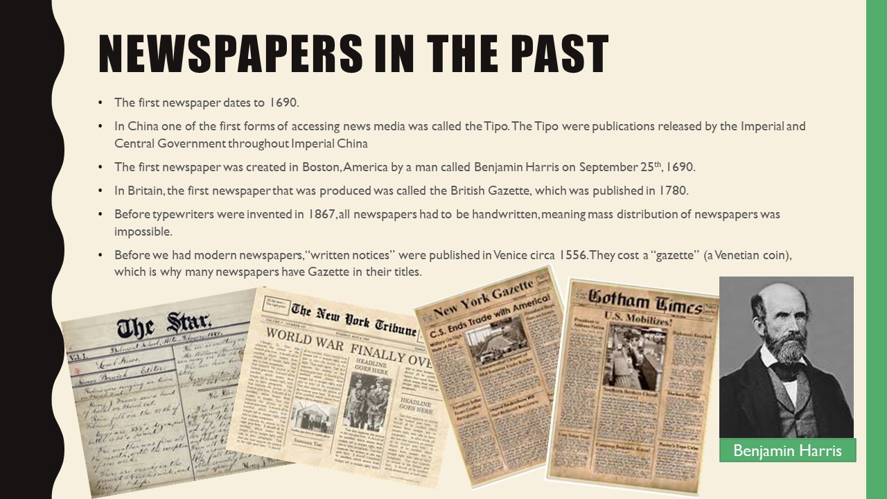
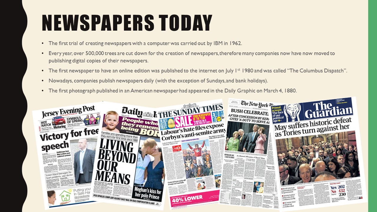
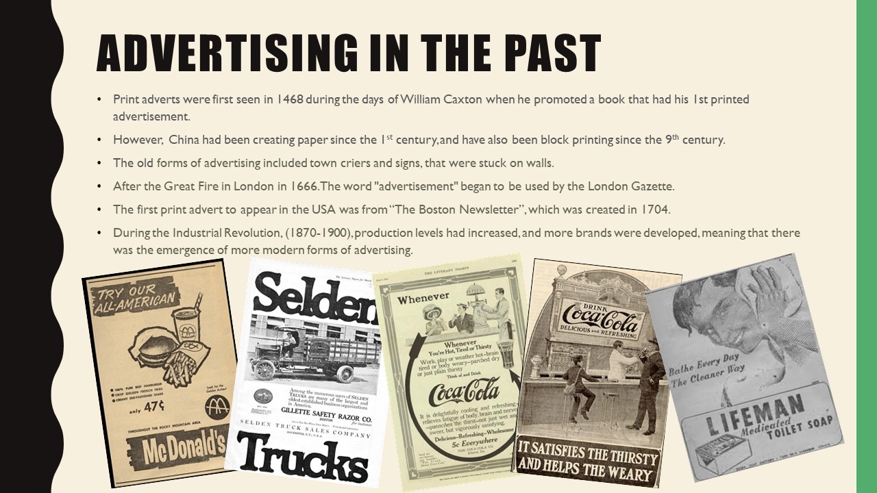
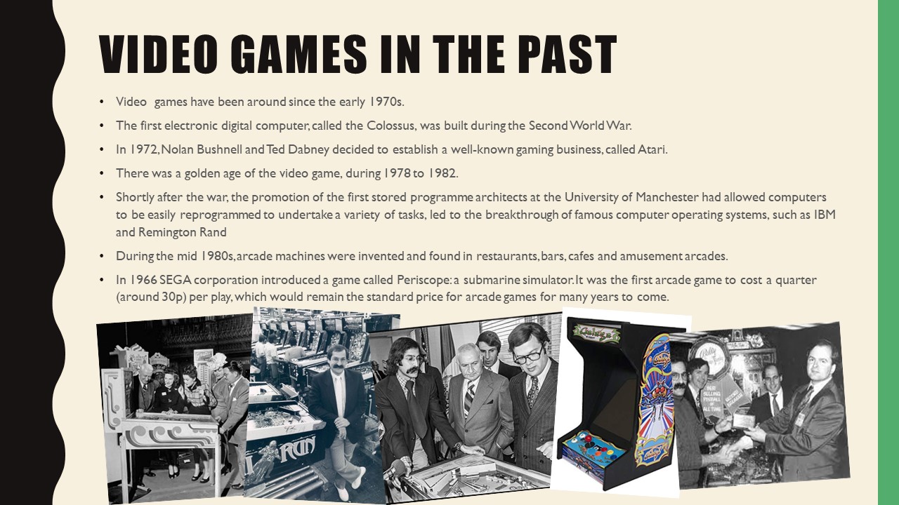
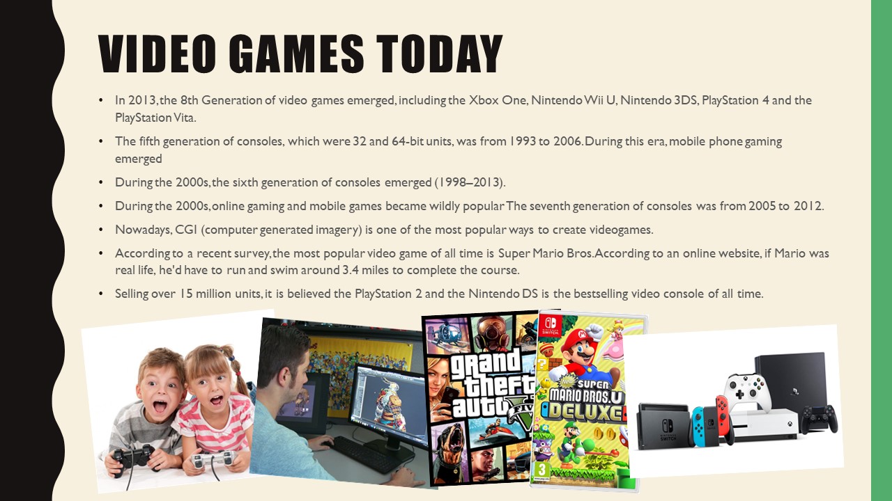
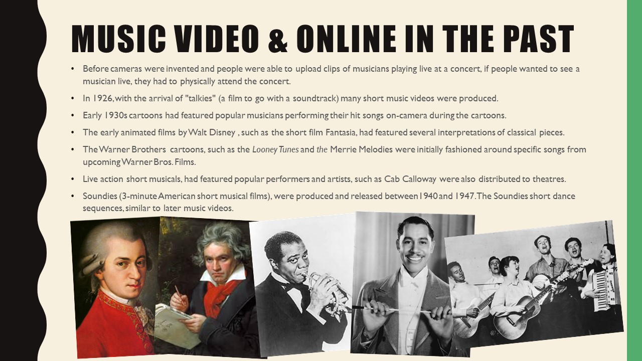
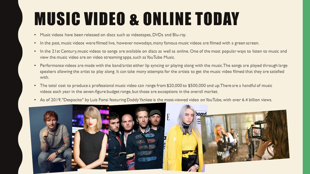
Media Timeline

Introduction Questions
What is Media?
Media can be a form of entertainment as well as carrying out educational purposes.
Media can be seen as a global platform
Media are different forms of providing information and entertainment.
Media helps us to communicate with the World and educate others who don’t live in the same place as us.
What is Media Studies?
Media studies allows us to learn about the different forms of media entertainment and how they are done.
Media studies allows us to learn about the different forms of media entertainment and how they’re done
It teaches us the production side of famous adverts that we know and love so we can identify what makes a source of media effective
It educates us on the production of effective advertisements
What is the point of media studies?
It helps us to know what makes effective media sources and enables us to identify the key points that go into media.
It helps us to identify how to portray something ie a product to entice potential customers to maximise their profits.
Understanding forms of media and how to apply them effectively and appropriately
I think that Studying media will help me to explain…
Photoshop techniques that adverts use to make their product look so appealing (commercial vs reality)
The different elements that come into the production of an effective ad
More about the importance of media in relation to communicating with the outer world
How companies use media to their advantage