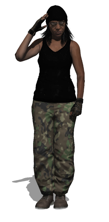
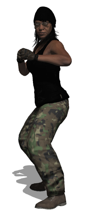
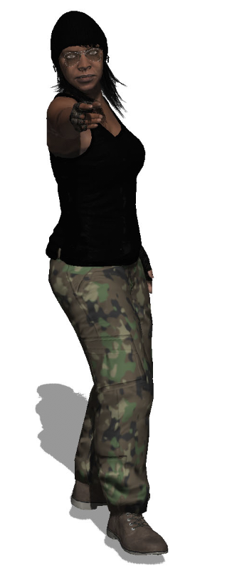
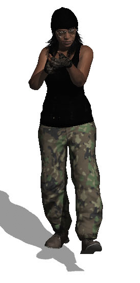
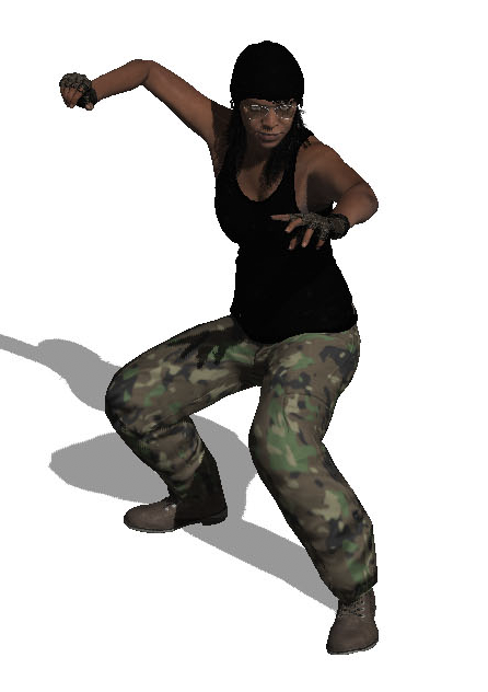
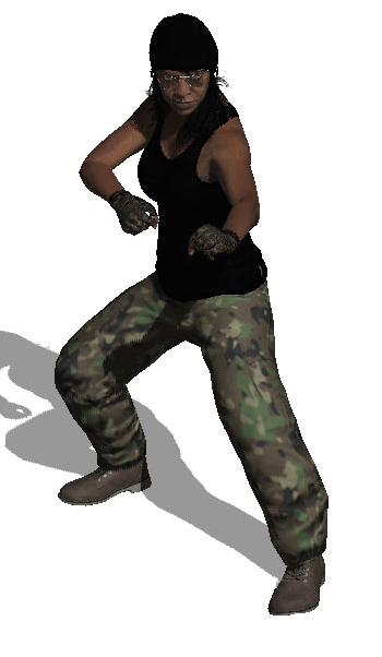
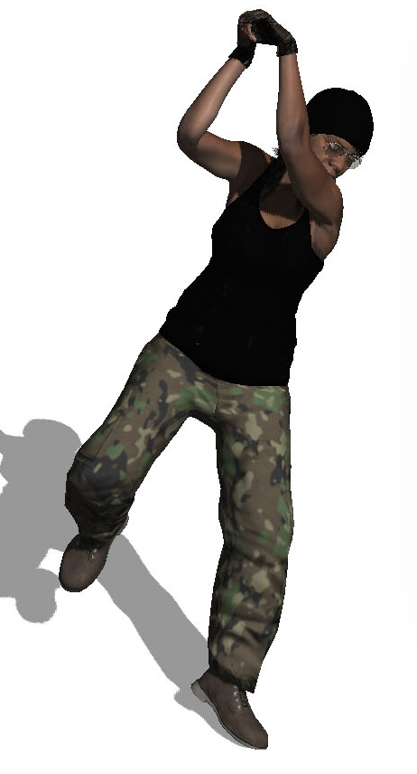
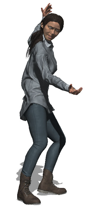
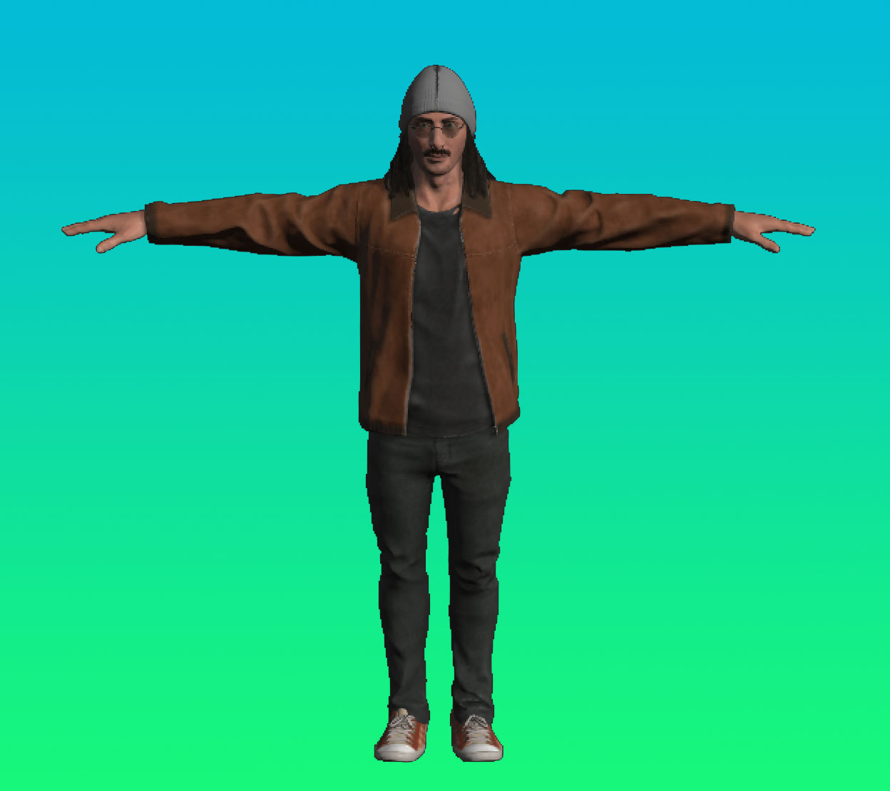
Like the Metaligirl, I created a character for my front cover in Adobe Fuse, and then changed her pose (as she is meant to be in the Army). I have based this character off the well known game, “Call of Duty”.
All posts by Emily B
Filters


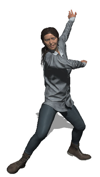
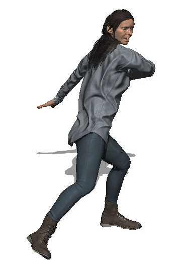
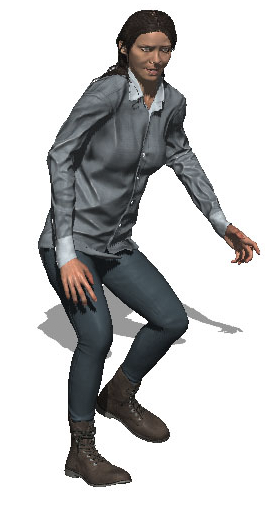
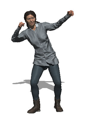
METALIGIRL – PHOTOSHOOT

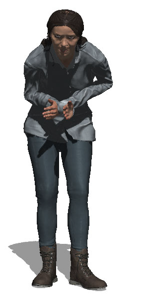

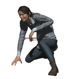
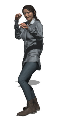
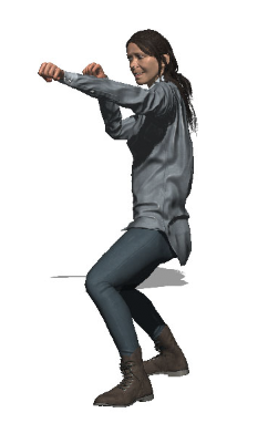
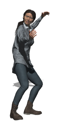
(Please note, I haven’t cropped out half the body, to upload them here, the site automatically cropped them)
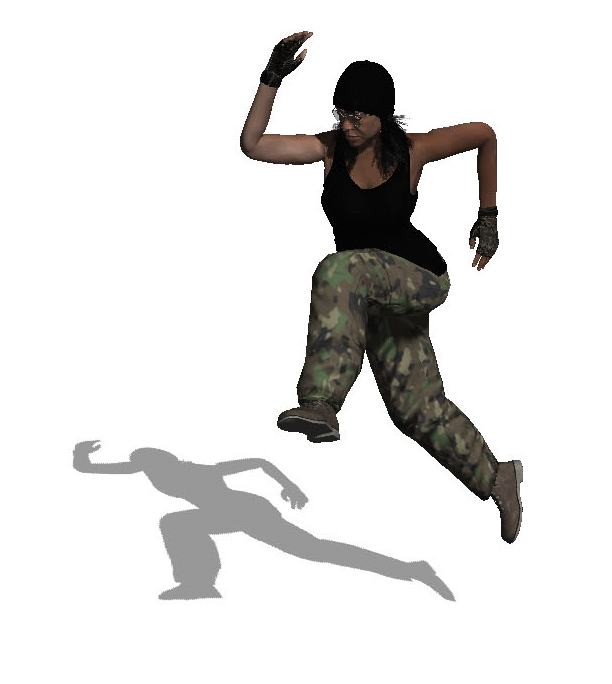
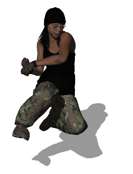
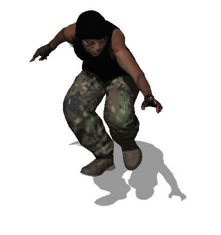
I created Metaligirl in Adobe Fuse and then changed her posing in Adobe Photoshop. I wanted her to look a bit like a villain. I am pleased with the way the photos came out, but I am unsure which one to use on my magazine cover because I like how they all turned out!
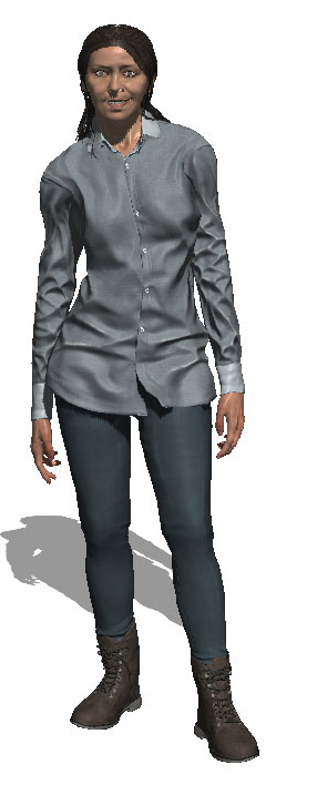
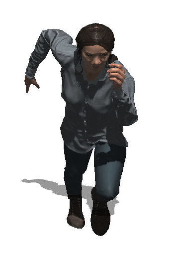
Fuse character – stevie
Statement of Intent
- Aimed at Young Teenagers (age 10-15)
- I had many attempts at creating different gaming magazines to see what placements of elements and colours look most effective
- My magazine is aimed at girls, so I will include feminine colours.
- My plug will include interviews with female game players, as my magazine is an attempt to promote more females into the gaming industry.
- Most of my images in my magazine will involve females as the main aim of my magazine is to promote more females into the gaming industry.
- My main cover image will be the launch of a new game, Marian Racers, that is enticing more females to get into the gaming industry through the introduction of female games characters.
- Before planning my NEA magazine cover draft I looked at the most famous game characters and noticed they are predominantly male and there aren’t many female game characters.
According to the Internet, there are 1.9billion children in the World, making up 27% of the entire population. These Children fall in the DE Social Group and are unemployed, signifying that they will be able to afford necessities with their pocket money. While students may be struggling with School Life and Friendships, my magazine will serve as a source of escapism. My magazine will be relatively cheap, so that people of any social class will be able to afford it. Before I began planning my front cover, I had a go at creating multiple magazine covers of different styles, to see which one was the most effective at persuading the consumers to buy as well as being the most suitable for my target audience. I had concluded that having 3 little plugs with photos summarizing the pages in my magazine was the most effective and suitable for my target audience.
Prior to planning my magazine cover, I looked at covers of famous gaming magazines and noticed that game characters are predominantly male, hinting that gaming is more aimed at males rather than females. The main aim of my magazine is to promote more females into the gaming industry. Elements of my magazine will help to promote female gamers, these will be shown in elements of my magazine, such as interviews and reviews that are with females within the gaming industry. To entice females to buy my magazines, I will use the colours that are stereo-typically associated with females (purples, pinks, neutral tones). Before I began designing my magazine cover, I studied magazines that are aimed at women, so I can establish what elements of them would entice females to buy them. I had discovered females are more likely to buy a magazine that has females as the cover image rather then if the magazine had males as a cover image.
I have included my cover image of Marian, she will be looking directly at the reader to establish a relationship with the reader, thus making them more likely to buy the magazine. On my magazine cover, Marian is pointing directly at the reader, I have made it effective so that whatever angle you look at the magazine from, Marian is still pointing at you. This makes it appear as if Marian is pointing at the reader to send them a message (to buy the magazine), thus creating a relationship between Marian on the magazine cover and the audience.
I have also included plugs, such as an interview with a professional gamer as online gaming is very popular with the Youths, so I feel the interview will be relevant to the magazine and a topic that will interest my target audience.The photo of Marian will be an iconic sign within my magazine cover and the “Marian Racers” logo will be an iconic sign, so that the consumer automatically knows that there is a cover image of Marian because the launch of the Marian Racers is one of the main articles within my magazine. Finally, I have thought very carefully about the sizing of my magazine, and I have decided on an A4 size of magazine because it will be able to fit into the consumer’s bag.
Cartoon Photo

Level Up – Cover Image

This is the cover image of my magazine, Level Up. As I am not very artistic, I drew over a photo of Mario I liked and I made him look unrecogniseable by using feminine colors to attract to my female target audience.
I have made it look like Marian (My cover image) is driving towards the consumer, so that they are enticed to buy by magazine as they feel a direct connection with Marian. Marian is wearing a purple and turquoise (her signature colours) hairband because I feel that will attract to my target audience as stereotypically, girls wear hairbands.
Level Up – Magazine Masthead (+plug)

This will be against a background of a lighter colour, so that the dark purple stands out. I have used dark purple as it is a bold colour and purple is also typically associated with females. This is important I use very feminine colours as my magazine is aimed at Female Teenagers (age 10-16).
Magazine Design Plan

I have decided to include the cover image of my magazine as Marion, the main character of the new game my magazine is based on, Marion Racers. When I create the magazine cover, I will edit it so that it looks like the kart is moving towards the consumer (face on) so it looks as if Marion is establishing a relationship with the reader through non verbal communication
For the caption of the cover image, I have used the font and colours (rainbow) of the title of the Marion Racers title. Due to the many colours that the magazine will involve, my magazine cover will be aimed at Teenagers (ages 10-16), hence why I have used a funky font that would appeal to youths more than adults.
I have also included 3 plugs at the bottom, with what the consumers will expect in the magazine, so that they are enticed to buy the magazine and read the magazine. These plugs include a competition you can enter within the magazine, an interview with a profession gamer called SpewPieDie and an article that introduces BotBoy, the new character you can play as in Marion Racers.
Missing from my magazine is the price, which I will put in a bubble on the left hand side to Marion in her racing car.
My Ideal consumer will be Teenagers (Ages 10-16), so I will use bright colours to attract their attention. My magazine will also be quite cheap so they can afford the magazine with their own pocket money. My ideal consumer will be based at females who can game, especially as my cover image will be a female games character. The ideal consumer will have long blonde hair, wear the fashionable trainers and wear ripped jeans (the typical teenager you will find everywhere). As my ideal consumer are girls, I will include feminine colours, (Red, Pink, Purple) and as I’m aiming the magazine at teenagers, I will include trends that teenagers use, such as
#GIRLPOWER, so the consumers instantly know this magazine is based at girls, as also shown by the multiple use of girl game characters as the cover image on my magazine.
Print Language on a Magazine Cover

Print Language