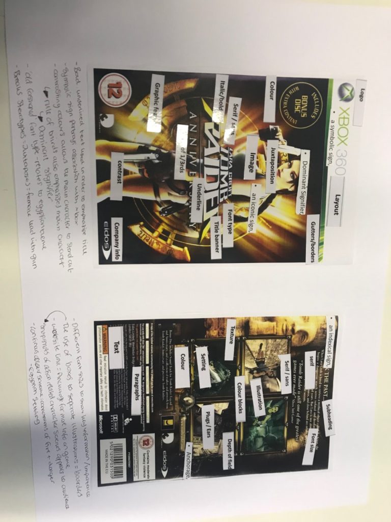
LARA CROFT – game cover ANNOTATIONS


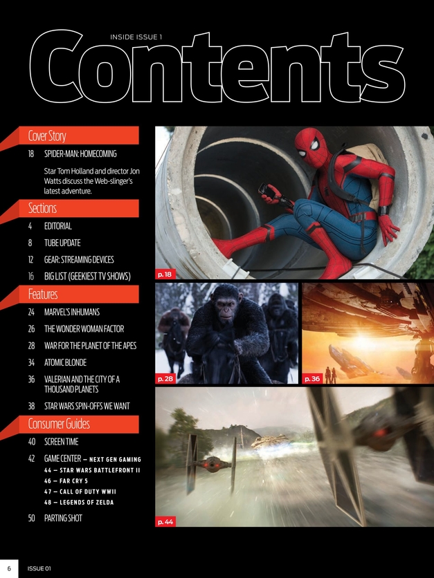
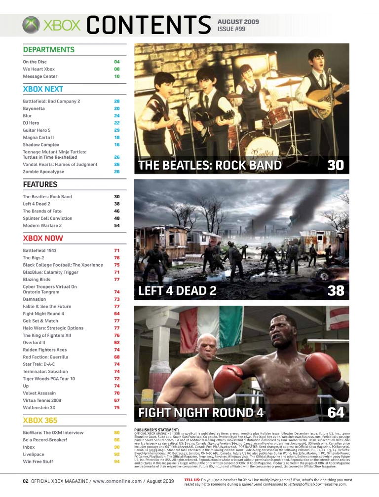
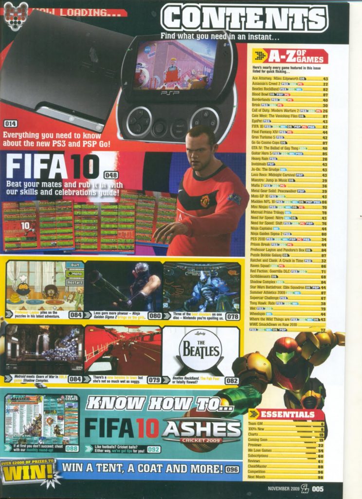

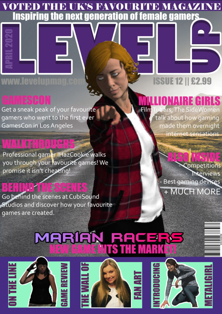
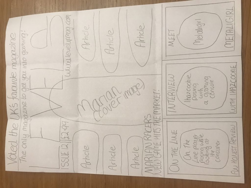
I made my masthead stand out more, and changed some of the fonts and colouring.
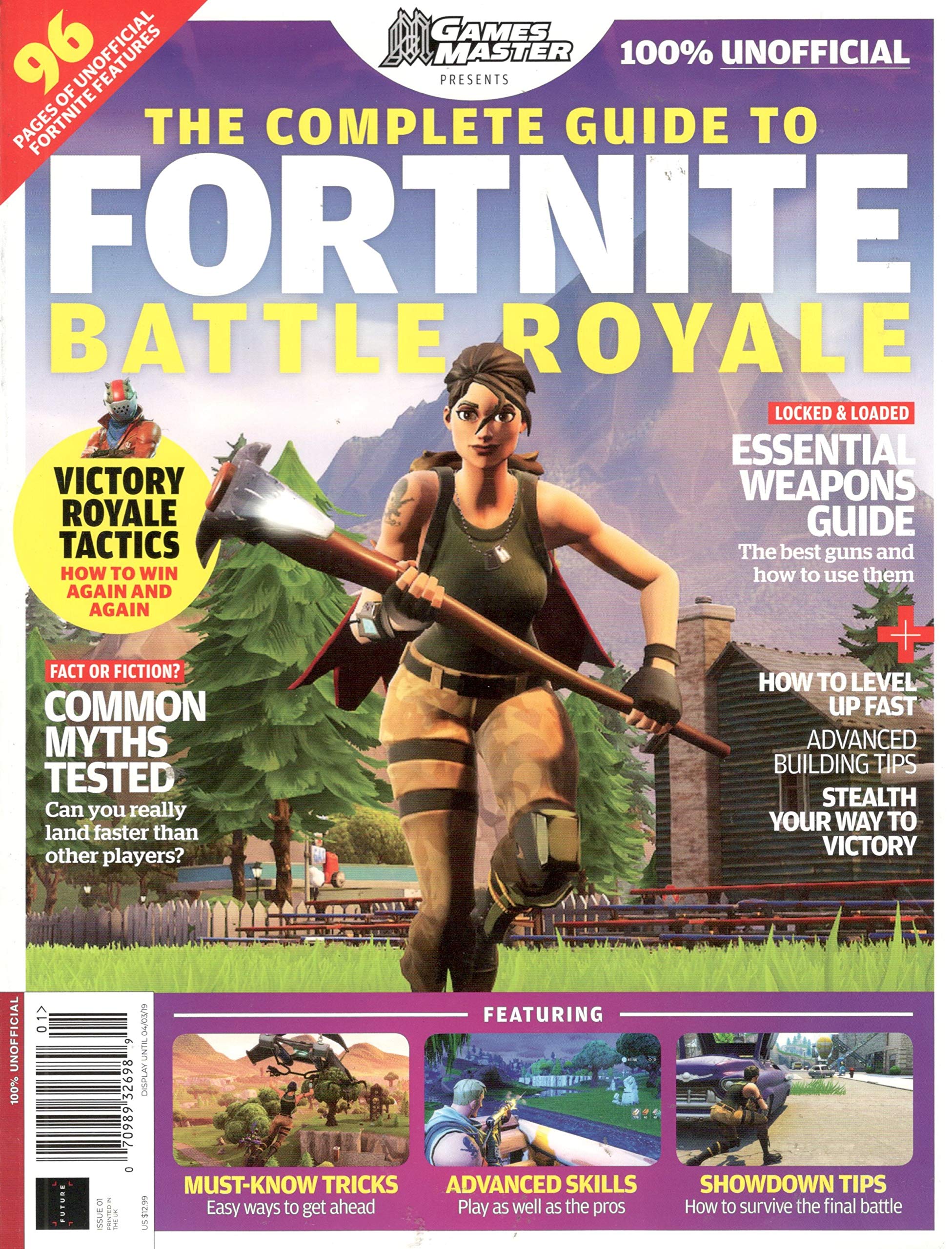
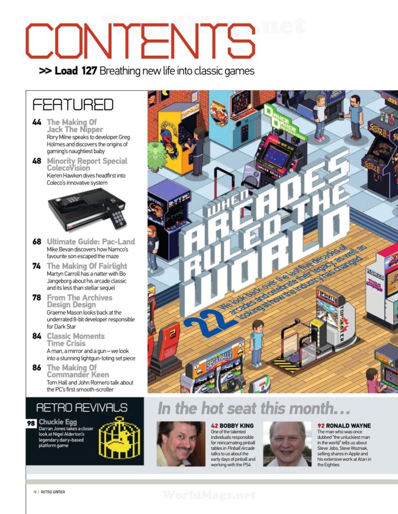
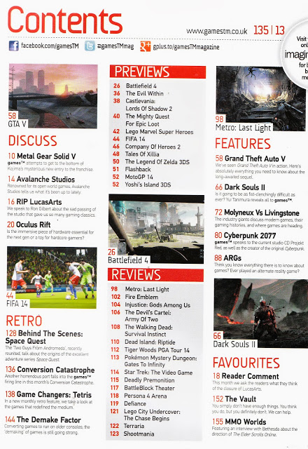
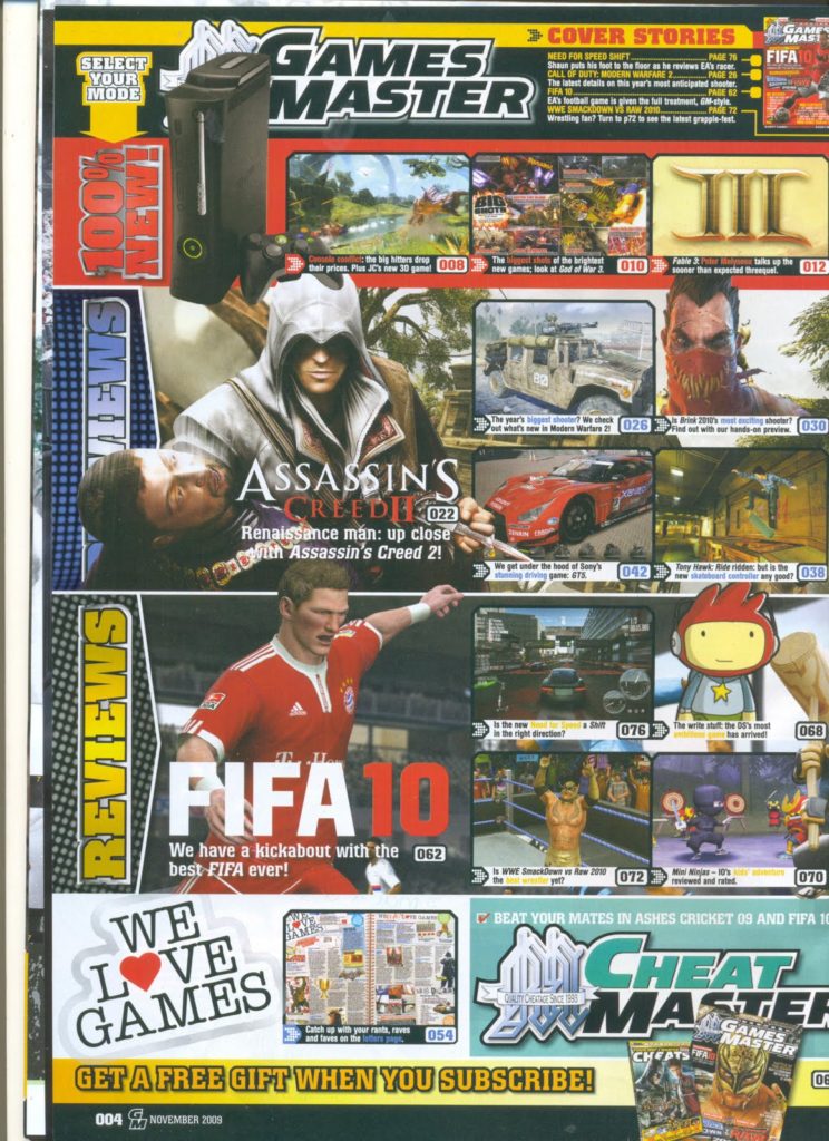
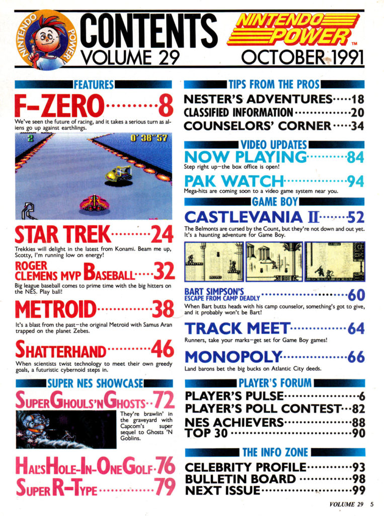
I have styled my magazine similarly to this Fortnite Magazine, in the sense that I liked to idea of the gallery at the bottom, therefore I have added in into my own designed magazine cover. What I have also taken from this style model is having the article plugs at the side, I have done this on my magazine because it looks effective and I also think it is clear and the reader’s attracted to the cover image, which will be one of the main selling points to entice consumers to buy my magazine.

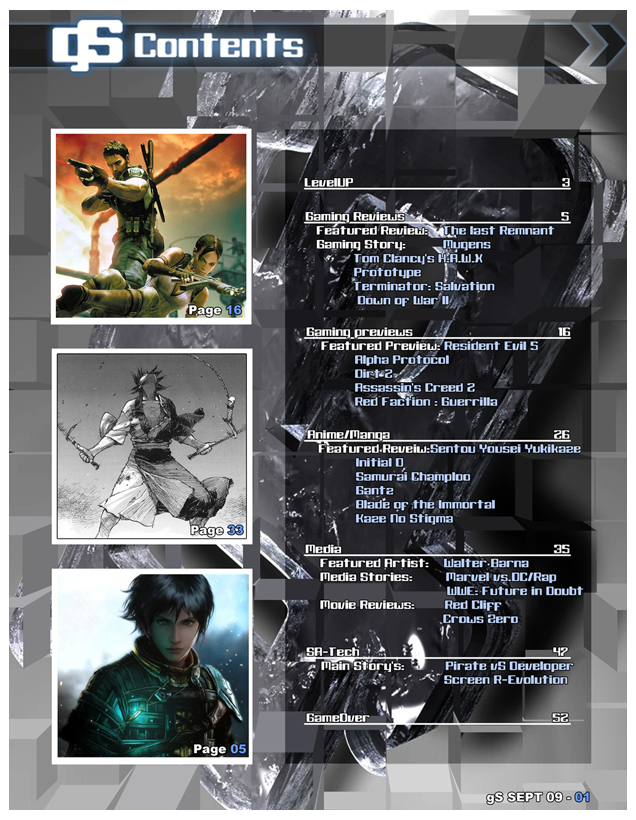
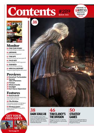
I have also designed my magazine similarly to this PC Gamer magazine cover. What I have taken from this magazine is how I stuck with a colour theme, pink, purple and mint to stand out. What I have also done similarly to this magazine is I included a banner that acts as a plug to entice my target audience to buy my magazine. I also have my cover image overlaying part of my masthead, because I think this is effective and attracts you to pick up the magazine. Finally, like the PC Gamer cover, my cover image is looking and pointing directly to the consumer as I feel this brings their attention to the magazine and it seems as if the magazine is trying to give them a message (to buy the magazine).

Codes and Conventions of my magazine cover
According to the Internet, there are 1.9billion children in the World, making up 27% of the entire population. These Children fall in the DE Social Group and are unemployed, signifying that they will be able to afford necessities with their pocket money. While students may be struggling with School Life and Friendships, my magazine will serve as a source of escapism. My magazine will be relatively cheap, so that people of any social class will be able to afford it. Before I began planning my front cover, I had a go at creating multiple magazine covers of different styles, to see which one was the most effective at persuading the consumers to buy as well as being suitable for my target audience. I had concluded that having 3 little plugs with photos summarizing the pages in my magazine was the most effective and suitable for my target audience.
Before planning my magazine cover, I looked at covers of famous gaming magazines and noticed that game characters are predominantly male. The main aim of my magazine is to promote more females into the gaming industry. Elements of my magazine will help to promote female gamers, such as interviews and reviews that are with female gamers. To entice females to buy my magazines, I will use the colours associated with females
I have included my cover image of Marian, she will be looking directly at the reader to establish a relationship with the reader. On my magazine cover, Marian is pointing directly at the reader. I have designed it so that whatever angle you look at the magazine from, Marian is still pointing at you. This makes it appear as if Marian is pointing at the reader to send them a message (to buy the magazine).
I have also included plugs, such as an interview with a professional gamer as online gaming is very popular with the Youths, so I feel the interview will be relevant to my target audience. The photo of Marian will be an iconic sign within my magazine cover and the “Marian Racers” logo will be an iconic sign, so that the consumer automatically knows that the main article of my magazine is the launch of “Marian Racers”. Finally, I have thought very carefully about the sizing of my magazine, and I have decided on an A4 size of magazine because it will be able to fit into the consumer’s bag.
Representation
I have aimed to represent Marian (the cover image) as radical to create the interpretation that women can be similar to men, in the fact that they can take on the adventure and action too, rather than stereotyping woman and expecting them to go out and work. I have also designed Marian to have fairly masculine features to remove her sexuality and make her similar to male characters, as usually female game characters have large breasts, and their body is in an hourglass shape. This is also shown by the posing of Marian, usually females are posing sideways, so that their feminine features are defined, however, I have put Marian in a pose that is not defining her feminine features, thus challenging the dominant ideology and expectation of females, thus emphasizing how women should be equal to men in the sense of their activities. Marian is also wearing clothes that are strategically covering her bottom, challenging the dominant ideology of females and the representation of women on games covers: wearing short clothes that shows a lot of skin to emphasize feminine features. I have also included no makeup on Marian, to also challenge the dominant ideology and make her a bit more masculine, but not overly masculine, one again, to emphasize how women and men should be represented truthfully, as not all females are the same as what is represented by the dominant ideology.
Audience Theories
The audience theory was developed by Jay G. Blumer. An audience theory, called the cultivation theory, was developed by George Gerbner, and is a theory that by creating more media challenging the dominant ideology, you will be able to change people’s theories. For example, if I wanted to emphasize that “dogs are amazing”, you could gradually include images of dogs onto newspapers, and then say a year later, everyone would see the image of dogs and think that they are amazing. On my magazine cover, I am cultivating the idea of equality for both males and females. This is shown by the common occurrence of females doing more male orientated activities, such as Marian (a female) is a female rally car driver, challenging the dominant ideology that only men are allowed to participate in car racing.
Style Models


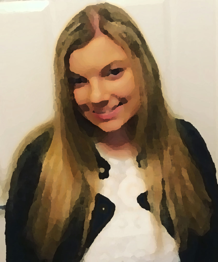
I have edited this photo of me in photoshop, this will serve as fan art on my magazine cover. This will appeal to my target audience because my target age range likes things a bit quirky and different, and I feel having a piece of art on my front cover will attract my audience and entice them to buy my magazine.
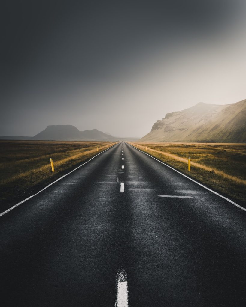

I found an image that I liked on Google Images, and then I edited it by changing some of the colours and the brightness. This will serve as the background of my magazine cover, as it is primarily based on ‘Marian Racers’, so the road in the background suits with the cover image of my magazine.

I created this Title for “Marian Racers” using an online font creator, where I chose the style of the font I am looking for and the colour scheme, then the website creates loads of presets I can edit. I chose this font because I find it is quite funky and I also like the gradient of the purple-pink-red as it really fits in well with my colour scheme.
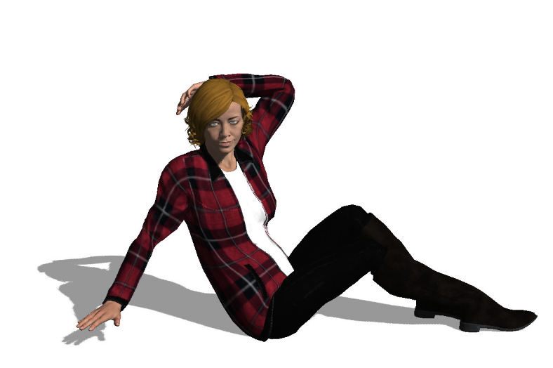
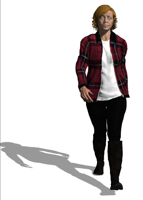
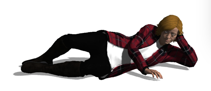
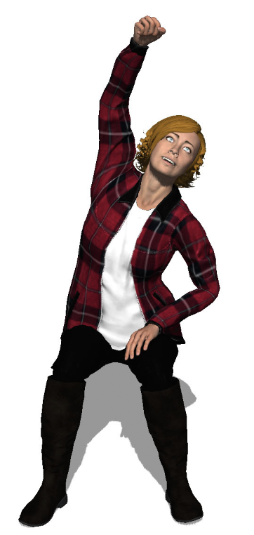
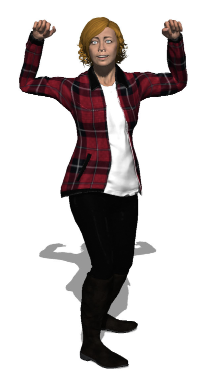


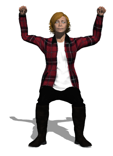
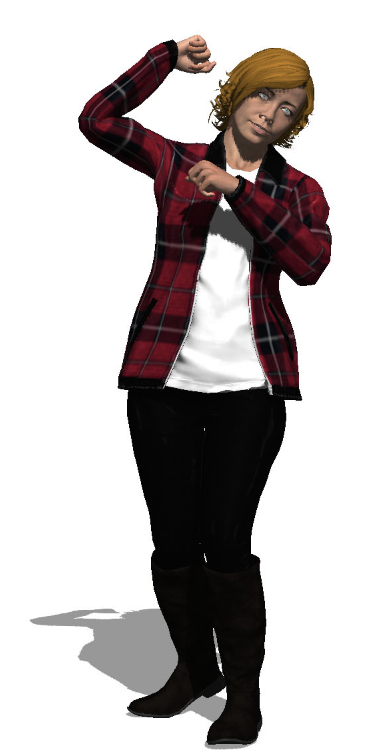
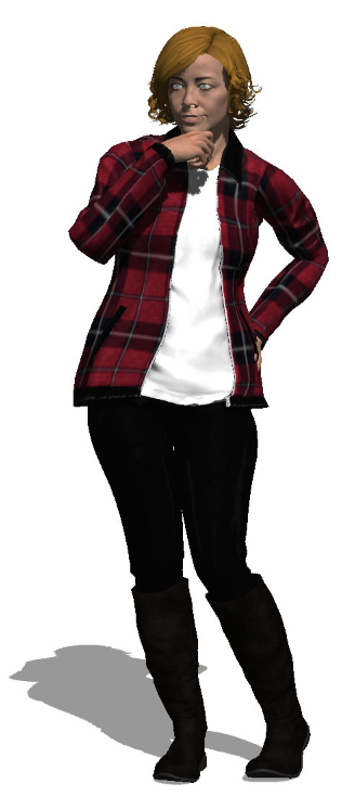
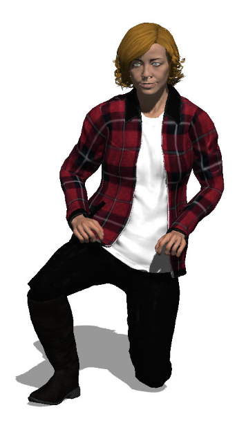
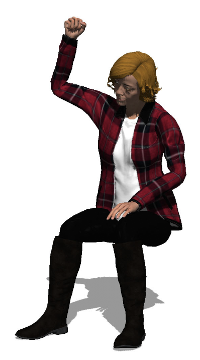
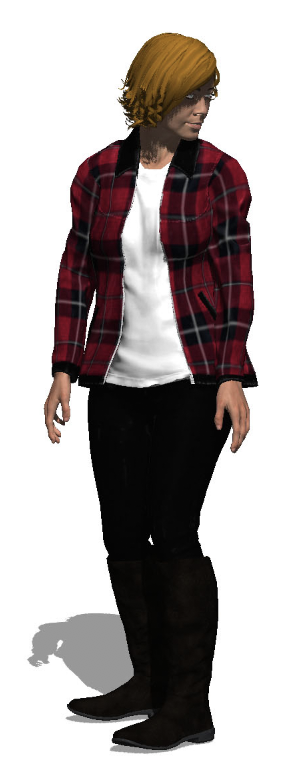

Marian is the cover image of my magazine. I have tried many poses with her (lying down and sitting down) because I am unsure if she will be in the car or pose by it. While I am editing I will see which type of pose looks the best.