All posts by Emily B

Filters

Author:
Category:

The Killing – Review

Q: Is this the first non-English language TV programme or film that you have watched? If so, how did you find this experience? Were you able to follow what was going on? How much did you rely on the dialogue / script / sub-titles?

For me, this is not the first foreign language film/TV that I have watched as when I was revising for my Spanish GCSE, I watched film and TV for revision. However, it was a little bit easier for me as I knew some basic Spanish and could identify what they are saying through my own knowledge. However, this was my first TV series I have watched without having any prior knowledge of the language it is in. Personally, not knowing the language and having to rely on subtitles was quite scary as you didn’t know exactly what they were saying and the emotions of the characters in the TV series, for example, when someone is angry, they might raise their voice. As I do not know Dutch and how they communicate facially, it was very confusing as I was unable to identify the emotions of the characters in the TV series.

Personally, I have never learnt Dutch or know any Dutch apart from the greeting “Hallo”, so watching this TV show, I had to rely on the English subtitles at the bottom of the screen. I found it was quite hard to analyse the mis-en-scene and the camera movements of this TV series because the subtitles were quite deceiving and my eyes were more focusing on the changing subtitles, rather then what was actually happening in the TV programme. I didn’t really like relying on the subtitles as it was translated from Dutch and there were some Dutch words that were not translatable into English, so the subtitles would show sentences that weren’t making sense, thus making me as the audience confused because it wasn’t translated properly into English for me to know and understand. It was also quite hard to follow on with the plot as they spoke relatively quickly, and it was hard to read the subtitles before they changed and the character spoke another line of speech.

I feel that if we watched an English version, it would be a lot easier to follow the plot as you do not need to focus on the subtitles to understand what the character is saying. Also, as we naturally speak English, we can identify emotions and the type of person a character is, so if we had an English version of this show, you’d be able to identify emotions and actions through their voices and physical actions.

The Killing – TV Show

Definitions:

Production = These are the stages that are created in order to produce a finished piece of media.

Distribution = Refers to how the media source is given to its audience (ie online, DVD, videos and E-Books).

Exhibition = This is how the media source is shown to the audience, such as through a tablet screen or a cinema screen.

What organisations (rather than individuals) are involved in the production, distribution & exhibition of this product?

Who is behind the Production?

  • There are two versions of this programme: one developed in the US by Netflix and Fox Television Studios and another developed in Danish by Danish production company DR in collaboration with ZDF Enterprises.
  • Originally, before the programme was taken over by Fox Television Studios and Netflix, it was produced by a production company called DR in collaboration with ZDF Enterprises.
  • The American version of this TV series was originally created by Veena Sud, it was also produced by Fox Television Studios in collaboration with Fuse Entertainment and later taken over by Netflix

How was “The Killing” Distributed?

  • In January 2007, it was broadcasted on Danish television for the first time.
  • Since being broadcasted on Danish television, it has also been distributed to many countries worldwide.
  • There has been many TV shows based on “The Killing” and it has both a Danish and English (US) version.
  • The English US version is available on Netflix and the Danish version is available online on Amazon.

What audience theories can be made from this TV show?

Stuart Hall’s theory of reception can be linked to this TV series as there will be 3 types of people: the people who love the series and want to continue watching it, people who may like the series but prefer a different programme and those people who absolutely despise the TV show and prefer to watch an alternative. However, it can be argued that George Gerbner’s cultivation theory can be applied to this TV show as some people may despise it, however, their views might change overtime the more that they see advertisements of the TV show and the more that they hear about people liking the TV show.

Audiences

Primary audience = this would be people who speak and understand Danish as this programme is produced in Danish and would want to watch the TV series again.

Secondary audience = these would be people such as critics and people who aren’t likely to watch the film, however they want to analyse the aspects that go into the TV programme.

Tertiary audience = these are the people that do not want to watch the TV show and they are only watching it because there is a theme that interests them. The tertiary audience for “The Killing” would be people who do not speak/understand Danish and people who like TV shows in the mystery genre. The tertiary audience would not want to re-watch the series again ,unlike the primary audience.

THE LANGUAGE OF MOVING IMAGES

TheoristWhat does it mean (in your own words)How does it apply to the advert (in your own words)
Equilibrium https://prezi.com/y5gvfc_pngwb/todorovs-narrative-theory/
https://www.bbc.co.uk/bitesize/guides/zqdhrdm/revision/3
Todorov’s Theory argues that every moving image follows a structure/plot and includes a beginning, a middle and an end. However, these elements are in equilibrium (balanced) at the end of the film, thus identifying that a resolution has been made. Todorov also mentioned that these events follow a chronological order of a beginning, middle and end. These are the full steps of equilibrium in media:
1) The narrative starts with everything normal and characters follow their day to day lives
2) An event stirs and causes trouble to the character.
3) There is a quest to make everything return back to normality
4) The narrative continues and the quest to normality is found
5) A way to restore normality is found and everything returns back to normal.
In the advert, the beginning is that Shayla and Manny arrive into a penthouse in New York. The event that causes disruption is the bellboy that arrives with loads of suitcases and presents them with a golden suitcase. The quest to return everything to normality is that Manny and Shayla open the golden suitcase and is transformed into a world of luxury, however, reality is restored when they put on the mascara and are transformed to a better world full of luxury.
Binary Opposition https://www.mytutor.co.uk/answers/8161/A-Level/Media-Studies/What-is-Levi-Strauss-Theory-of-Binary-Opposites/
https://en.wikipedia.org/wiki/Binary_opposition
Straus claims that there are certain elements that oppose to each other in order to thicken the plot and take the narrative into more depth. An example of this is in a superhero film, they include a superhero, who defeats the villain that is plotting to change everything and disrupt normality. The only problem with binary oppositions is that they can create negative stereotypes towards something that might actually have an aim to be regarded as a positive stereotype. Overall, it is very important to identify binary opposites because it broadens the narrative and takes it into more depth.
In this advert, Manny and Shayla are opposite to the bell boy, as they are on holiday/work trip and are staying in this penthouse in New York, whereas the bellboy that delivers the suitcase is working. Another binary opposite used in this advert is the clothing all the characters wear: the bellboy is wearing a dull grey bellboy uniform (before the transformation) whereas Manny and Shayla are wearing clothing that aren’t a uniform and are quite casual everyday clothing. However, at the end of the advert, they are all wearing golden clothes, signifying wealth that goes against the beginning of the advert when they are in plain, everyday clothing/ a bellboy uniform.
Character Types https://www.bbc.co.uk/bitesize/guides/zgydhv4/revision/1
https://en.wikipedia.org/wiki/Vladimir_Propp
Propp had analysed that moving images follow a plot and this plot is determined by the characters included and what decisions they make. Propp also concluded that in an advert there are different types of people in moving images: the hero, the villain, the donor (prepares the hero for what they are going to do), the helper,the false hero, the dispatcher (the person that sends to hero to the event) and the princess. Propp also stated that one character can adopt multiple roles (ie a person might act as both the donor and the dispatcher.
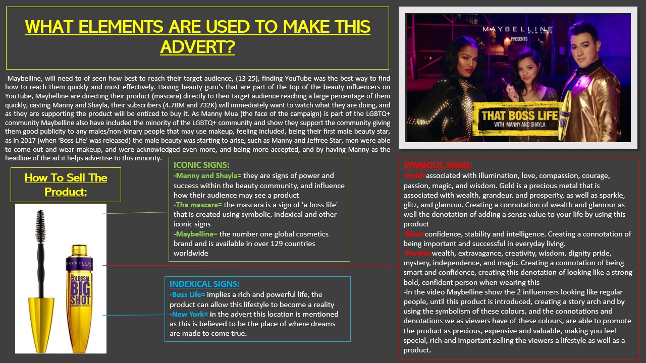
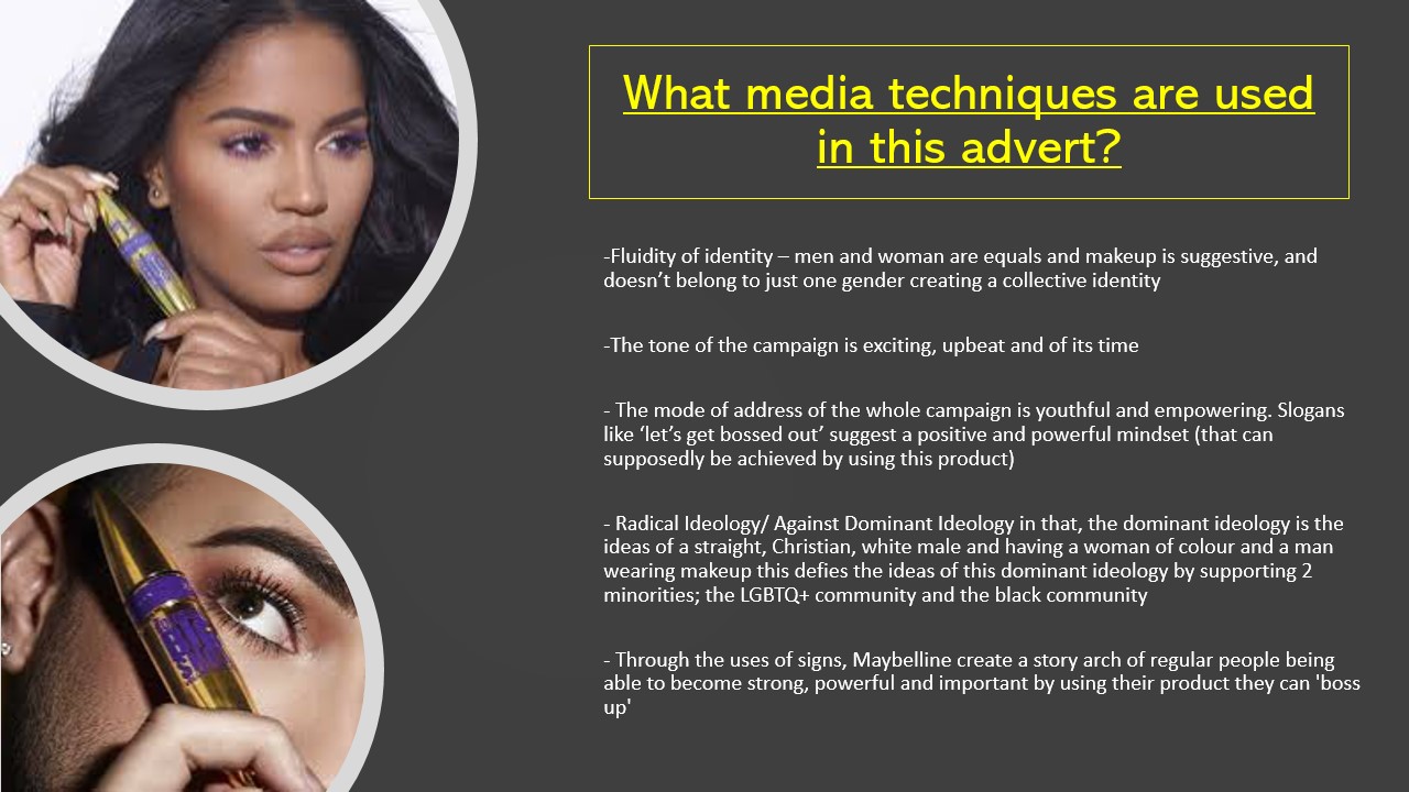
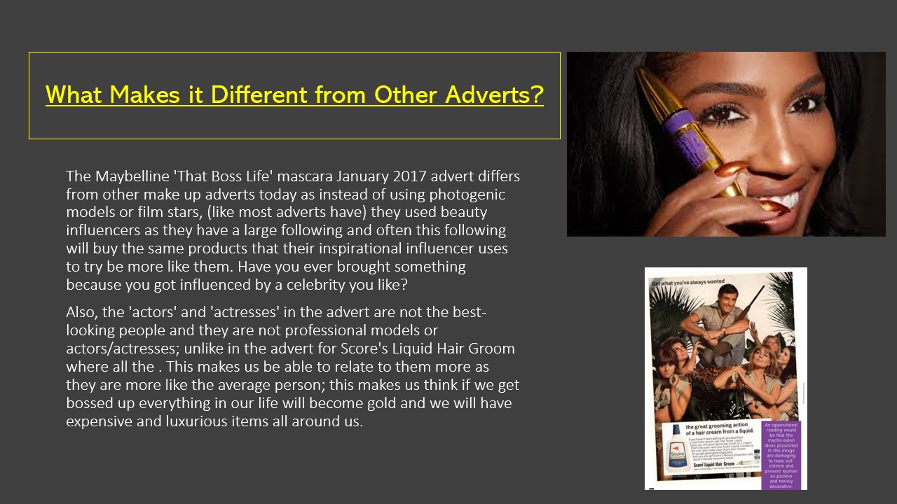
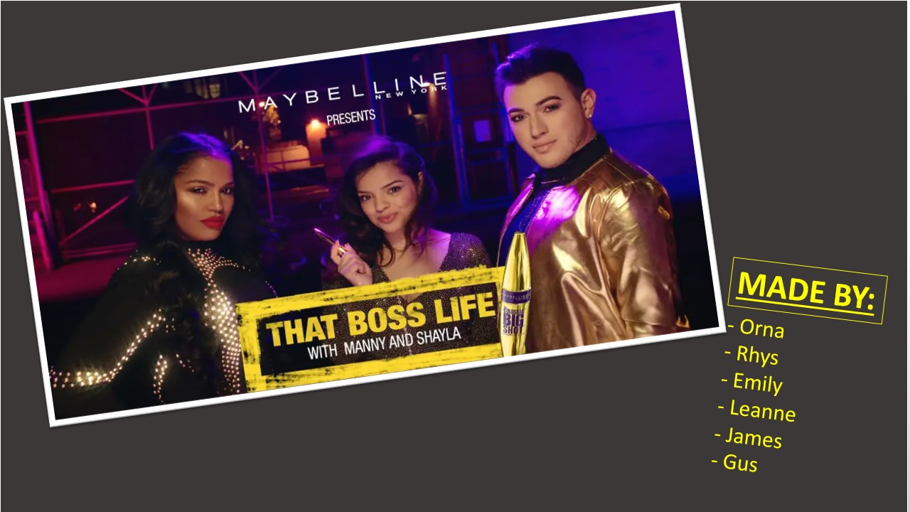
In “That Boss Life” the mascara can be seen as a hero as it creates beauty and gives power to people, whereas at the beginning, Manny and Shayla (before applying makeup) could be seen as the villains because they are not wearing makeup. It can also be argued that Shayla can be seen as a hero for “Bossing up” herself and Manny.

“THAT BOSS LIFE” – THE LANGUAGE OF MOVING IMAGES

Technical CodeDenotation (ie what is it – simply describe what you see / hear)Connotation (ie what does it signify)
SettingA penthouse overlooking New YorkNew York is known for being an extravagant place and a place known for luxury. New York is quite an expensive place to live, so it identifies wealth, which complements the golden colours used within this advert. New York is also known as the “place of dreams”, so it appears luxurious and a place all about glamour.
ClothingAt the beginning, Manny and Shayla are wearing dull, ordinary clothing. However, when they open the mascara they transform and wear Gold.Gold is a colour of luxury, thus identifying that this mascara gives luxury to the consumer. Gold is also a colour that symbolises wealth, thus emphasising that this mascara will “make your life golden and luxurious”. The way they wear ordinary clothing at the beginning shows the transformation that the mascara creates to the consumer.
NVCThe way they pose towards the end looks quite fierce.They have uses both a gay male and a female of darker skin colour to show diversity and inclusion. The way they pose at the end of the advert, looking fierce while staring into the camera and holding their hands on their hips show a bit of sassiness, thus emphasising that this mascara brings confidence to the consumer.
DialogueIn the middle of the advert, Manny and Shayla say “Let’s get bossed up”“Bossed up” emphasises that they want to transform through using this mascara. “Boss” can mean leader, also meaning powerful, so the way a gay man and woman of a darker skin tone get “bossed up” show that they are powerful and are included within makeup, as stereotypically, males don’t usually wear makeup, however, with this advert, Maybelline goes against this dominant ideology.
Sound EffectWhen they get “bossed up” and open the suitcase there is a glittering sound, sounding almost like a magic wandThe sound effect of a magic wand shows the transformation of both Manny and Shayla, taking them into a parallel universe where everyone is included and they are able to “lash like a boss”, thus showing power and identity to the minorities.
MusicStrong drum rhythm throughout the advertAt the beginning, the drum rhythm sounds a bit like a heartbeat, thus creating a rhythm to sound alive, as if using this befire this mascara you are in reality. However, when the briefcase opens, the music becomes more angelic and like a harp, sounding all futuristic and nostalgic.
Camera shot sizeThe camera size shrinks and zooms into whenever the mascara appears.This draws the attention to the mascara as there is nothing else to see, thus putting all our attention to the mascara and its application. The focus also increases on the mascara, thus showing every detail of the mascara and the “beauty” of the product.
Camera movementSlow motion when they open up the briefcase and throw the mascaras out of the suitcaseThe slow motion slows down time and puts our attention into when they are throwing the mascara out of the suitcase, thus putting all our attention to the mascara. The focus also increases on the mascara, thus showing every detail of the mascara and the “beauty” of the product.
EditingThere is glittering when they shows the mascara product. Thus emphasising the beauty of the product. The glittering effect also gives attention to the mascara and it seems as if it should be admired and is showcasing this product as glamourous, which complements the setting of the advert in New York.

HOW IS GENDER REPRESENTED IN MAGAZINES AND GAME COVERS?

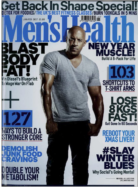
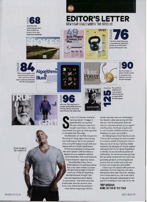
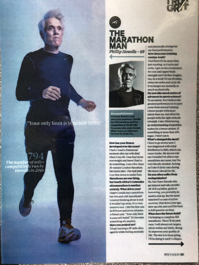
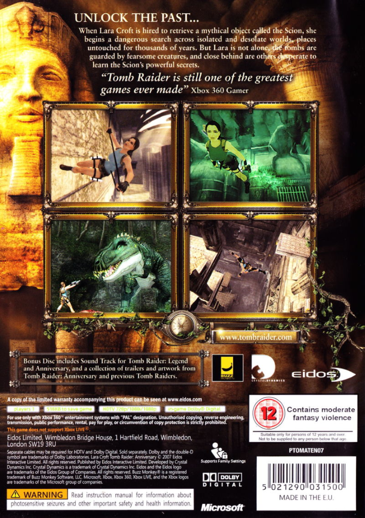
I have closely studied the front page, contents page and a double page spread of the Men’s Health magazine and the front and back of the cover sleeve for the popular game, Tomb Raider. In this essay I will explore how gender is represented in magazines and identify features such as the mis-en-scene of the cover images of both these media sources and how the Tomb Raider cover misrepresents the dominant ideology of females. I will also identify where each media source has followed David Gauntlet and his theories of identity. After identifying how gender is represented in these two media sources, I will conclude with how they can make the main images appear either radical or reactionary to modern day life.

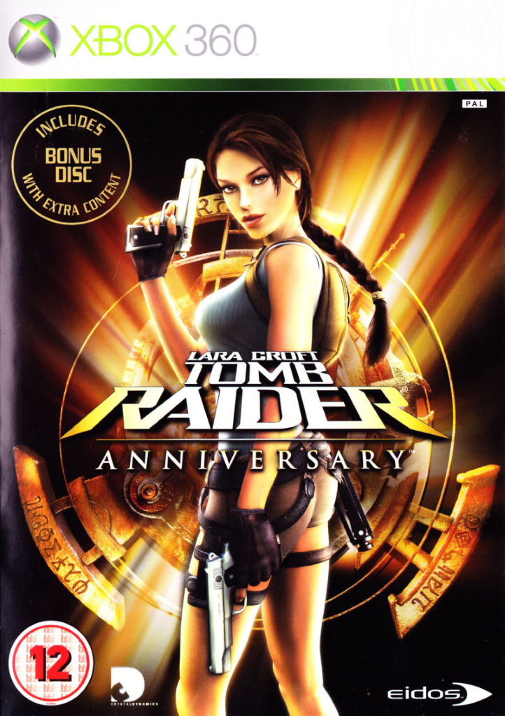
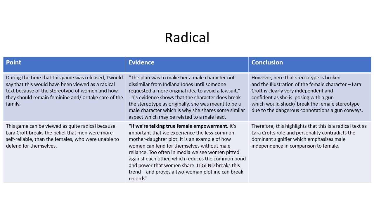
To begin with, Men’s Health and Tomb Raider are two sources of media that represent gender very differently. Men’s Health has a target audience of males who are into fitness, however, Tomb Raider is aimed at males, even though the conventions of a male orientated video game are broken by using a female as the protagonist, as explained by one of the creators of Lara Croft, Heather Gibson, “The story goes that within the industry it wasn’t easy to sell a female heroine…Up until then they were quite masculine characters because your main market was men or boys.”. What is similar about these media sources is that they are both aimed at a target audience of young adult men, as Men’s Health only consists of images of men and Tomb Raider has a central image of a beautiful young girl, which attracts males, the target audience, to play the game by using Lara Croft, who in a report conducted by the BBC, was designed to be a “cybersex symbol”, as identified by her hourglass shape body, large breasts and minimal clothing being worn. However, Men’s Health follows the dominant ideology of males and follows the gender stereotype of males being muscular and regularly attending the gym, thus being represented as quite reactionary. However, the cover of Tomb Raider is represented as radical as the main image of Lara Croft goes against the dominant ideology of females, as shown by Lara Croft holding a gun, which appears radical as Lara Croft breaks the belief that men were more self-reliable than females, who were believed they were unable to defend for themselves. According to an article on Lara Croft, “If we’re talking true female empowerment, it’s important that we experience the less-common mother-daughter plot. It is an example of how women can fend for themselves without male reliance. Too often in media we see women pitted against each other, which reduces the common bond and power that women share. LEGEND breaks this trend – and proves a two-woman plot can break records”​. Therefore, this highlights that this is a radical text as Lara Crofts role and personality contradicts the dominant signifies which emphasizes male independence in comparison to females, whereas the Men’s Health ca be seen as reactionary due to the male protagonist, who appears on the font cover and contents page, following the dominant ideology of males.

The Men’s Health magazine cover uses lots of blue and blacks, as they are colours stereo typically associated with males, however, the Tomb Raider game cover goes against the gender stereotype of females, as the cover uses oranges, blacks and greens, colours that associate with fire and adventure, which goes against the ideology of females. The mis-en-scene of the Men’s Health magazine follows the dominant ideology of males, as signified by the image of the interviewee running, which fits in with the ideology of the magazine as it is based around sports. However, the mis-en-scene used on the game cover of Tomb Raider goes against the dominant ideology of females because Lara Croft is holding a gun in front of a ring of fire, which presents her as radical, rather than reactionary. The settings of both the media sources counteract against each other because Men’s Health uses a very soft background against their images, which could be misinterpreted and seem as if males are being represented as quite feminine. Alternatively, Tomb Raider does the opposite of Men’s Health, by representing females as quite masculine and against the dominant ideology of females, as suggested by putting the central image against a dark colour and fire, which typically signify danger, thus identifying that Lara Croft goes against the regime of females.  

The connotations and denotations of both these sources of media represent gender very differently. For example, the ruling of thirds on the Tomb Raider front cover brings our attention to the centre “square”, which happens to be Lara’s Croft’s breasts, thus suggesting that the intentions of the game cover it to place attention on her large breasts, as she was originally created to be a cybersex symbol for games aimed at young males, who themselves may be looking for love, thus representing Lara Croft as beautiful and a source of escapism for males who have no girlfriends and may feel lonely. The connotations and denotations of the Men’s Health magazine counteract the ideas and radical message that is portrayed through the Lara Croft game sleeve. For example, the Men’s Health contents page and front cover feature a skinny, muscular male, and is positioned so that the iconic sign of Vin Diesel is surrounded by plugs such as “Blast Body Fat” and “Lose 8KGs fast”, thus suggesting that the consumer should be more like Vin Diesel, which then links back to David Gauntlet’s theory of negotiated identity, as the consumer may attend the gym and be muscular, however they question whether they are doing the right thing as the magazine is telling them to be more like Vin Diesel.

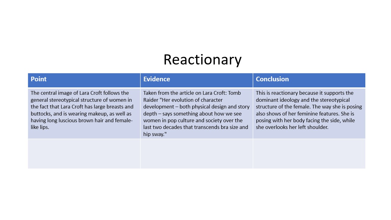
Finally, using David Gauntlet’s theories of identity, the font and back cover of the game sleeve for Tomb Raider has made Lara Croft be represented as having a negotiated identity because she follows the dominant ideology of males, as shown by her going against the female regime by holding a gun, however, she also follows the dominant ideology of females by being positioned sideways on to show the feminine features of her bottom and large breasts, as well as minimal clothing to reveal her and make her come across as a “cybersex symbol” for males who play the game. This negotiated identity of Lara Croft also creates a constructed identity of Lara Croft as a more masculine figure, because her positioning and characteristics within the game make her come across as more masculine, thus changing the player’s beliefs about females, due to the creators of the game intentionally using a female protagonist that goes against the dominant ideology and expectations of the female.

To conclude, Men’s Health and Tomb Raider contrast in the representation of gender. This is shown by the mis-en-scene of both the central image of the products, which is reactionary as they follow the dominant ideology of what females and men aim to look like. The colouring of the media sources also represent gender very differently as Men’s Health uses colours that are stereo-typically associated with females; however, Tomb Raider goes against this by using colours associated with danger, thus going against the dominant ideology of females. The setting of the media sources also represent gender very differently, as Men’s Health uses a soft background, which is a bit misleading as it could appear quite feminine. Whereas, Lara Croft on the Tomb Raider game cover uses fire and an Egyptian style background, which also misrepresents females as it could appear quite masculine, which then presents Lara Croft as being quite masculine and a figure who goes against the dominant ideology of females in media. 

How is Gender REPRESENTED ESSAY – PLAN

Write up a 750 word formal essay (ie beginning, main body and conclusion) that compares the representation of gender in both Mens Health and Tomb raider (draw on all of the pages and not just the front cover). Use key language and specifically show your knowledge of: 1. SEMIOTICS, 2. PRINT LANGUAGE, 3. REPRESENTATION & 4. AUDIENCE THEORY.

GUIDANCE: Compare the specific choices that have been made in the representation of gender in the two products. In your answer, you must consider: 

  • how gender is represented through processes of selection and combination 
  • the reasons for the choices made in the representation of gender 
  • the similarities and differences in the representations of gender 
  • how far these representations are influenced by historical, social and political contexts of media. 

DUE 30th OCT 9AM

Plan:

  • Females’ features are defined to show off their curves and feminine features (ie bottom and the hourglass shape of women’s bodies)
  • Talk about the strategic bum covering.
  • Misrepresentation = females are misrepresented by Tomb Raider as Lara Croft is holding a gun.
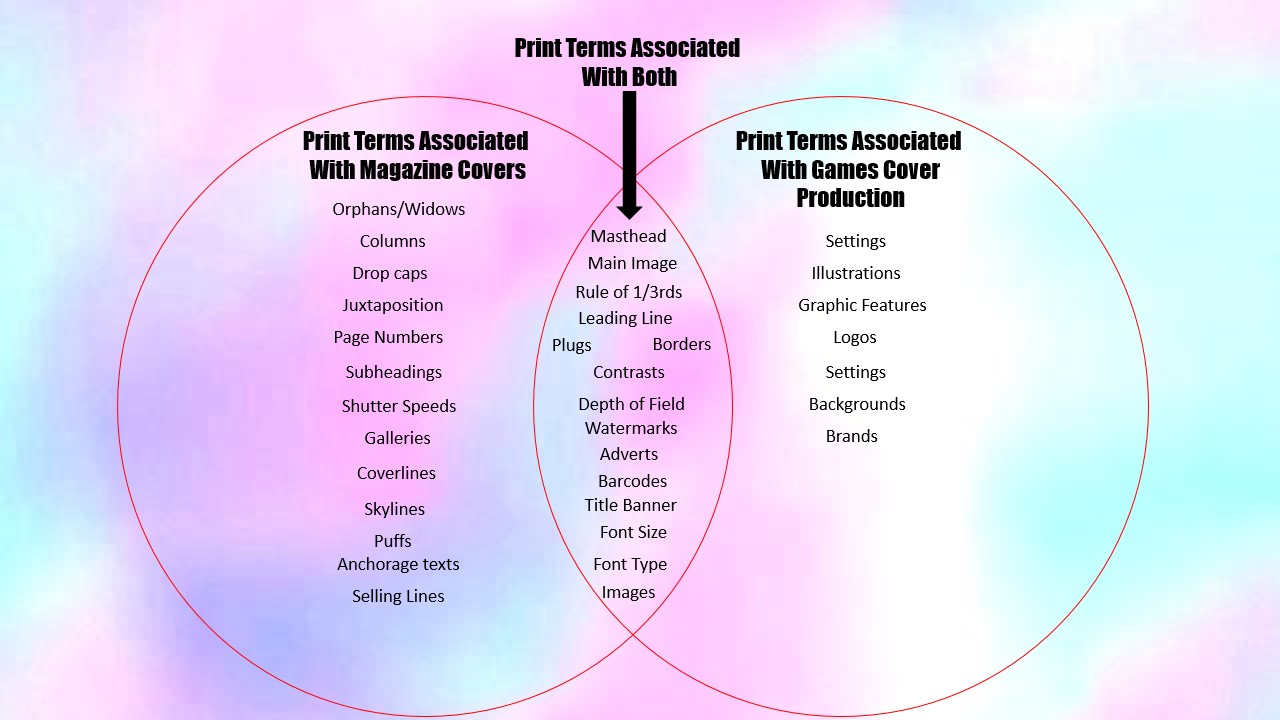
  • Semiotics of Men’s Health and Tomb Raider
  • Talk about the different audience theories (ie cultivated audience theory)
  • according to a report conducted by the BBC, Lara Croft was marketed as a cyber-sex symbol, to entice more females to play the game through allowing them to play as a beautiful, female character, who is the protagonist of the “Tomb Raider” Franchise.
  • According to Heather Gibson, one of the creators of Lara Croft, “The story goes that within the industry it wasn’t easy to sell a female heroine…Up until then they were quite masculine characters because your main market was men or boys.”
  • Iain Simon, the founder of the GameCity festival says “I think she [Lara Croft] was part of a broader movement towards a new kind of powerful feminism that came about.”
  • According to a viral tweet on Twitter, someone stated about the first-generation character of Lara Croft, “Look at the proportions. Look at the clothing. Look at the pose. They’re all sexy! Lara Croft isn’t a model. Her job is not to look sexy. She is a Tomb raider. She’s supposed to be quick, gritty and tough. Sexy is merely a bonus. But the picture says otherwise. The original Lara Croft was designed keeping her sexiness in focus. Feminists or any rational person won’t like that because they don’t like their sexiness being focussed upon and then using it as basis for their entire value Women are a lot more than just sexy. Women can be tough, intimidating, gritty, brave, funny, smart and a lot more”

My Essay Draft

Men’s Health and Tomb Raider are two sources of media that represent gender very differently. Men’s Health has a target audience of males who are into fitness, however, Tomb Raider is aimed at males, even though the conventions of a male orientated video game are broken by using a female as the protagonist. What is similar about these media sources is that they are both aimed at a target audience of young adult men, as Men’s Health only consists of images of men and Tomb Raider has a central image of a beautiful young girl, which attracts males, the target audience, to play the game.  

“Men’s Health” and “Tomb Raider” represent gender very differently. Men’s Health follows the dominant ideology of males and follows the gender stereotype of males being muscular and regularly attending the gym, thus being represented as quite reactionary. However, the cover of Tomb Raider is represented as radical as the main image of Lara Croft goes against the dominant ideology of females, as shown by Lara Croft holding a gun, going against the gender stereotype of women being caring. On the Tomb Raider cover, Lara Croft’s features has been designed to show off her large bottom and hourglass body shape by positioning her sideways on, while the man on the cover of Men’s Health is standing in a pose to make him appear to be quite tough and to show off his defined muscles, thus making the central image of Men’s Health appear reactionary. 

 The Men’s Health magazine cover uses lots of blue and blacks, as they are colours stereotypically associated with males, however, the Tomb Raider game cover goes against the gender stereotype of females, as the cover uses oranges, blacks and greens, colours that associate with fire and adventure, which goes against the ideology of females. The mis-en-scene of the Men’s Health magazine follows the dominant ideology of males, as signified by the image of the interviewee running, which fits in with the ideology of the magazine as it is based around sports. However, the mis-en-scene used on the game cover of Tomb Raider goes against the dominant ideology of females because Lara Croft is holding a gun in front of a ring of fire, which presents her as radical, rather than reactionary. The settings of both the media sources counteract against each other because Men’s Health uses a very soft background against their images, which could be misinterpreted and seem as if males are being represented as quite feminine. Alternatively, Tomb Raider does the opposite of Men’s Health, by representing females as quite masculine and against the dominant ideology of females, as suggested by putting the central image against a dark colour and fire, which typically signify danger, thus identifying that Lara Croft goes against the regime of females.  

To conclude, Men’s Health and Tomb Raider contrast in the representation of gender. This is shown by the mis-en-scene of both the central image of the products, which is reactionary as they follow the dominant ideology of what females and men aim to look like. The coloring of the media sources also represent gender very differently as Men’s Health uses colours that are stereo-typically associated with females; however, Tomb Raider goes against this by using colours associated with danger, thus going against the dominant ideology of females. The setting of the media sources also represent gender very differently, as Men’s Health uses a soft background, which is a bit misleading as it could appear quite feminine. Whereas, Lara Croft on the Tomb Raider game cover uses fire and an Egyptian style background, which also misrepresents females as it could appear quite masculine, which then presents Lara Croft as being quite masculine and a figure who goes against the dominant ideology of females in media. 
Key Terms

Positive and negative stereotypes = a positive stereotype refers to a subjectively favourable belief held about a social group. However, negative stereotypes could be considered as the cognitive component of prejudice, which is defined as a general negative evaluation of a social group. Negative stereotypes are also related to discrimination, that is, to negative behaviours directed toward individuals because of their group membership.

Counter-types = they are positive stereotypes which emphasises the positive features about a person.

Misrepresentation = when you give a false and inaccurate representation of something, creating a misleading account of the nature of someone. For example, Pitbulls are represented as being very vicious, when in reality they are quite loving house dogs if you give them the correct training.

Selective representation = this is when some groups of people are represented more in the government than other groups of people.

Constructed reality = The term social construction of reality refers to the theory that the way we present ourselves to other people is shaped partly by our interactions with others, as well as by our life experiences.

Dominant ideology = the ideology of the dominant class. It denotes the attitudes, beliefs, values and morals shared by the majority of people in a given society.

Hegemony = it is a way to describe people or ideas that become and seek to remain dominant in the dominant ideology.

Audience Positioning = it is a technique used by the author of the text, which gets the audience to understand the ideology of a text.

David Gauntlet – Identity Terms

Fluidity of identity = Fluidity of Identity has the ability to change in many directions. For example, if a man on weekdays wore suits and masculine clothes (the apparel stereotype of males) , however on weekends, they decided to wear make-up, dresses and heels (the apparel stereotype of females).

Constructed Identity = this is when you shape a person’s beliefs, values or morals by individual actions.

Negotiated Identity = this is when people contemplate “who is who” with their identity. When the identity has been determined, people have to be respectful and agree to the identities people have taken. This means not making assumptions of gender.

Collective Identity = it is the shared identity of the group and its members.