

| Technology and Newspapers | ||
| Production | Distribution | Consumption |
| pen / pencil / paper word processor / printer telephone camera microphone license | (large scale) printing press lorries / vans / cars stacks / shelves / display cases social media platforms billboards | paper (the ability to read? & understand?) a digital device (ipad/phone, computer reading glasses |
What is the network effect?
Network Effects describes the phenomenon how the value of a good or service increases as more people start to use that good or service
‘Feedback loop theory’
A feedback loop is a concept found in systems theory. Feedback loops provide information to an organization about system successes and problems. Success results in a positive feedback loop and problems create a negative feedback loop
What is the Dunbar number?
Dunbar’s number is a suggested cognitive limit to the number of people with whom one can maintain stable social relationships—relationships in which an individual knows who each person is and how each person relates to every other person.
I didn’t stick with the style model I showed in my statement of intent and I didn’t do what I said I was going to do in my statement of intent.
I changed the style back to one of my original ideas which was to create my own character using Fuse. Here is my outcome.
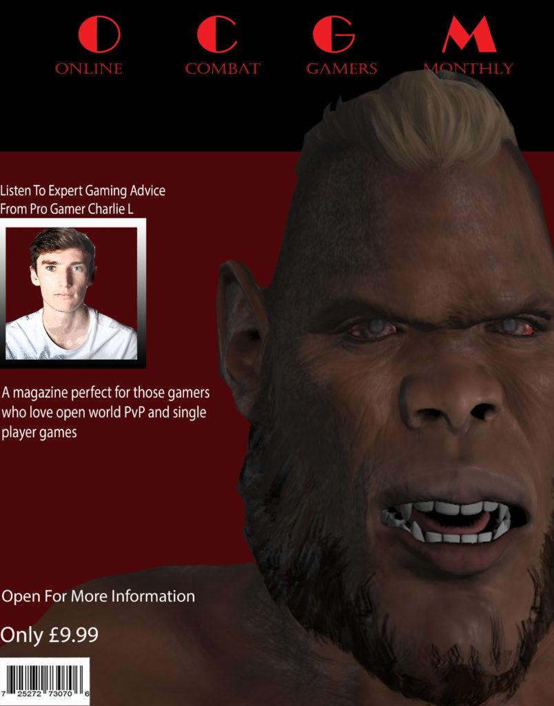
I really like how this turned out with the main image really drawing your attention and the color scheme really creates a feeling within the audience and sets a spooky and fear chilling feeling. When you look at the image and the color scheme you really get that feeling as to that this game is a PvP and/or violent game, which is what I was aiming to create.
My gaming magazine will have a main character as the main image and the center piece of the magazine. The colour scheme for the character and background will be more of a dull colour scheme with colours being black and white but the writing being bright colours that attract peoples attention, I will use bright colours on a dark background due to exaggerated look of the character but also the impact the bright colour will draw the attention of people.
My main character for the front cover of the magazine will be a guy looking slightly away from the camera with a chiaroscuro look to make the main character and frame look more threatening to the audience.
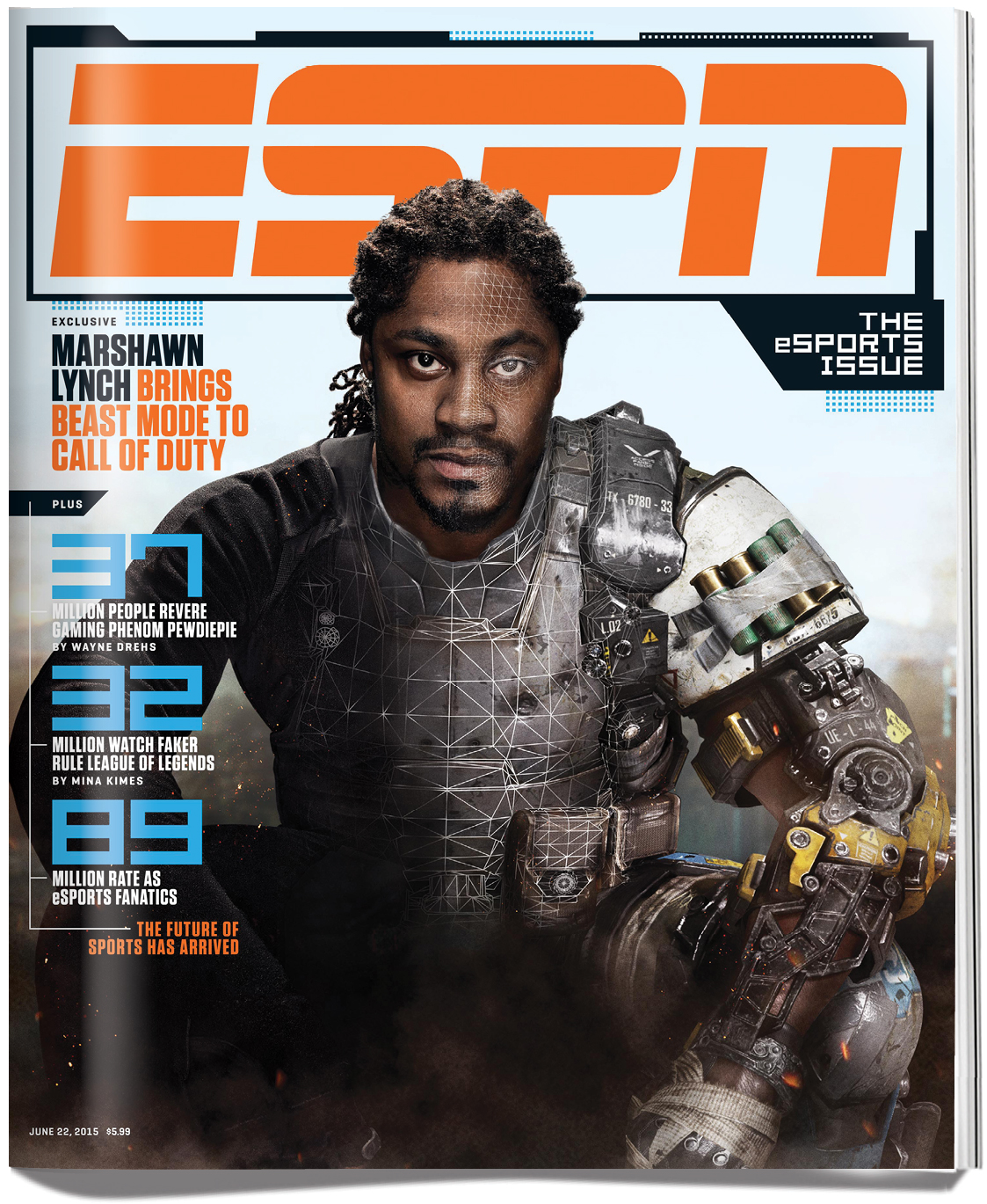
I got this inspiration from the following magazine
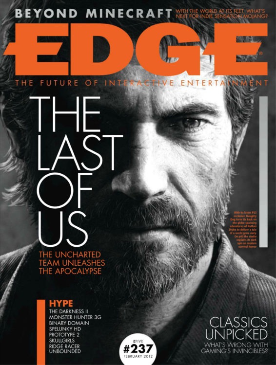
I really like the look of the black and white character and image as it has that ‘edgy’ and threatening and sinister look which is really effective to create an atmosphere.
I am going to use a real person instead of using fuse because I would be able to get the lighting for the chiaroscuro look a lot easier as I would have to physically do it myself, I can also get my model to have specific facial expressions which I would use to create a specific feeling within the audience.
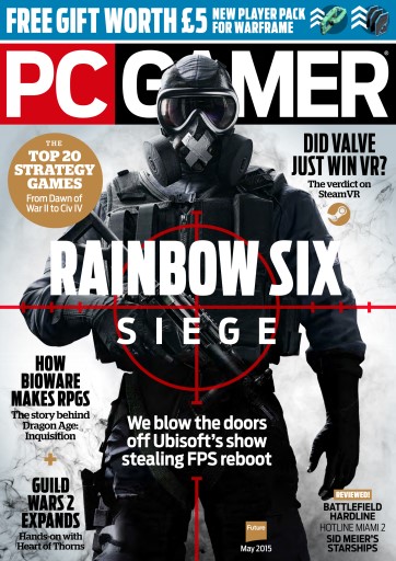
This is the other front cover of a gaming magazine that I am taking inspiration from, which has a similar look and design of which I was thinking of doing but also the other style model I’ve been looking at. With the main image being a character which is the only picture in frame which you are instantly drawn to, with it being in black and white, but having main and bold colours such as blue and red which really stand out. This front cover uses multiple layers on the cover, with the character covering the title of the magazine and the red target and the name of the game partially covering the games character.
My target audience are going to be young males between 18-24 who are interested and enjoy playing open world and violent games, the reason I have chosen this age group is the magazine will be promoting a game which promotes violence and there is a minimum age where you can play such violent games. But the actual audience would be anyone who picks up this magazine, which could be nay age, gender or race.
Facts about Common:
The music video is playing on top of the song, Letter to the free. The theme of the music video is about freedom, this is clear with the title of the song, but also the setting of the video being shot in a prison, a place associated with freedom, well lack of. The genre of the song is Hip-Hop/Rap. The song and chorus especially is inspired by the slavery of black people, with the chorus repeating ‘freedom’ and repeating things such as ‘hold on’ and ‘Won’t be long’ is a hidden message which were used by black slaves to send hidden messages, much like ‘Wade in the water’.
A black square hovering in the air appears throughout the clip, which, in a final shot, is framed as empty space in a field this gives the representation of an empty space like the freedom has been taken away.



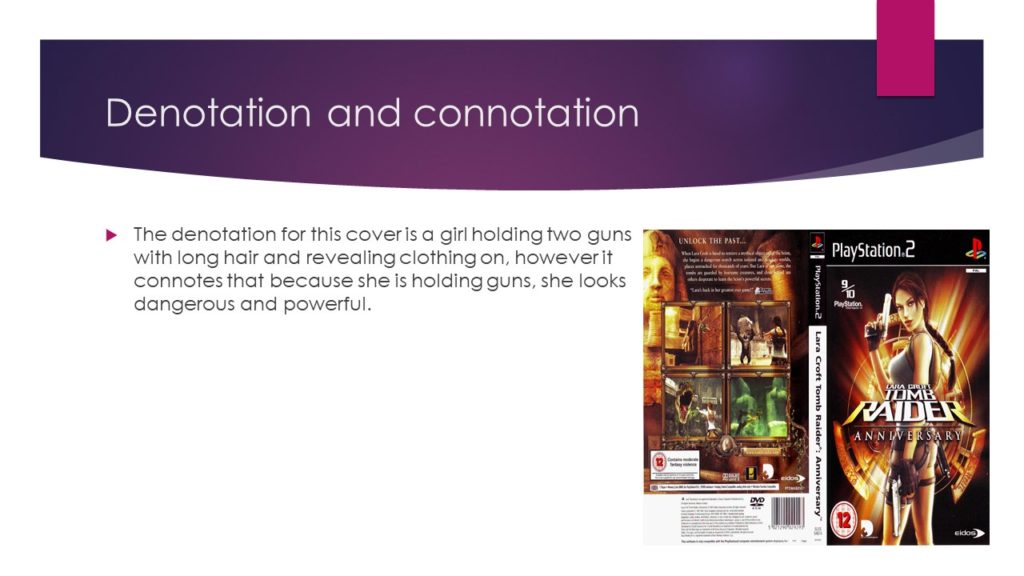
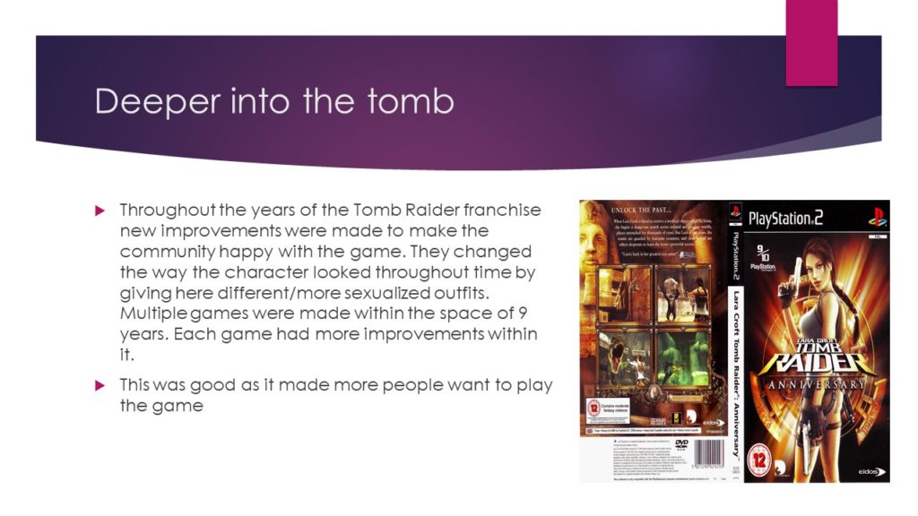
In this essay I am going to show and explain how gender is represented in two extracts which have been provided for us, one is a front and back cover for a game CD box for the Lara Croft Tomb Raider Anniversary game, and the other extract is a front cover, contents page and a double page spread from a Men’s Health article starring Vin Diesel on the front cover.
Both CSP’s represent gender in a different way. In Men’s Health magazine, on the front cover is gym enthusiast and popular actor Vin Diesel. On the cover, Diesel is staged in a way which using the lighting effects, exaggerates the muscle and the definition within his arms to make them stand out. This is an indexical sign linking to the dominant ideology that this is the norm look for men within our society today. This common look within inspirational and well known actors and people such as Vin Diesel, Dwayne ‘The Rock’ Johnson and Martyn Ford, this creates a negative representation as it causes the majority of people to misinterpret and stereotype all men with having this physique. The main image can be interpreted as advertisement use as men who see this may aspire to look a certain way, and with the help of the magazine and the contents will be able to achieve that.
Similarly in Tomb Raider the main image of Lara Croft has been made and portrayed in such a way to draw attention to her exaggerated looking bottom and breasts, as well as the camera angle the use of wardrobe also draws your attention to specific parts of her body, such as her short and tight shorts along with the tight top she is wearing. Much like in the Men’s Health magazine this creates a negative representation, as people will believe that this is the norm for body types with females globally. But the use of adding the handguns along side her challenges the dominant ideology that this is a reactionary text as not every person owns a gun, this makes the character more badass and not someone to be messed with.
I believe that both texts are a radical representations of common stereotypes which are common along side gender and body images within different texts, whilst Men’s Health supports and continues to use this in order to gain popularity and Lara Croft Tomb raider challenging the common ideologies through body manipulation and exaggeration.

